150+ Photos of Modern Interiors in Gray color. The advantages that gives gray design

If you think that the gray interior is boring, the photo says the opposite. This color is a fashion trend for modern life.
Content:
The color that gives peace and historical luxury
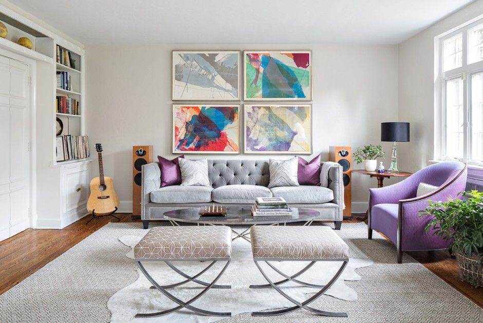
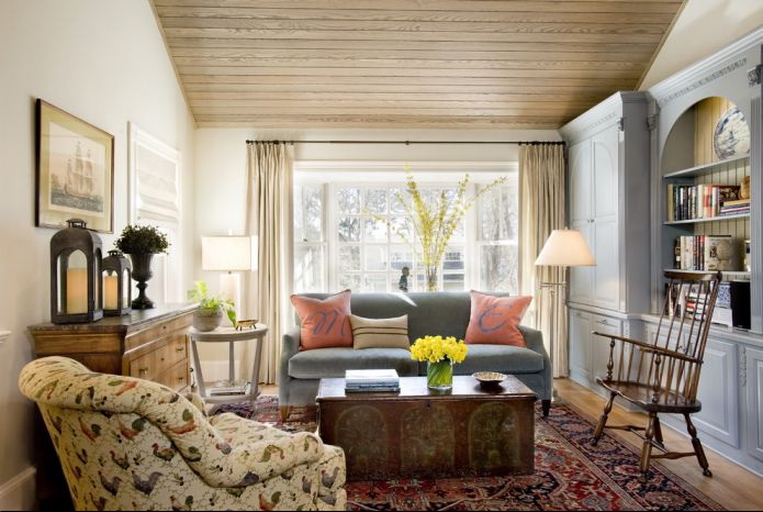
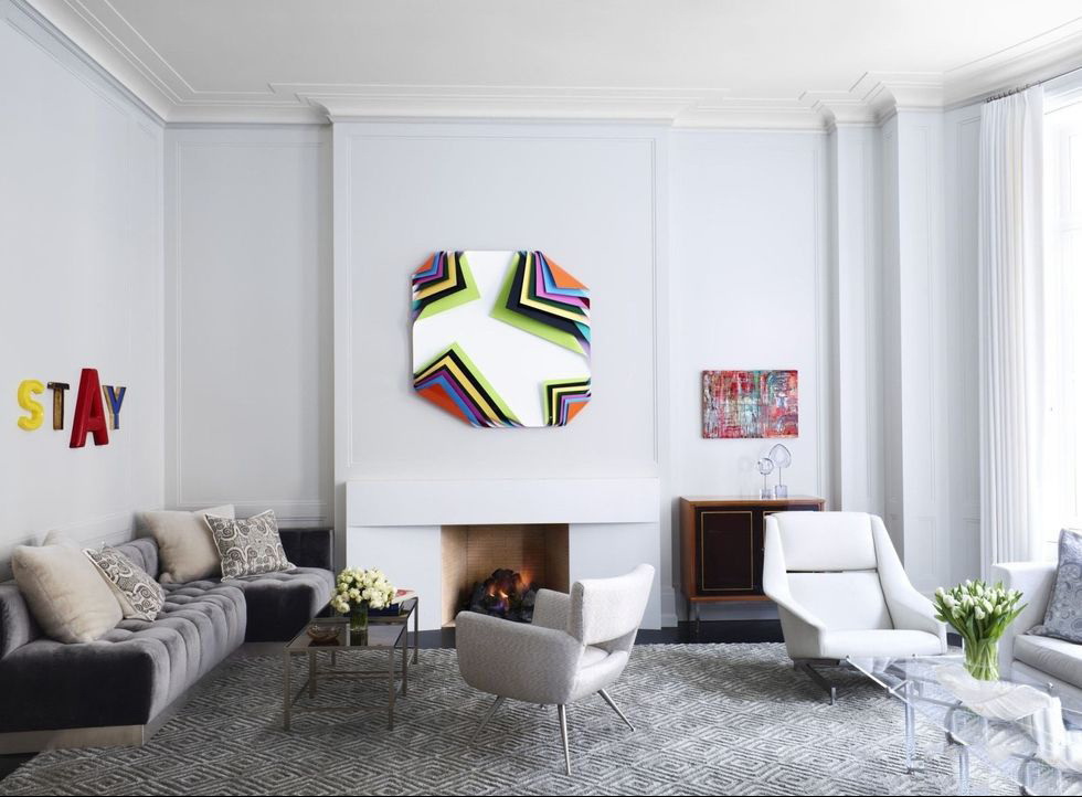
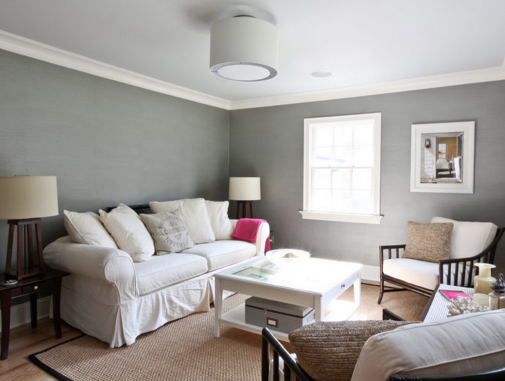
You should not think that the gray color is depressing and makes the interior faceless. Experts consider different shades of gray as a wonderful background for interior items, of furniture. It is not annoying, not distracting, applicable for various styles. Subtle combination of materials texture:
- wallpaper;
- decorative plaster;
- tiles;
- color whitewash;
- furniture upholstery;
- textiles different shades of saturation.
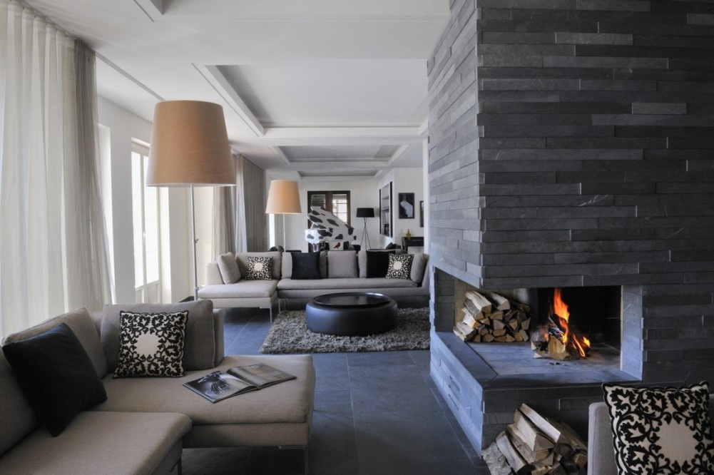
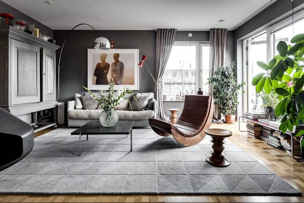
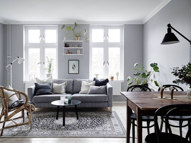
Gray color in the interior
Gray color has a large range of colors:
- Carbonic.
- Anthracite.
- Nacre.
- Metal: tin, steel.
- Wet asphalt and stone.
The list can be continued. But the main thing is that this color gives variety and ample opportunities to create unique interiors in various styles.
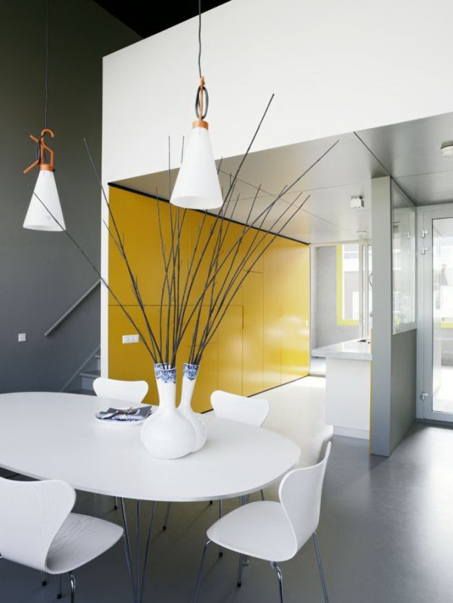
Fashion trend for modern life
Different shades in conjunction with:
- brown;
- blue;
- green;
- red;
- purple;
- pink and others.
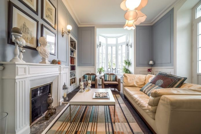
Used to create historical interiors of classical, neoclassical styles. How? It is enough to add a small amount of gray to the paint; it acquires historical charm with a touch of age-old beauty.
Gray color has a large range of colors.
These shades of different saturation well complement the wooden parts of furniture, interior, decoration materials, imitating it, wicker rattan furniture, coating sex tile Brown color gives softness, plasticity and balances the severity of the main color.that Furniture does not have to be only wooden. It combines natural material and metal parts:
- legs;
- racks fixtures;
- drawer handles.

Shades of this color are suitable for interior items
This color is in harmony with:
- birch;
- alder;
- spruce;
- beech;
- exotic: dusii, sweets, goncala.
Wooden frames mirrors, paintings, the doors, tables, details sofas diluted monochrome interior. The same effect gives the green color of living and artificial of plants - flowers, trees, palm trees. They give the rooms a sophisticated charm.
Brown color gives softness, plasticity and balances the severity of the primary color.
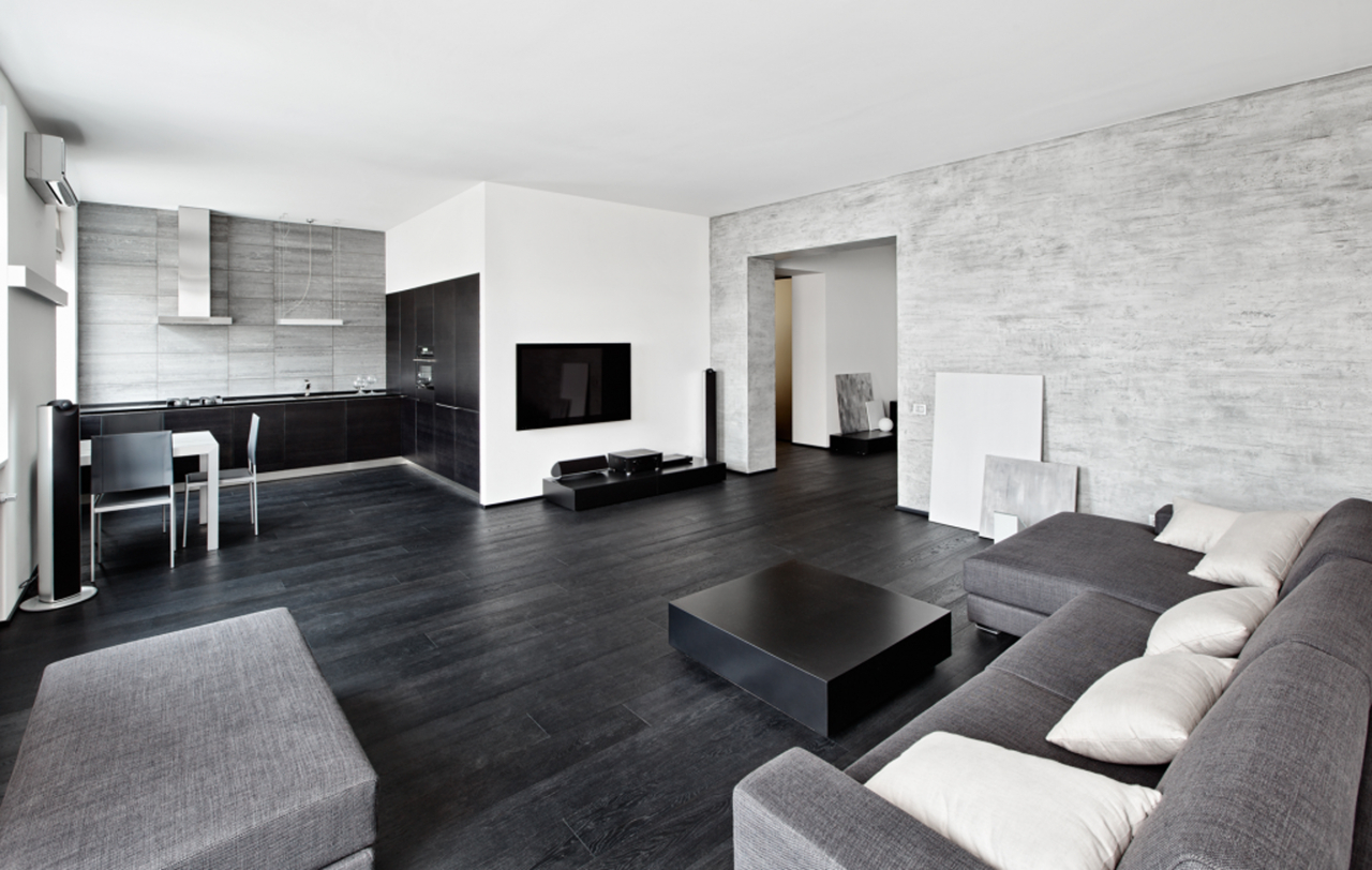
Lovers high tech Highly appreciate this color, because it harmonizes well with nickel-plated parts, lighting fixtures, ladder marches in houses.But, not to do without iconic parts: lights, glass furniture. Otherwise, housing becomes state-owned, strict.
Hi-tech style
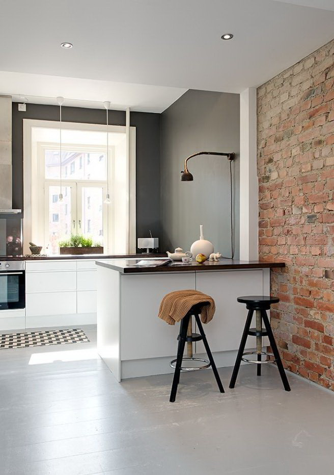
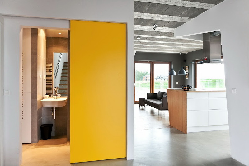
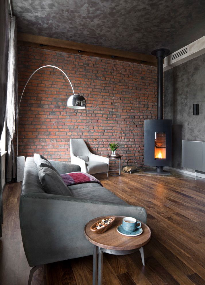
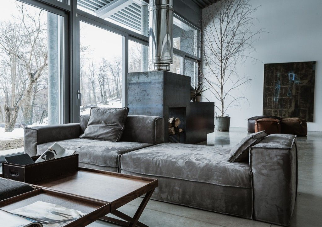
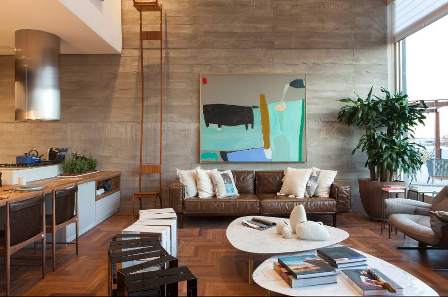
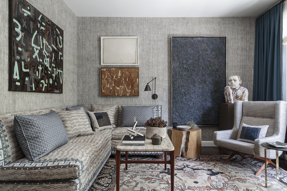
Style loft attracts with its originality. It combines industrial brutality, dynamics. In this style, natural stone or brick masonry in harmony with smooth plastered gray walls.
Want to diversify the world around us? Use of pebbles will help. The perimeter of the room is decorated with sea pebbles, shock-proof glass or transparent durable plastic is placed on top. The interior is transformed and corresponds to the fashionable environmental trend.
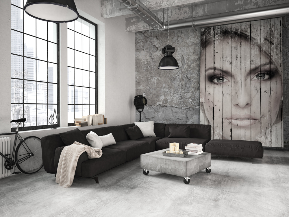
Loft style attracts with its originality
Tapestries, fur covers add softness, plasticity, volume to the laconic design of a monochrome interior.
Modern design directions use plastic, nickel-plated metal, fancy glass, color gamut. For items made from these materials, strict gray walls are becoming a stylish frame.. They do not distract attention, but give focus on interior items.
Exquisite modern easy to implement in small spaces
Gray helps create historical interiors. It is enough to add a small amount of this color in:
- blue;
- brown;
- green;
- red.
The room acquires historic charm. In combination with aged metal, stylistic lamps, even small rooms are transformed and acquire century-old refinement.
Exquisite modern is easy to implement in small spaces.
For this, monochrome walls are complemented by:
- Tiffany lamps;
- stained glass windows;
- glass door details.
Frilly furniture, plastic lines in the form of a scourge come to the fore. Thanks to the main background, it is easier to create fragments of this style in small rooms.
Helps to create historical interiors
Austerity combined with lively greens. Wood is a feeling of stability. As a result, the interiors are not only beautiful. They provide a wonderful transition from the modern rhythm of life to the necessary peace.
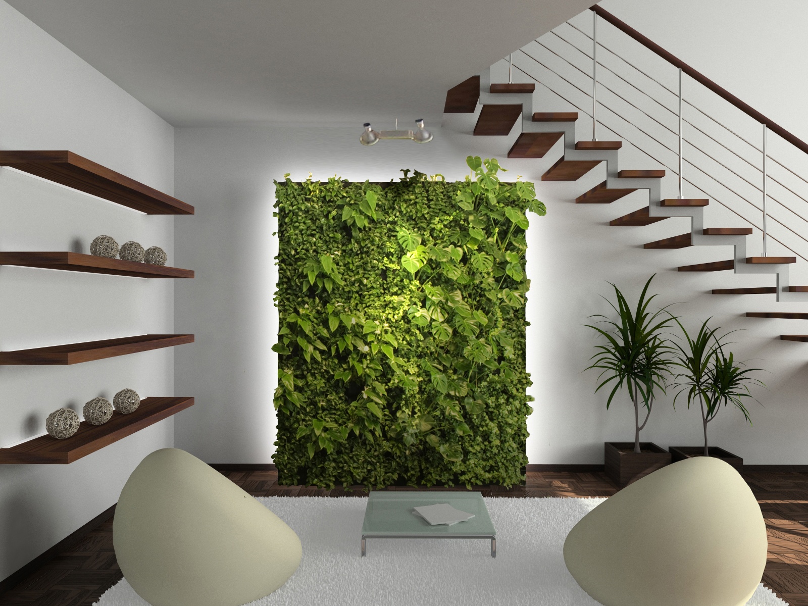
Eco style
Gray wallpapers - is it boring or stylish?
What is gray color? This is the border between white and black. Such concepts are completely opposite. Designers and decorators play on it: they connect the uncombinable: decoration materials of different styles, furniture. Against a gray background, even laconic sofas with bright upholstery or a slide with a dark color become art objects.
The border between white and black
A room decorated in this color becomes interesting if you use design tricks.
It is necessary to choose the right complement to the "capricious" color.
- Do not decorate all walls in one color, it casts boredom. Apply one of the three options described below.
- If you want to wallpaper the same, choose different textures.
- Plain walls become a good background for bright details.
- Choose beautiful furniture (which attracts attention with color, shape).
The room becomes interesting if you use design tricks
Interesting wall decoration:
- One wall is decorated with a large print wallpaper. Choose a pattern in the same color and different shades.
- Similar to the first option, but drawing a different color. He becomes an art object. Do not decorate the entire wall, make a frame of moldings or stucco. You can create a man-made picture.
- Three walls - smooth wallpaper and one option with a large texture. In this case, diversity is guaranteed, and the textural options become an additional decoration of the room.
Do not decorate all walls in one color, it casts boredom.
Gray is indispensable in the offices. Business atmosphere will be provided. If you combine gray with brown, the room takes on a festive look. Choose smoky, steel shades that provide a sense of maturity.
Business atmosphere will be provided
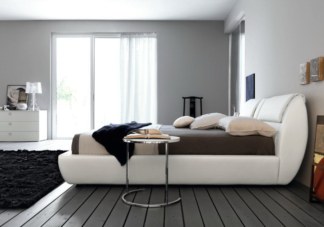
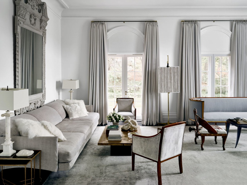
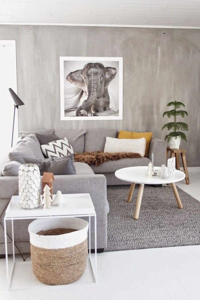
How to make a monochrome gray-white interior beautiful?
Do not be afraid of calm colors. The great Leonardo da Vinci stated: "White, this is the first of the main ones." But few dare to choose a pure white interior. A large number creates a cold atmosphere, internal tension and the memory of hospital wards.
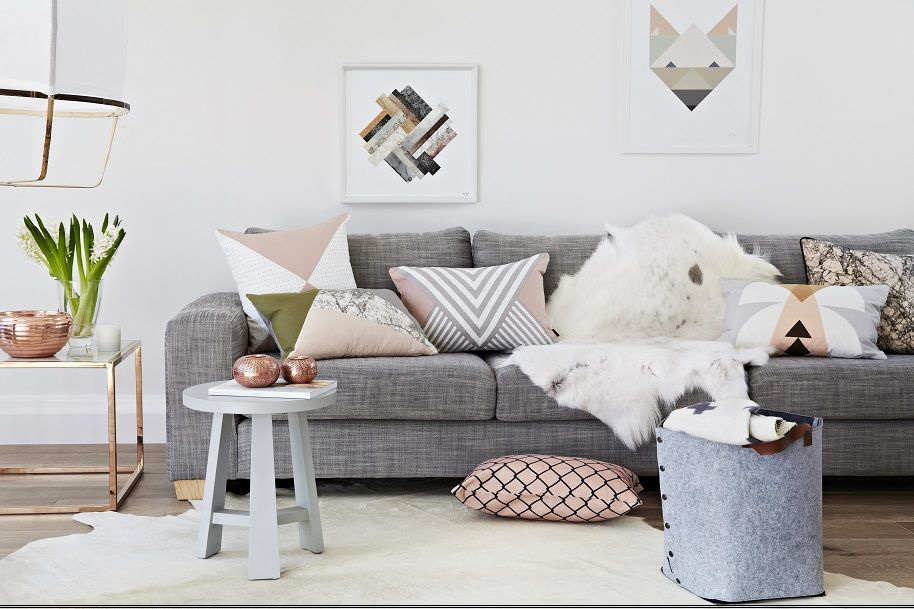
For lovers of undisturbed peace, the gray-white decoration of the rooms with fragmented patches of bright details becomes a good option. What could it be? Dark wooden furniture, picture frames, lively green flowers, bright lighting or curtains.
"White is the first of the primary colors" by Leonardo da Vinci
This basis of the interior becomes a "clean canvas" for other items. He charges energy and gives purity of thought. The combination of two basic shades can be complemented with any other and it looks harmonious.
The use of materials of various textures:
- decorative painted gray walls and furniture with glossy doors;
- white walls and gray furniture upholstery, gray with white carpetanthracite facades and countertops furniture;
- One of the walls is decorated with white, and it becomes the background for paintings, floor vases, upholstered furniture, and decorative shelves. The remaining three are gray.
The combination of two basic shades can be complemented with any other colors and it looks harmonious.
This interior is the easiest to transform and change. You can organize seasonal decor: in winter add warm colors: red, orange, yellow pillows; in the spring - green vases, bedspreads for sofas and chairs; in the summer - to provide a cool blue or blue; in the autumn - pink or lilac tones.
return to menu ↑How do curtains change the look of your home?
Textile transforms the room, emphasizes the chosen style, balances the severity of a concise design, protects the room from the environment. What do designers offer? Natural materials and their imitation:
- linen;
- cotton;
- silk;
- taffeta;
- velvet.
Gives you the opportunity to play different textures
Consider the location of a particular room. For the northern side, choose light shades, the southern one needs good sun protection, therefore saturated colors are quite appropriate. It does not distract from other interior items and becomes a complement, rather than an accent detail.
This year's fashion trend is natural tones.
Gives you the opportunity to play in different textures. Thin curtains choose with the texture of flax, cotton fabrics. Curtain satin or silk with soft folds smooths sharp corners. If you do not arrange the room in neoclassical style, forget about lambrequins. They lost their positions.
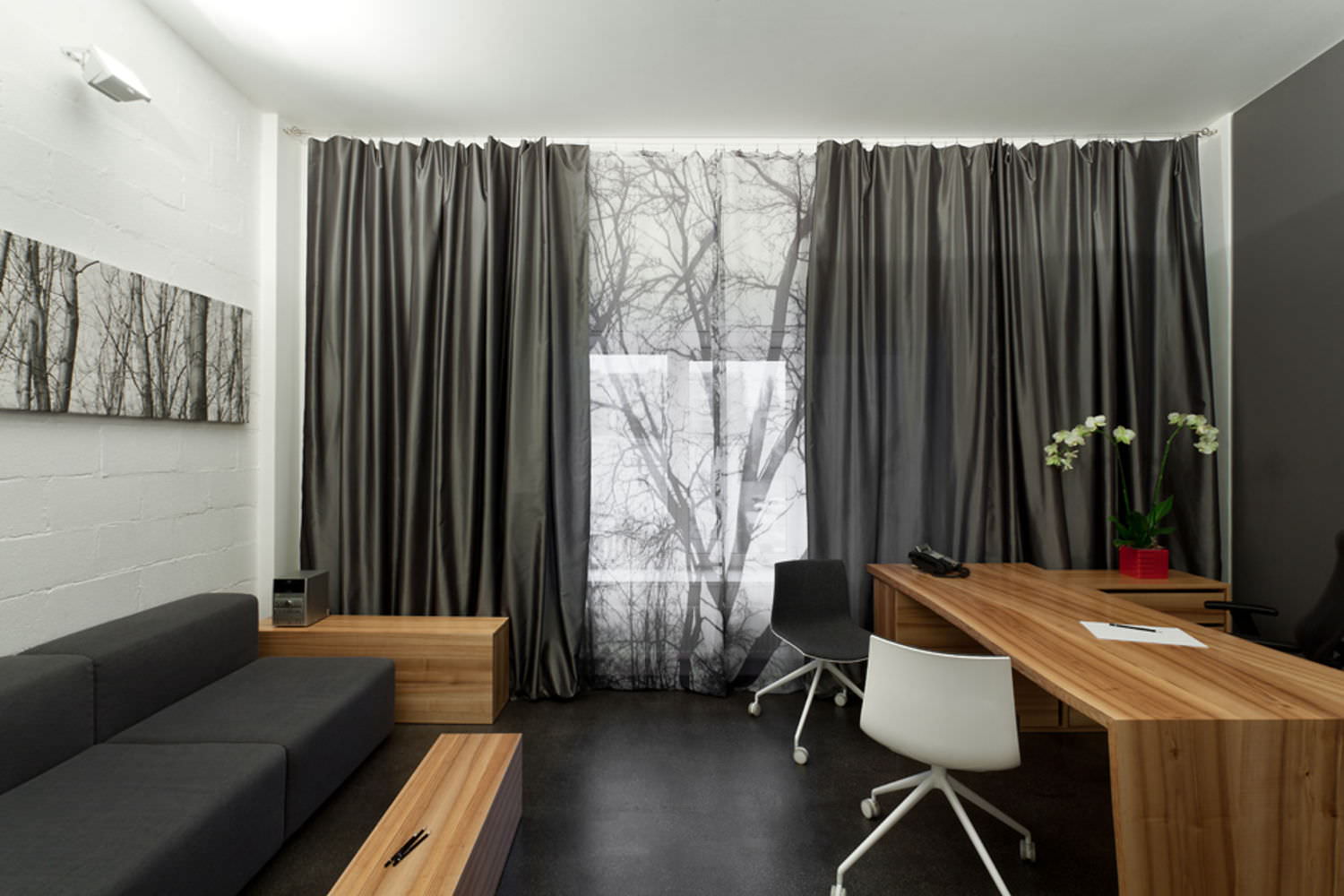
Textiles transform the room, emphasizes the chosen style.
Use for draping grabs. They provide soft, uniform folds. It is desirable that the curtains and other textiles are in harmony with each other. This allows you to create your own comfortable atmosphere.
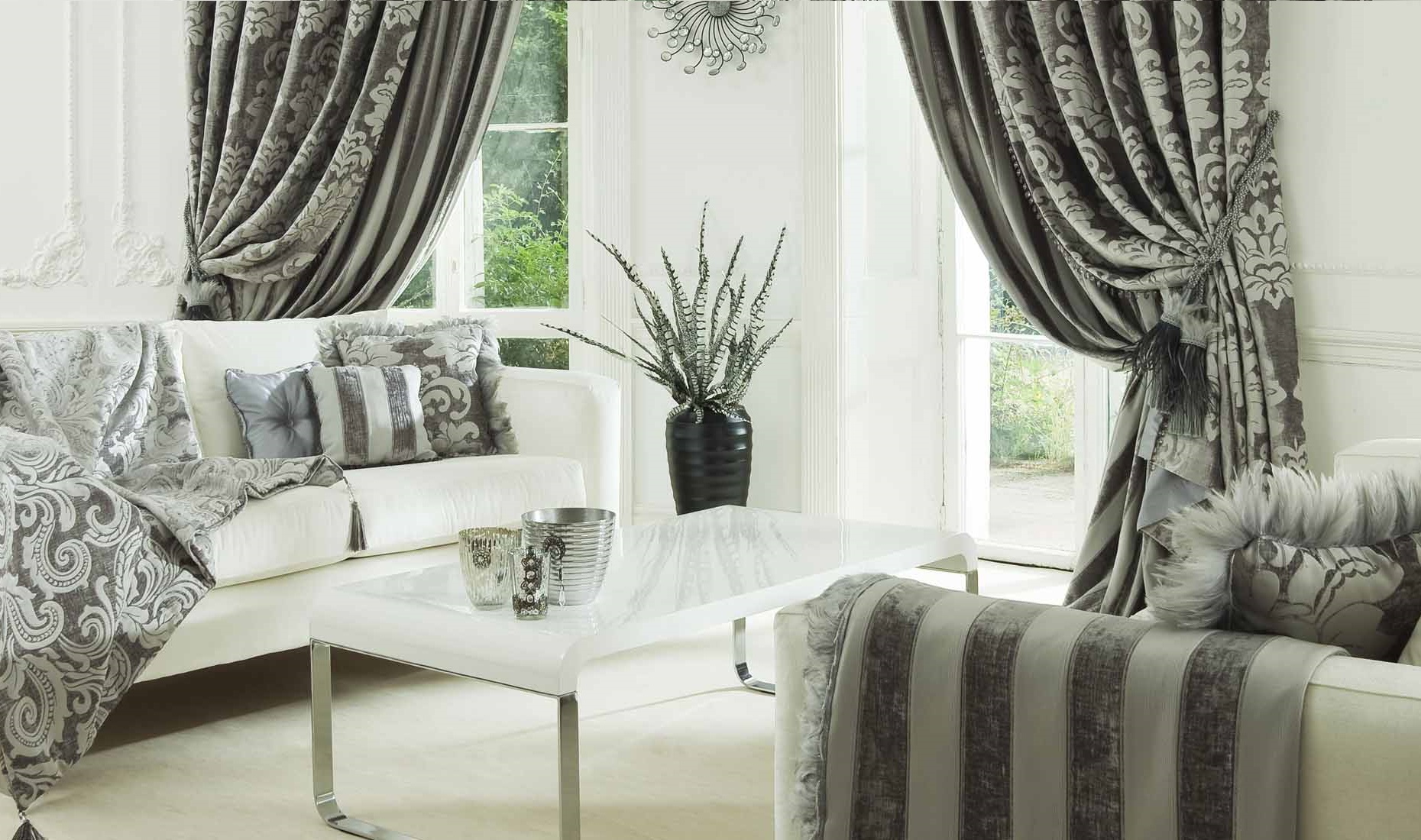
Beautiful combination
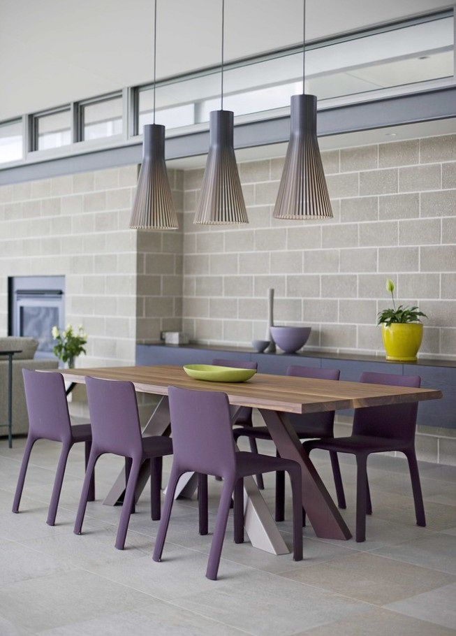
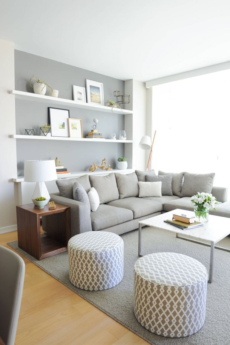
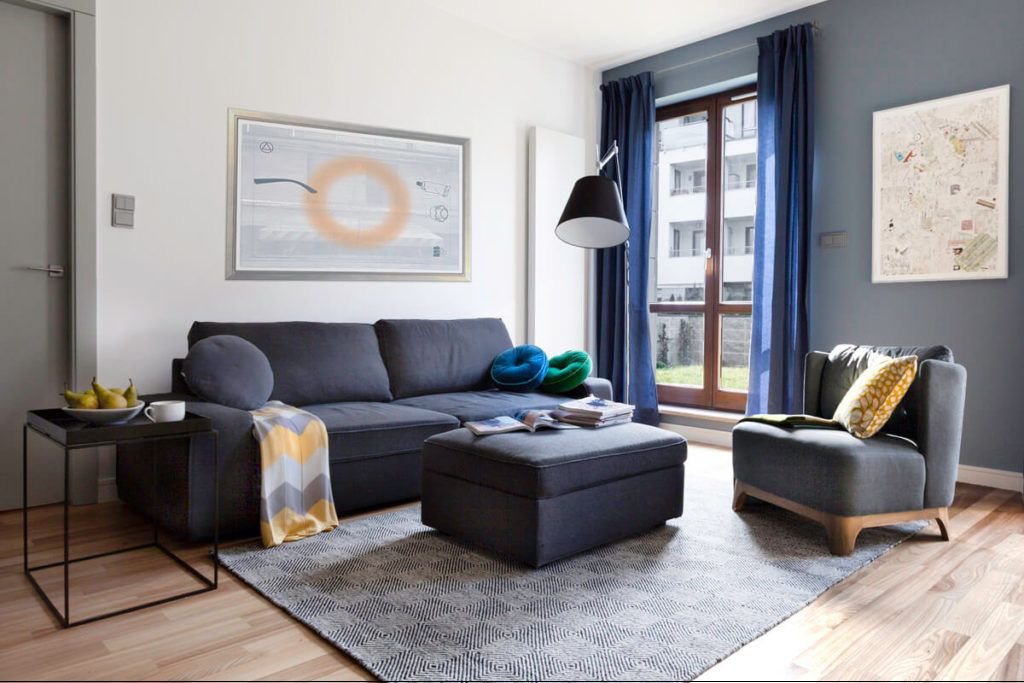
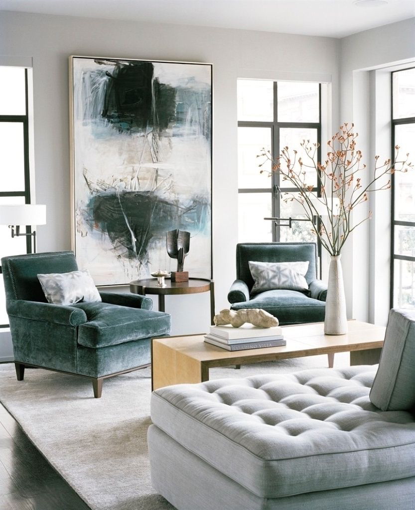
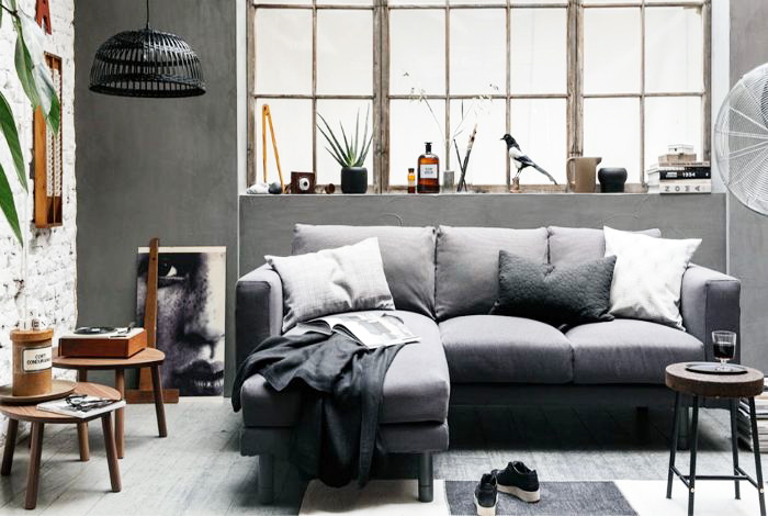
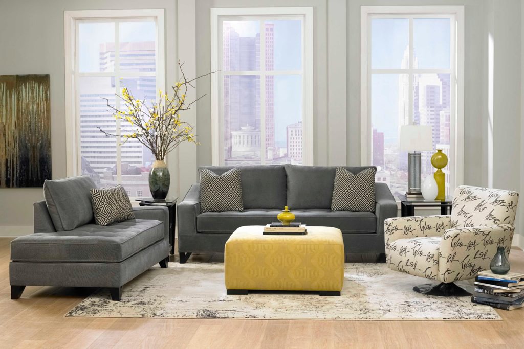
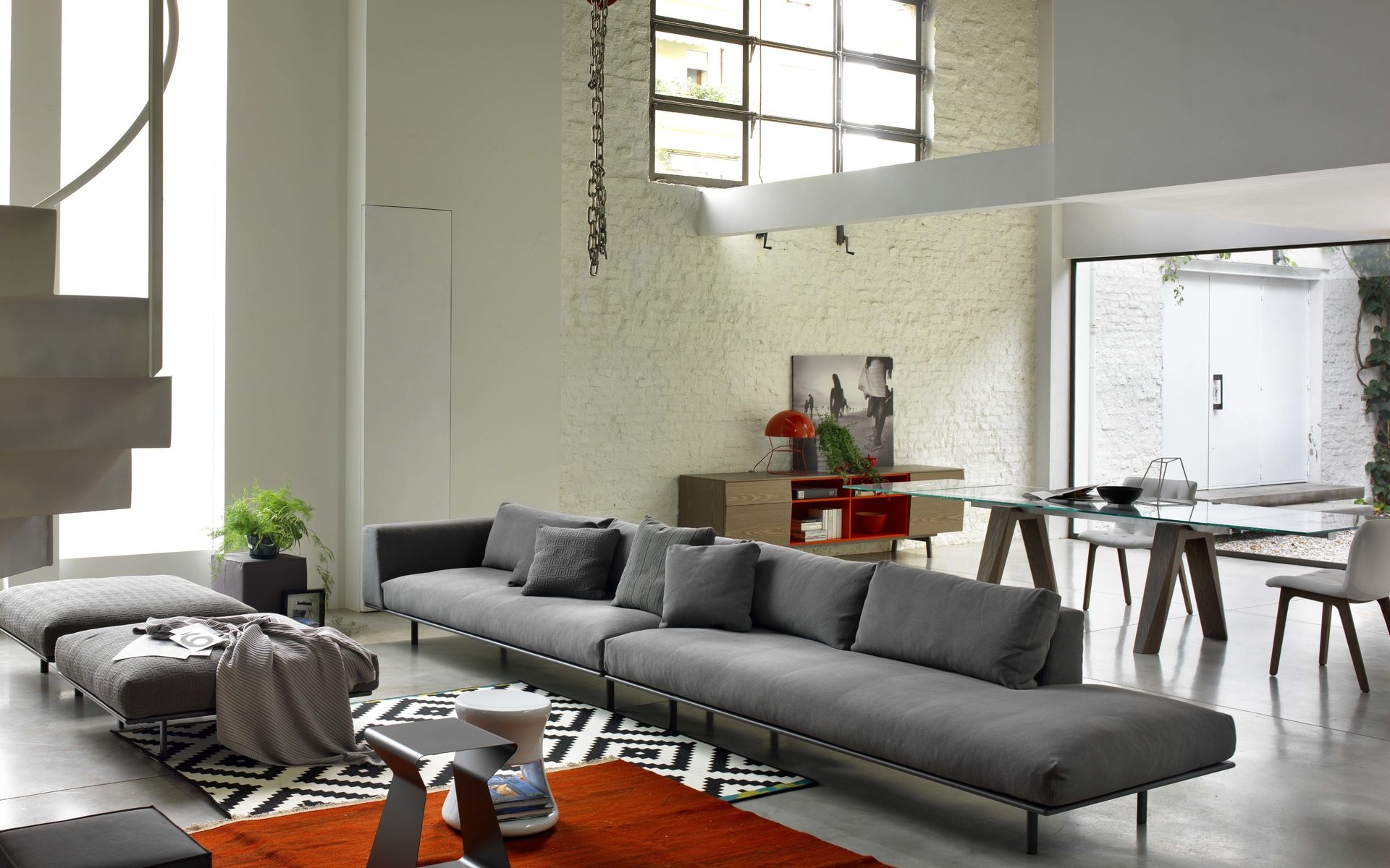
Sofas
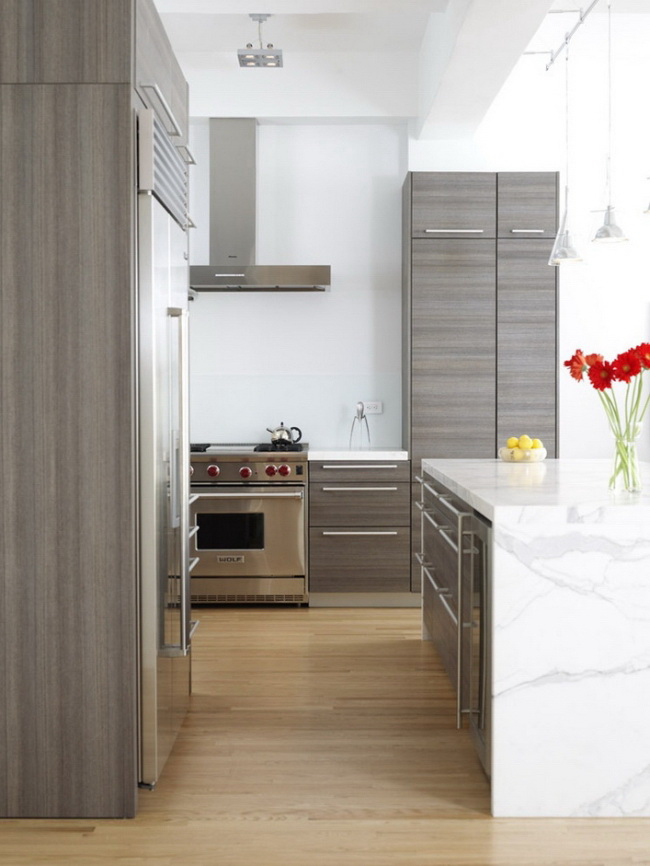
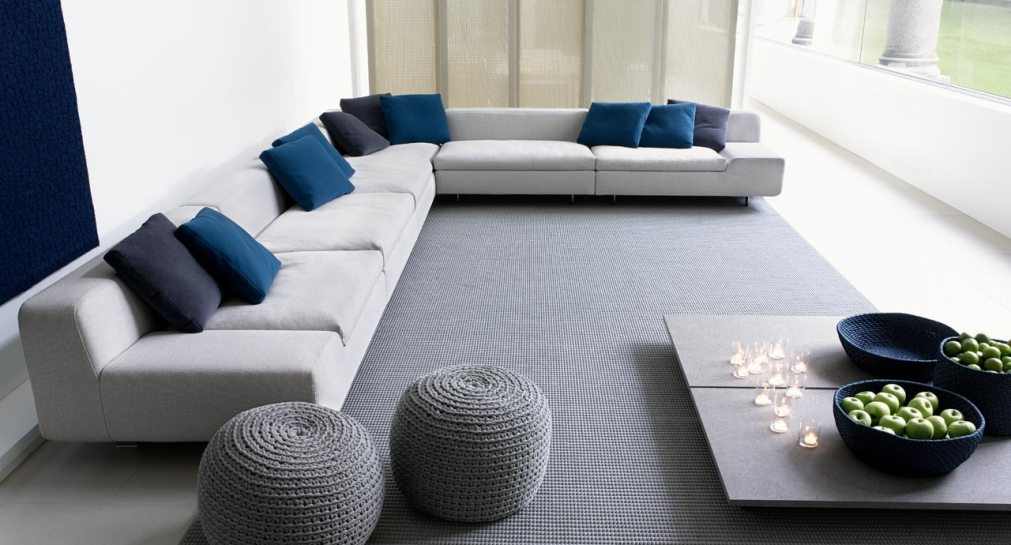
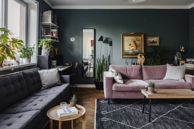
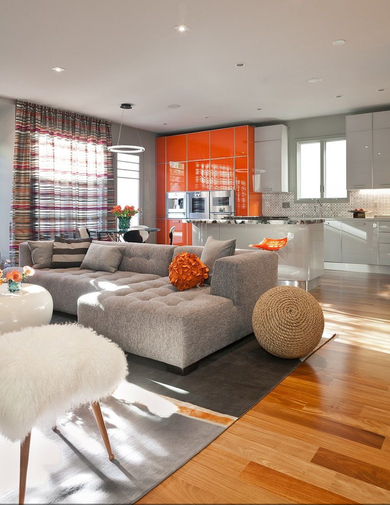
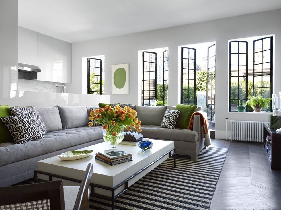
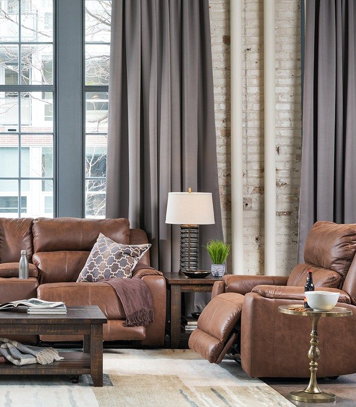
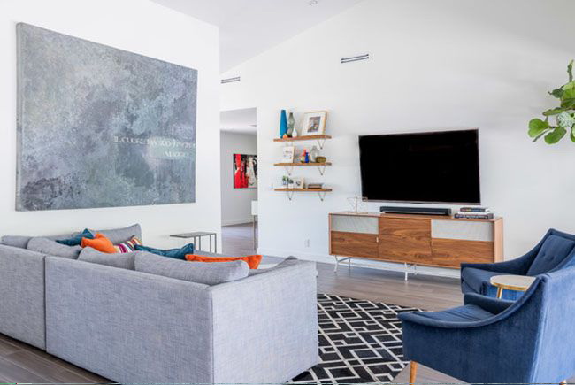
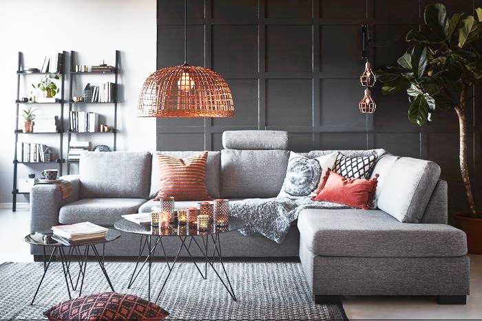
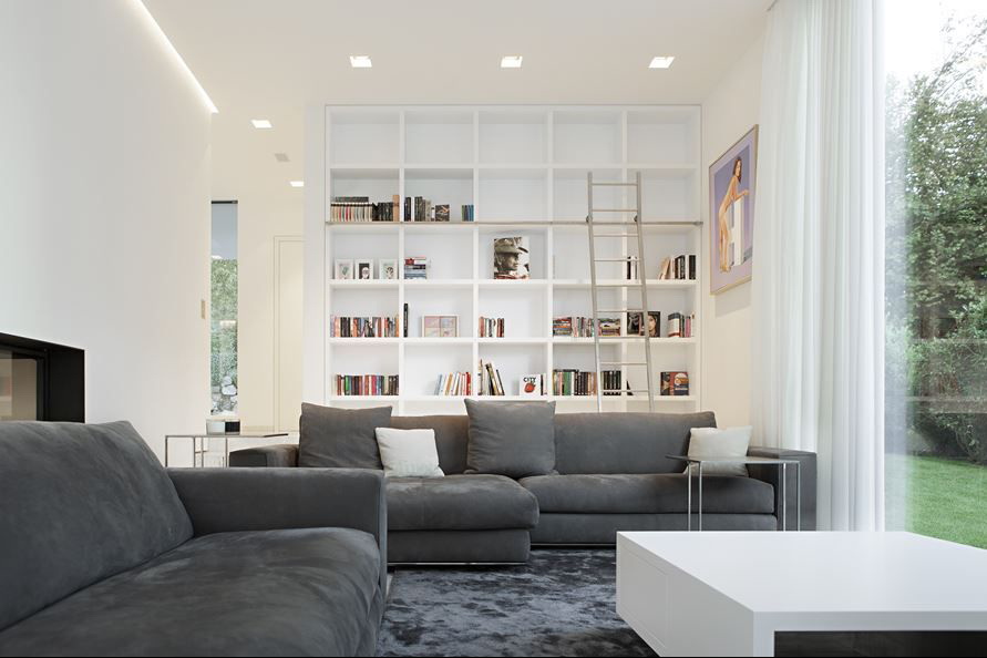
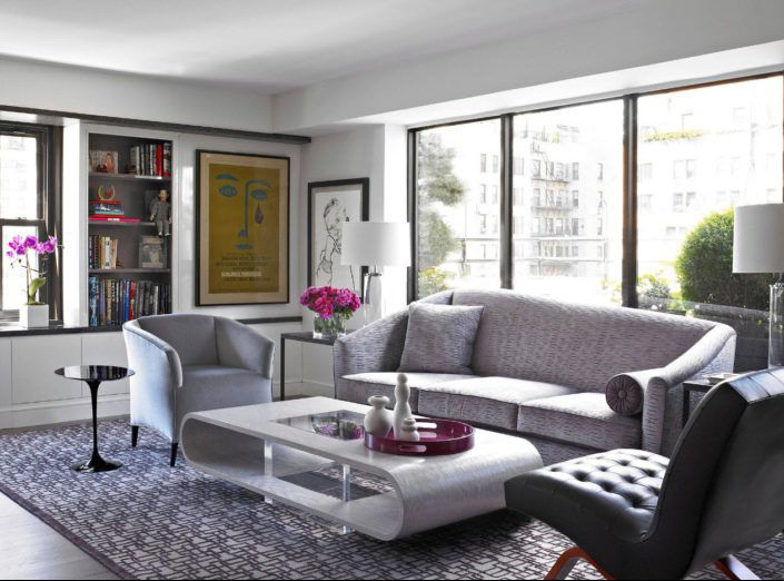
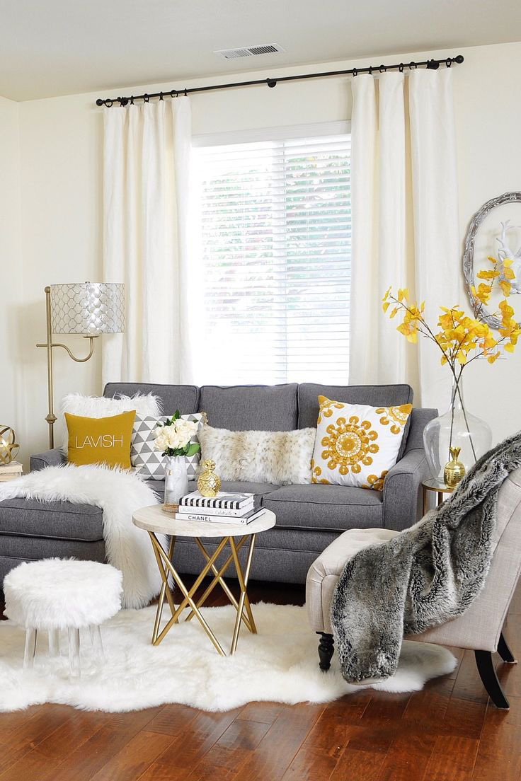
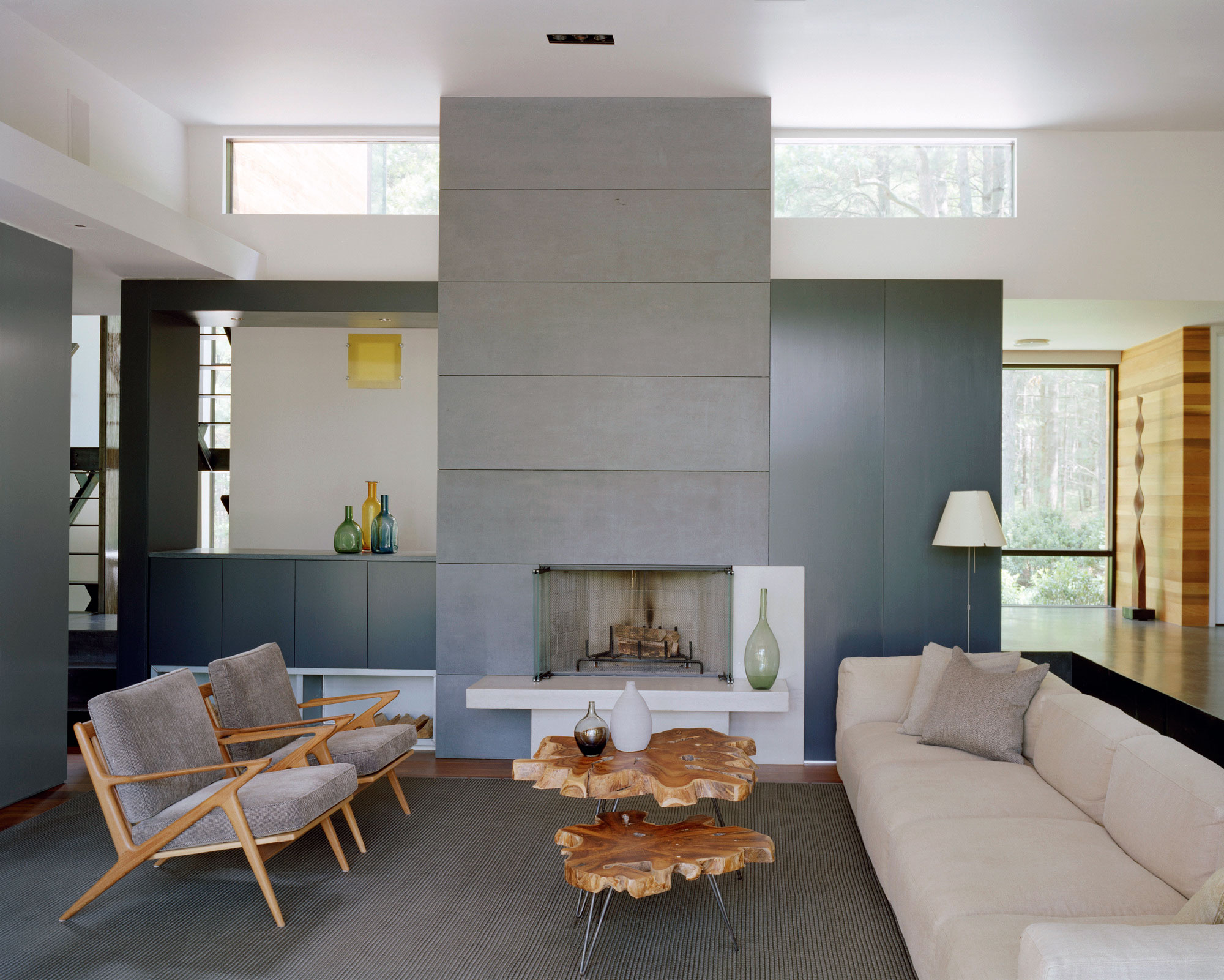
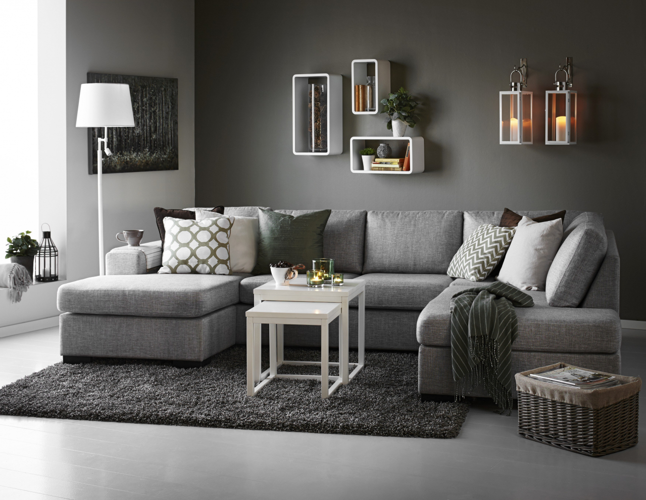
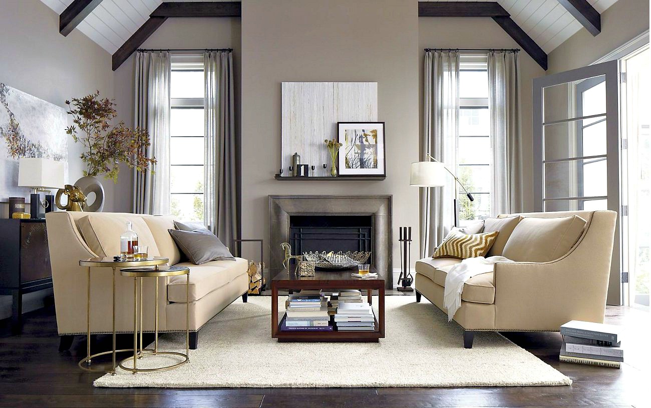
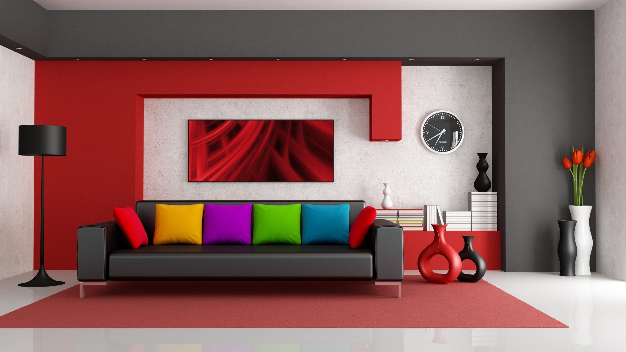
Furniture needs a trendy, functional. Gray gives elegance and sophistication. Great look, not black, but graphite leather upholstery. We will consider two options: gray upholstery of sofas in the interiors of other colors and colored furniture in the gray rooms. Both options can be.
For lovers of experiments in living room Two sofas are installed: one is gray and the other is white, black or brown. Variety and exclusivity are guaranteed.
Elegance and refinement
This approach can be used for kitchen sofas in rooms with free layout. The upholstered furniture in the living area is large and gray, and the kitchen is brightly upholstered. This approach balances the monochrome interior, but does not irritate the riot of colors.
White, black, blue sofas with gray cushions, armrests decorate the interior and create a refined atmosphere. This technique looks better bright monophonic models.
Furniture needs a trendy, functional.
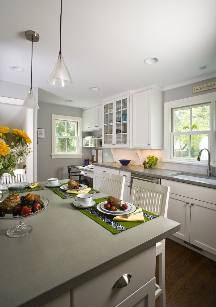
Kitchen doors, what color is fashionable?
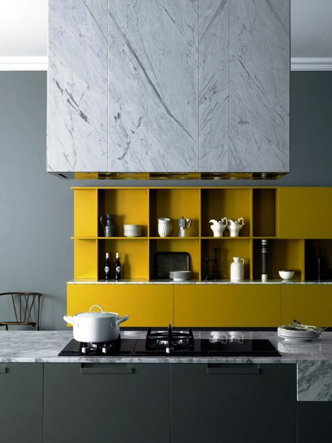
Gray is often used in the design of the kitchen and hallway. Why I offer this color. Brown, in various interpretations, has already become boring. Manufacturers invent:
- unusual inserts with stones;
- sandblast drawings;
- stained glass windows;
- bindings of various shapes.
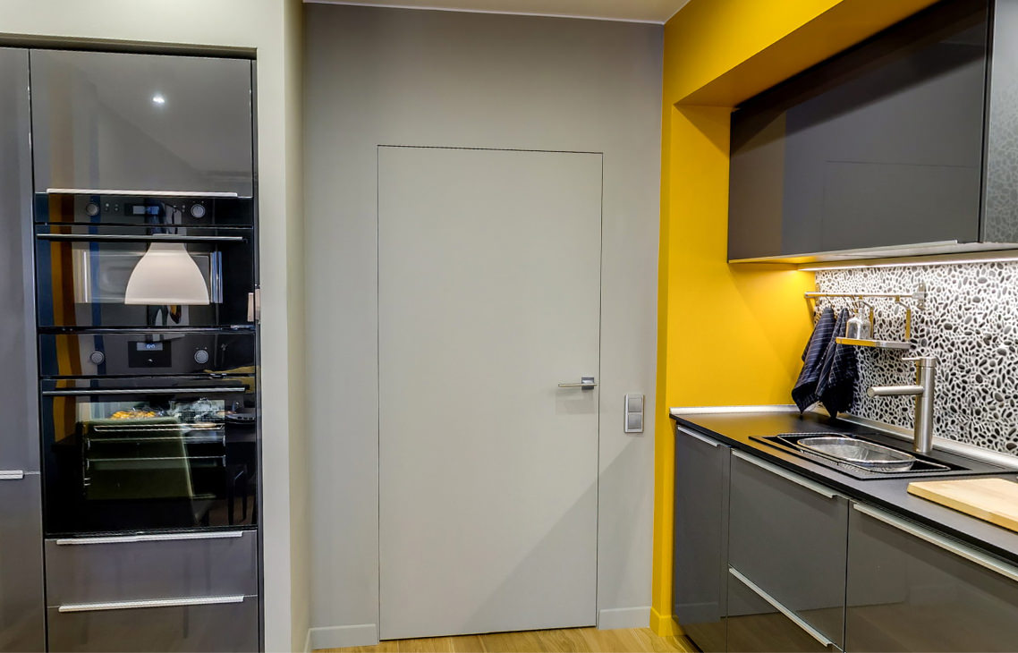
A simple version of the doors to the kitchen
If you want to quickly update the interior, but do not repair the whole apartment or house. Try to set the doors to gray. The effect will be amazing. The color range is extensive:
- pearl;
- light gray;
- smoky;
- ashen;
- graphite.
What is their advantage:
- The doors refresh the room and make it cozy.
- No visible contamination.
- Doors, flooring these shades are the perfect backdrop for green, cherry or black.
- Beige-gray options provide a warm, intimate atmosphere.
- Door leaf with a bluish tint gives a refreshing chill, emphasizes cleanliness.
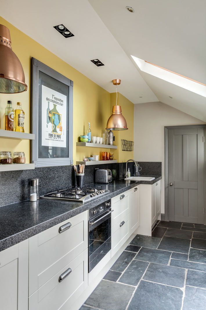
Gray is often used in the design of the kitchen and hallway.
Doors become the boundary between the two rooms. Choose models in one style, otherwise discomfort is guaranteed. For child's, sleeping, bathroom models with a deaf cloth are preferable. In living rooms, kitchens door frames with textured, colored glass look good.
In which interiors are they applicable? Smooth linen with laconic moldings for modern homes and apartments. Imitation of aged light wood emphasizes country style and provence. Silver palette, curly pretentious panels, decorative overlays complement classic styles. Glass bindings for eco styles, Japanese and minimalism.
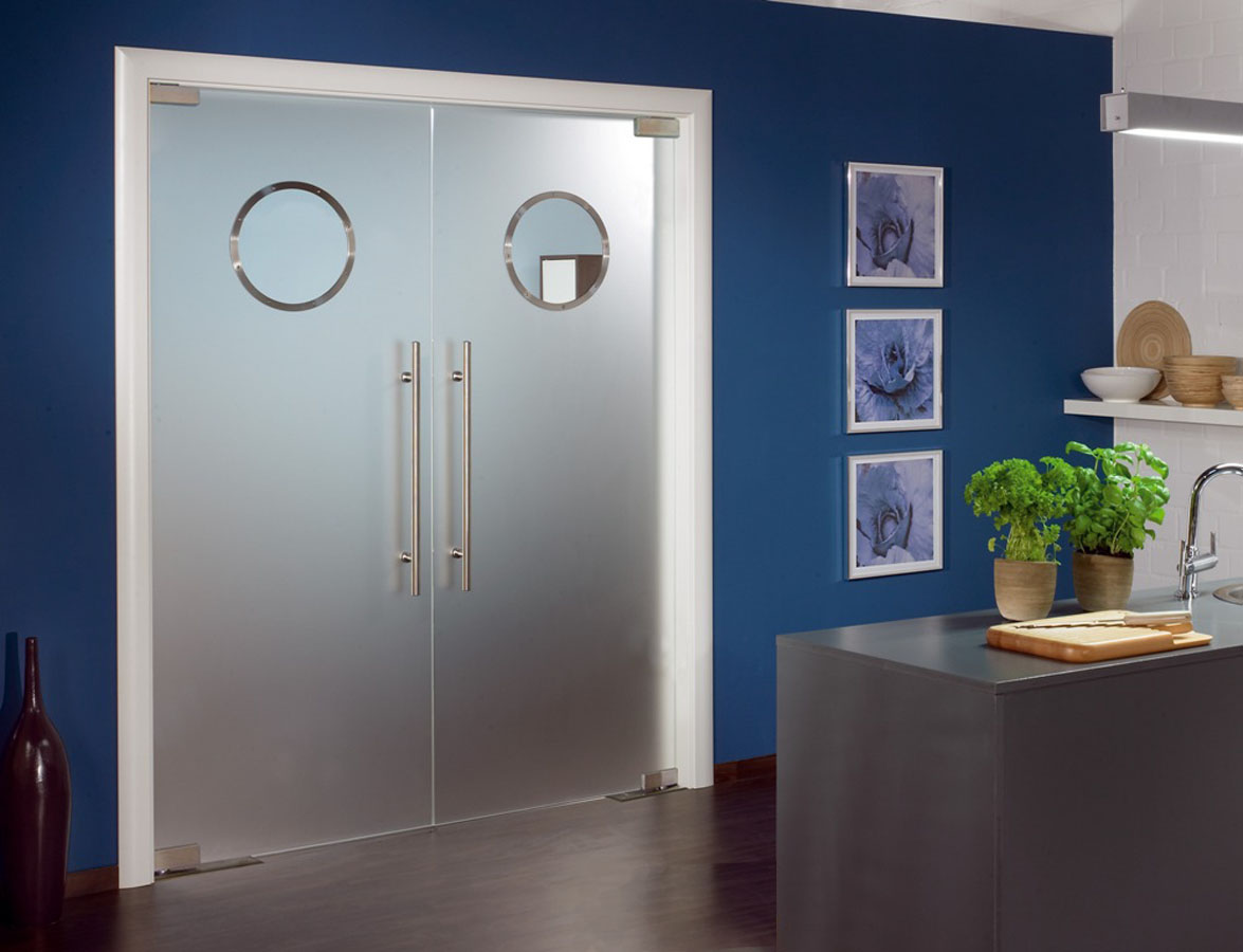
Doors refresh the room and make it cozy
What to avoid?
- Do not put a smooth door in a neoclassical style room. Otherwise, the interior loses its value and looks cheap.
- For a small room, graphite, anthracite tones are not acceptable. They visually steal space.
- Eclectic and Empire are not combined with gray doors.
Dark brown walls and the same door evoke negative emotions. But the interior with pastel walls becomes larger, and luxurious accessories and furniture acquire charm. The graphite door sets off the furniture of different shades of white: melted milk, ivory. Steel also supports elegant blue and cyan.
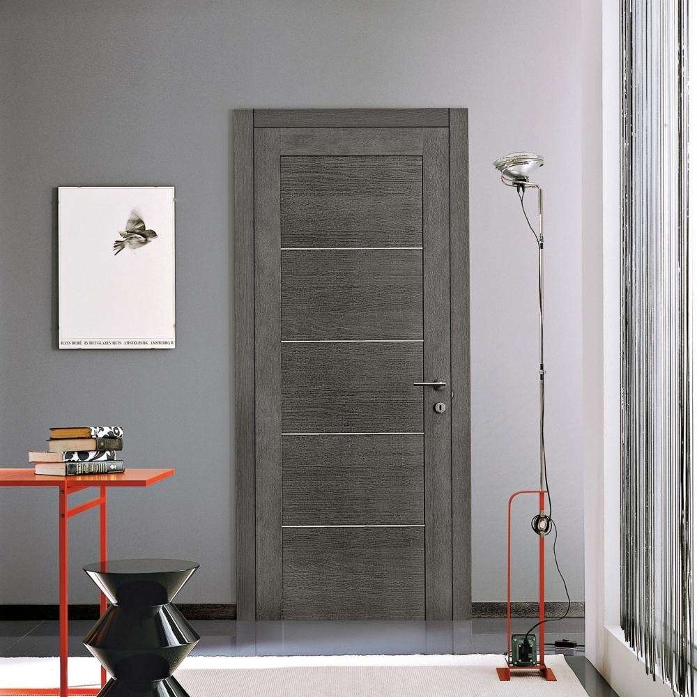
Model in a silver palette
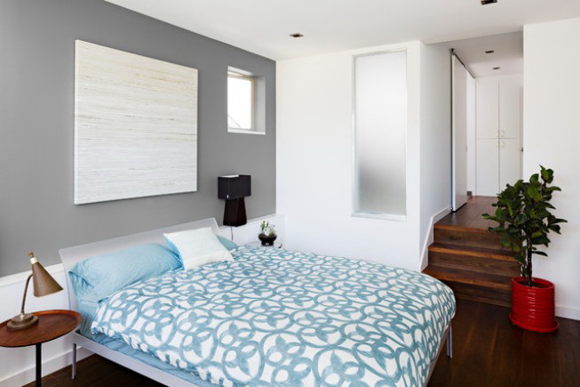
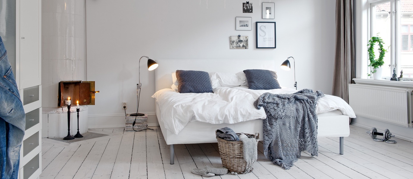
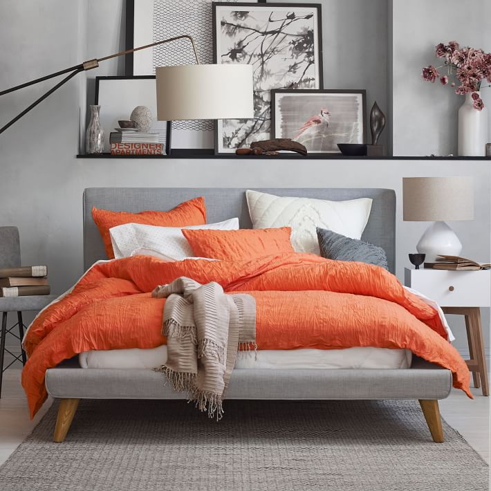
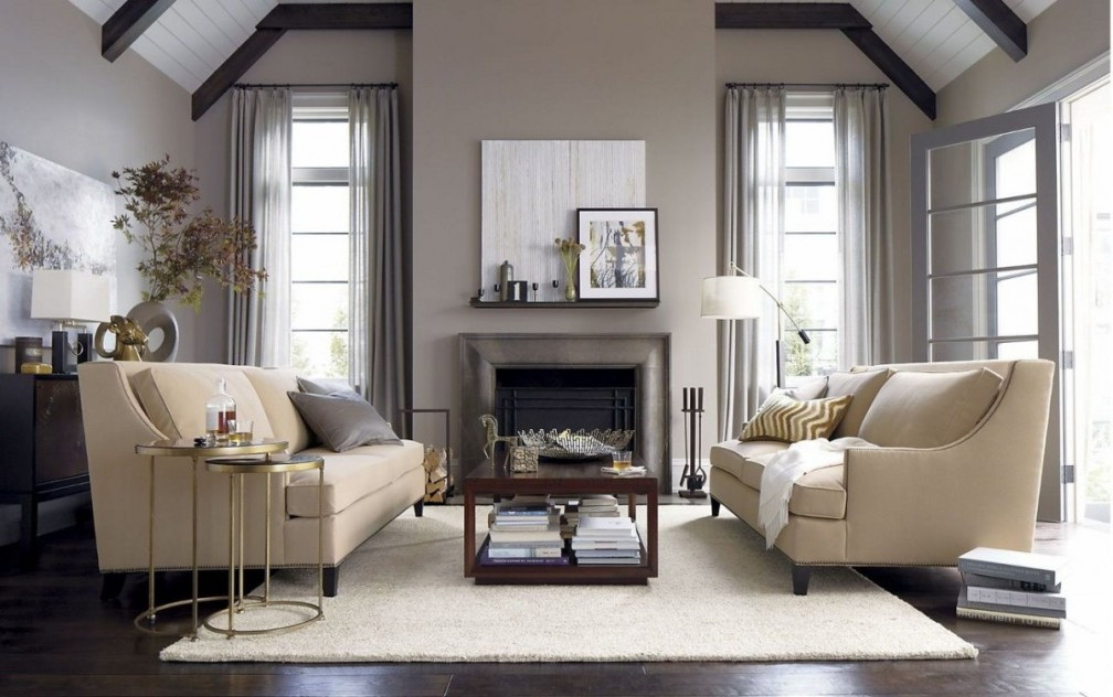
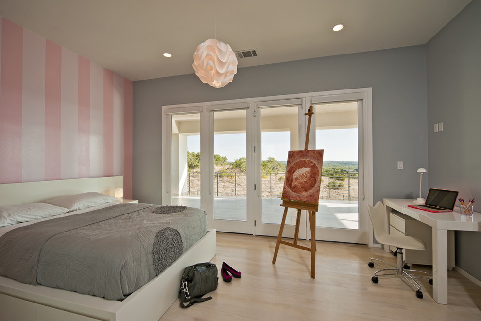
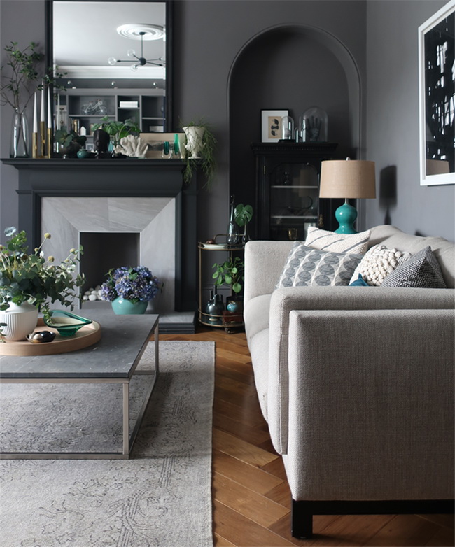
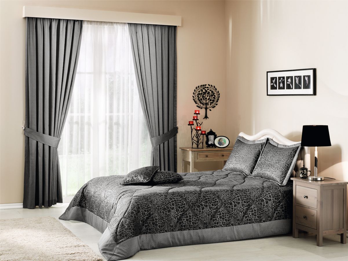
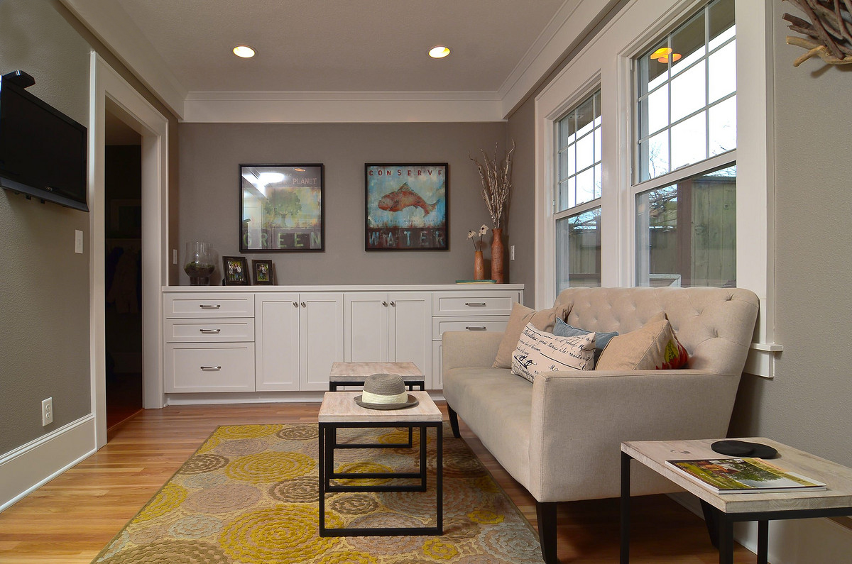
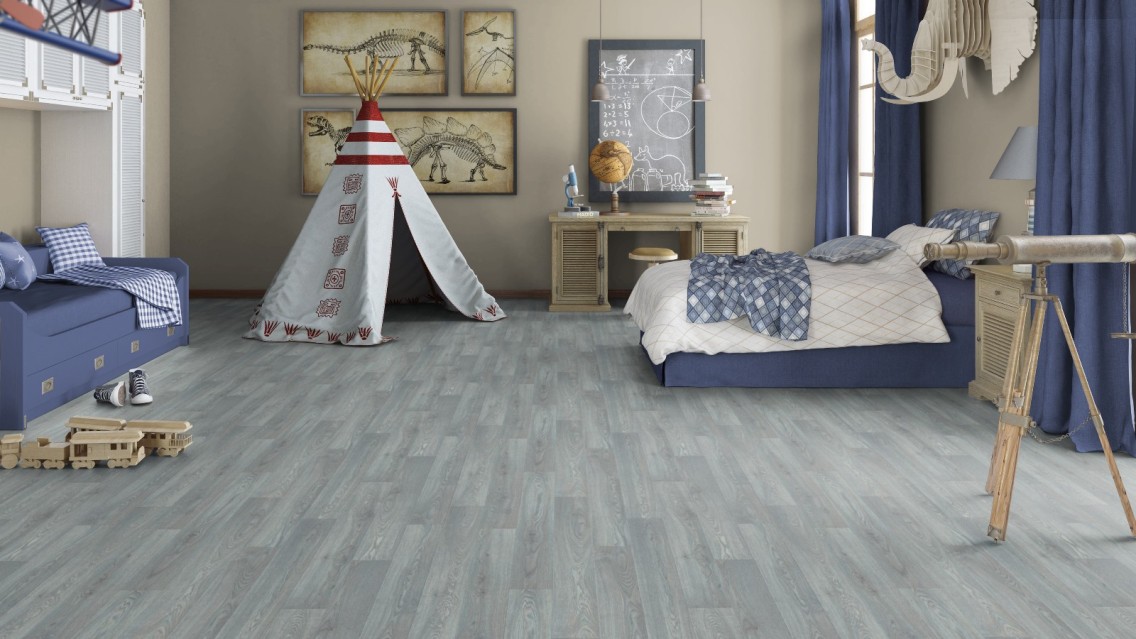
Bedrooms
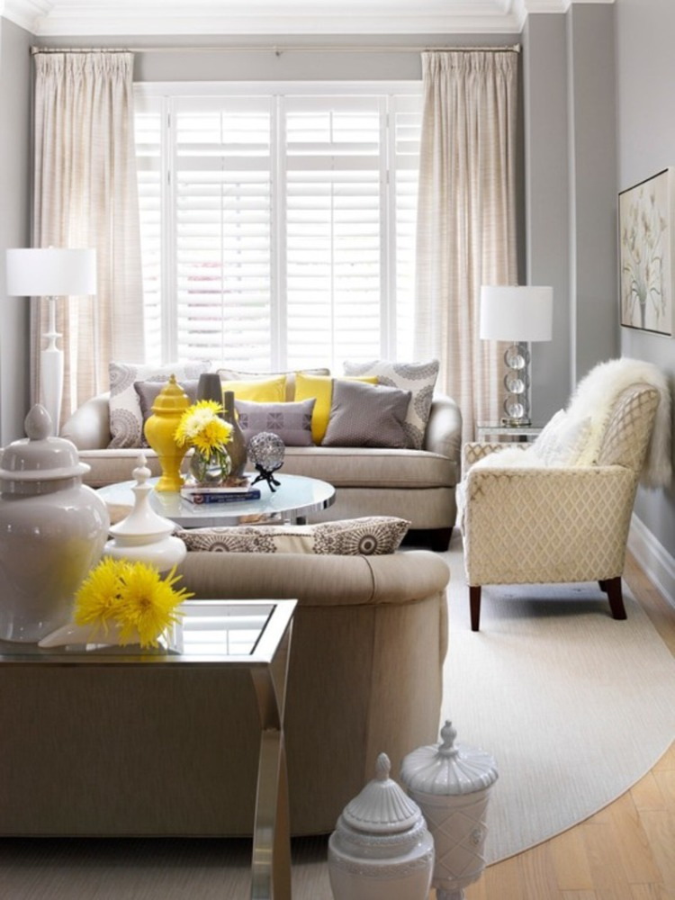
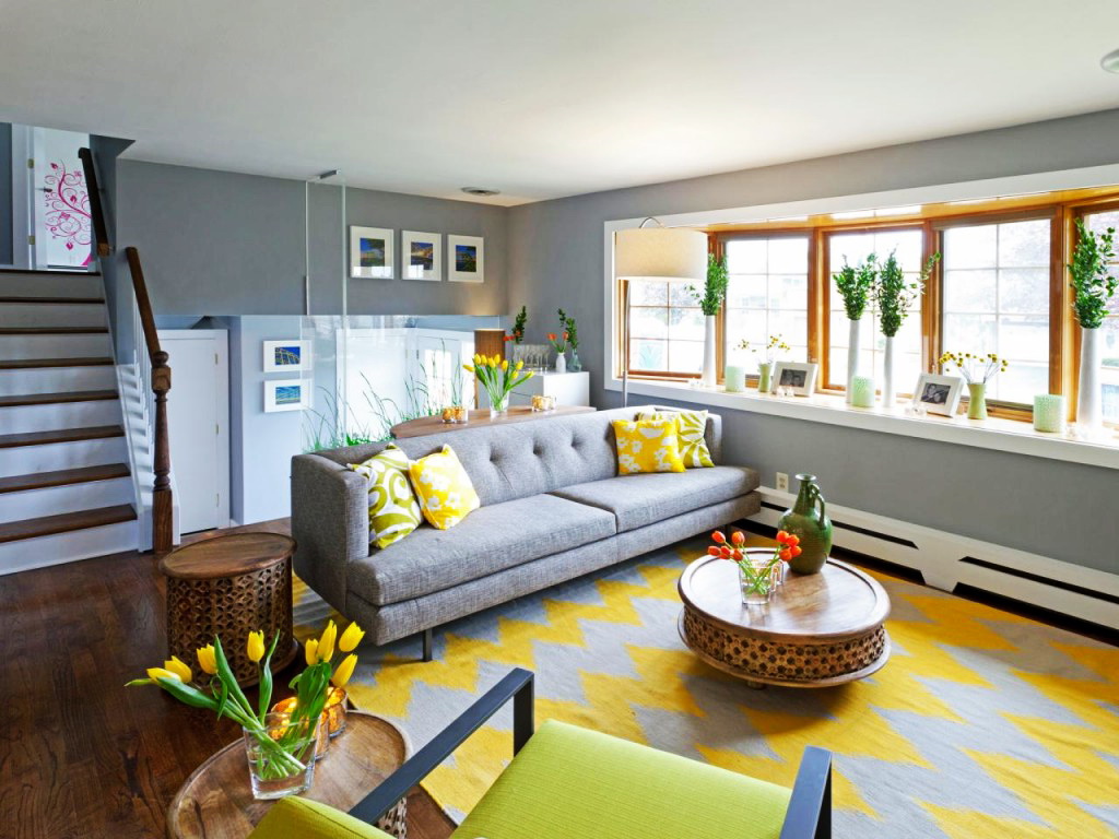
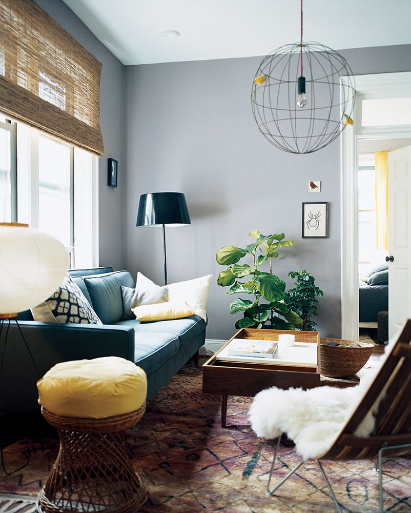
In the rest rooms gives an atmosphere of peace. It becomes a good background for other objects and your life in general. Not distracting, but allows you to focus on yourself, your loved ones. It is combined with pink, yellow. Gives positive energy.
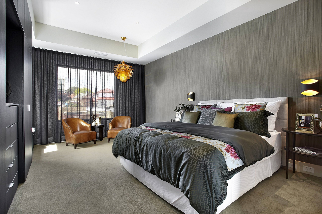
Natural shade and fashion items
Well complements colors for environmental styles:
- green;
- brown;
- Orange;
- blue.
Thus, an oasis of peace is created, even in a smoky and noisy city. In long rooms, paint short walls a tone darker than long ones and you will see that the room has changed and visually acquired other parameters.
Natural shade and fashionable items, interior elements give a harmonious blend of nature and modernity. This technique ensures relaxation and a sense of harmony.

In the rest rooms gives an atmosphere of peace
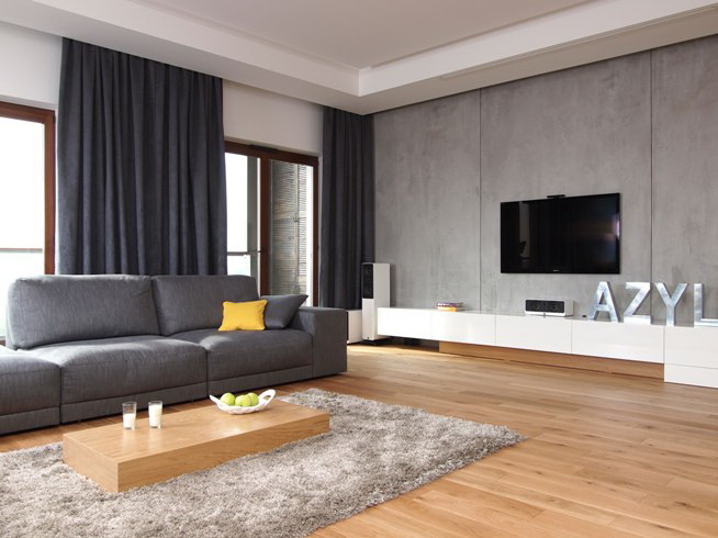
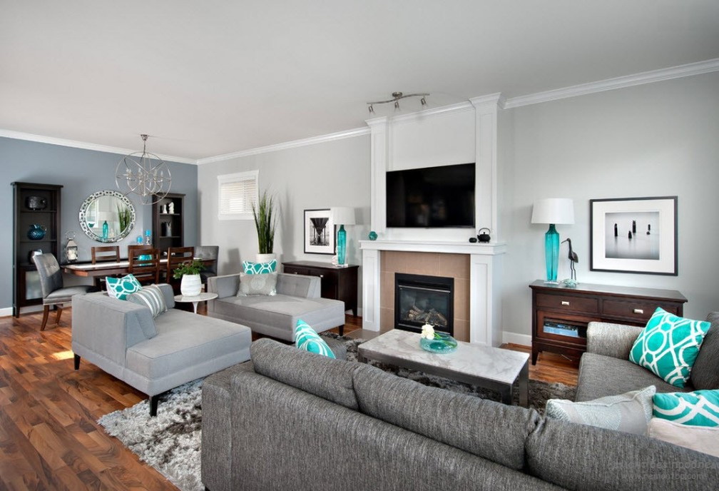
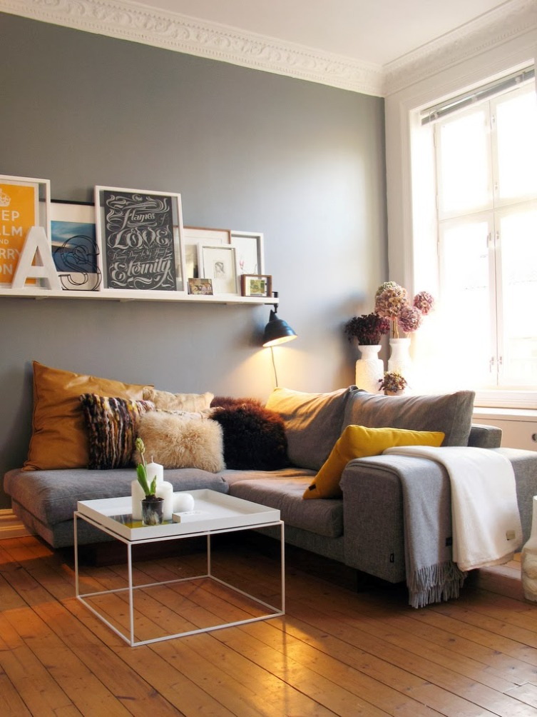
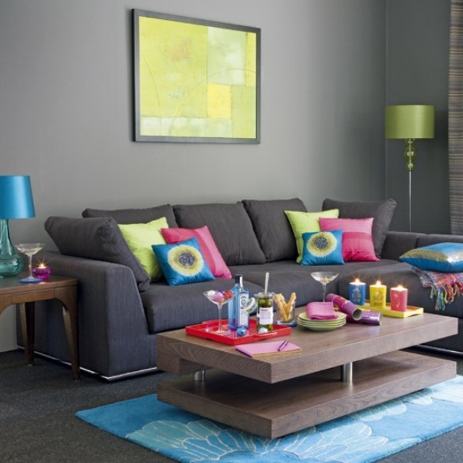
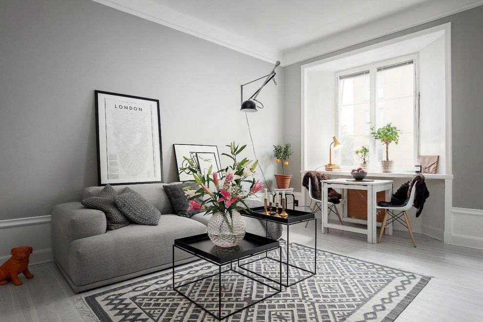
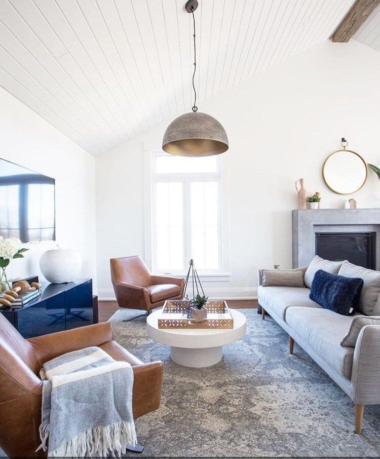
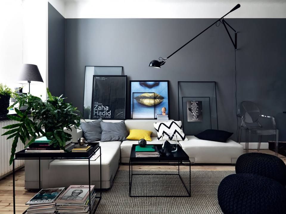
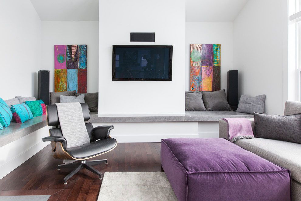
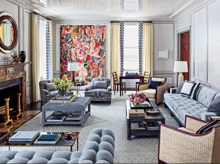
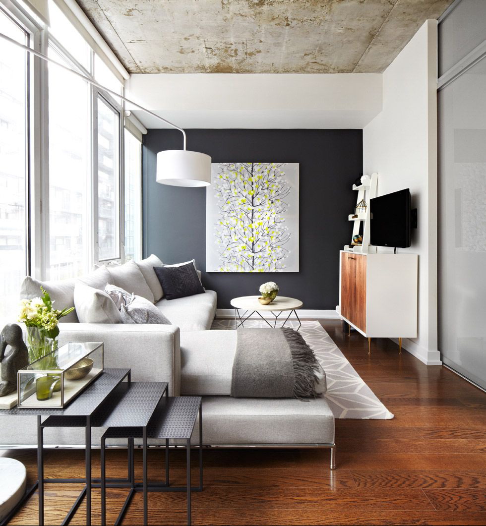
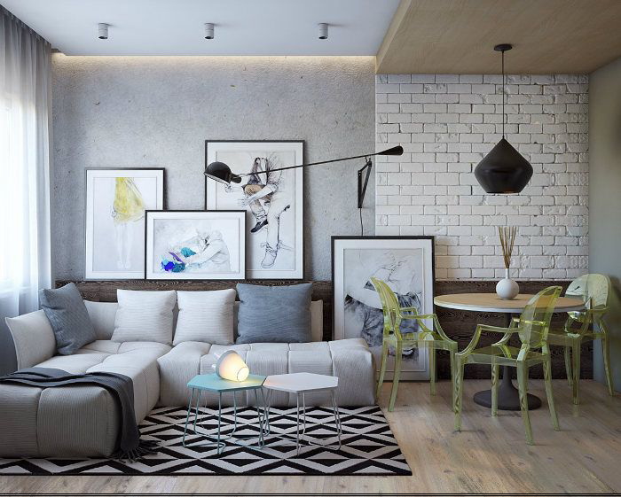
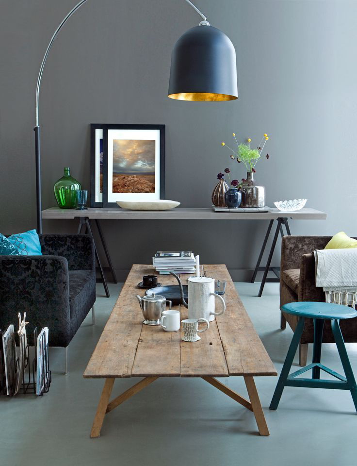
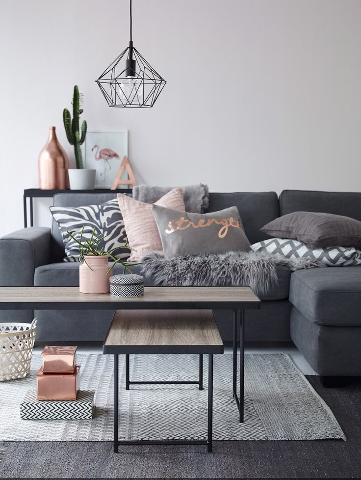
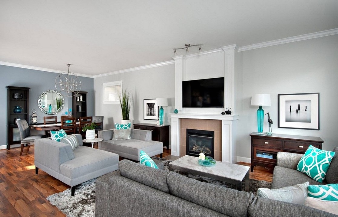
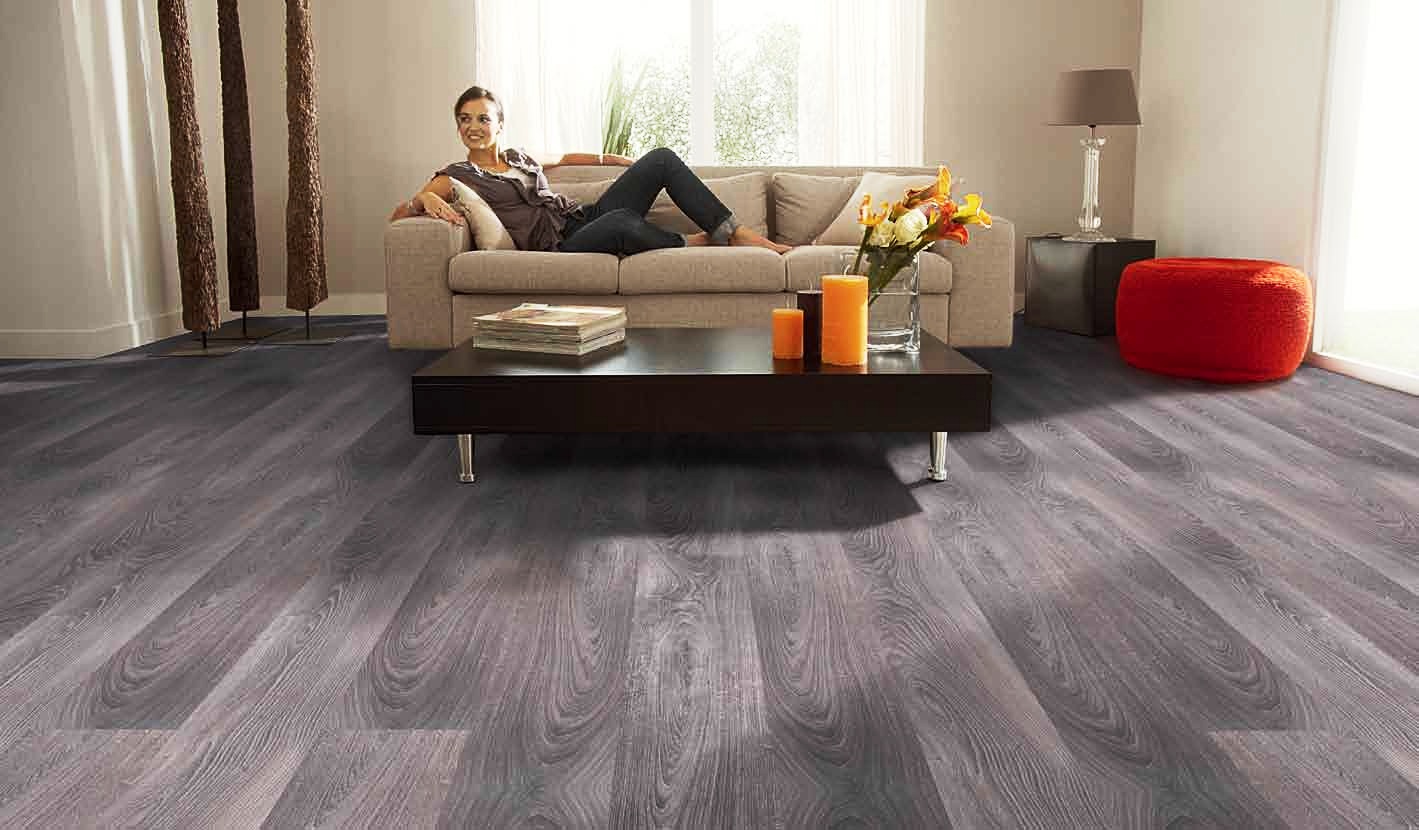
Living room
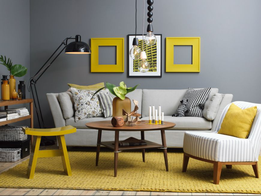
So that the interior does not seem monochrome, it is enough to dilute it with contrasting objects or bright accents:
- floor lamps;
- sconce;
- lamps;
- vintage curtains.
In the interior of the living room
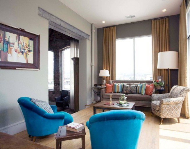
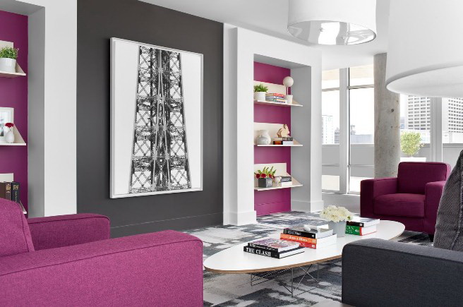
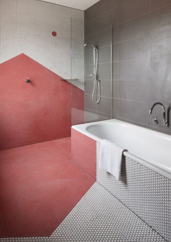
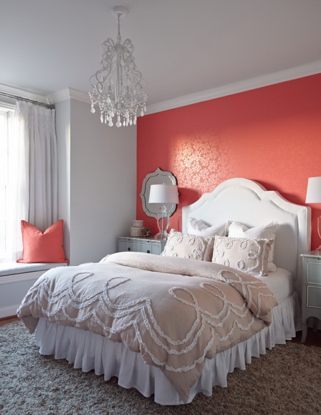
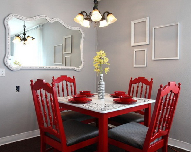
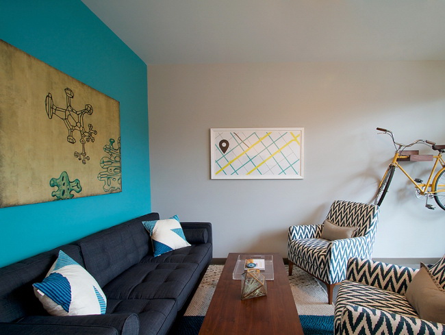
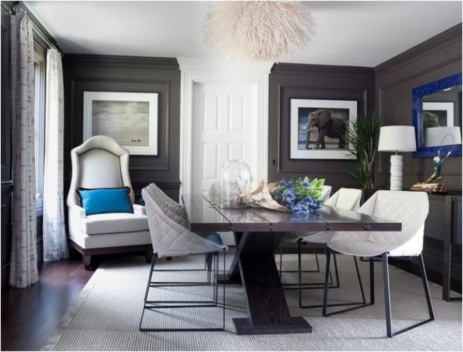
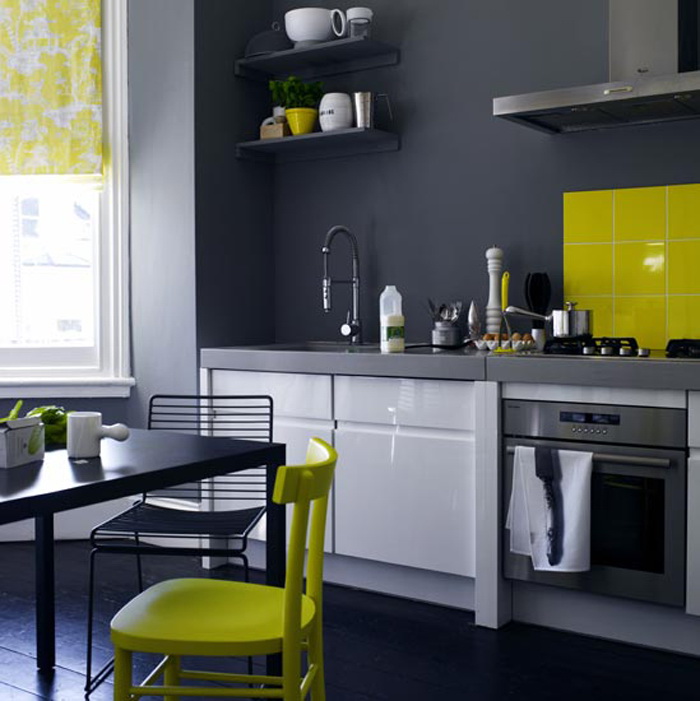
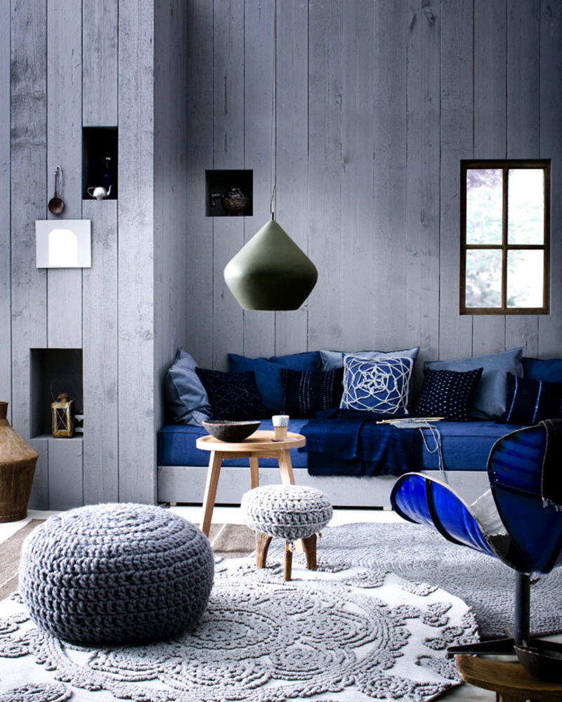
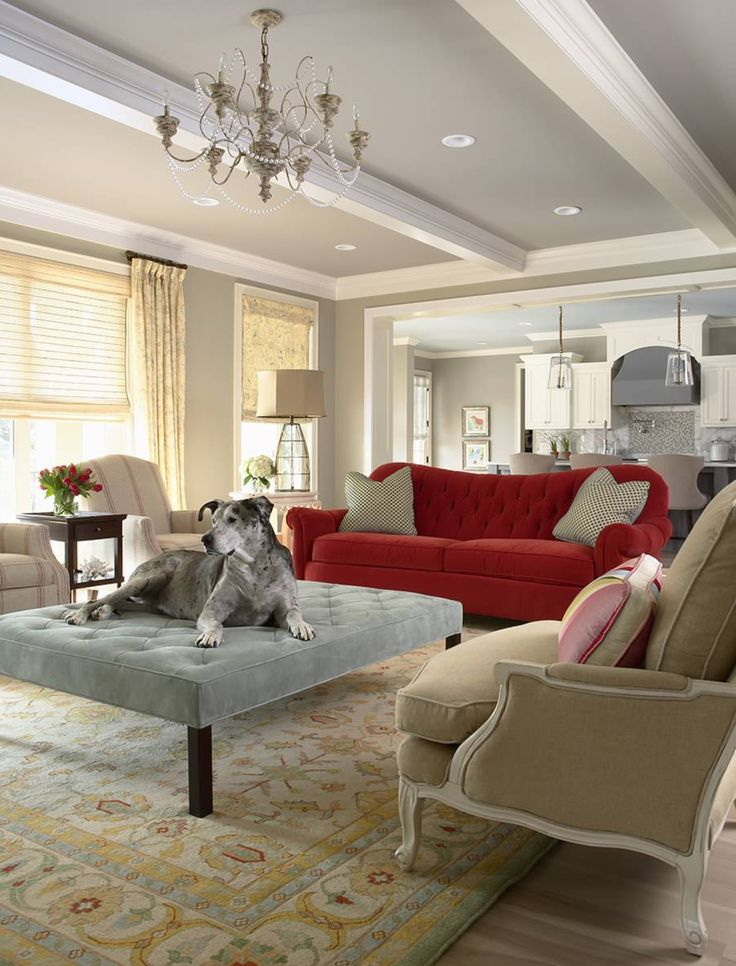
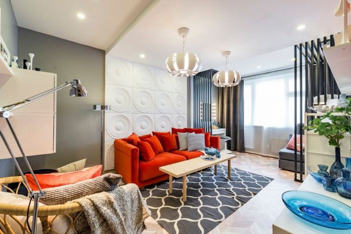
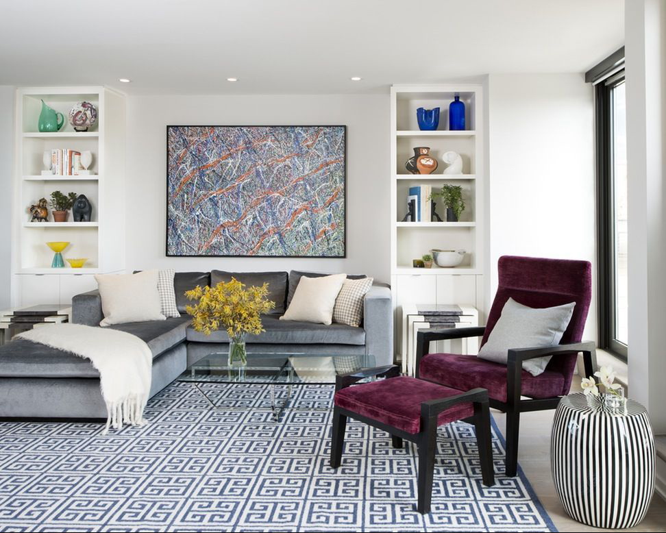
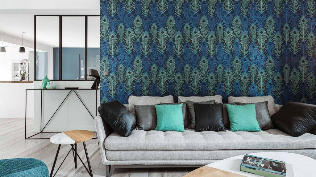
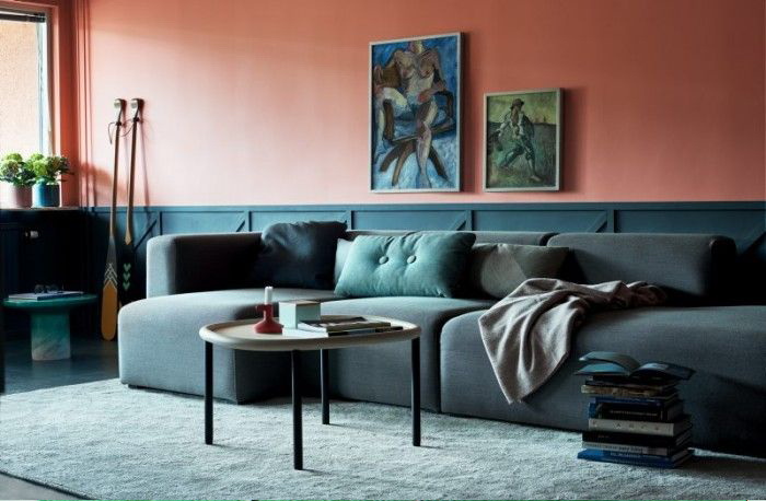
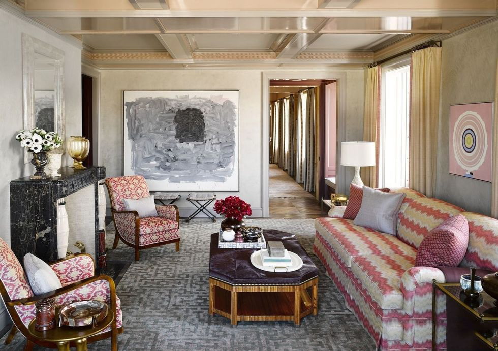
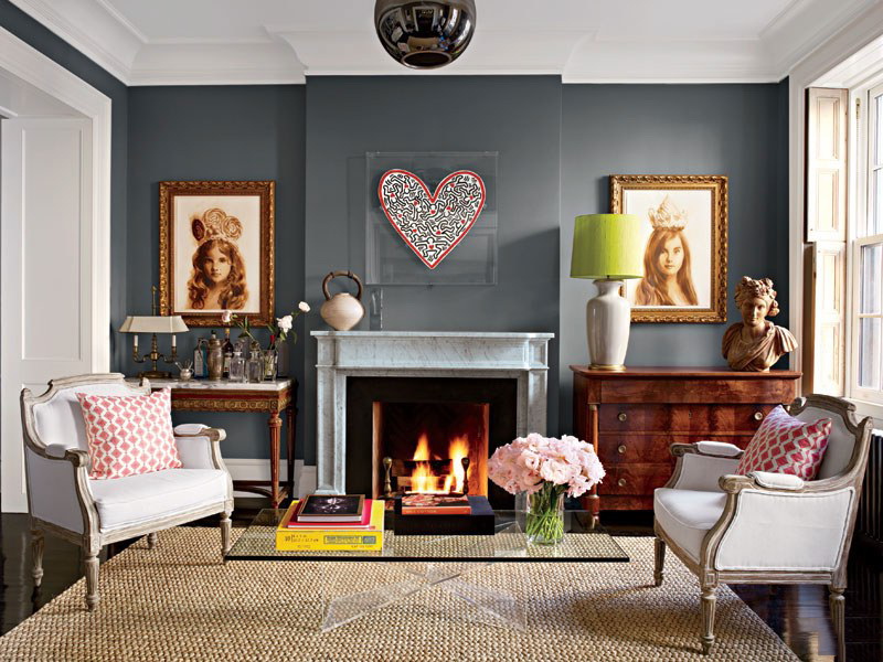
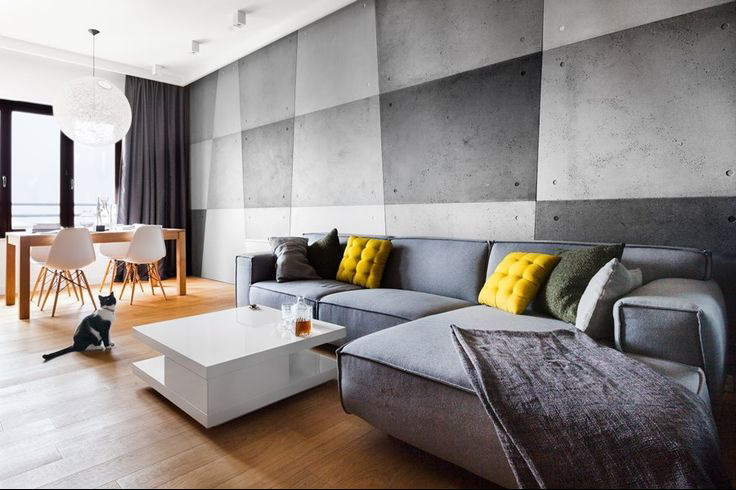
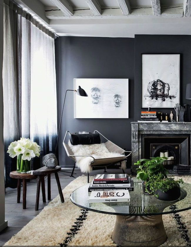
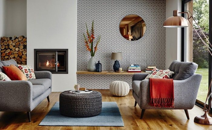
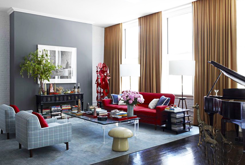
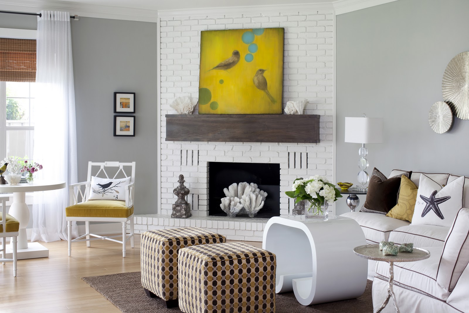
Gray and red is an unusual combination. But it is well suited for rooms facing north and north-west. Usually these rooms lack enough light. Red plays the role of bright color spots and provides warmth. It is associated with classic Empire style interiors.
Gray and red - an unusual combination
For living rooms, color nuances help to avoid the riot of colors and give peace, which is necessary for relaxation. The owners have a large range for the choice of decor:
- paintings;
- VAZ;
- lighting fixtures;
- floor coverings.
It is easier to choose textiles and change it according to your wishes.
Japanese style lovers will love the combination of gray walls, flooring and furniture, decoration materials, and wooden doors. It is appropriate and furniture of anthracite color concise form. In such interiors, all the details serve to help people listen to themselves, their feelings and enjoy the world around them.
Helps to avoid the riot of colors and gives peace
Light shades of gray are needed for decorating small rooms. The same can be said about:
- fur capes;
- carpets;
- decorative cushions.
You want to quickly change the interior, replace textiles, play with texture. There used to be an atlas, take a tapestry, replace the fur with flax. The world around us will immediately sparkle with new nuances.
An introduction to the interior of warm colors: yellow, orange give peace and a sense of sunny mood. Use this technique in autumn and winter to prevent a depressive mood and not lose the feeling of joy.
Light shades are needed for decorating small rooms.
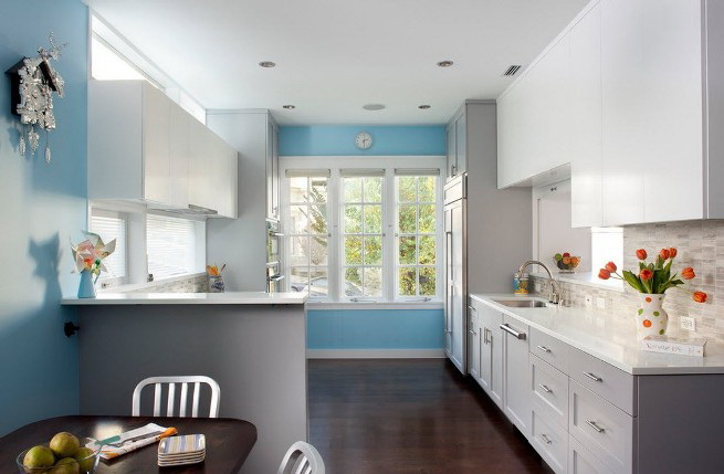
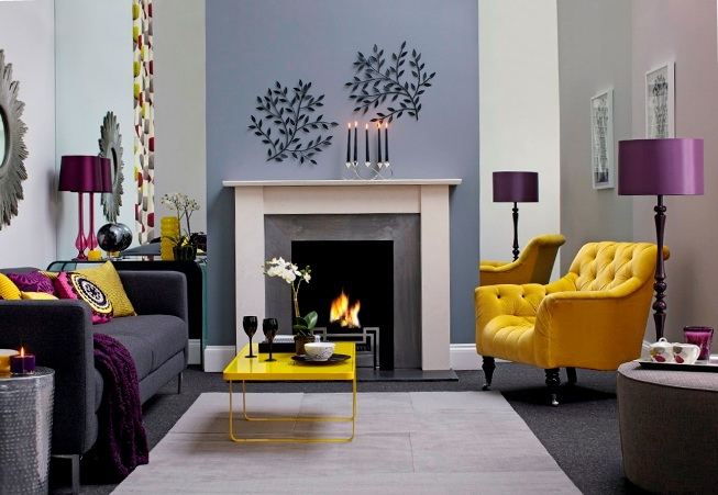
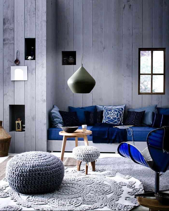
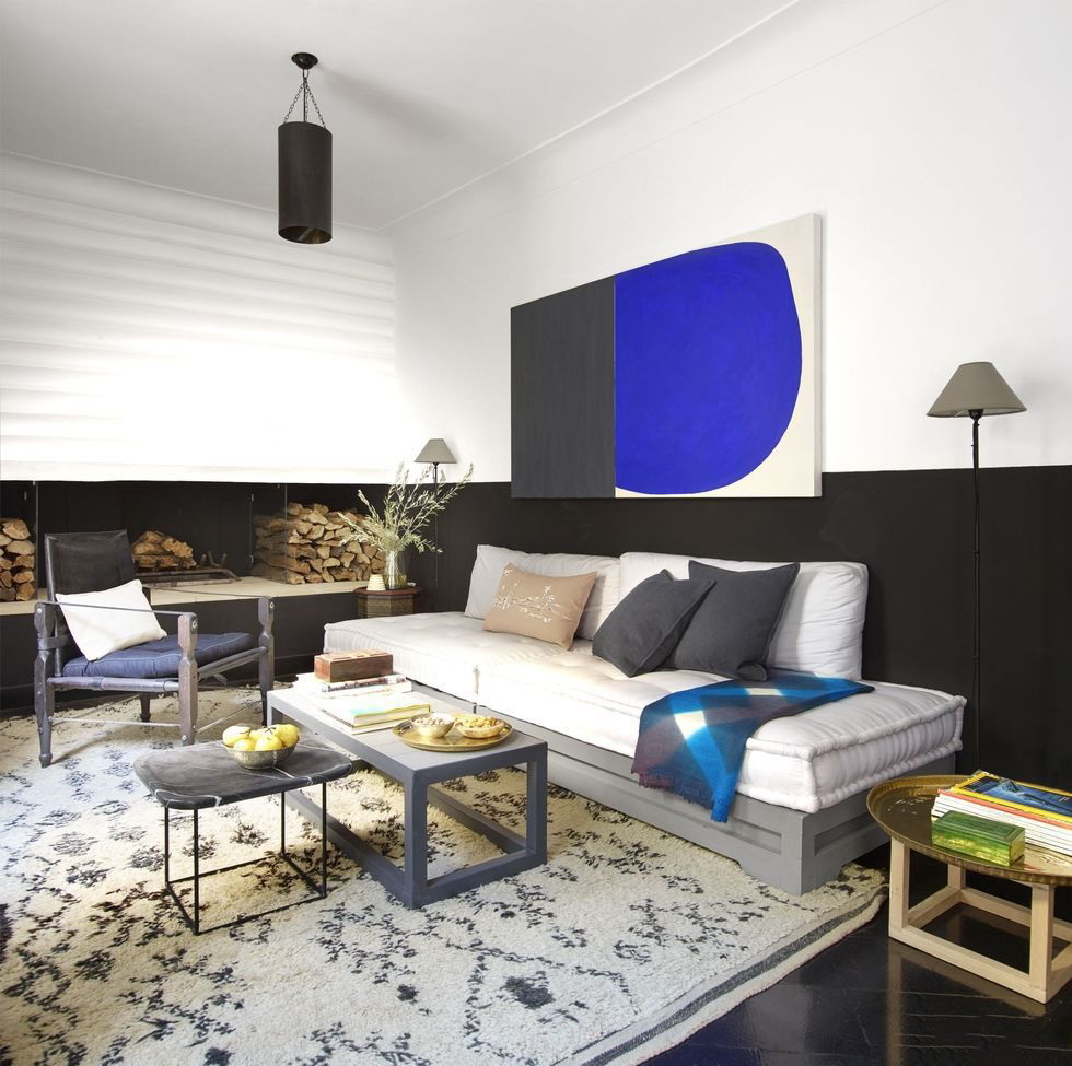
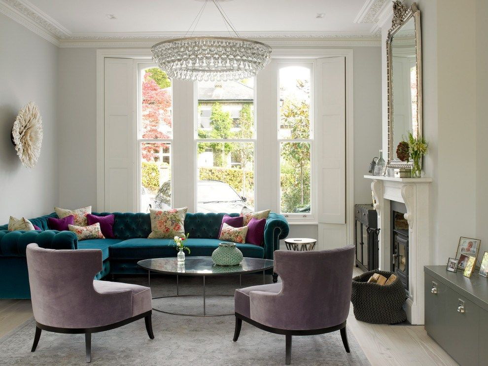
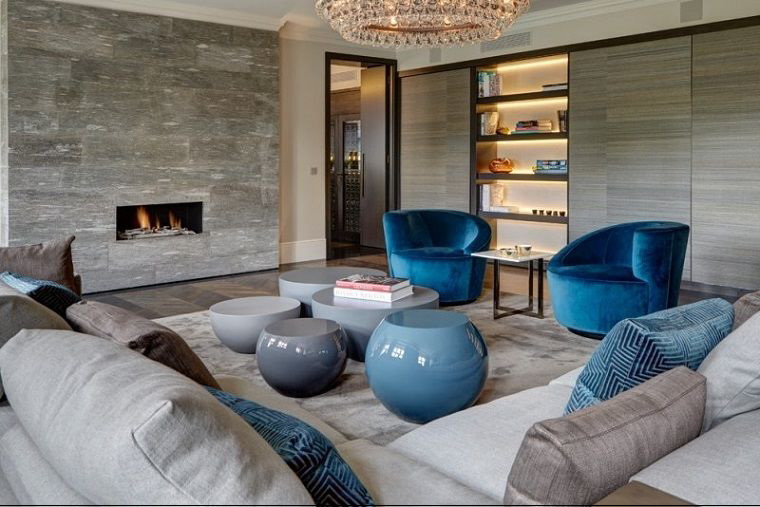
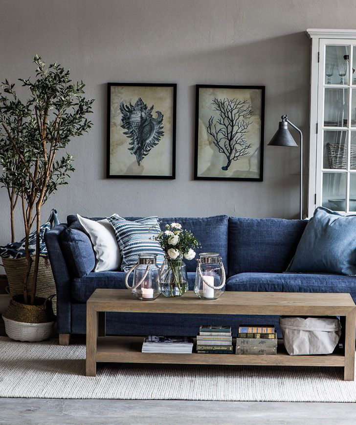
Gray blue
Gray remarkably gets along with blue, similar to it blue and turquoise. In the bedrooms and living rooms, the pearl shade of the decoration and the blue furniture and textiles provide classic chic. Such colors and shades intertwine, complement each other.
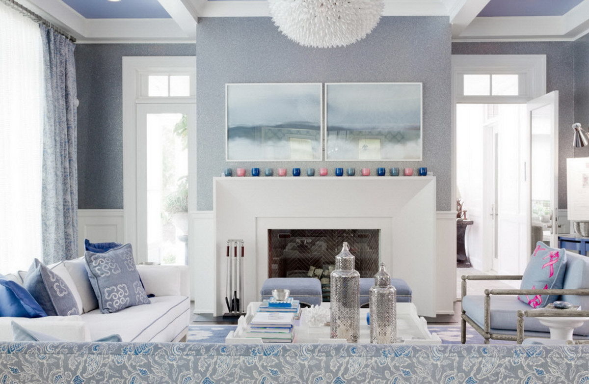
Gray gets along great with blue
The classic combination of blue + gray is rooted in baroque palace interiors. This trend does not go out of fashion, since everything created in the past remains with us at the genetic level and includes the necessary strings of the soul. As a result, there is no explosion of colors, but there is a nobility of lines and restrained fashionableness. Turquoise upholstery, throw pillows set the necessary accents and adds cheerful notes.
Calm, pleasant and not boring room
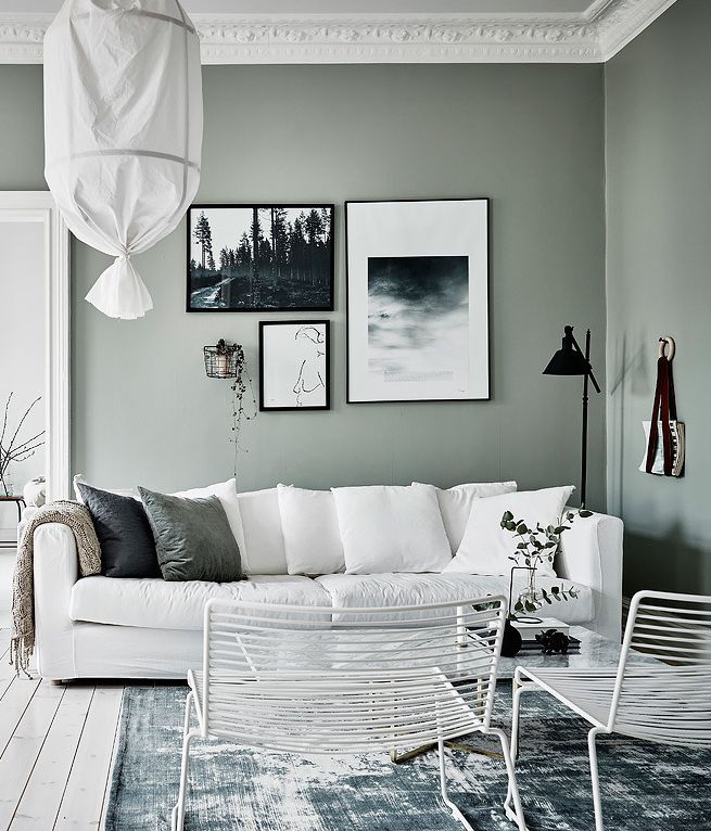
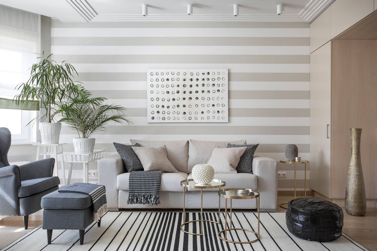
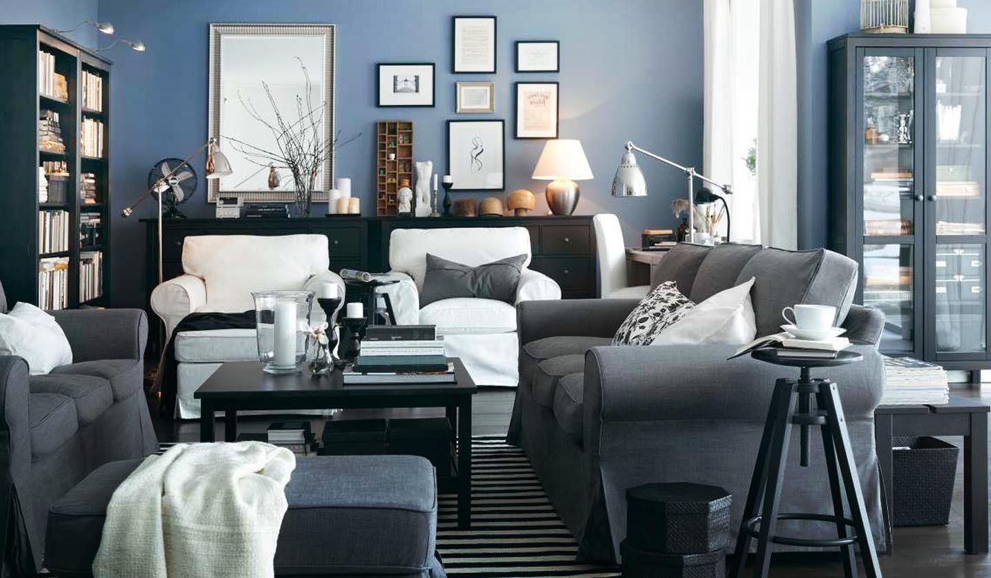
Gray white - bright nobility
Do not like the explosion of color spots that offer lovers of pop art style, kitsch. But tired of the beige palette - the trend of recent years? Pay attention to the tandem: white and gray.
White color dilutes the main gray tone, provides a visual increase in the room. Fragmented use of graphite or anthracite shades will help to diversify the interior. It may be:
- frieze ceramic tiles;
- door trim;
- window sills;
- bar counter.
Tandem: white and gray
This mix fits the Scandinavian style. And this is not surprising: residents of the northern regions with snow carry natural shades into the design of housing. They are needed for those who care about the comfort of housing, inner peace. Remember the snowy plains, which they give peace of virgin purity. Such sensations give gray-white interiors.
In rooms facing north, use soft white shades:
- creamy;
- baked milk;
- cream.
They guarantee a gentle transition, do not make the room cold. The winning option: anthracite floor, neutral gray walls and snow-white furniture.
White color dilutes the basic gray tone and provides a visual increase in the room.
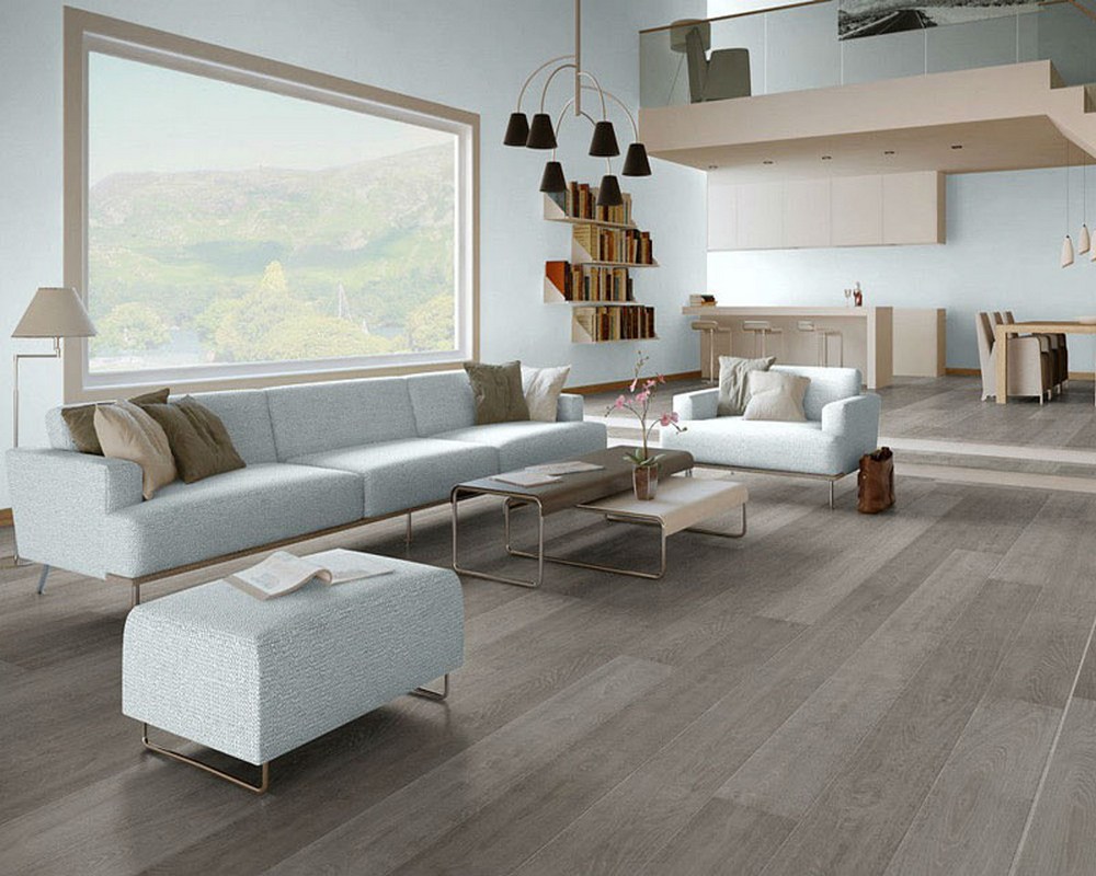
What can give the interior linoleum?
Wooden floors, tiles do not go out of fashion. But linoleum for the floor remains popular. The main advantage is the price, a variety of patterns, versatility, the ability to quickly replace the floor covering. Let's talk about color and pattern.
The advantage of this linoleum is the price
Enough to go to the hardware stores or online sites to understand linoleum imitates:
- a rock;
- marble;
- tree;
- parquet;
- abstract drawing.
Fits well with other materials:
- tiles;
- floorboard;
- laminate flooring
It is enough to get transitive thresholds, the problem of connection is solved.
This material helps not to make large financial investments, quickly change the interior. Small clarifications. For the hallway need linoleum with good wear resistance. Residential rooms important foam or felt base. Otherwise, comfort is difficult to achieve.
Linoleum for the floor is still popular
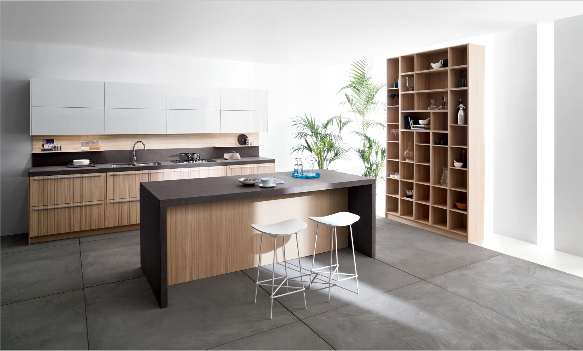
What needs to be considered?
What floors are we used to see in the interiors? Most will say: brown in different color and texture interpretations. That is why I propose to use gray. Do not be afraid to experiment. Updated housing colors can change life drastically.
Designers suggest using different materials for decorating the floor. Let's see why they should be different. In living rooms, bedrooms, offices, children - need warmth. Kitchens, hygiene rooms, hallways are often washed. Based on this, look in the collection of building materials, take what is offered in the best gray color: linoleum, tile.
A good, non-marking choice for the floor
Let's consider which gray materials are applicable in the interior:
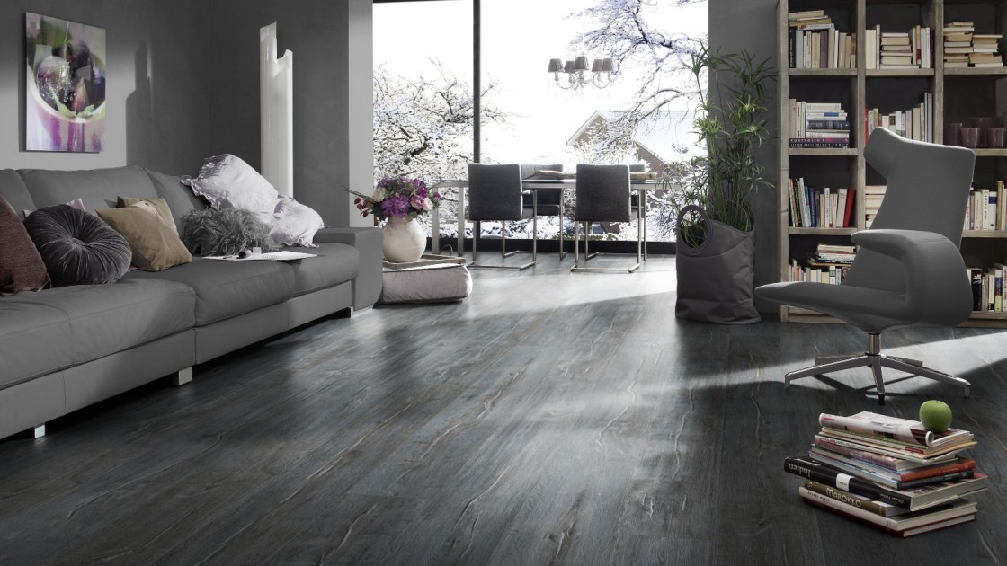
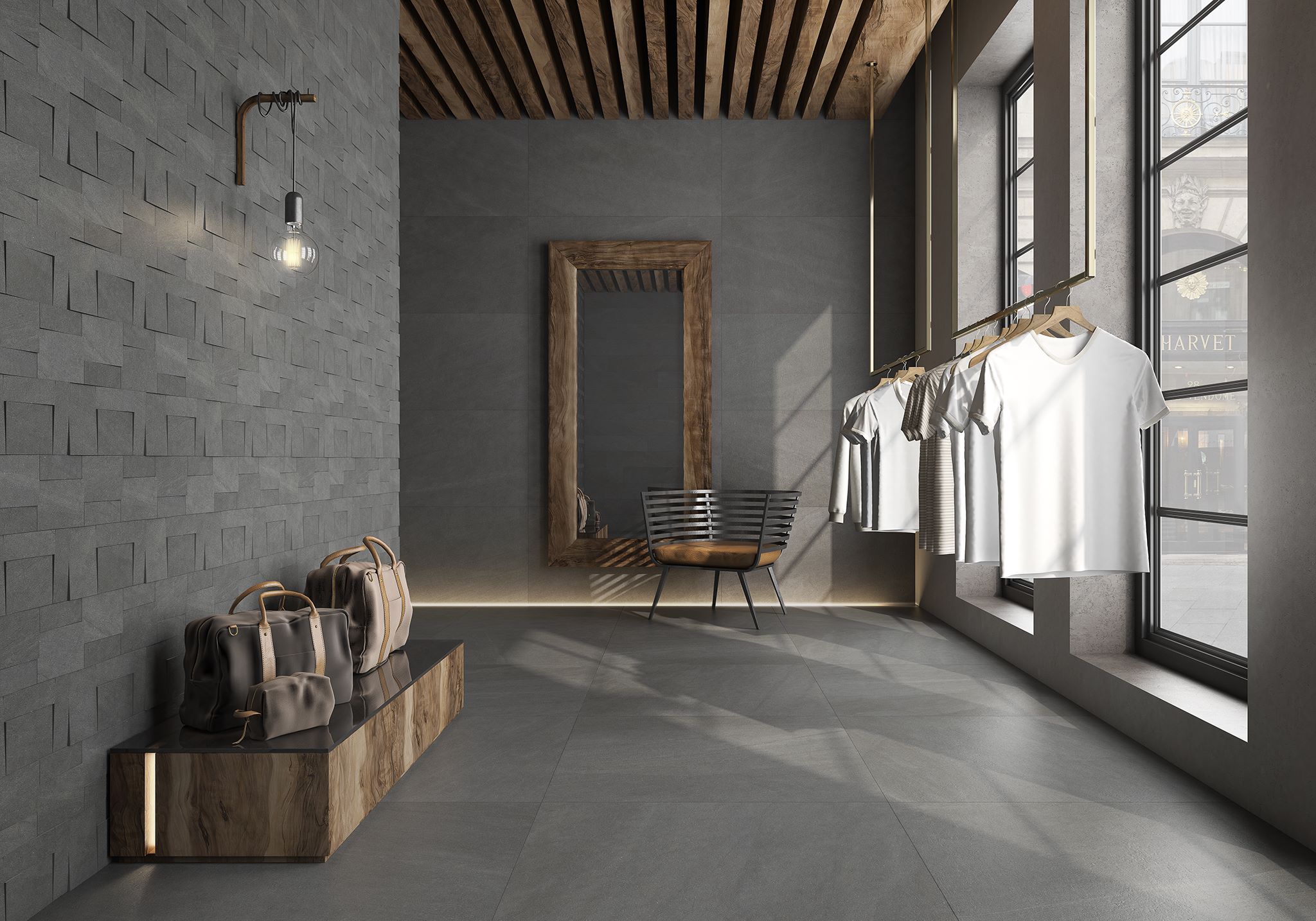
- Wood is a wonderful stylish option.
- Ceramic tiles are presented in a wide variety.
- Linoleum is a budget opportunity to experiment.
- Self-leveling floors are an expensive option, but the effect will be amazing.
Sustained, somewhat strict, while the elegant gray color for any material does not lose its properties.Gives peace, sophistication, exclusivity and is not annoying, unlike collections with bright complex color drawings.
Tile is best suited for the kitchen or hallway
Let's talk about the practical side. This flooring is easier to operate. Less noticeable water stains, scuffs, scratches, dust. This makes life easier for homeowners.
This foundation of the floor complements other subjects well:
- furniture;
- decorative things;
- textile.
The original appearance of the housing is guaranteed.
Gives peace and sophistication, exclusivity and does not irritate
Tile
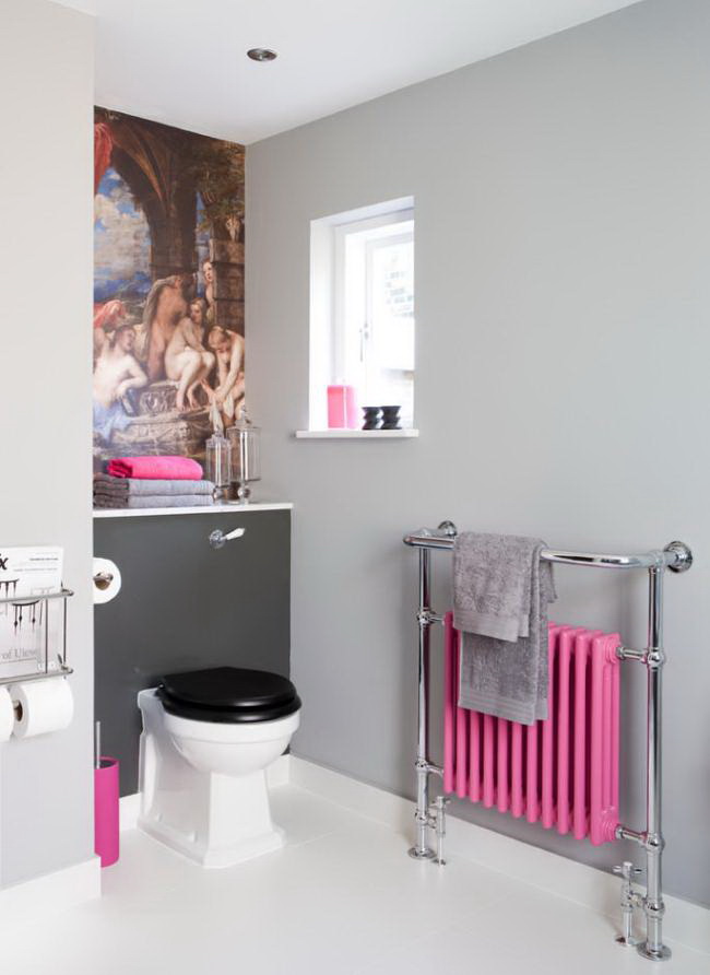
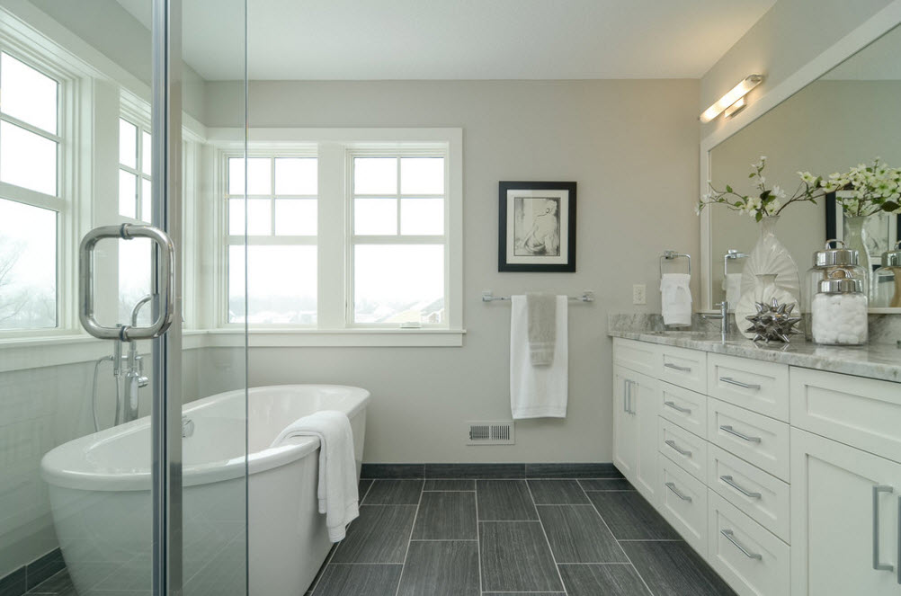
The light gray tile adds a cosiness, emphasizes cleanliness. A winning option are gray walls, bright tiles. Large print designs in a trend, well dilute monochrome calmness of the main color.
In small rooms, play with the texture of the size.
Choose a large tile for the floor with a rough surface, and glossy for the walls. The tile pattern should be the same or in the same style. Floors make a bit darker than walls. Some collections offer such options. As a result, the combination of gray surfaces, white plumbing fixtures, lamps, mirrors make the room large and elegant.
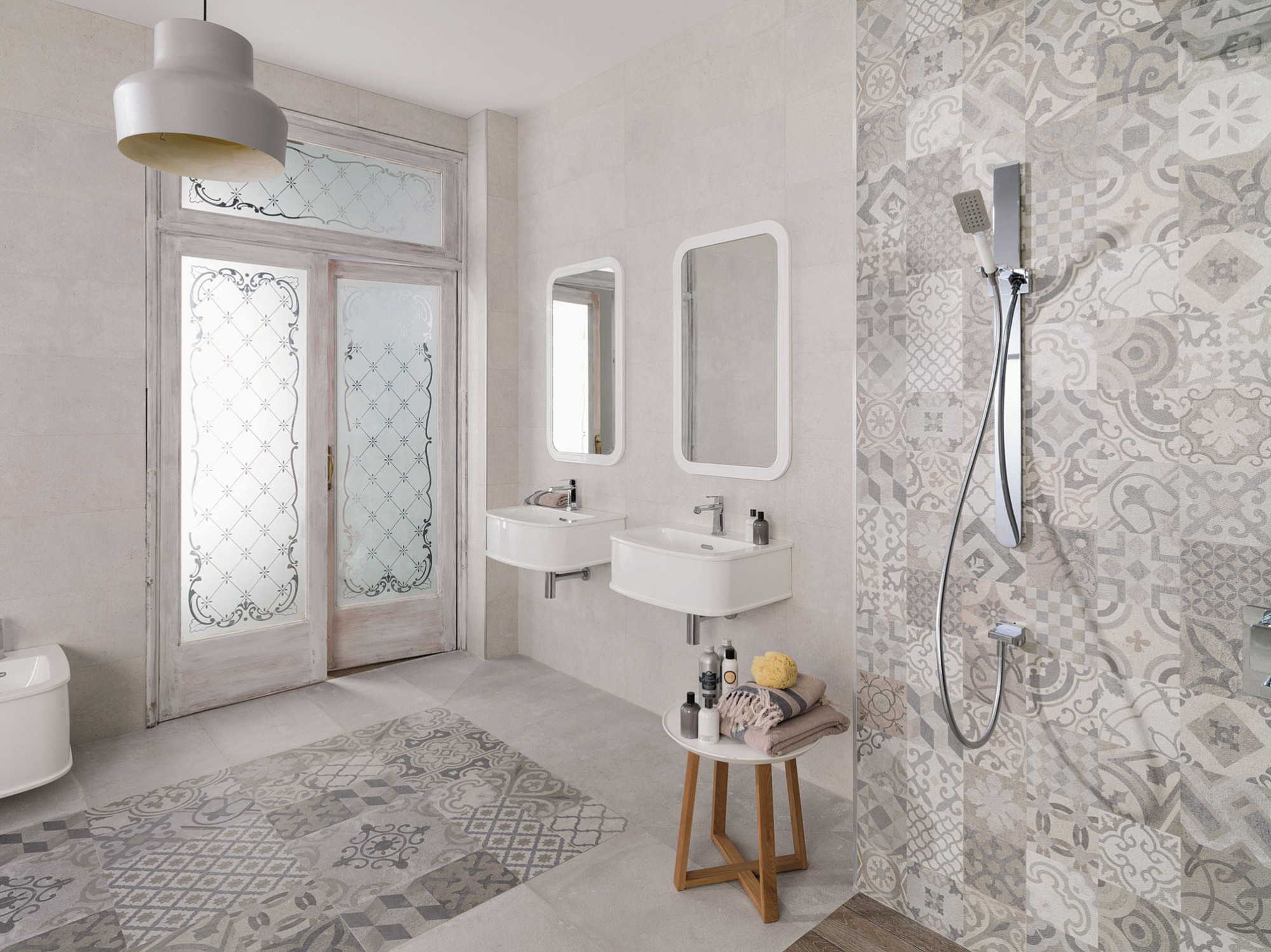
A light gray tile adds comfort and clarity.
They ate to buy tiles of the same color, a console toilet, a sink without a leg, the room loses clear boundaries, which is advantageous in small hygiene rooms. This color masks stains, small debris, dust. The hostess does not have to walk around with a rag all day long, as it happens if black or white is chosen for the tile.
Use natural materials with these shades. You will be surprised how life, family relationships are beginning to change. After all, it is not a secret that what surrounds us - it creates our inner “I”, helps to move forward or “die from boredom”, create masterpieces or regret lost opportunities. Choose what you like, you will see a completely new tomorrow.
Floors make a bit darker than walls.
The basic rule is the harmonious introduction of color additions in various shades of gray. And now let's summarize.
Gray color has advantages: it gives peace of mind, becomes the base tone for decorative objects and furniture.
It goes well with various colors. To ensure diversity, decorate the walls of individual rooms with different shades.
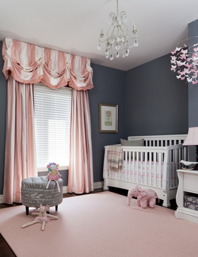
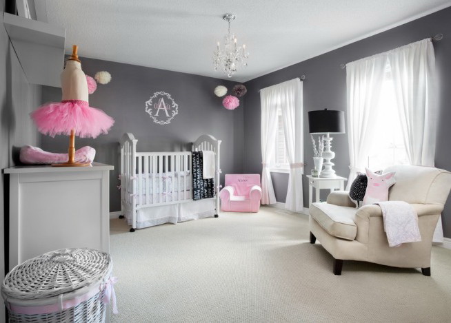
Shades of gray in a large number make melancholy. To create a historic interior skills are needed. Only in this case the addition of gray pigment to the paint will give bourgeois luxury, the walls will not look dirty. Gray color in the nursery should be supplemented with a large number of different colored pieces of furniture, interior.
The basic rule is the harmonious introduction of color additions in various shades of gray.
Gray in the interior
Combine with other colors