Modern trends in flooring can be figuratively divided into two types - imitation of wood and stone and soft carpets. Many homeowners are still looking for a soft, cozy carpet comfort. Today there is a wide choice of style, design and color of carpets, but a good choice played a cruel joke with us, making the achievement of harmonious decor a difficult task. Here are the main rules for carpeting that you can implement in your home.
Content of this article:
Main rules
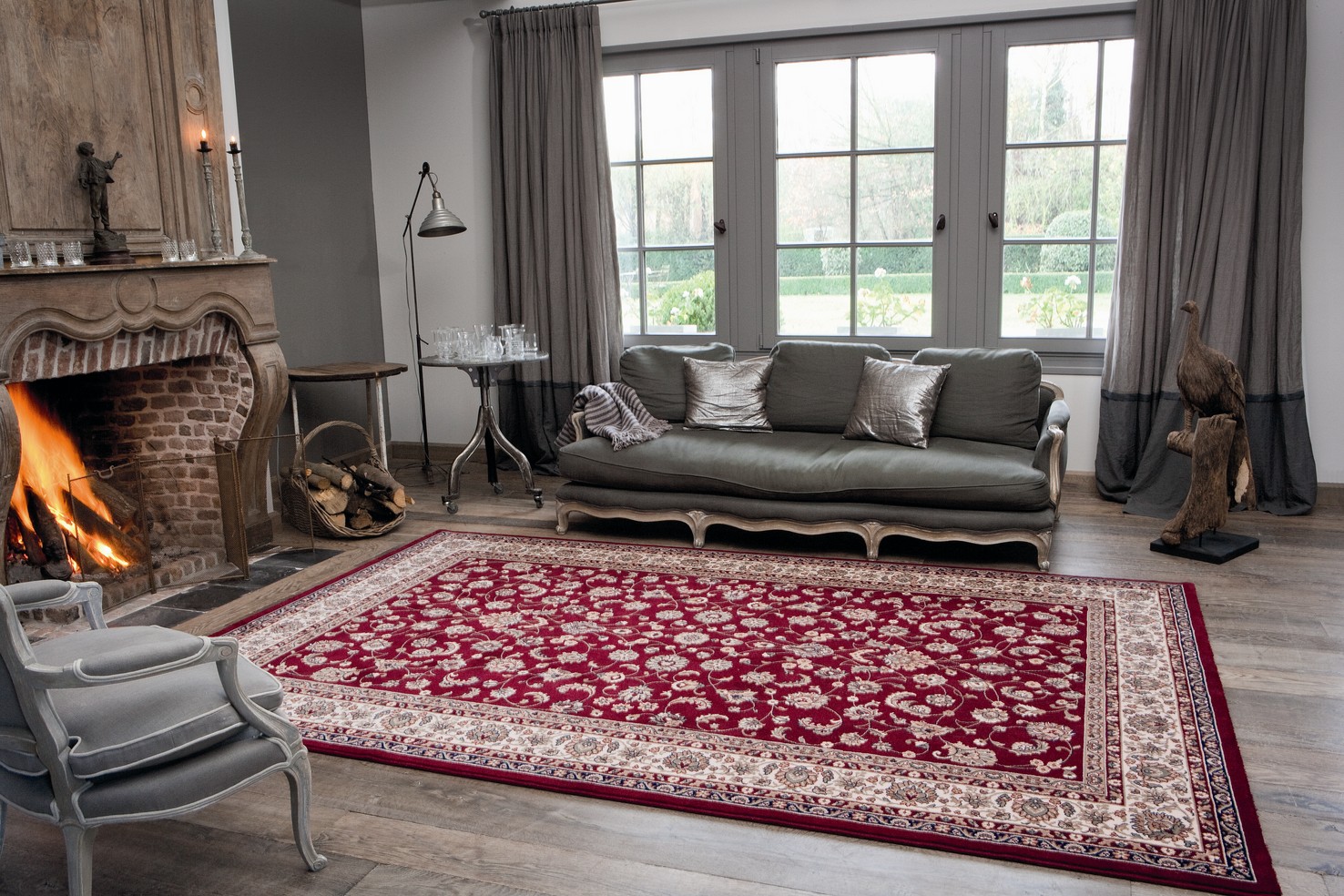
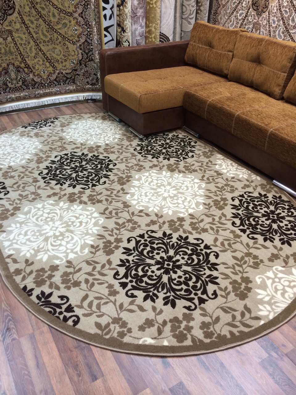
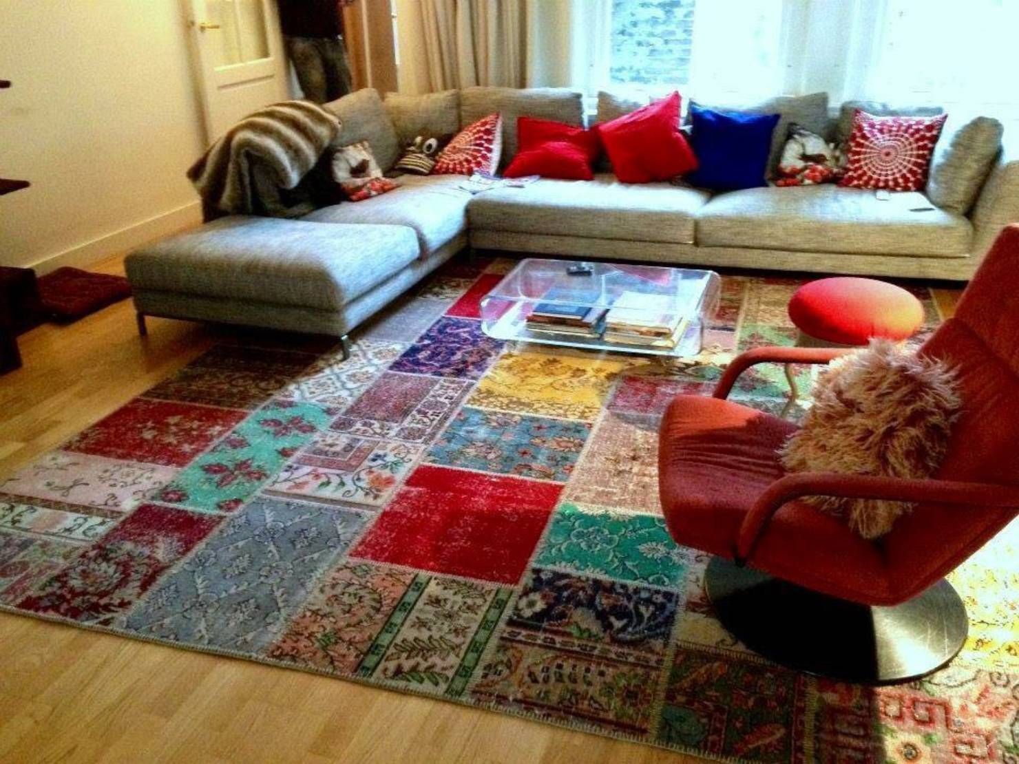
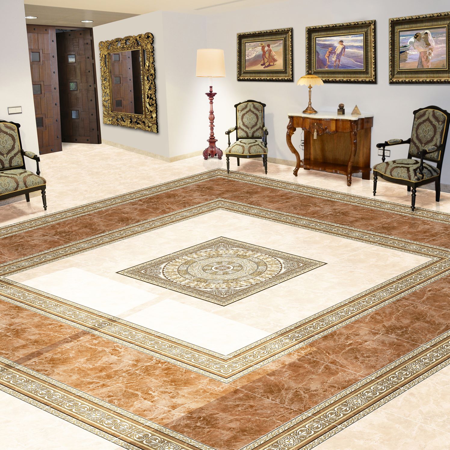
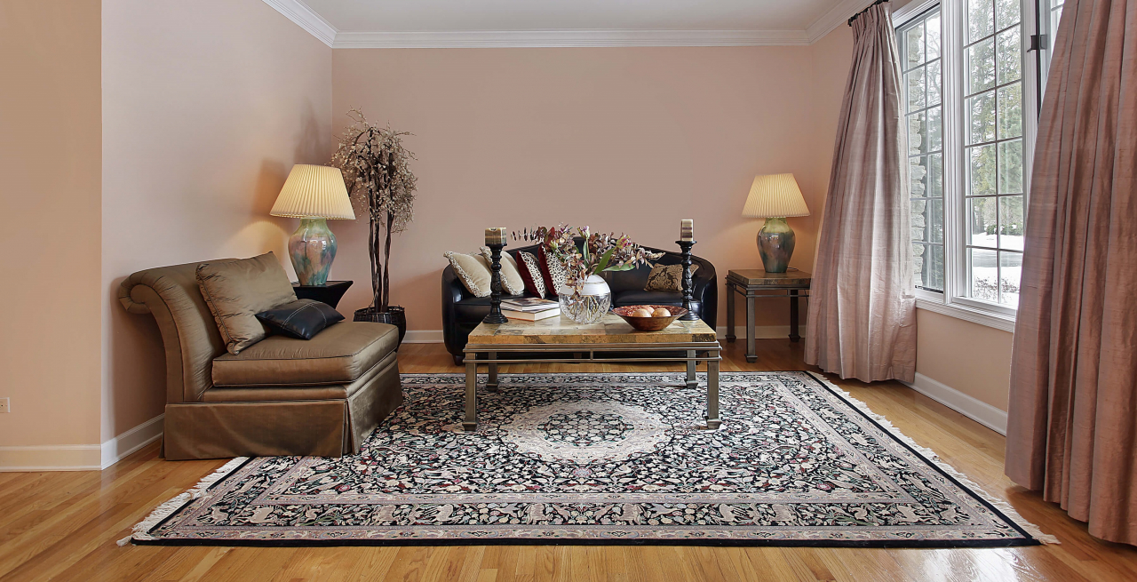
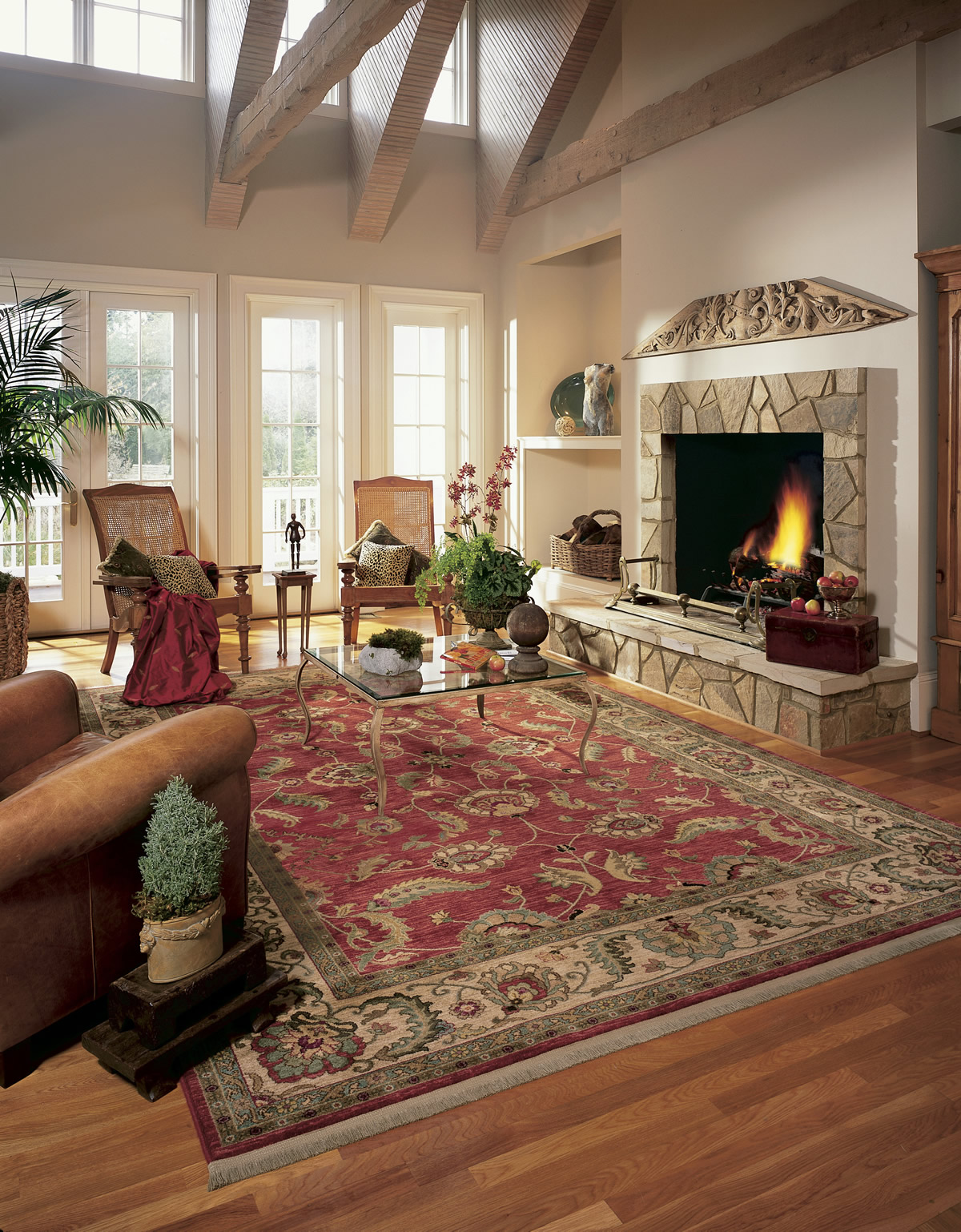
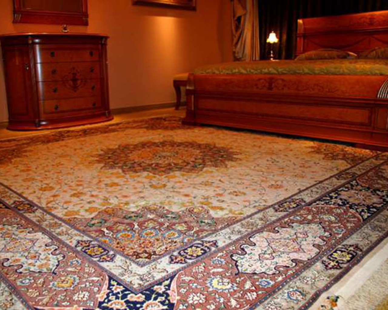
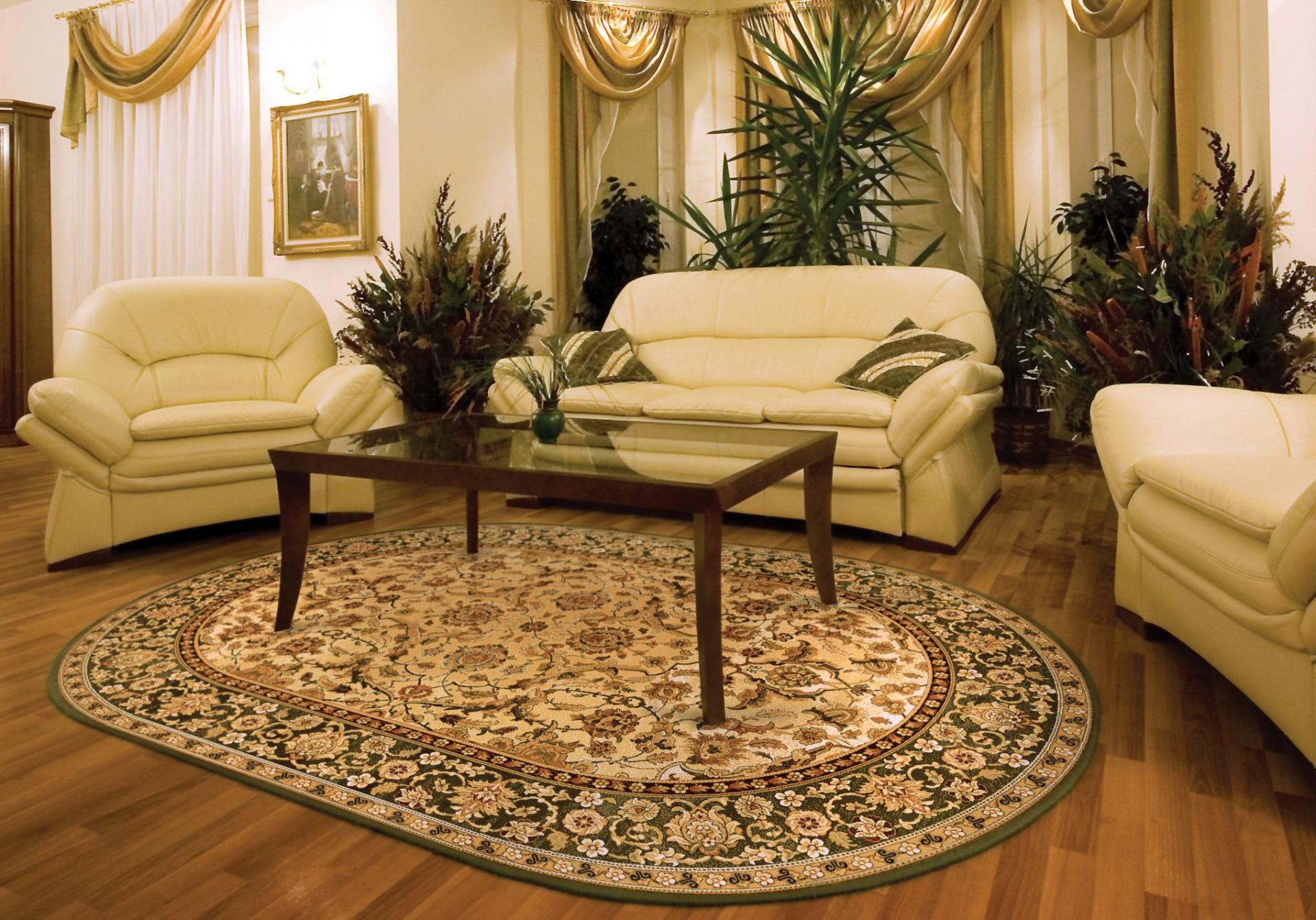
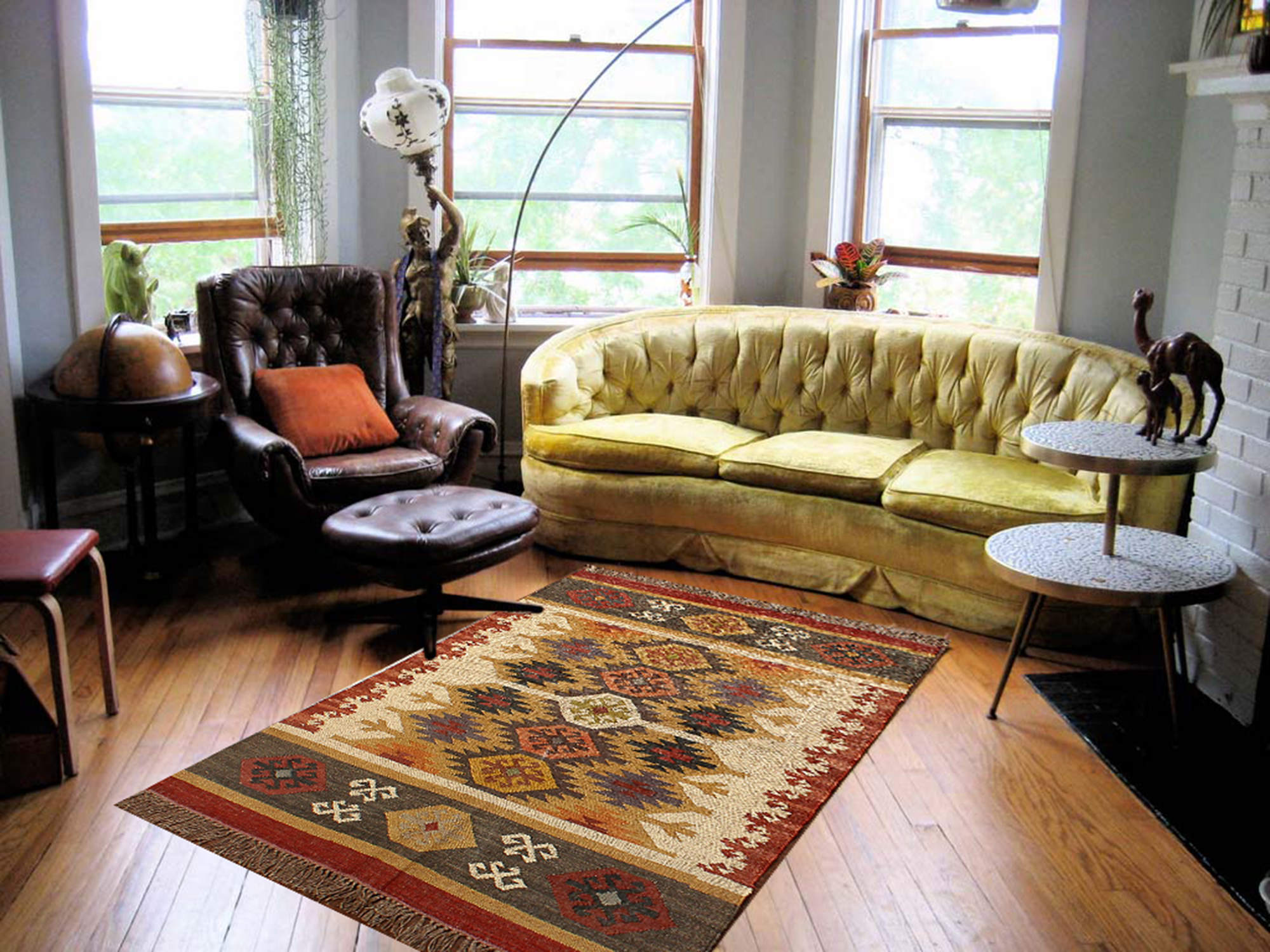
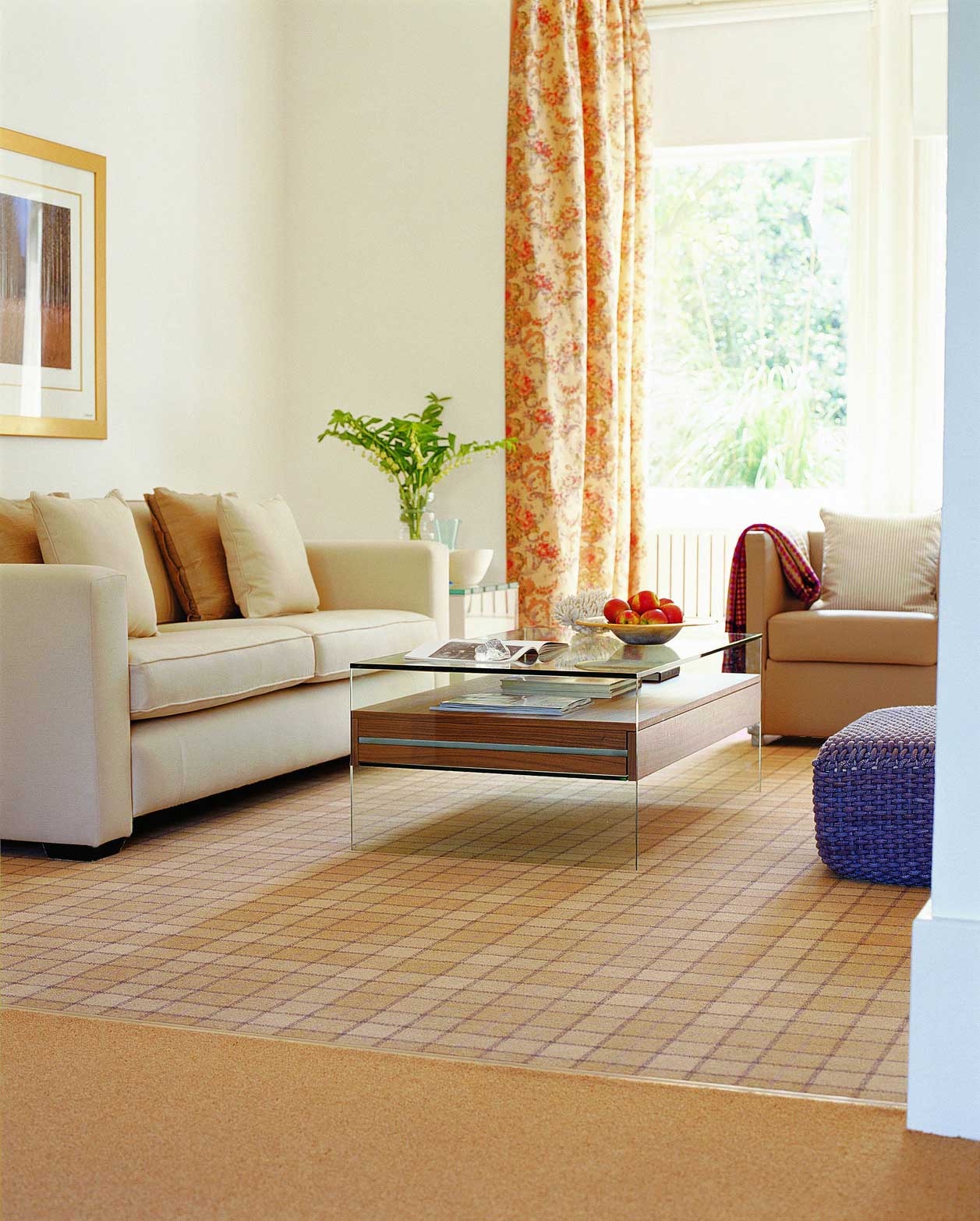
The design of the carpet on the floor in the room should not be isolated. The most successful home interiors are designed for continuity.

Harmonious decor in the interior
Even while some rooms may be individualized, it is helpful to think about your home as a whole body, rather than a series of unrelated spaces.
The main thing that he was not isolated
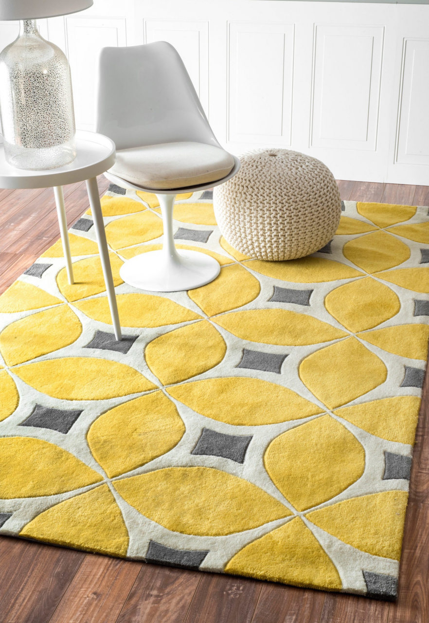
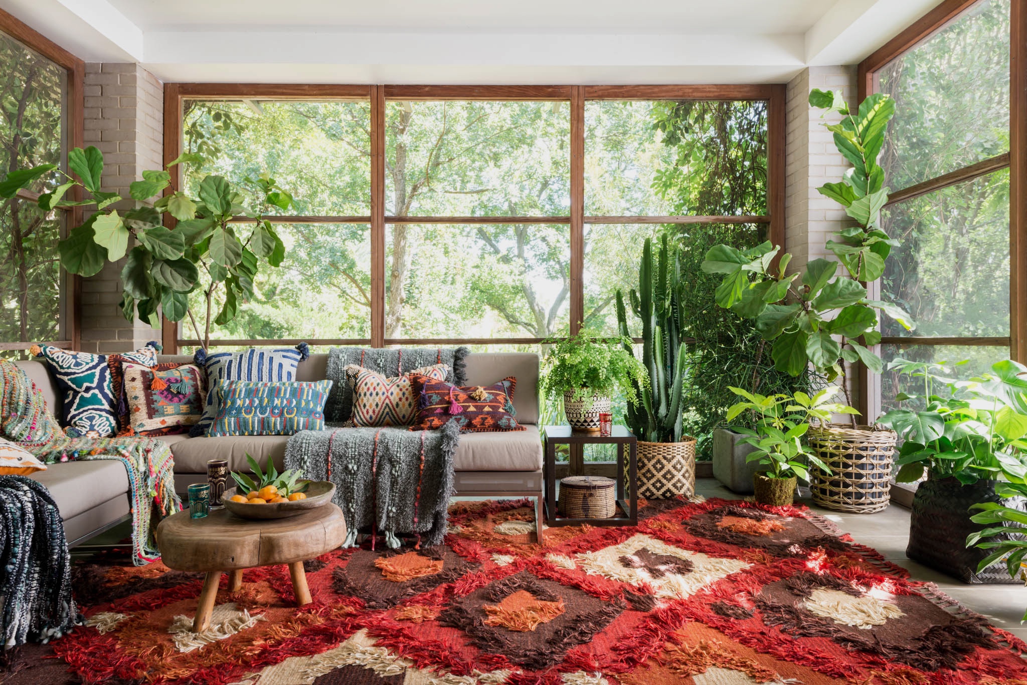
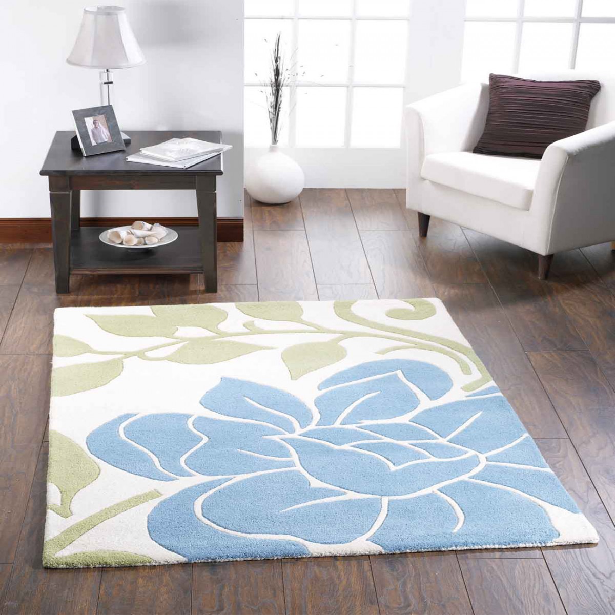
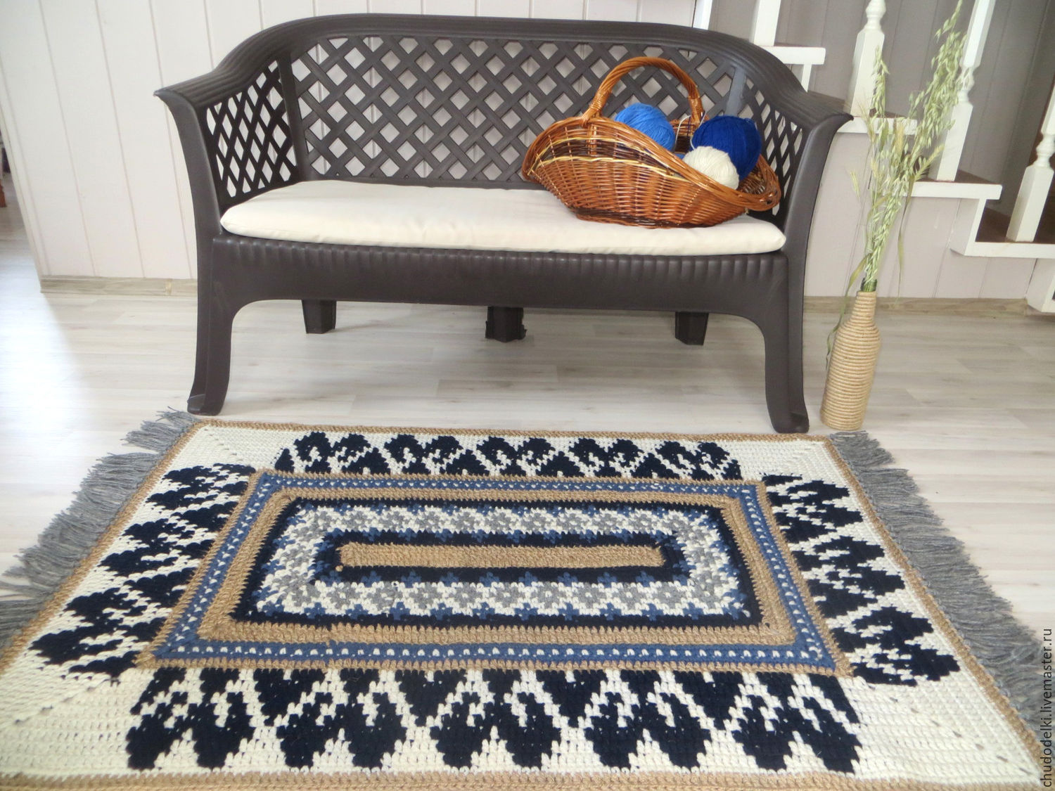
Your choice of carpet can be the basis for planning the decor.
In any case, coverage for sex connect all the design elements, creating a coherent scheme for any interior.
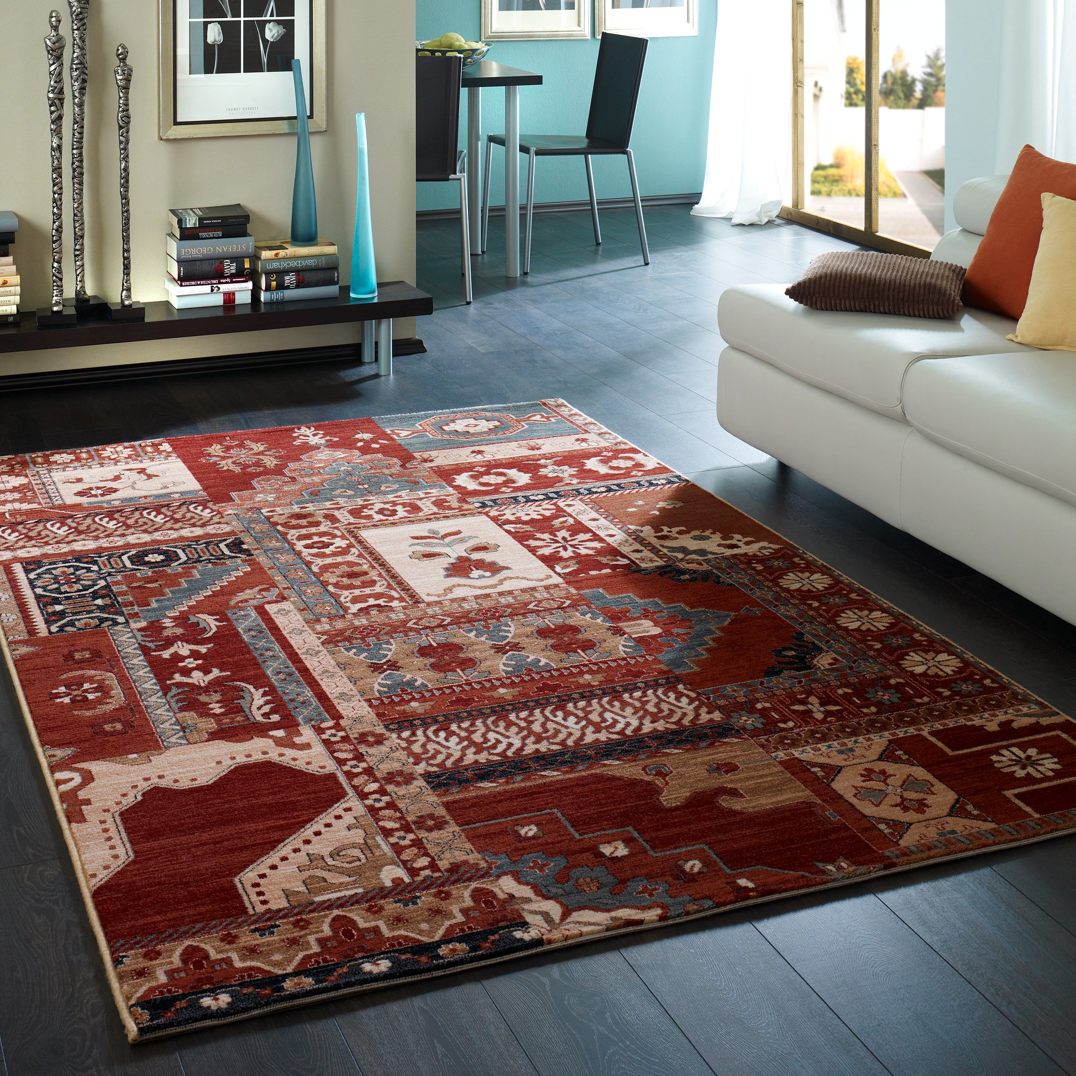
We select for your interior
A useful approach when planning a scheme is to consider it as an equation consisting of four parts:
- Colour;
- picture;
- texture;
- style.
Designer carpet option
It helps to gain basic knowledge of how color, texture, pattern and style work when planning an interior.
It will be interesting to you:OVERVIEW: Rugs, puzzles for children - Soft floor: developing with comfort (145+ Photos)
return to menu ↑Create mood
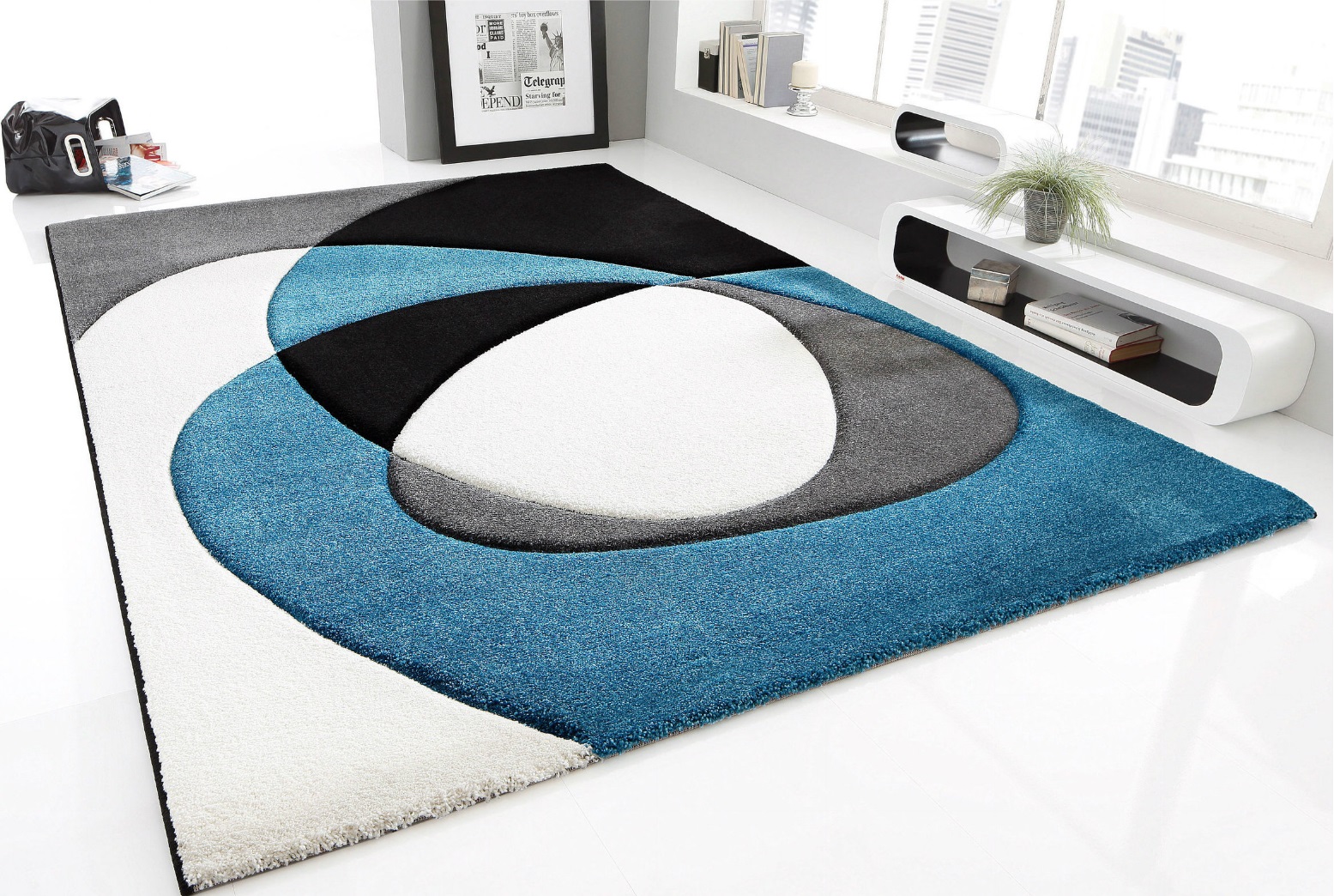
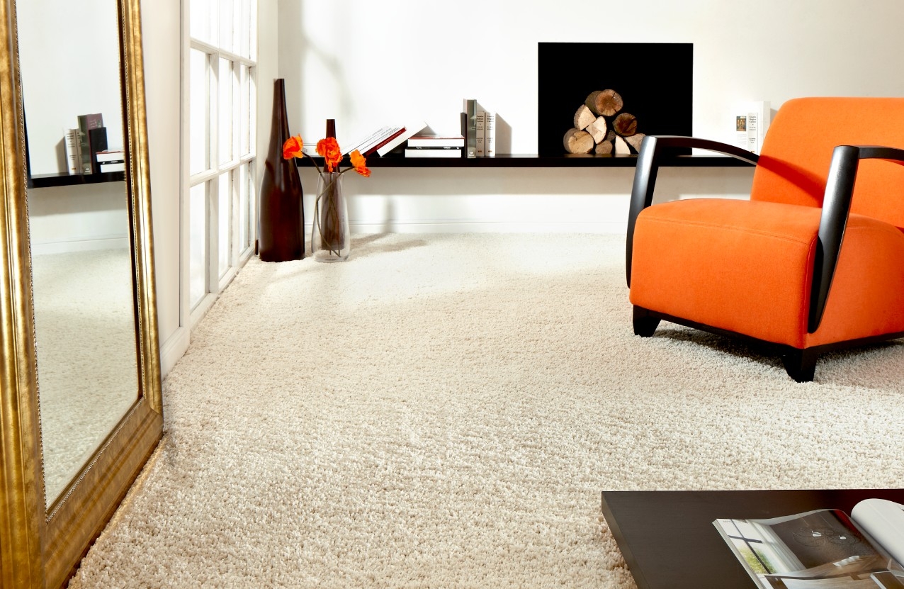
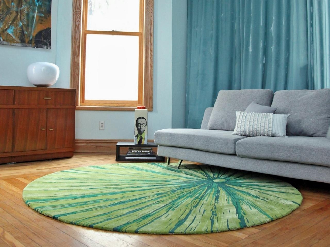
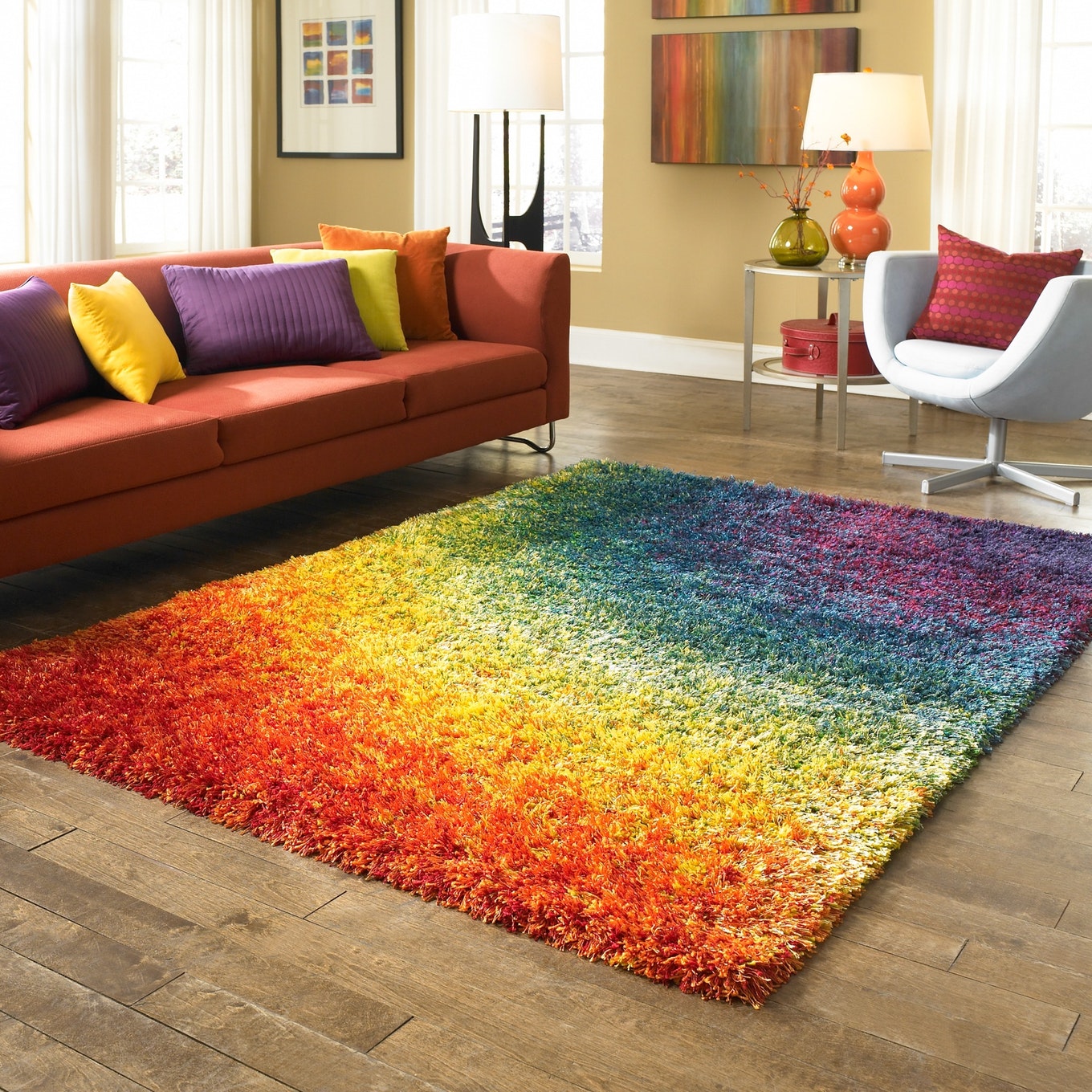
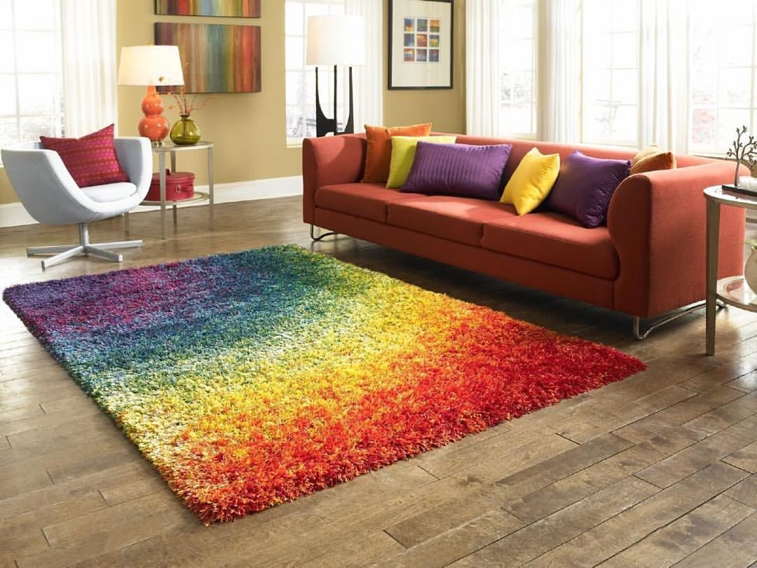
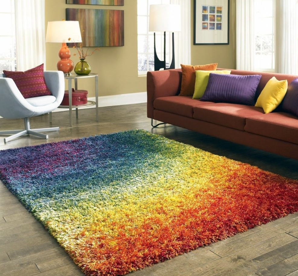
Color creates mood because it controls size and shape and skillfully plays with light. The floor and walls are often the largest visual spaces in the room, so choosing the right color for your carpet is a very important step.
Coating color plays a big role in the overall style of the room
Color circle
Consists of primary colors, secondary colors and shades or tones. Major - redblue and yellow - are “clean” flowers. Combining basic provides additional colors.
Color circle
Primary and secondary colors are arranged in a circle in the spectrum.Each primary and secondary has different shades that are between the main colors and reflect the dynamics of their change. Also, the function of the circle is to determine the cool and warm shades. Colors on blue and green The side is cool, on the red and orange - warm.
Bright Star for Harmony in Families
Combining
There are three ways to combine to create the layout and mood of your home.
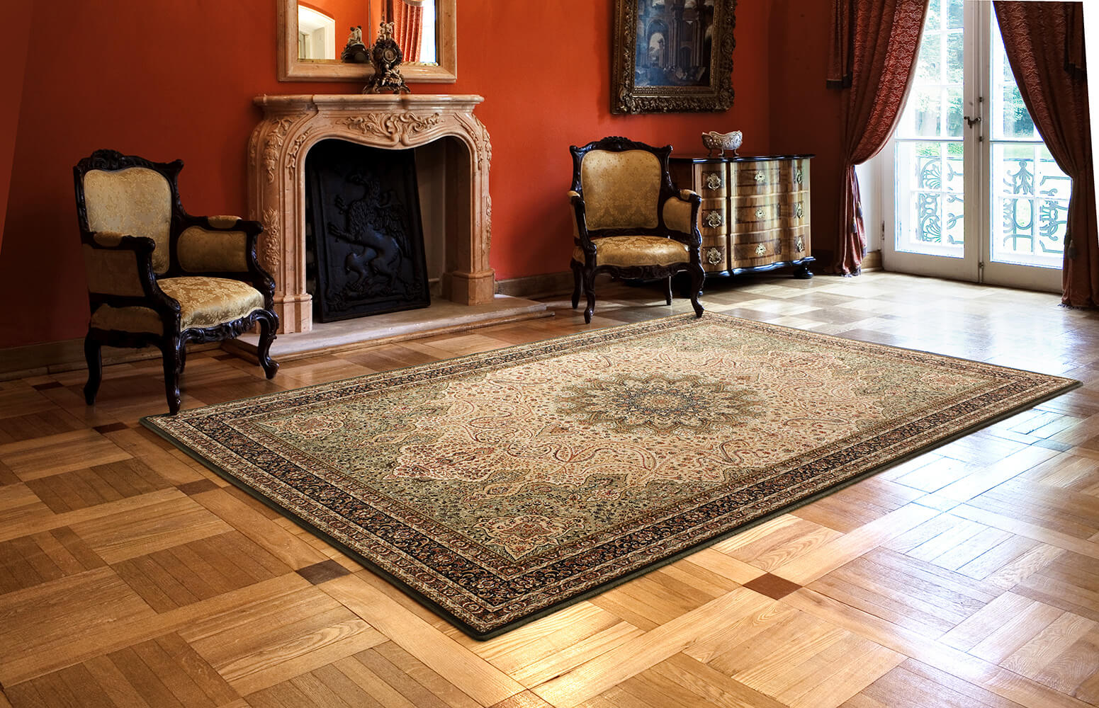
Beautiful flooring
Color effects
The benefits of color effects can be used in different ways.
Saturated colors make objects closer and, therefore, help to make a large open room more comfortable and intimate.
More brightness - more emotions.
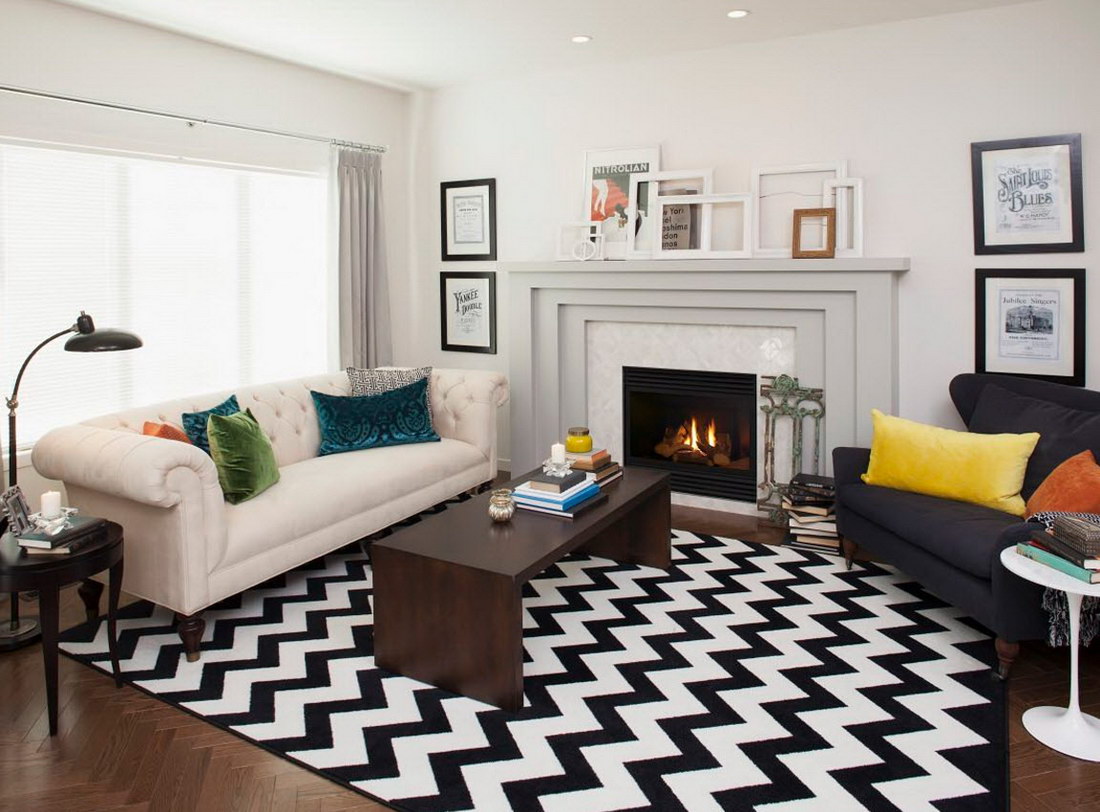
Art of disguise
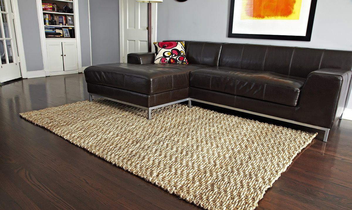
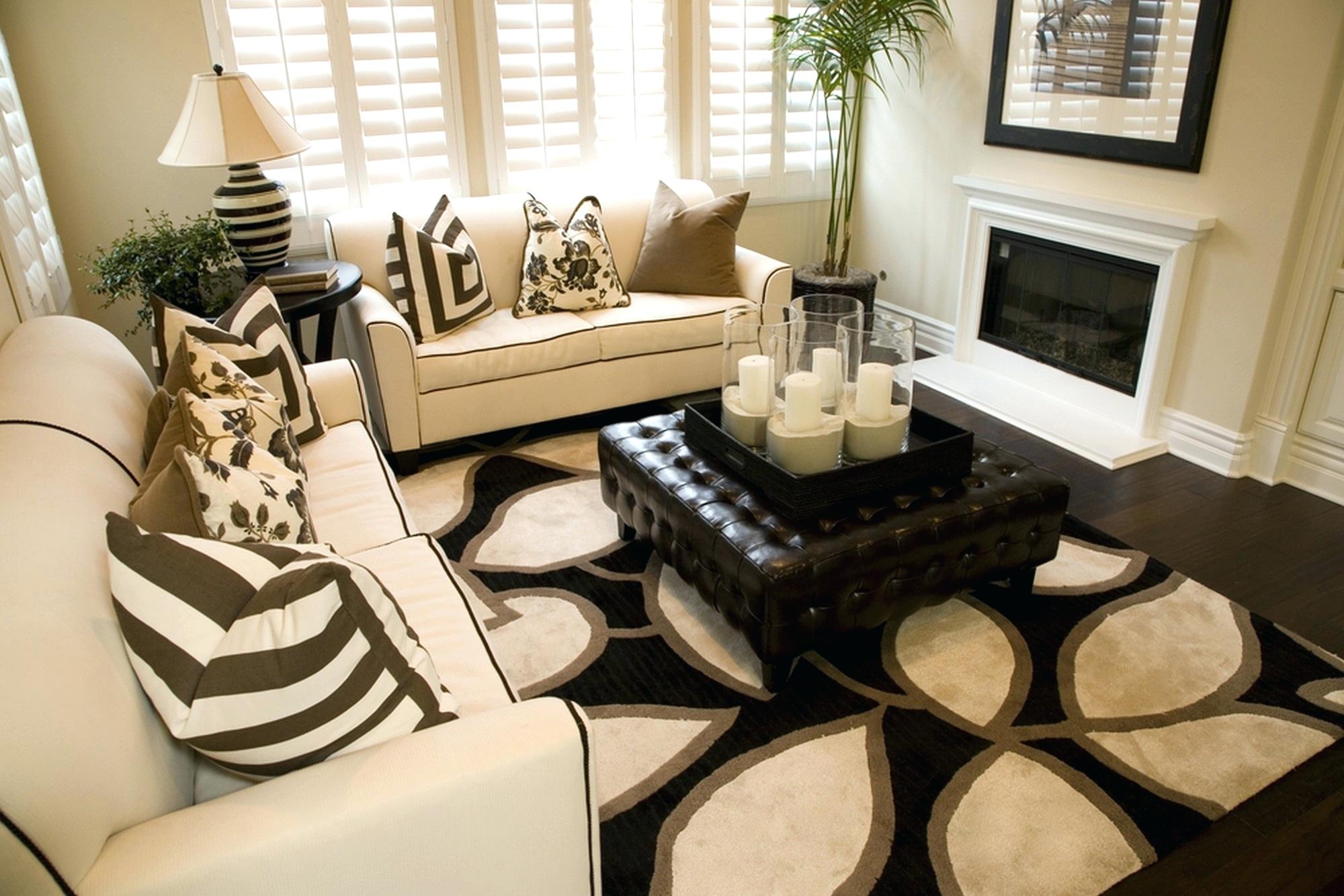
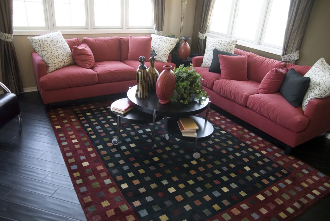
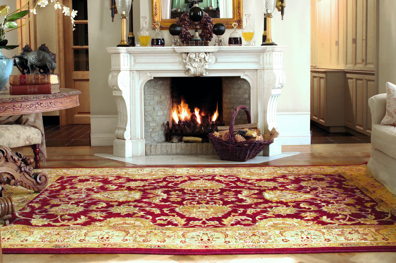
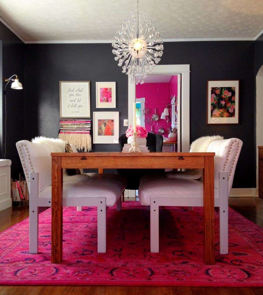
Bulky items in the room can be disguised with clever use. Great victorian sofa, upholstered in dark color, will seem less cumbersome and merge into the scheme of the room if the carpet and walls are in close shades.

When we pick up in tone
Increase the heat
Carpet or other accessories - such as curtains or pillows- warm colors, clean the cold in the room and create an abundance of energy.

Extra warmth feeling
Raise perception
Mixing can provide a sense of height.
Use the darkest shade on the floor, the next shade on the walls and the lightest shade on the ceiling.
The darkest shade on the floor
Create a feeling of peace
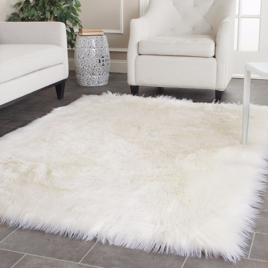
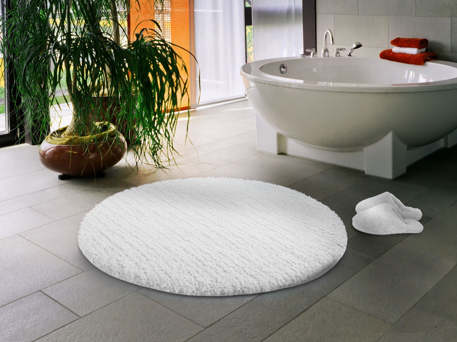
Choose neutral to create a gentle, mild calm environment, a nature reserve in the midst of modern life at a frantic pace. Pale colors are peaceful, serene and therapeutic. Eliminate visual stress and over-stimulation with simple furniture.

Create a sense of calm
Increase the sense of light
Use more pale shades (colors with added white) to brighten the dark room. The reflective quality of white more than any other increases the feeling of light and space.
We increase the room due to the white
Balance the palette
Colors that are directly opposite to each other on the color wheel, such as blue and orange, can be used to complement each other. Use this method to create a balance in the interior while simultaneously using warm and cool tones.
Add color balance
Color in action
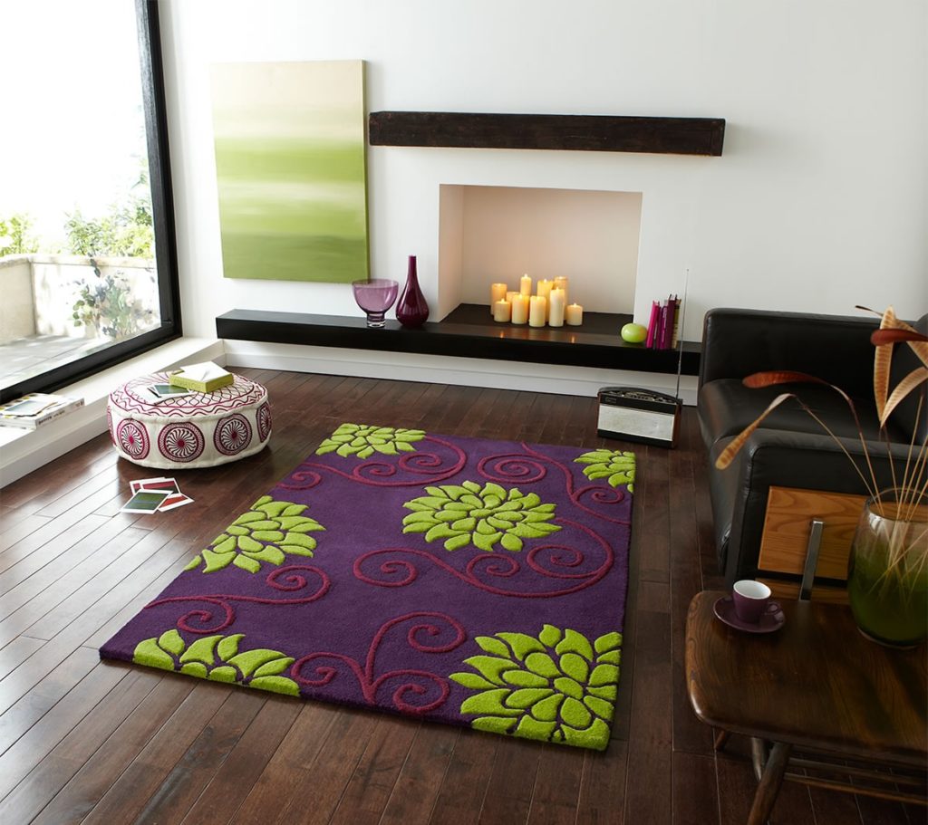
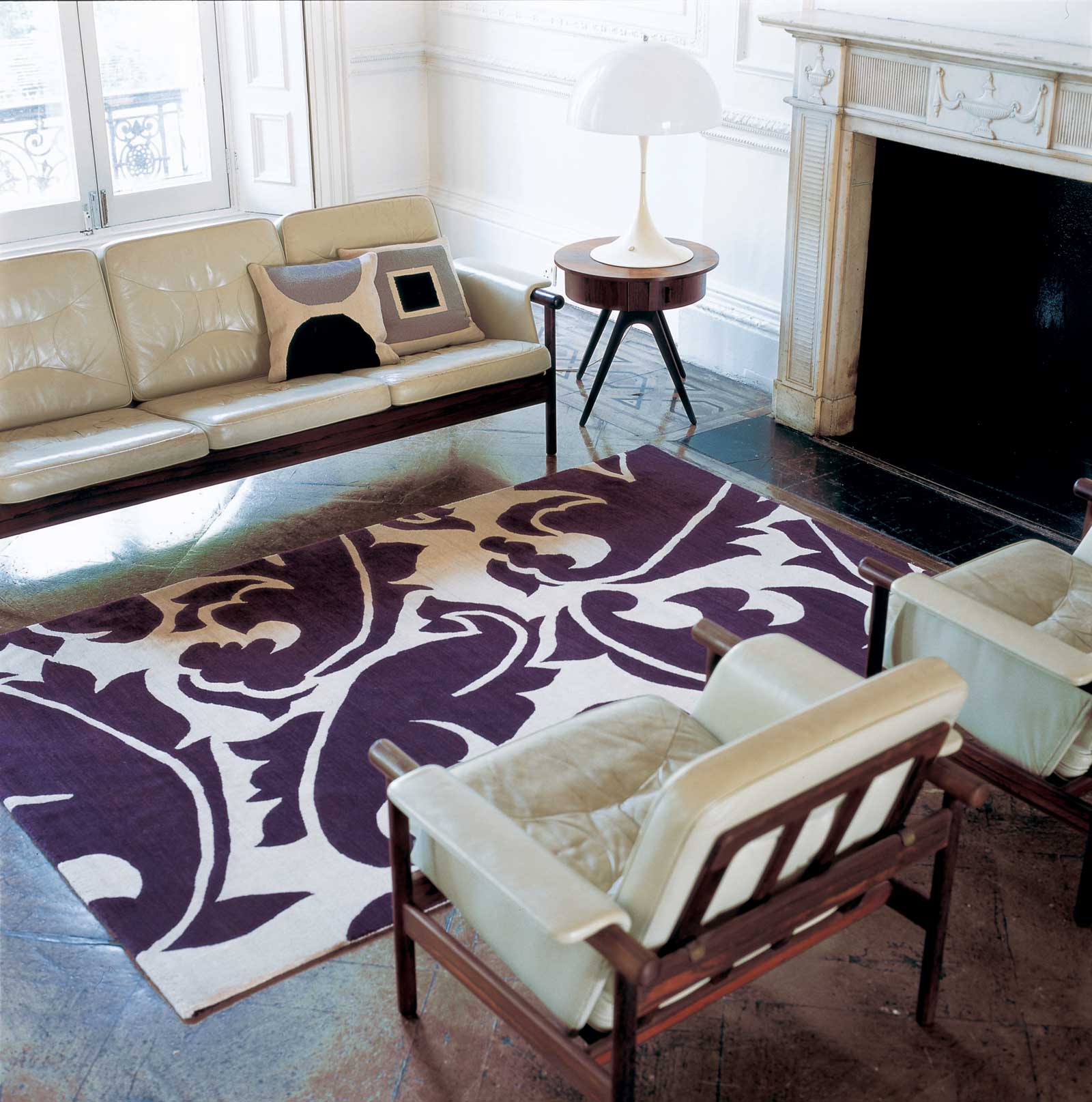
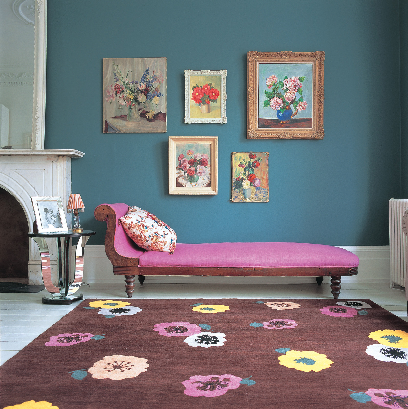
Plum and purple
They have a formal, almost regal association, but this is a result of cultural influence, and not their purpose in nature. While a strong purple brings a dramatic touch to the interior, paler shades of purple and lavender look delicate and delicate.
Regal association with purple
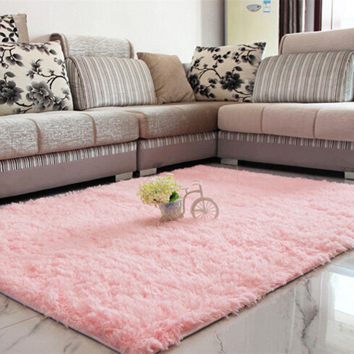
The color of sunlight and spring flowers, as well as pure yellow
Can be used to bring warmth and lightness to the home. It reflects light and can be used to illuminate a dim room. The tones of orange, brown and golden brown are warm, cozy colors.
Bright accents can liven up the basic colors of neutral browns.
Warm and cozy golden
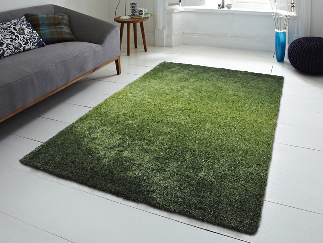
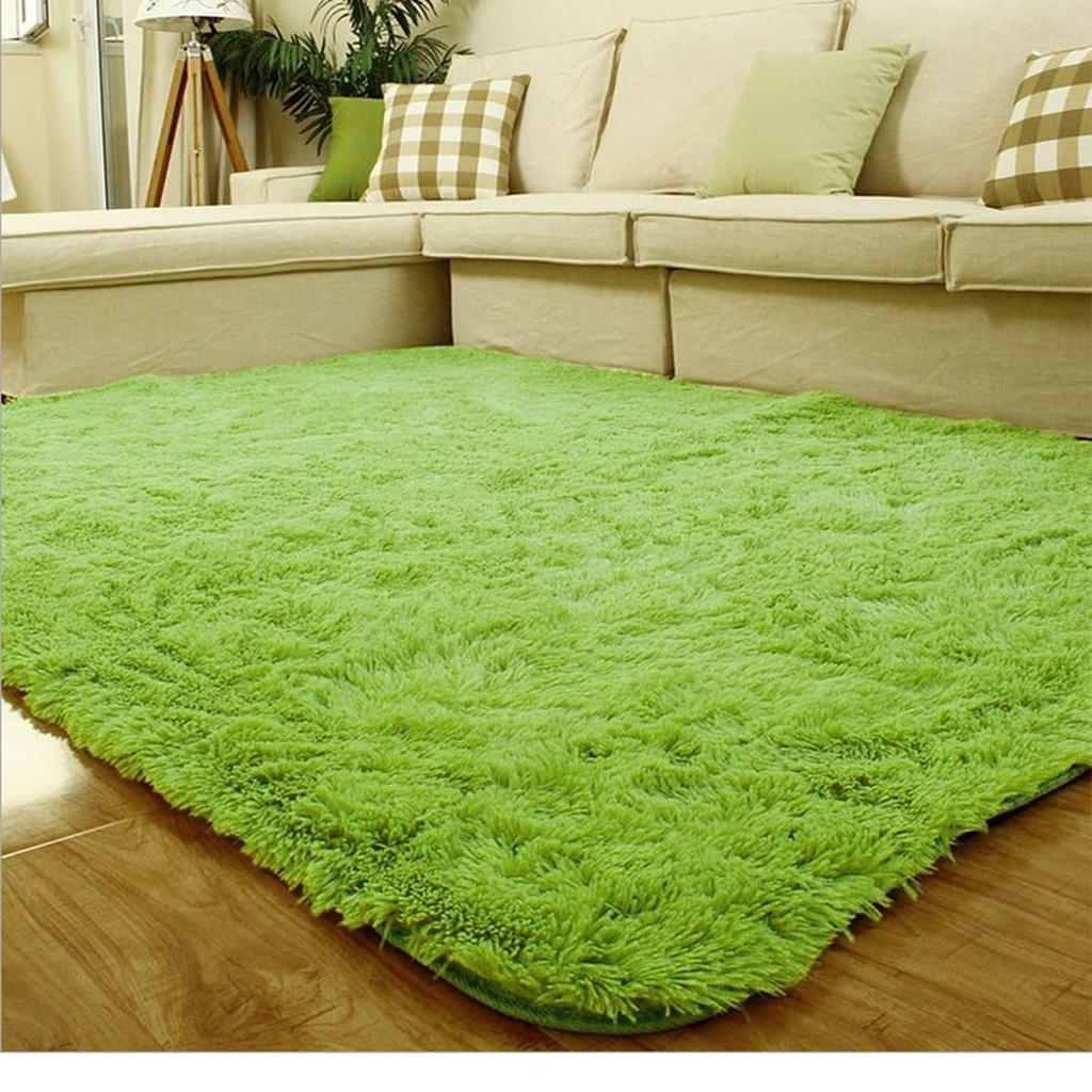
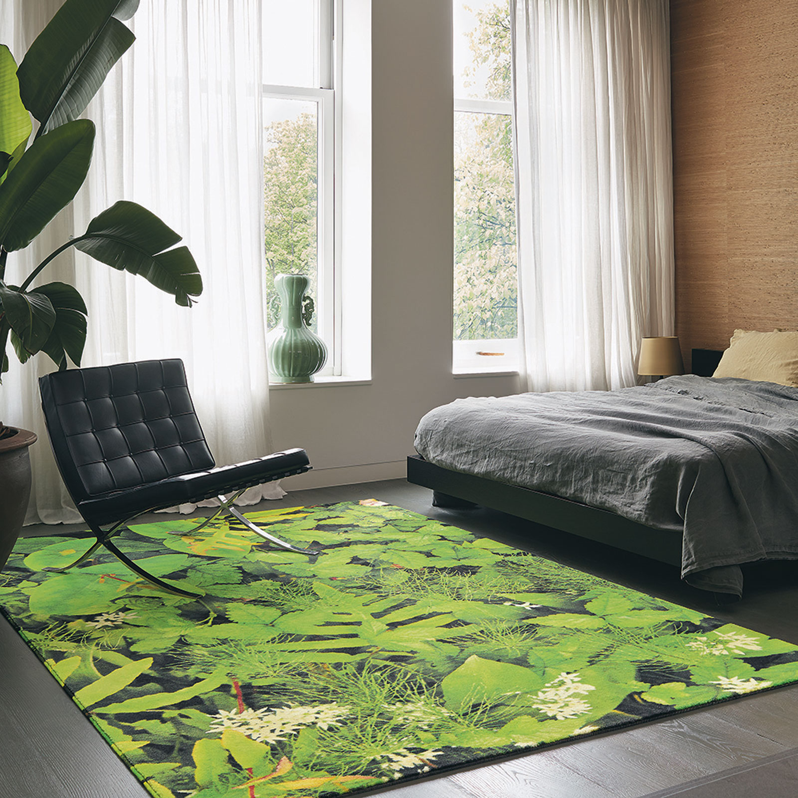
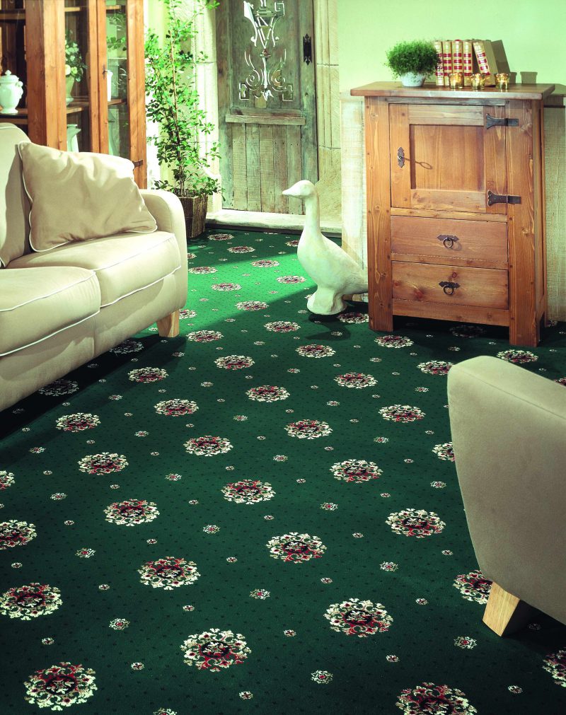
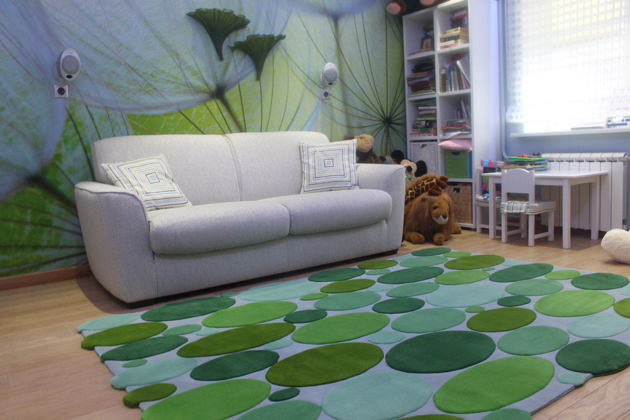
Green
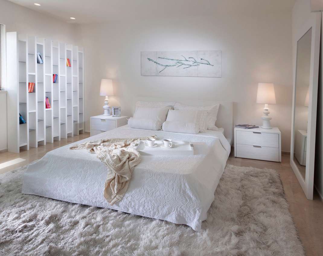
The natural color of nature, encourages self-analysis and calm - the mood is suitable for the living room or bedroom.
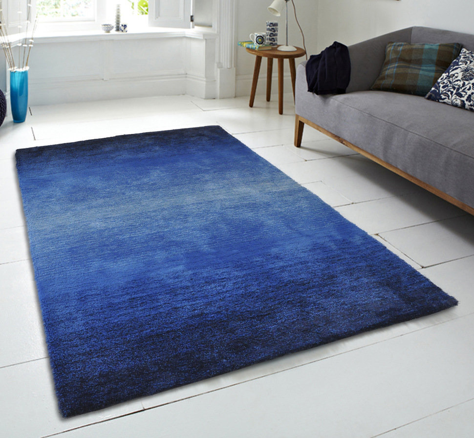
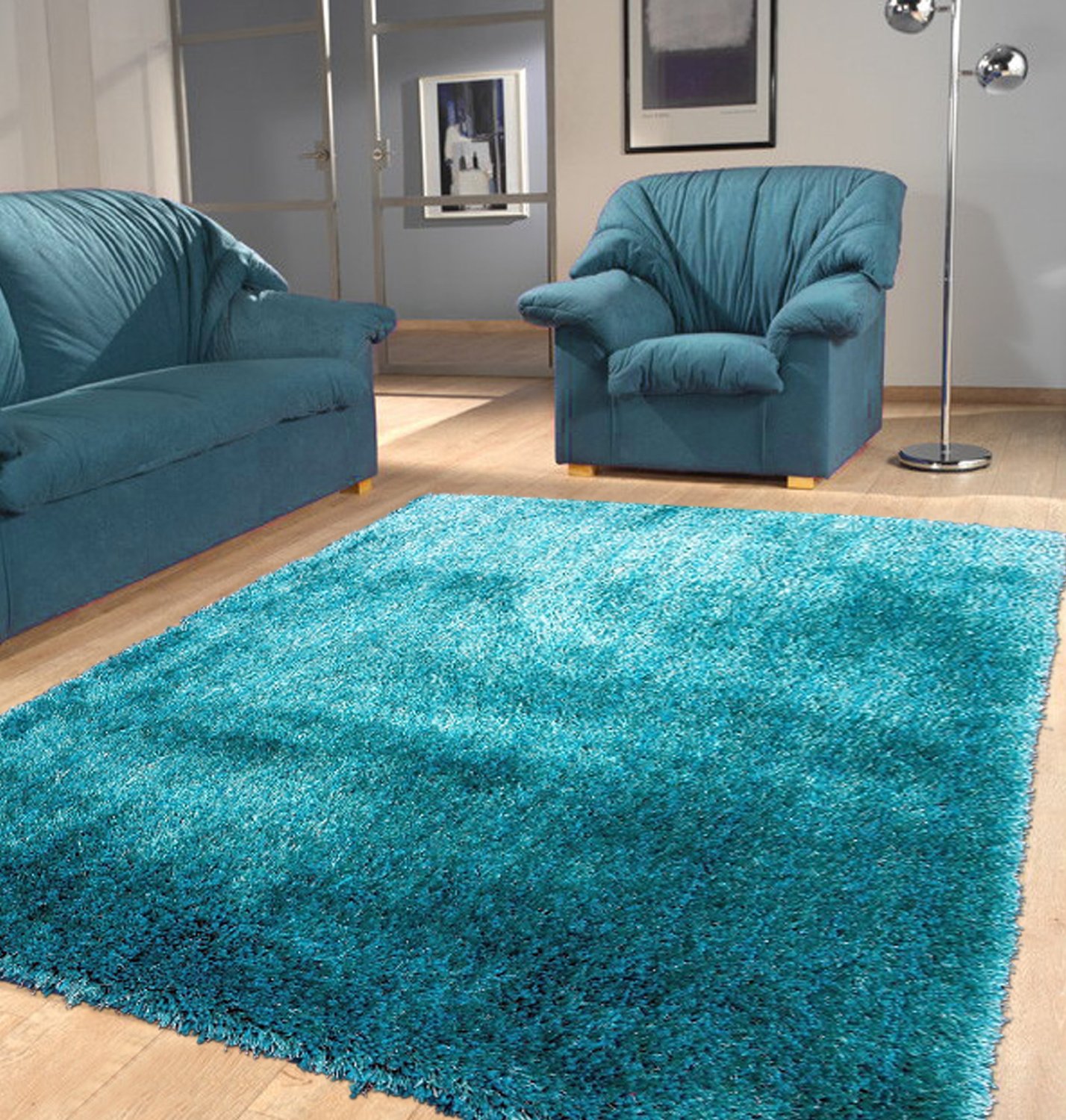
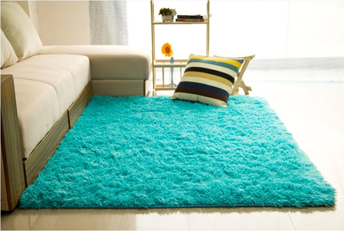
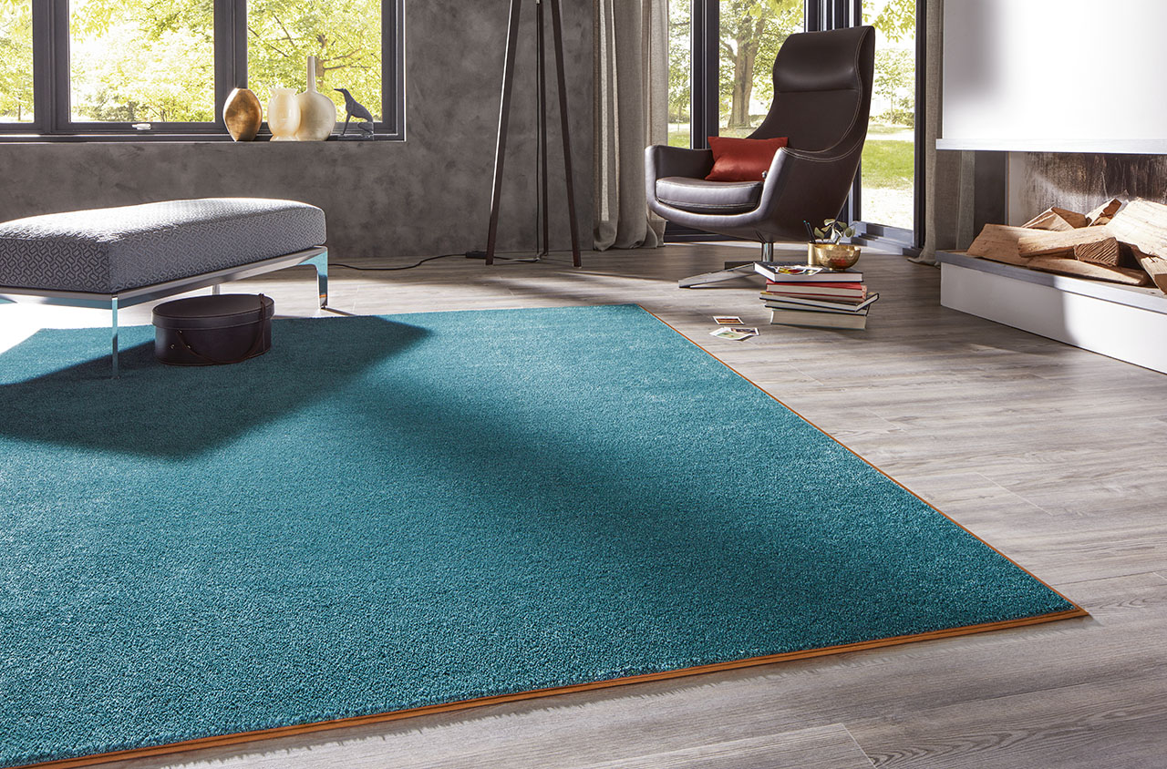
Blue
The color of the water and sky can be used to create a cool, spacious environment. Calm blue has a calming effect in rooms such as bedrooms and cabinets.
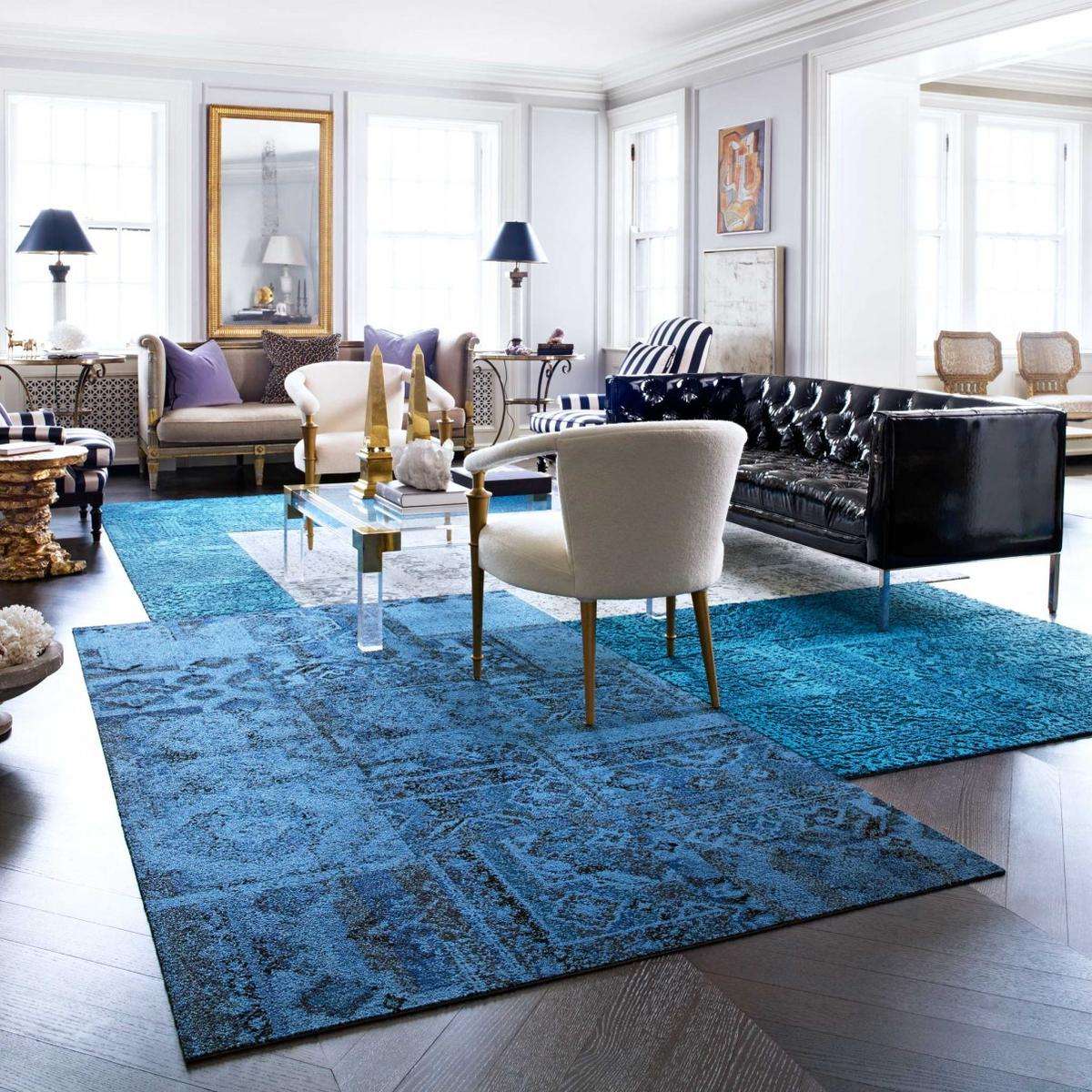
Add some space
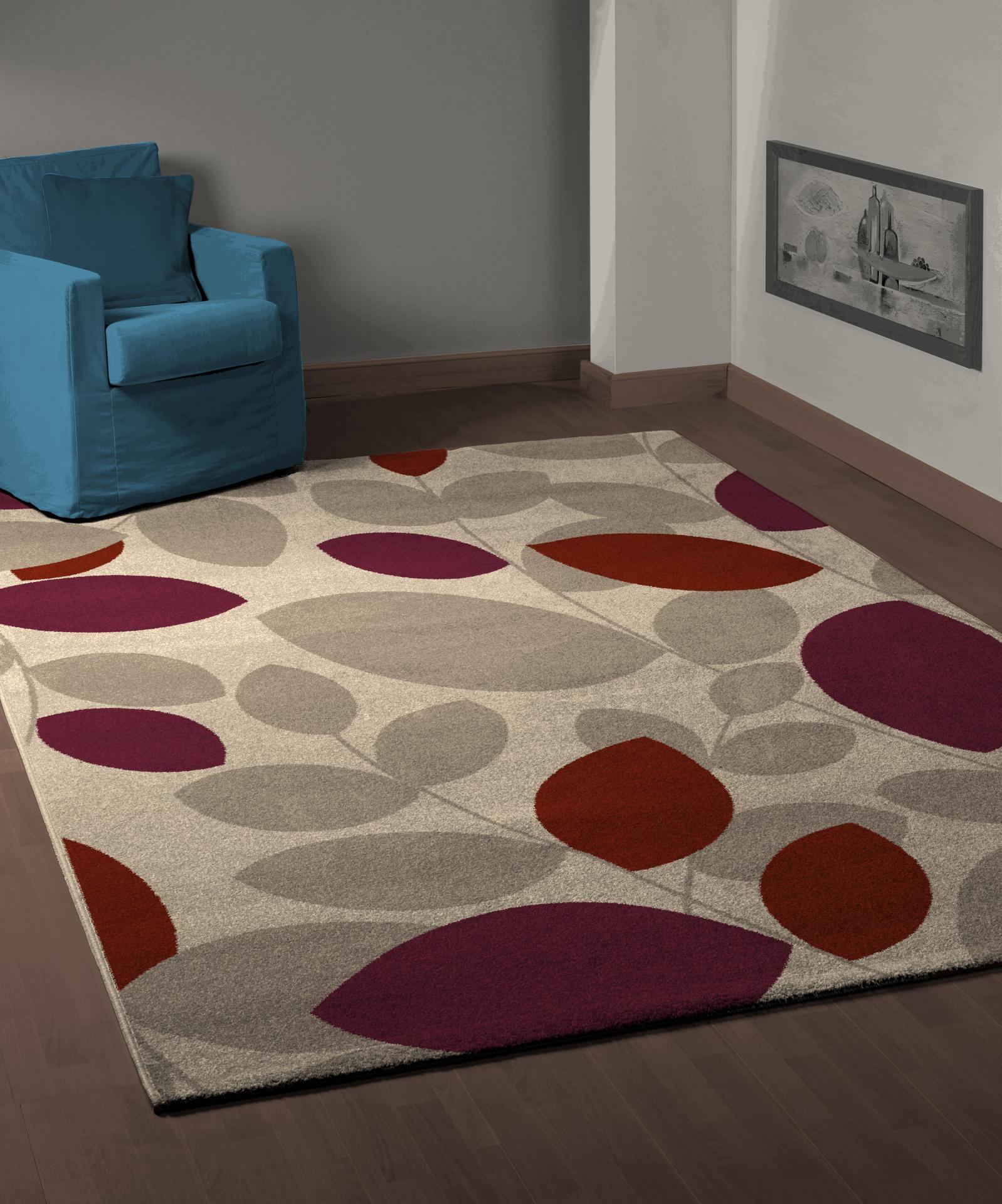
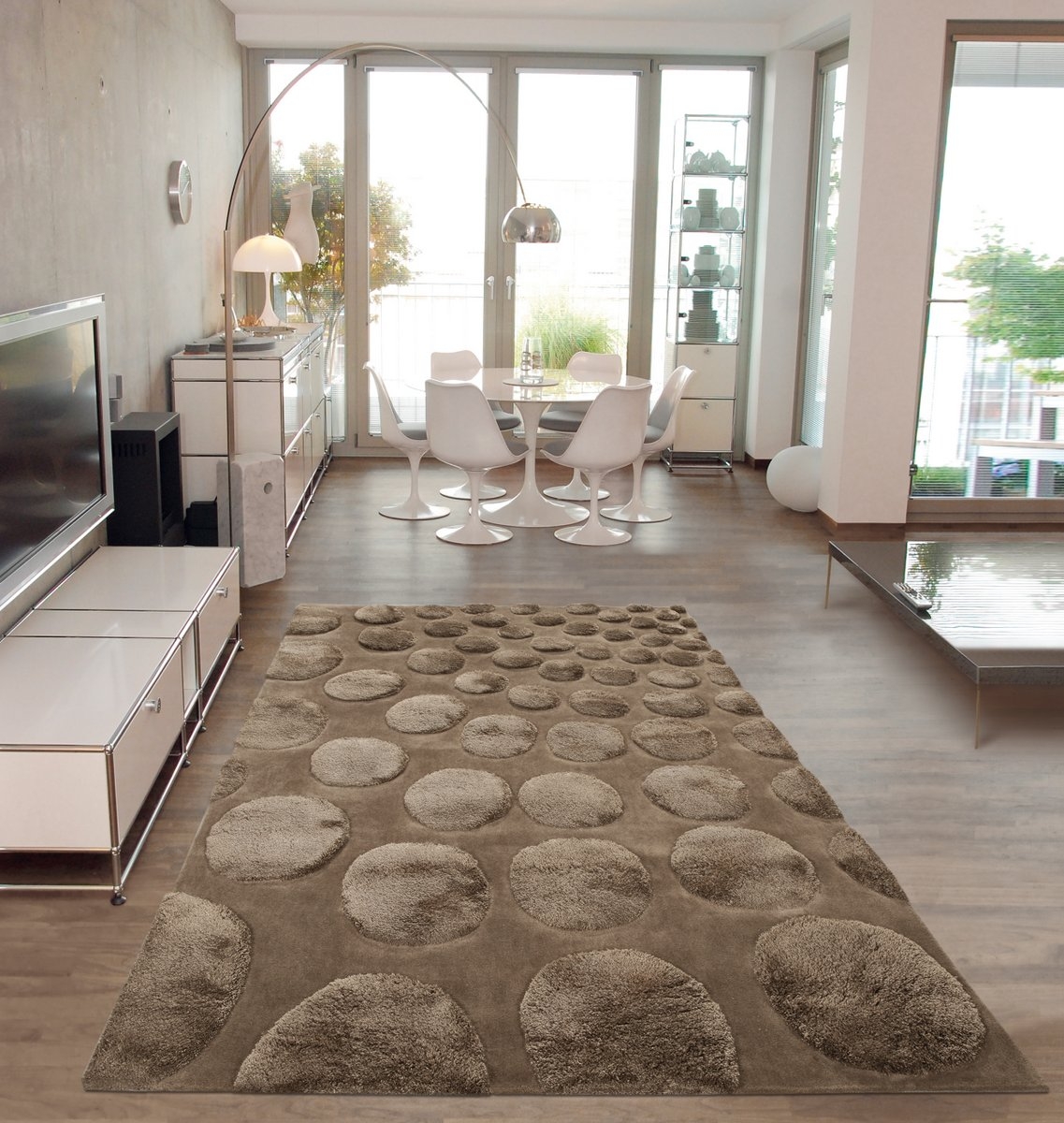
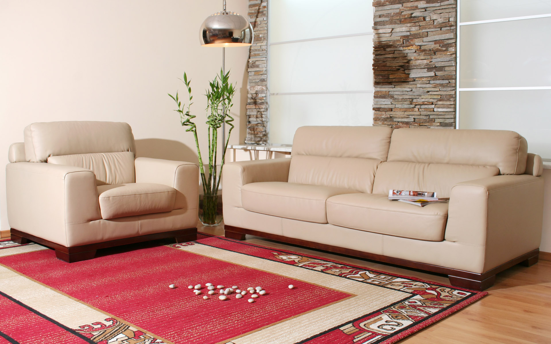
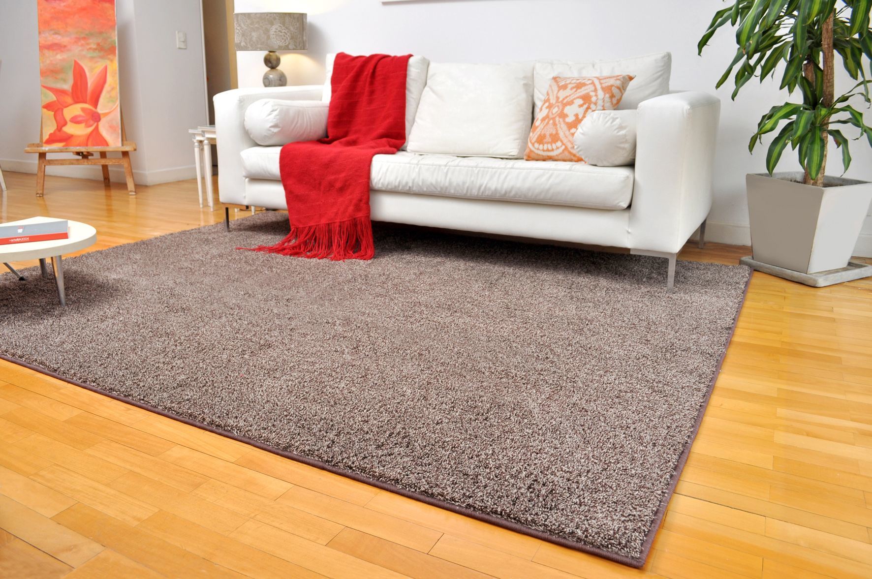
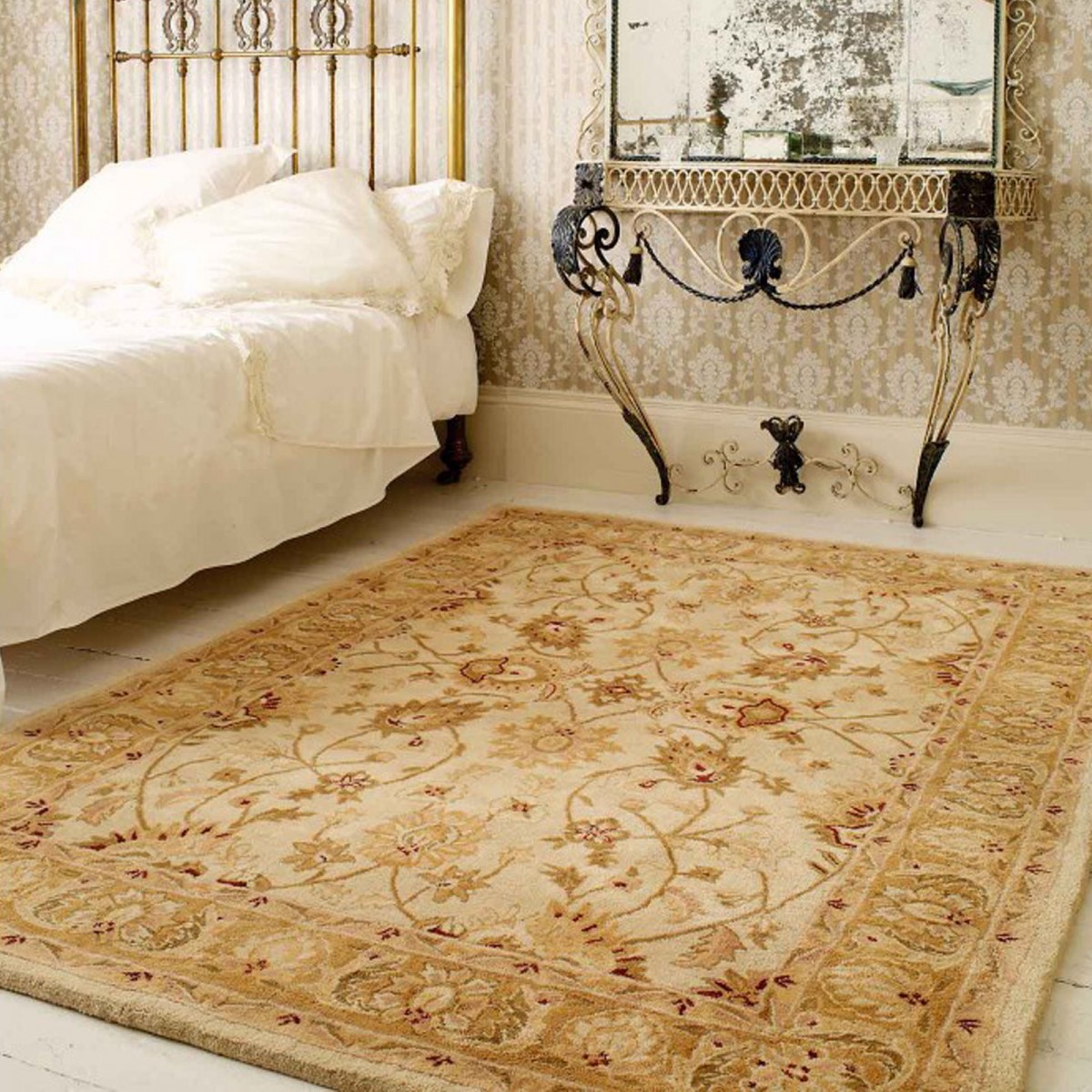
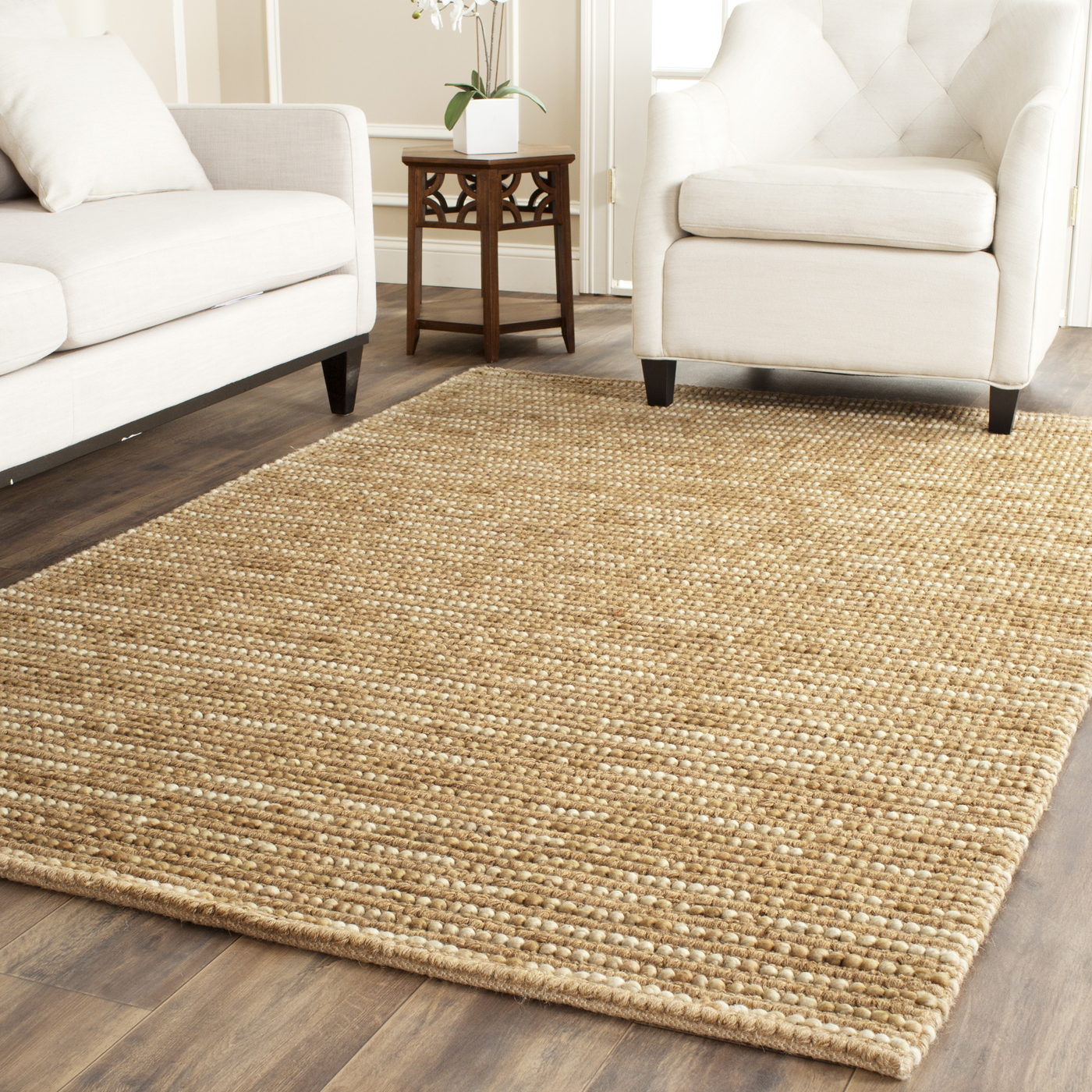
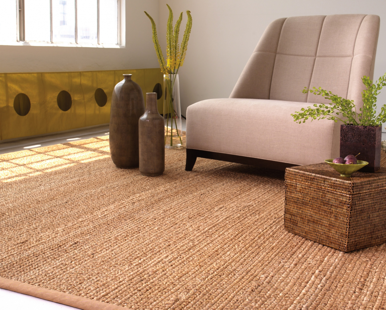
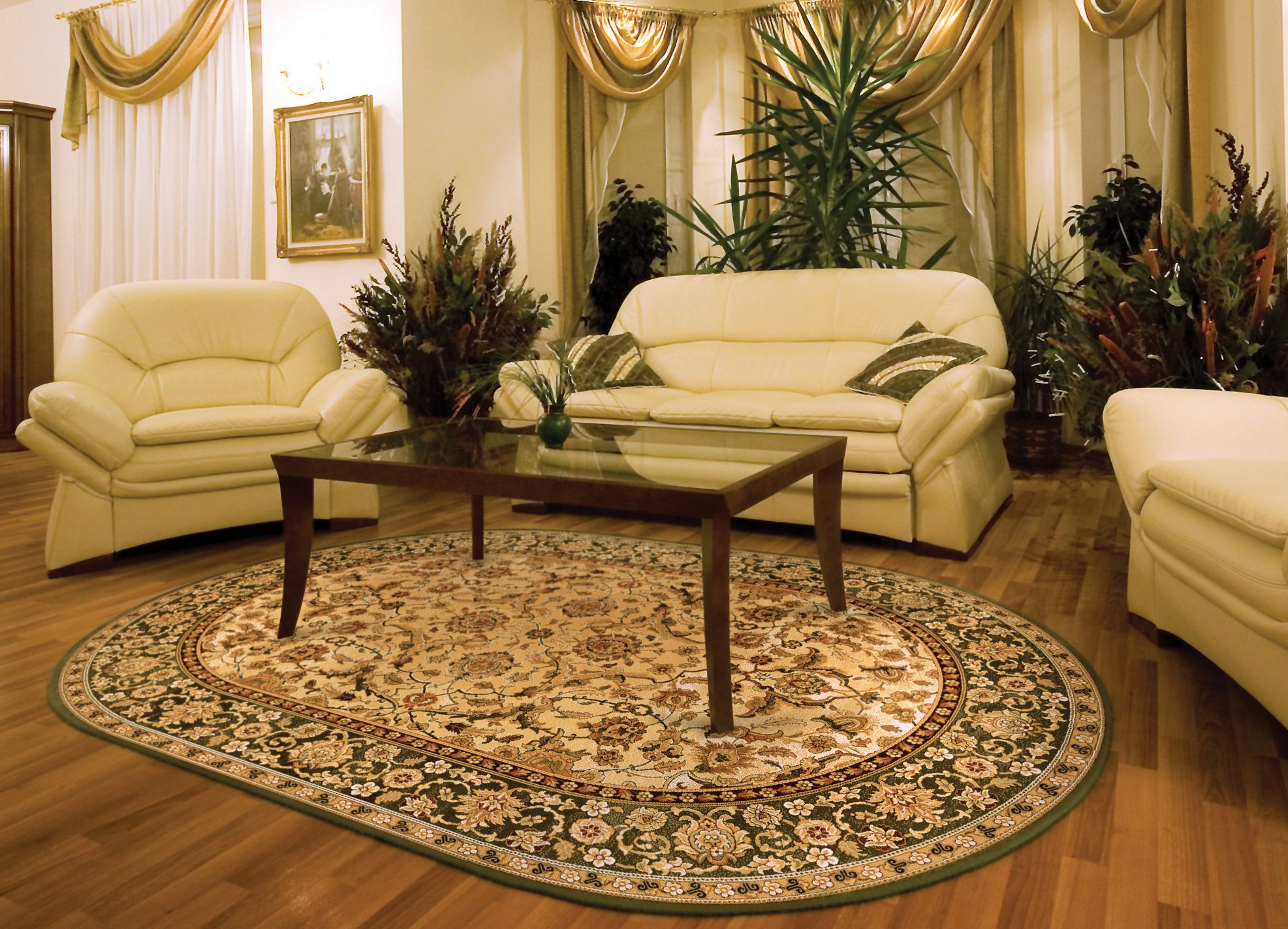
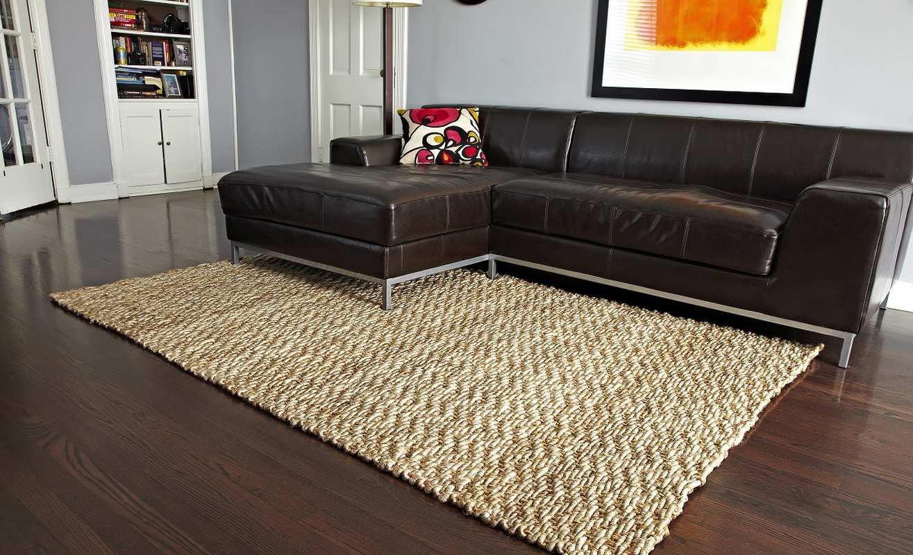
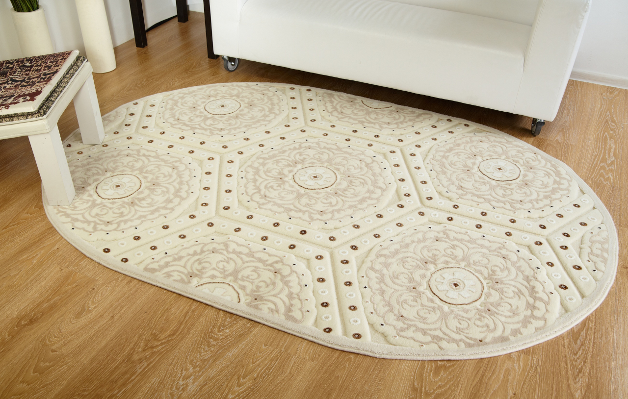
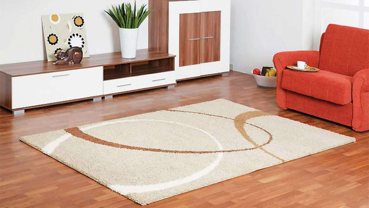
Neutral colors
Such as gray, beige and palebrown, soothe, creating a quiet, warm atmosphere. The palette of neutral shades can be used to offset other features of the room, such as bright paintings or interior objects.
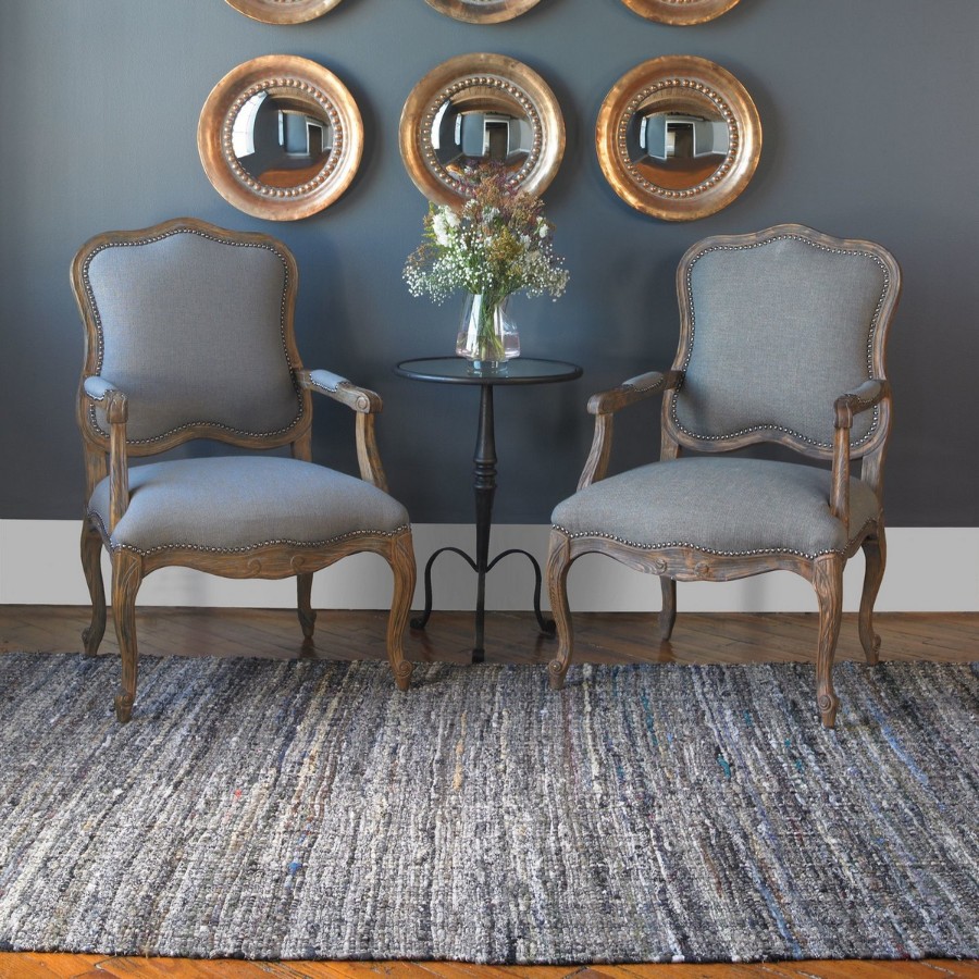
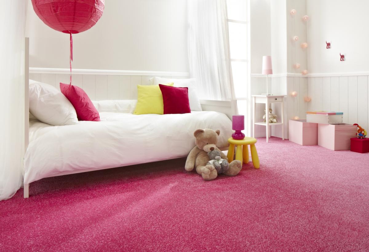
Warm gray carpet atmosphere
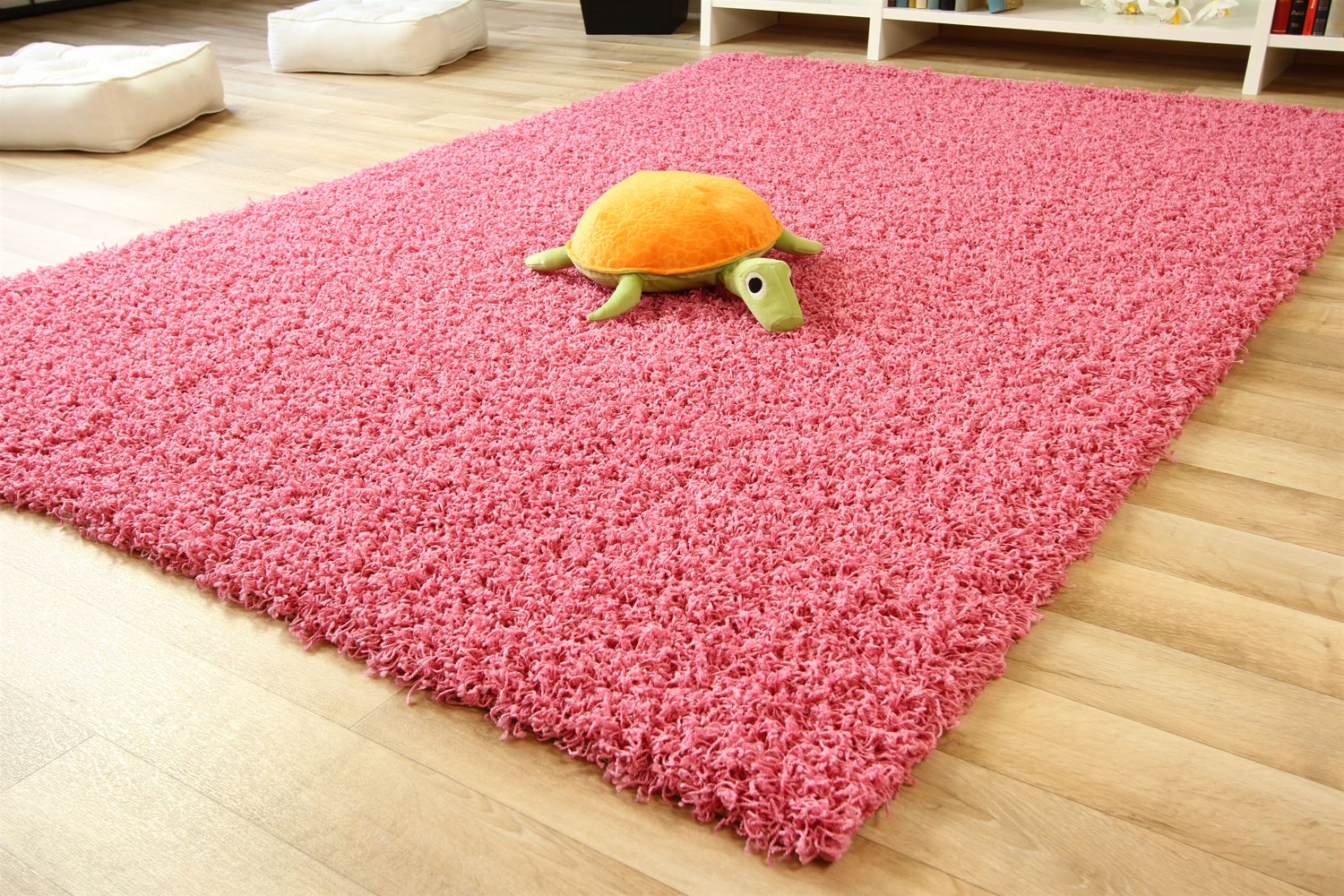
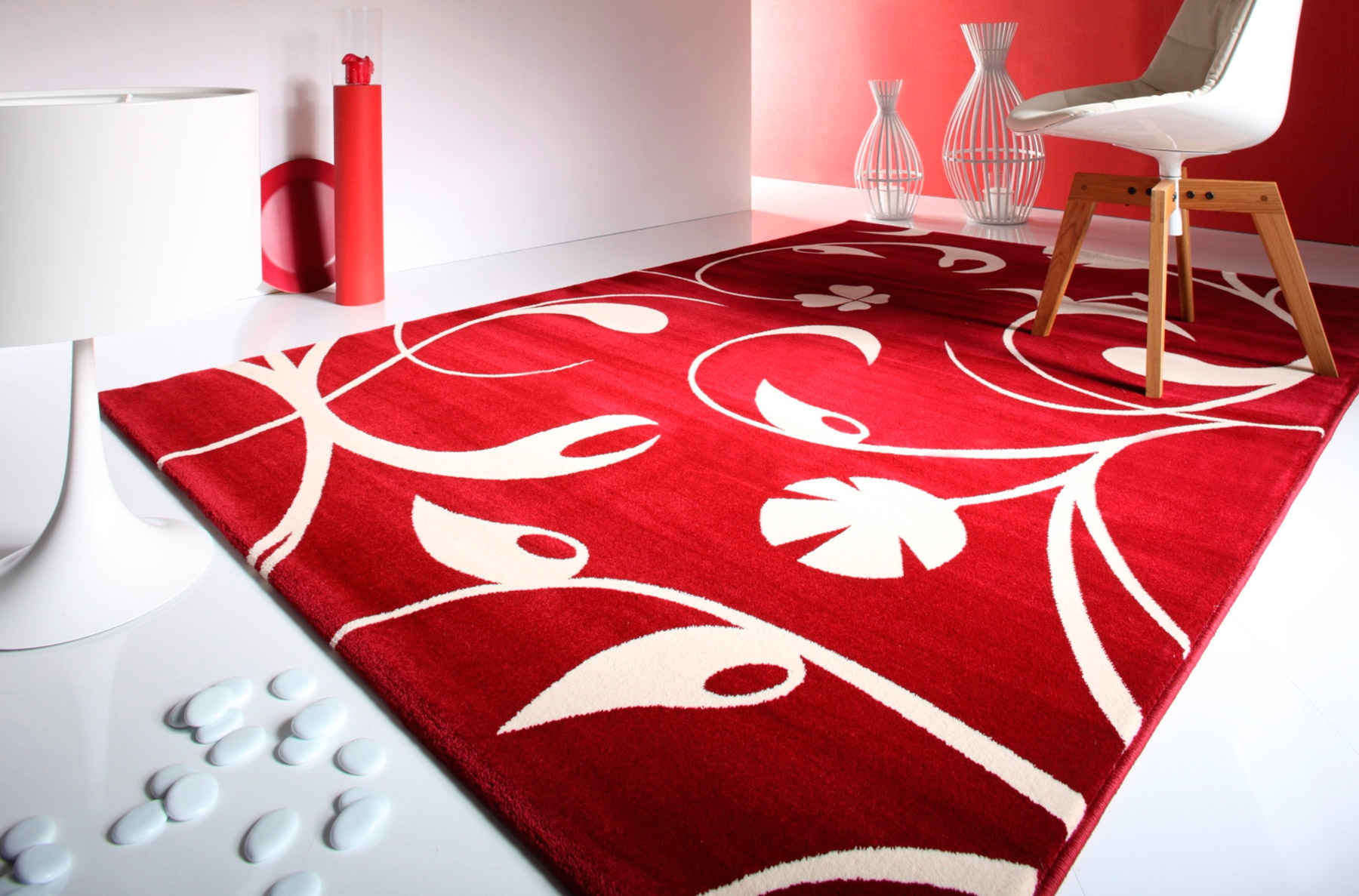
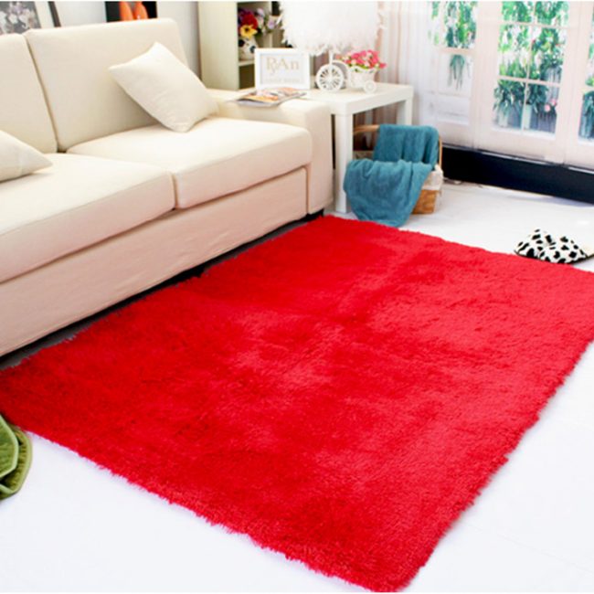
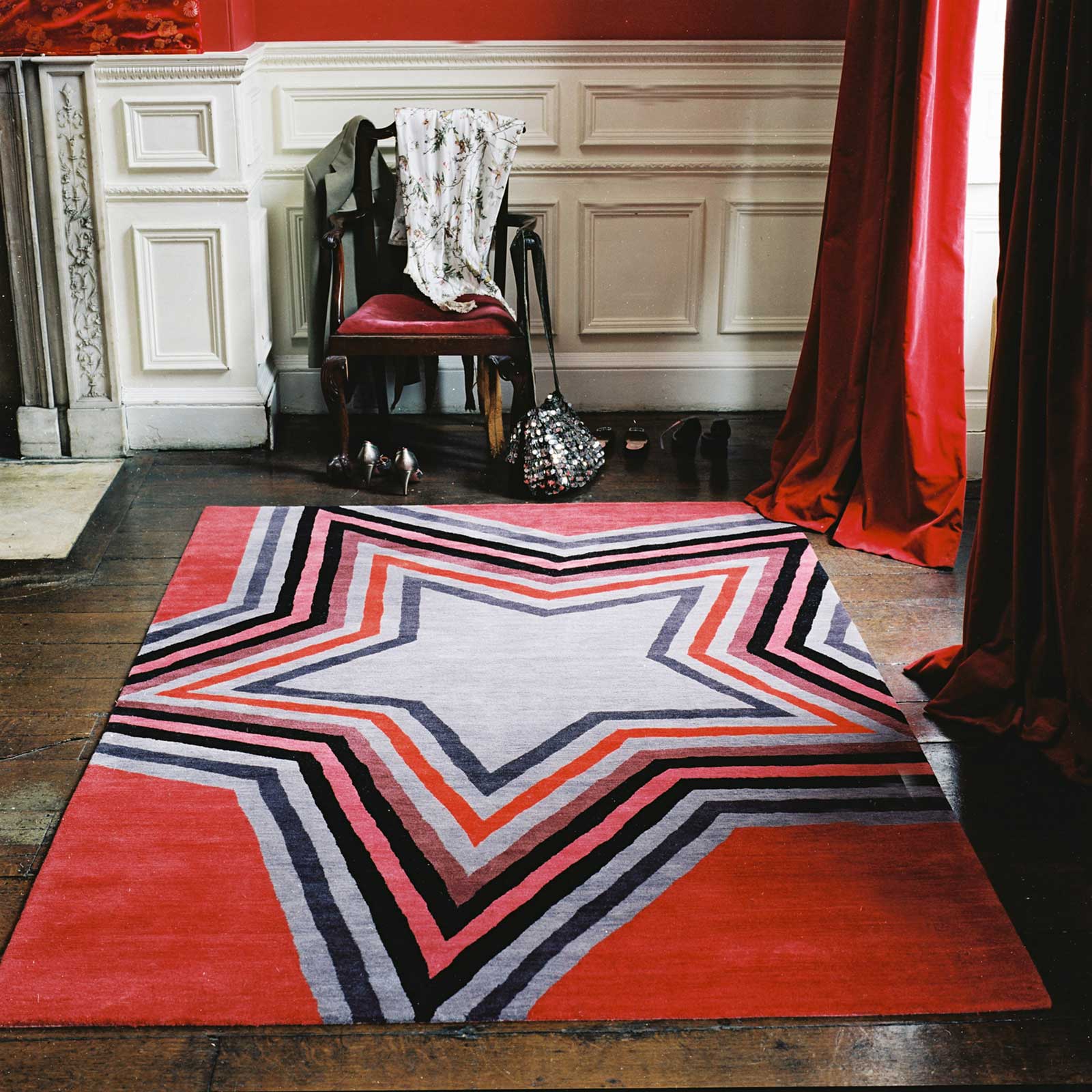
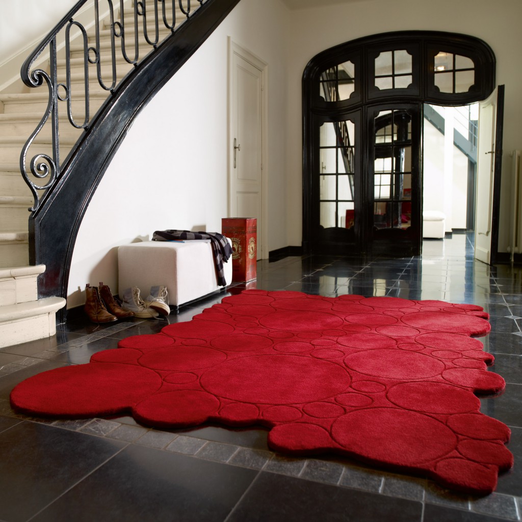
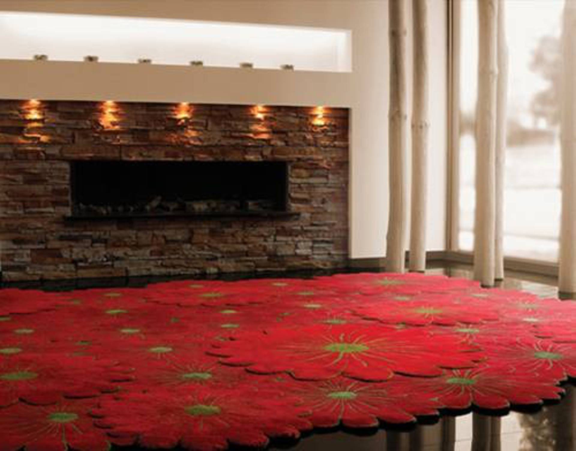
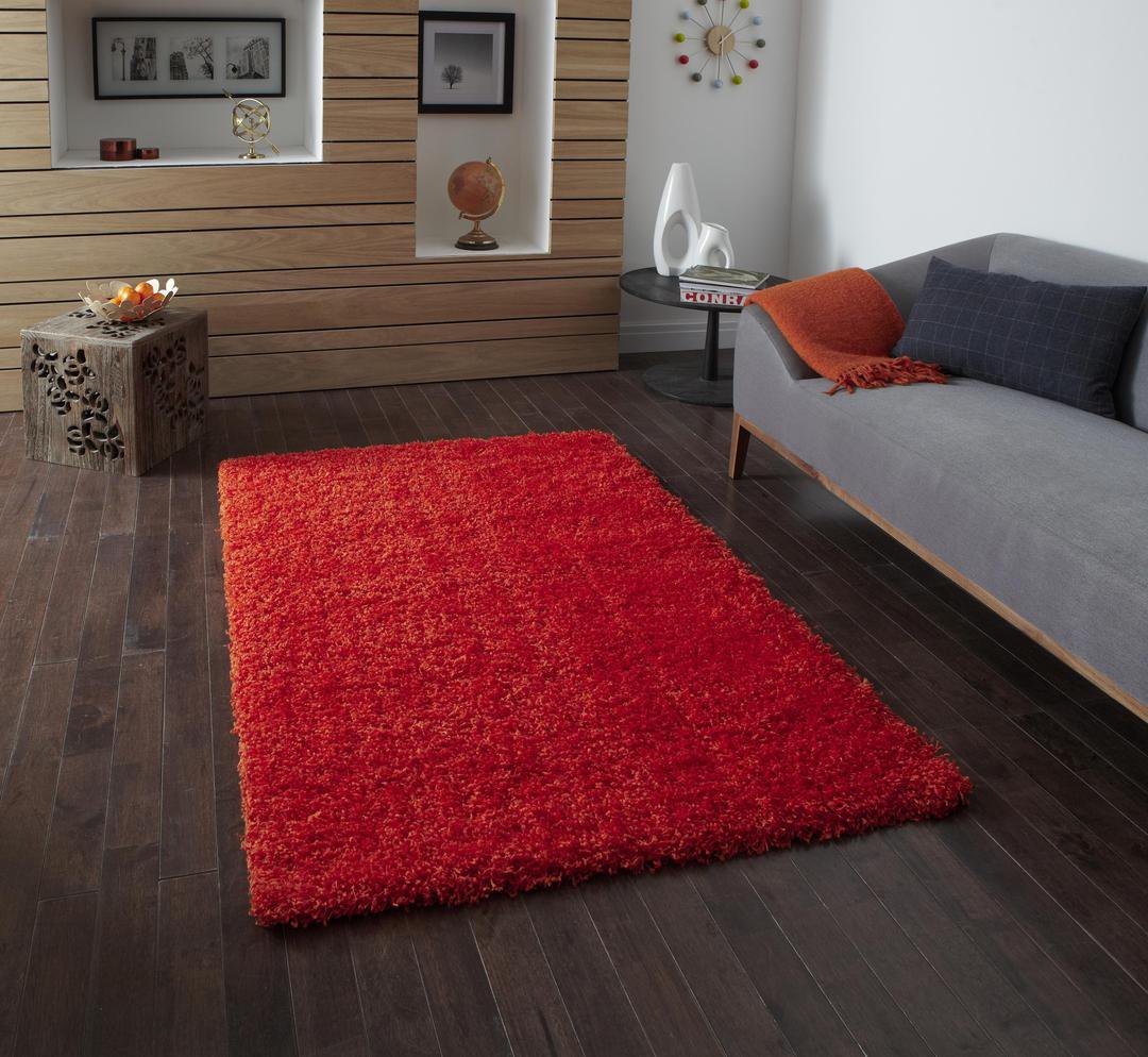
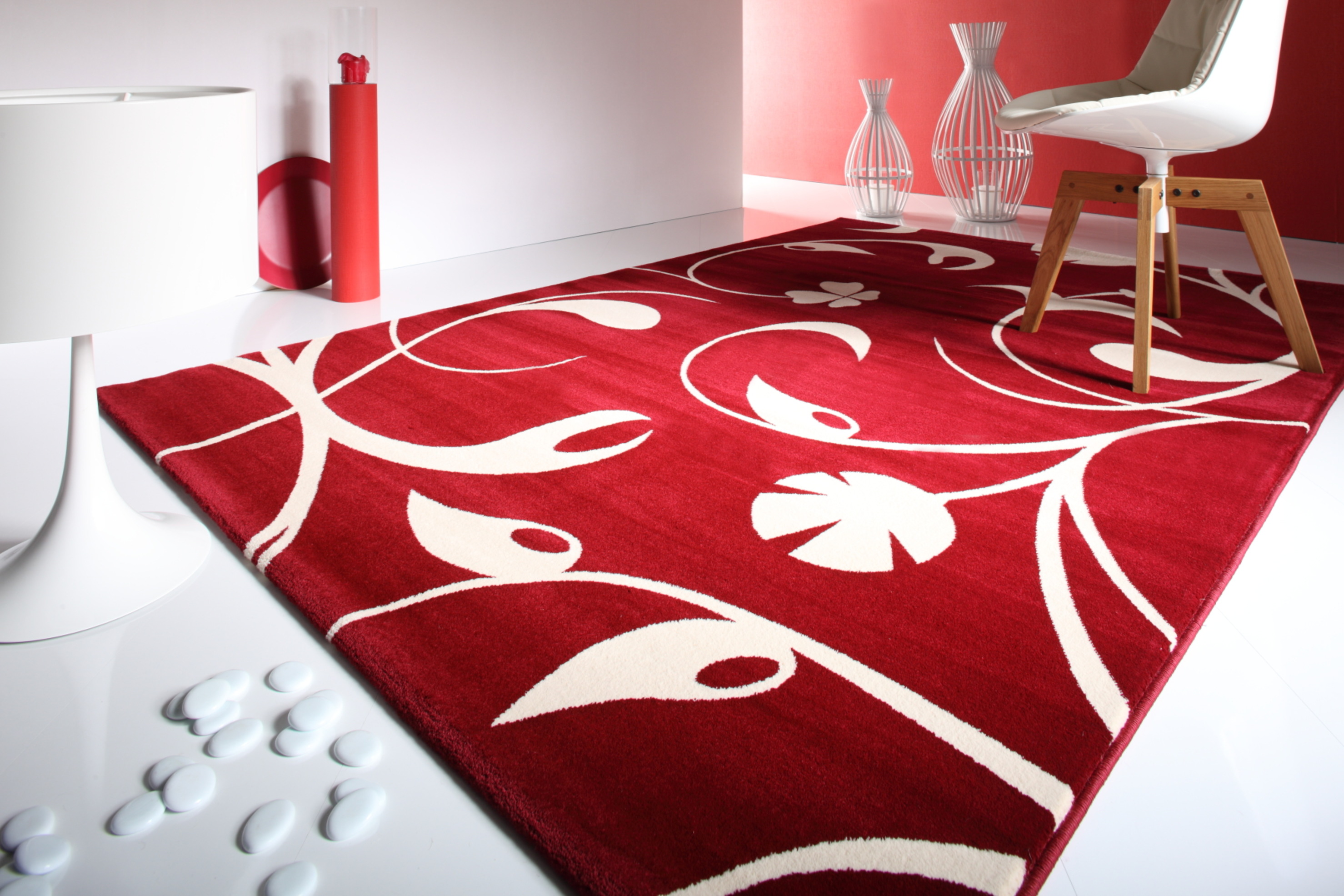
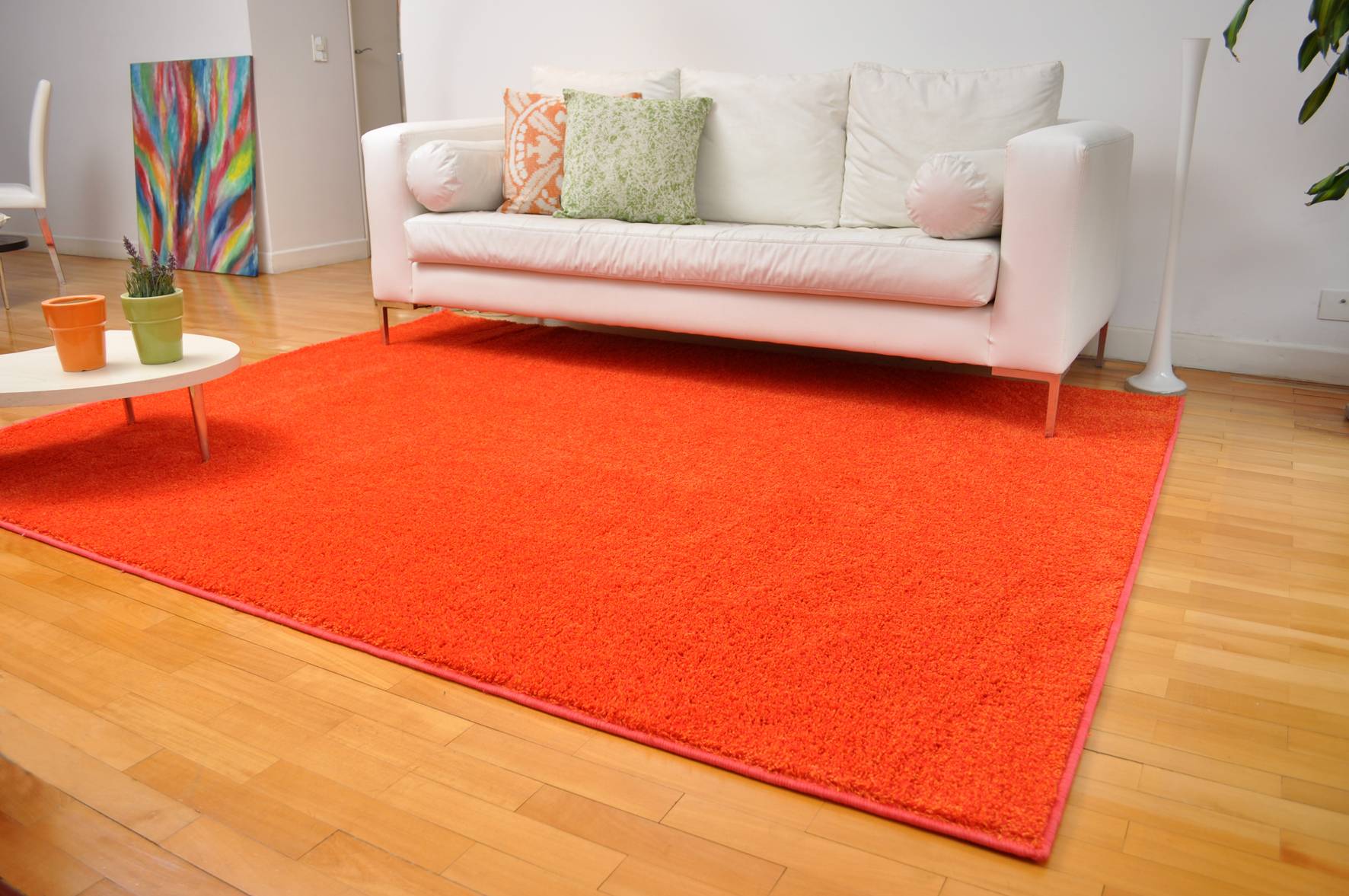
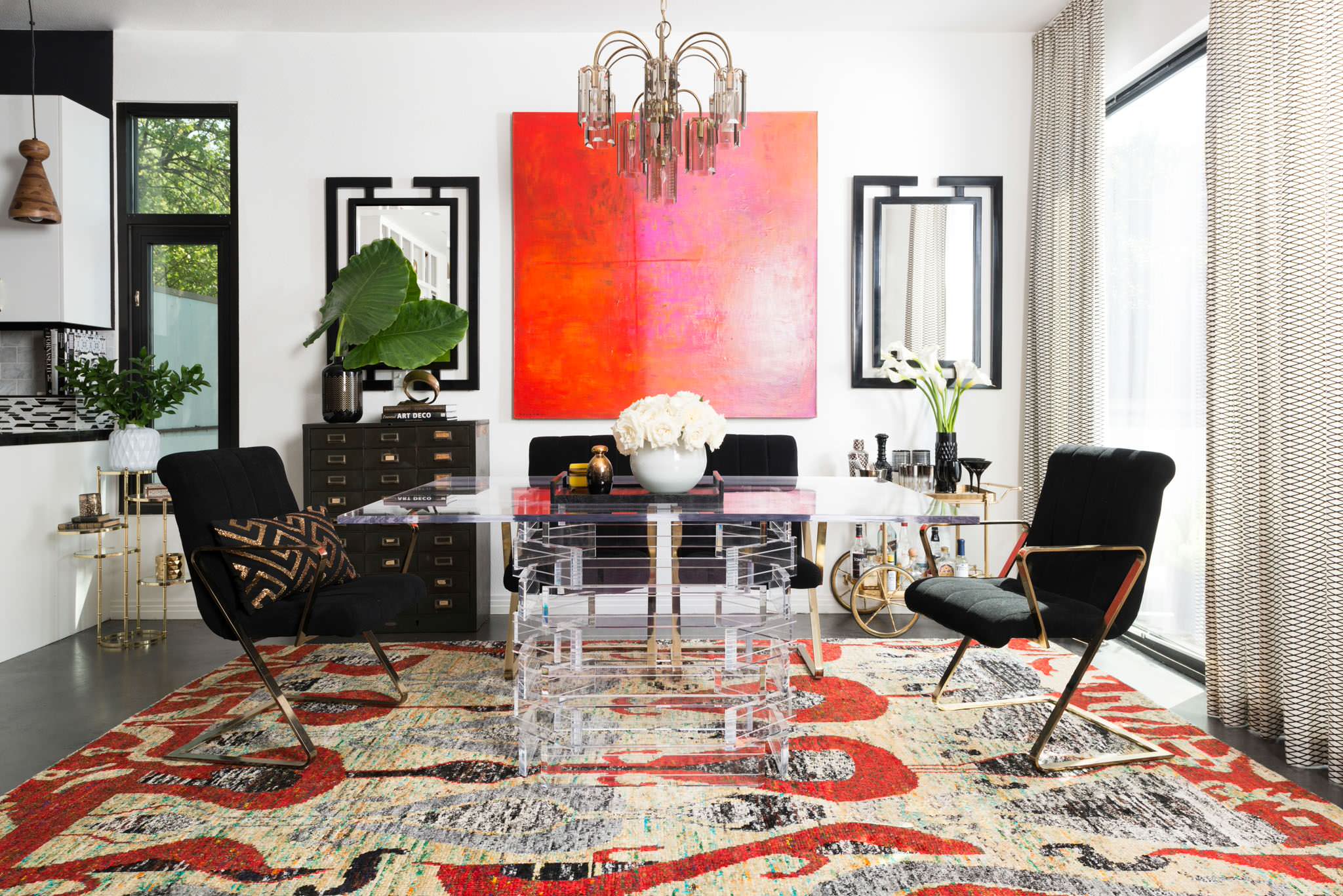
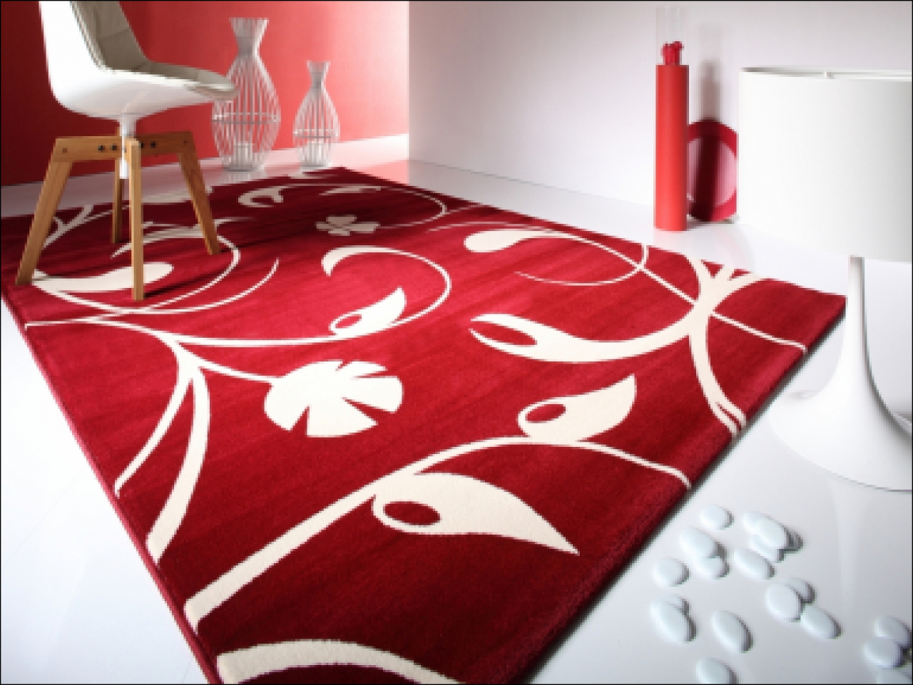
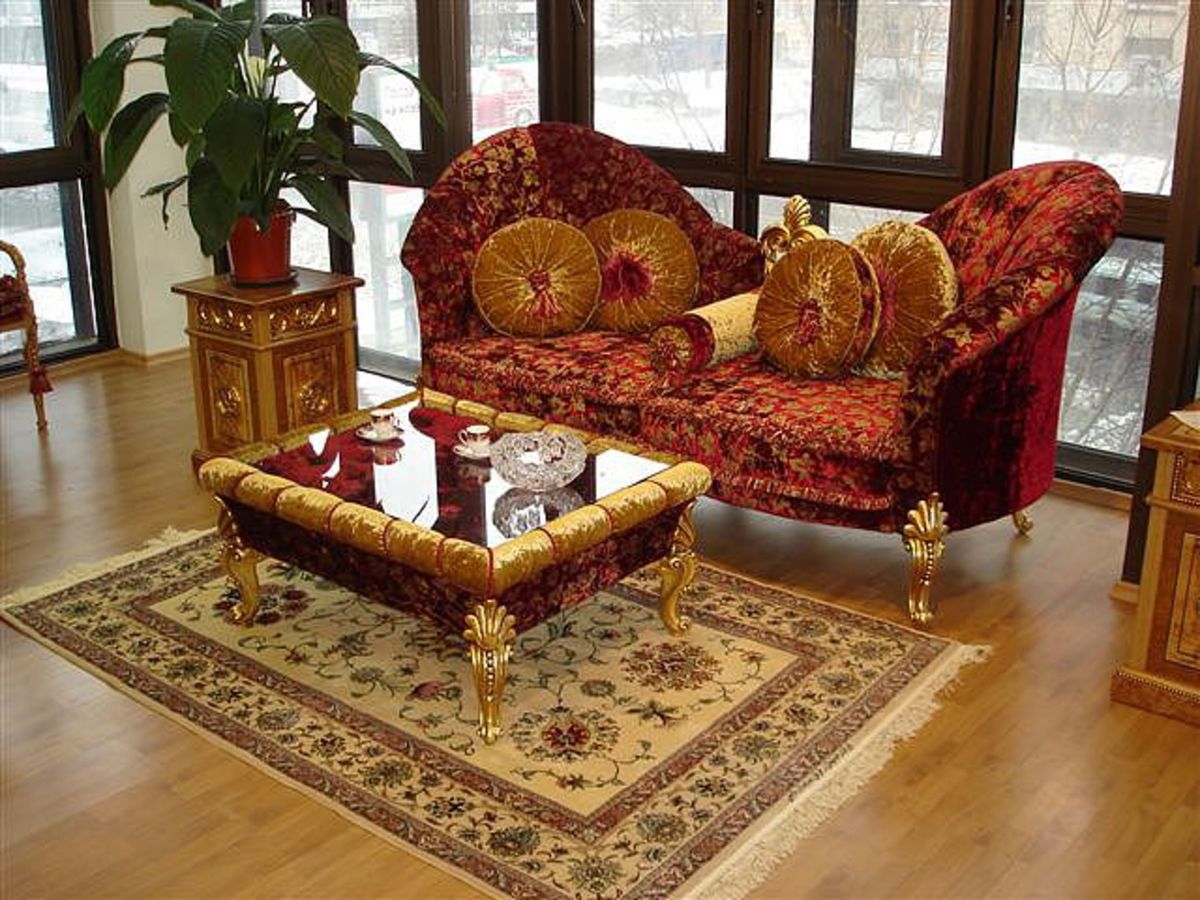
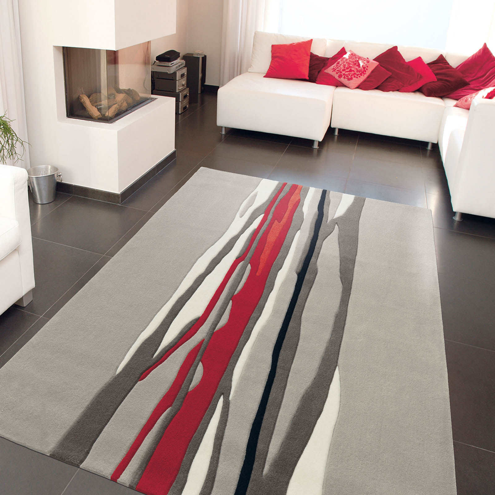
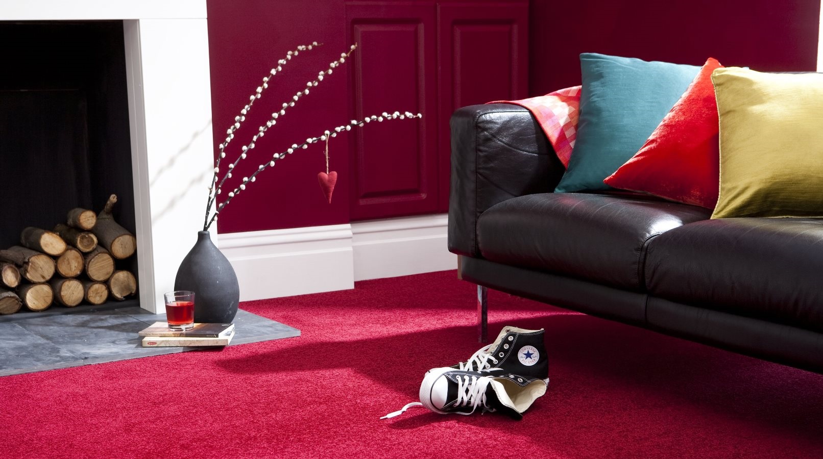
Red
The color of fire - rich, warm and lively. It has pleasant qualities, but may be overly stimulating if it is used for large areas in frequently used rooms. Because red stimulates the appetite, it is a traditional choice for diners.
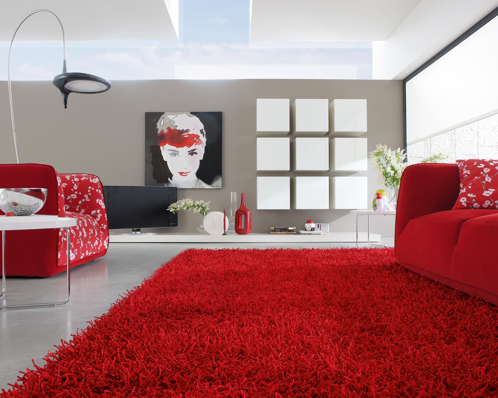
Not everyone will choose a bright accent in the room.
Only by fully studying the color in a particular house, you can really be confident in the correctness of the choice. The look of your carpet is affected by the color of the other furniture in the room, as well as the amount of natural light.
Artificial light tends to "gray" colors, so check samples for daylight as well as for nighttime lighting.
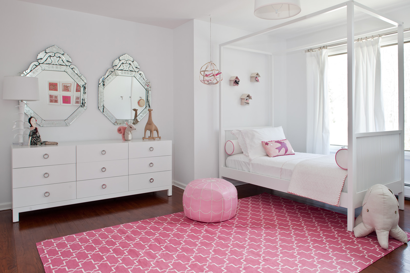
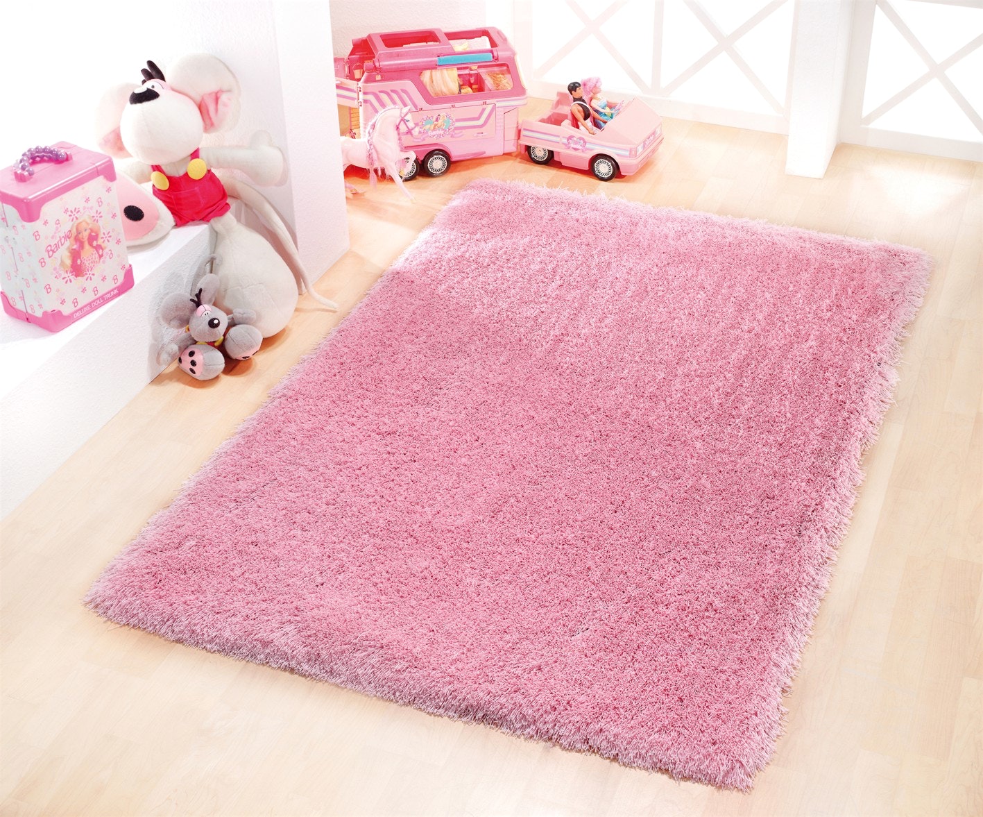
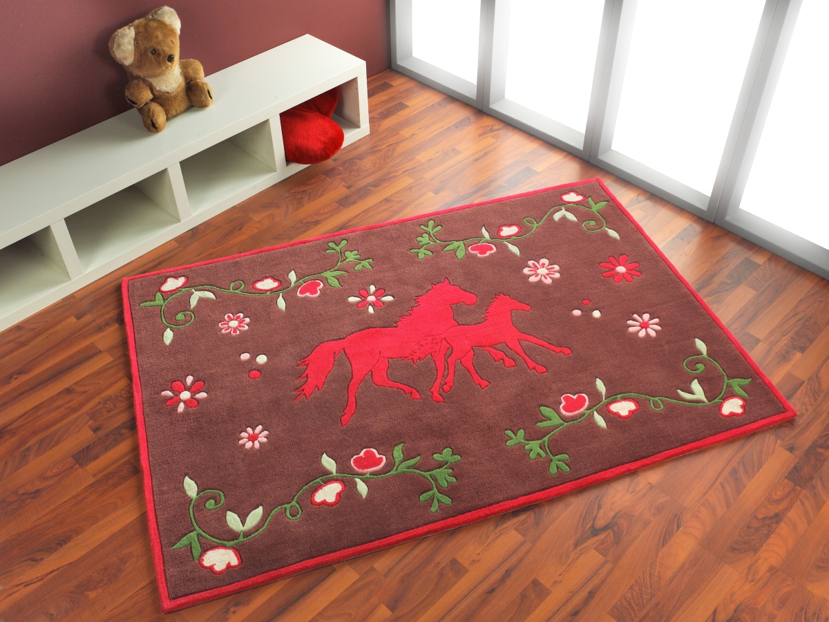
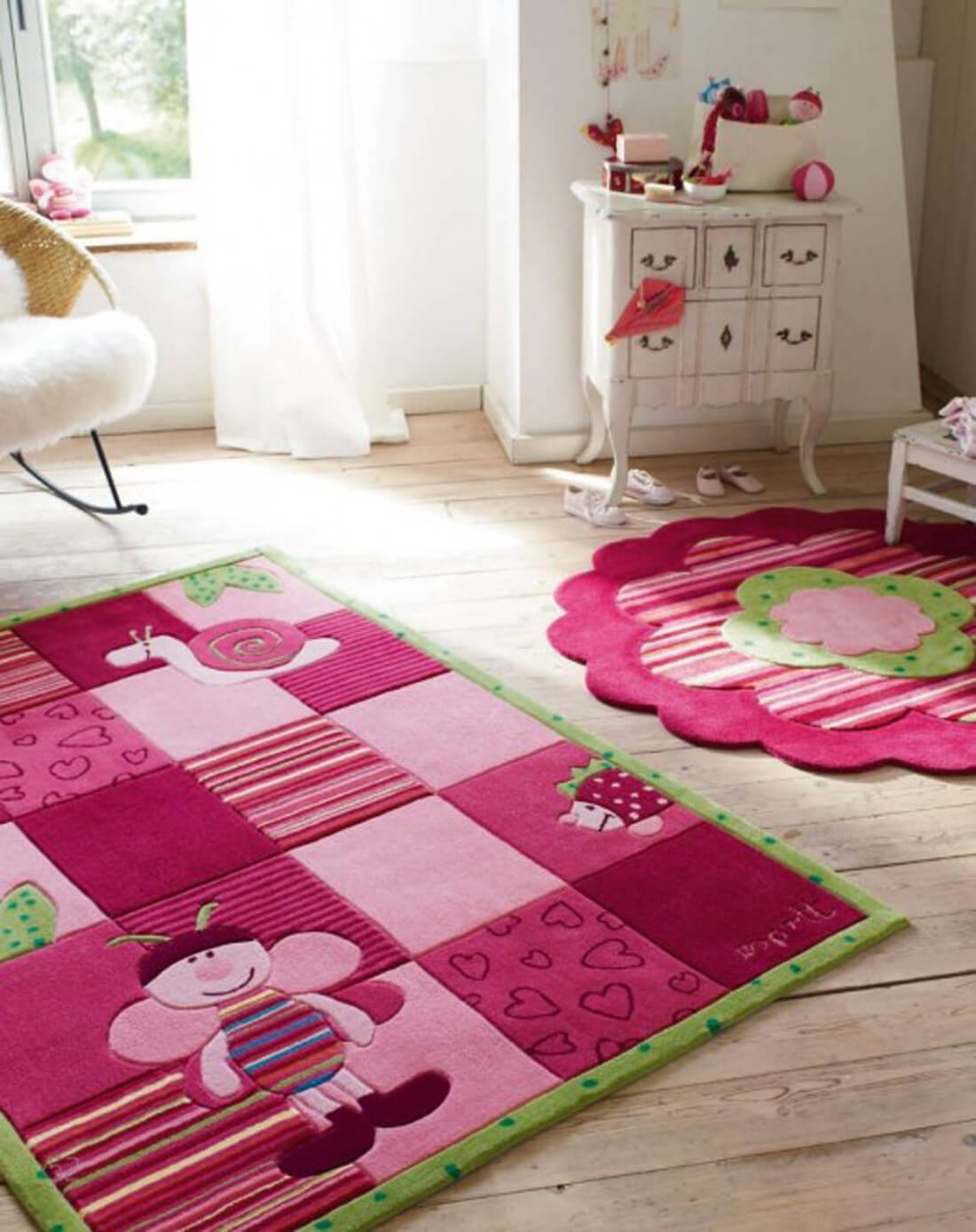
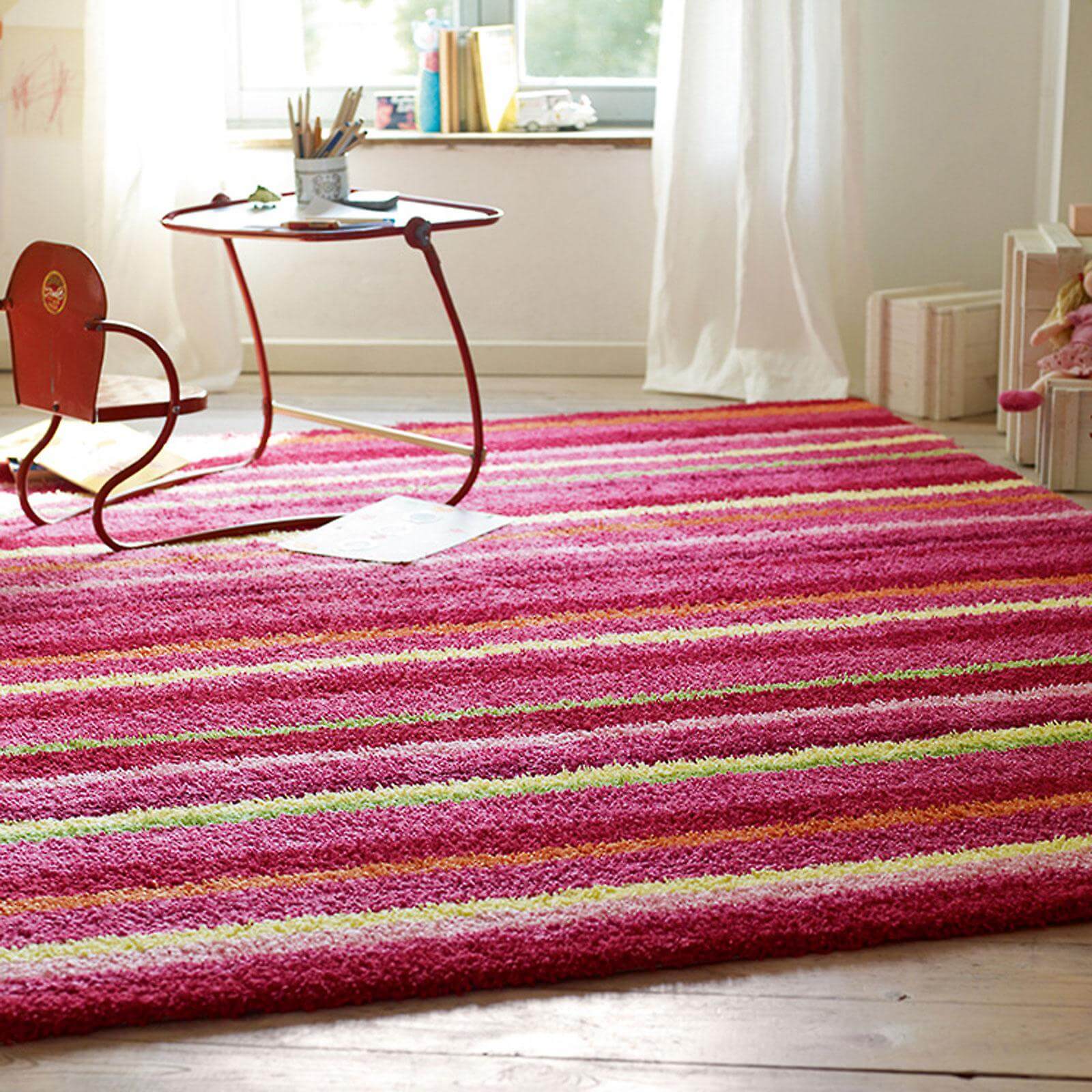
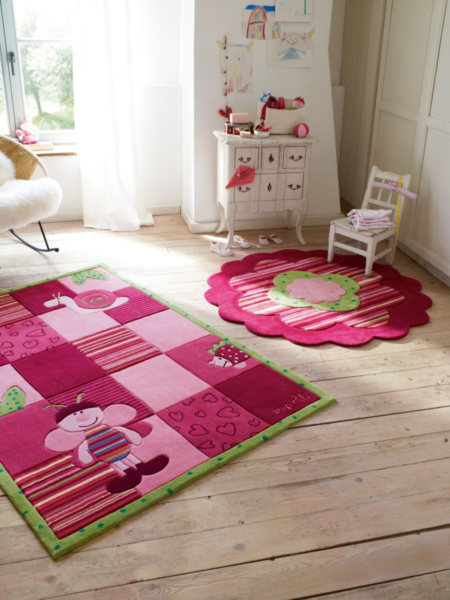
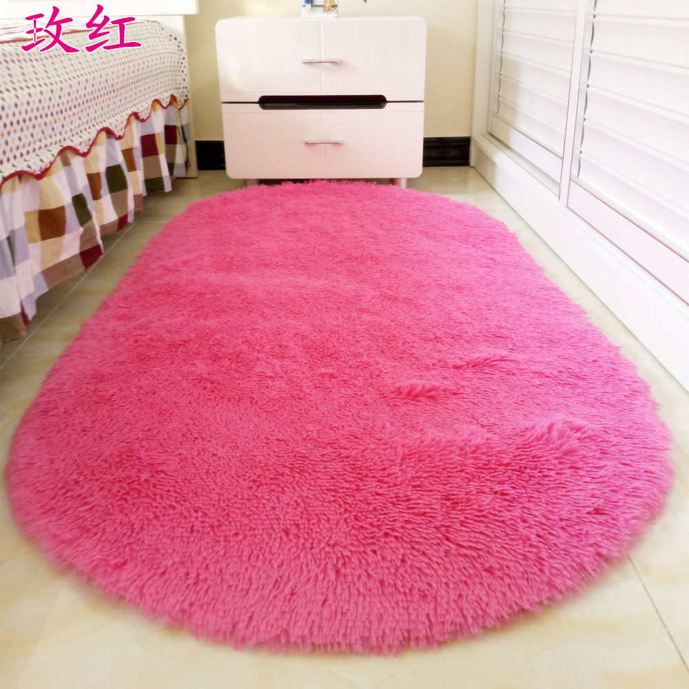
Looks great in the room for the girl.
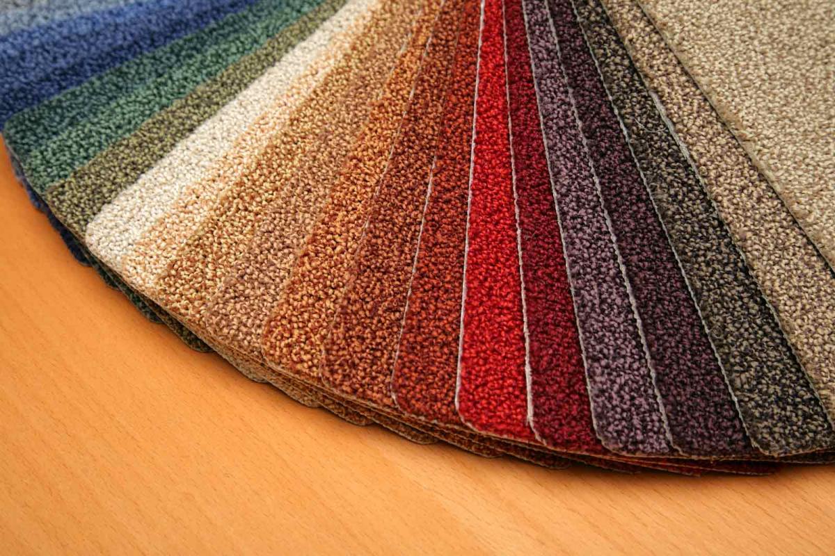
Selecting slowly, using color swatches
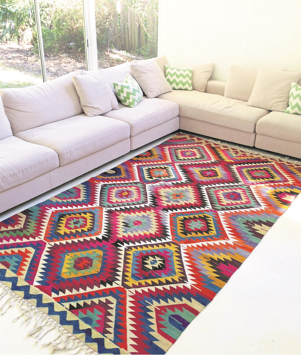
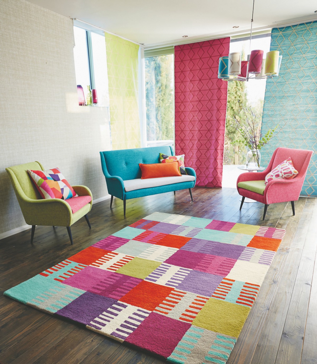
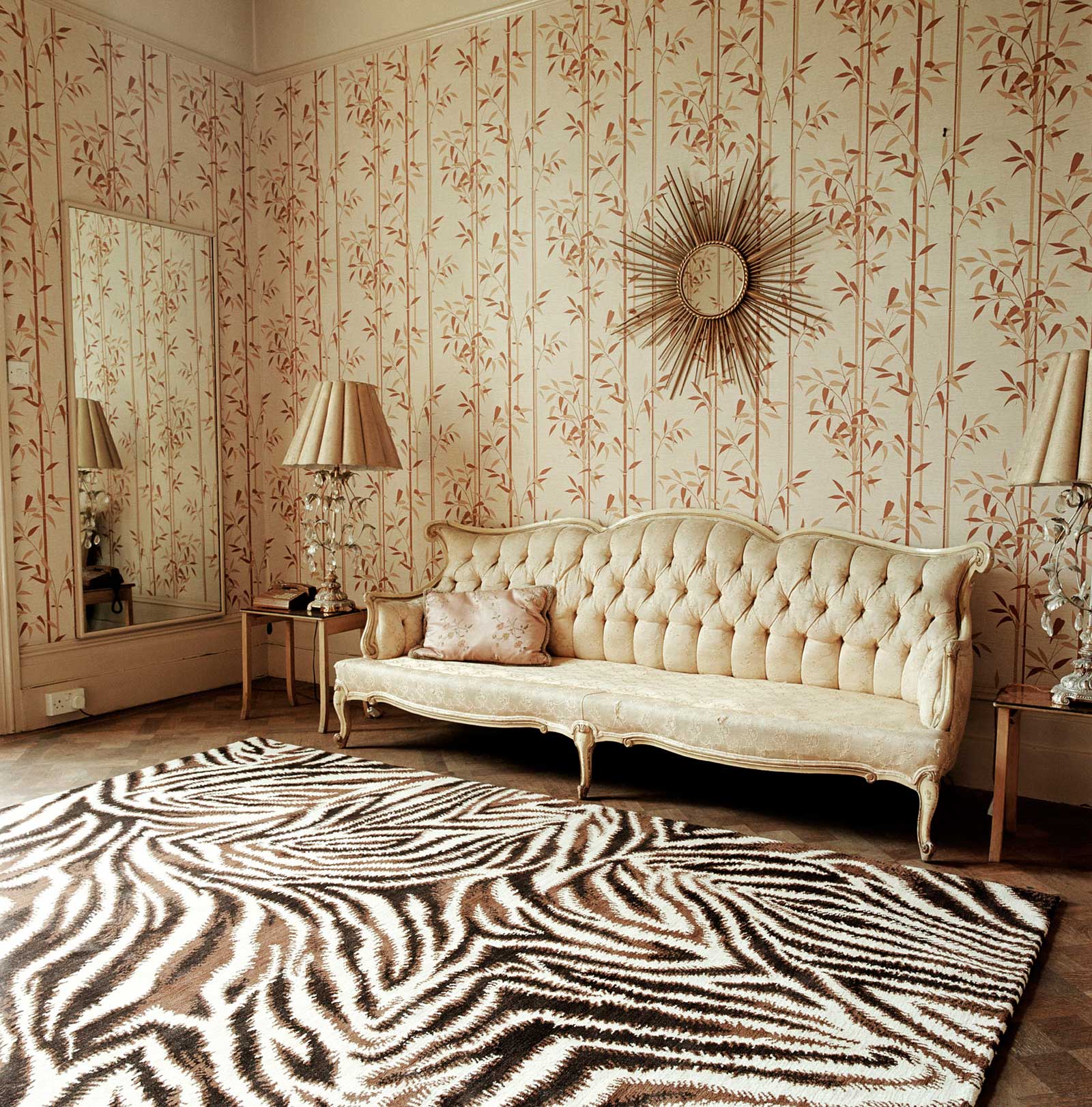
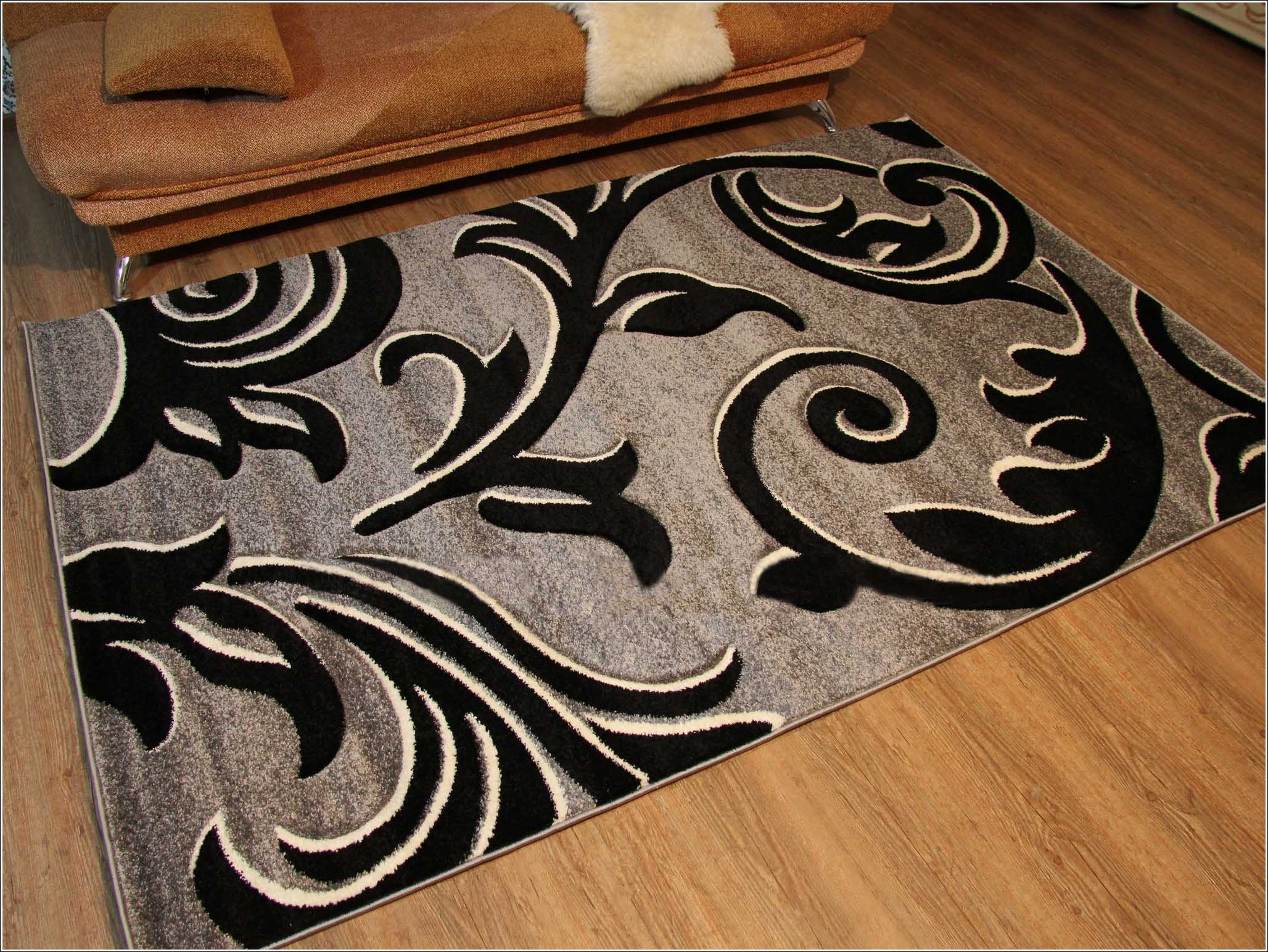
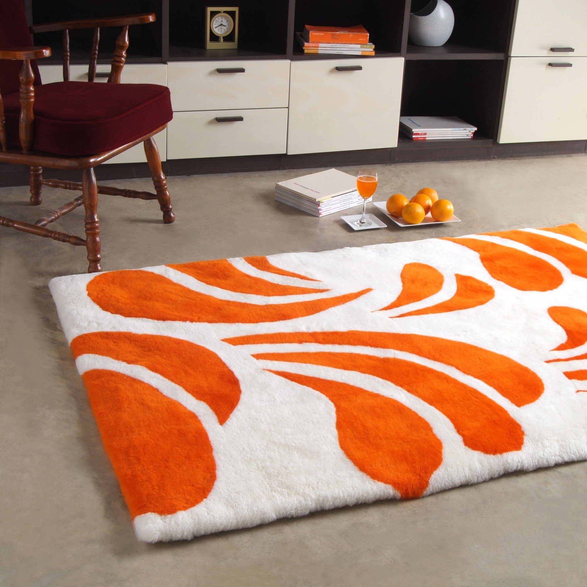
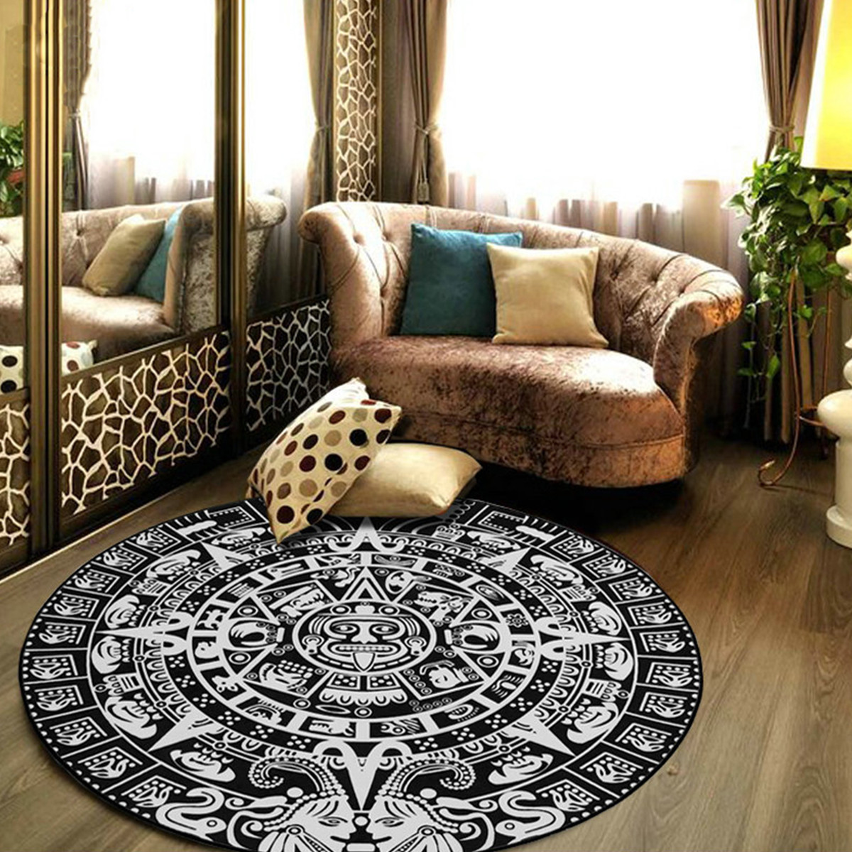
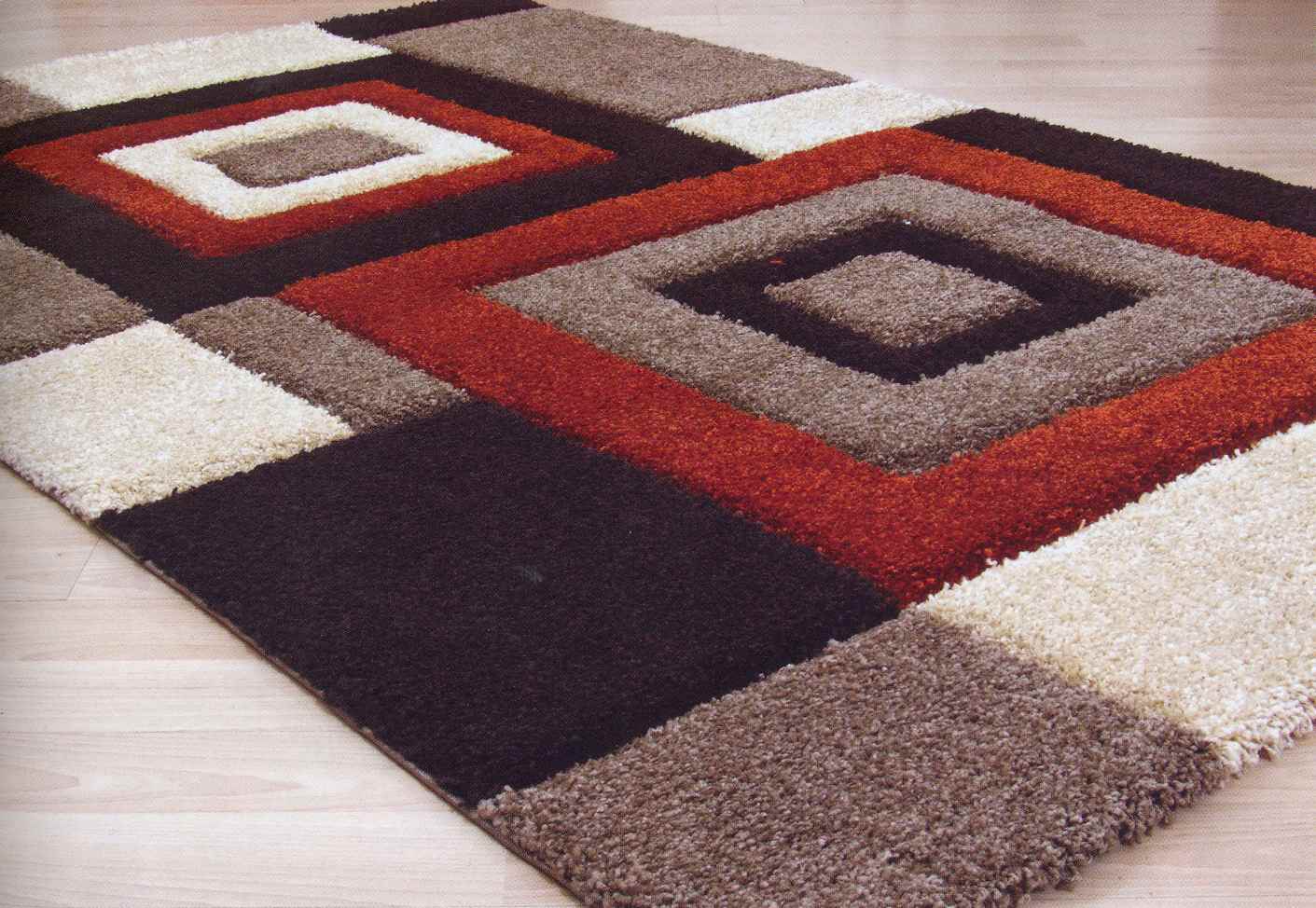
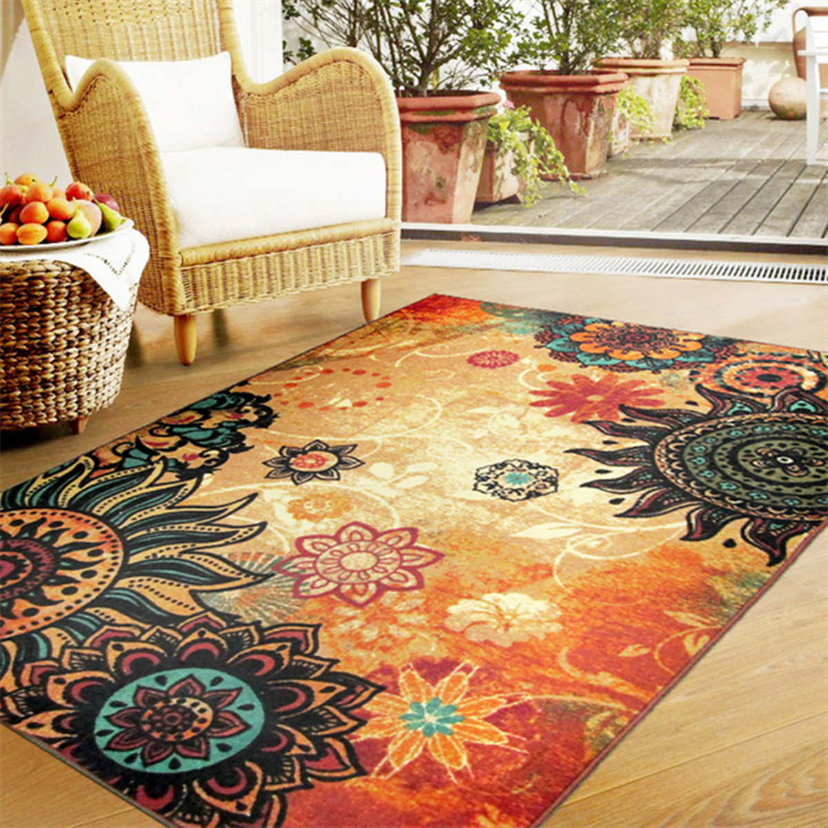
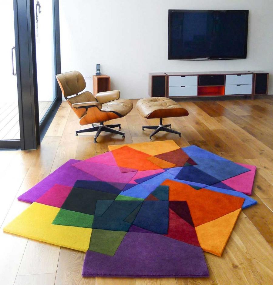
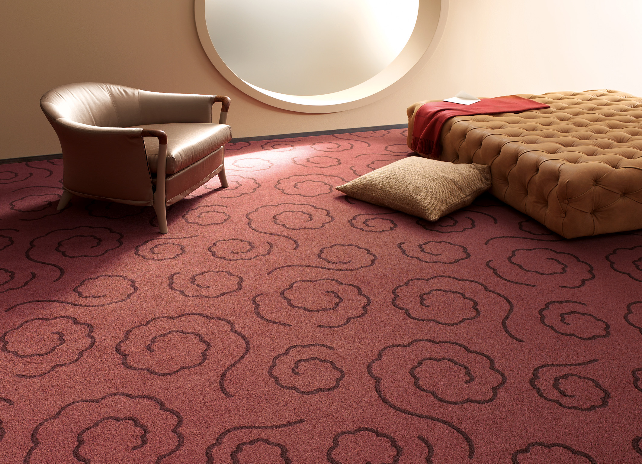
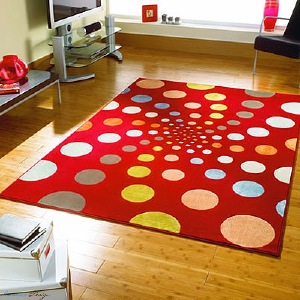
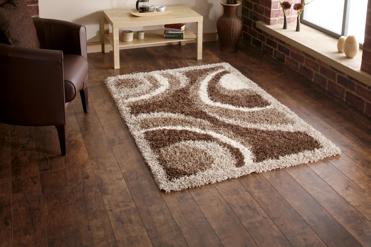
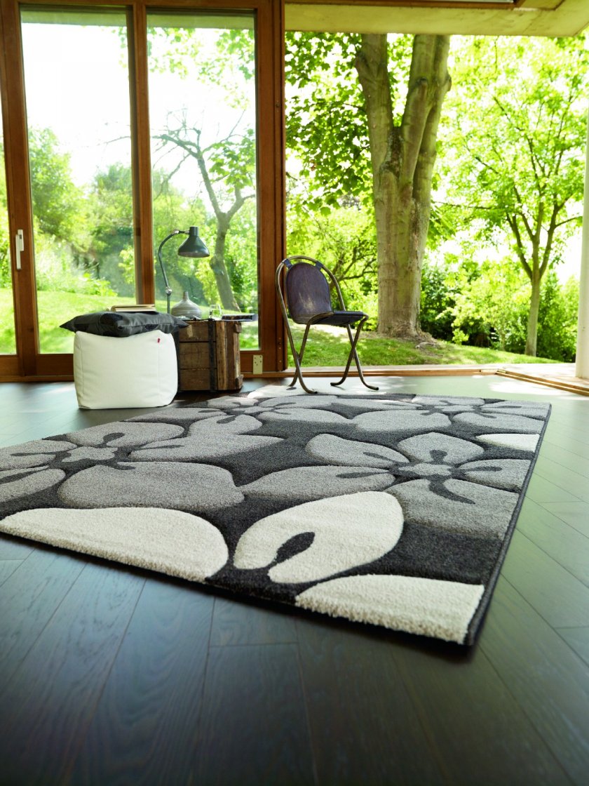
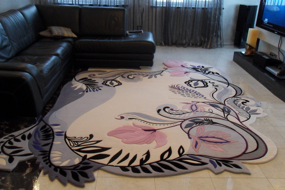
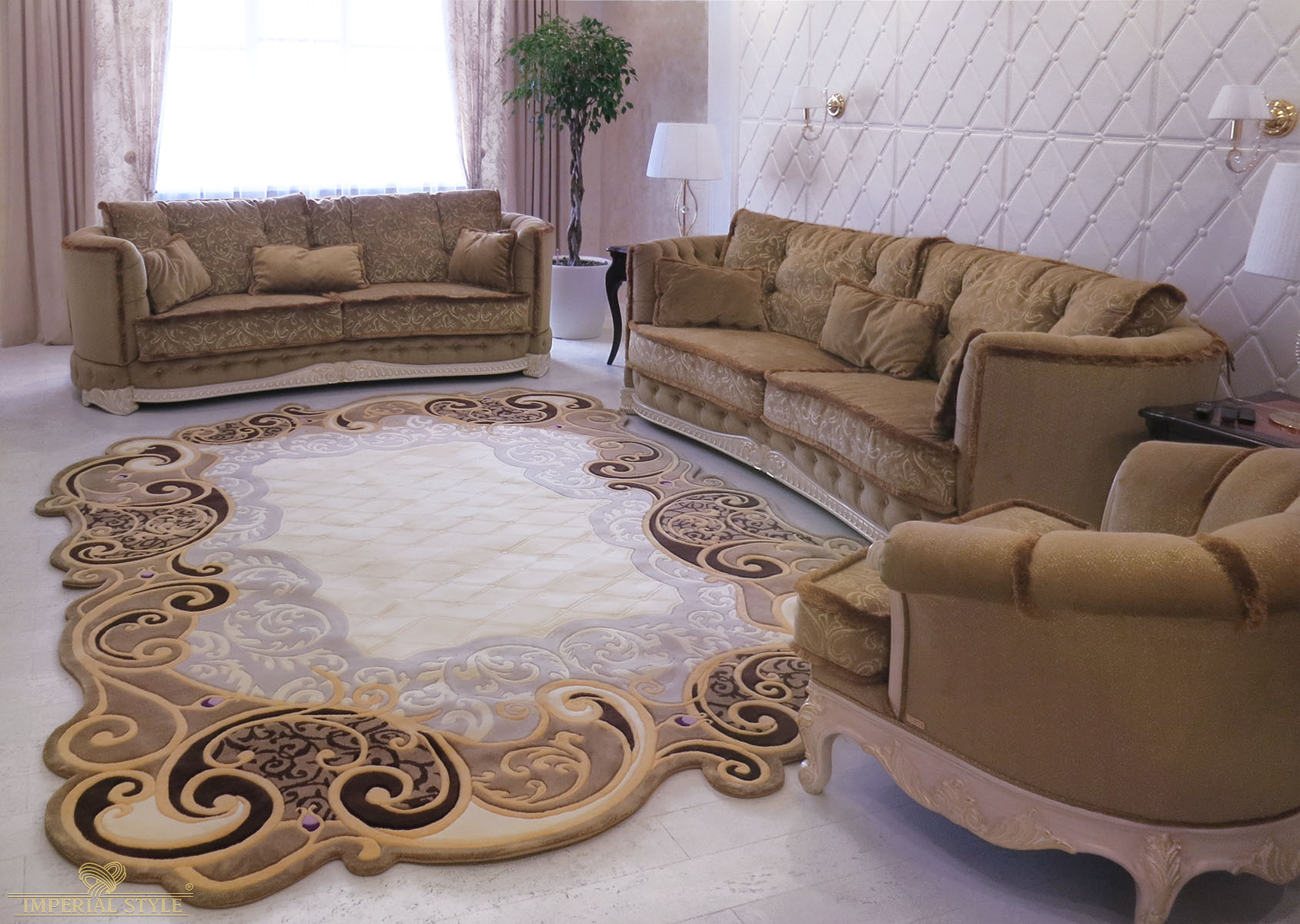
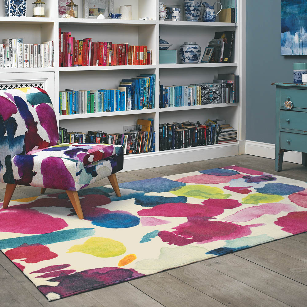
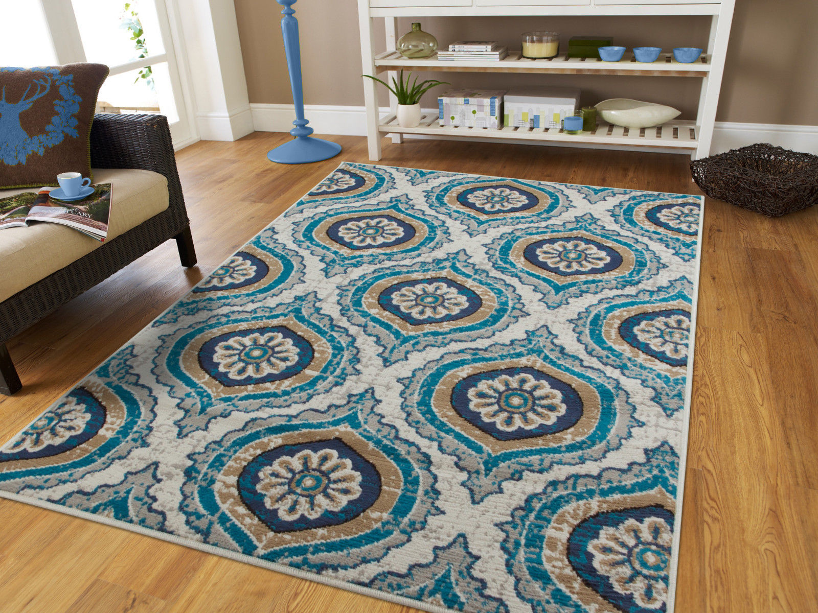
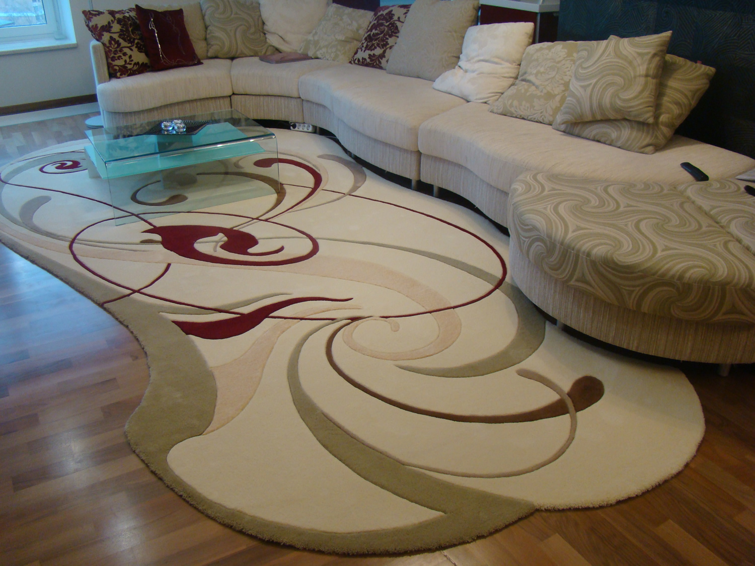
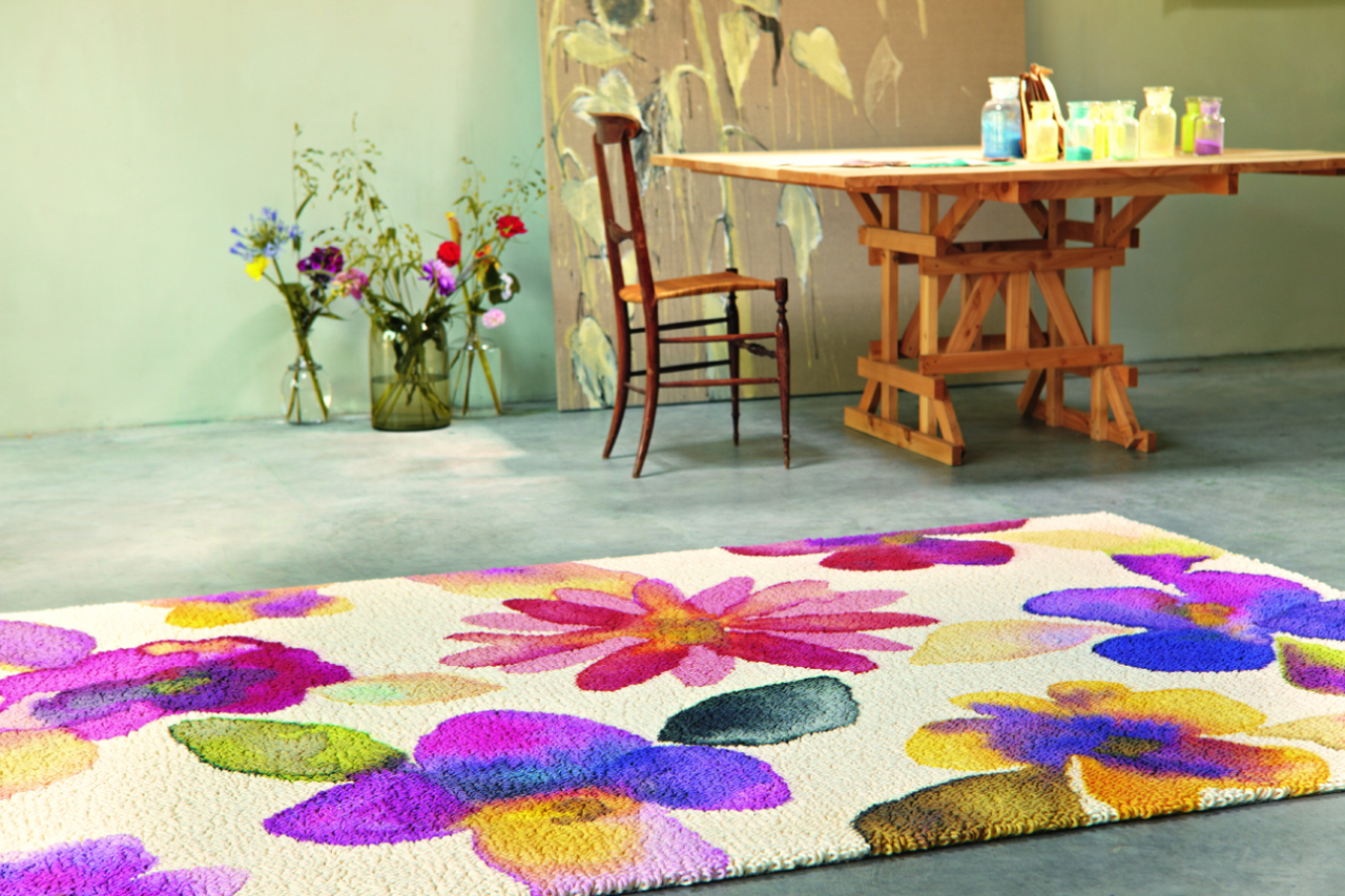
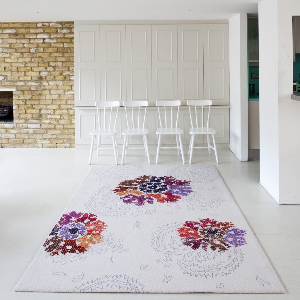
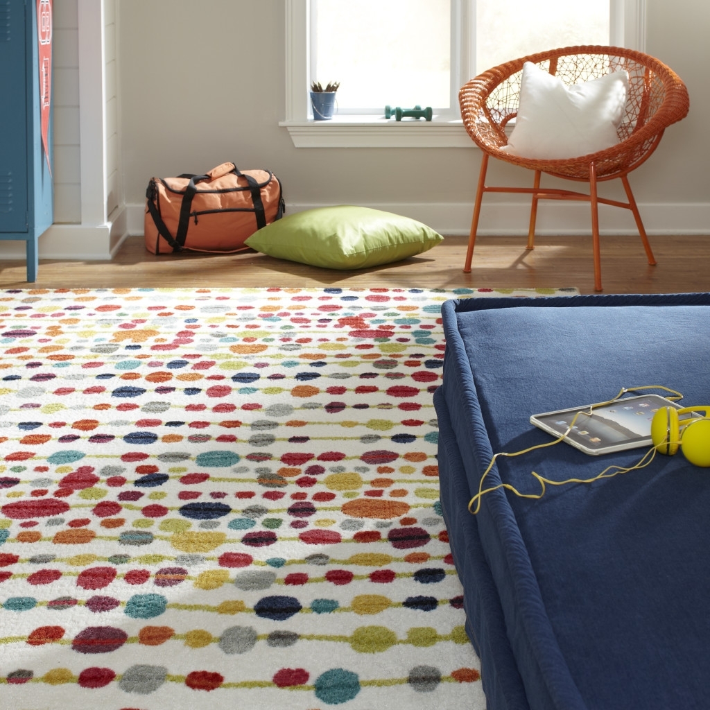
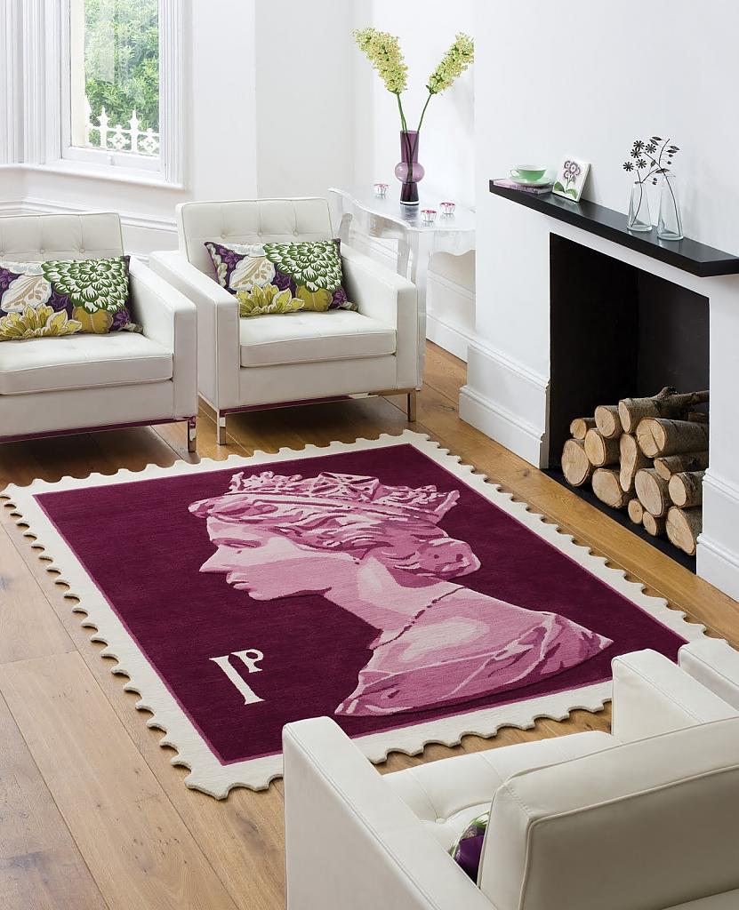
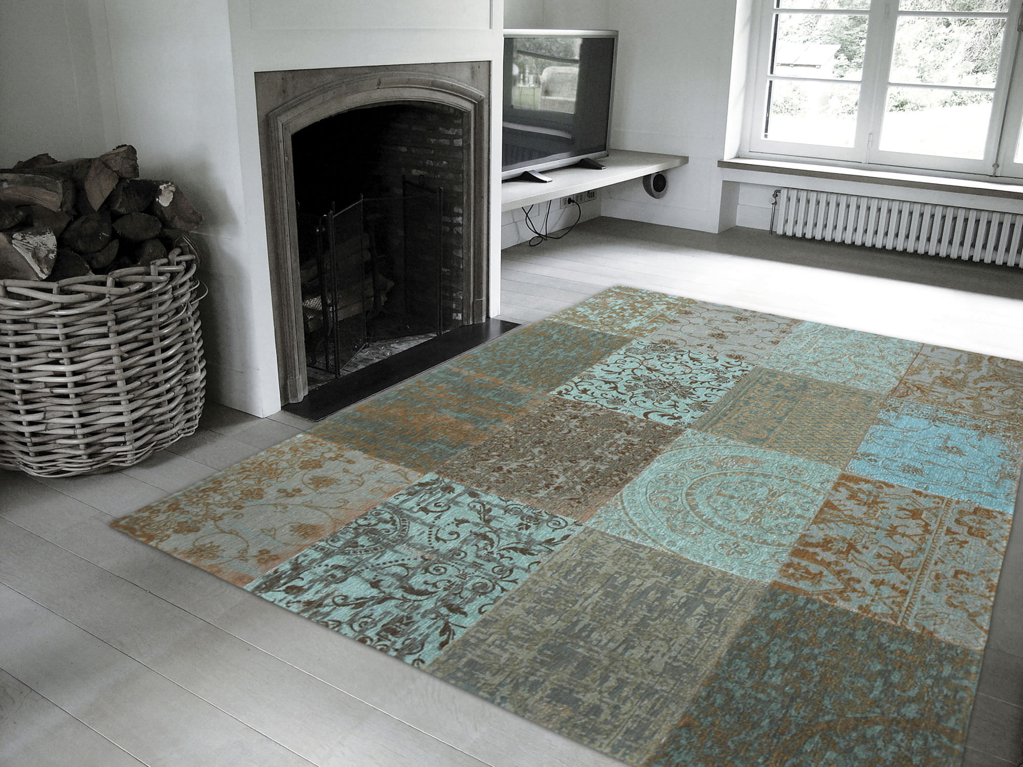
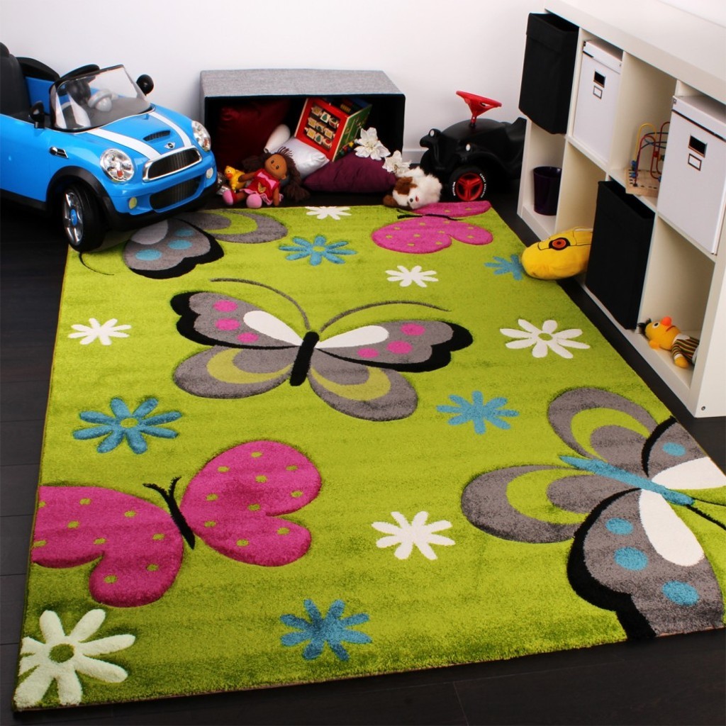
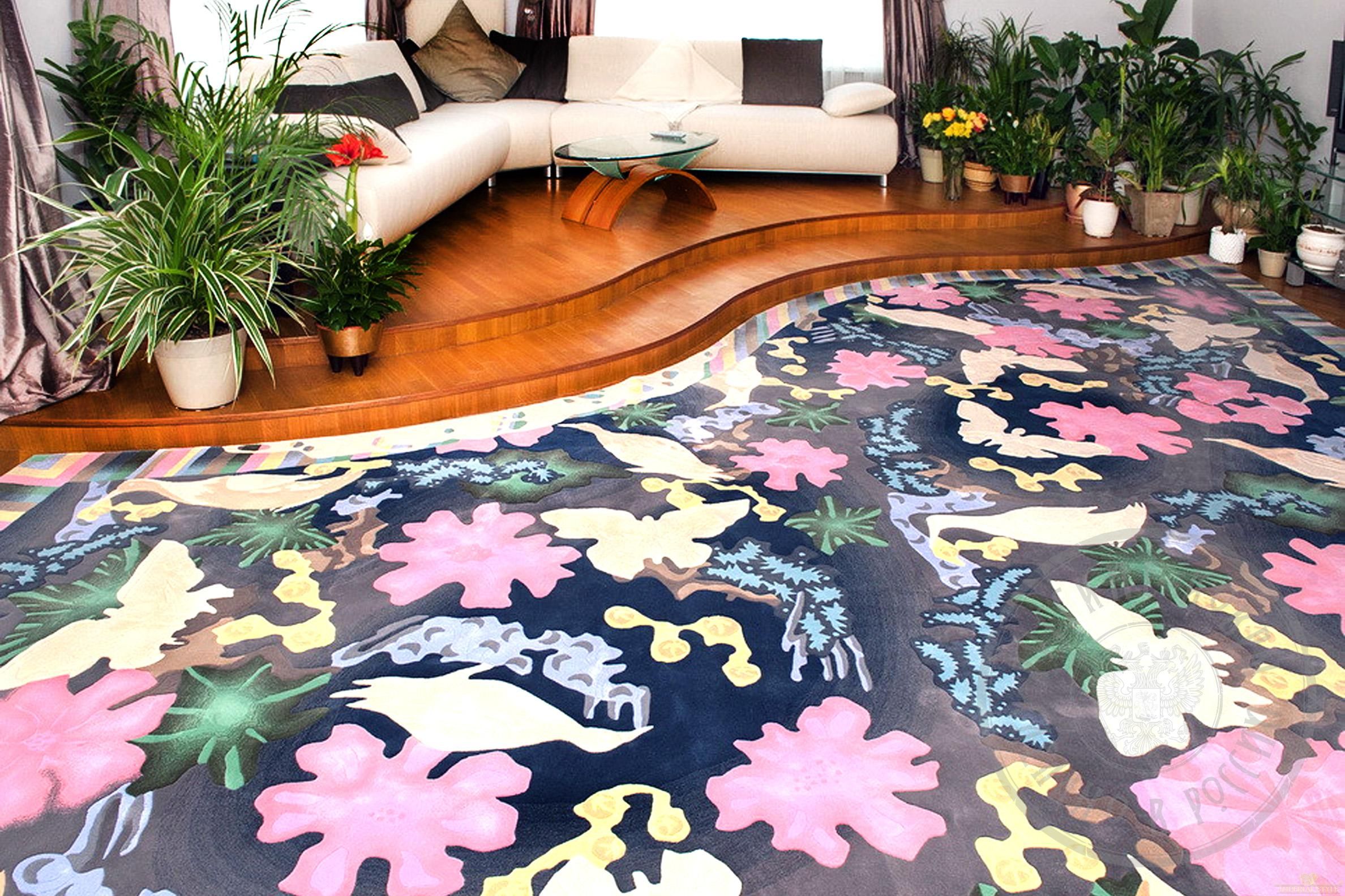
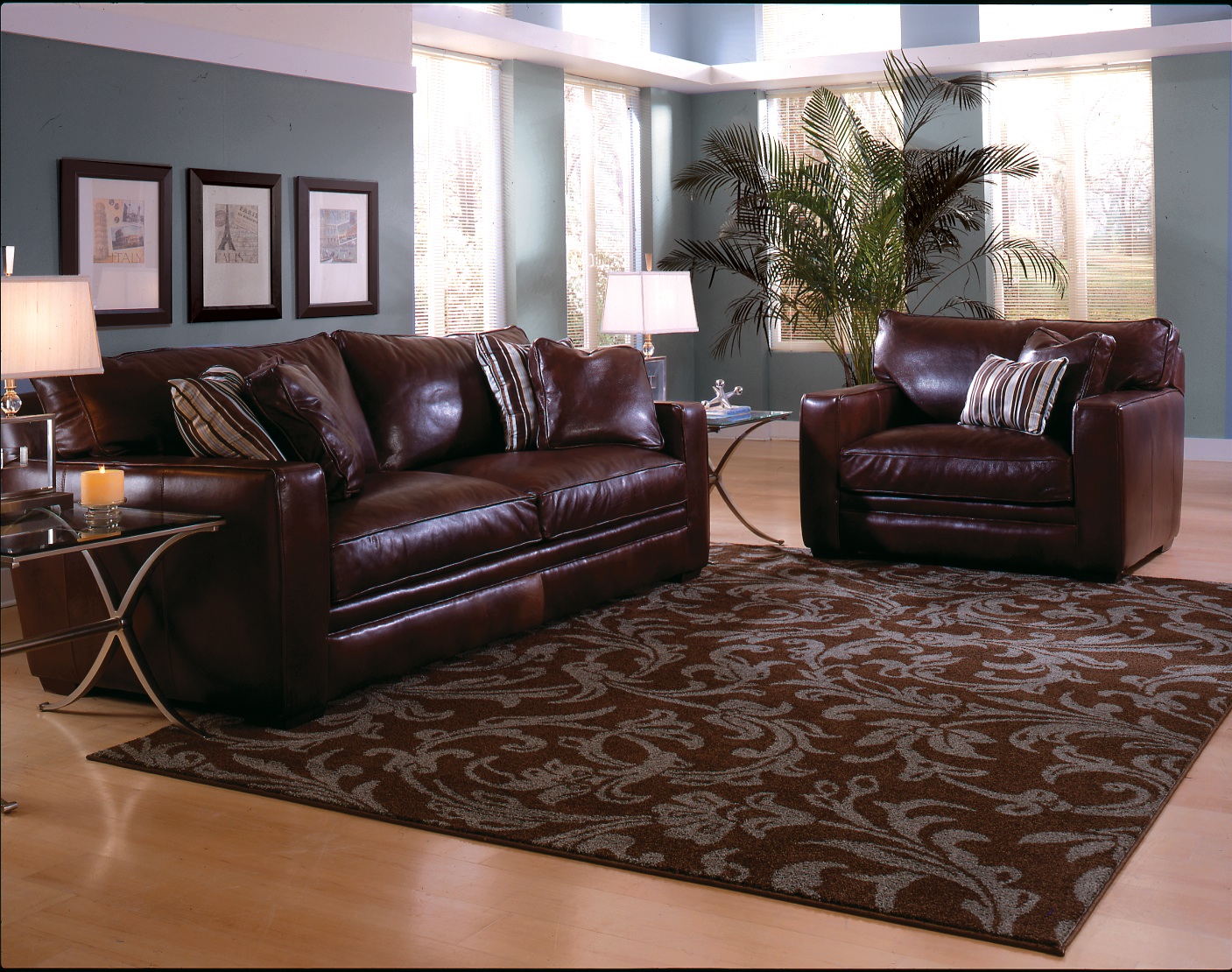
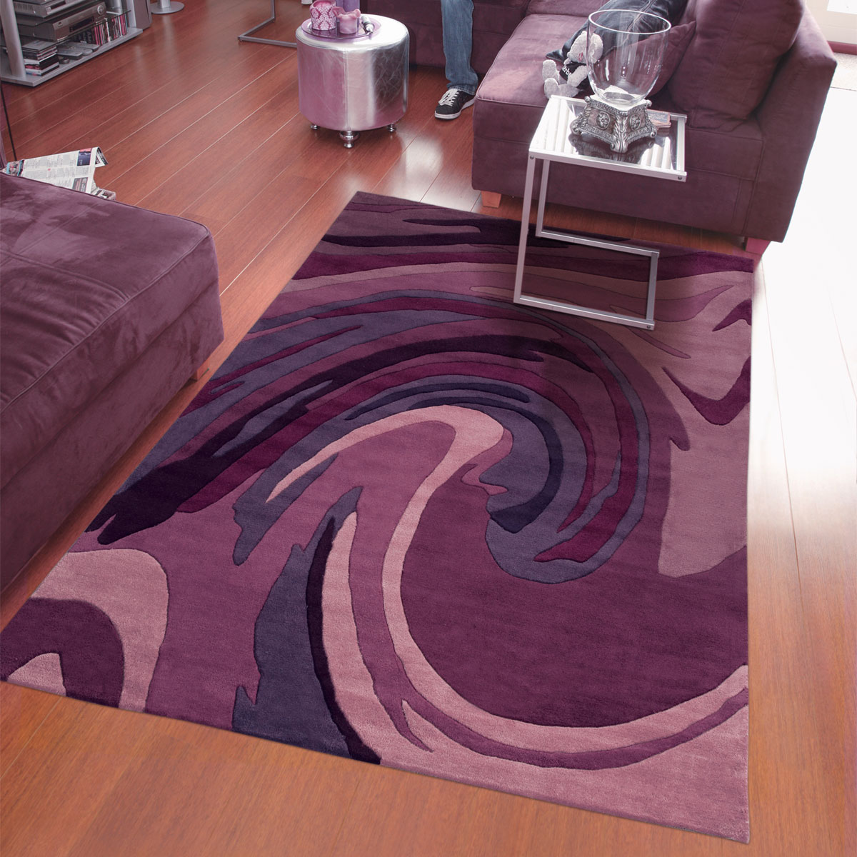
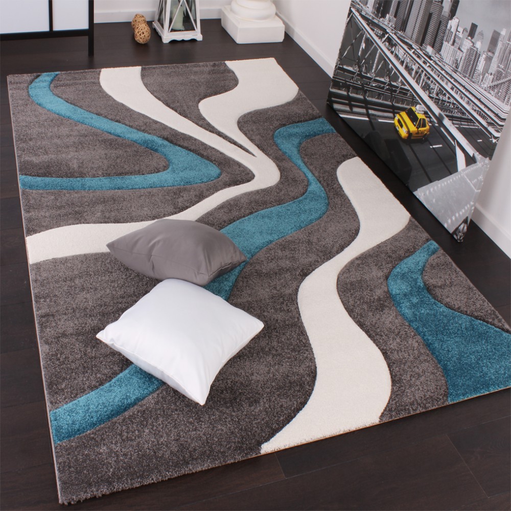
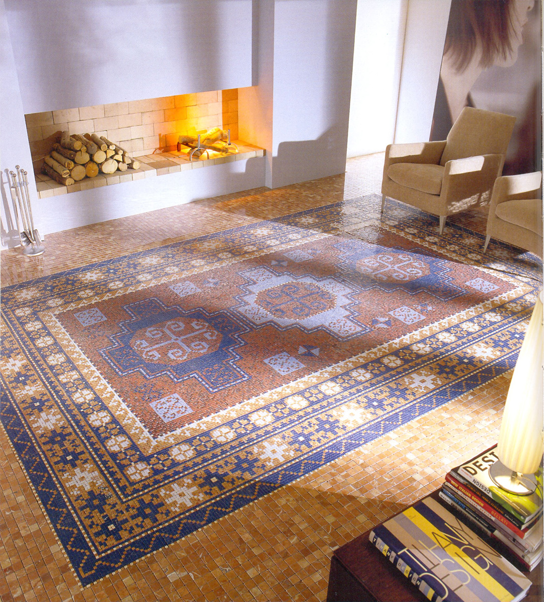
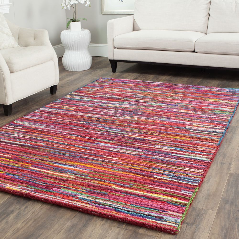
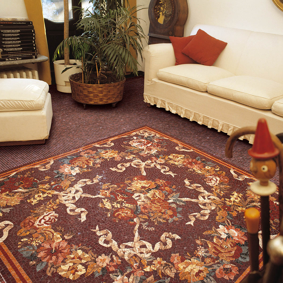
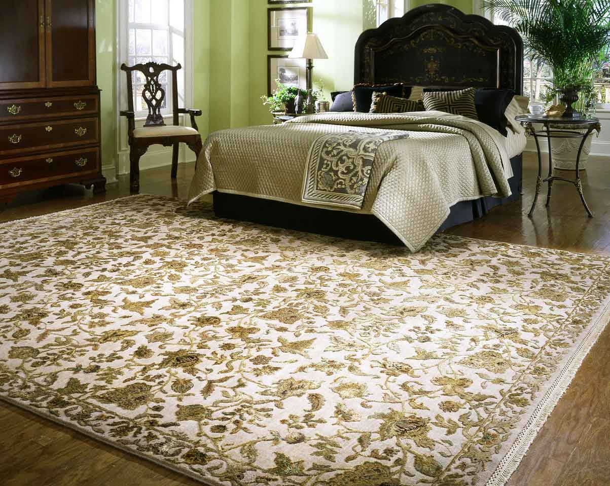
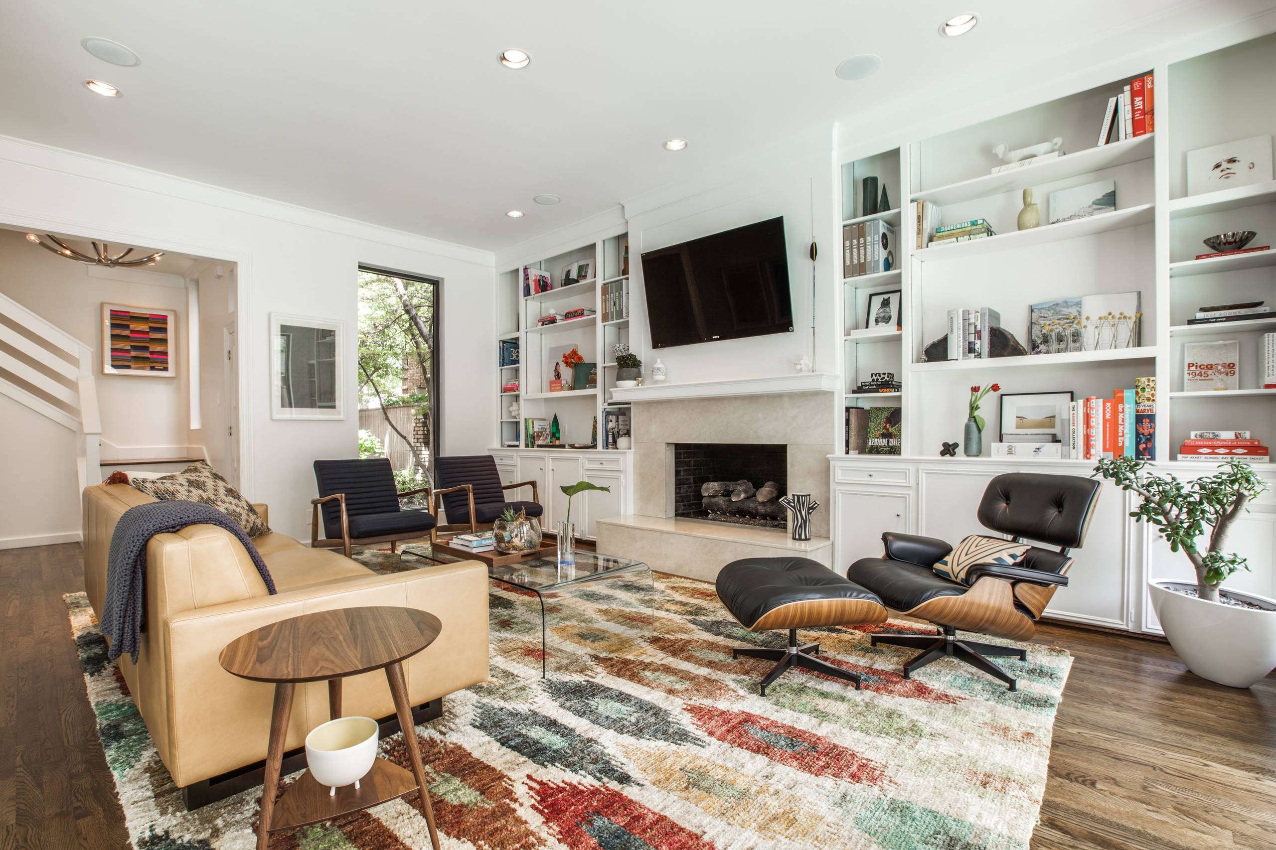
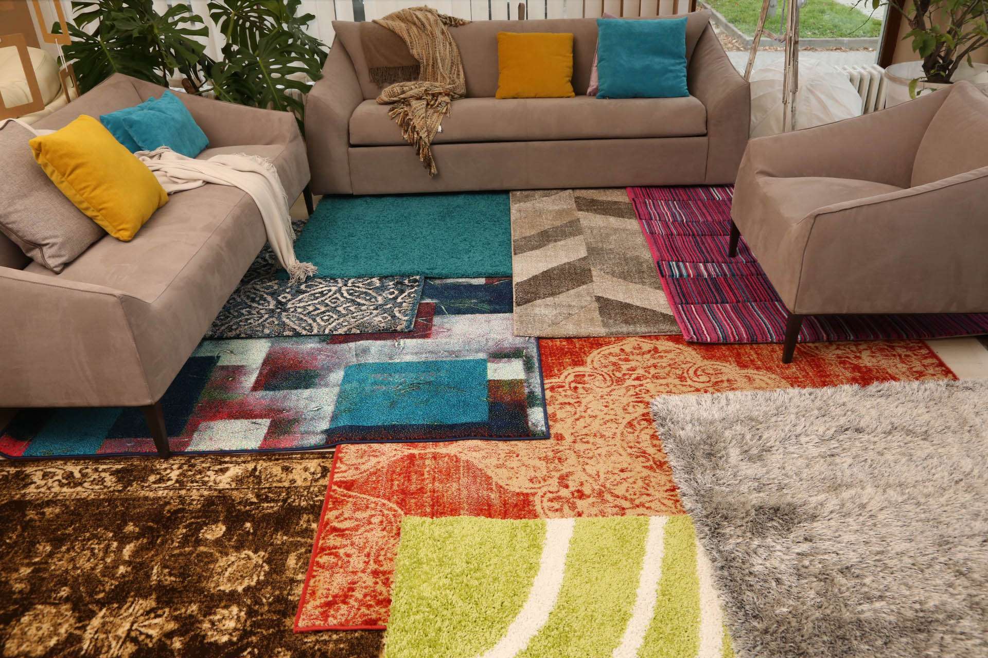
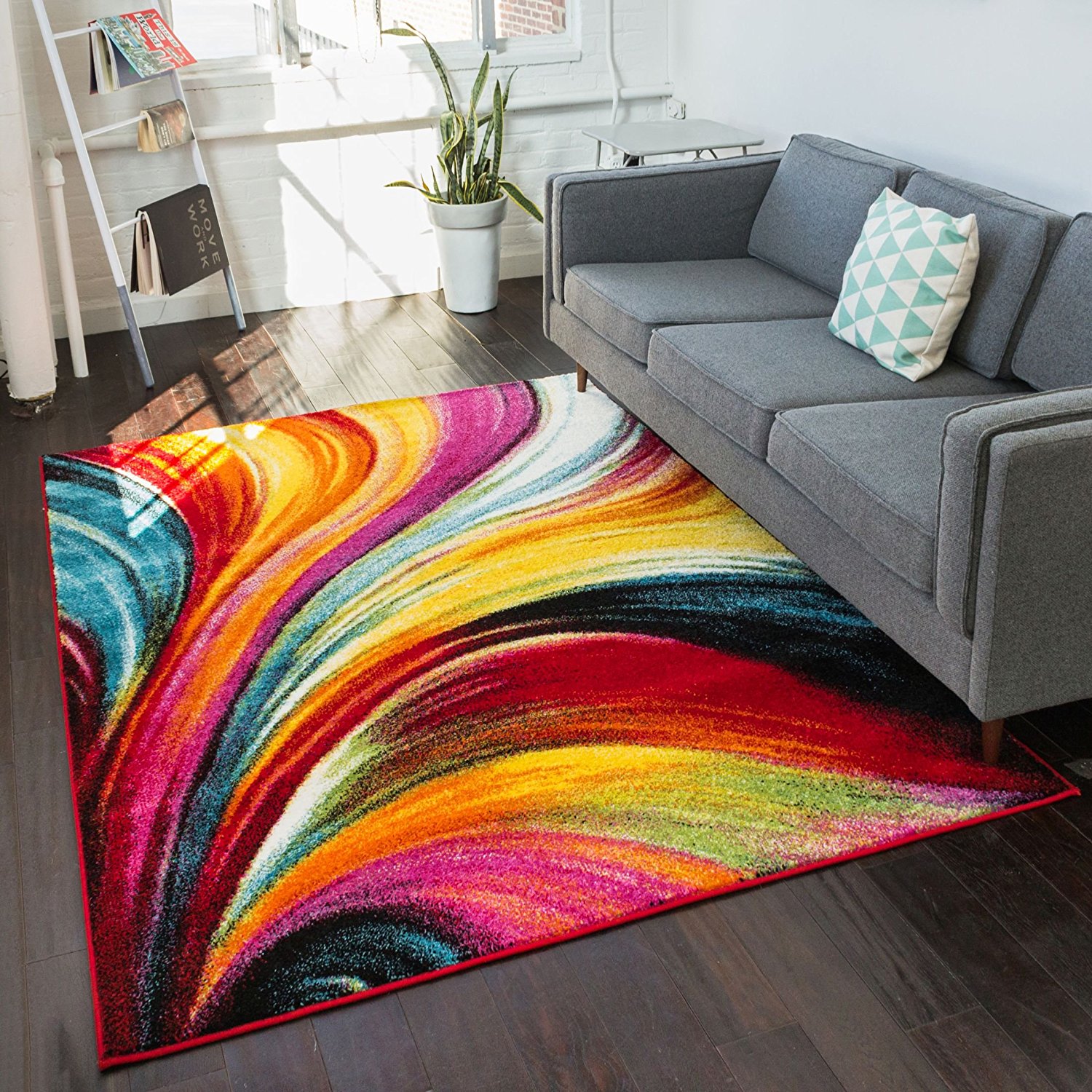
Special effects patterns
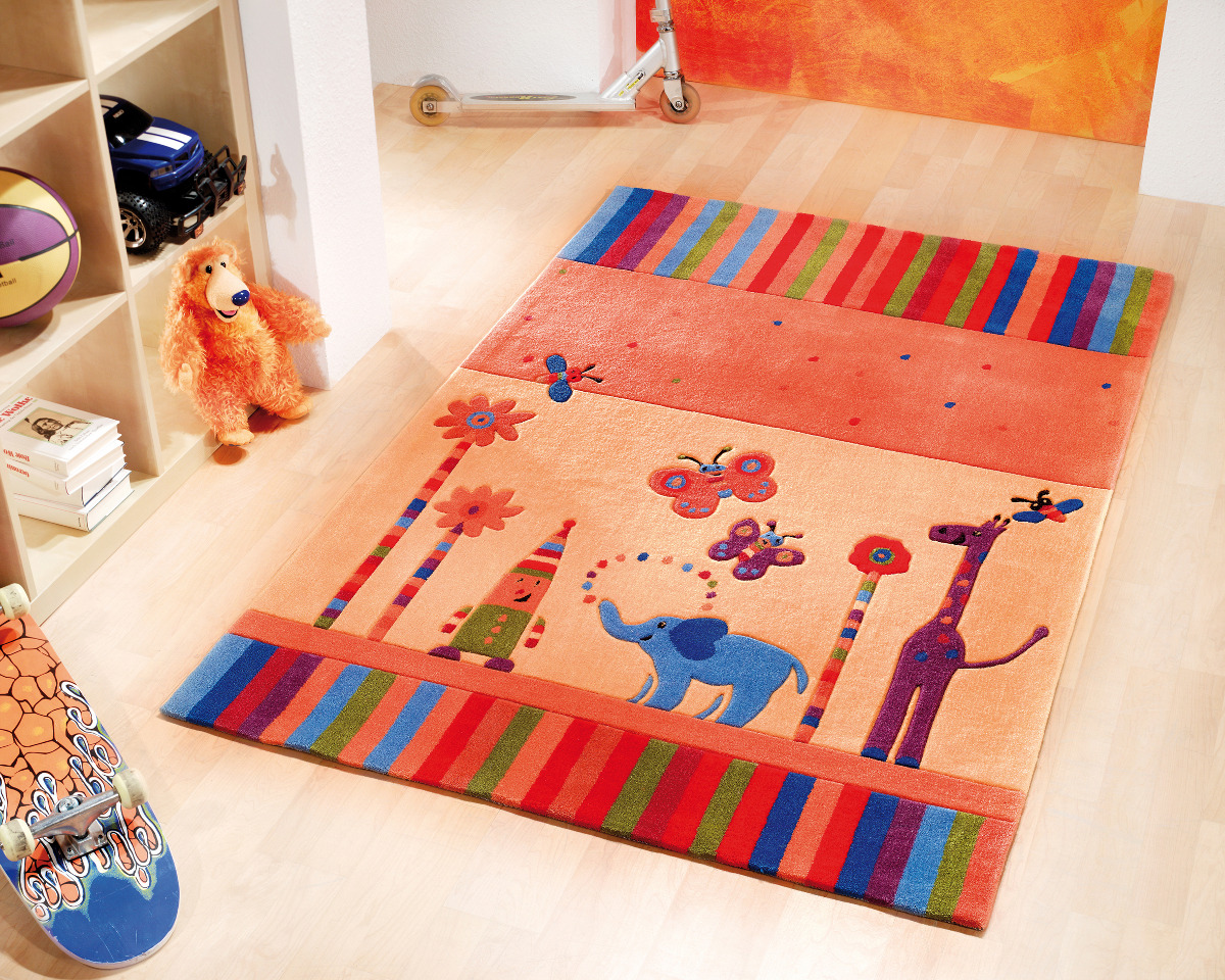
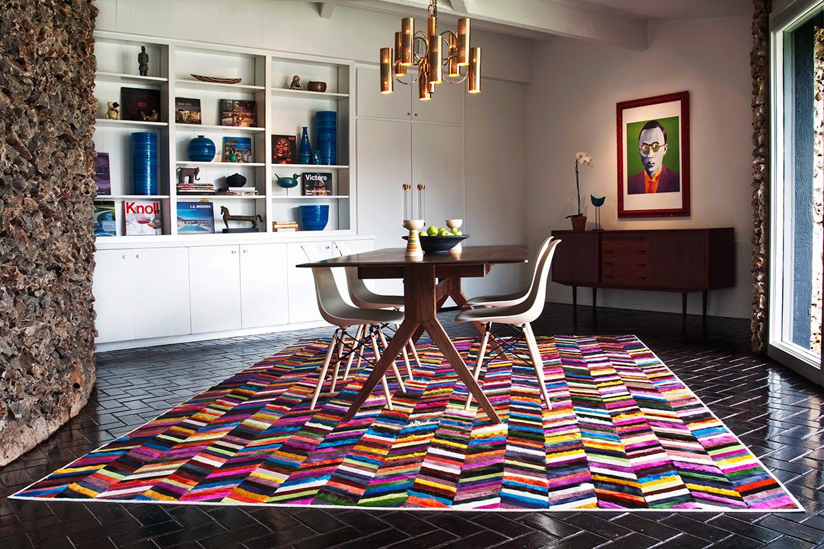
Here are some pattern effects you may encounter:
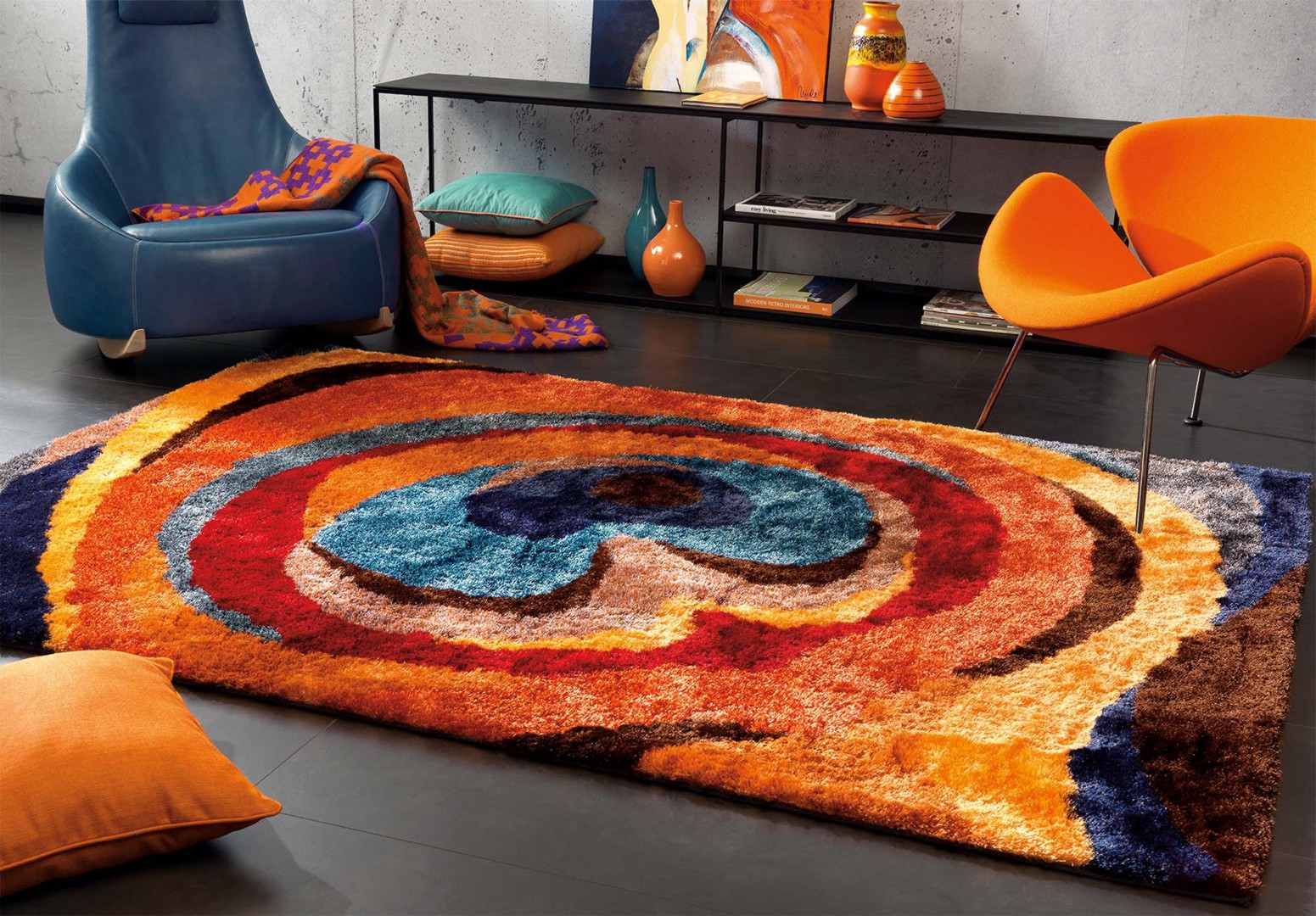
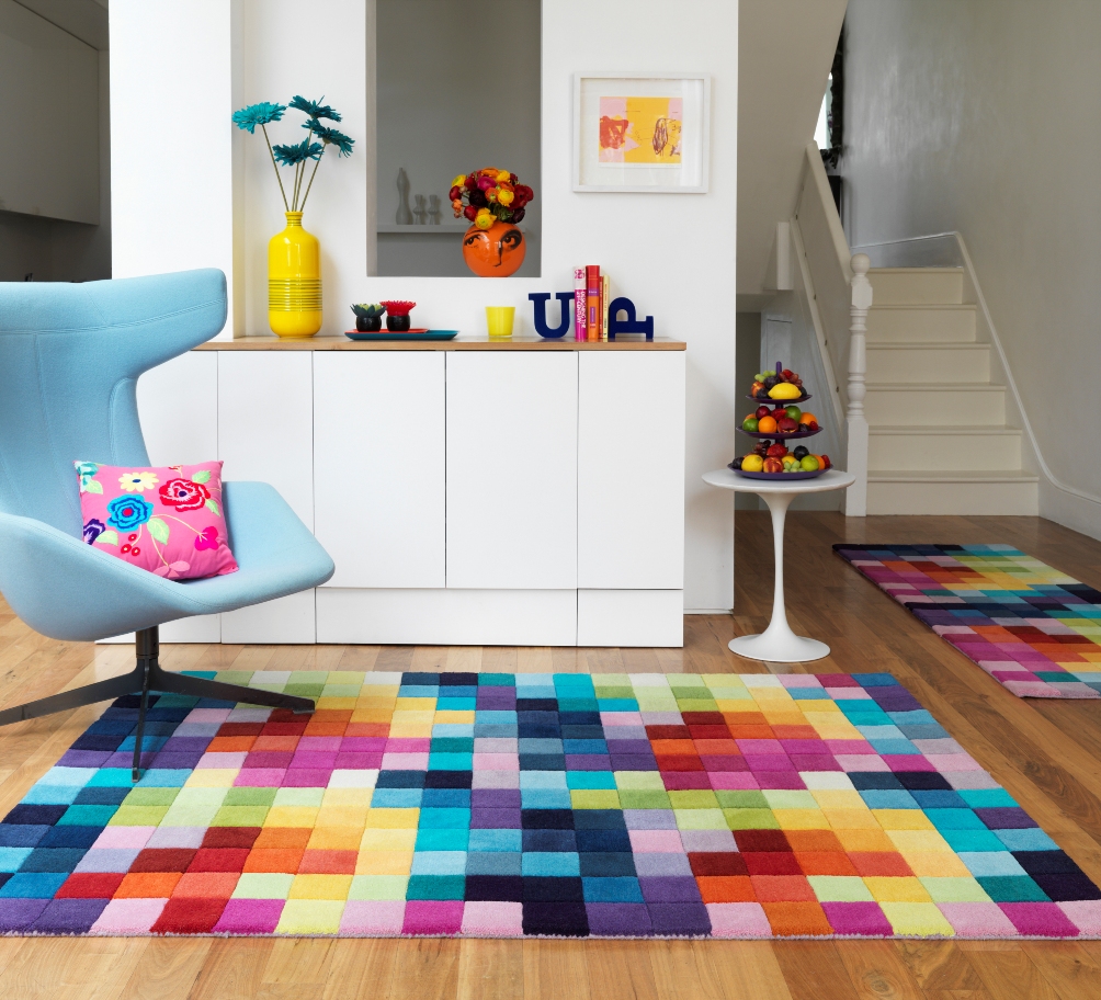
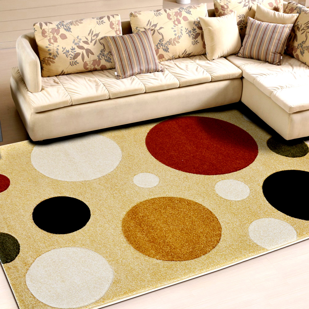
- they compress space. Large areas of the pattern will be closed in the room, especially if the repetition of the pattern is large;
- a patterned carpet masks pollution and normal wear - so it is popular with restaurants and hotels;
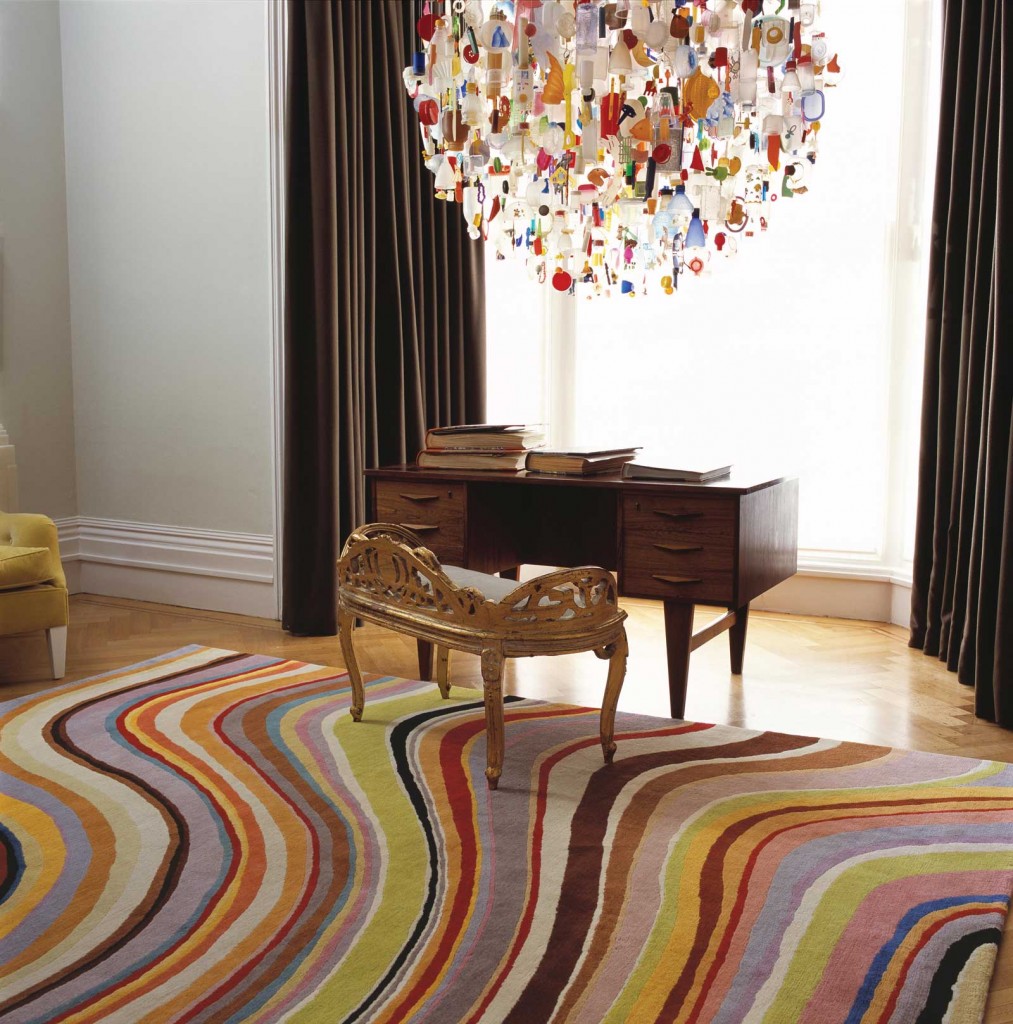
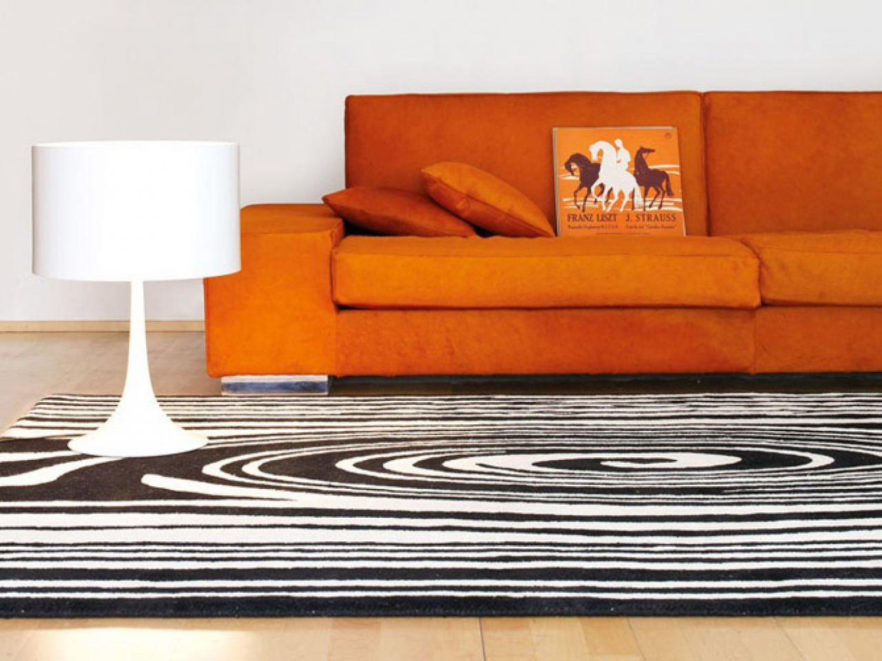
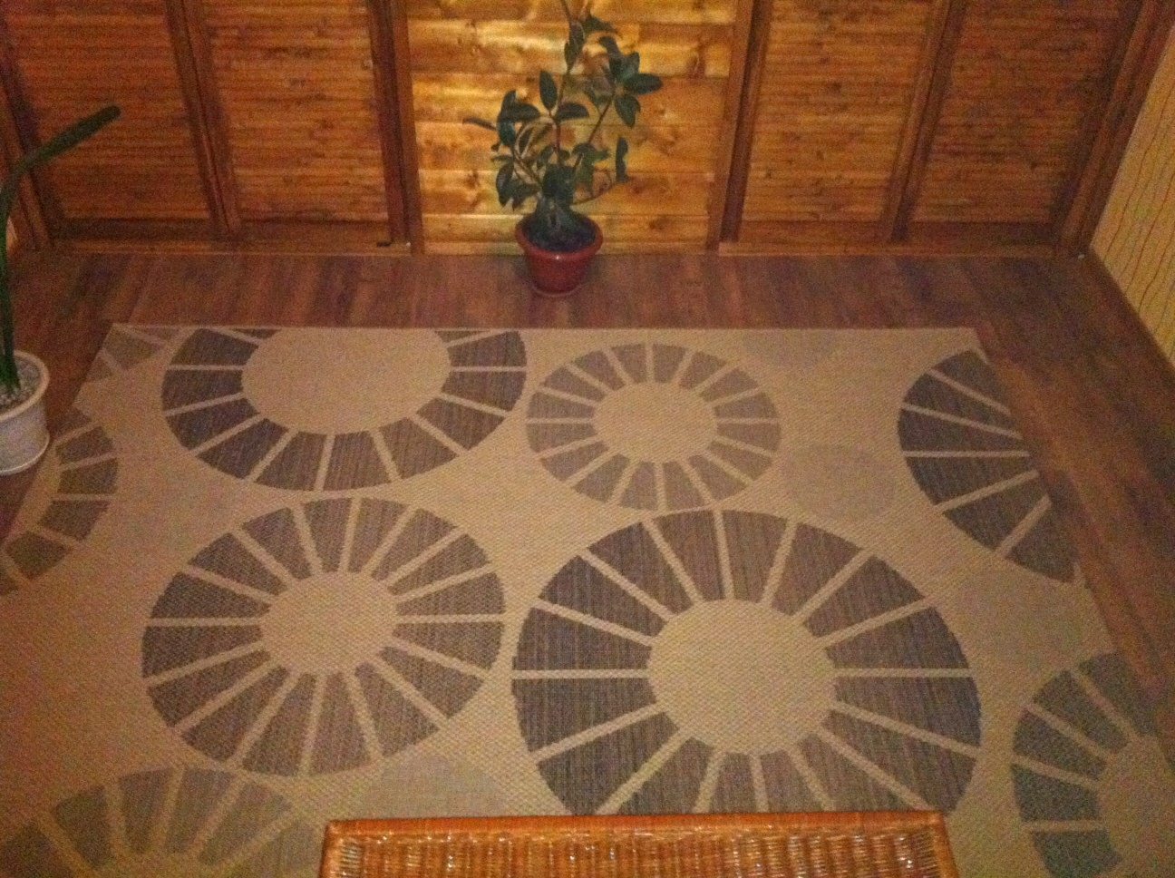
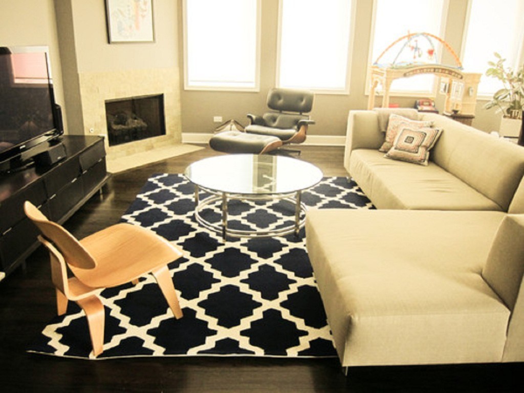
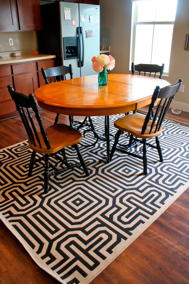
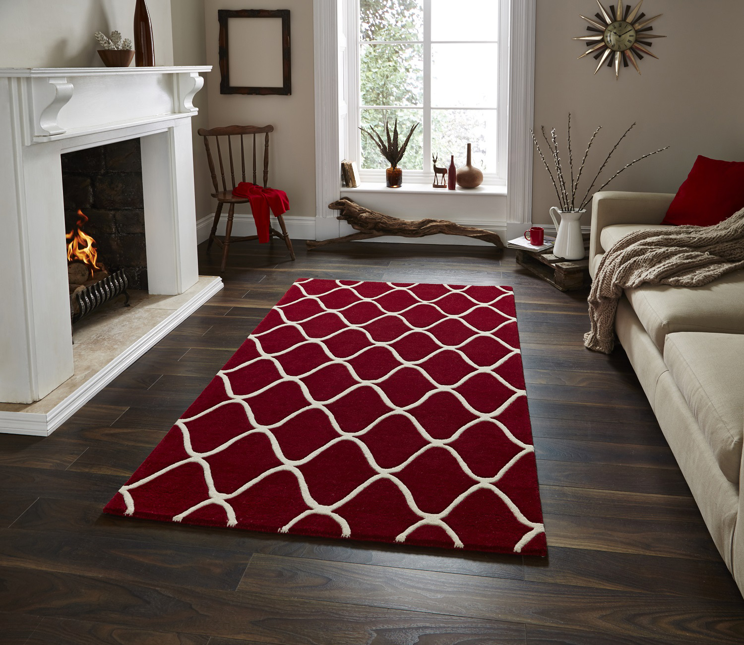
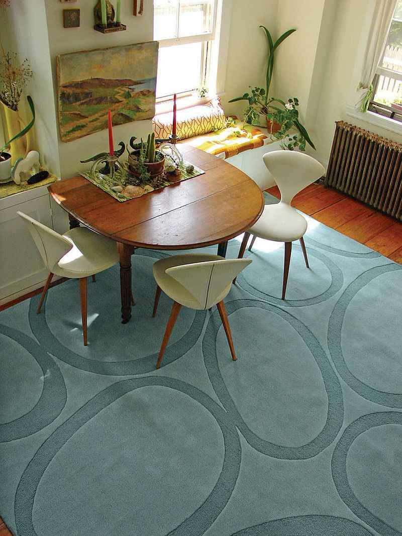
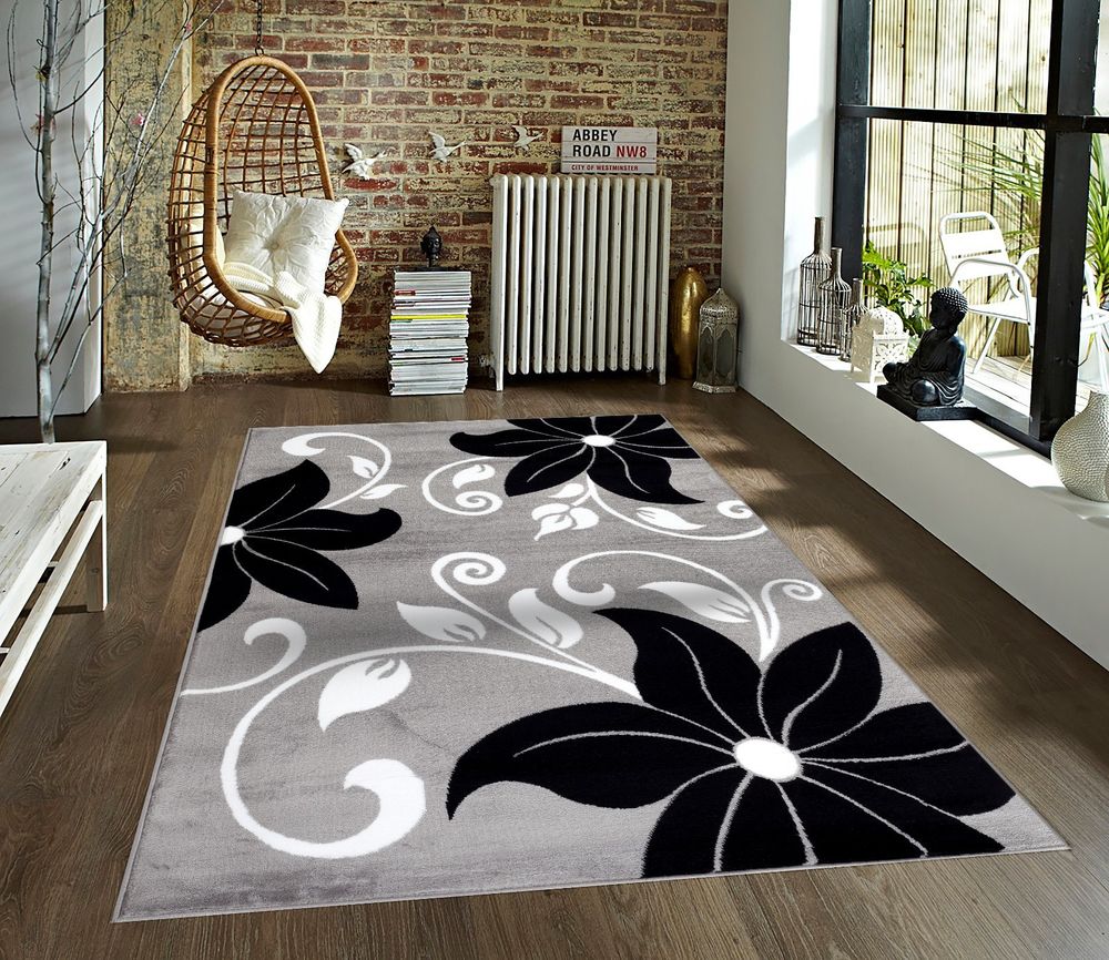
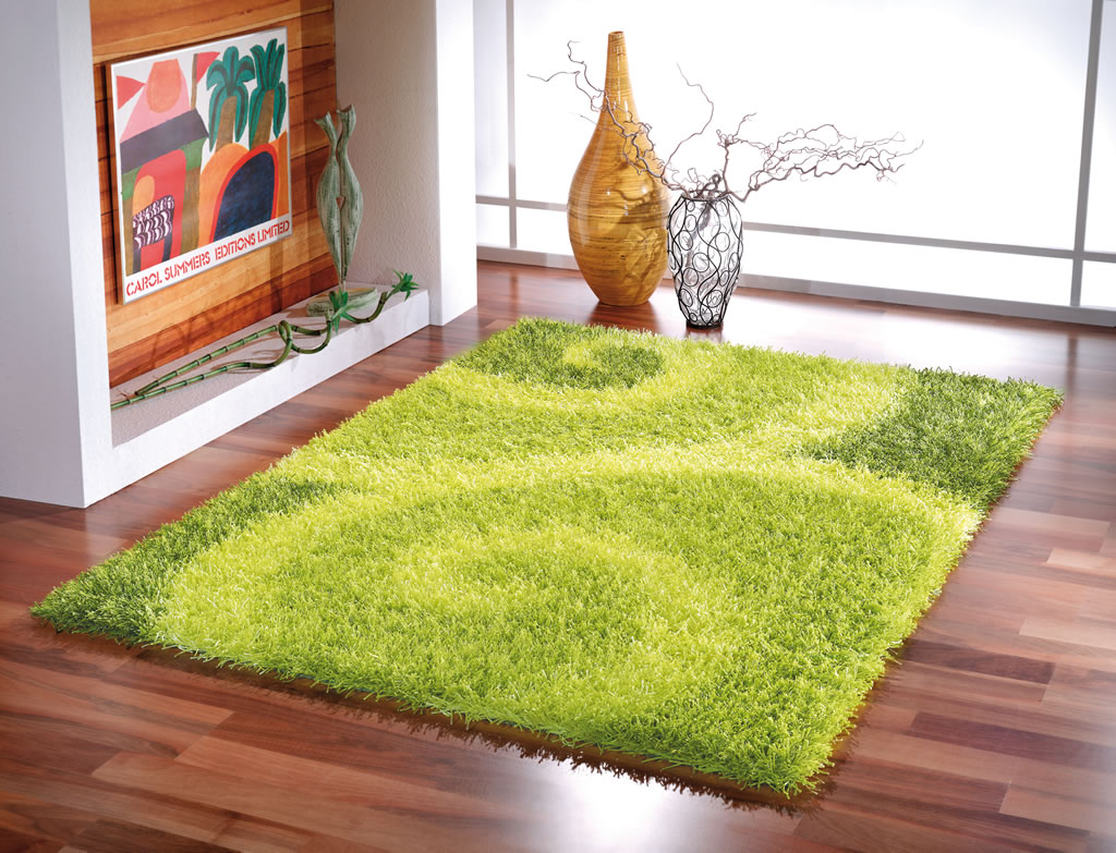
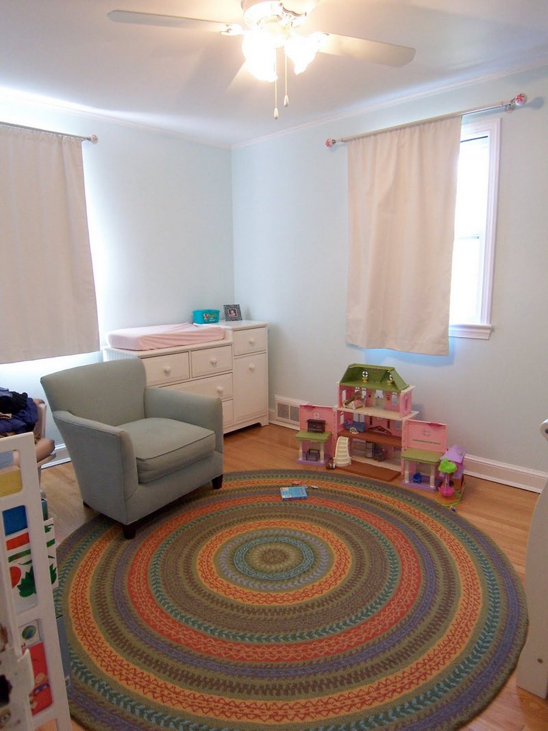
- a pattern in the form of stripes stretches the size of the room, visually extending the space in the direction of the stripes;
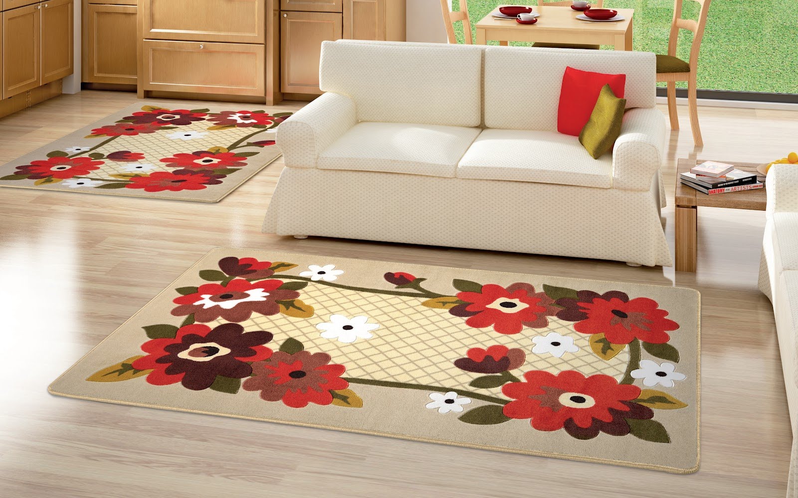
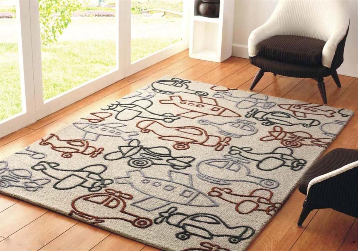
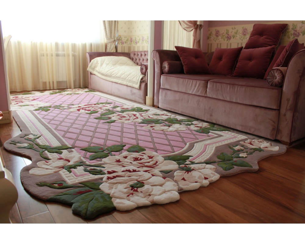
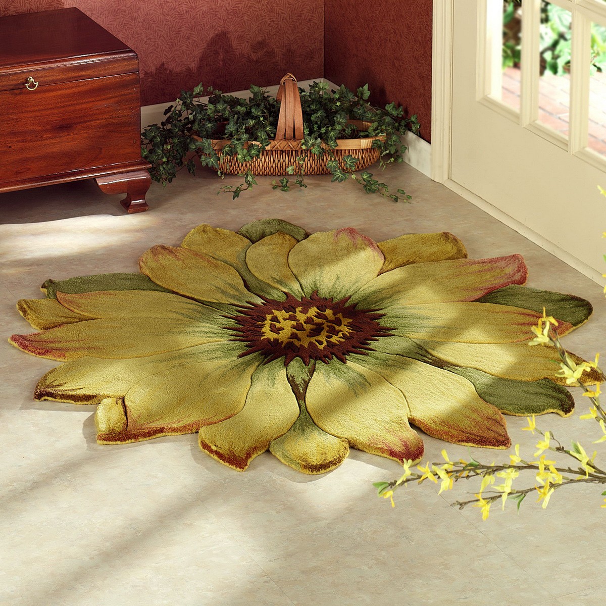
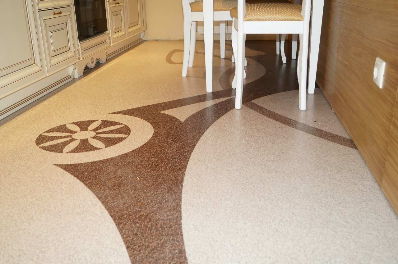
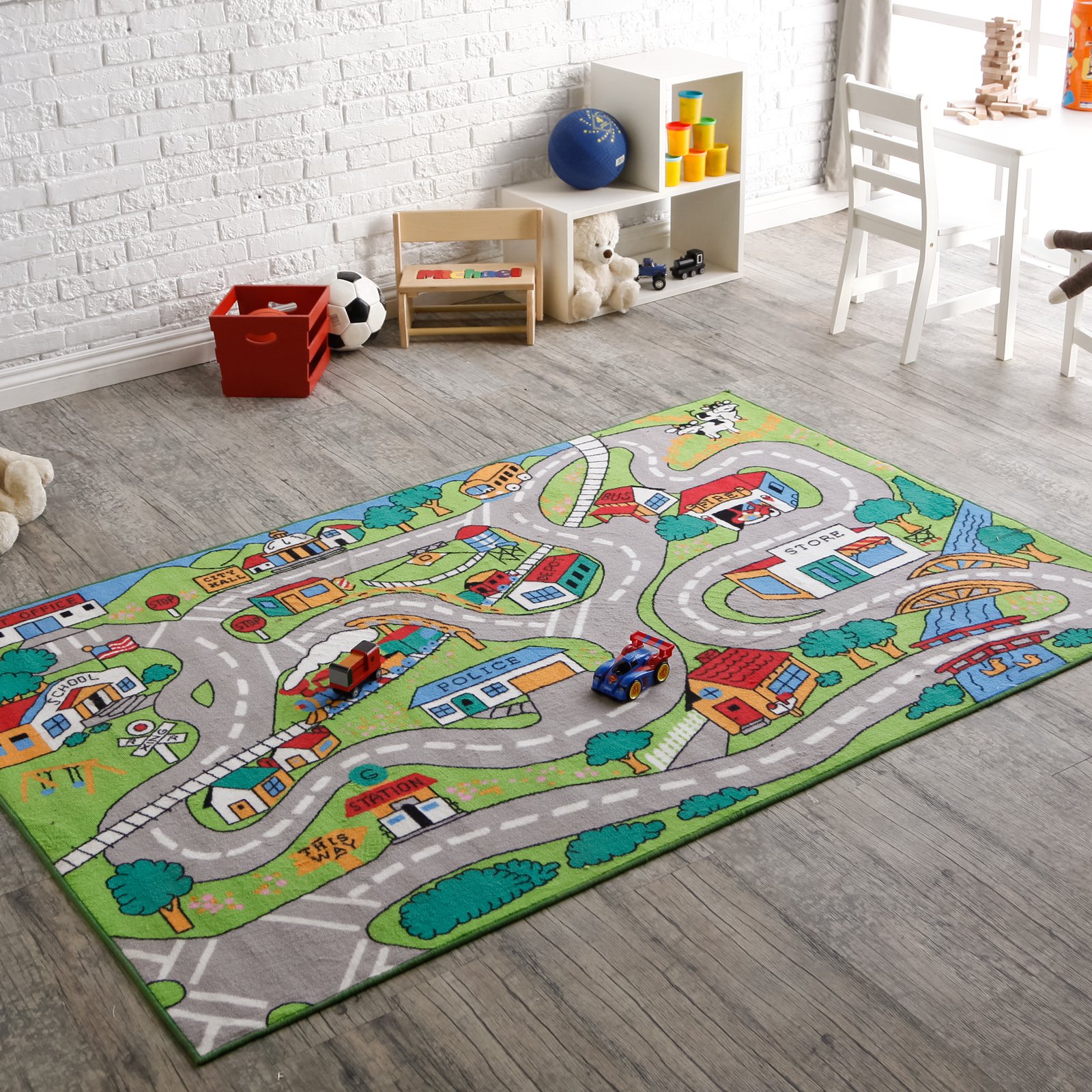
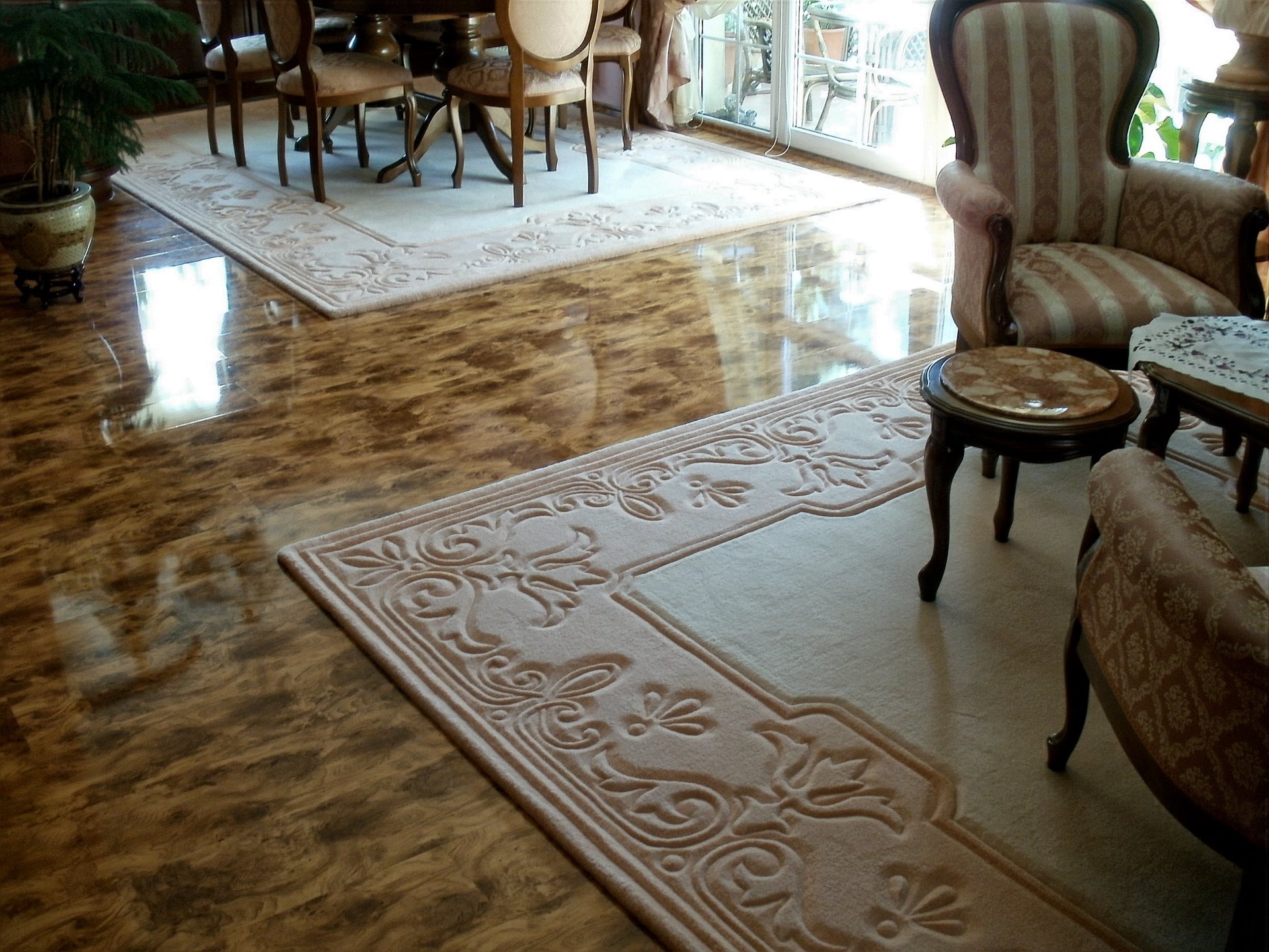
- the pattern may suggest the appointment of a particular zone. For example, the area of such a carpet may fall in the area of the dining room or meeting room.
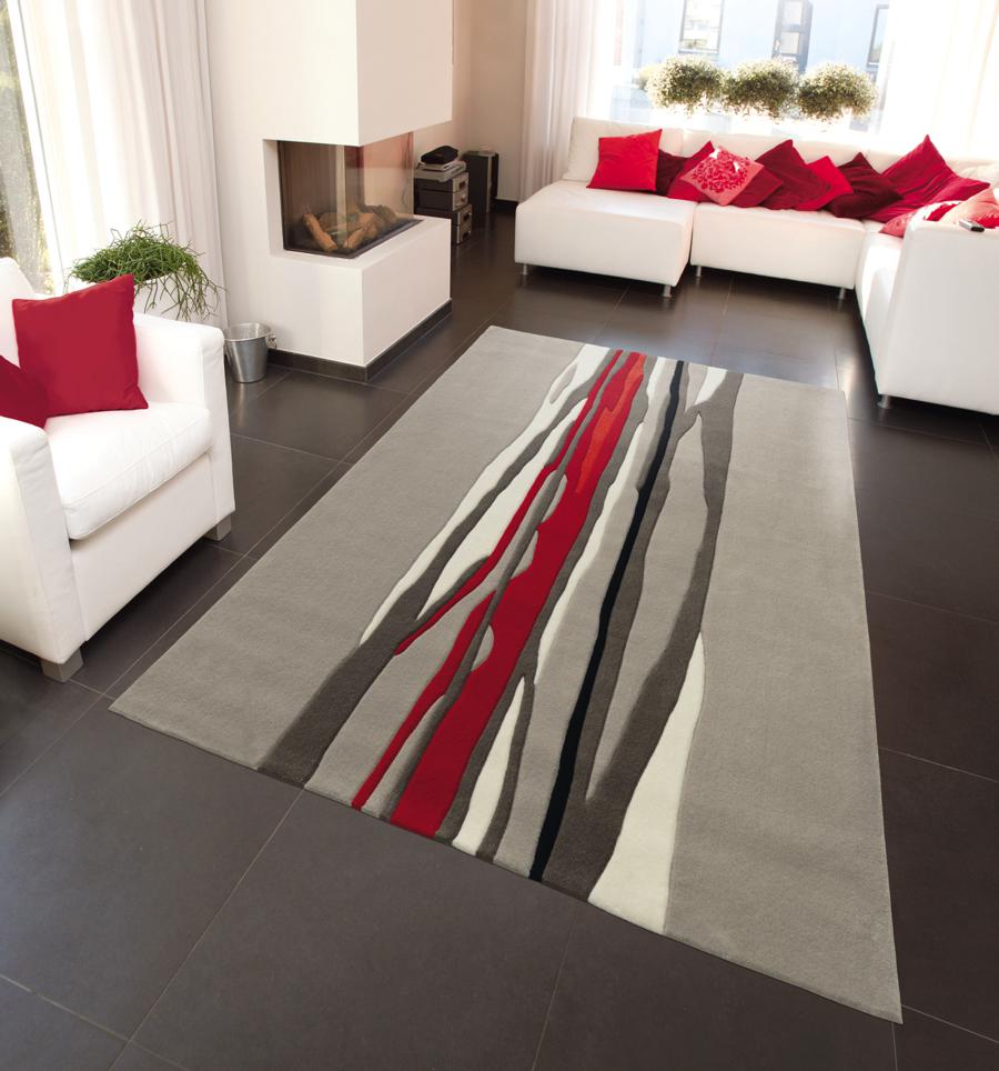
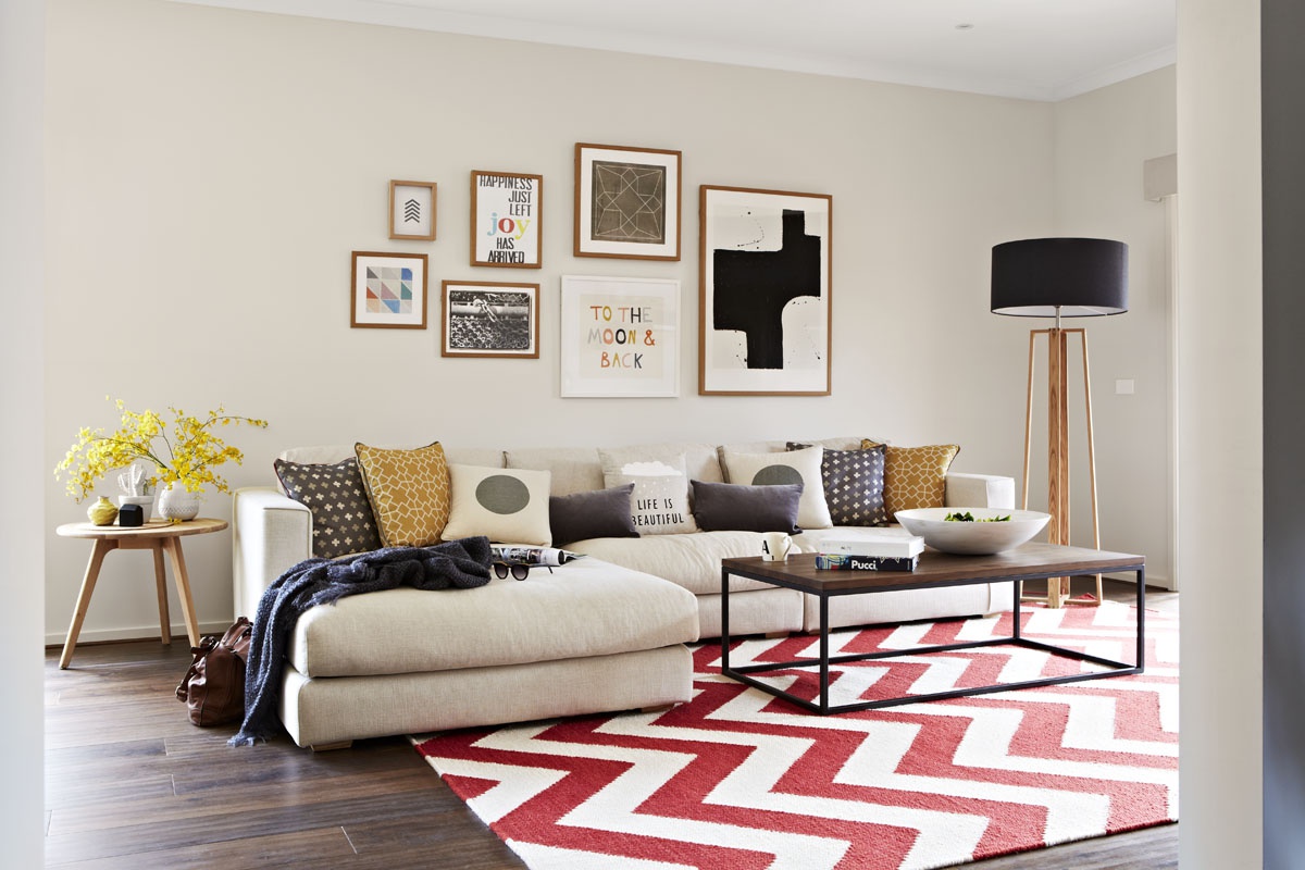
Stripes significantly stretch the room
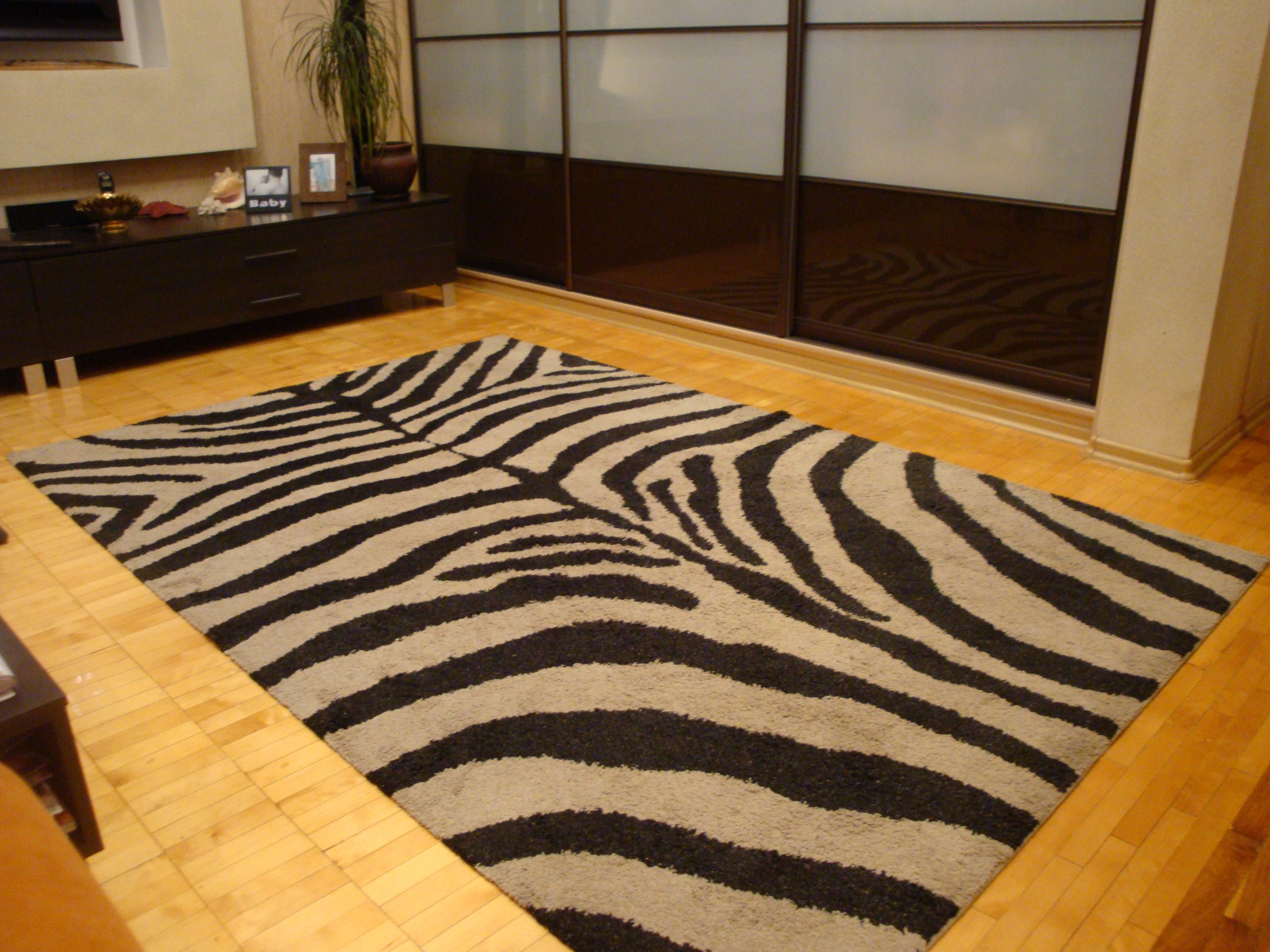
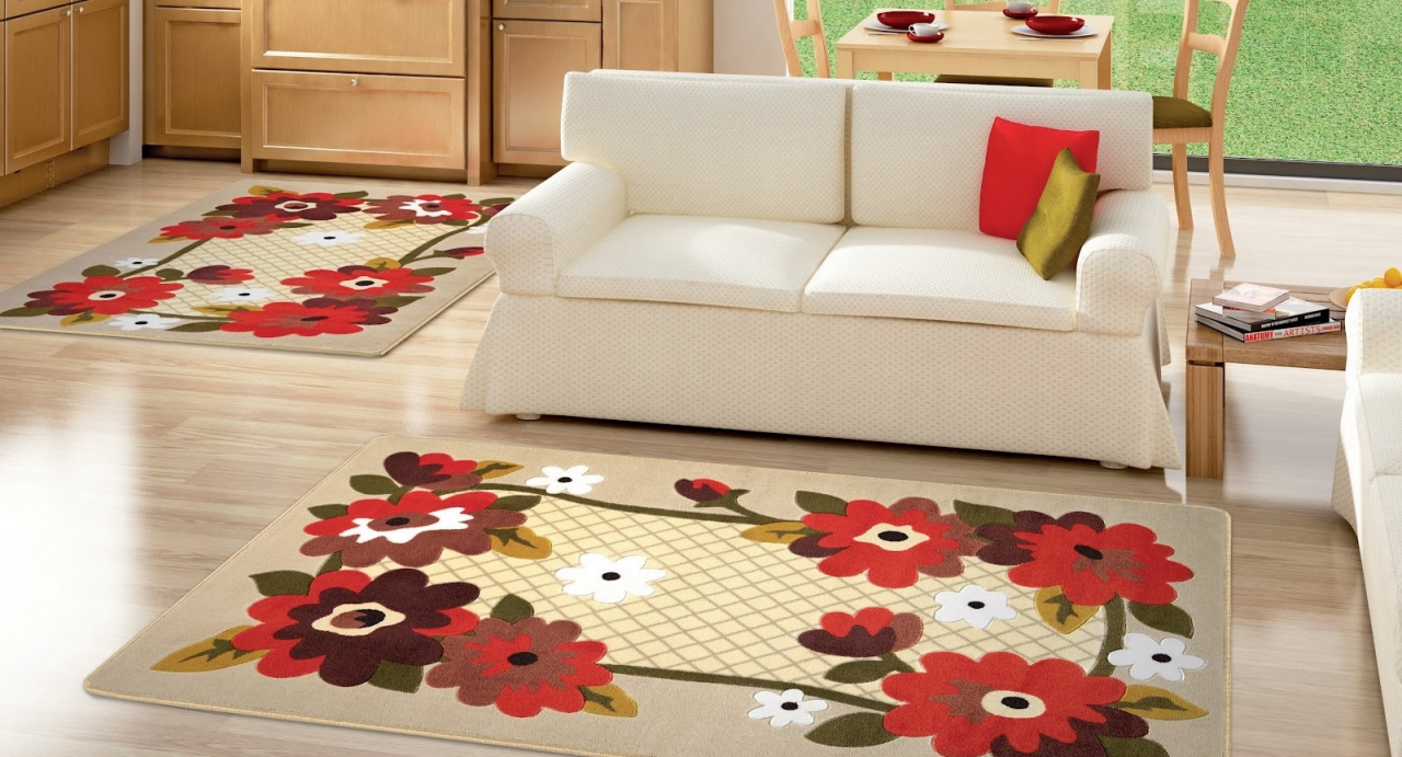
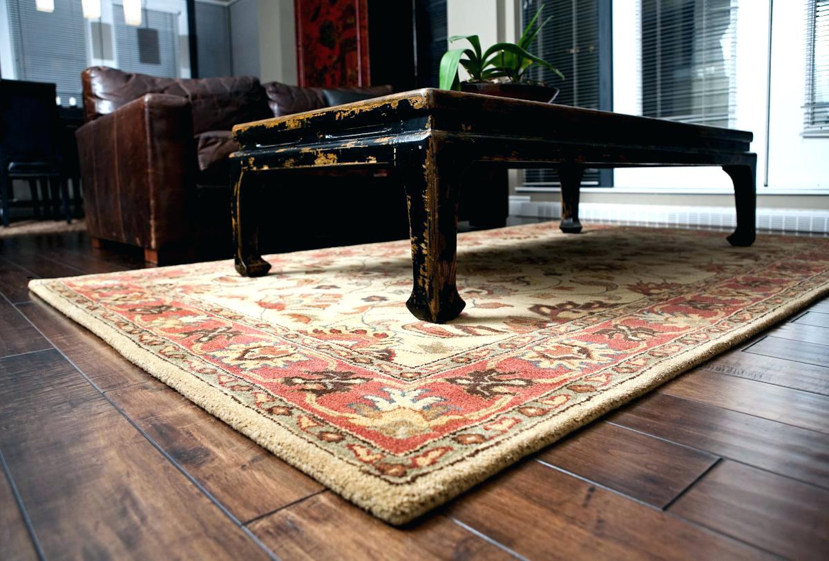
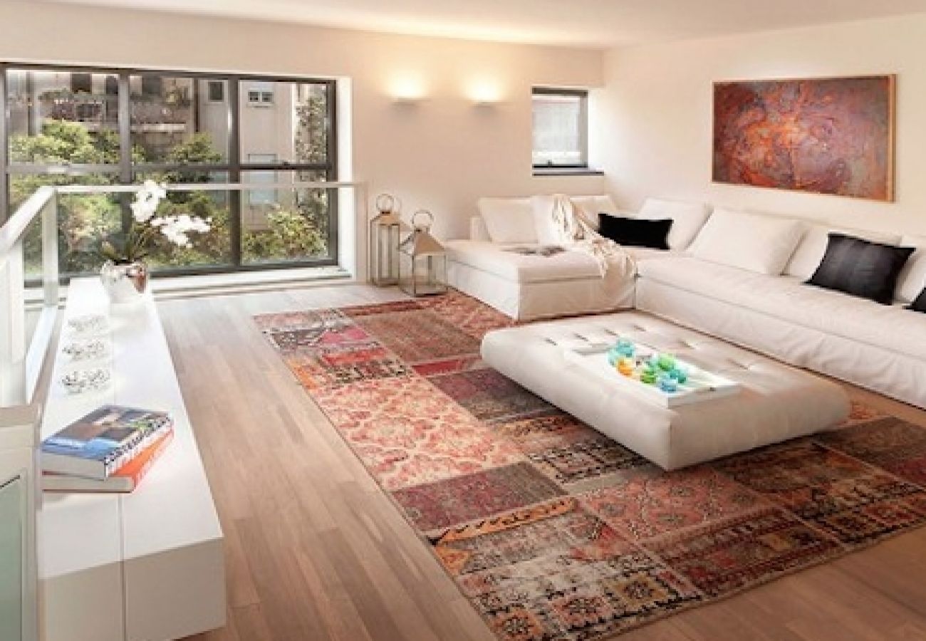
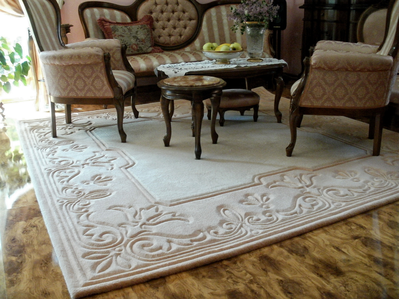
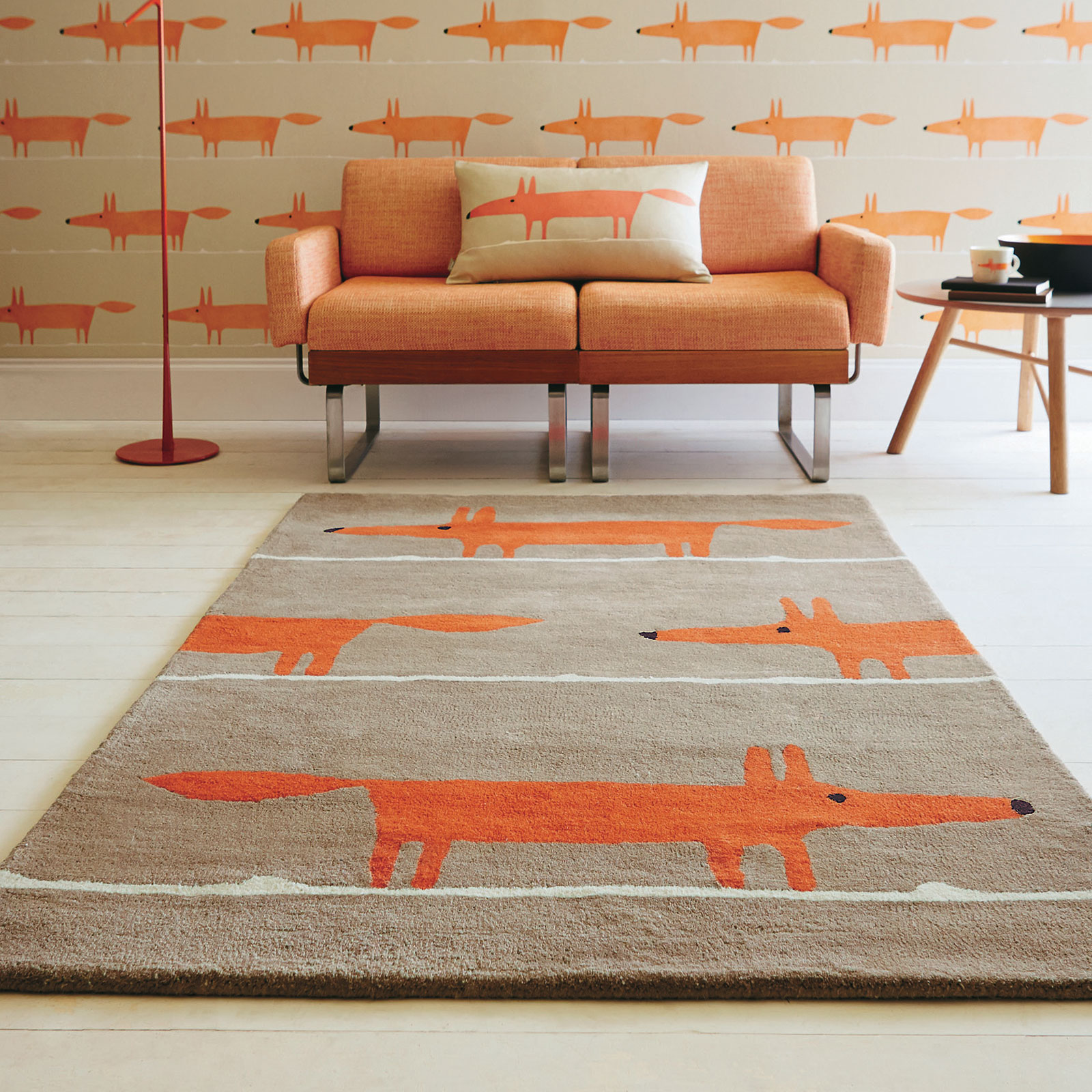
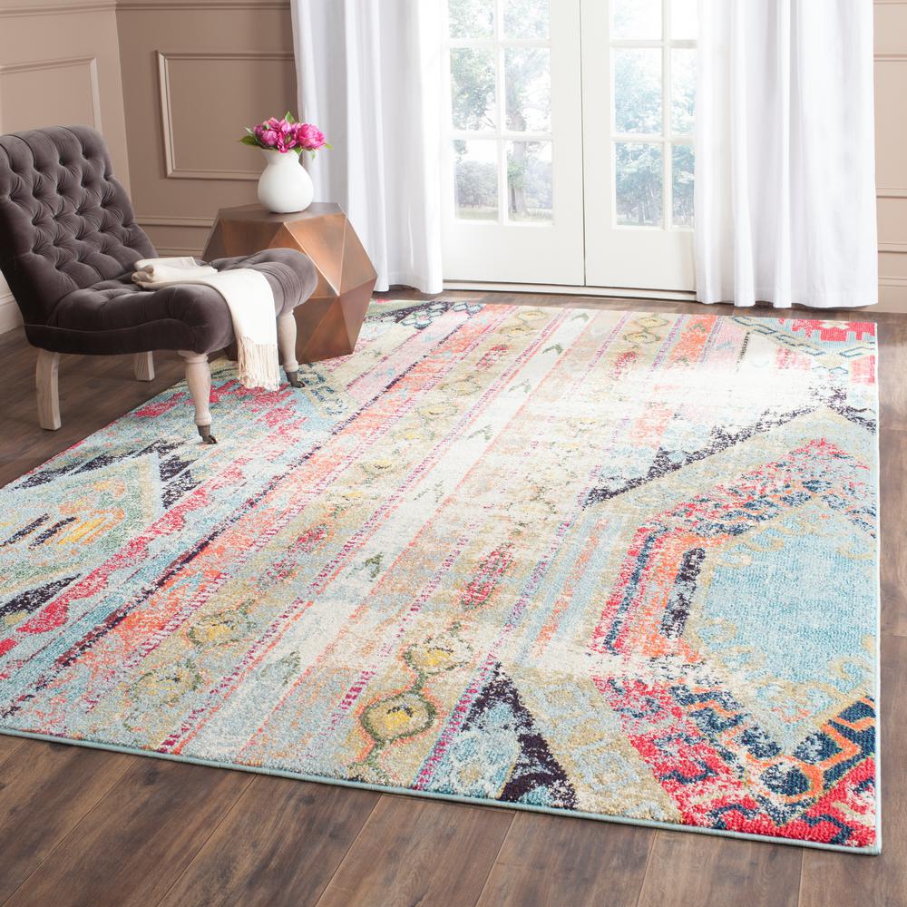
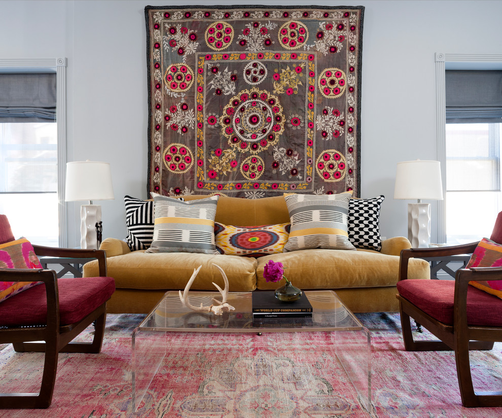
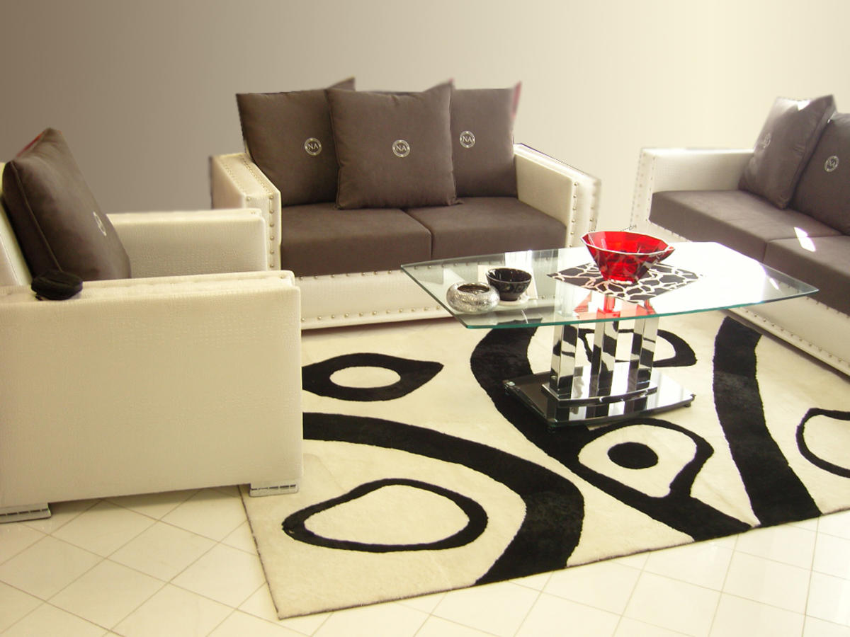
Patterns on carpets can look very good or very bad! Some rooms suffer from “overdose” patterns, as many themes of carpet patterns tend to dominate. The problem can be exacerbated when less obvious patterns are skipped - brickwork, window or pattern that can be seen from the next room.
We try to avoid oversaturation with patterns.
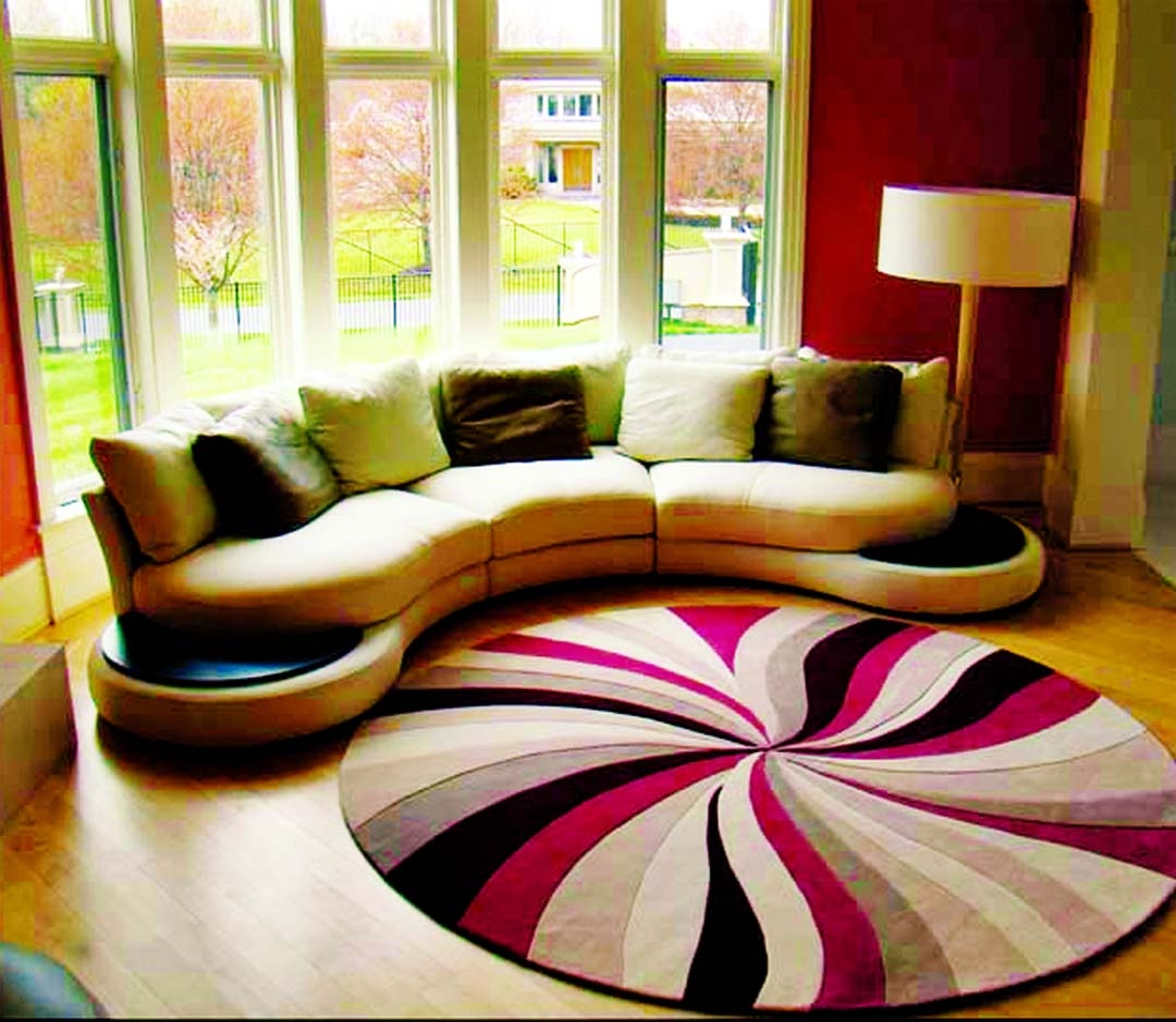
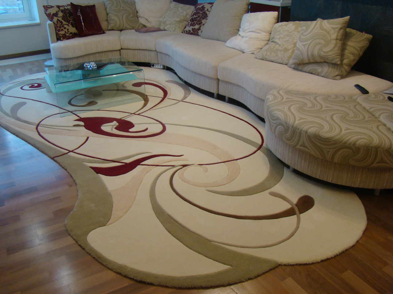
The general rule of thumb is that if a pattern is bound by style or texture, the combination is likely to succeed, since it is safer to confine to one pattern in each room.
Before you buy, try to model the pattern of the carpet at home, as it may look very different in the context of your room. Make sure the pattern complements the style of the furniture..
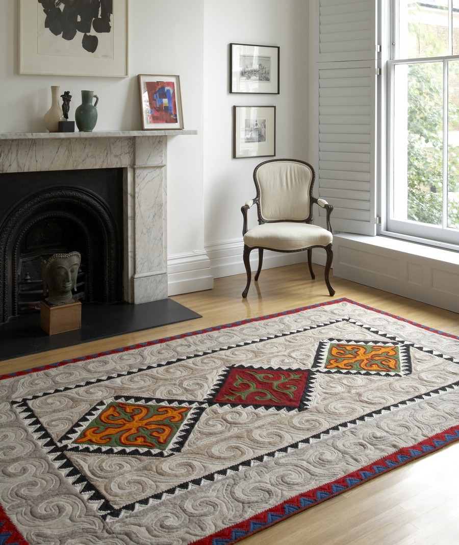
Figure complementary style
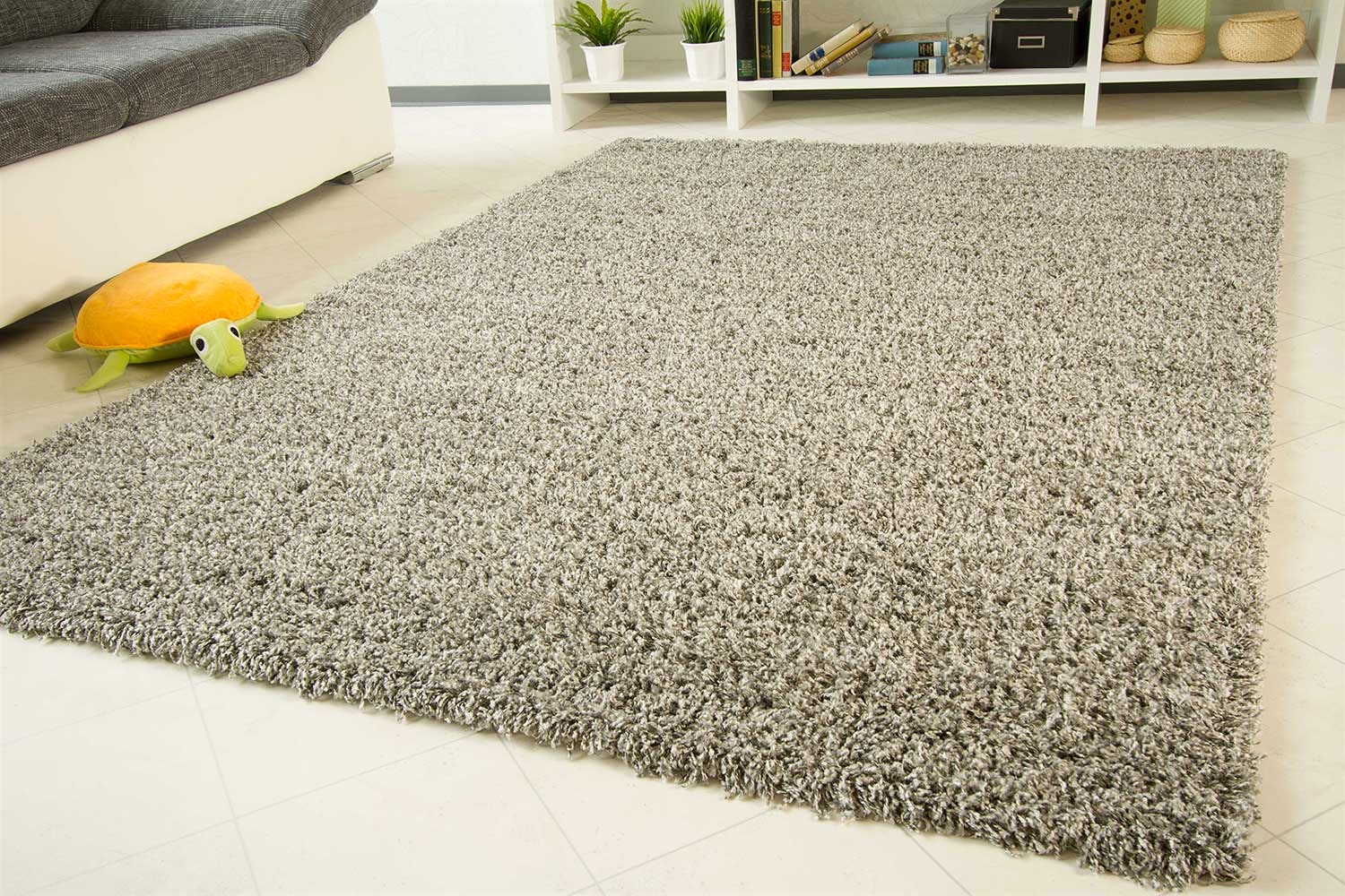
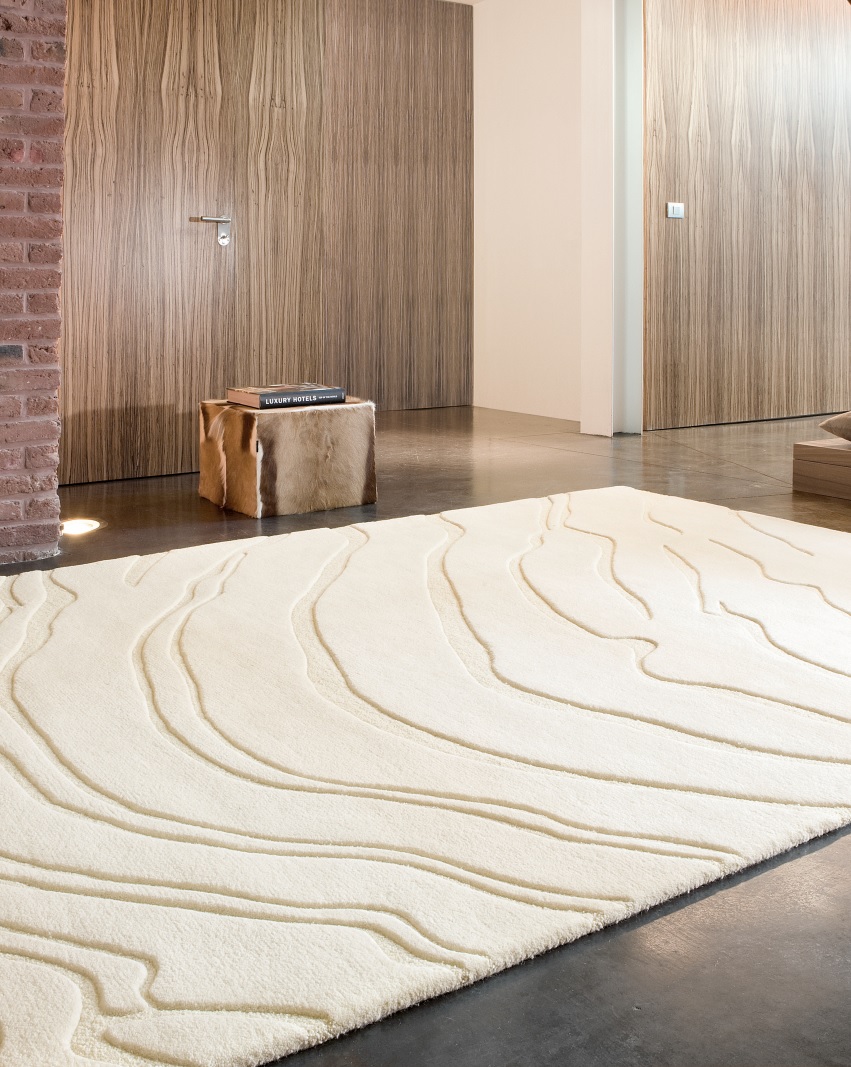
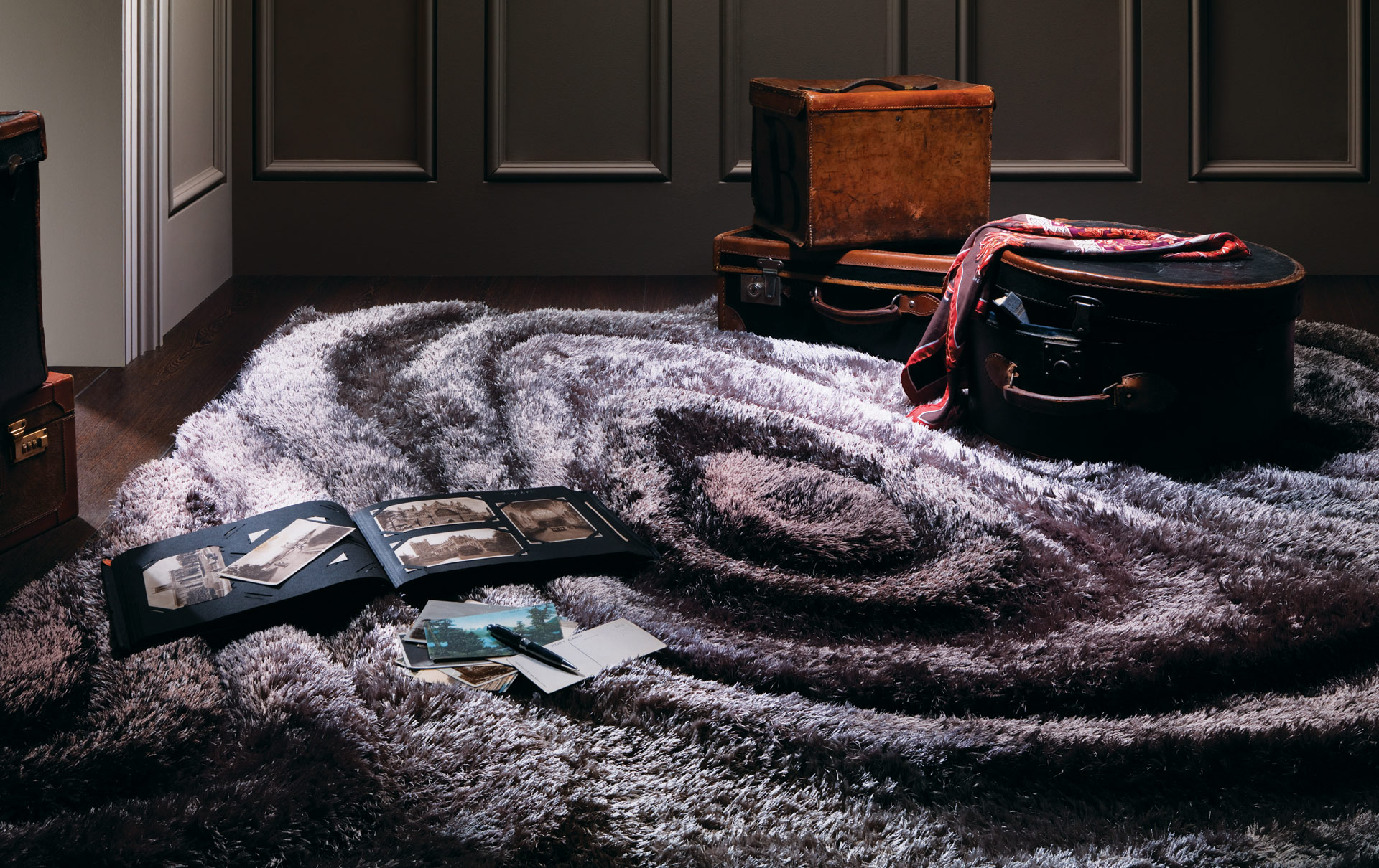
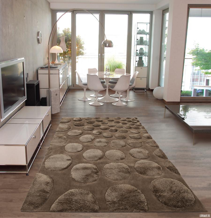
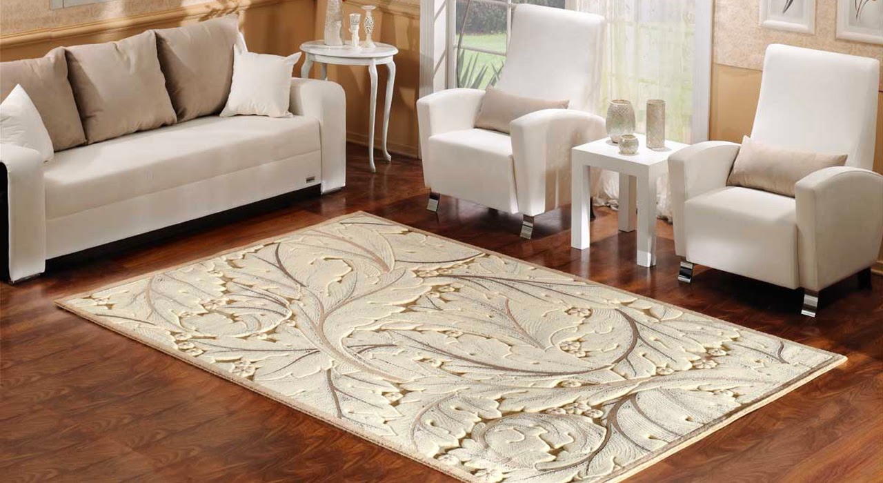
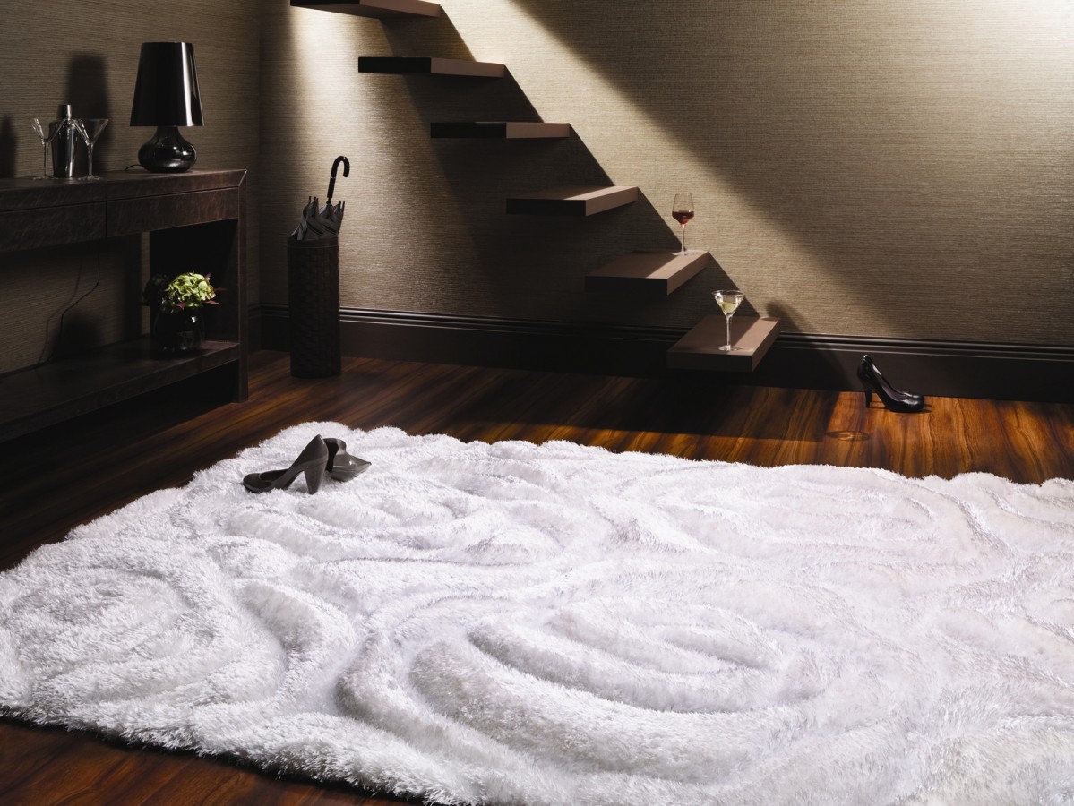
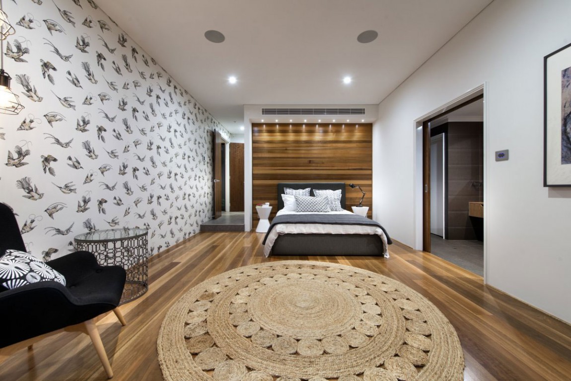
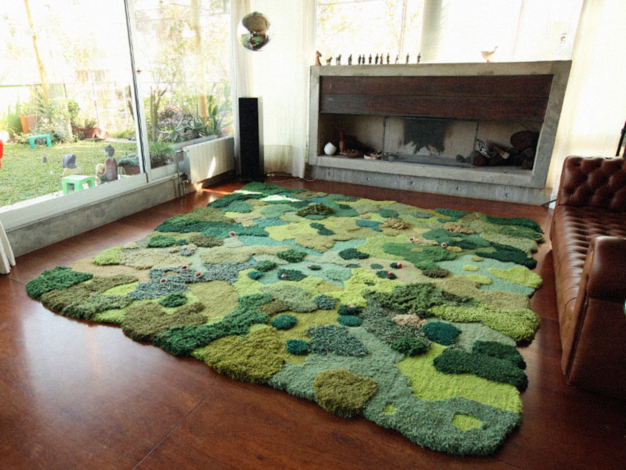
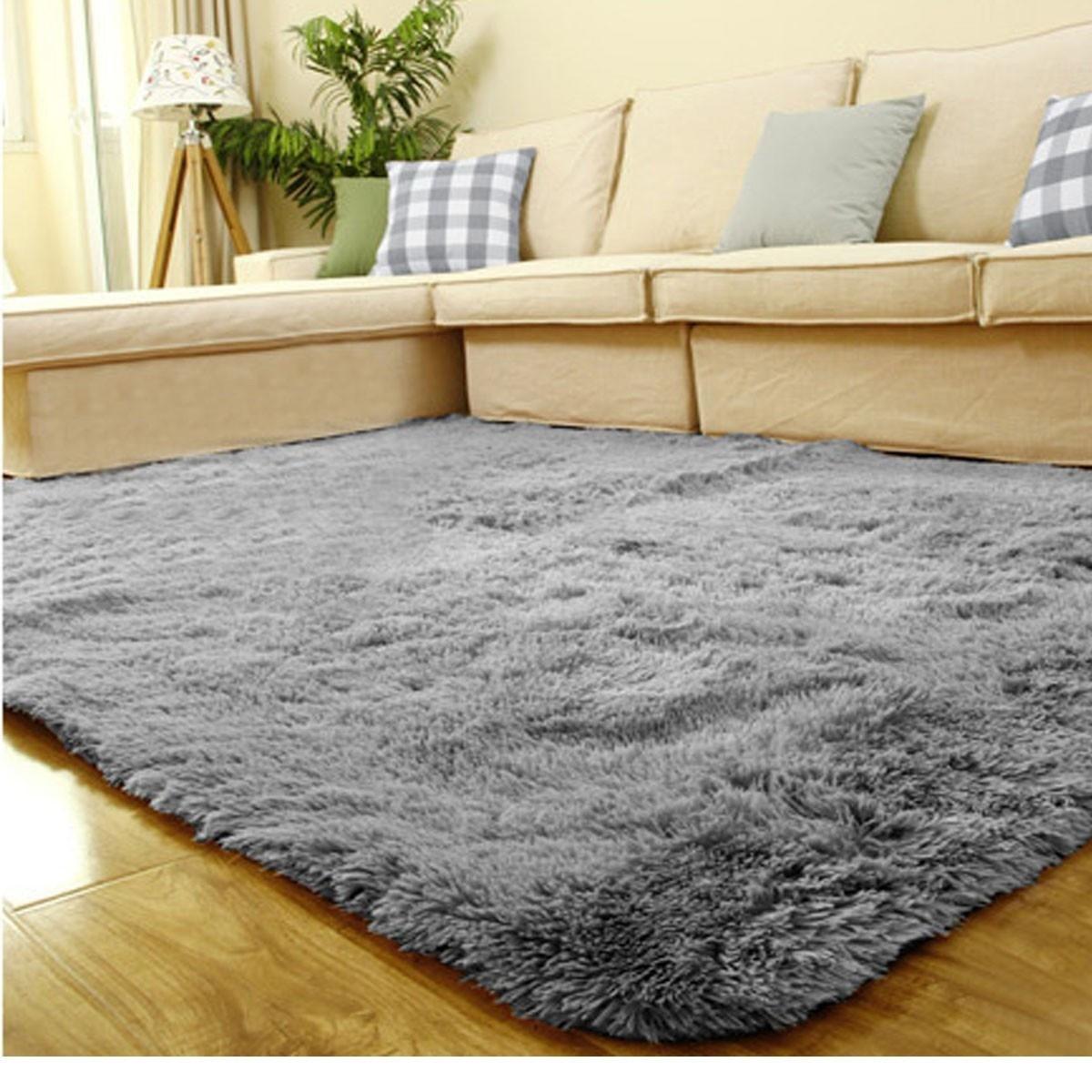
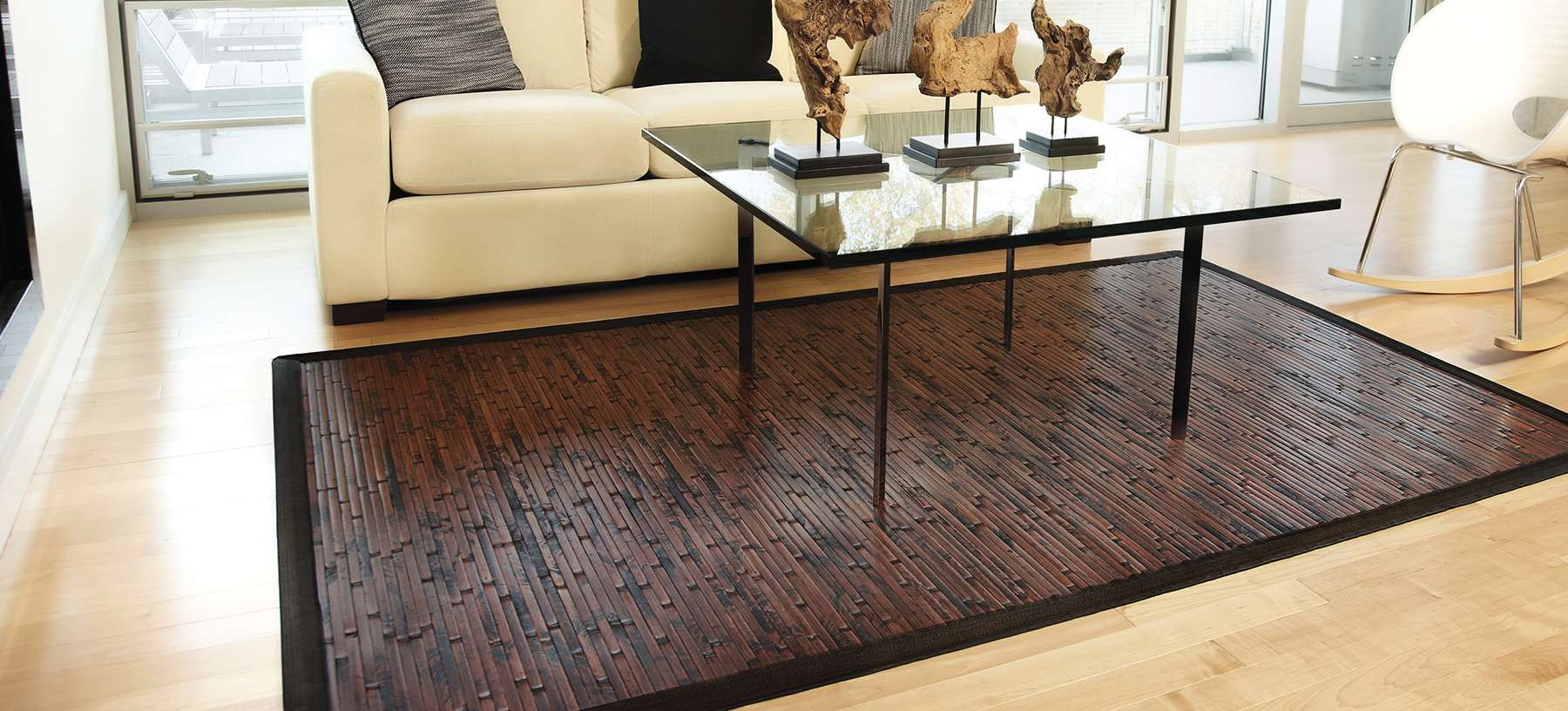
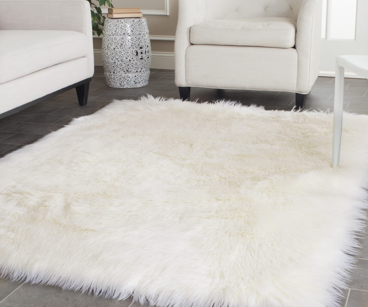
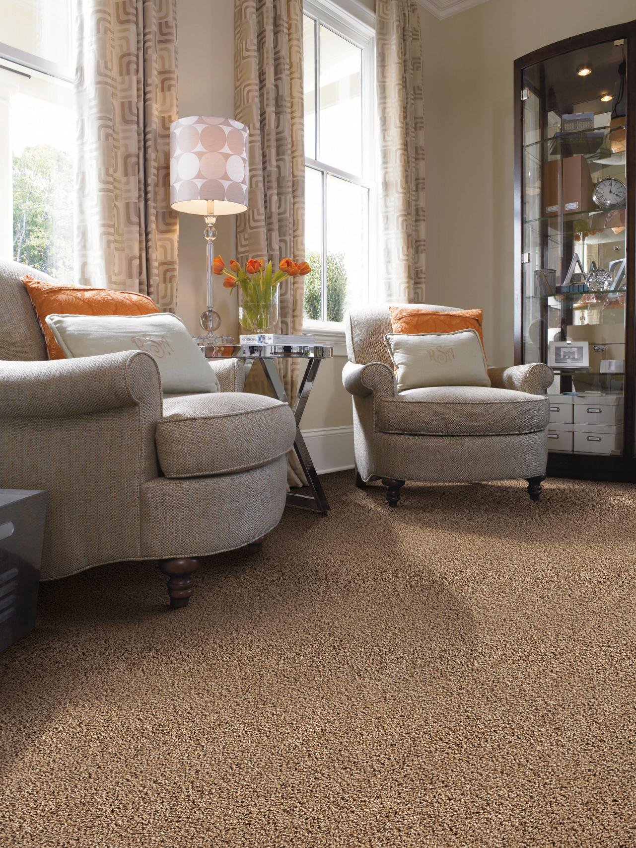
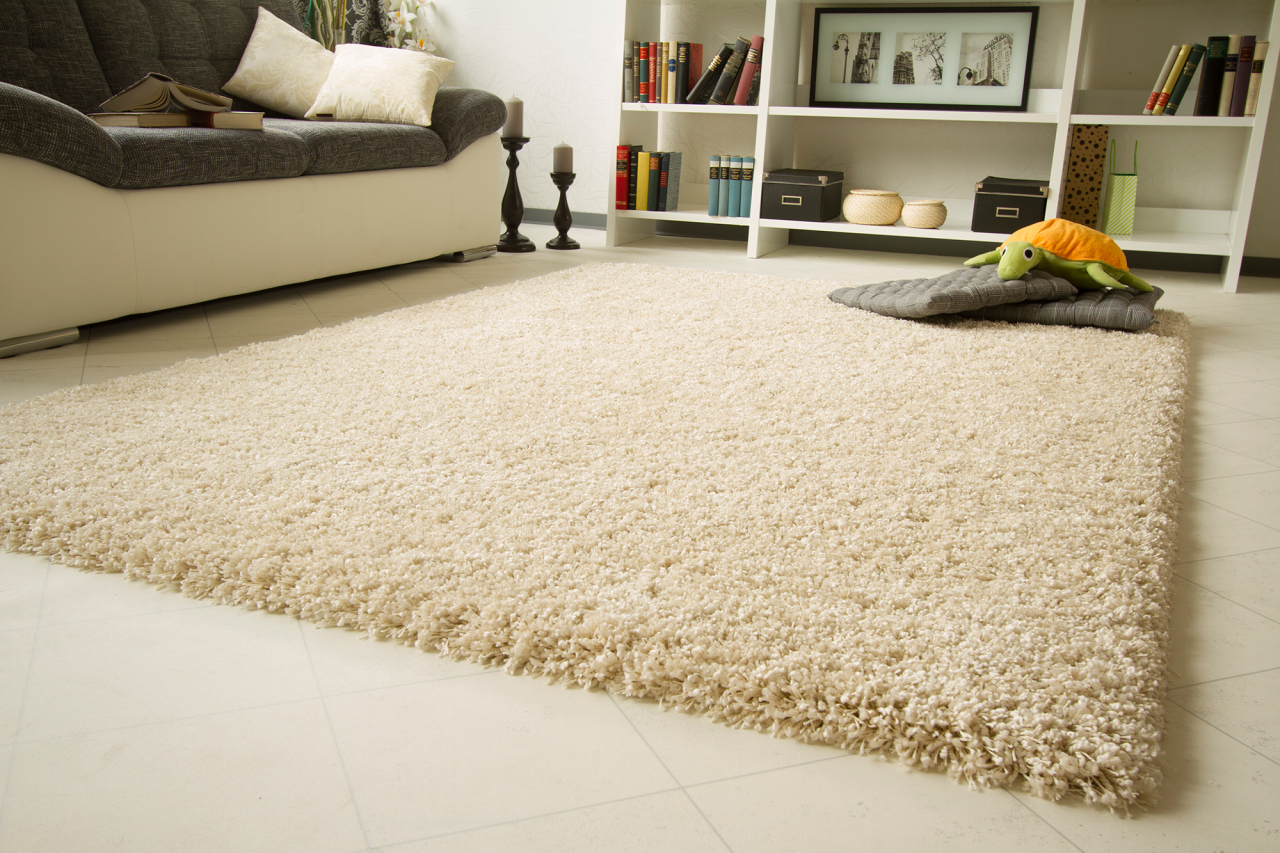
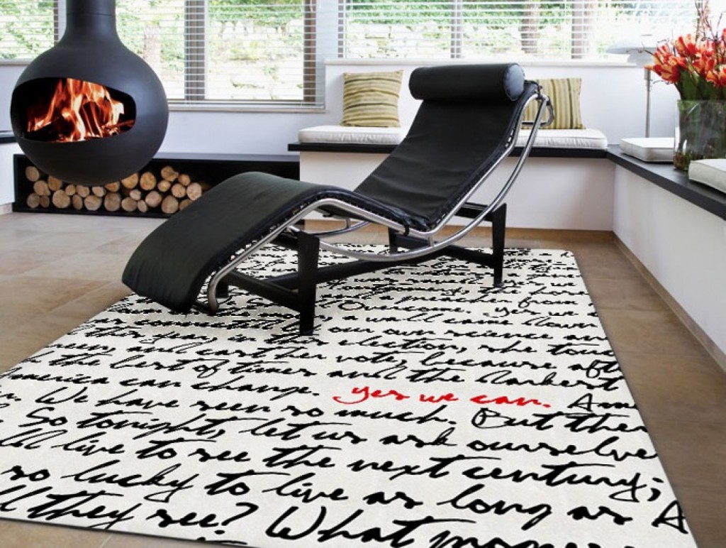
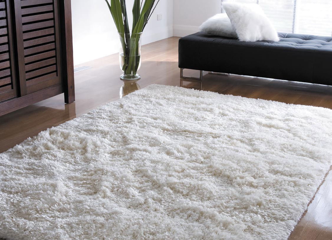
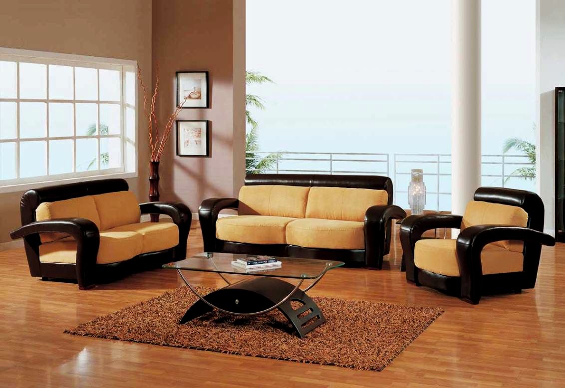
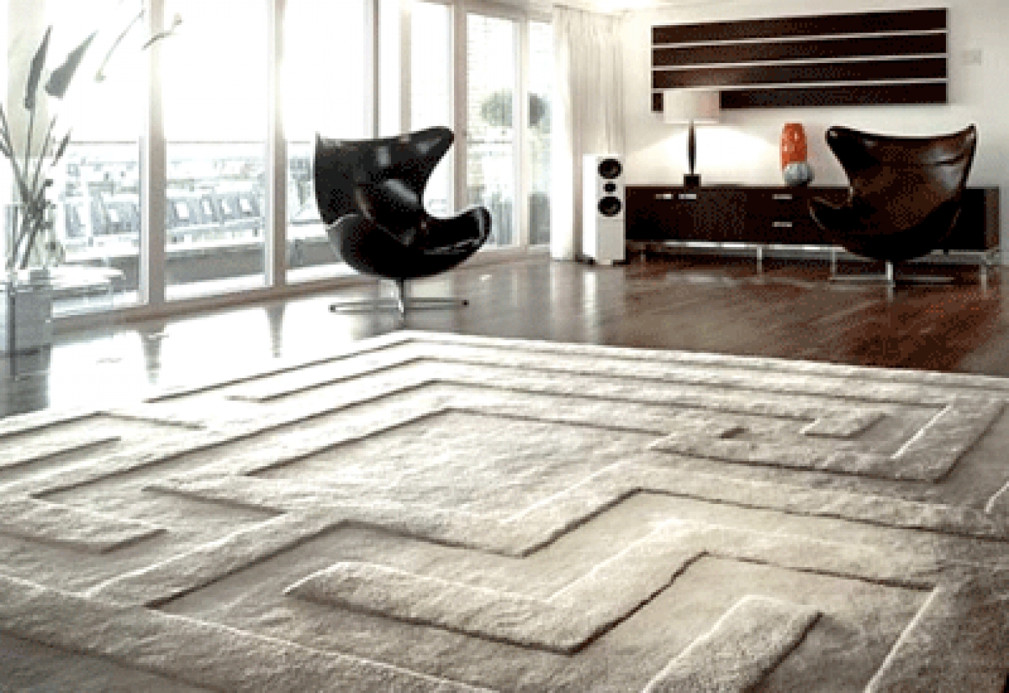
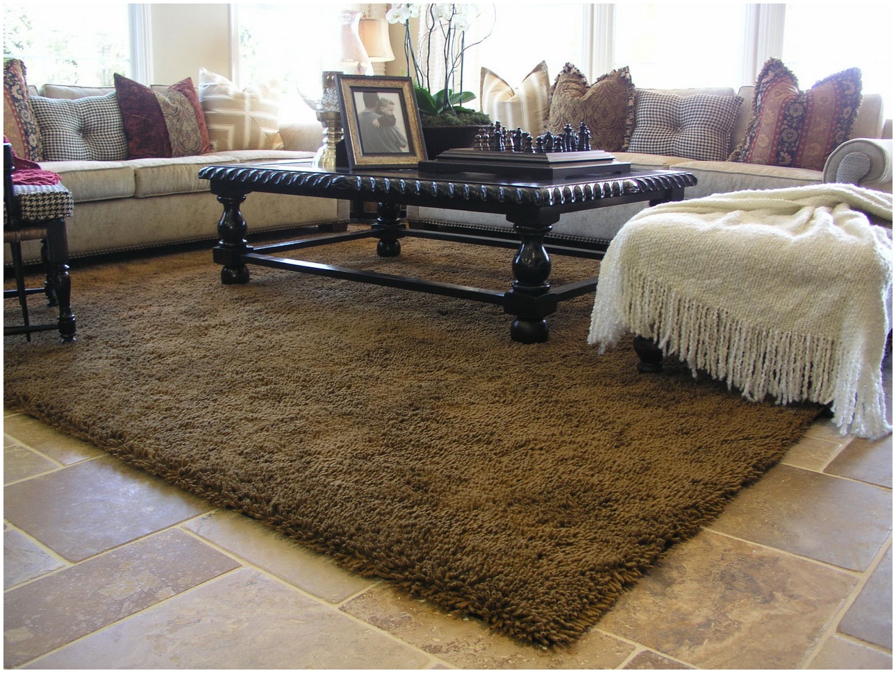
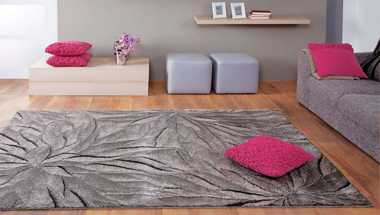
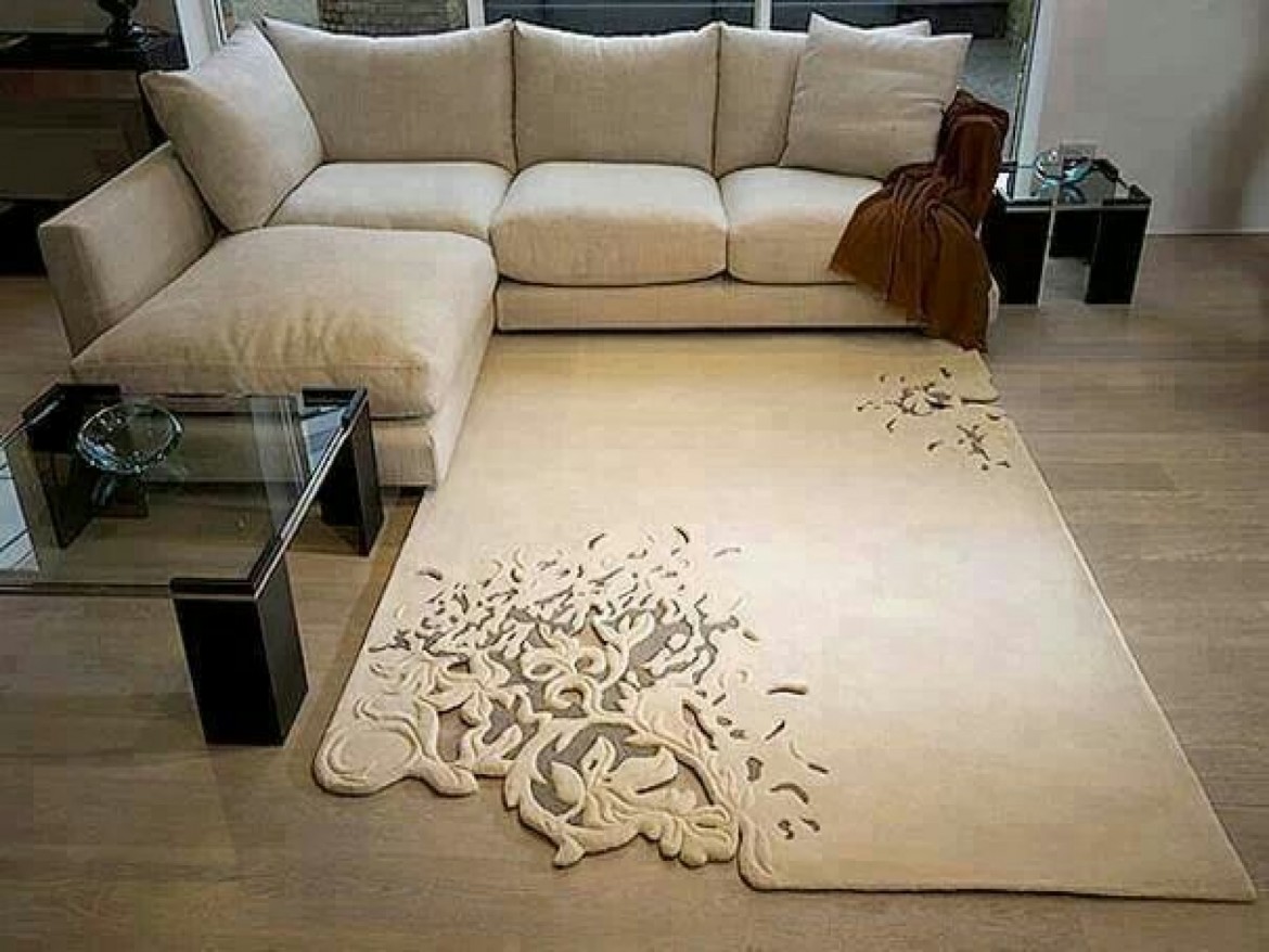
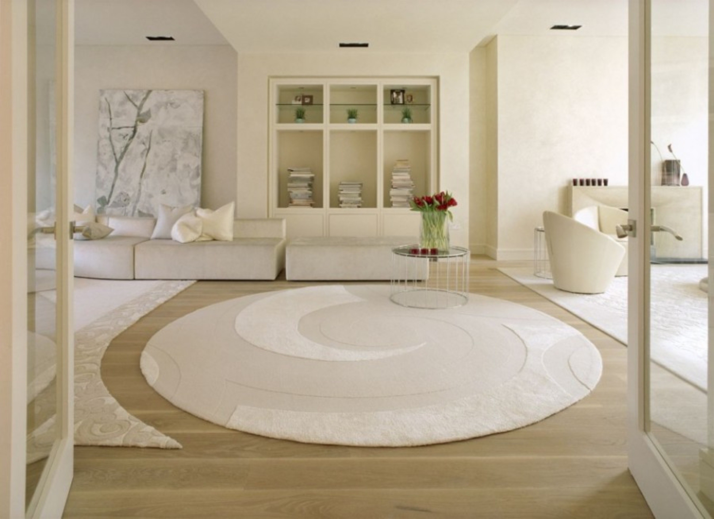
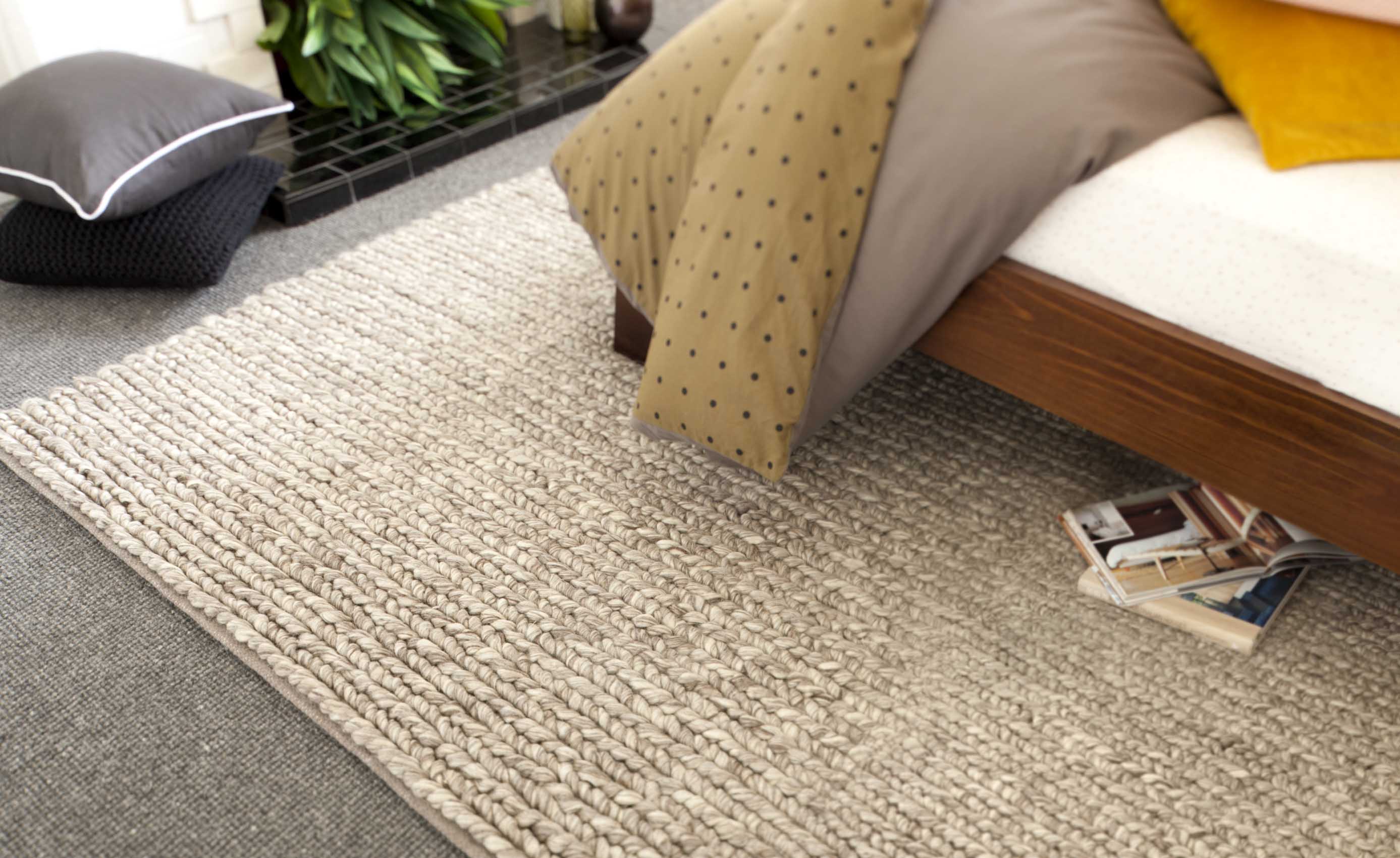
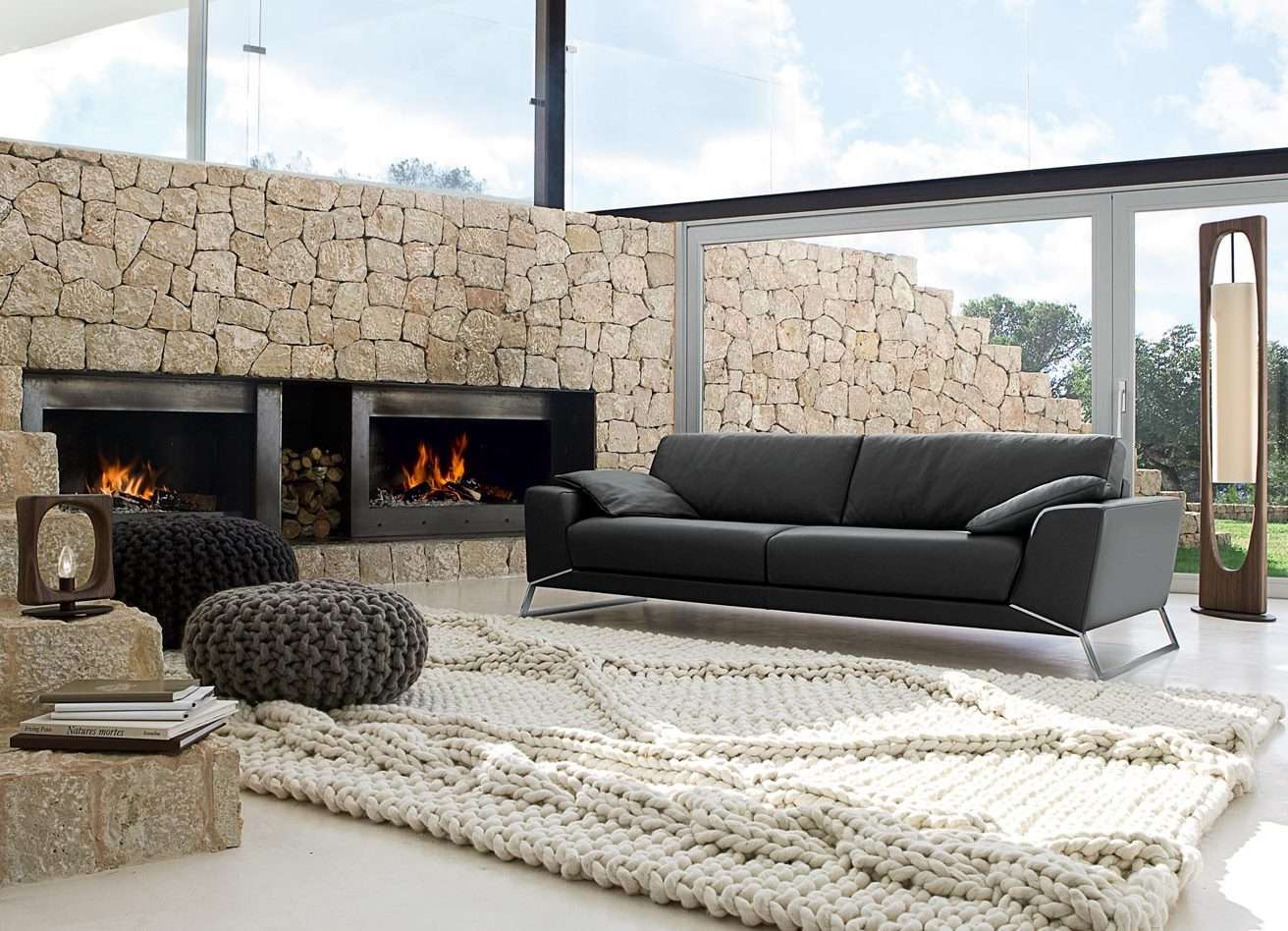
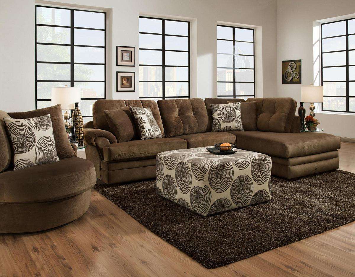
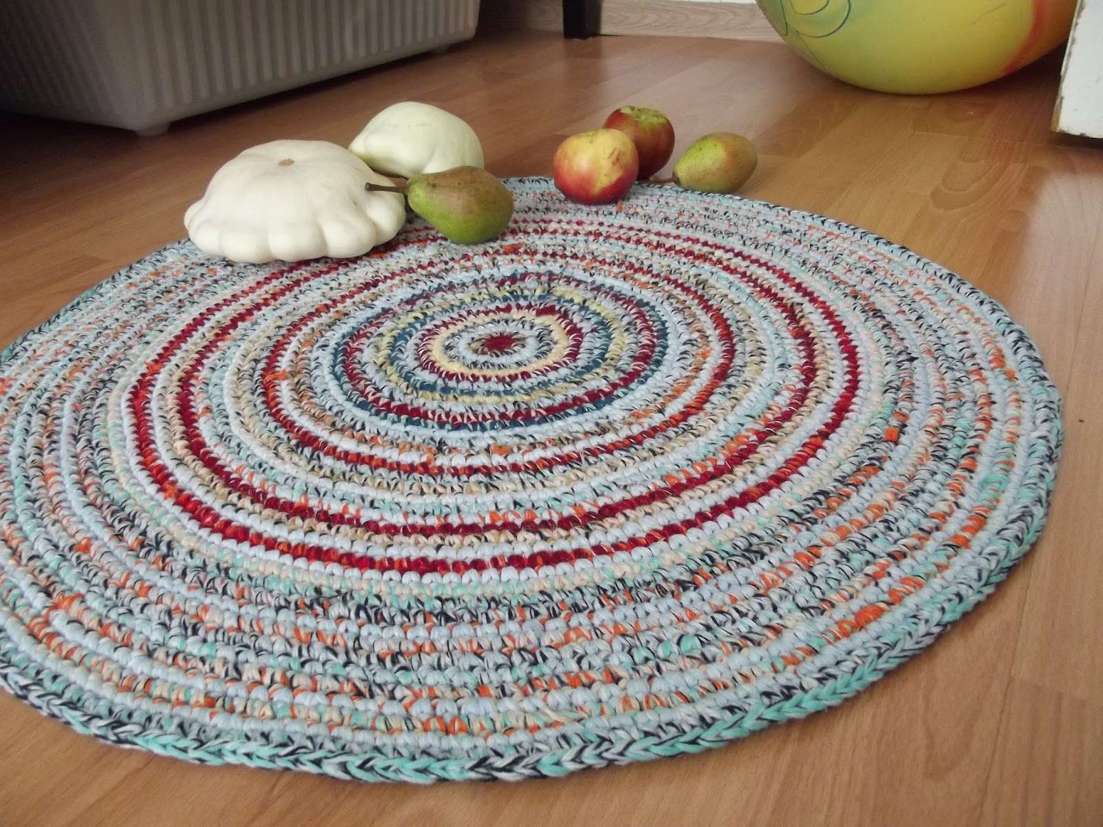
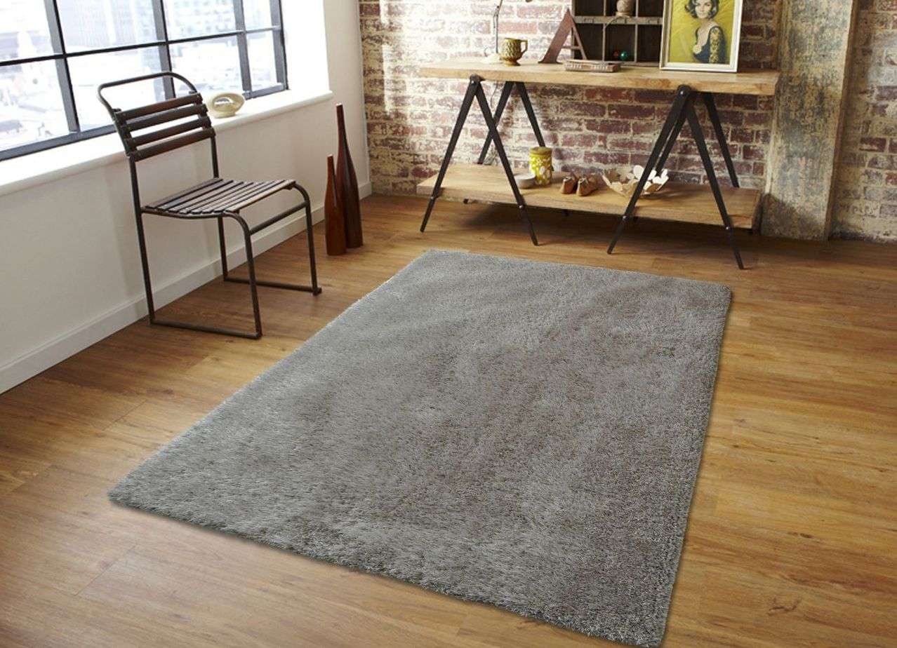
Texture
By choosing the right expressive texture, you can transform the room in the right direction. Here are 3 tricks you can use when working with textures:
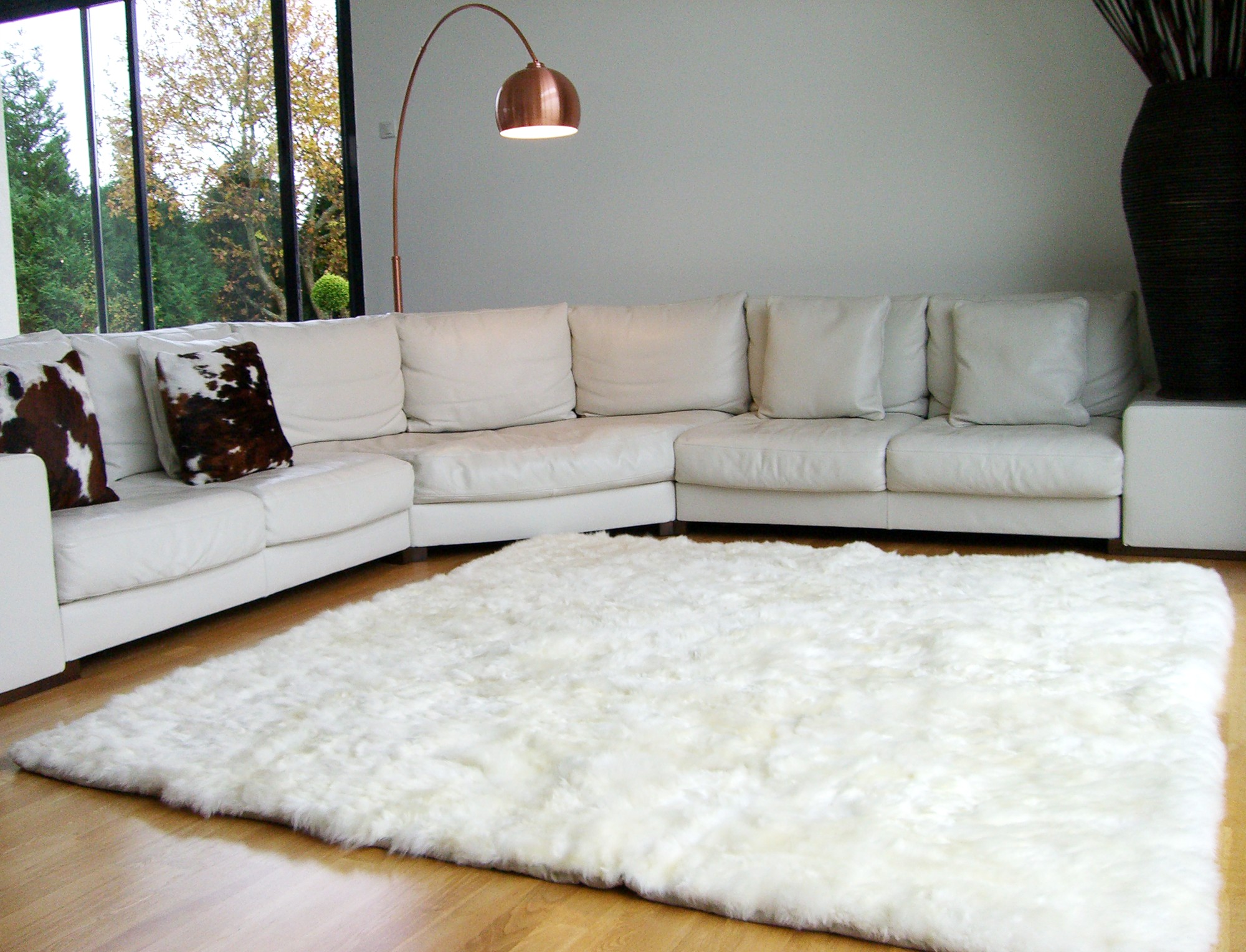
- Heat. Add warmth with woven sisal or a short nap woolen carpet: in combination with rustic tweed upholstery and rich color walls, these effects will warm a room that does not get much sun.
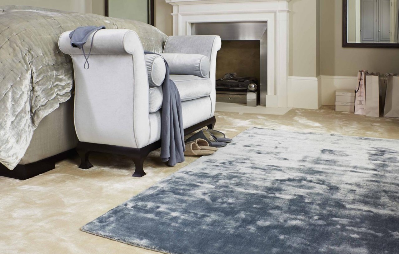
- Space. To achieve a feeling of spaciousness, without sacrificing textural interest, a light, finely textured, woolen sisal carpet in soft gray-green or blue gamut will suit. Faded, which we associate with the distance, will create a feeling of wide space even in a small room.
- Shading areas. The pronounced texture absorbs more light than smooth surfaces. Even with the same yarn color, a high and short pile will have a completely different effect.
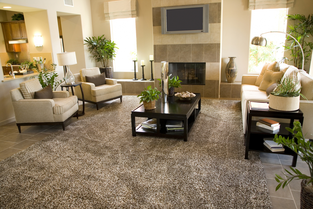
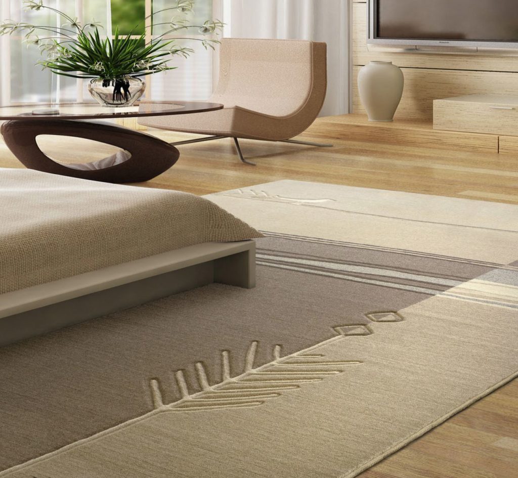
Size with coverage required
At the international level, texture is the hottest topic for discussion in interior design, and nothing is more exciting for designers than a discussion of texture that a carpet should have.
But what is texture? Texture is a sensation of touch and the behavior of the surface when in contact with objects. It represents not only and not so much a relief surface, such as, for example, It is not just uneven surfaces, but a texture contribution to the perception of your room - whether it is rough, soft, shiny, smooth or silky.
Each has its own texture and surface.
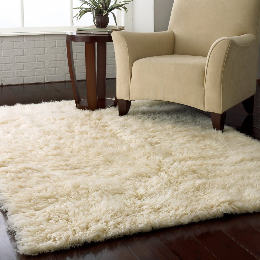
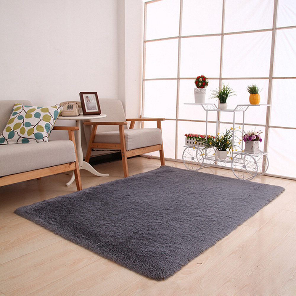
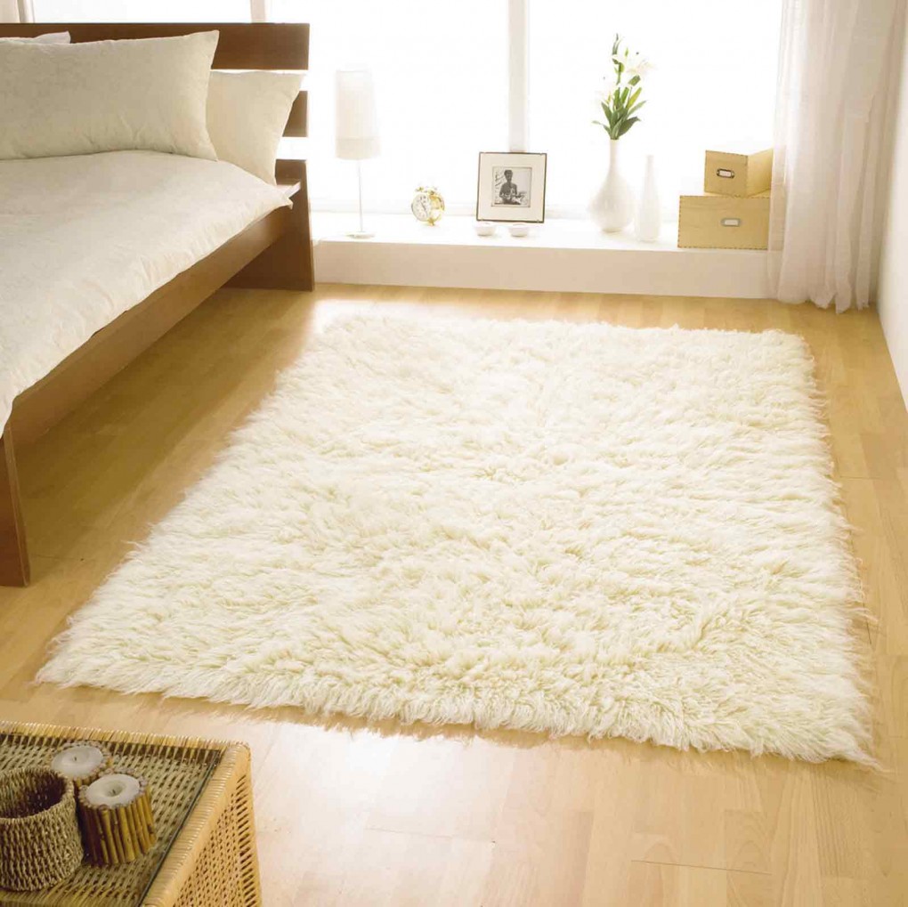
The reaction to a particular material is associated with the sensation of touch. The room, decorated with chrome furniture, glossy walls and slate floor, can be described as "hard and cold." This impression would be based on the touch associated with the materials used.. A warm, cozy and soft texture, such as wool, will bring a feeling of comfort to the house.
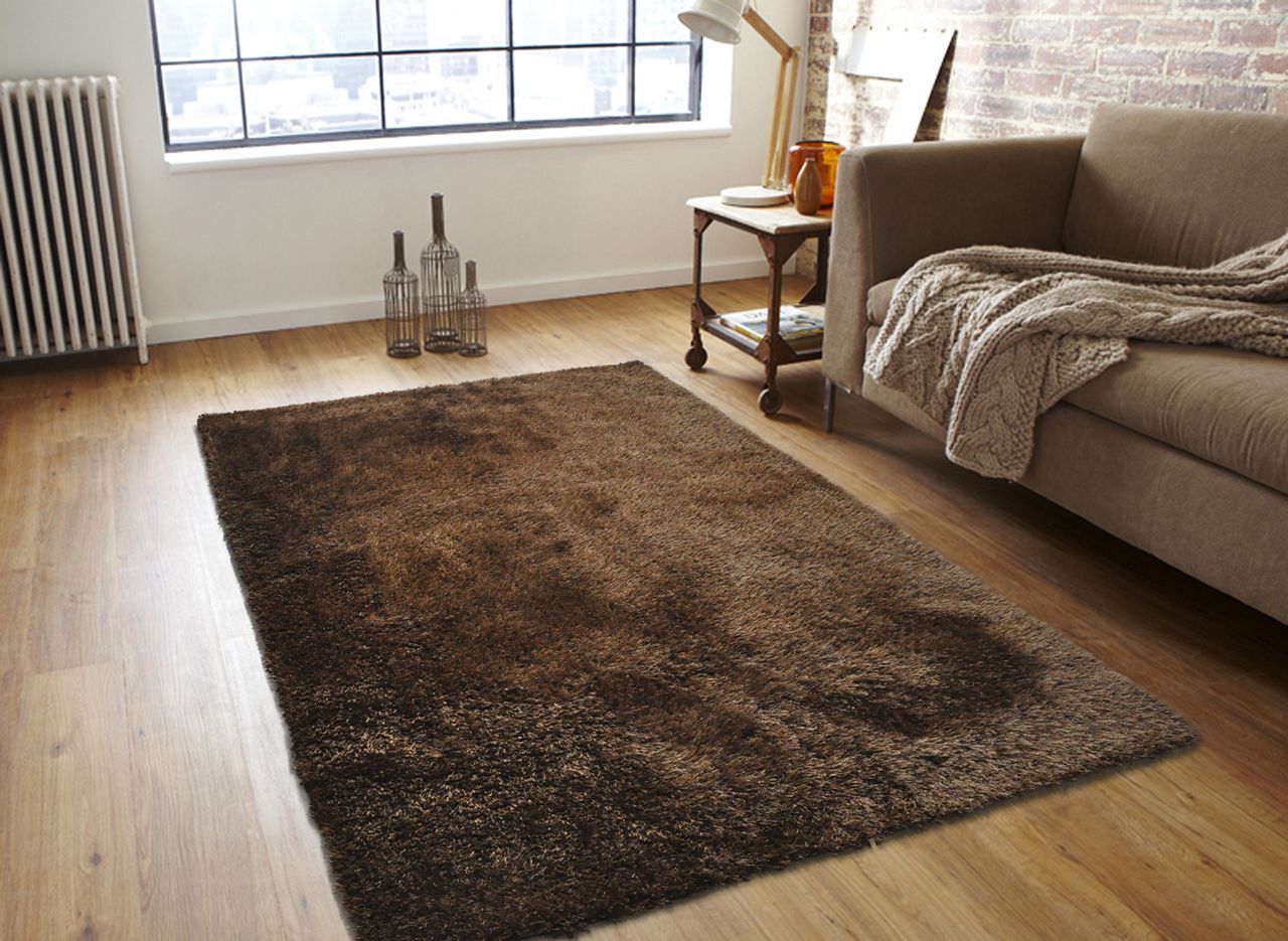
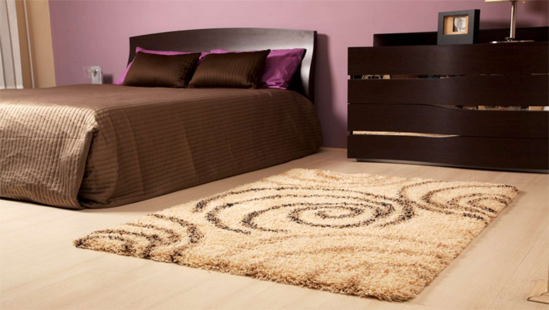
Very soft and warm carpet
What do the design and style experts say?
Let's see what the professionals are saying about trends and style in carpeting. And that's what I found for you. Below is a selection of three stylish trends that designers choose.
return to menu ↑Recycled carpet
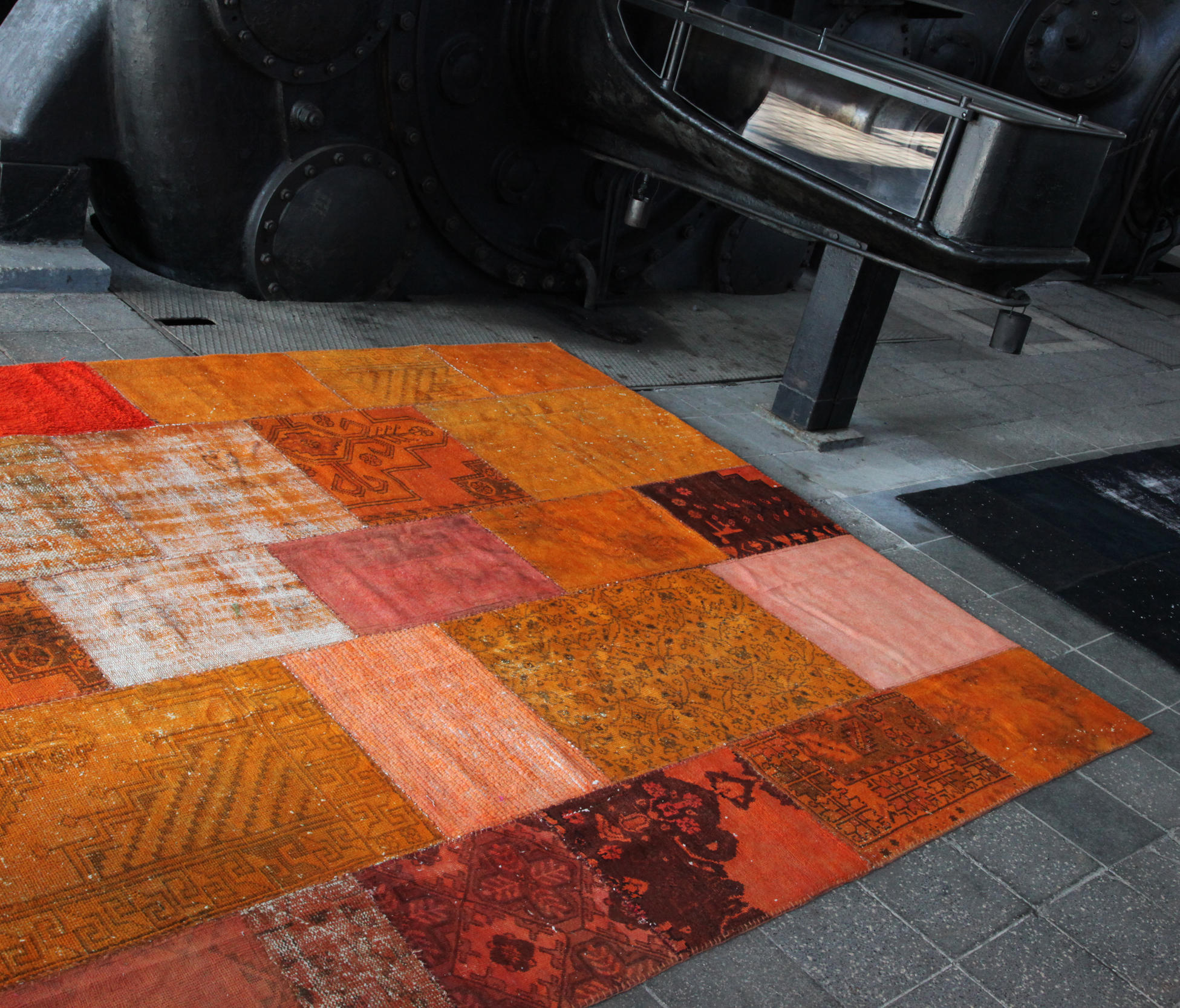
Ecologically clean floors are a powerful trend, and carpet is no exception. In fact, most of the carpets made today are made, at least in part, from recycled material.
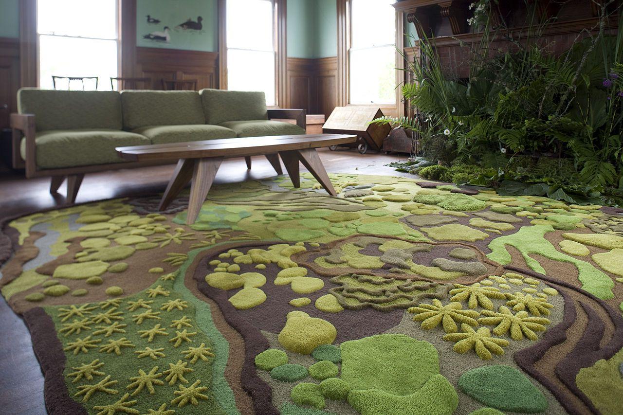
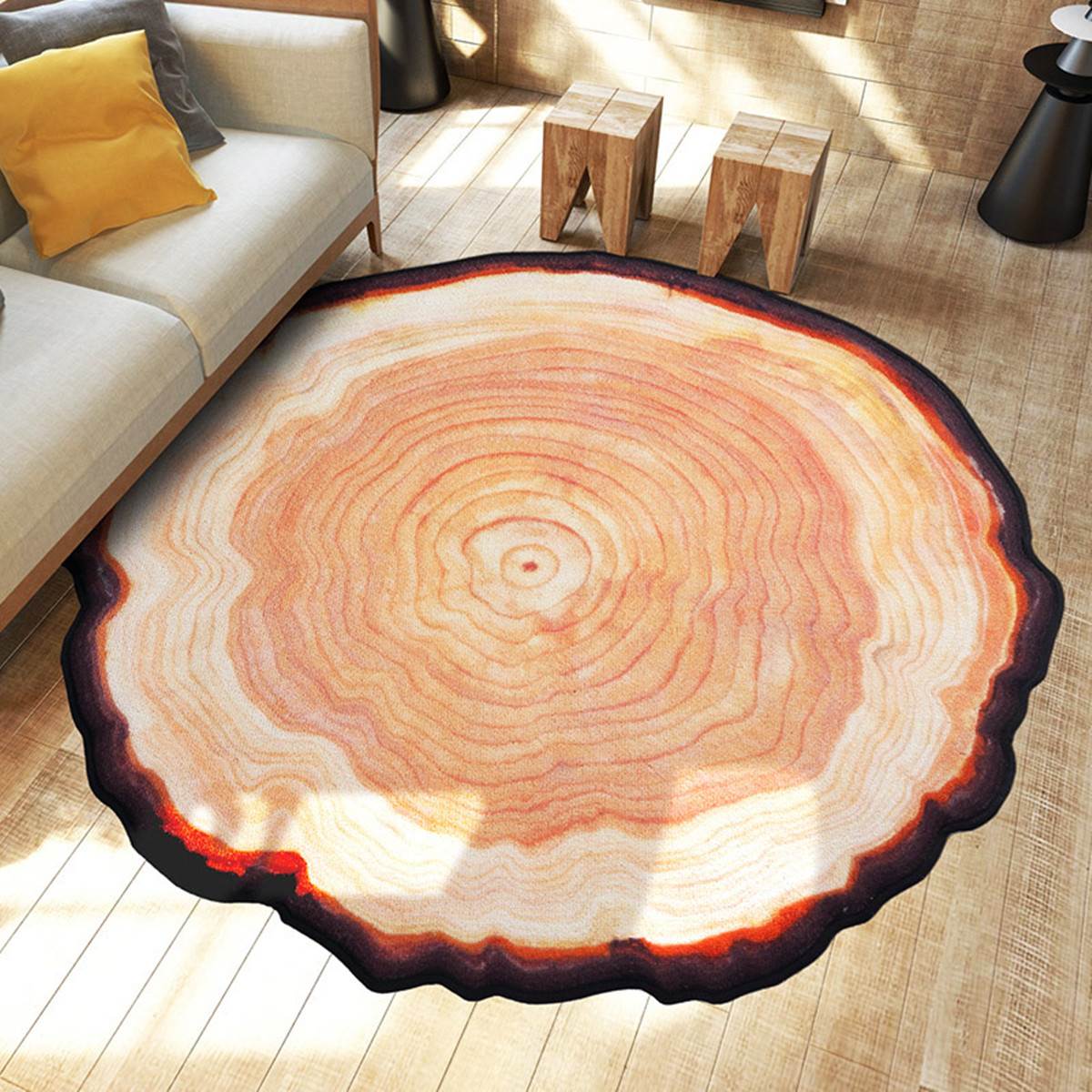
Large picture that does not spoil the interior.
Frize
Frize is a long twisted pile that looks curly. It is a relatively new trend and is likely to continue, at least for the next decade.
Frieze - a new trend in design
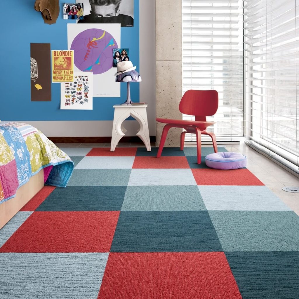
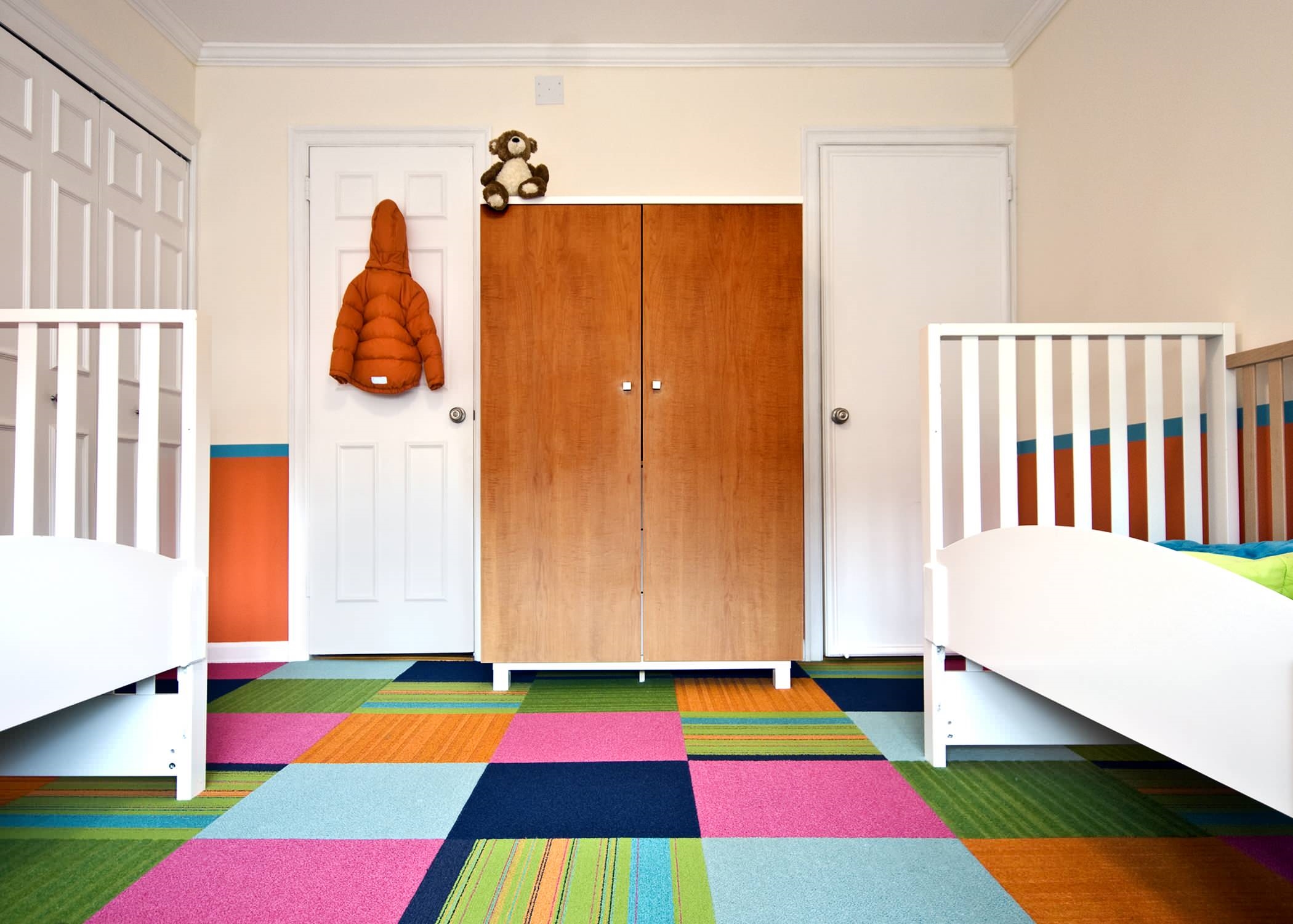
Carpet tiles
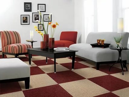
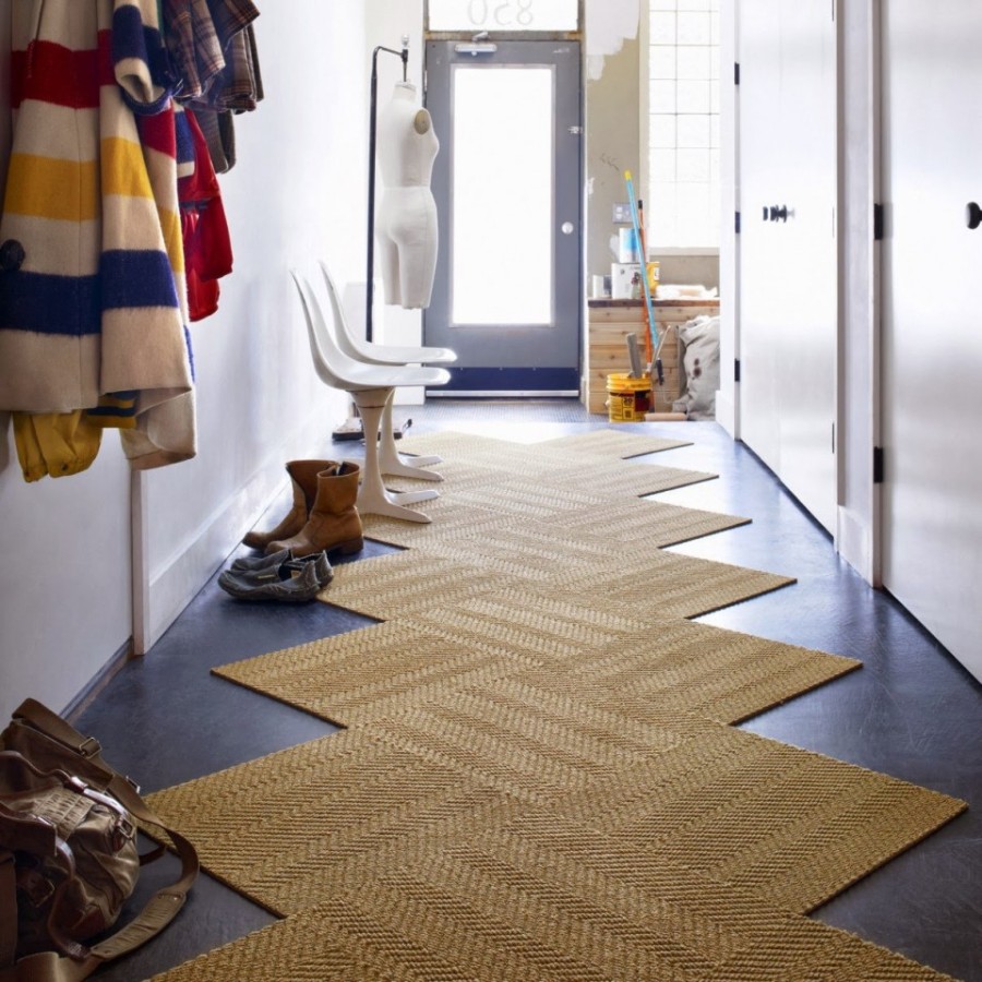
Carpet tile suitable for high traffic areas or in family houses where there is a risk of damage or wear. It is suitable for different rooms, as the stores have a rather wide selection of special carpet tiles for the bathroom, kitchen or bedroom.
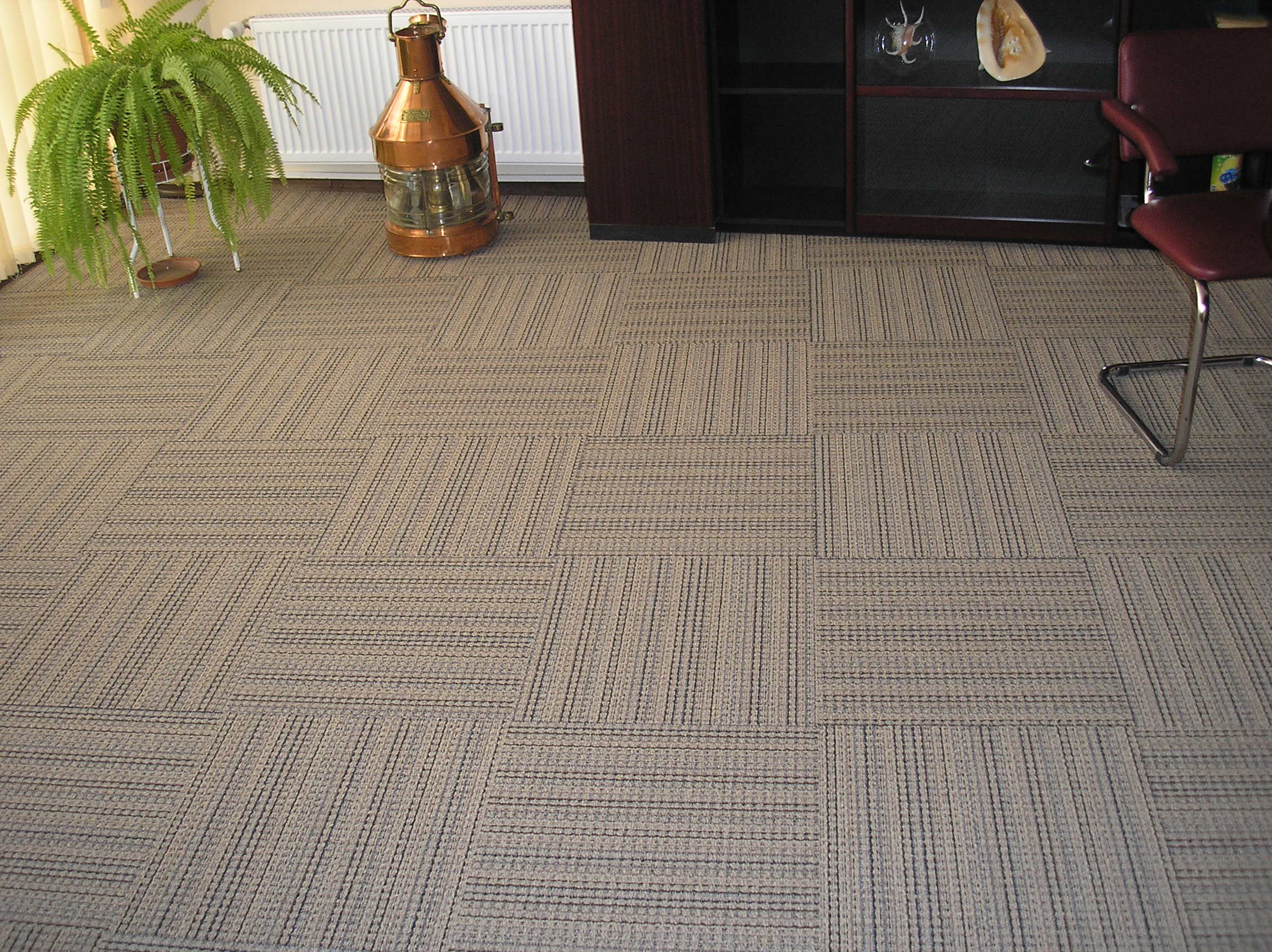
Carpet tiles suitable for bedrooms
The carpet tile contrasts interestingly with laminate flooring and other surfaces can be used in several versions at once.
return to menu ↑VIDEO: Carpet for your interior
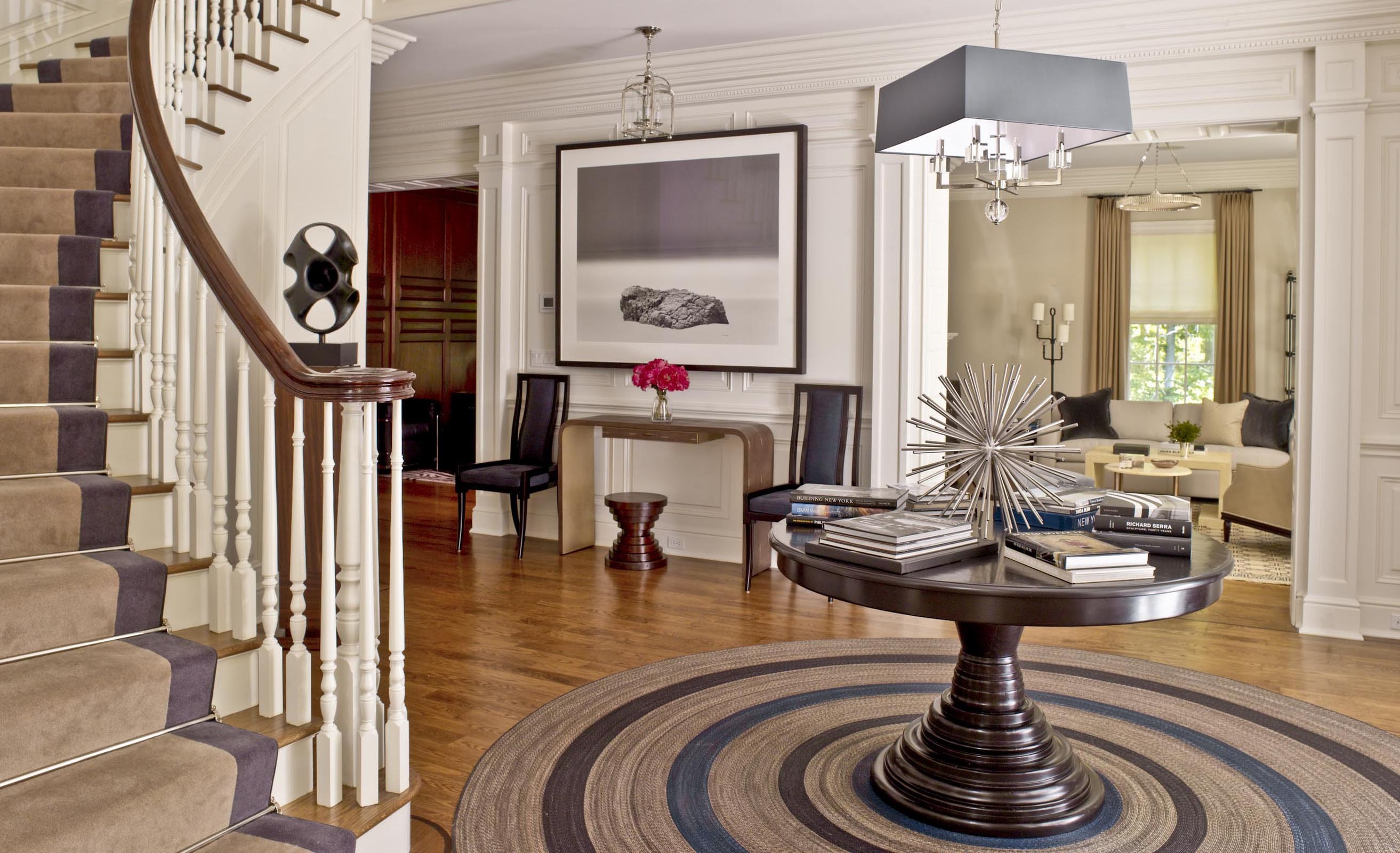
Carpet on the floor
Choosing the right