Interior with sourness: + 135 Photos of the kitchen in yellow. We start the morning vigorously and sunny

Most often, the color of the future interior, we choose according to the principle: "my favorite." And this is the biggest mistake! The effect of colors on the human psyche and health is a proven fact.
Content:
For example, yellow - invigorates! And even if he adore at least a hundred times, he will not let him relax in his own bed, he will make him nervous, problems in relationships will not keep themselves waiting. Therefore, it is not recommended to use for the design of bedrooms. But this is a great option for the kitchen!
Positive properties:
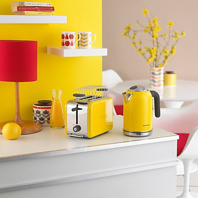
- Stimulates the appetite.
- Accelerates metabolism.
- Raises self-esteem.
- It tones.
- Stimulates creativity.
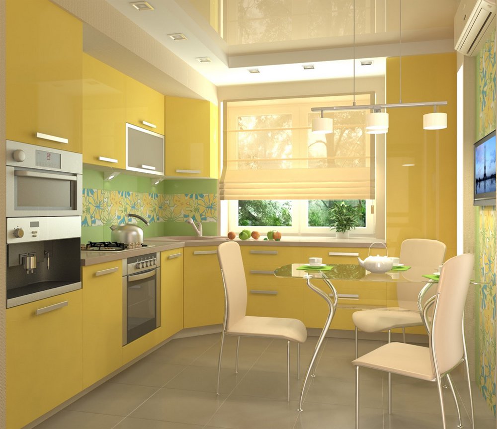
Yellow - invigorating color
In a large number of yellow - tiring, makes the room "stuffy." To avoid this, it needs to be diluted, supplemented and a little "extinguished", as too bright a fire in the hearth. We will understand in order - how to choose a successful combination and determine the proportions.
A color scheme
Colors, like people, show their character depending on who they “communicate” with. Contrasting - those that are further located on the palette, loudly "argue", excite. And located nearby - calm, as old neighbors.
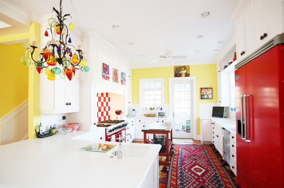
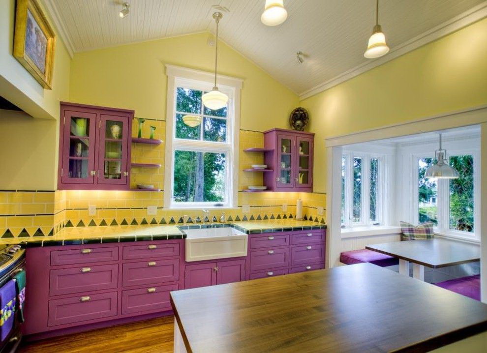
Even experienced designers use the color wheel to select the necessary pairs. If you believe the circle, one of the flashy combinations: yellow with purple. With light green or sand - a complete understanding.
Saturated shades not all benefit
For a neutral atmosphere it is better to choose partners:
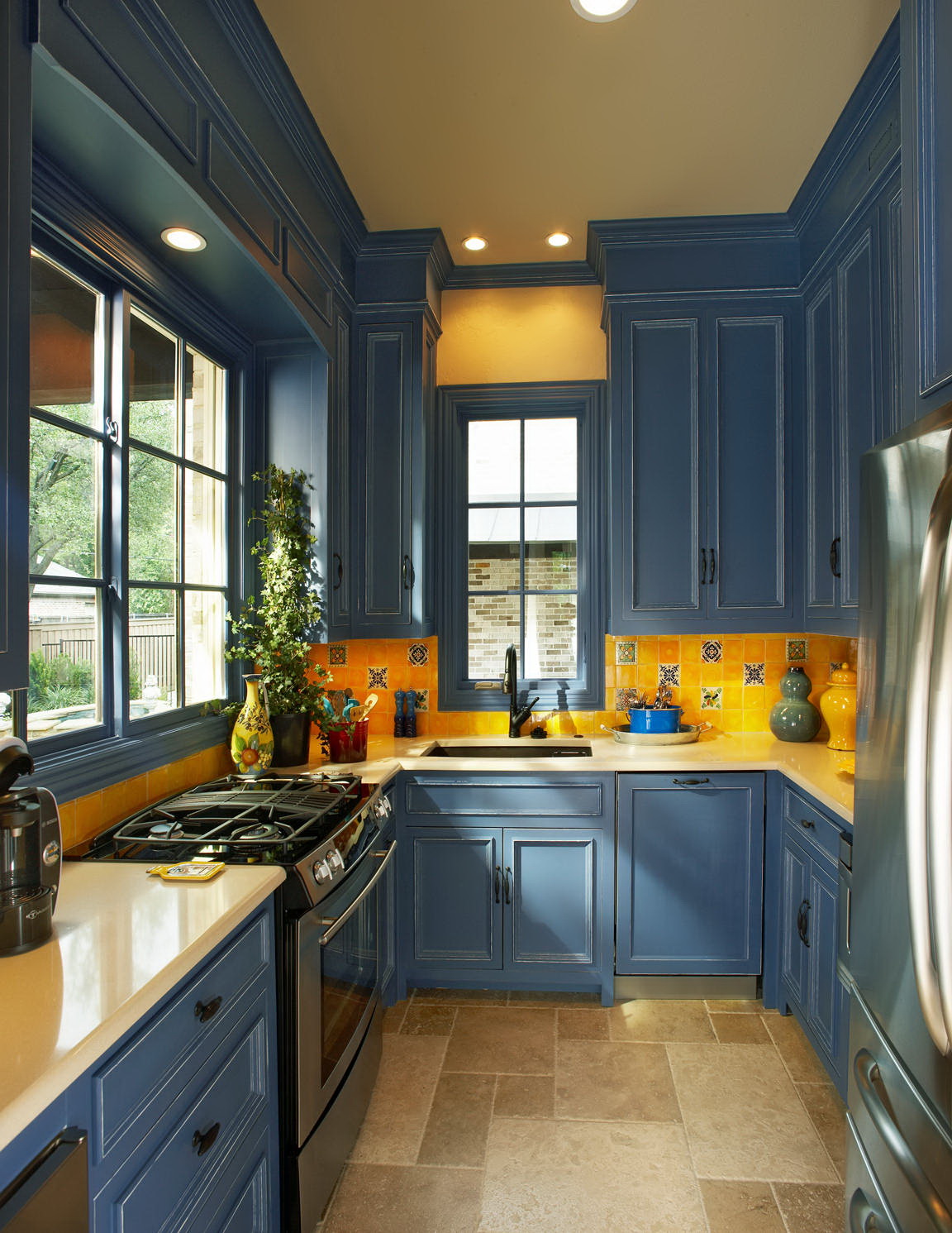
But with those that are pronounced - blue or red, It is better to exercise caution. Next to the canary they seem even more expressive than without him.
This color stimulates the appetite.
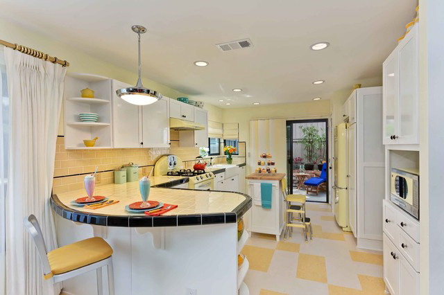
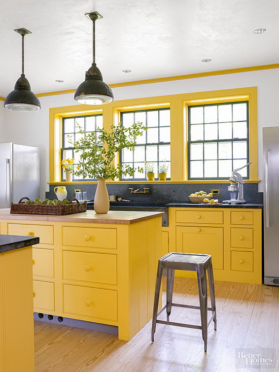
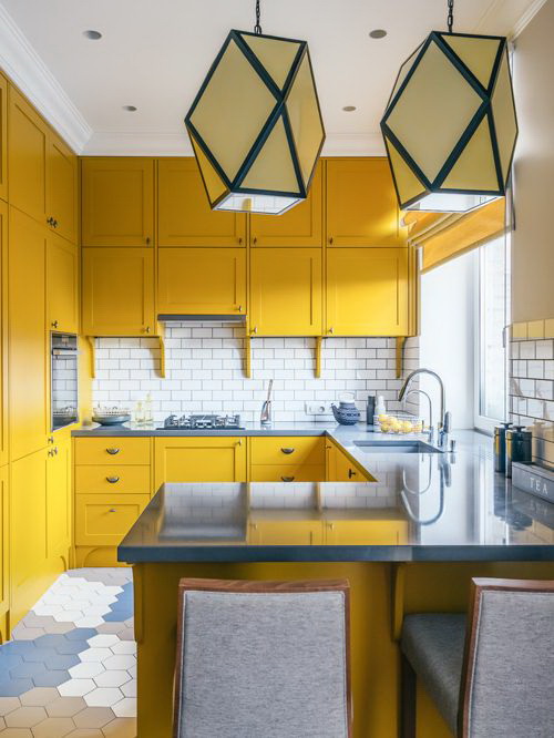
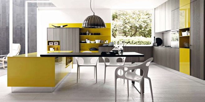
Even before the start of repair, it is worth making a decision: will the yellow form the background or will it appear in accents? It depends on this decision - how bright it will be. For a bright interior in the Scandinavian style, feel free to choose furniture or accessories active shades. And if the background is for classics or country, fit restrained:
- linen;
- sand;
- cream;
- straw.
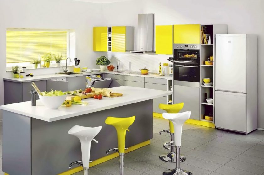
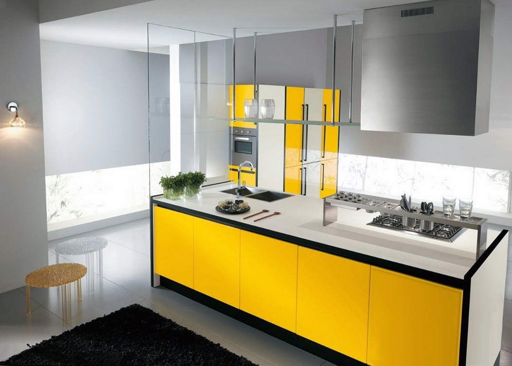
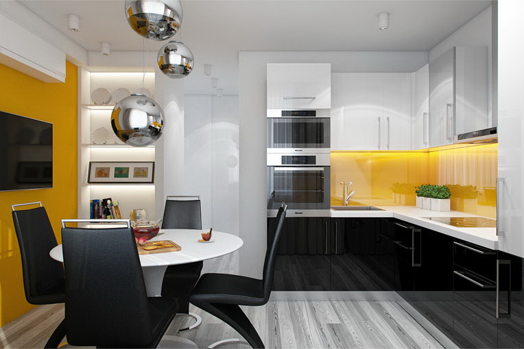
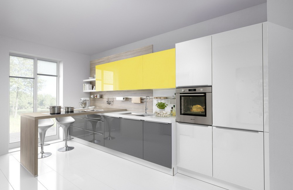
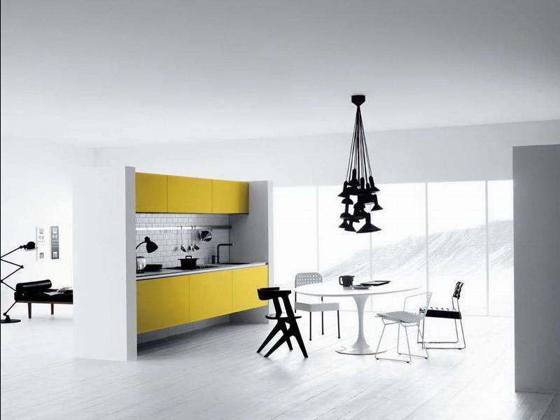
Duet with white or gray
White is now in fashion, so taking him as a companion will not go wrong. Balances the playful sunshine notes, slightly smoothes them, discharges. The combination is a trend!
But be careful! Both colors have the ability to reflect light well and create a festive atmosphere too. If you are so a positive person, then there is no need to disturb the nervous system. Choose soft amber or honey.
Combined with gray
A less intrusive alliance will turn out, if we replace crystal snow - with gray: ivory, eggshell, dusty, marengo. This will add sophistication. Gray is considered solid, it calms and gives a degree.
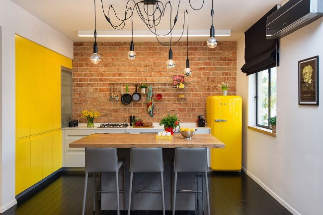
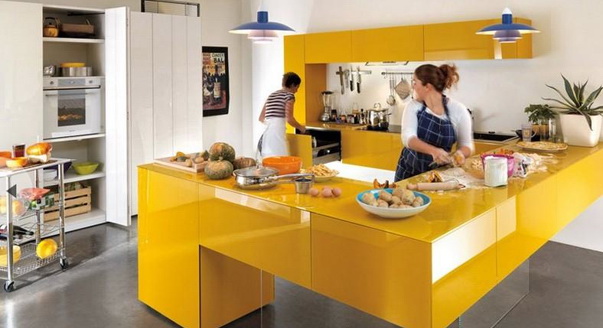
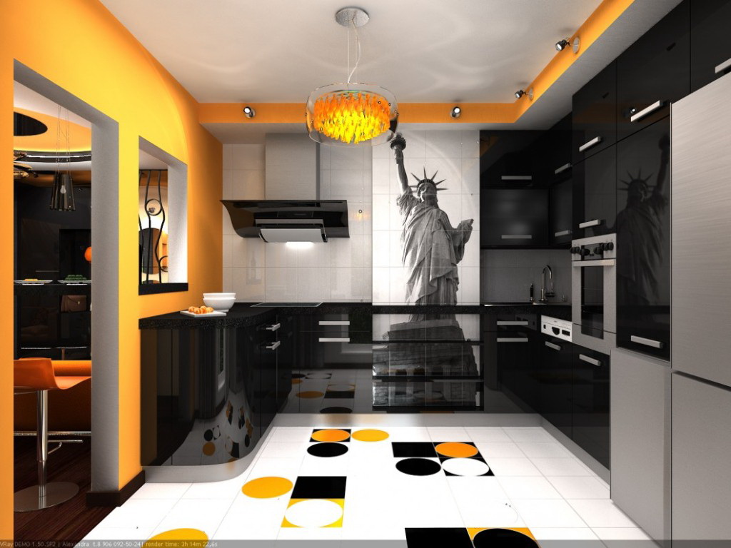
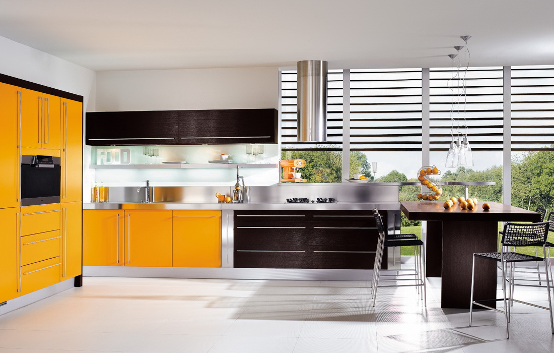
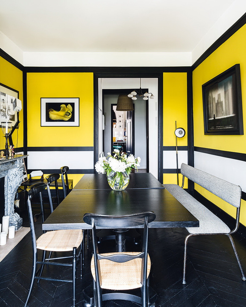
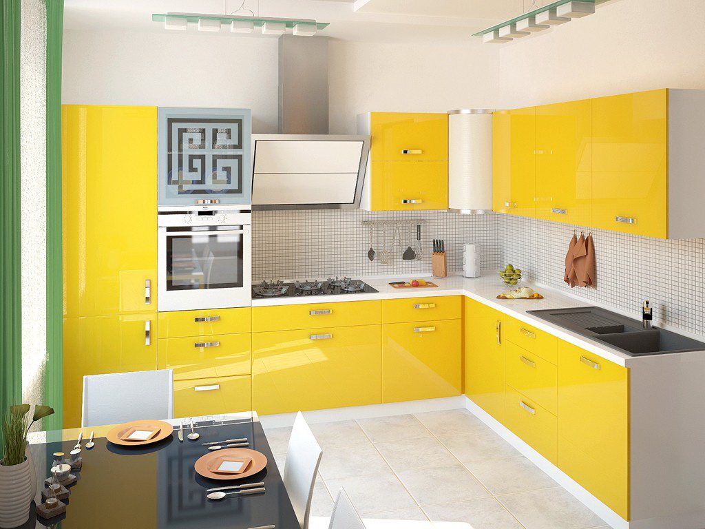
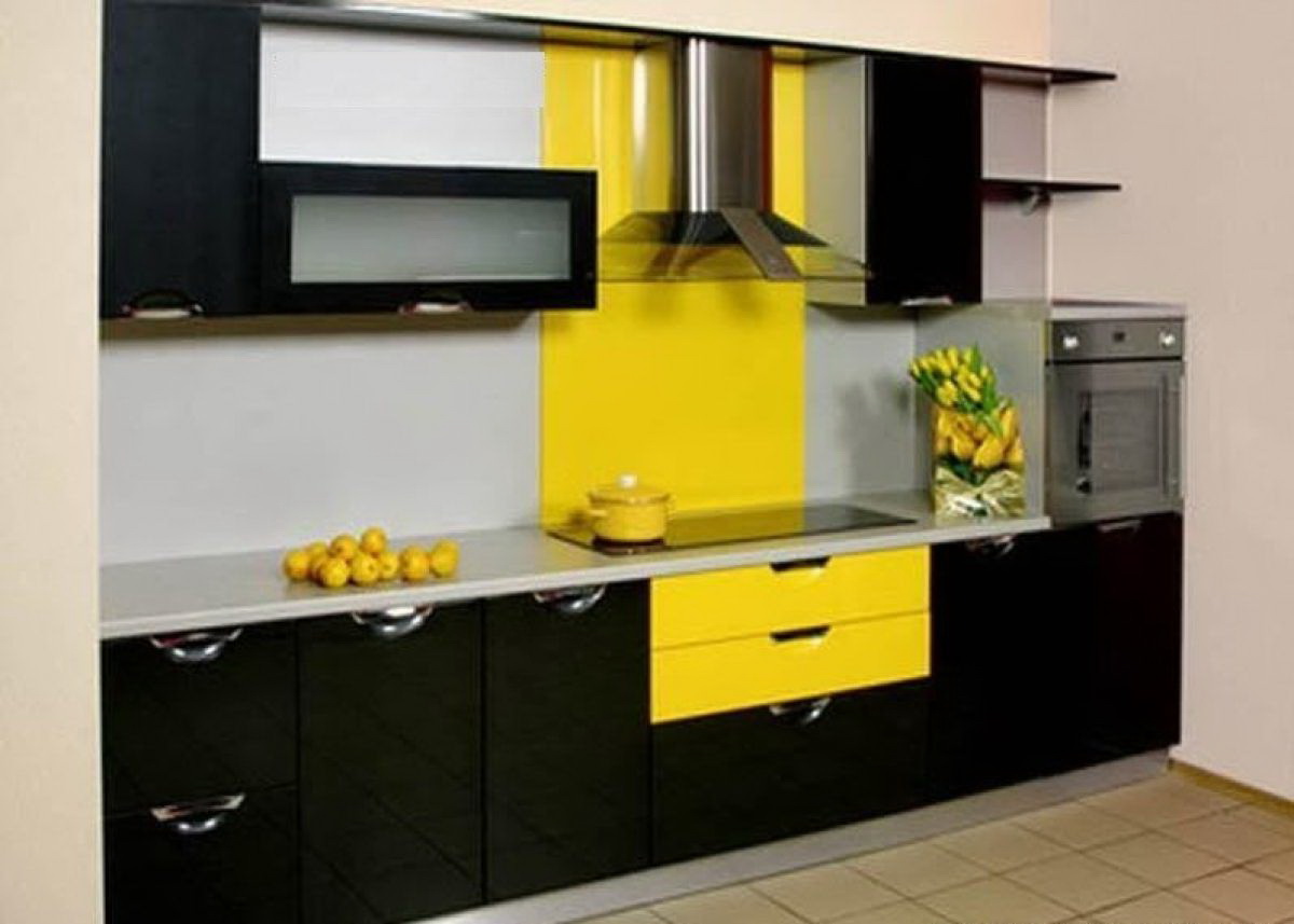
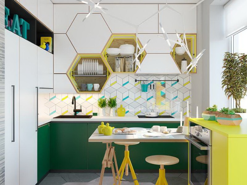
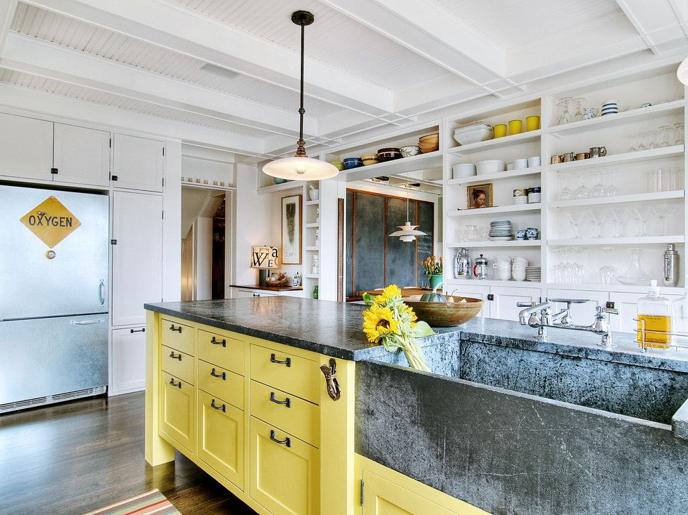
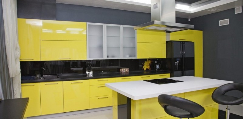
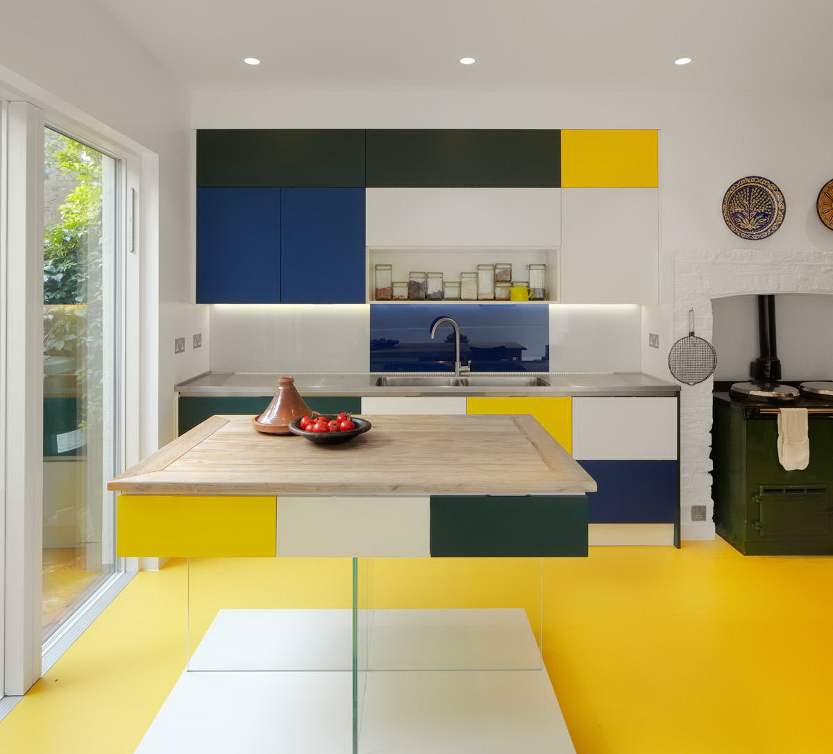
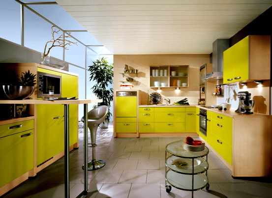
Yellow-black life
These are very sharp contrasts. Especially for the kitchen. Yes, such an interweaving eats in nature - bees, bumblebees. But it is aggressive!
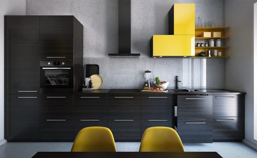
Sharp contrasts
A room can look interesting and dynamic if the following conditions are met:
- keep proportions: black no more than 1/3;
- add white;
- make lightness at the expense of glass parts (cabinet doors, household appliances).
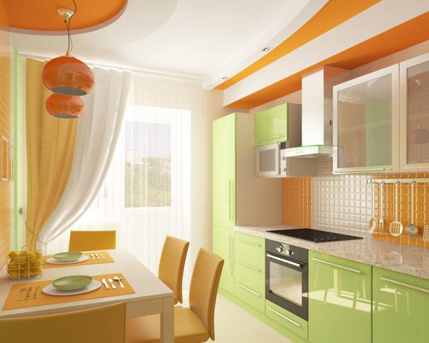
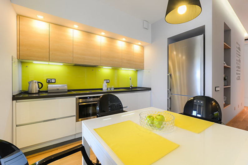
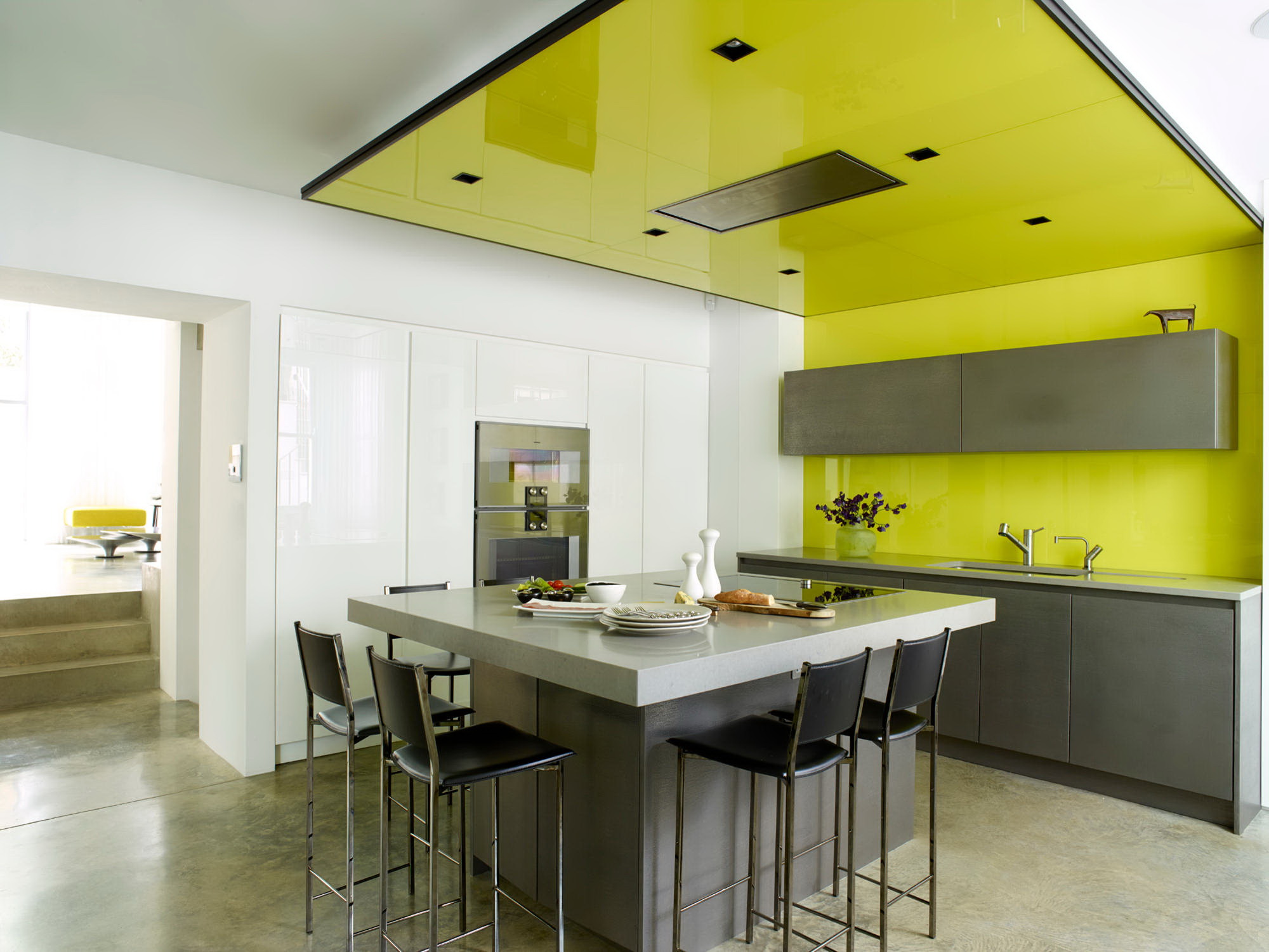
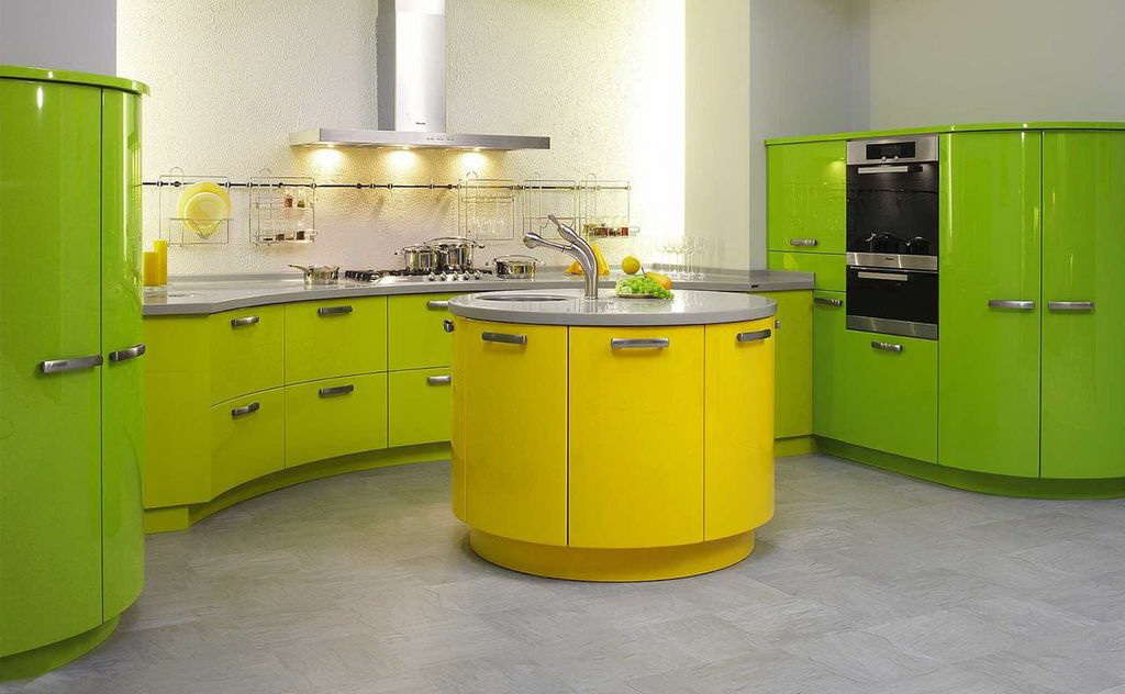
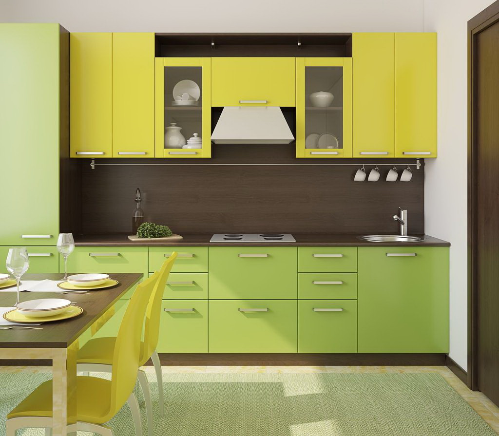
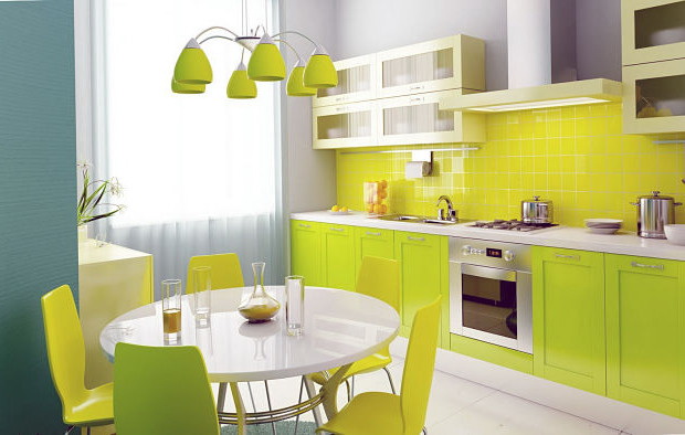
Lime and green
This combination is often found in nature, therefore, in itself is harmonious, familiar to our perception. But, here, in design for some reason, a rarity. Perhaps very summer and motley, for an amateur.
And, of course, without skill, it is difficult to calculate the appropriate shades. Rich colors - self-sufficient, each trying to dominate. But there is a way out. Take as a base pastel derivatives, as in the style of Provence. Walls, table and chairs - "wheat", facades cabinets - pale green, as if "burned out".
Soothing can be a union of cream and mint. Both seem to be diluted with milk, and a bit "lived." Do not tone up.

This combination is often found in nature.
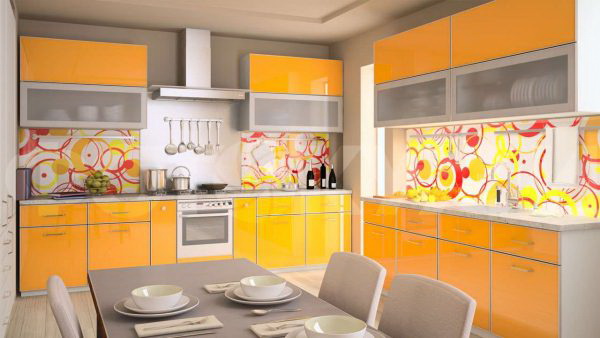
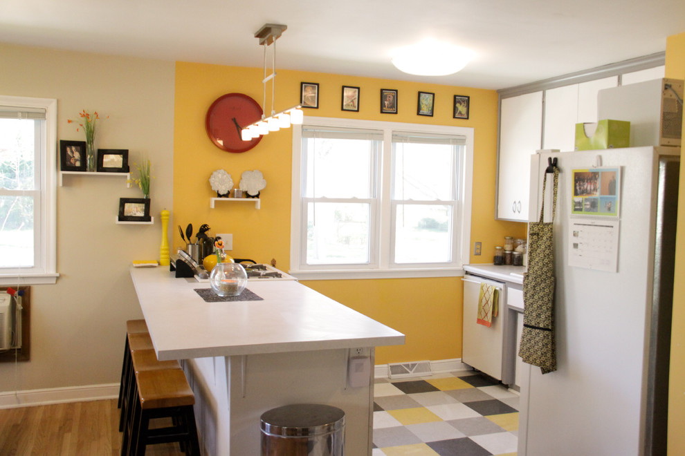
Orange yellow
Honey and orange - it would seem, positive and tasty colors, just for the kitchen! But there is a catch. Both colors are warm and very active. If there are too many of them, then the effect is not always necessary:
- the temperature in the room seems a few degrees higher;
- increased appetite, which is harmful for people prone to overeating;
- nervous system becomes agitated.
This is easily avoided if you do not treat them as equal partners. Taking as a basis only yellow, and then muffled, and orange - to leave in details: household appliances, accessories, decoration.
Positive and tasty colors
The company will be less tart and sugary if you add a third party:
- cool blue;
- mint;
- pearl.
Yellow blue
Imagination draws associations: the sun, sky, sea. The most harmonious and environmentally friendly union, often found in the environment. It has to rest, gives a charge of optimism.
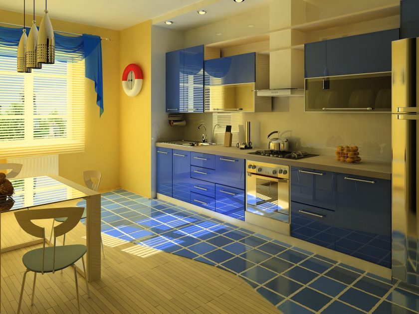
The most harmonious and eco-friendly union
Blue next to amber - for thrill-seekers and creative personalities. Therefore, both are deep, with a high concentration of pigment.
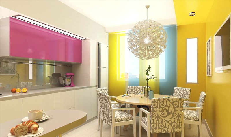
Cornflower blue shade is obtained by mixing blue and purple. It has a pink fleur. And pink is interesting to work in a company with a sunny one, making the interior delicate and romantic.
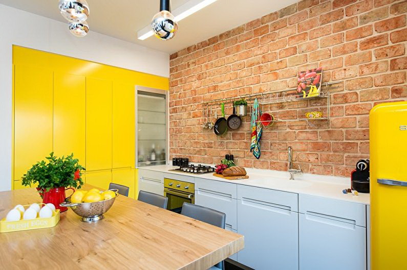
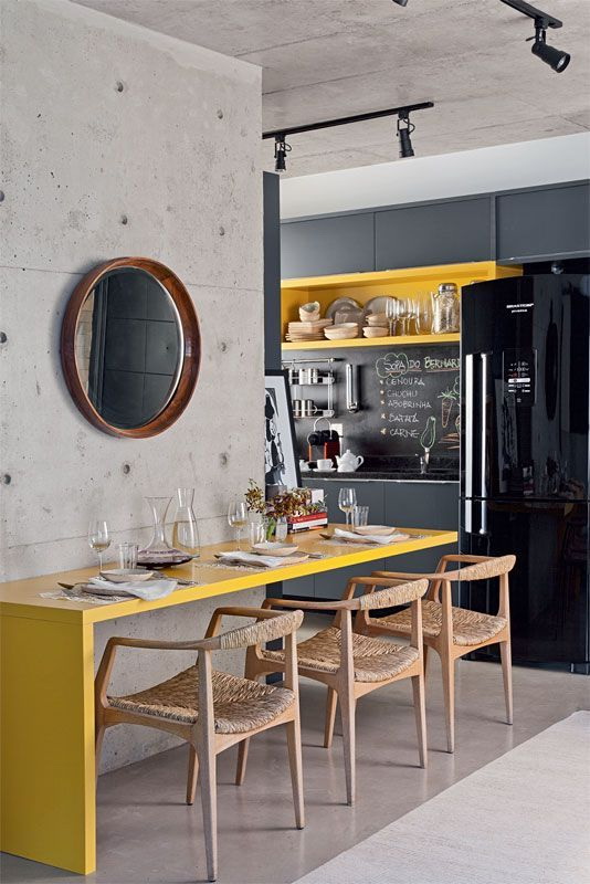
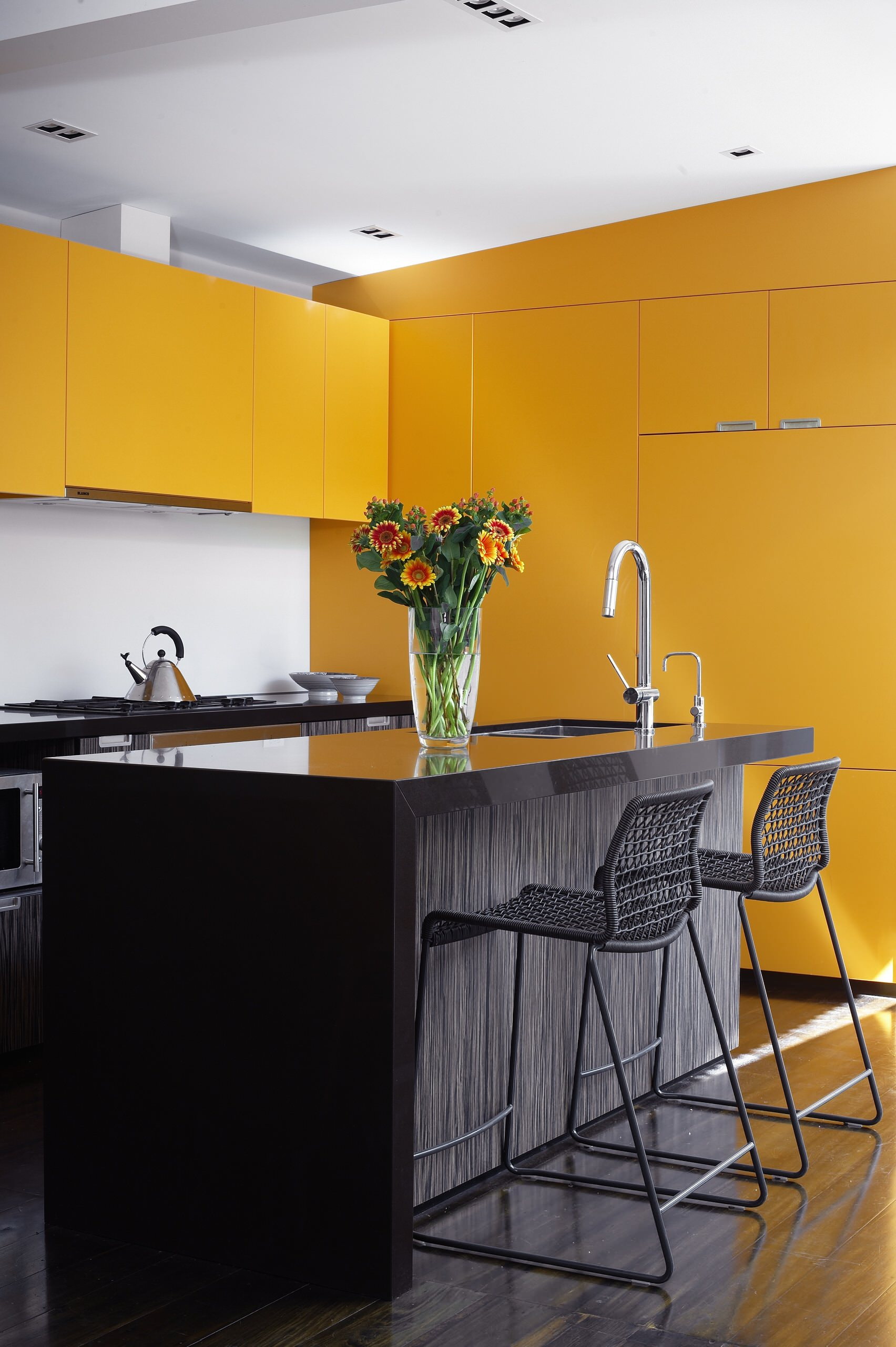
return to menu ↑Tan brown
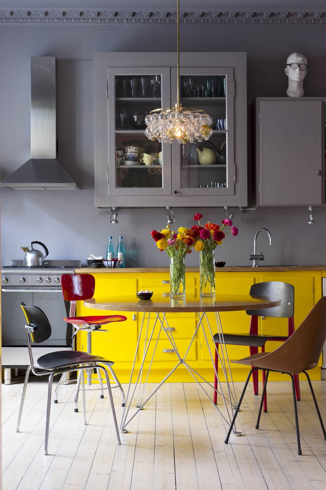
These two colors are located on the palette very closely. Moreover, the composition of brown is yellow, which means that they are practically relatives. And therefore the combination is neutral, devoid of emotions.
These two colors go very well together.
Both "relatives" have a high temperature. Therefore, they need to be diluted with fresh and cold - smoky, gray, steel. Coal is also suitable for contrast, it will add momentum.
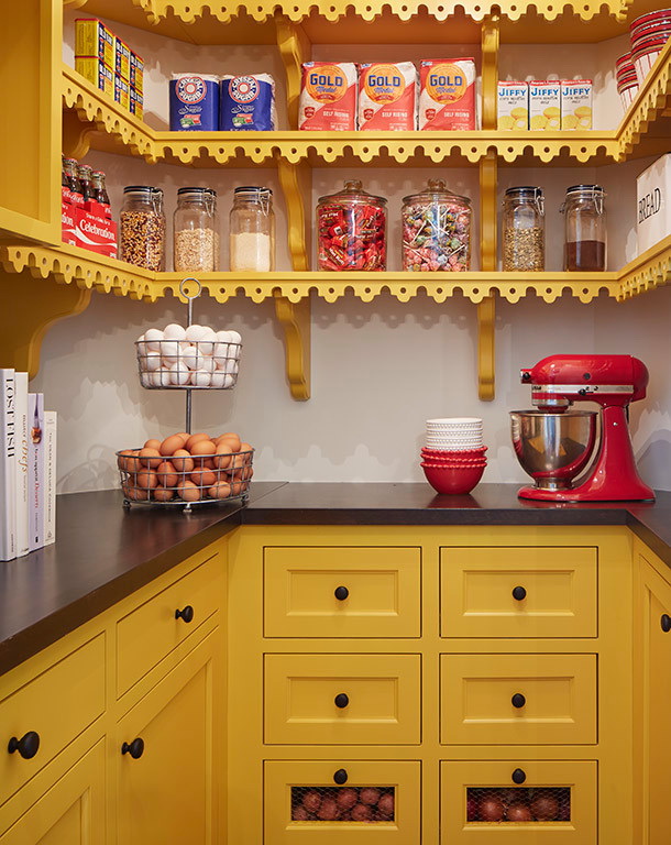
return to menu ↑Finishing items indoors
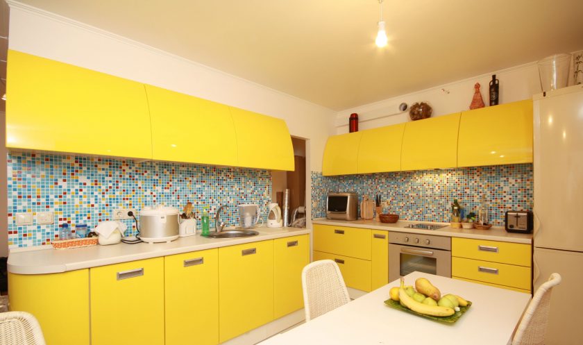
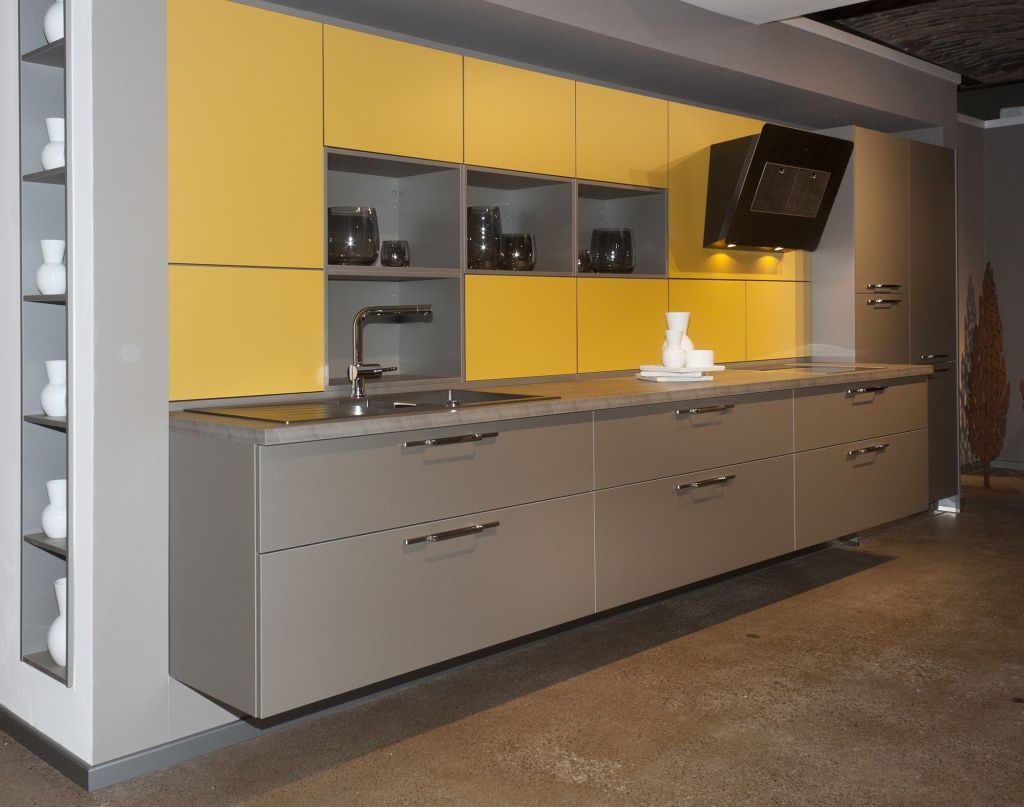
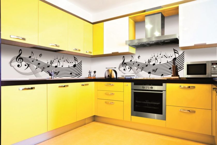
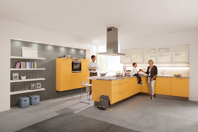
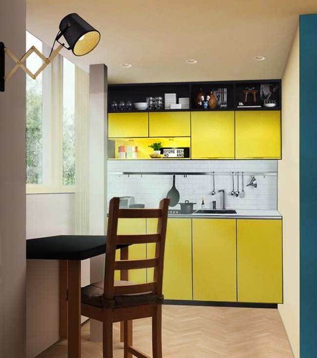
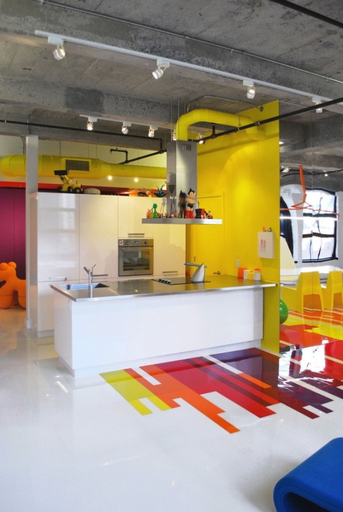
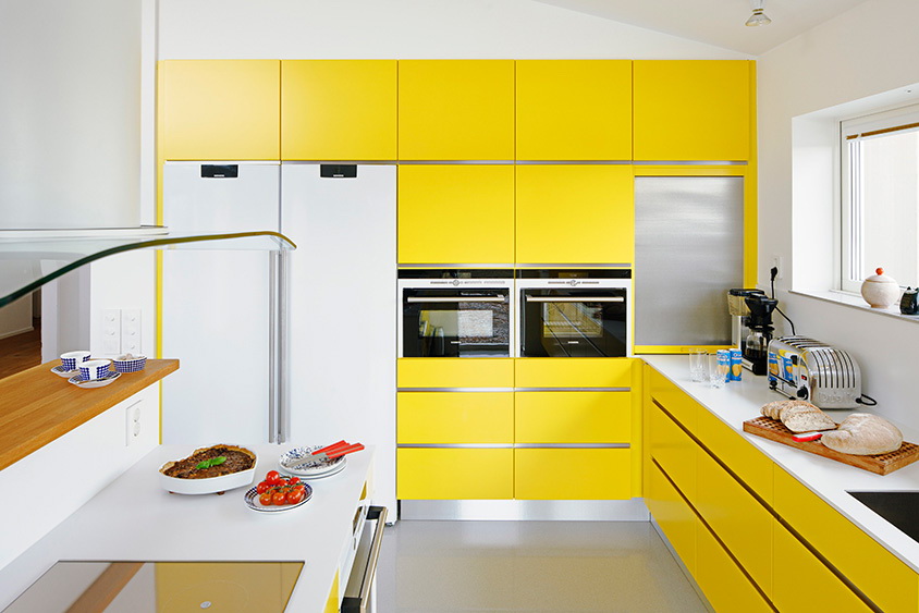
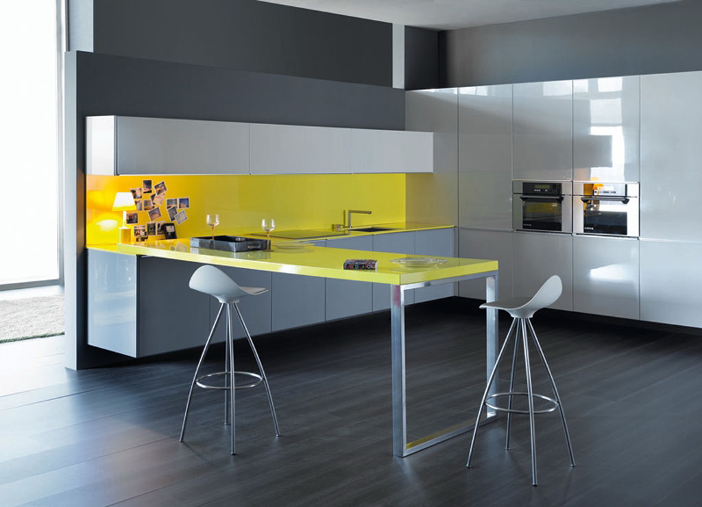
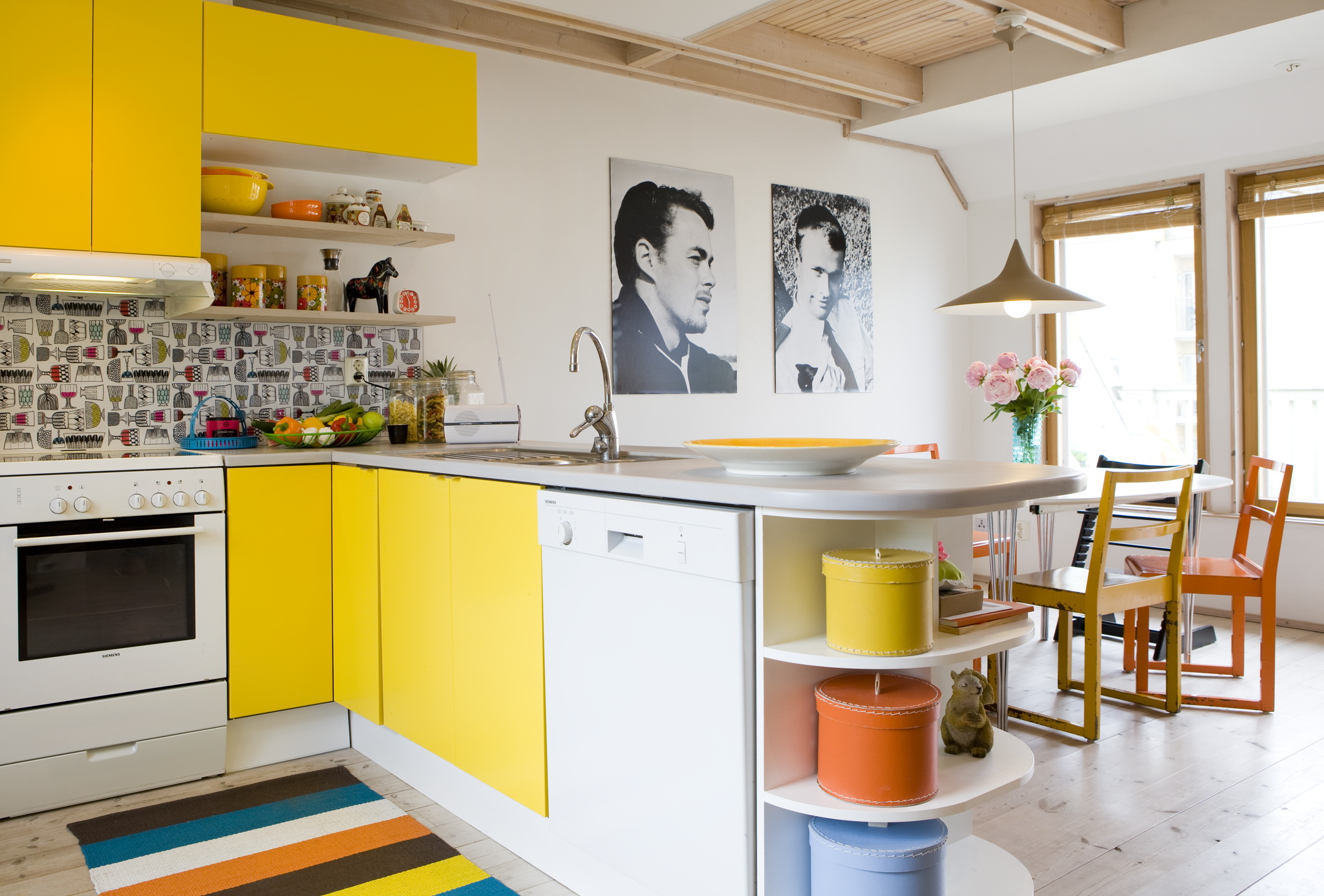
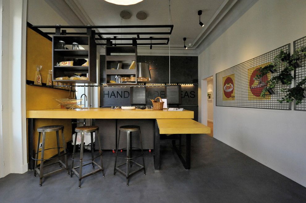
What will be the kitchen, if we allocate there certain elements? Adding a little yellow, we can make a bright accent of a particular object in the interior.
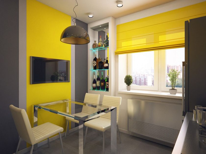
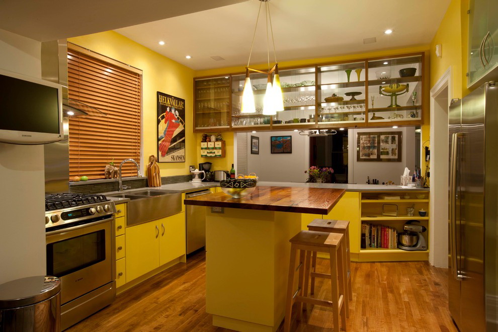
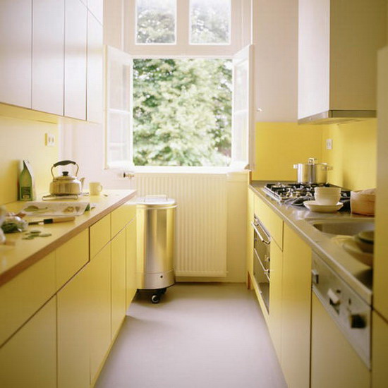
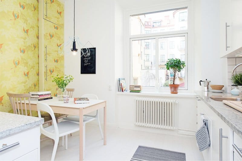
return to menu ↑Linden walls
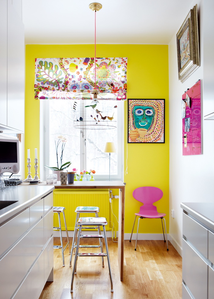
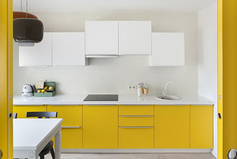
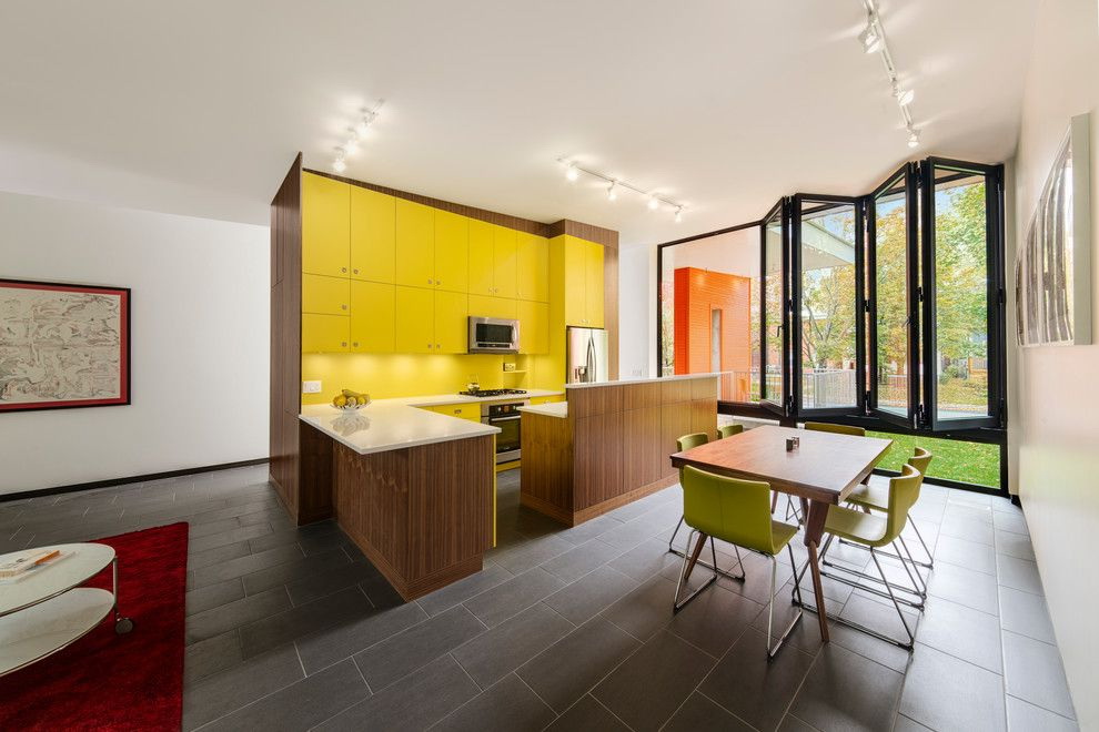
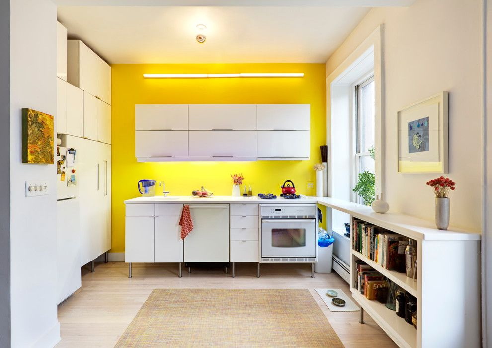
Yellow has the property to increase the space, is able to smooth defects and sharp corners. However, in large numbers he is intrusive and with time begins to annoy. That is why it is not necessary to paint all the walls. You can arrange only the dining part, thus zoning space.
Vertical lines visually pull the room up. When all the walls are of the same color, the corners seem to be invisible, everything merges. And if you paste over different, then the verticals in the corners are striking. Thus, they visually lift the ceilings.
But the gamma should be the same. For example, one wall is “snowy”, two are cream, and the fourth is yellow. Such is the design trick.


A relatively new trick is a combination of wallpaper with and without a pattern. It is easy to pick them up, manufacturers keep up with the times and produce entire collections that are suitable in style.
You can combine:
- striped;
- monophonic;
- with graphic print;
- with floral ornament.
Ceiling in such a kitchen should be white. For finishing the floor will suit light brown or caramel.
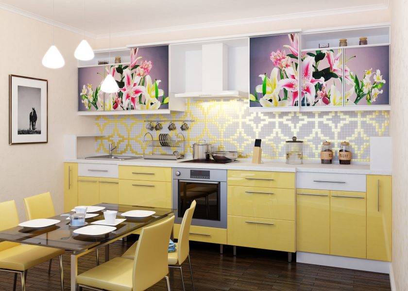
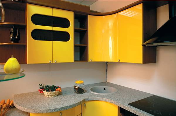
Floral Top Cabinets
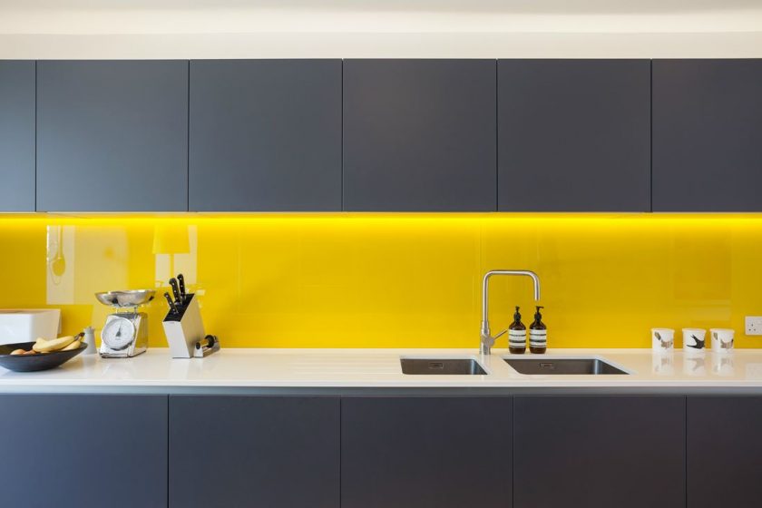
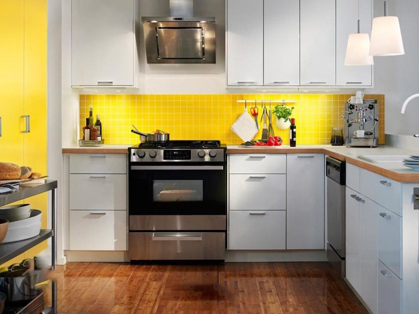
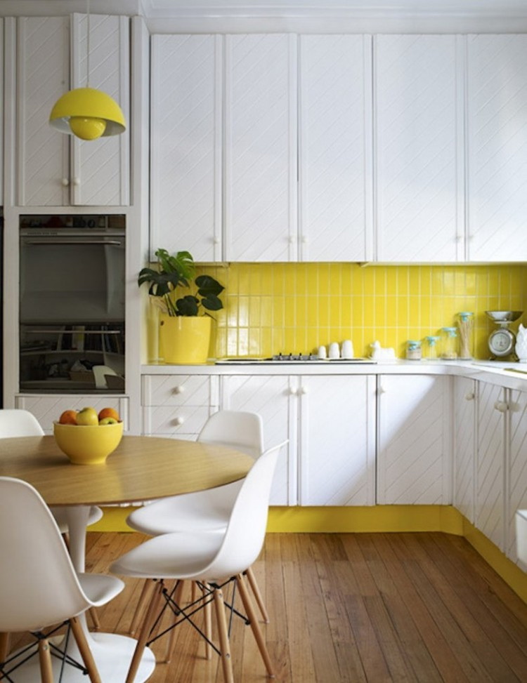
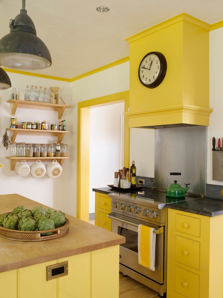
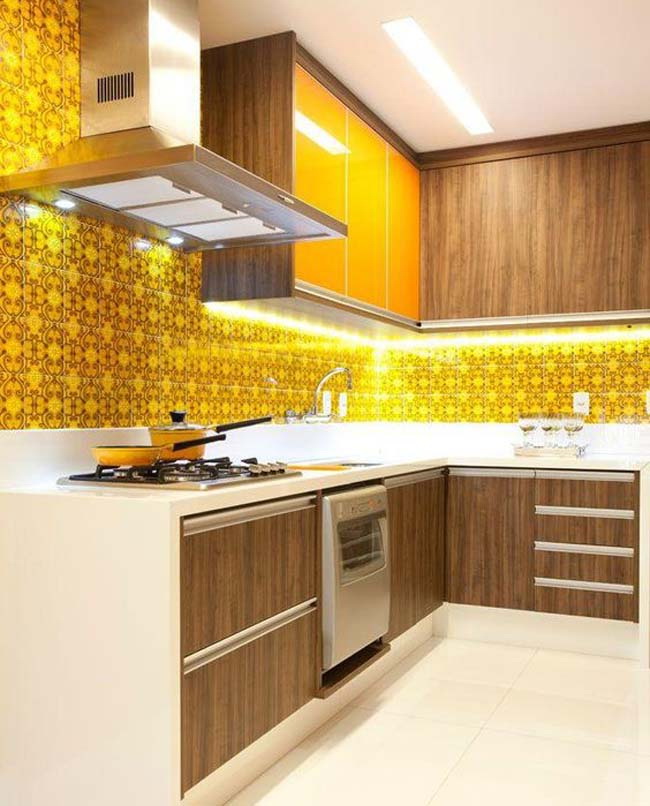
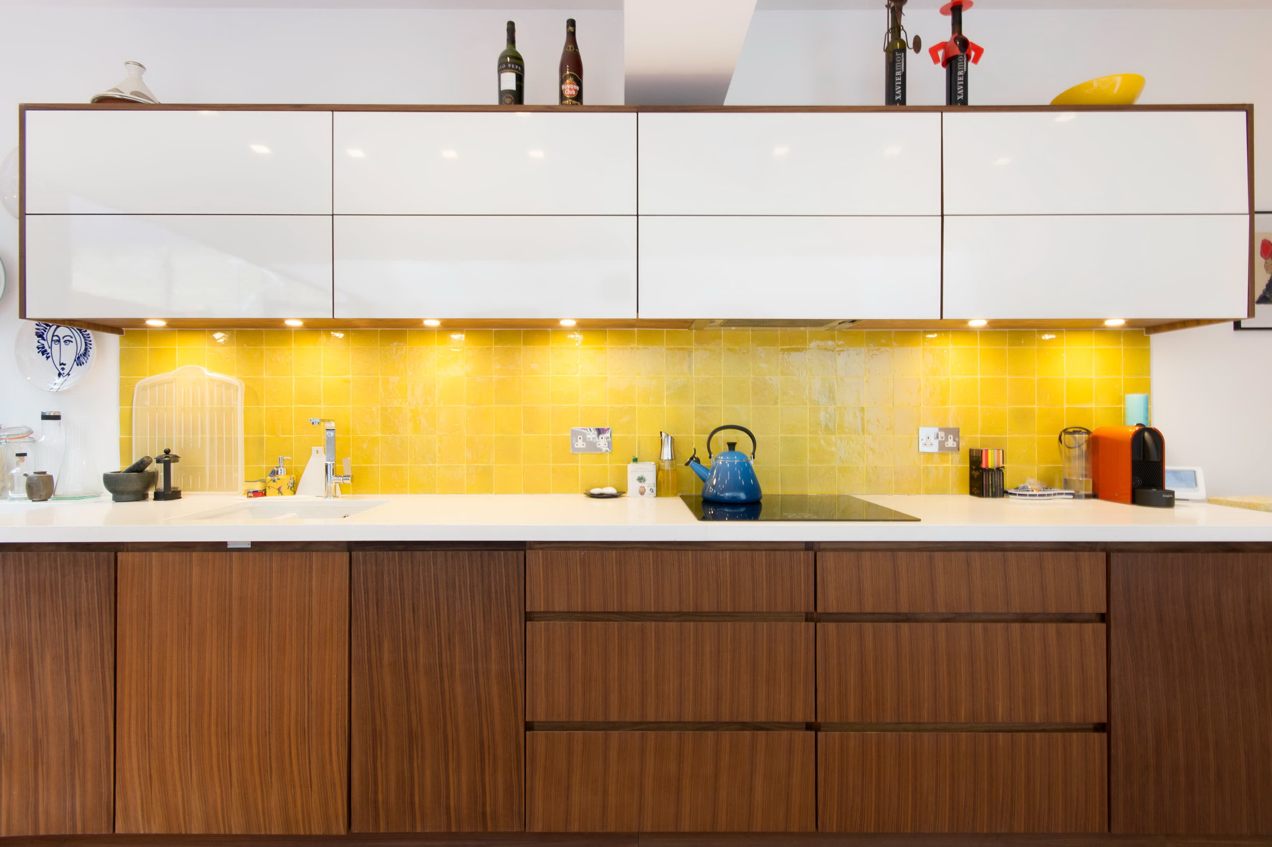
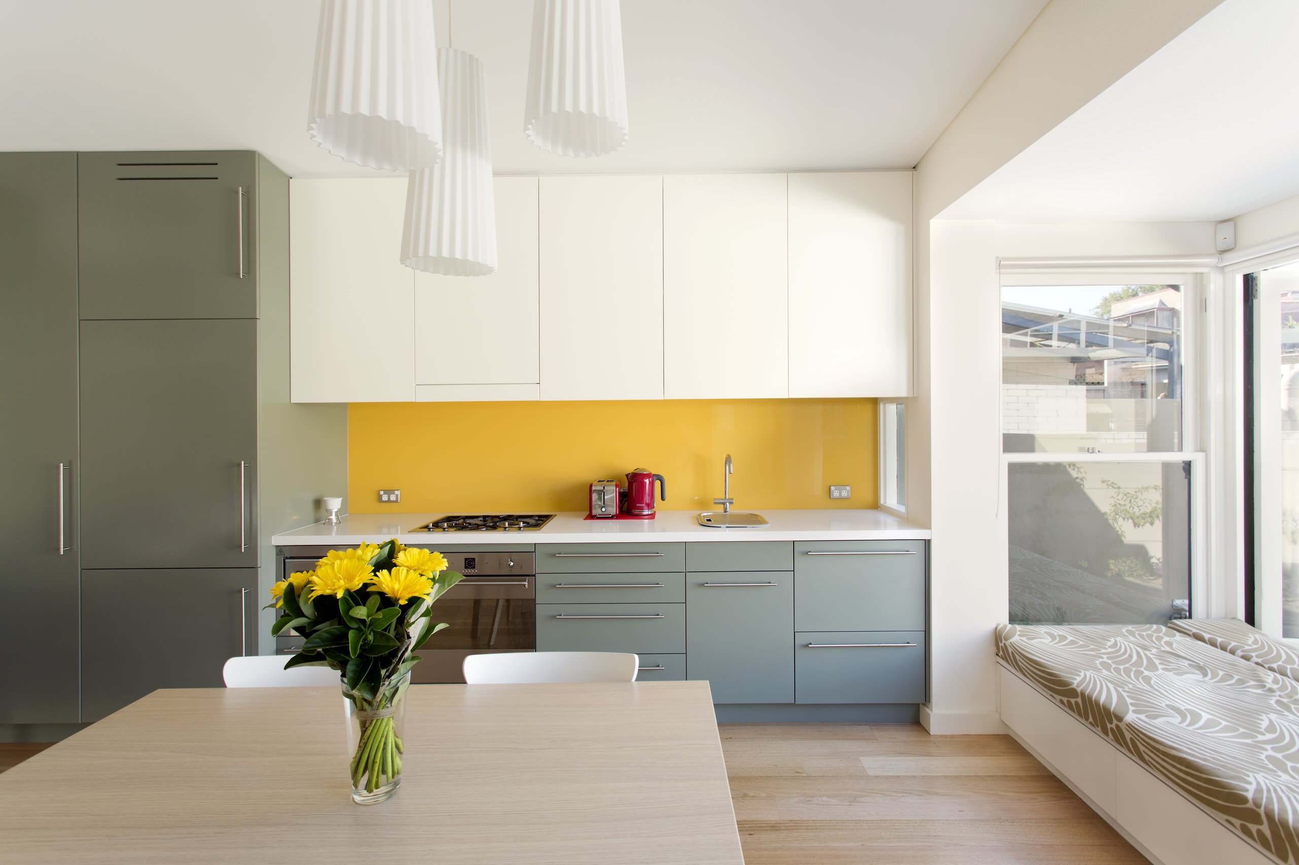
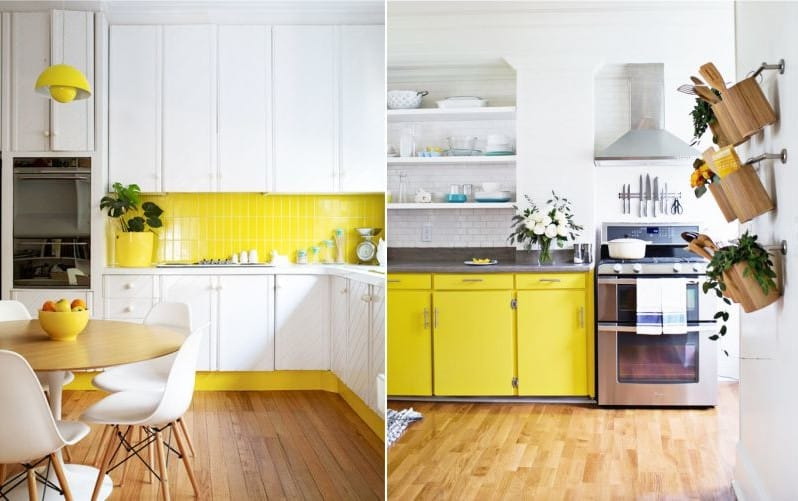
Apron
Just in case, we will clarify what is apron on the kitchen. This is part of the wall in the working. zonebetween the lower and upper sections of the headset. That is, this is the area that sprays the most, including fatty ones!
There is not always time to quickly clean the dirt and get rid of the effects of culinary chaos. So, the main principles in choosing an apron:
- ability to mask spots;
- It should be combined with the interior;
- heat resistance.
Metal heats up faster. In the summer in the cramped kitchen works like a second oven. The heat from the slab is easily maintained by tiles and various types of modern plastic.. They have clear advantages. The choice is only between matte or glossy texture.
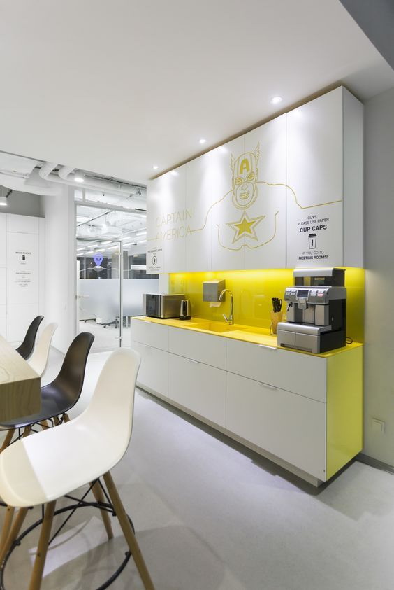
Hi-tech style
The apron can be very bright and even stand out from the rest of the kitchen. It is permissible.The horizontal line, which catches the eye, widens the narrow and narrow space. But eyes are quickly tired of variegation. And the zone, do not forget, working!
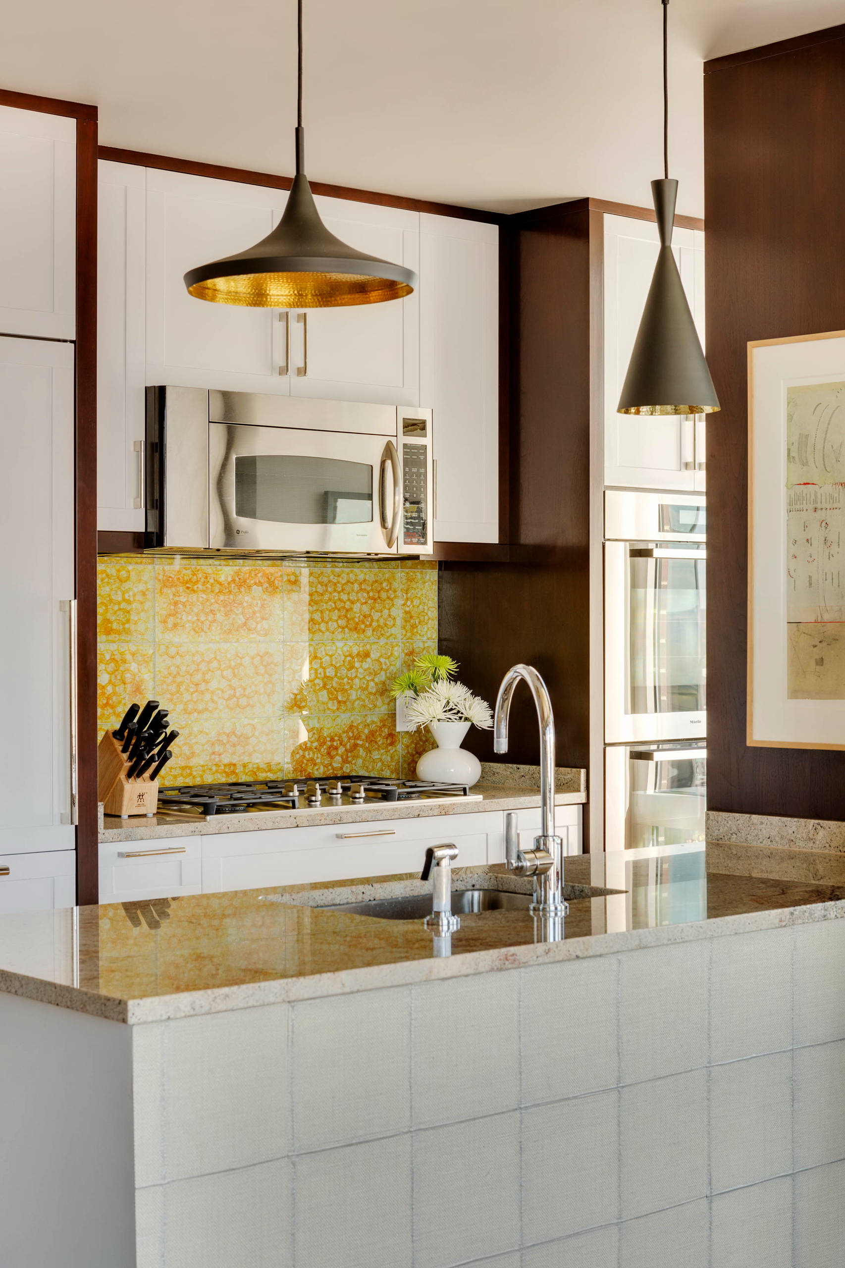
Yellow, orange and beige, oddly enough, very practical colors for this part of the kitchen. They perfectly mask fat drops, from fruit and vegetable juices. And the leader in this “spy” story is the color print.
Any drawing distracts, camouflages spots. But a small drawing visually reduces the entire space, a bad idea for a territory with a small area. Large print - creates the opposite effect.
If the whole kitchen is already framed in honey colors, metal ones will do. panels. Perfectly fit into loft or high tech. For ethnic and classical, all color pairs listed above are suitable.
An apron of this color is practical
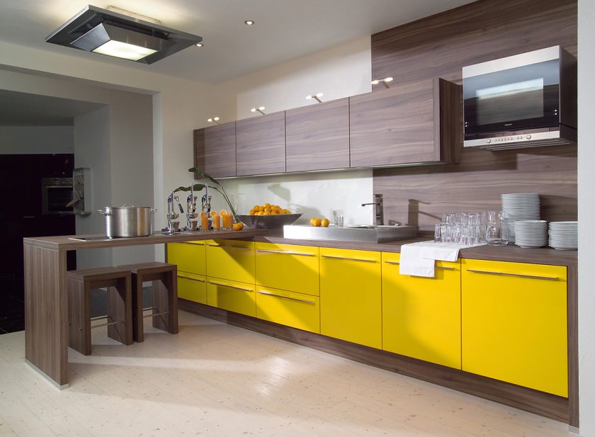
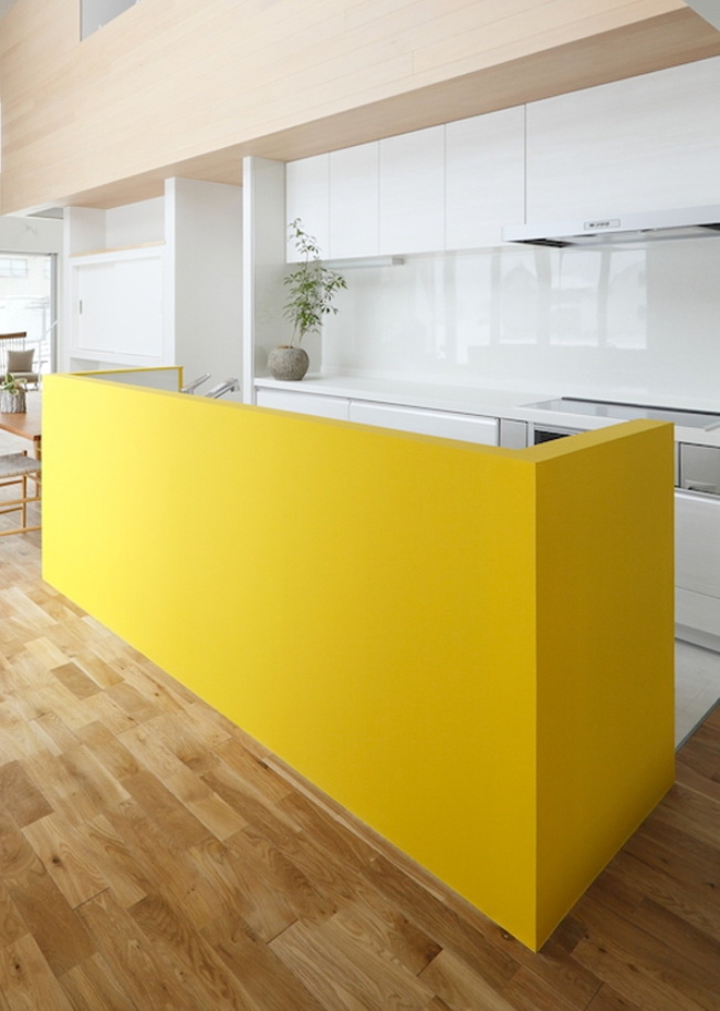
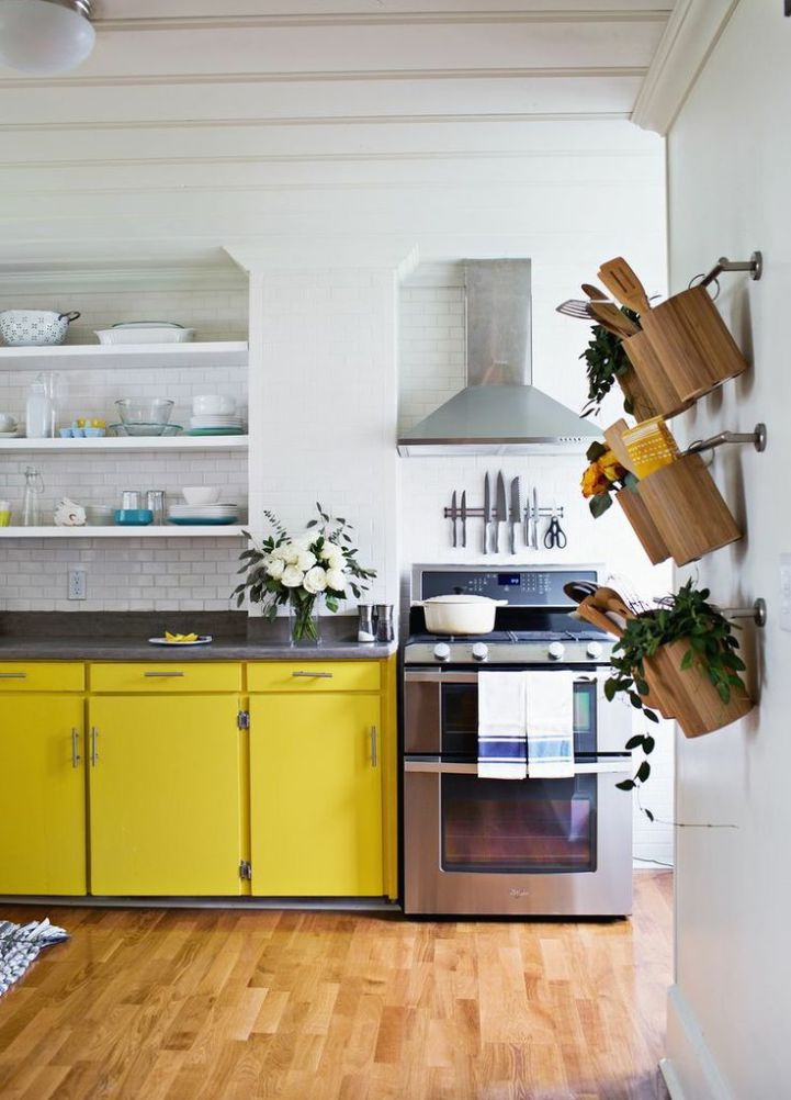
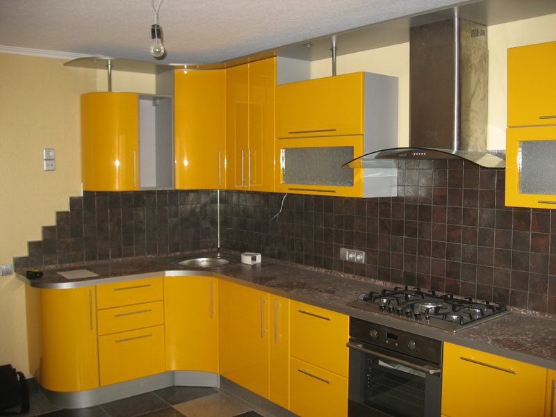
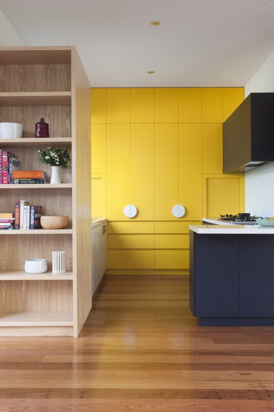
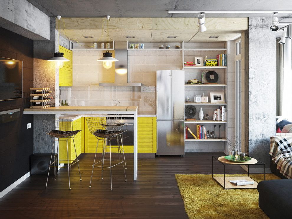
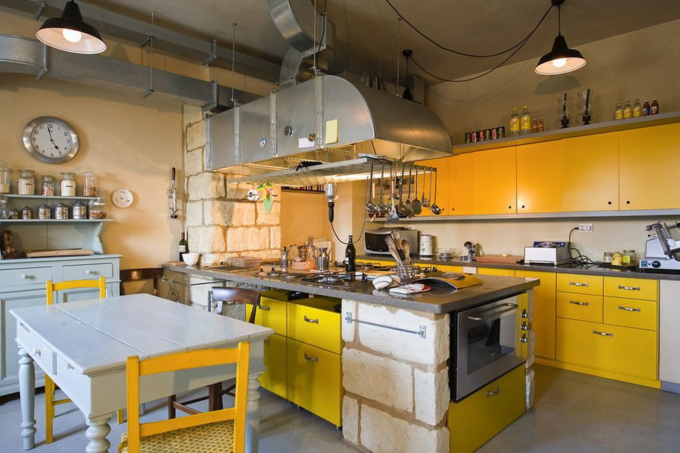
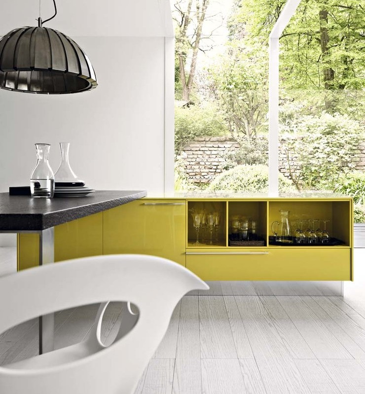
Facade
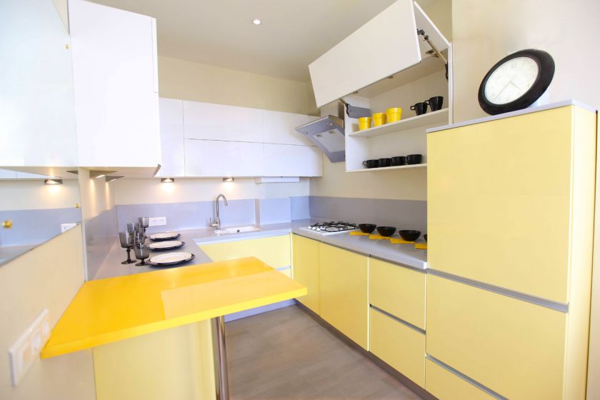
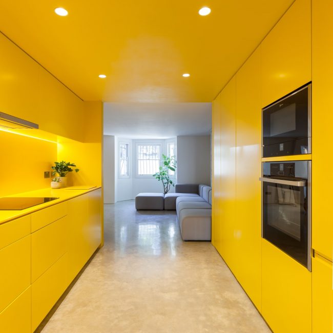
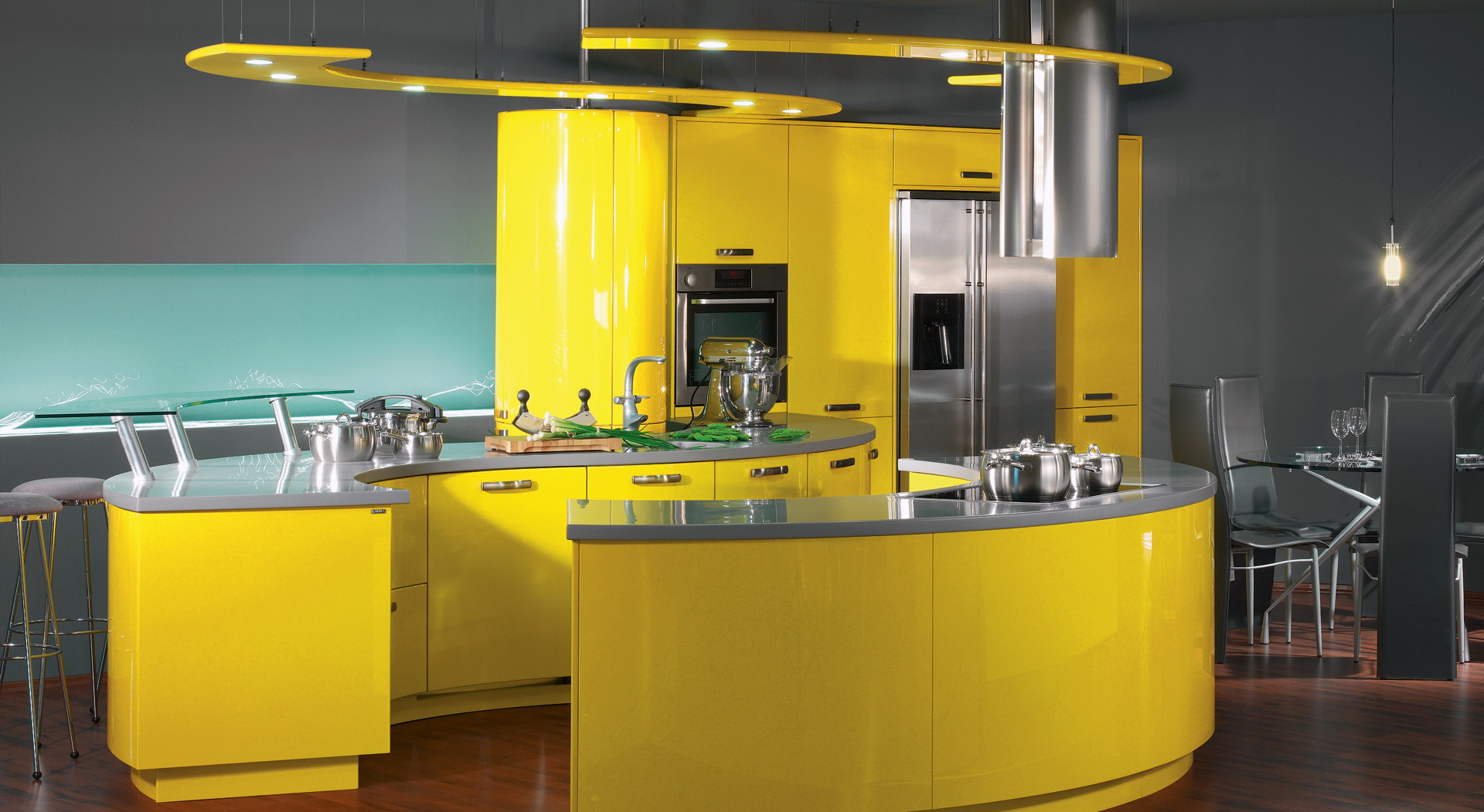
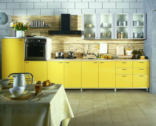
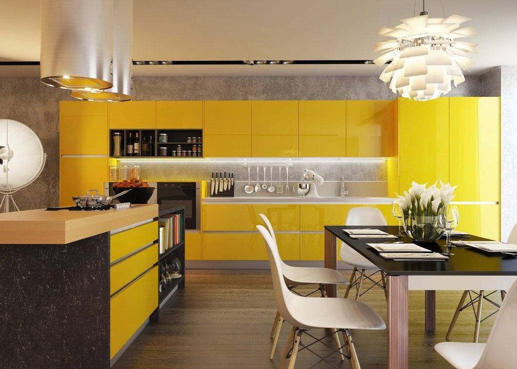
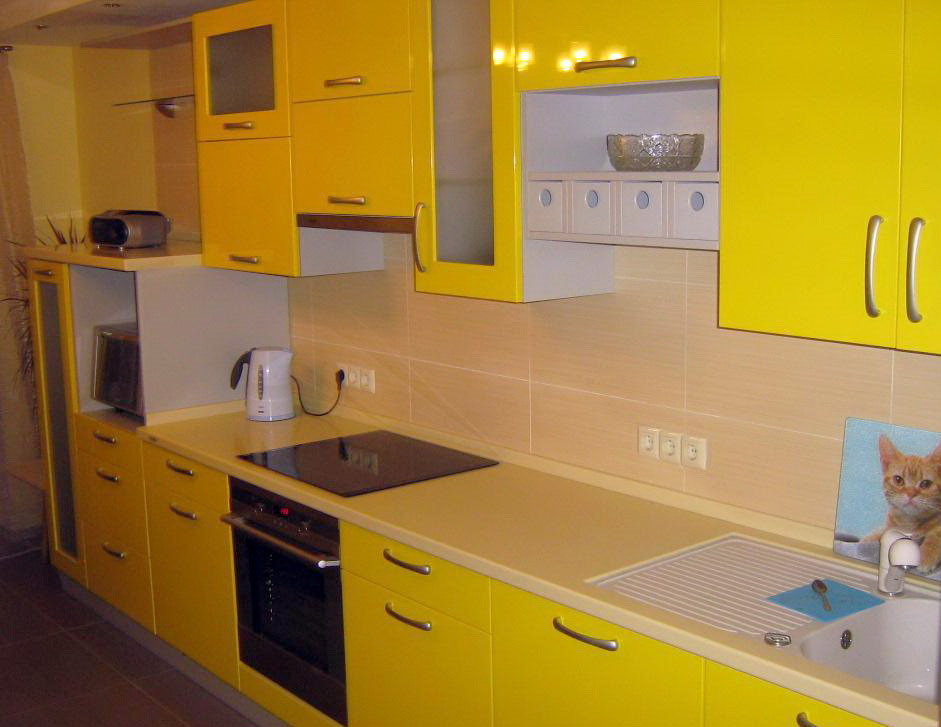
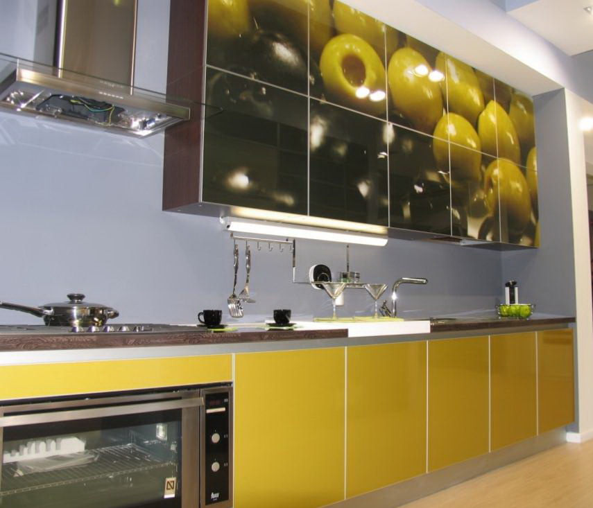
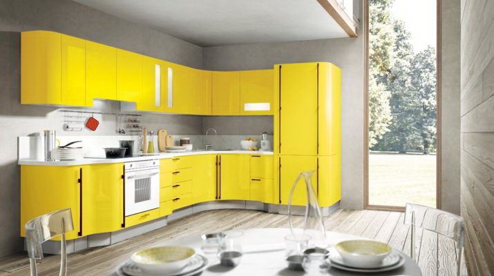
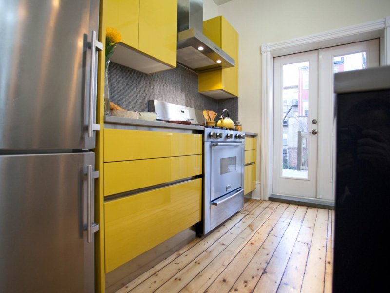
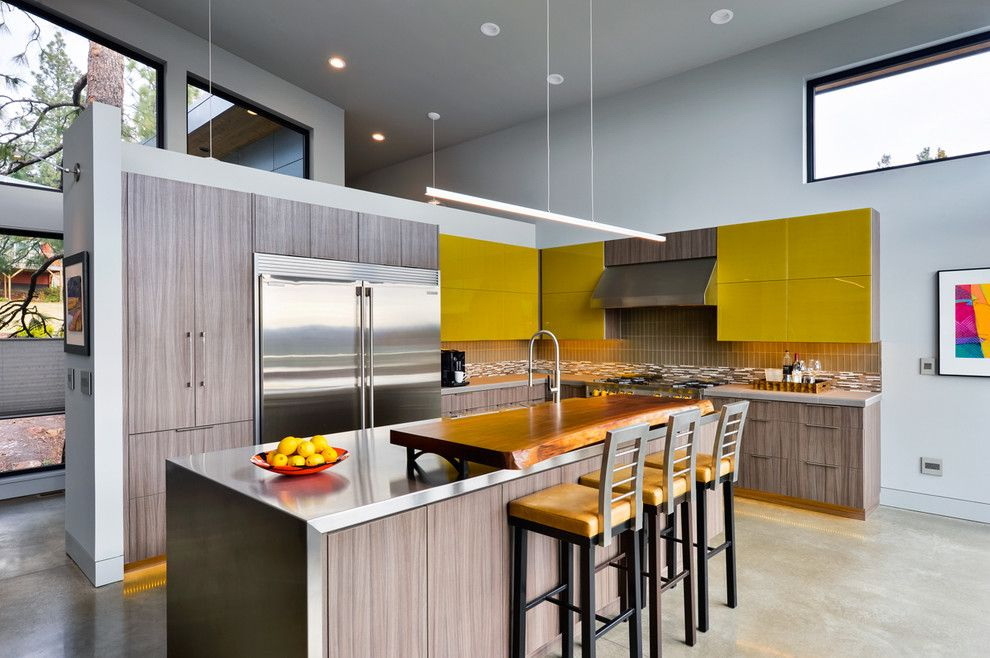
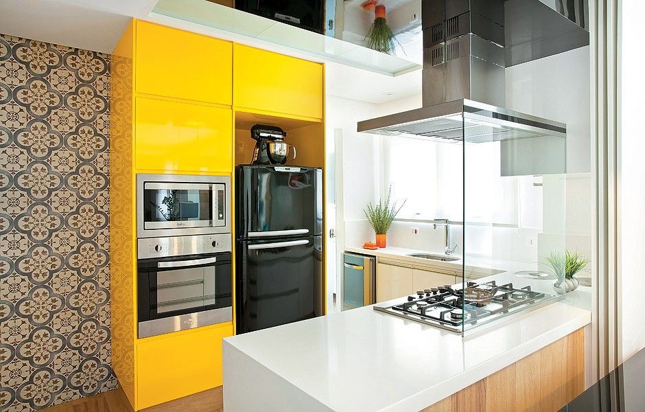
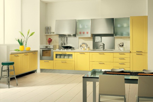
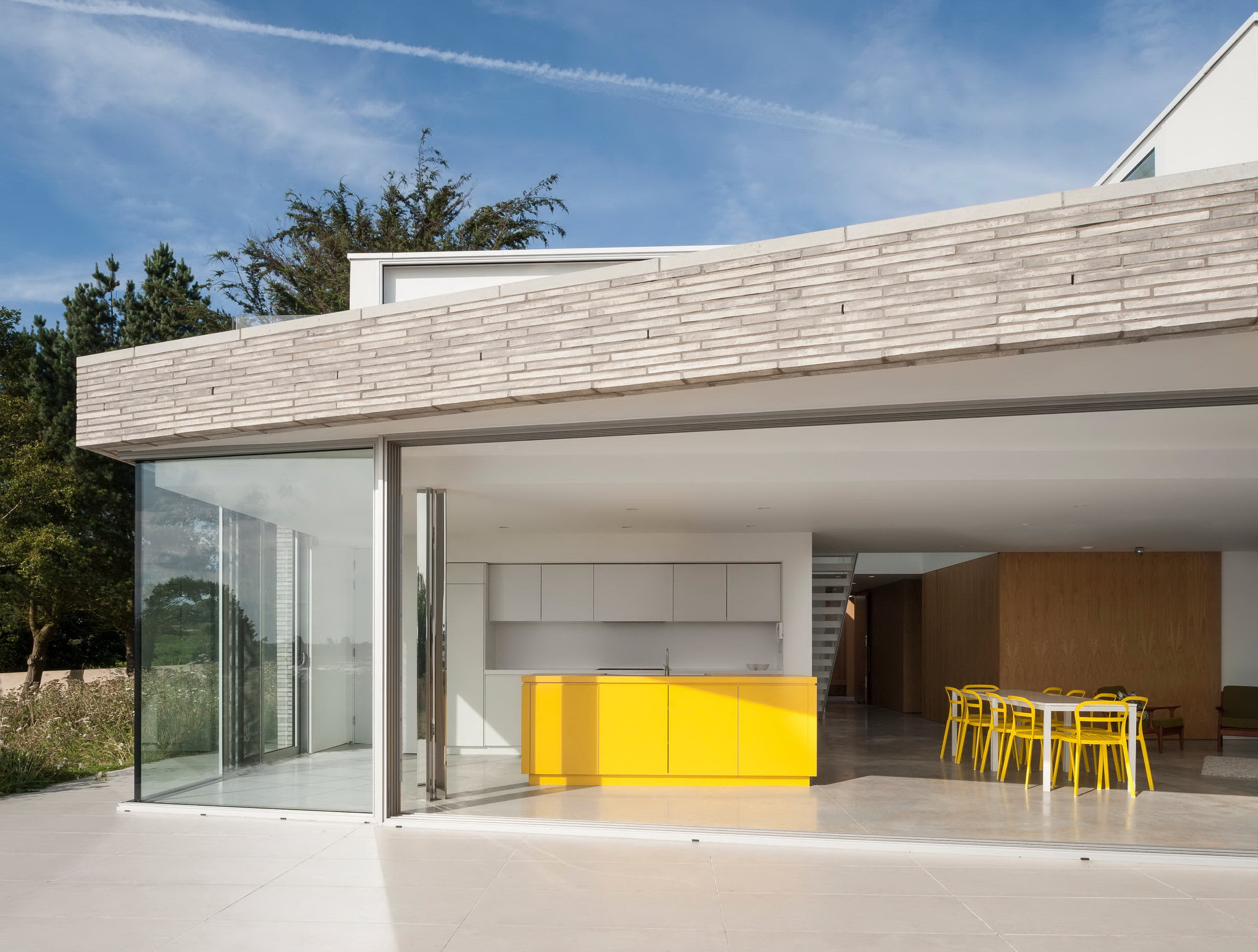
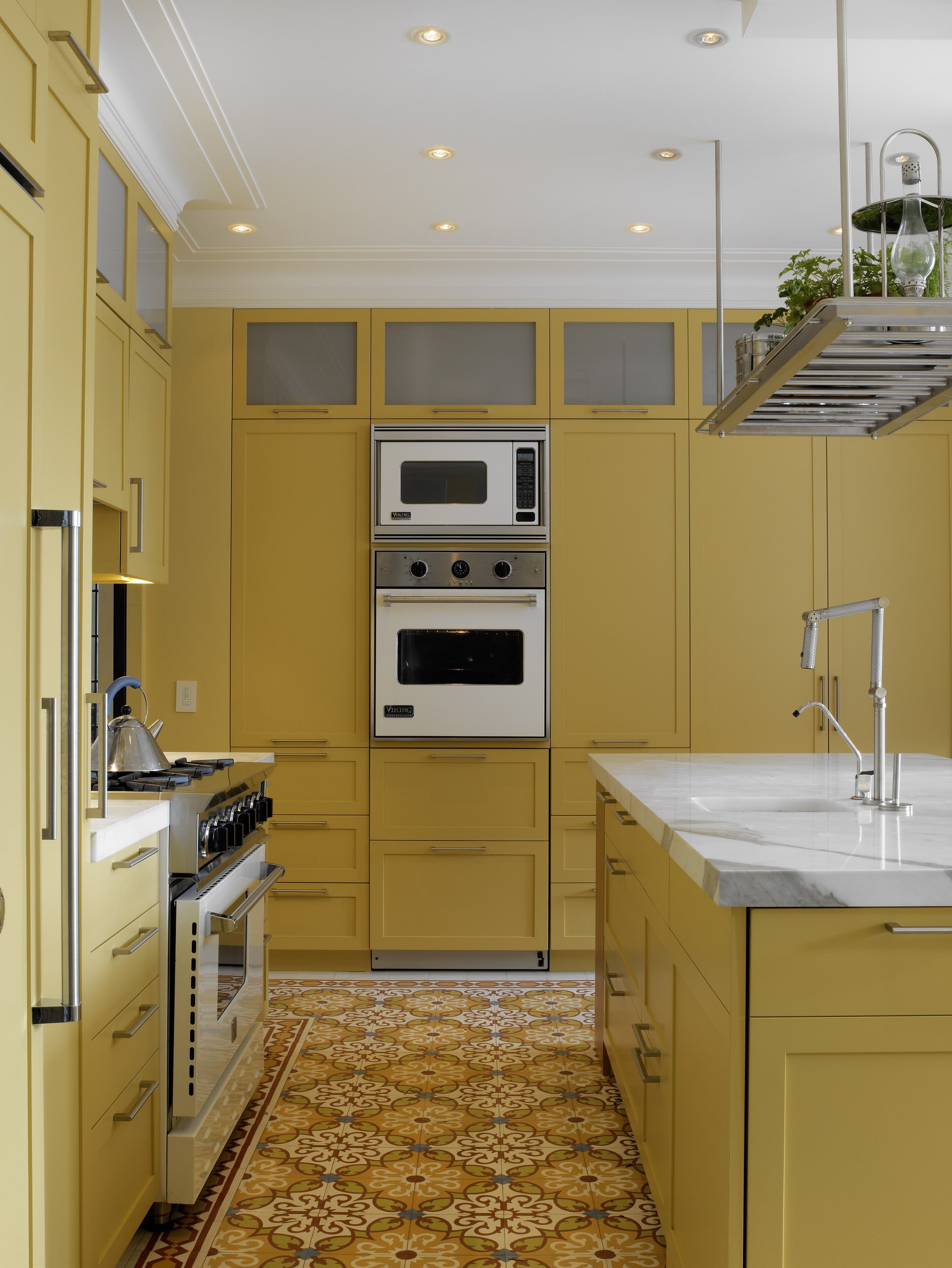
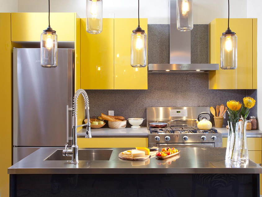
Juicy lemon façade of the kitchen unit is the best remedy for beriberi and autumn spleen. However, do not dwell on color. The decisive role is played by the material from which the furniture is made. Most often in Russia MDF is used - 85%, with acrylic, enamel or film coating.
Glossy, and even yellow surface will increase the space - this is good. But it will force you to endlessly fight fingerprints - badly. The film shines less, compared with enamel or acrylic - plus. However, faster burn and fade - minus.
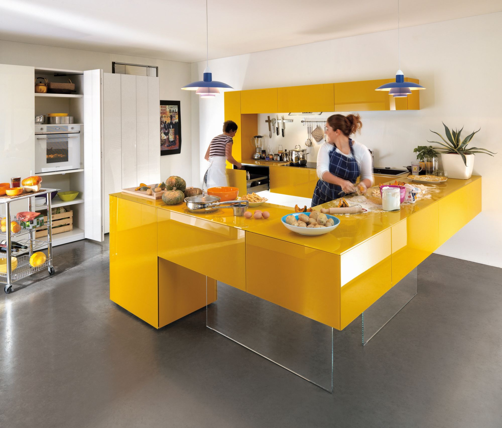
Bold color for cheerful people
Excellent hides fingerprints prints pattern on the furniture. Using the photo printing method, you can apply any image to the film, the most delicious associations: oranges, golden gingerbread cookies. And do it only for some panels. And then dock monochrome and with photos.
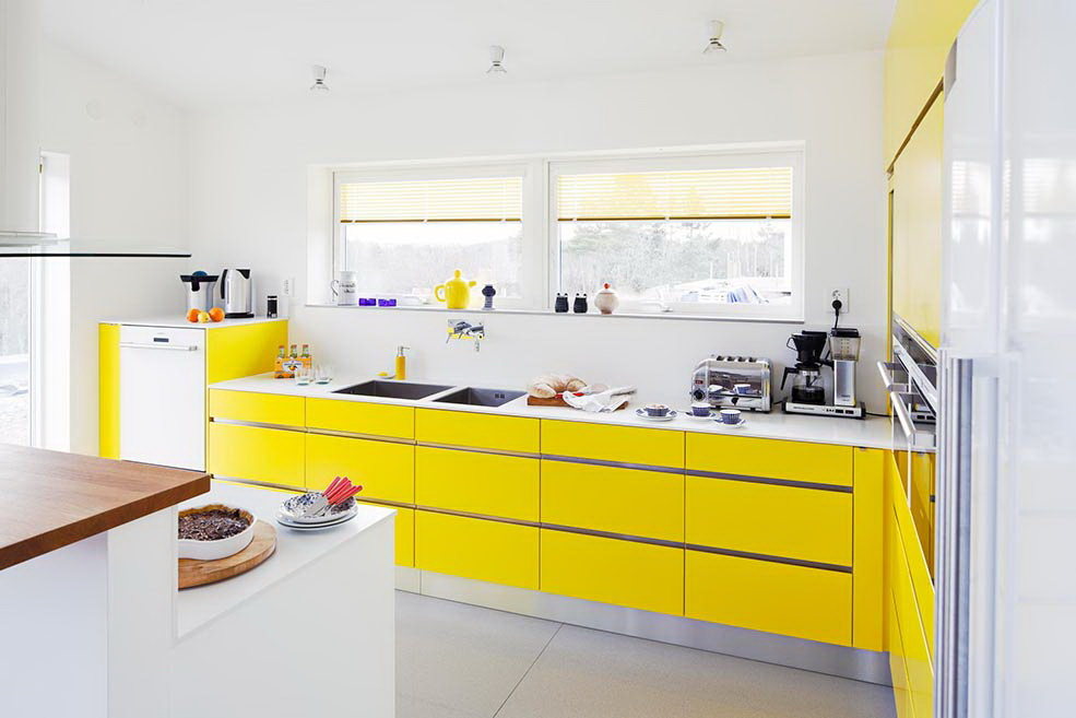
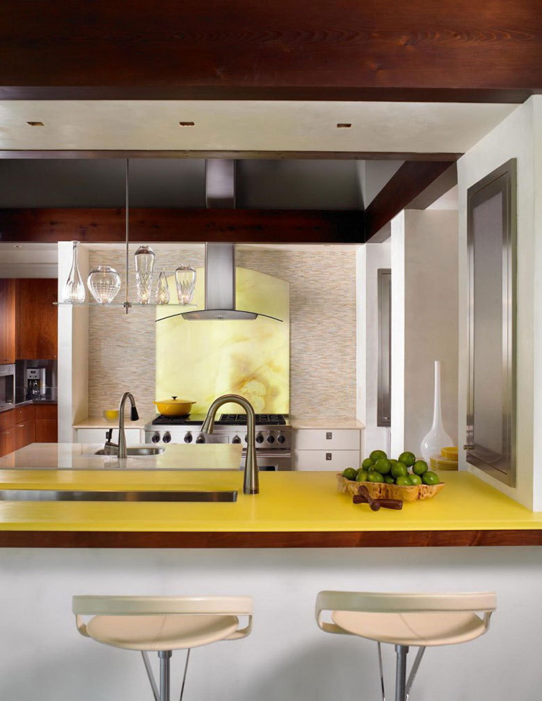
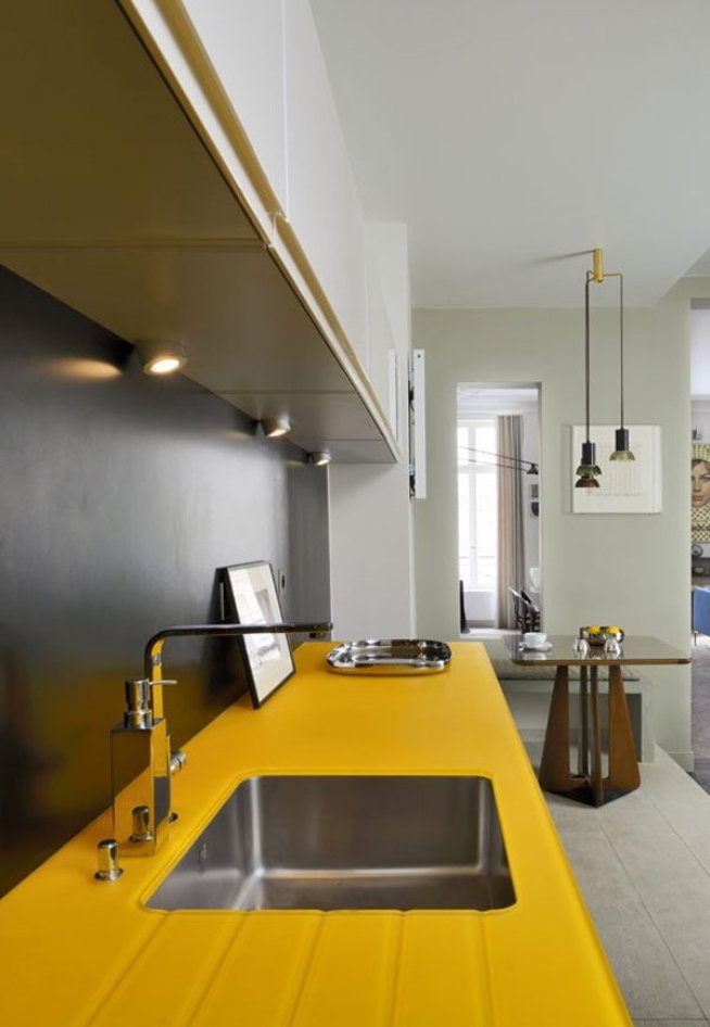
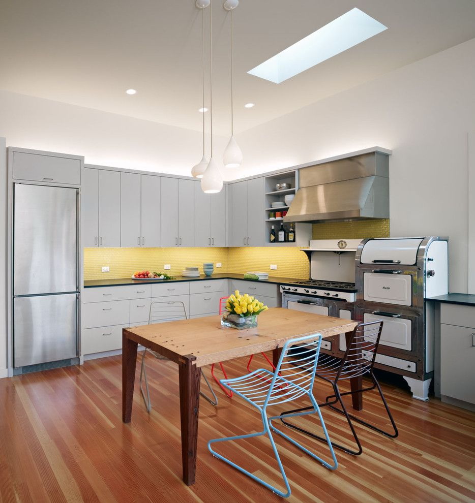
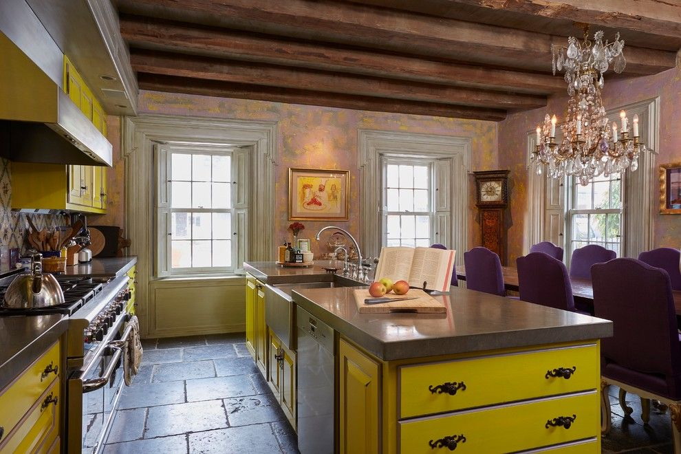
return to menu ↑Appetizing countertop
Recruitment countertopsAs a rule, it occurs in the final of the repair, when there is already something to focus on. However, the task is still difficult, given the variety of materials that exists today.
Not only color, but also the texture should be combined with the set and the overall style. If you have a provence, then the glossy surface will stand out and drag the “blanket” over you.
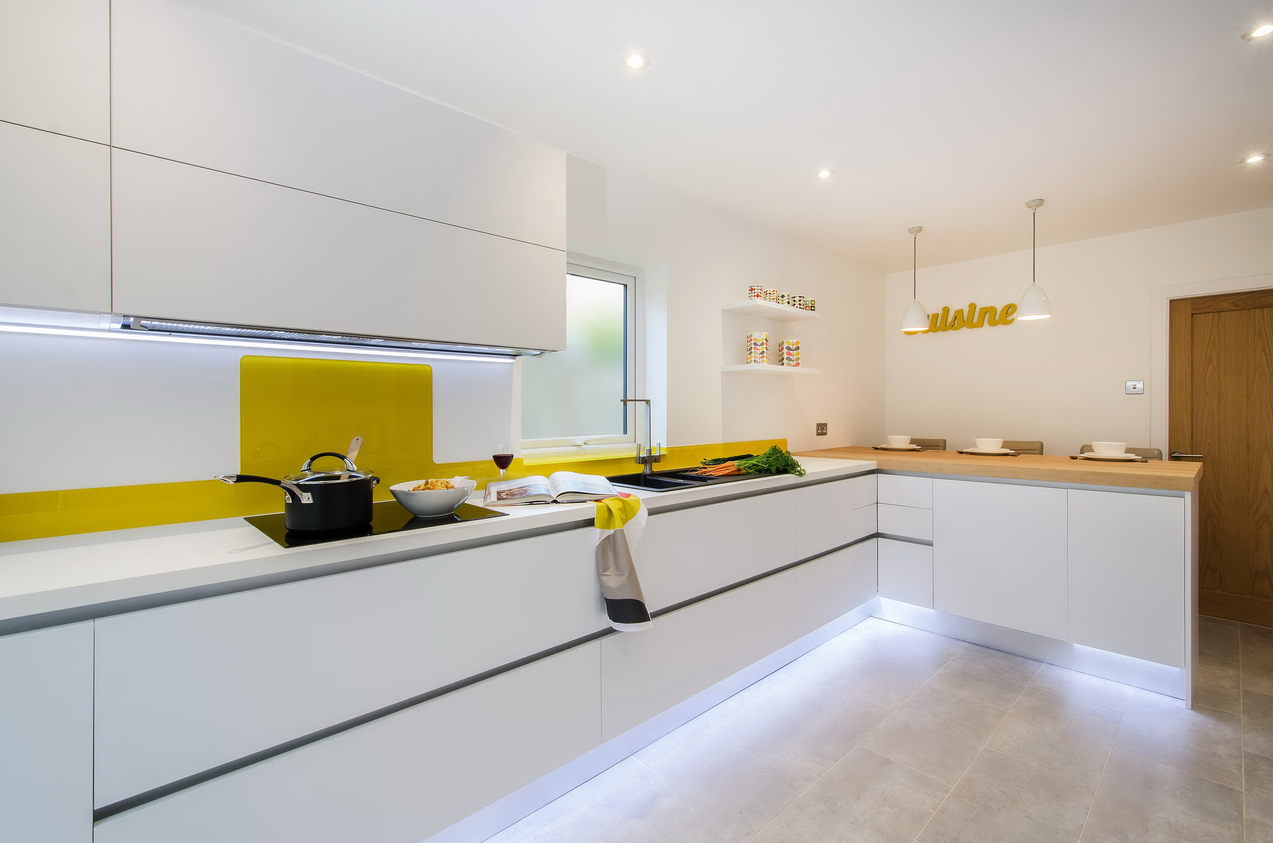
For decoration and furniture yellow is a great option! Helps set momentum to a boring space. But for the table top designers do not recommend it. This color is good for wallpaper, but not for the working surface, which will turn into a bright spot.
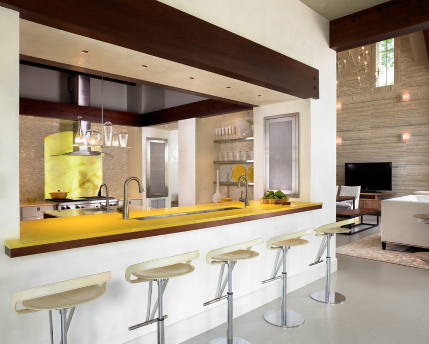
Yellow makes things look bigger
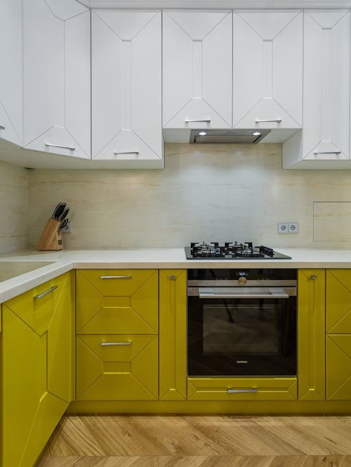
The worktop goes well with the "honey" walls:
- caramel;
- cream;
- chocolate
Practical, and evoke thoughts of delicious food! Popular in our country classics - almond and black.
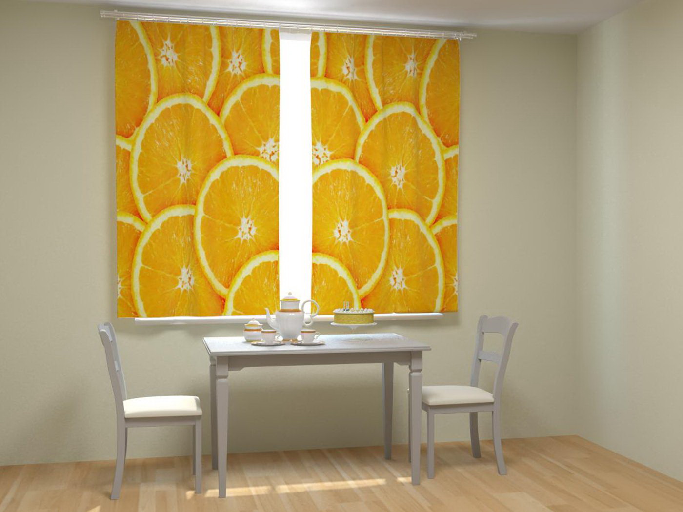
Curtains
This is perhaps the most important part of the interior! Because it is textile that gives comfort. Or ... completely kills him. Different texture of the fabric makes the style pompous, polished, or vice versa - emphasizes rustic simplicity.
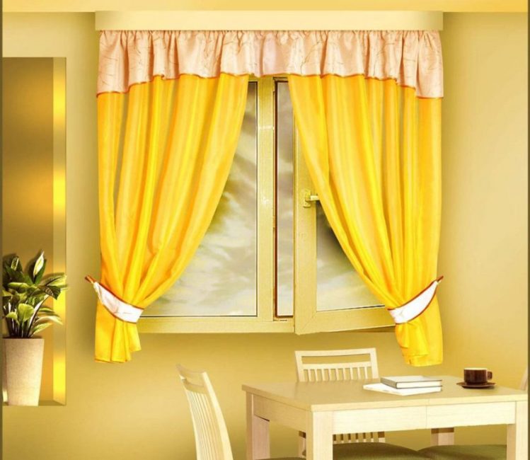
This is perhaps the most important part of the interior.
Curtains in the kitchen should not annoy, oppress and distract from the meal. Therefore do not suit:
- brilliant - satin and silk;
- dark
- heavy.
Curtains refract natural light from the street. This means that they can raise or lower the overall temperature in the room. Not literally of course, but in psychological perception. A high concentration of yellow will make the room "stuffy."Therefore, the choice of color should be approached carefully.
It is worth choosing a shade carefully
If the windows look to the north side, do not be afraid of any shades! But if the kitchen itself is already too bright, then the curtains will suit muted blue, gray or green.
With a picture of curtains worth being careful. Small creates a feeling of untidiness. Cage - forgive. This is not bad, if only it corresponds to the general style and idea of the designer.
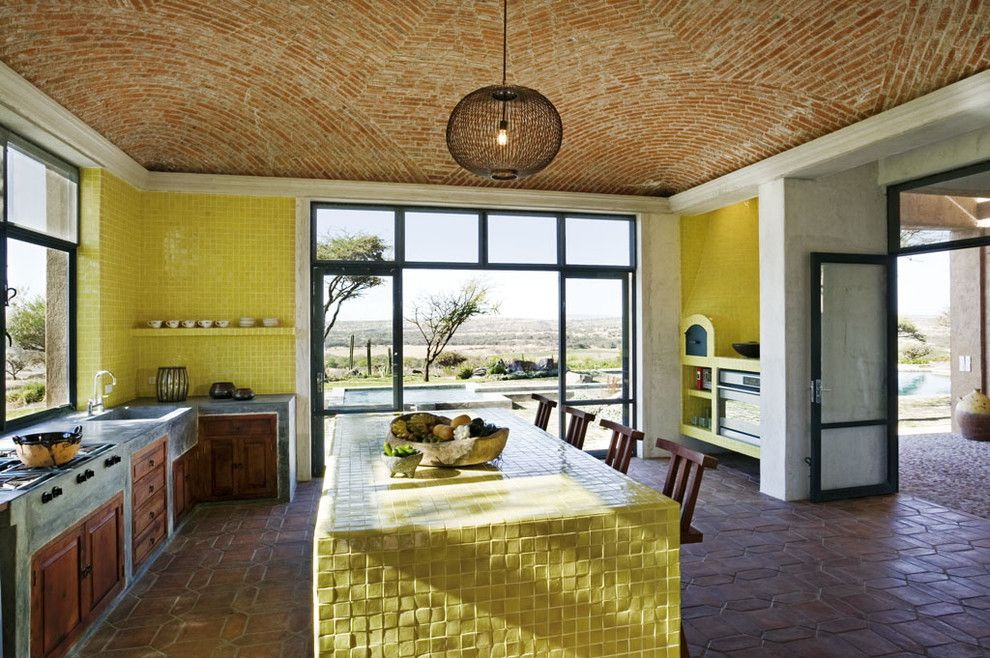
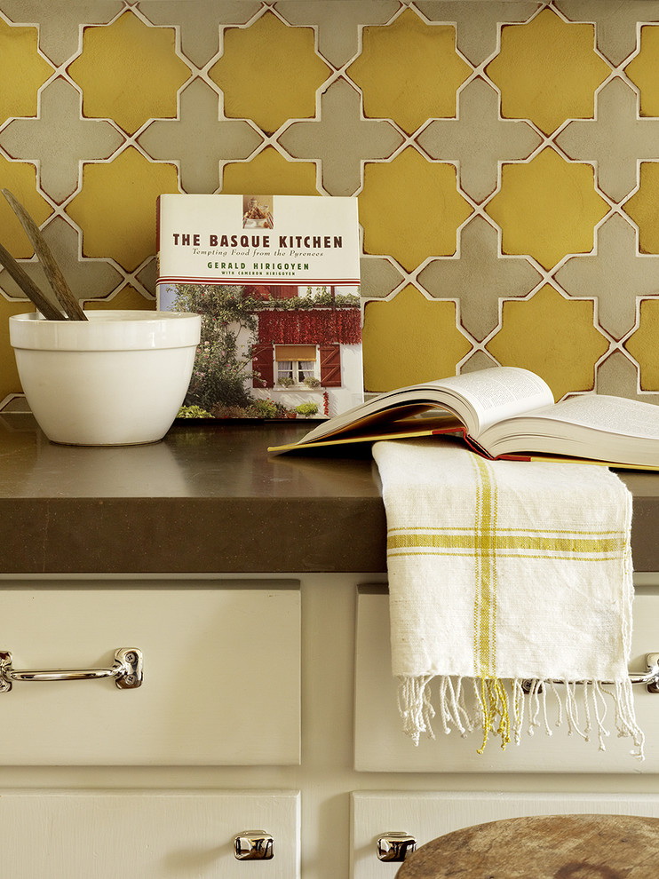
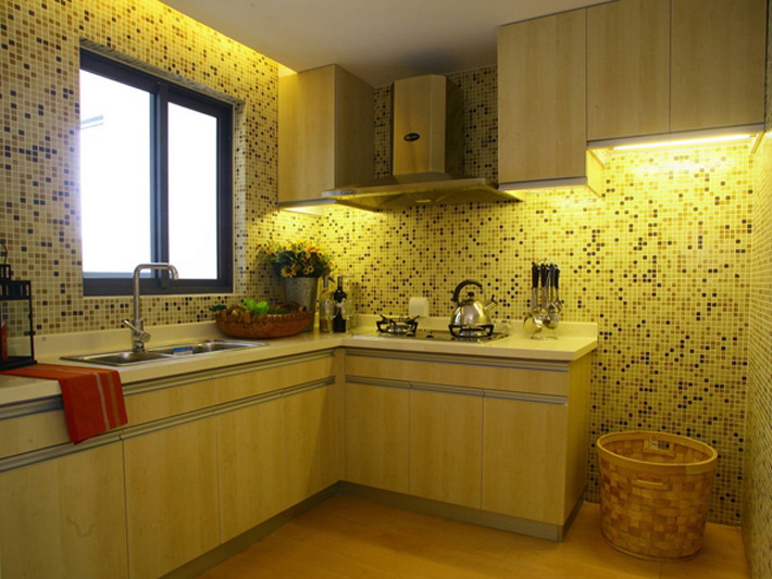
return to menu ↑Tile
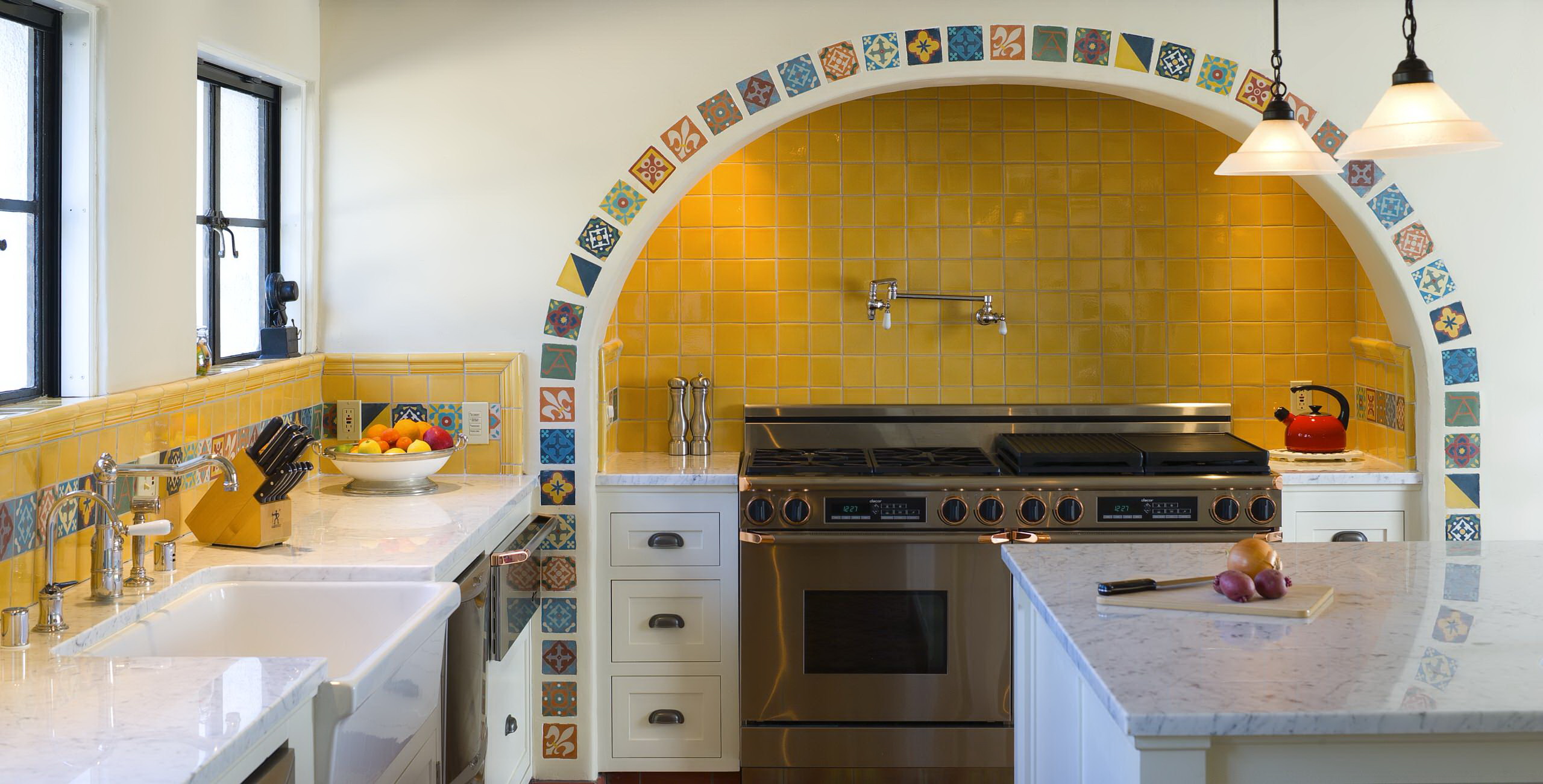
In the kitchen, it can be used not only for an apron. Very impressive pottery looks on the floor. For the Spanish or Italian style, it is slightly worn, with national patterns of Mediterranean countries. It is also appropriate in the yellow kitchen.
By the way, tiles can be laid not on the whole area, but only in the center. Get a practical carpet that is easy to clean. The perimeter in this case is issued by the board or laminate flooring.
Use tile in this color.
Another option is the Egyptian style, with dark tile flooring. But it needs to be supplemented with accessories, painted clay vases, figurines - details characteristic of the country and the era of the pharaohs.
The design idea is always reinforced by yellow ceramics.. Because it attracts attention. For ethnics in African or Mexican motifs matt is suitable. A gloss highlight high-tech. The main thing - to choose the right texture.
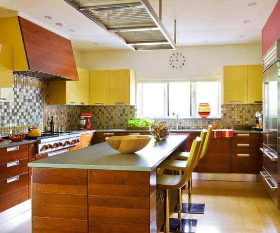
return to menu ↑Gold
This is the most pretentious format of yellow. Historically it was used in the decoration of palaces and castles. Is it appropriate in a modern kitchen? Full Moreover, the best way to add gloss to the interior. If you keep the verge of reasonable. It can be accessories - furniture handles, lamp framing, brass mixer.


Since the yellow metal has a high reflectivity, it is considered ideal for wall decoration in kitchens with poor natural lighting.
For example, trim the apron:
- decorative plaster with mother of pearl;
- mosaic imitating precious metal.
Or paste one of the walls with gold wallpaper. But the more pompous material, the less must be complex, ornate details. To make the kitchen not look cheap and pretentious, you will need to use more noble natural materials - oak, marble, or their imitation.
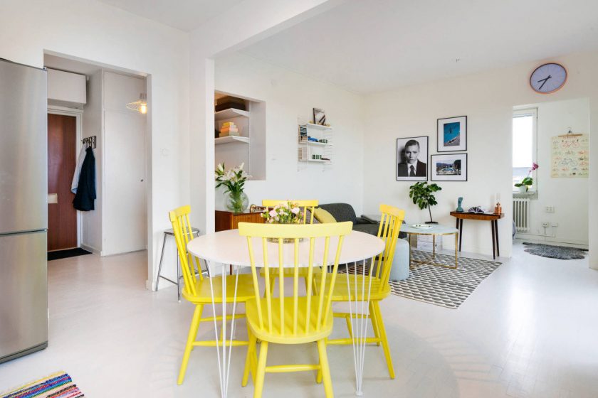
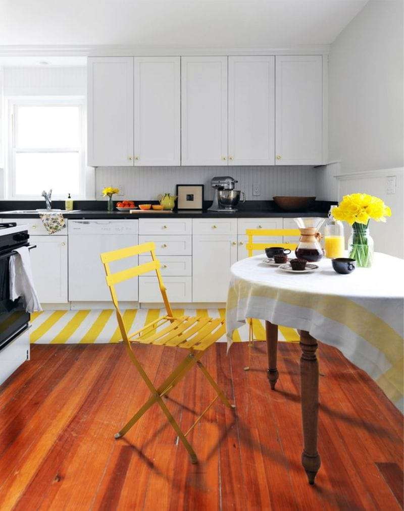
The table, as the highlight of the room
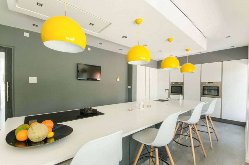
Lighting
As you know, lamps are of three types of glow:
- warm;
- cold;
- of natural.
But which of them is better to use depends on:
- Appointments room.
- The overall range of the interior.
The cold glow, with a light blue tint, psychologically causes associations with winter or early morning. It makes work and is more often used in offices. Not the best option for the kitchen, where we relax in the evenings.
Universal - the third, which is characterized as natural.


Traditional chandelier in the kitchen - the subject is not practical. She is not able to replace all the necessary fixtures. Because in the working area where we are cooking, we need powerful lamps that will allow everyone to see everything well. Chandelier - not save, too far.
But in the dining room, above the table, the light can be softer. And best of all, with the ability to adjust power. Often place several small devices with weak lamps. Include one, two or three - according to the situation.
In the style of minimalism
Perhaps a compromise way - use it only in detail.This allows you to plunge into interesting experiments, diversify and not spend money on large repairs.
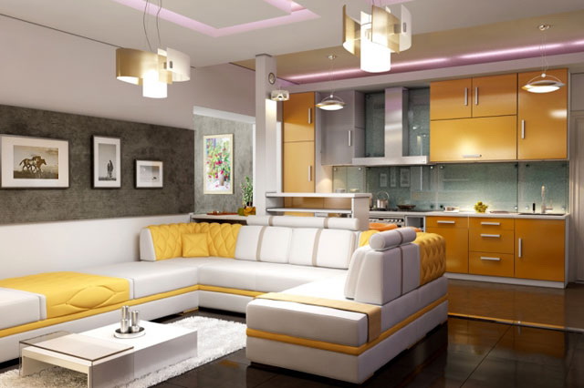
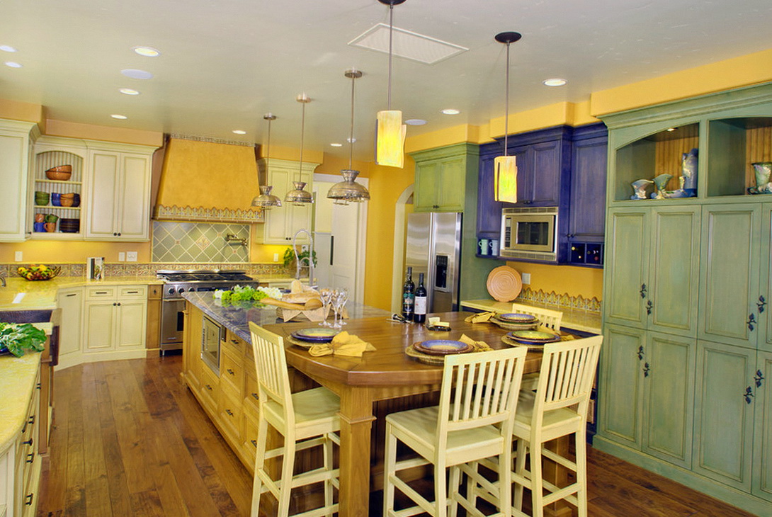
Yellow in the interior of the kitchen
How can I use it?


 - Ideas for Making beautiful designs")