Gray kitchen: 50 shades of interior variations. 250+ (photo) combinations in design
 combinations in design")
If you love the atmosphere of sophistication and tranquility, then the kitchen design in gray will be a safe choice for you. In our country there is a biased and even disparaging opinion about this color. However, few people think about the advantageous sides of gray - depending on the saturation, it can acquire very interesting shades and transform the design of any room.
Content of this article:
Advantages and disadvantages
The kitchen in gray colors looks elegant and stylish, it combines chic and severity equally. Let's look at the most popular combinations of smoky color to the design of your kitchen attracted the eye and caused delight.

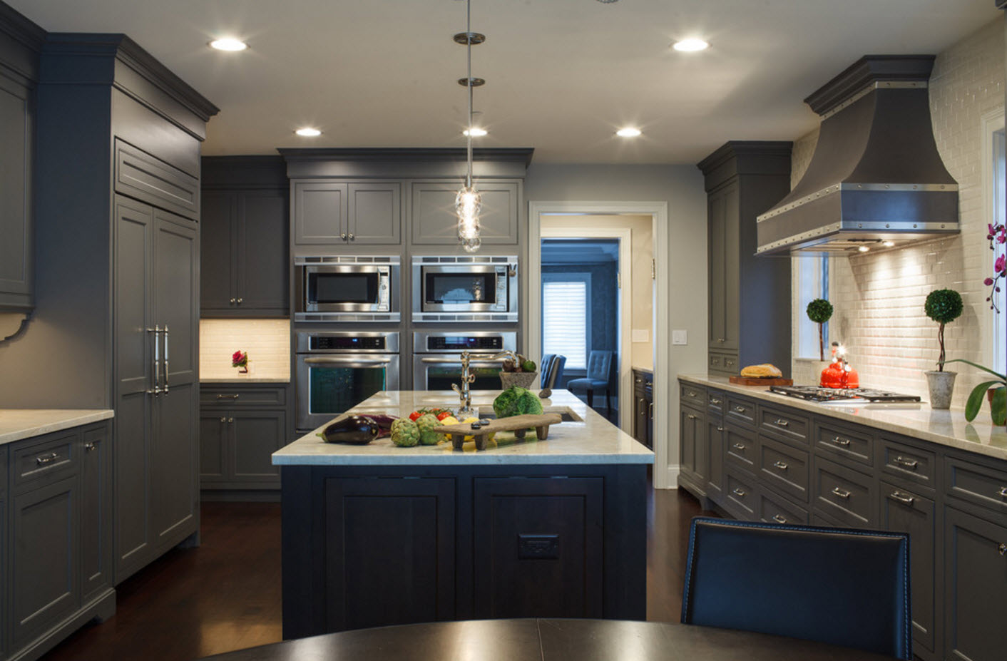
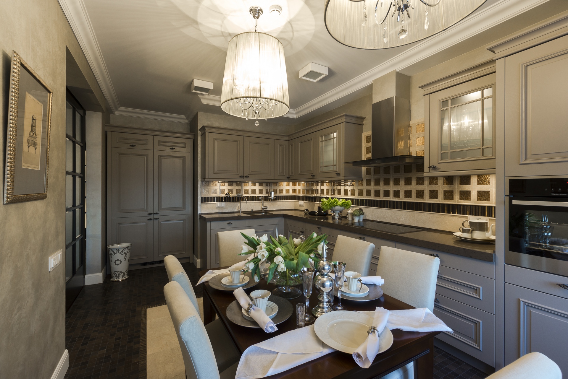
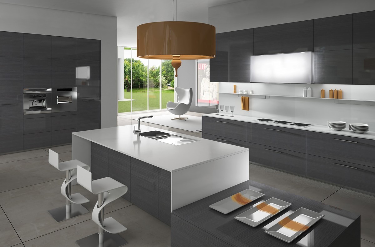
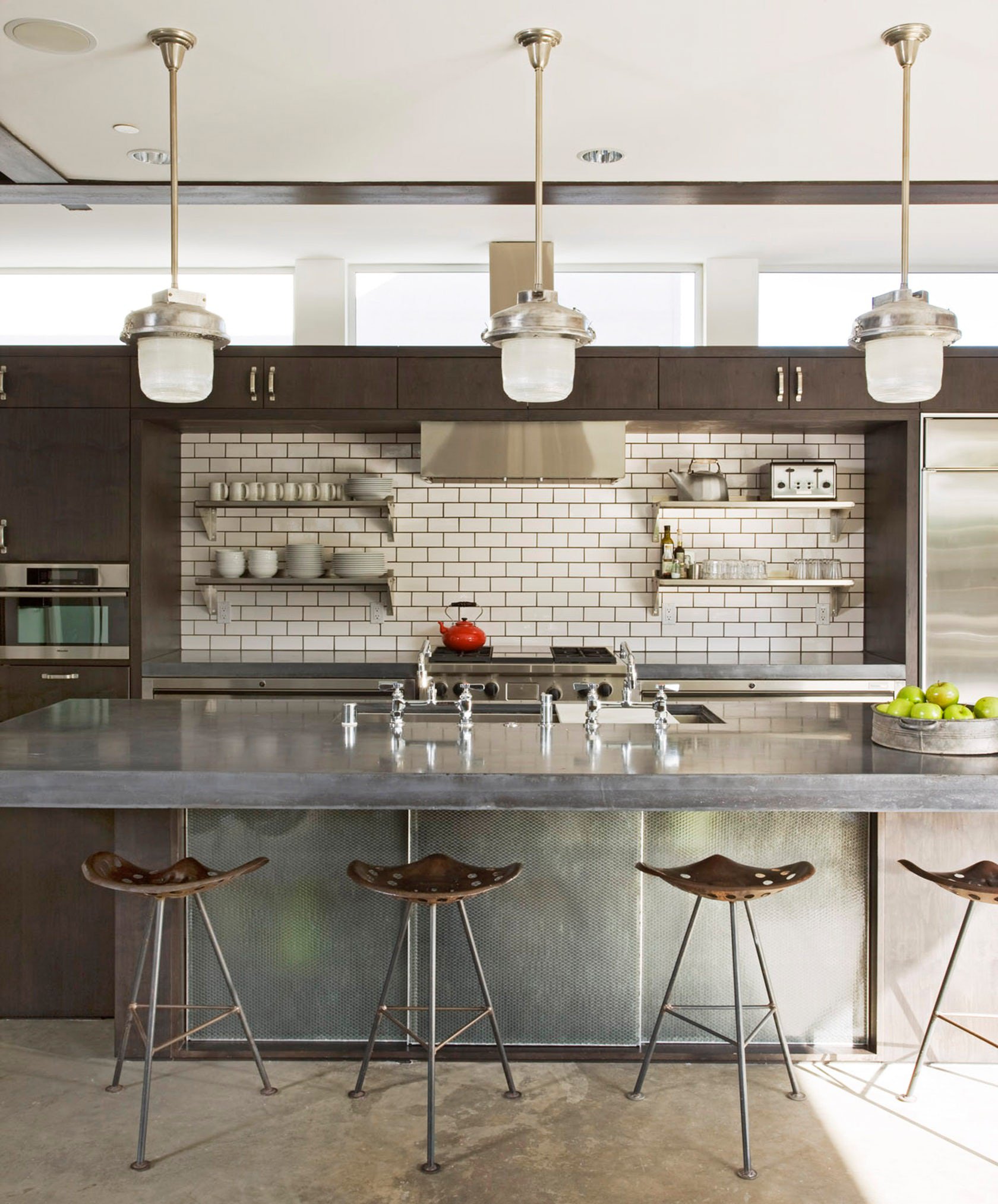
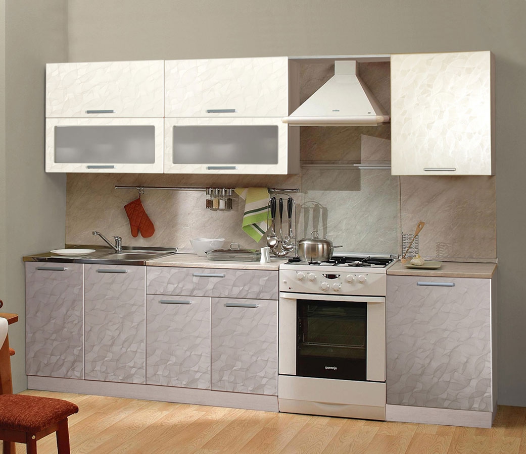
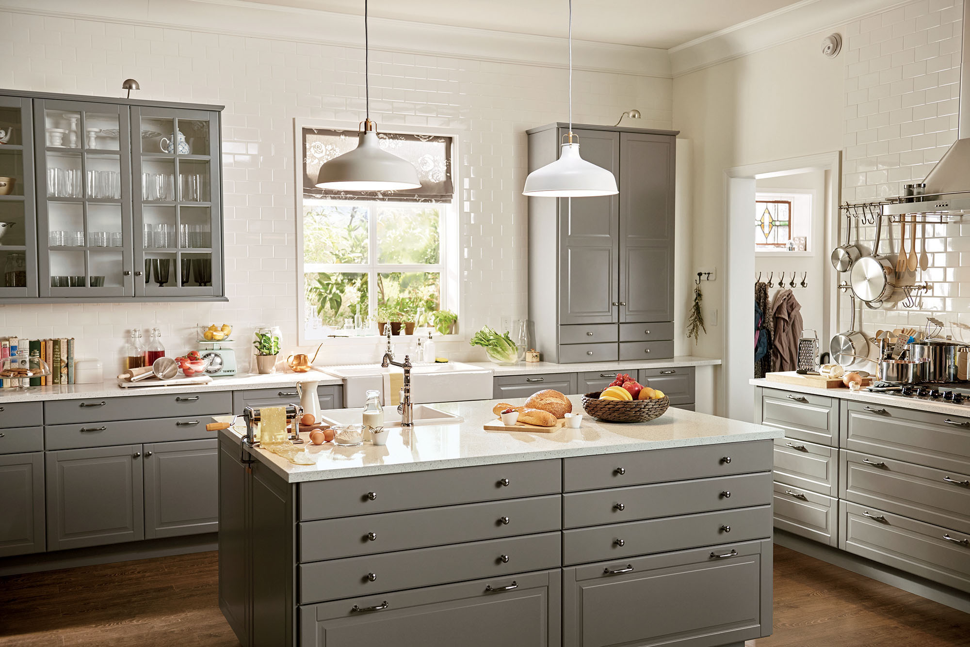
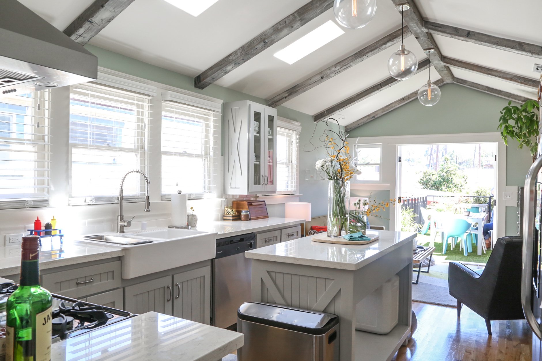
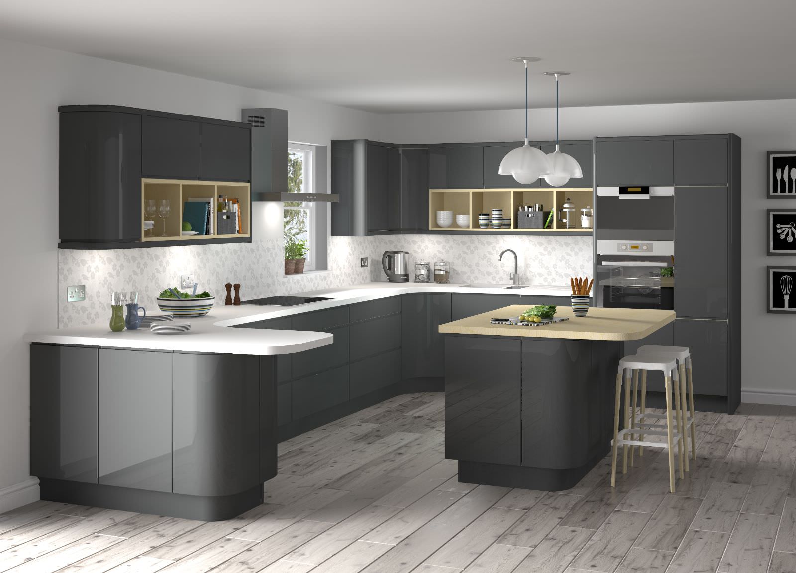
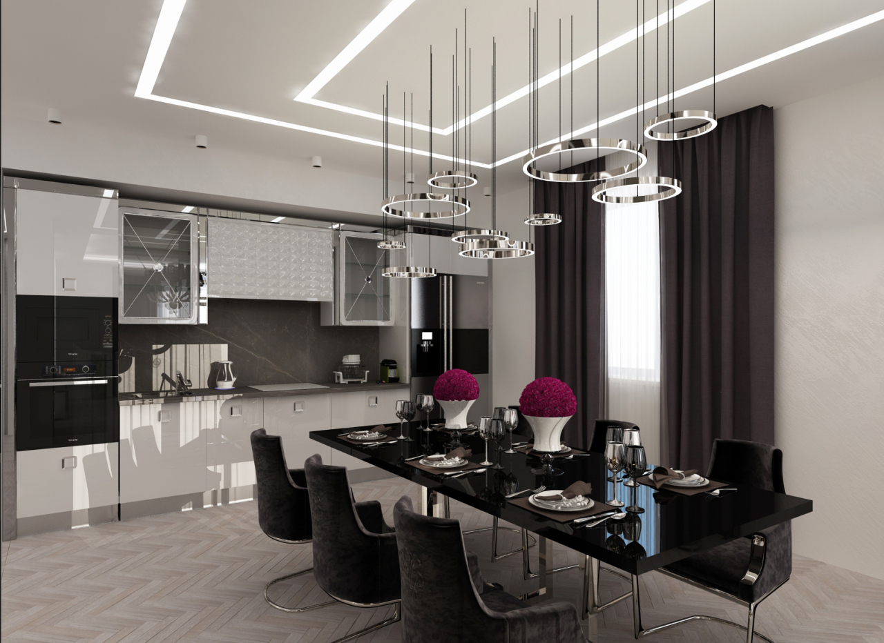
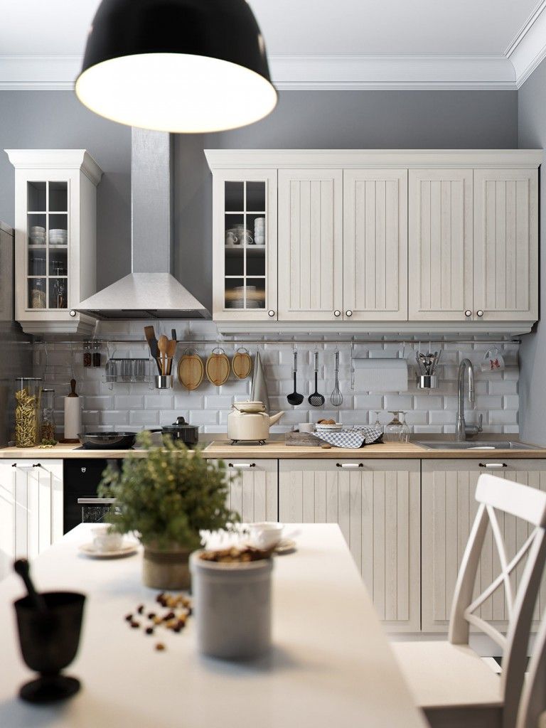
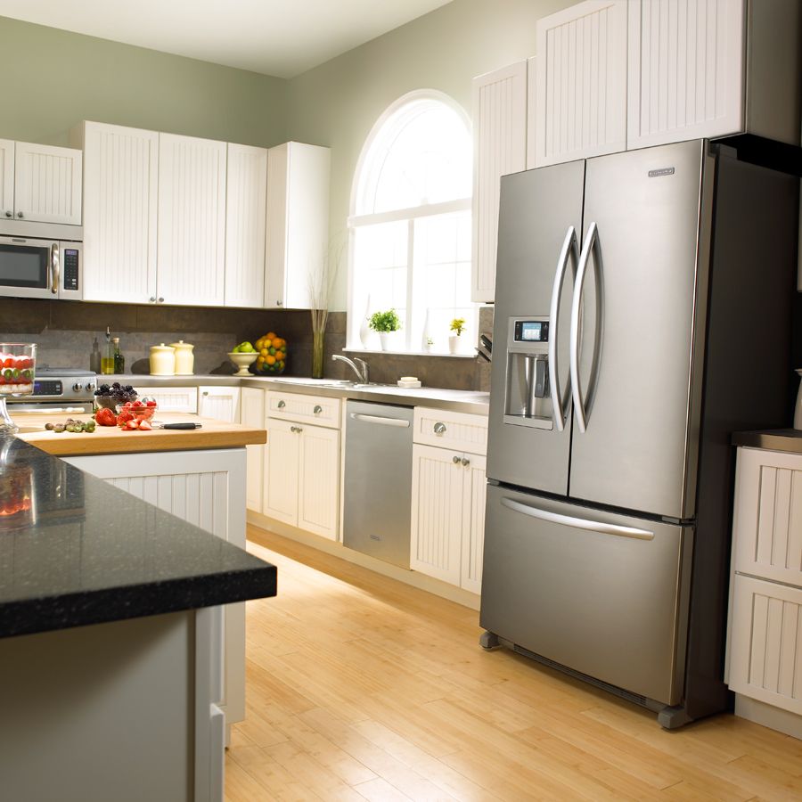
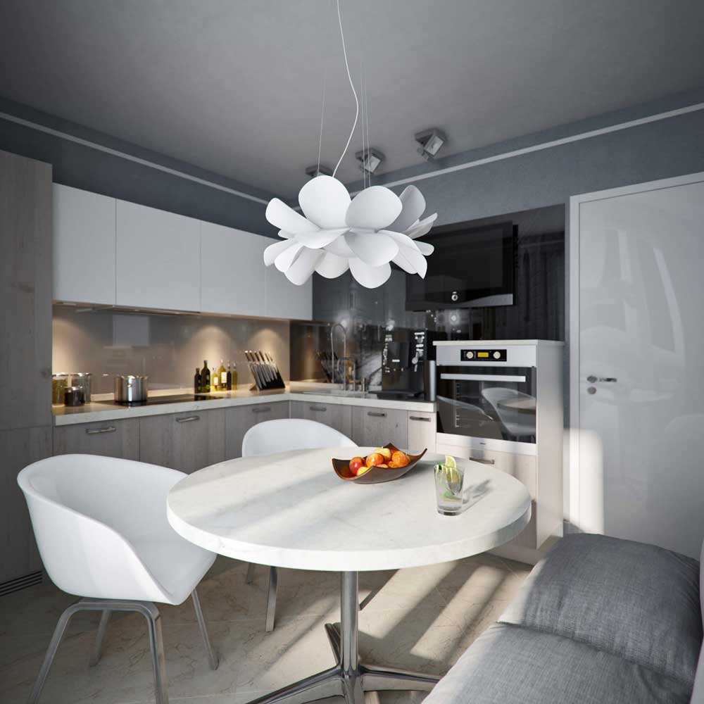
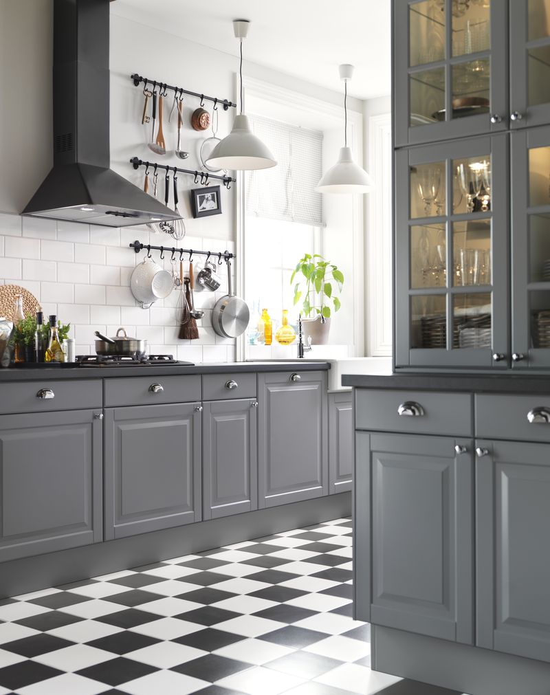
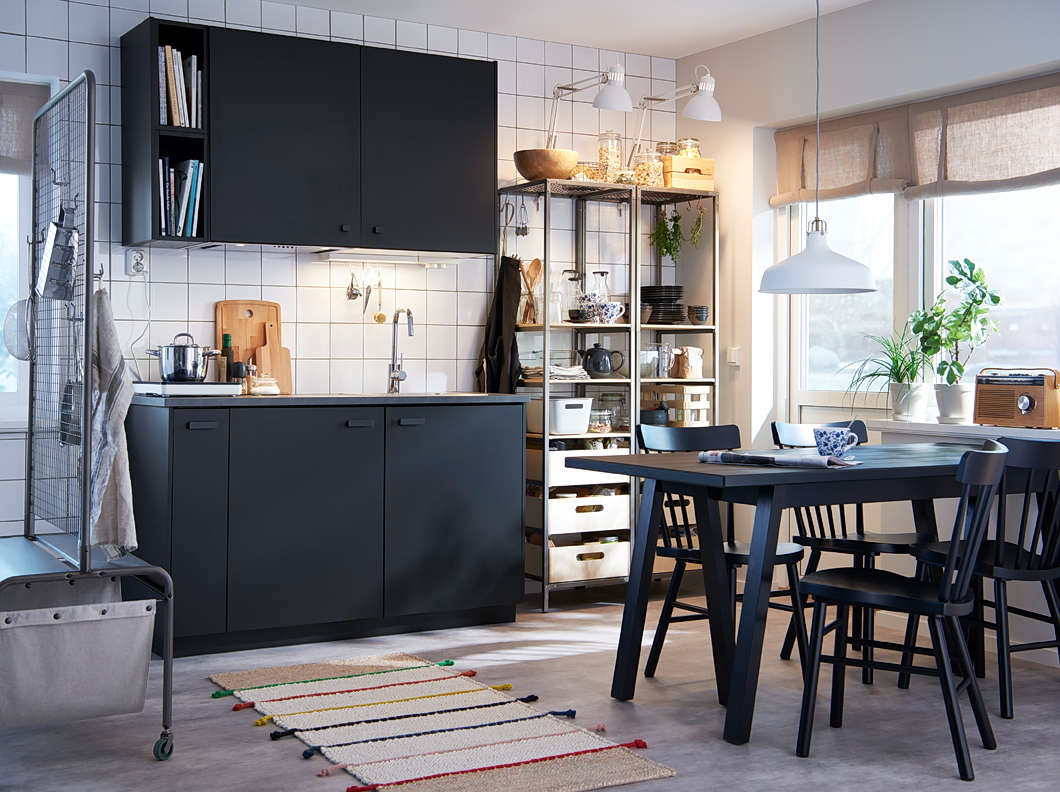
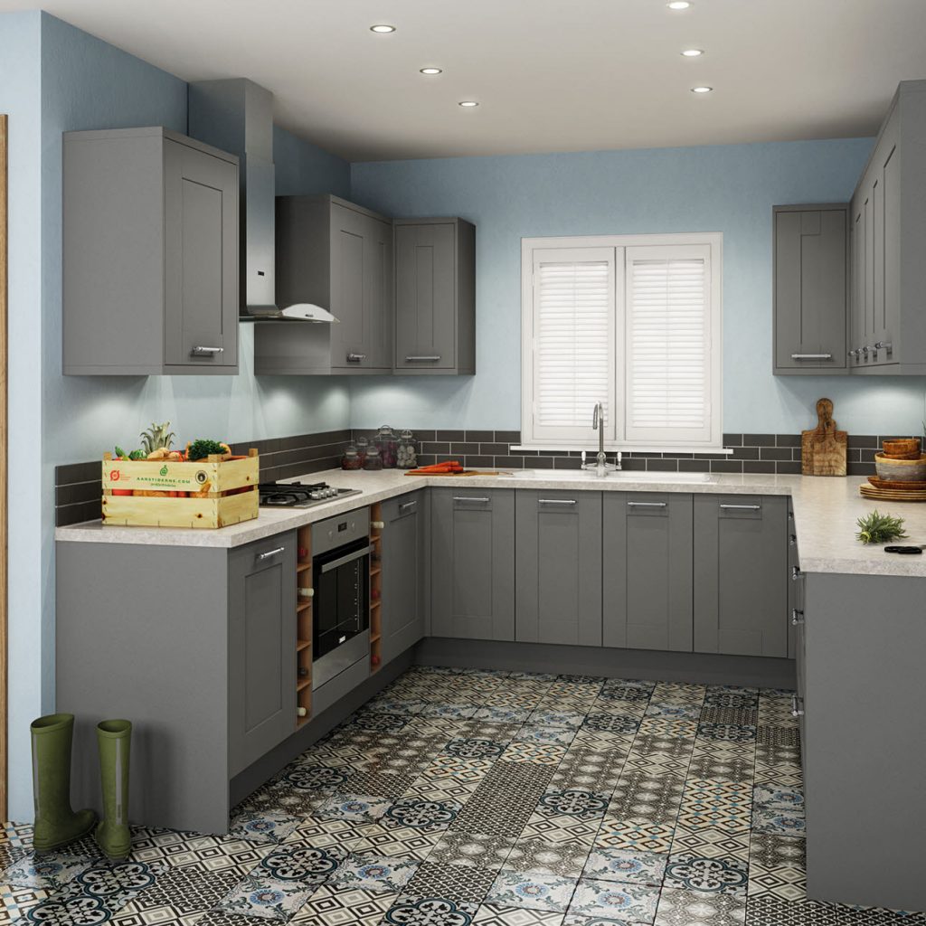
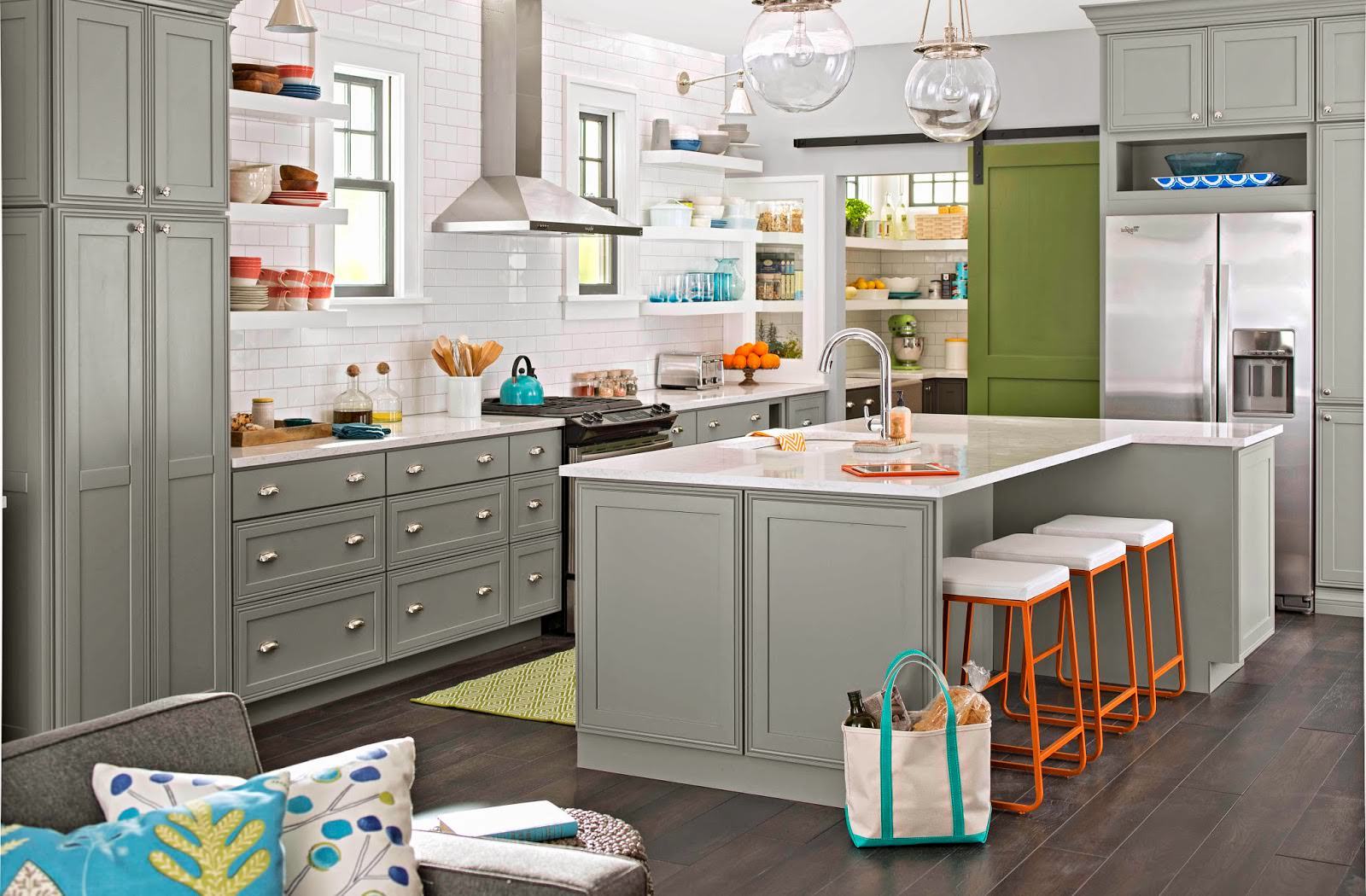
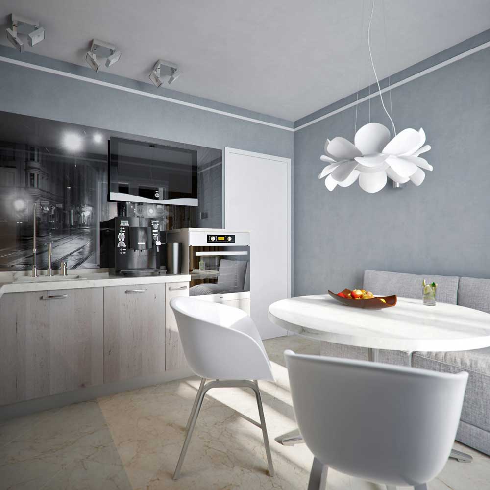
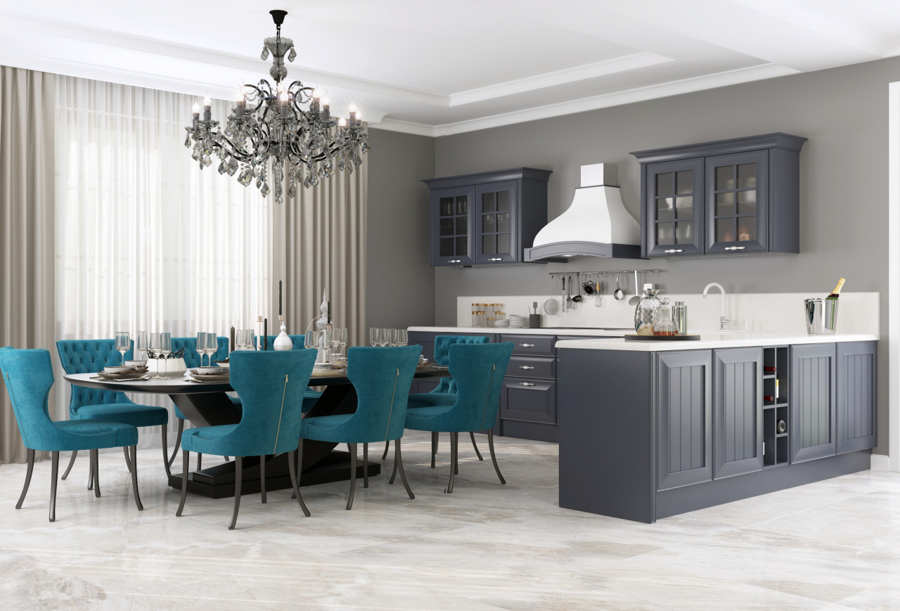
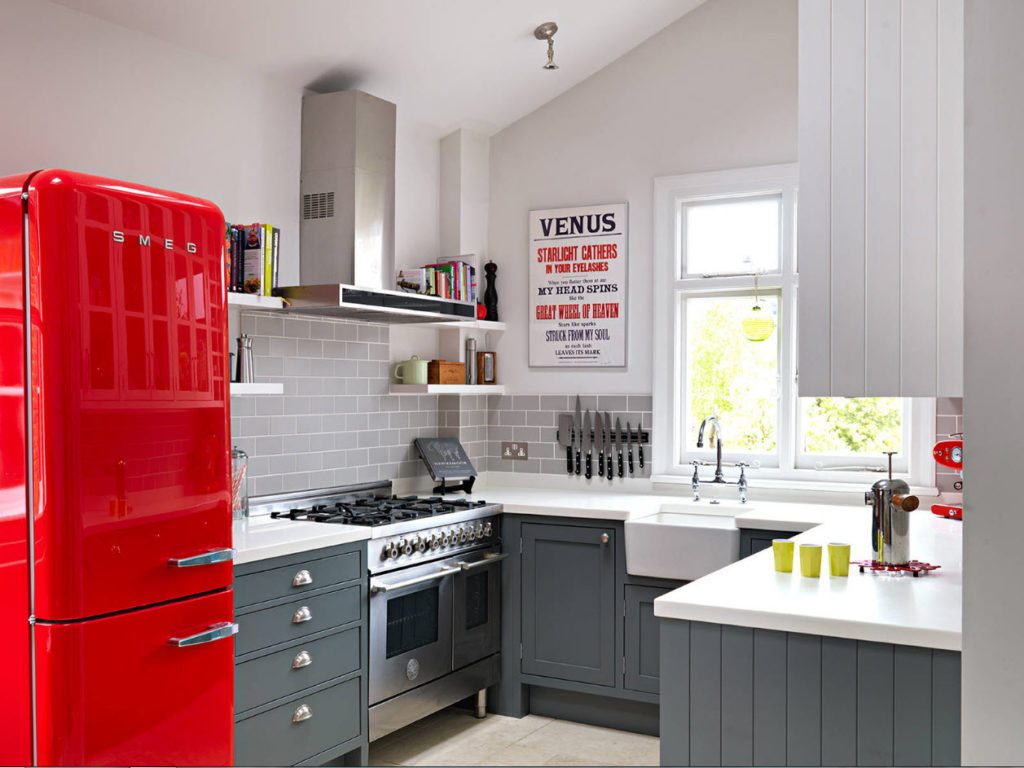
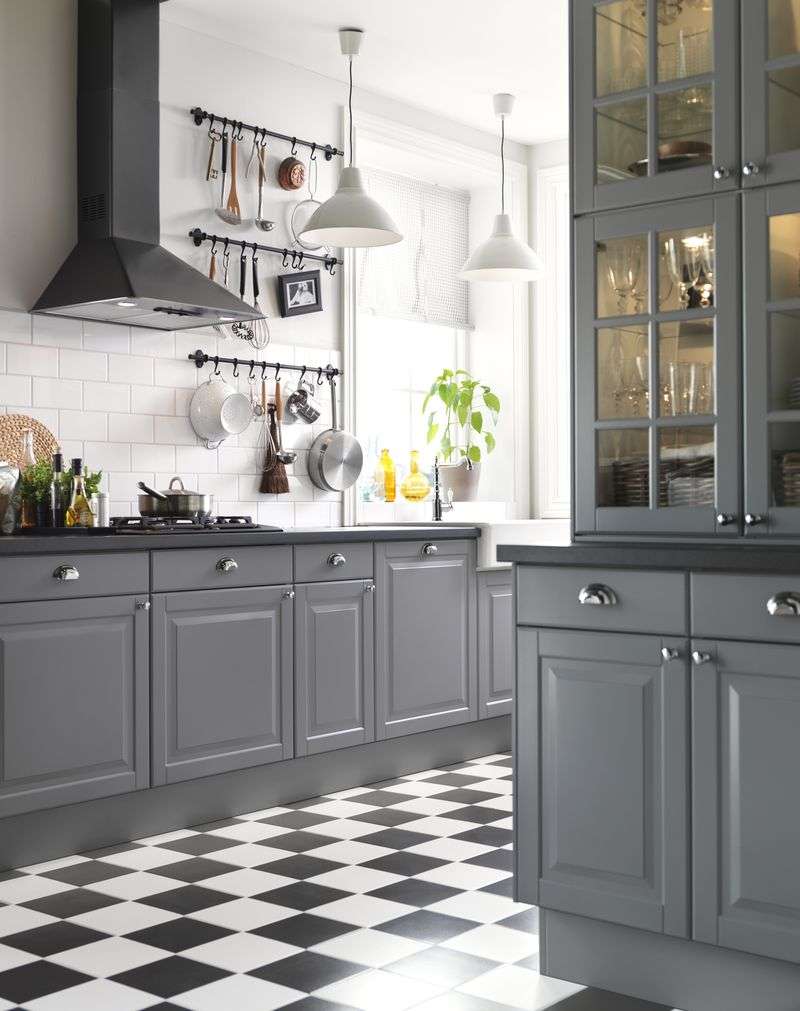
Beautiful and festive cuisine
Gray is considered the favorite color of many designers.. It helps furniture and decorative elements to open up and stand out, to focus on the form and texture. Imagine you are looking at the red nightstand - you remember only a bright saturated spot.
However, if you start looking at this color item of furniture, then pay attention to the attractive shape and other details.

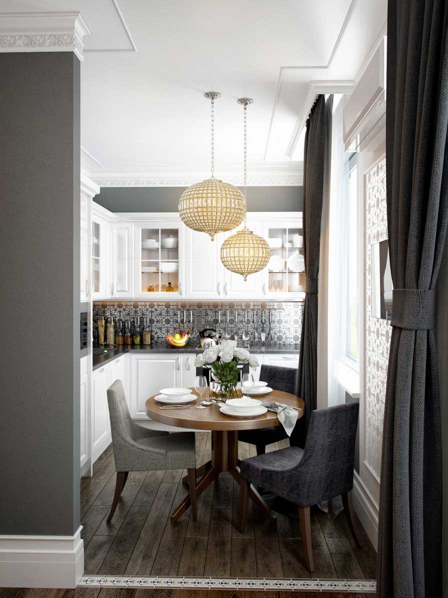
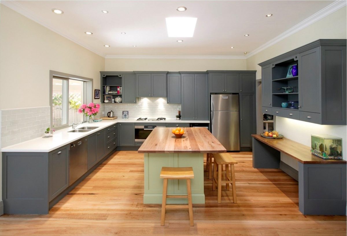
Design Ideas for your design
In addition to such a clear advantage, you can highlight the following advantages of the kitchen:
- It is considered neutral. Speaking of any other shades, they either cause sympathy or not. Silver in most cases does not cause strong emotions, is taken for granted.
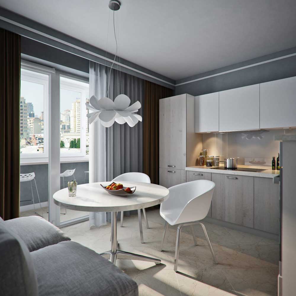
- Bright smoky shades are suitable for the design of a very small room. When your kitchen can not boast of large size, the walls and furniture in gray will look organic, do not absorb light and visually increase the space.
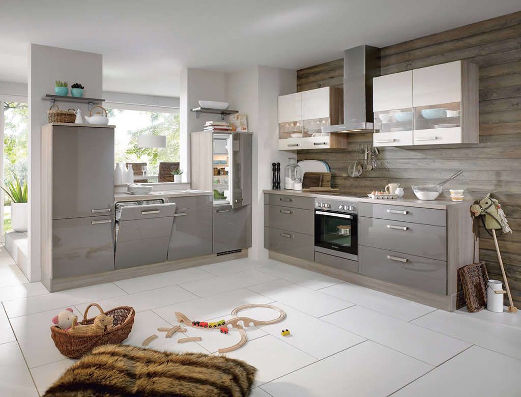
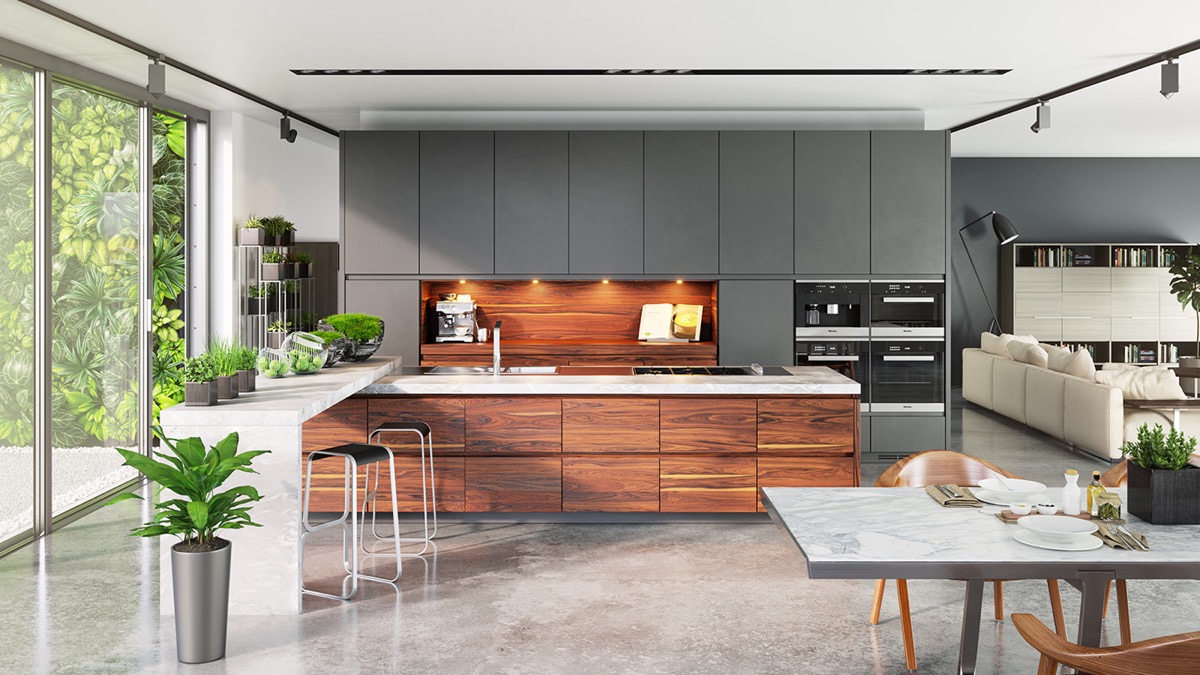
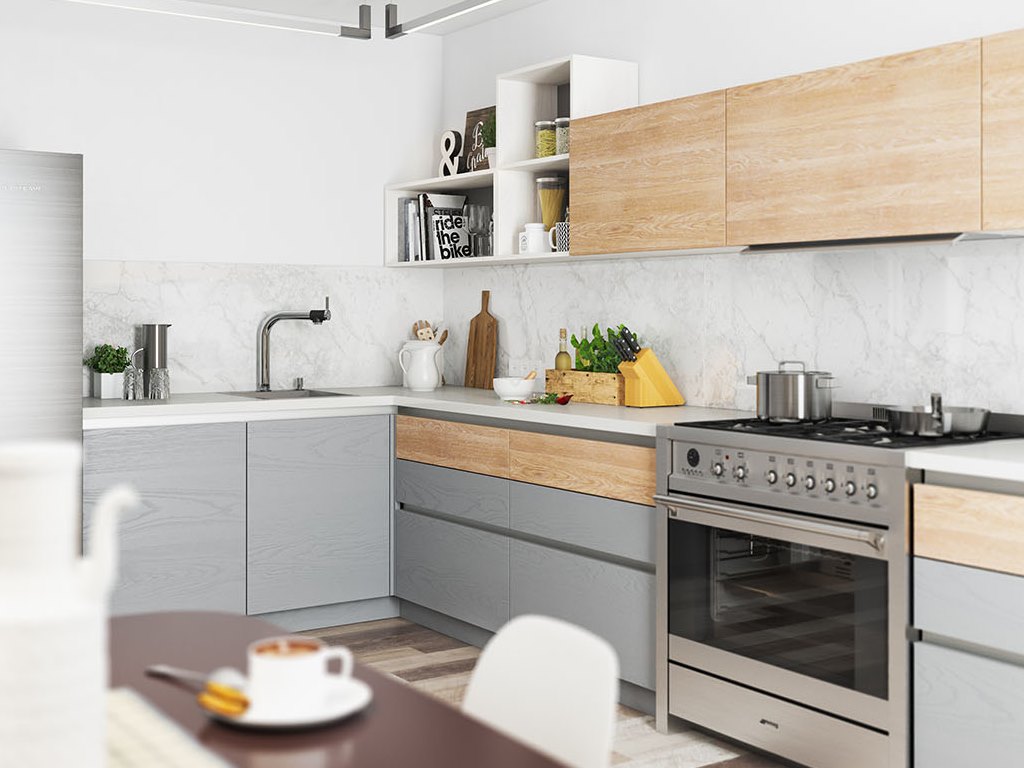
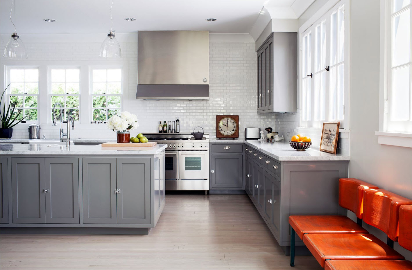
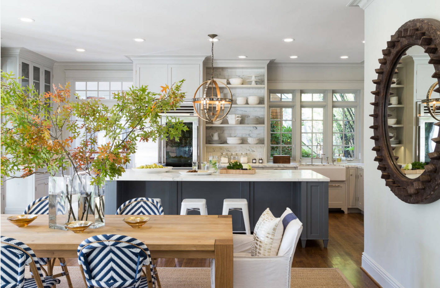
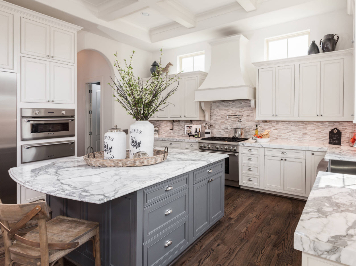
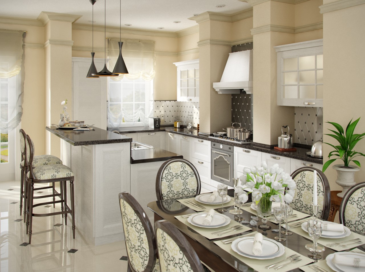
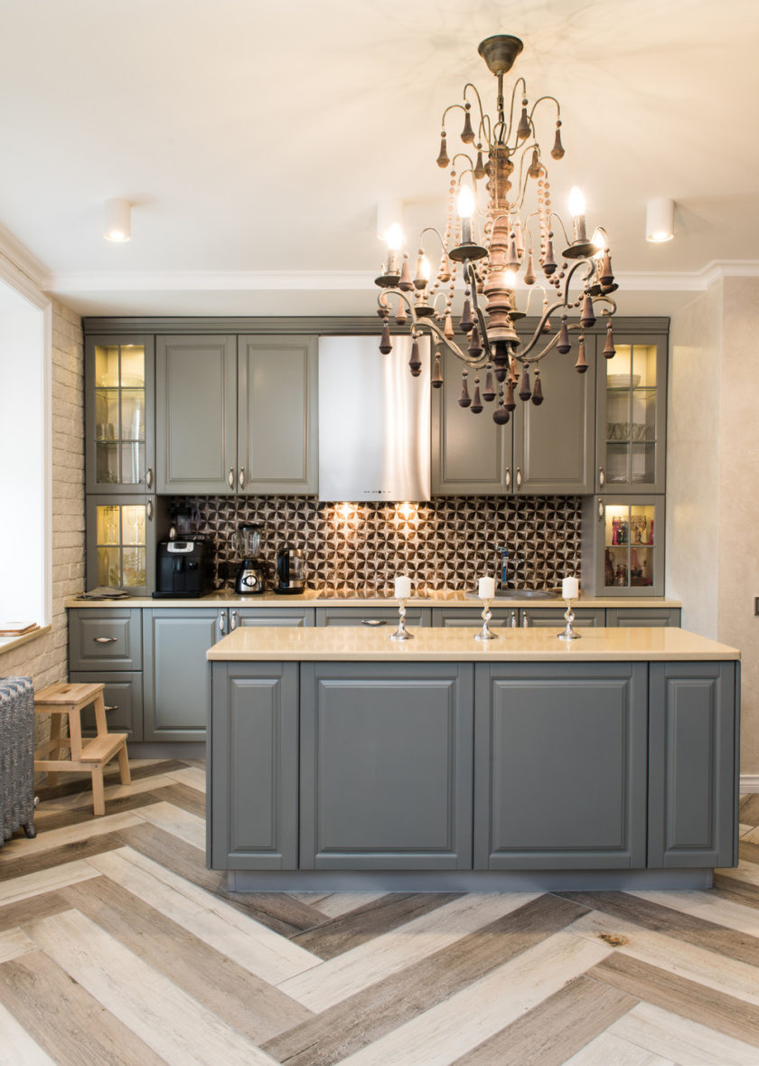
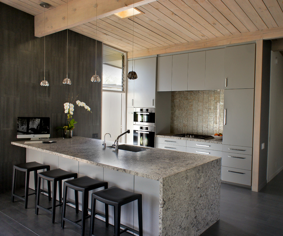
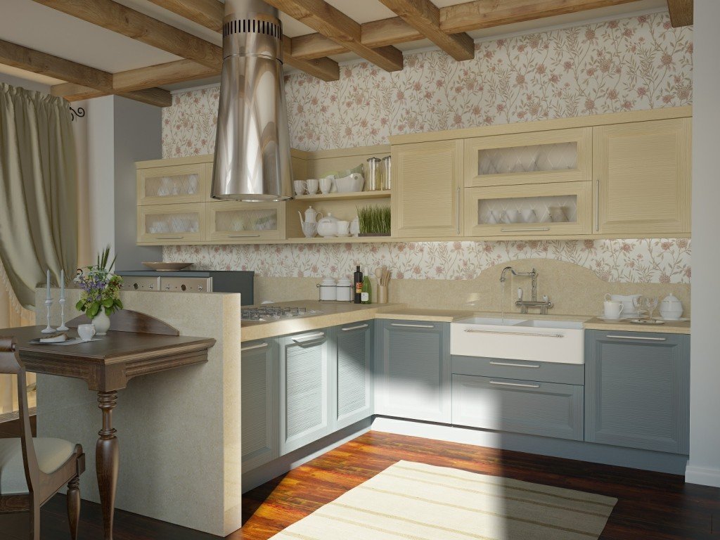
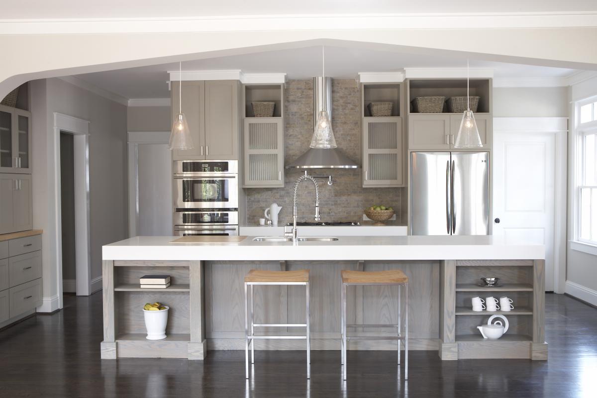
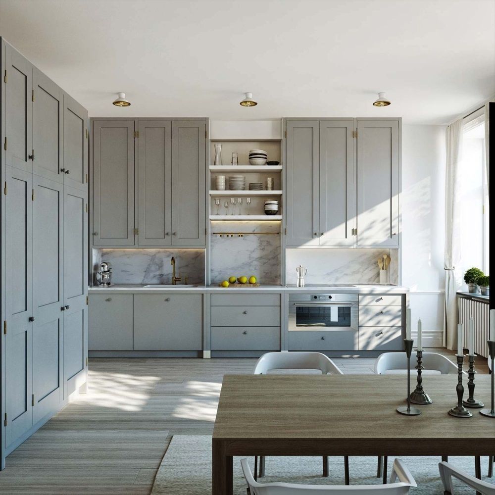
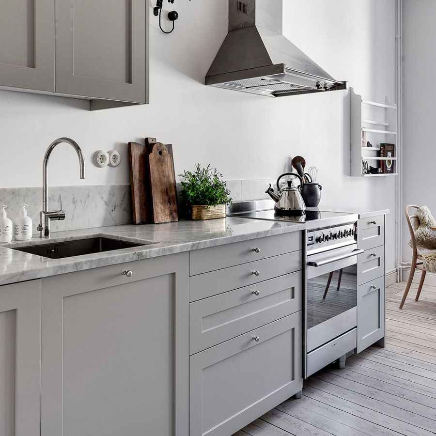
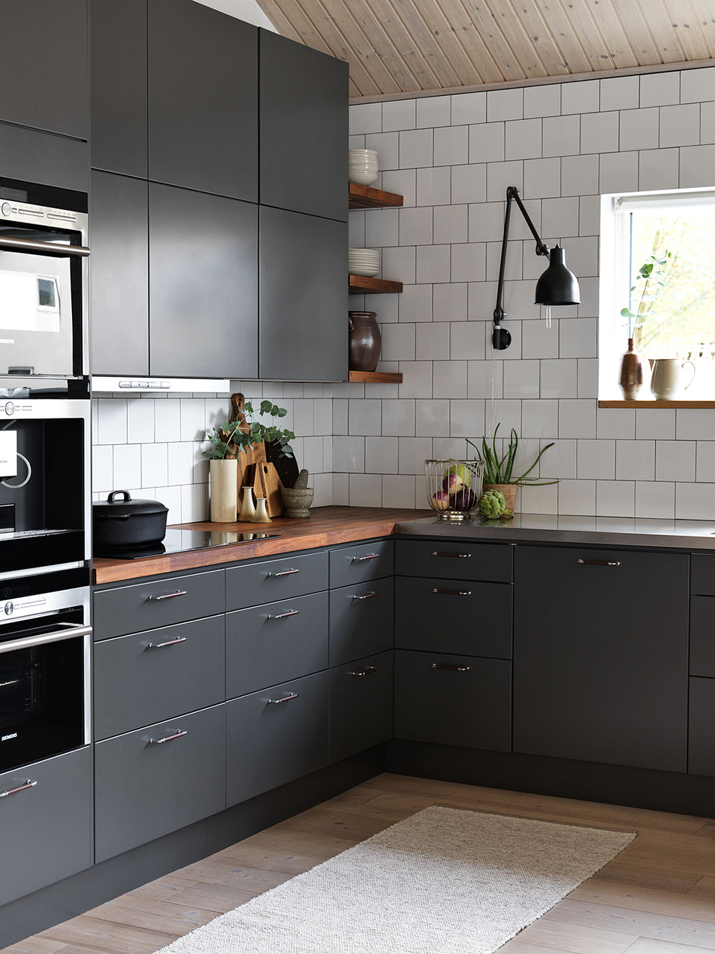
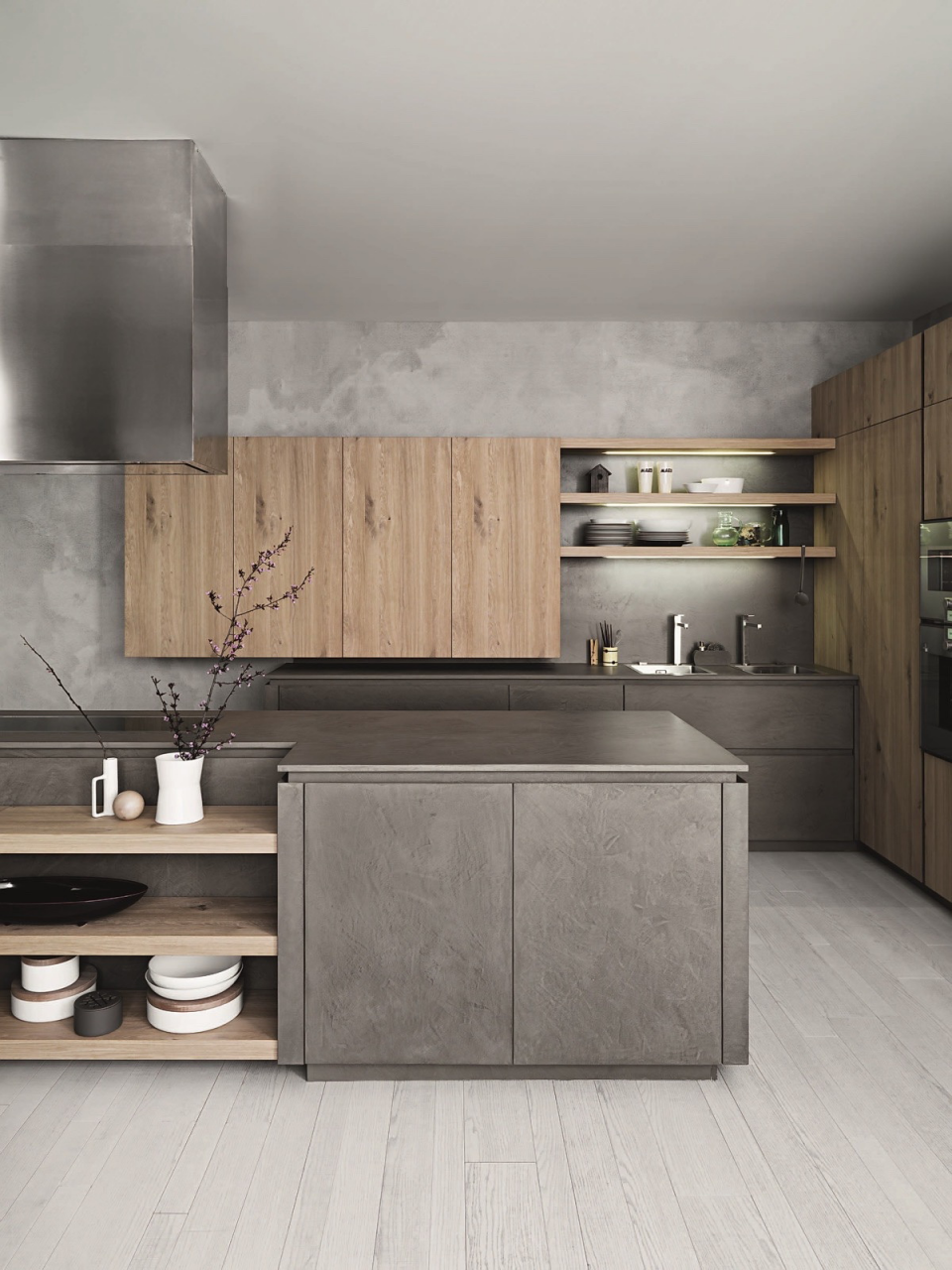
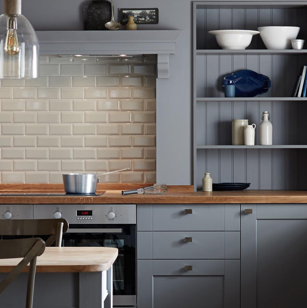
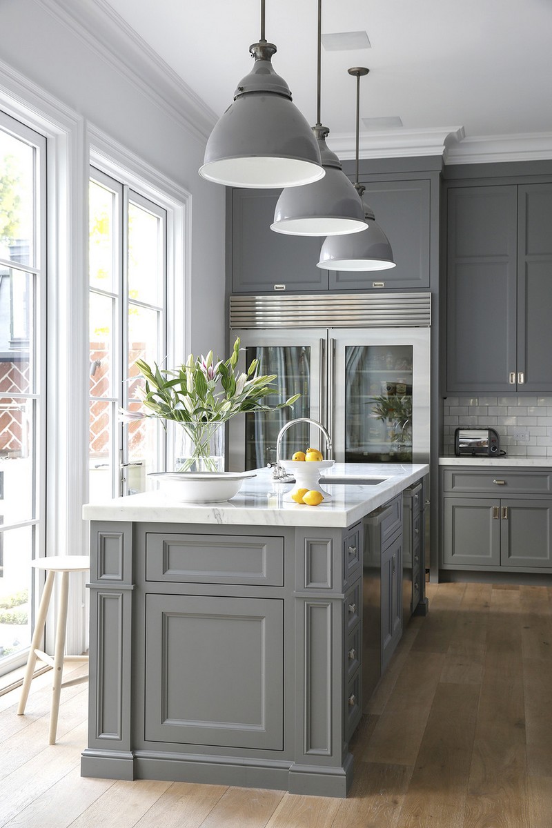
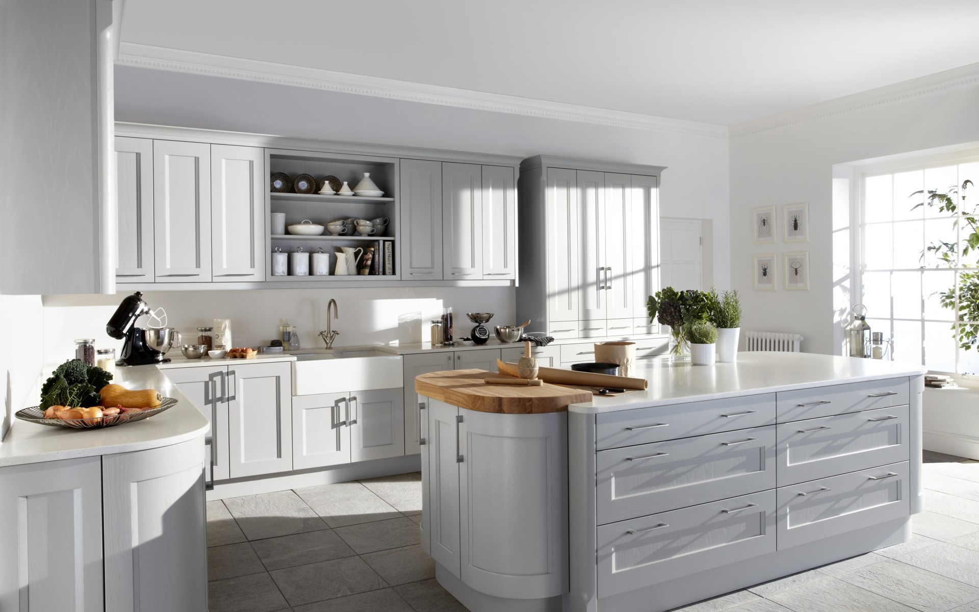
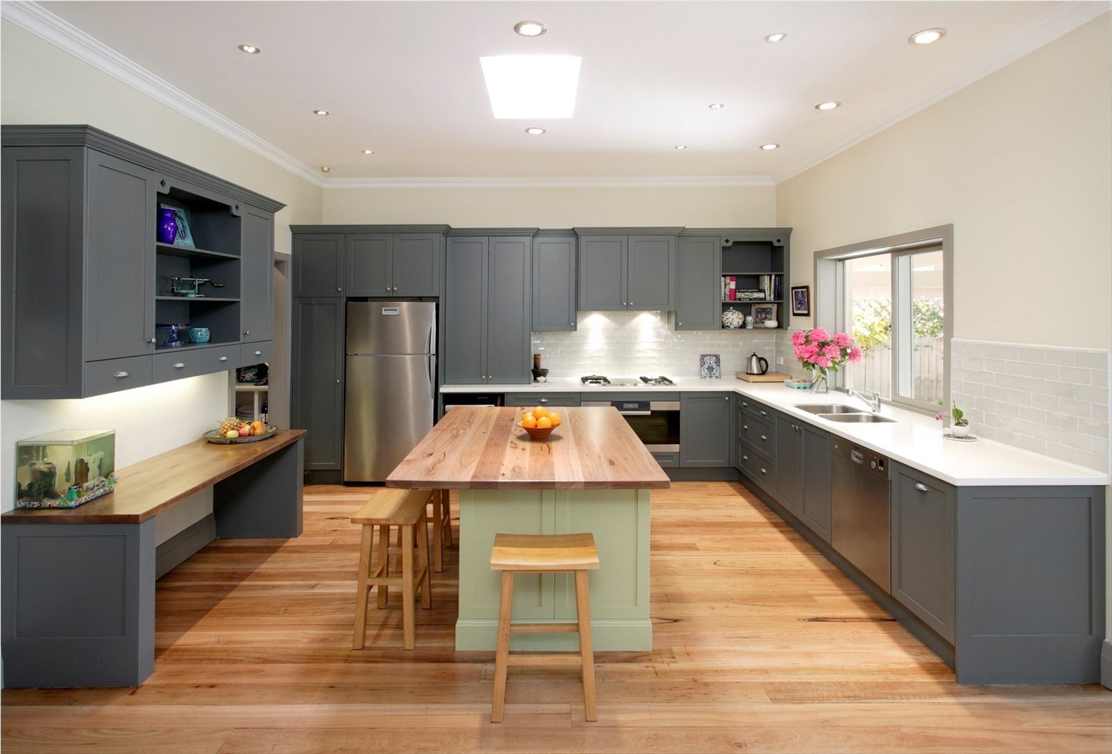
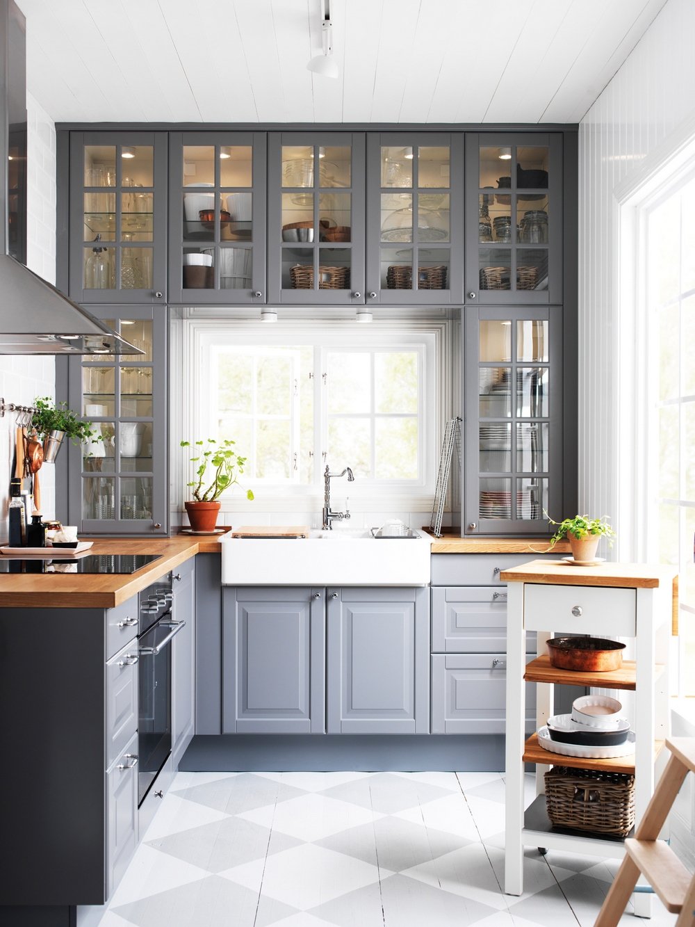
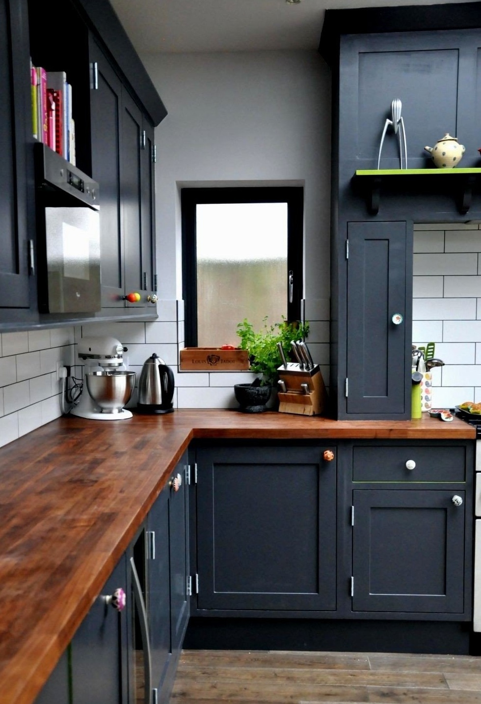
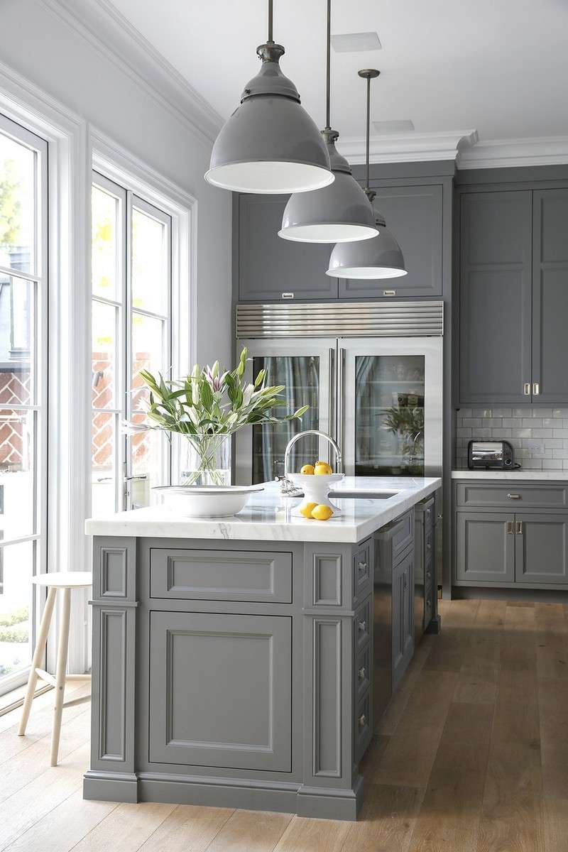
- This shade looks great in combination with natural a tree. Dining table, chairs, sets, made in wood, will make the interior very stylish.
- It allows you to experiment and create unusual combinations. Gray will be a great background, thanks to this you can make bold bright accents.
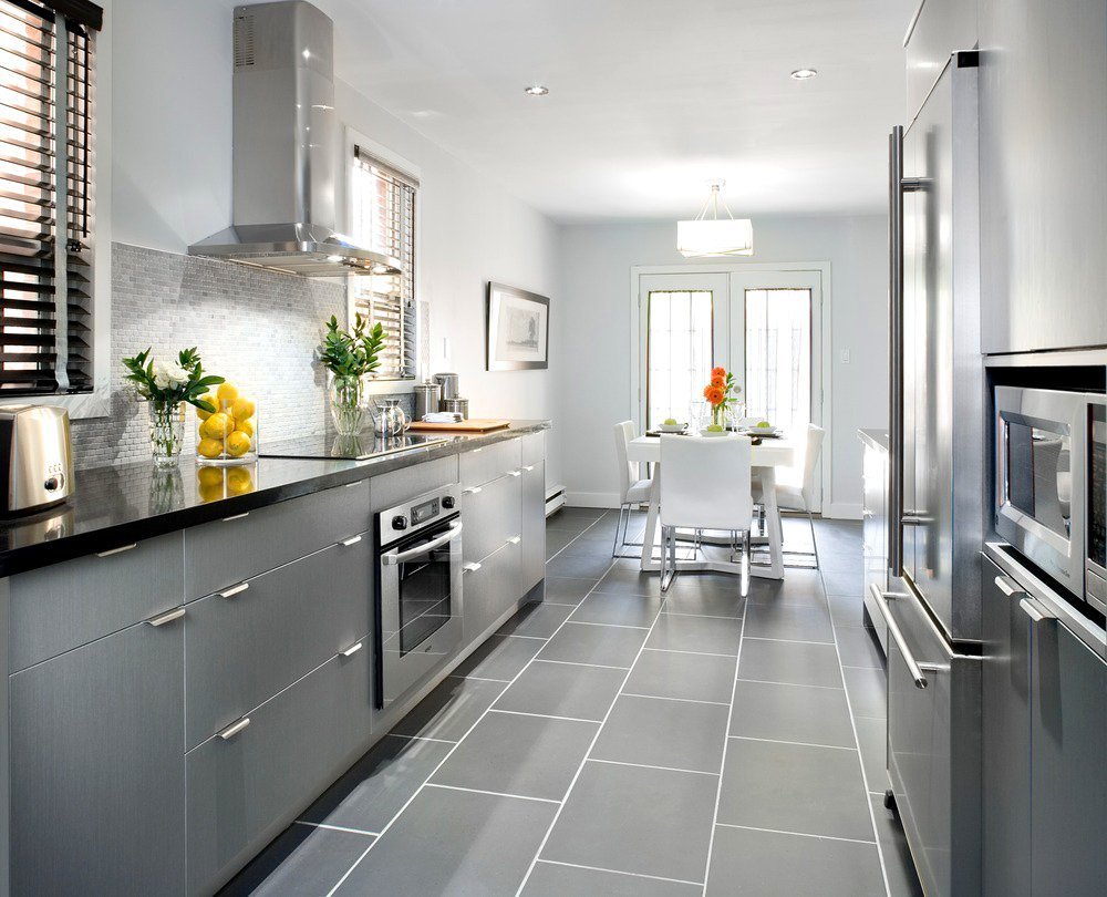
- Gray is more practical compared to, say, white. On the surface of white color any mote is noticeable, while smoky dust is hidden. This applies to furniture, sexthe walls. For example, in the kitchen an apron invisible fat stains, water stains.
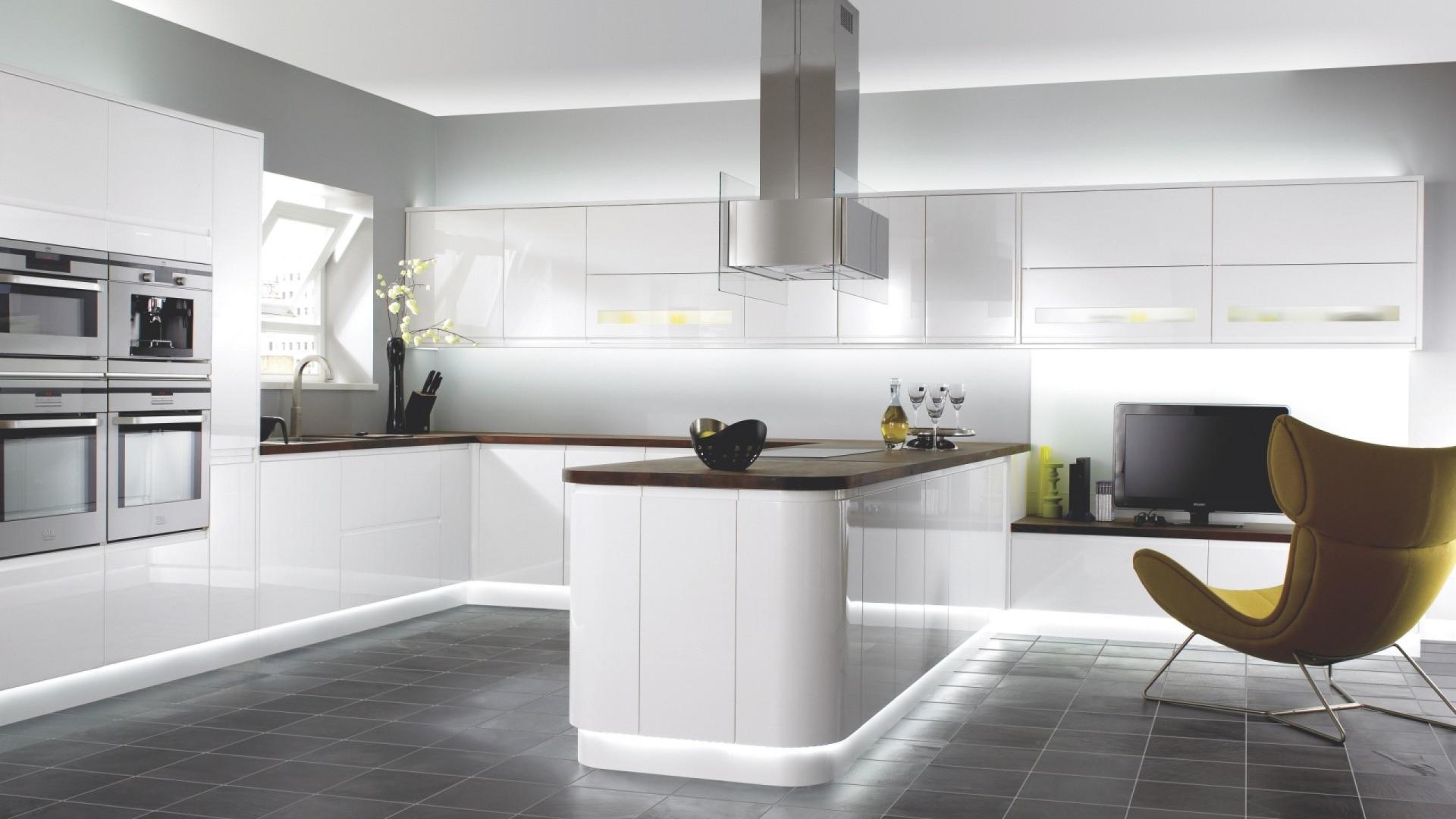
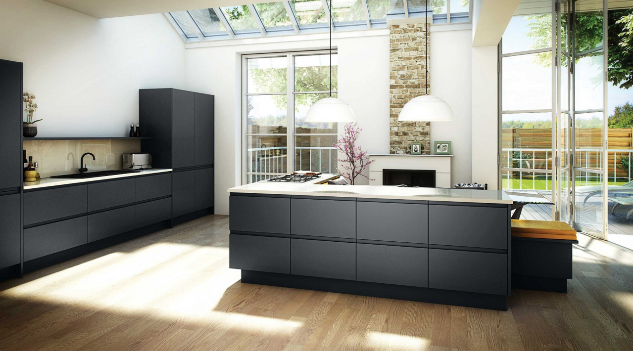
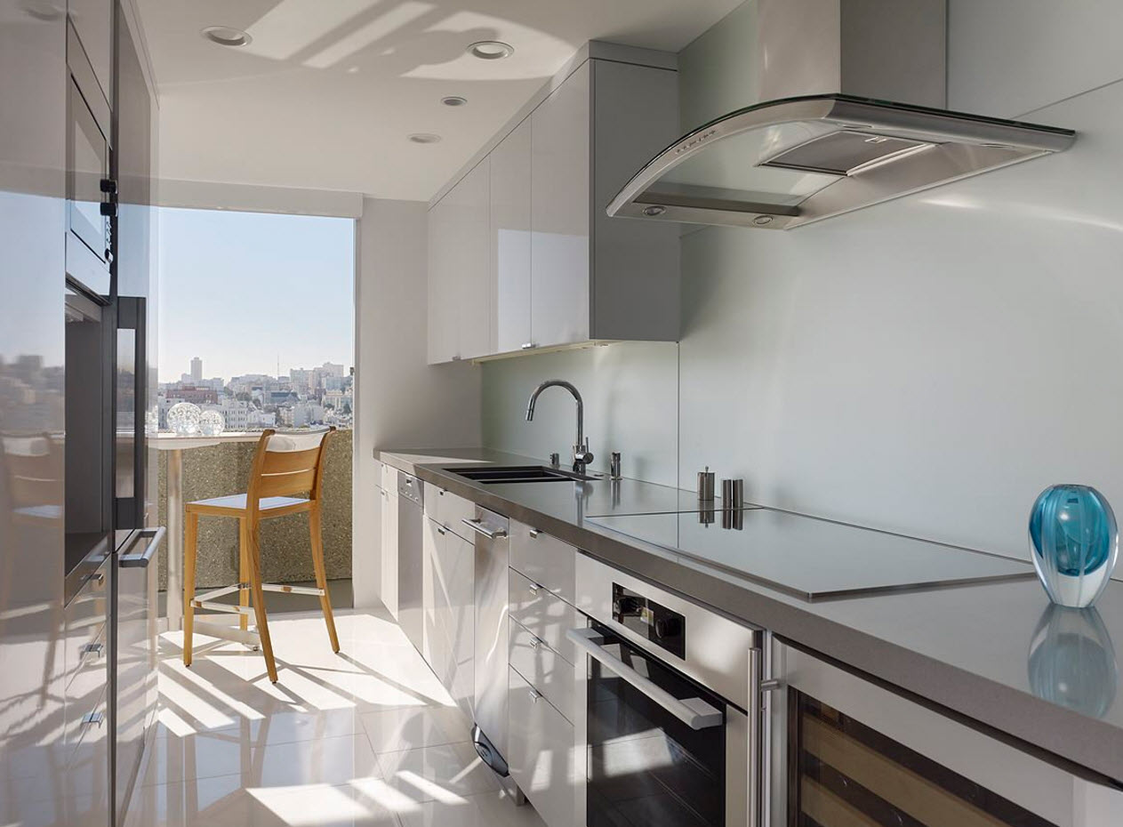
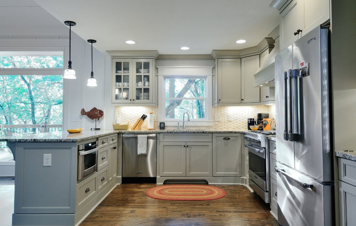
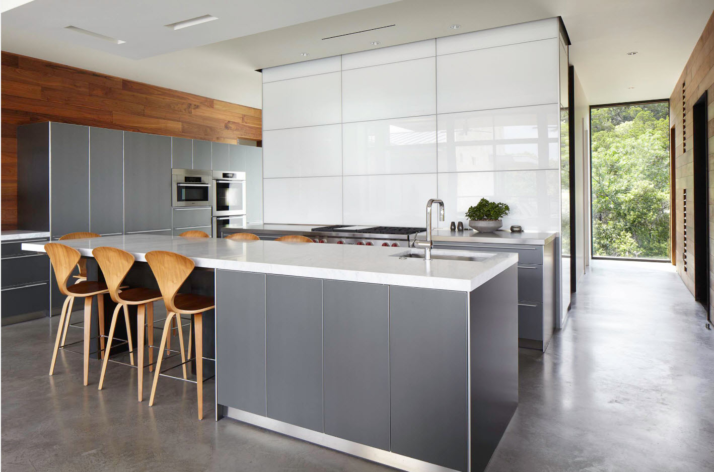
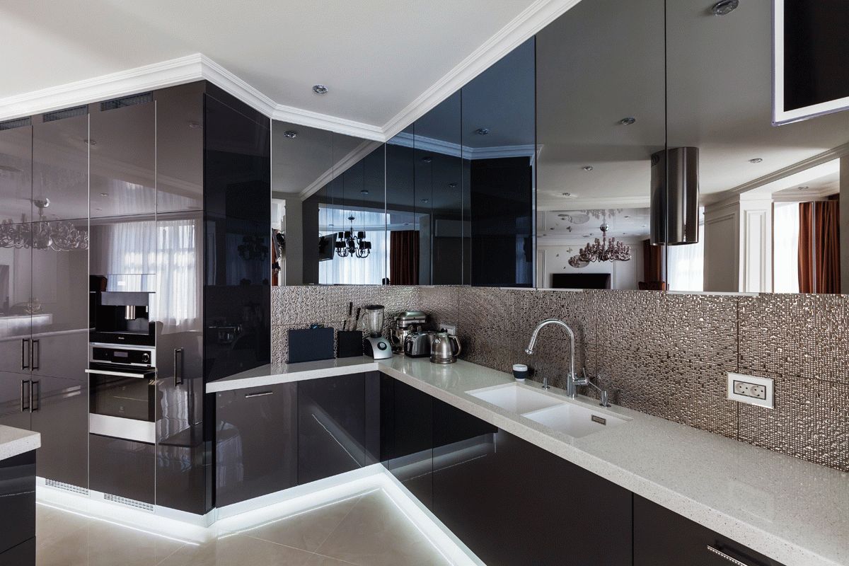
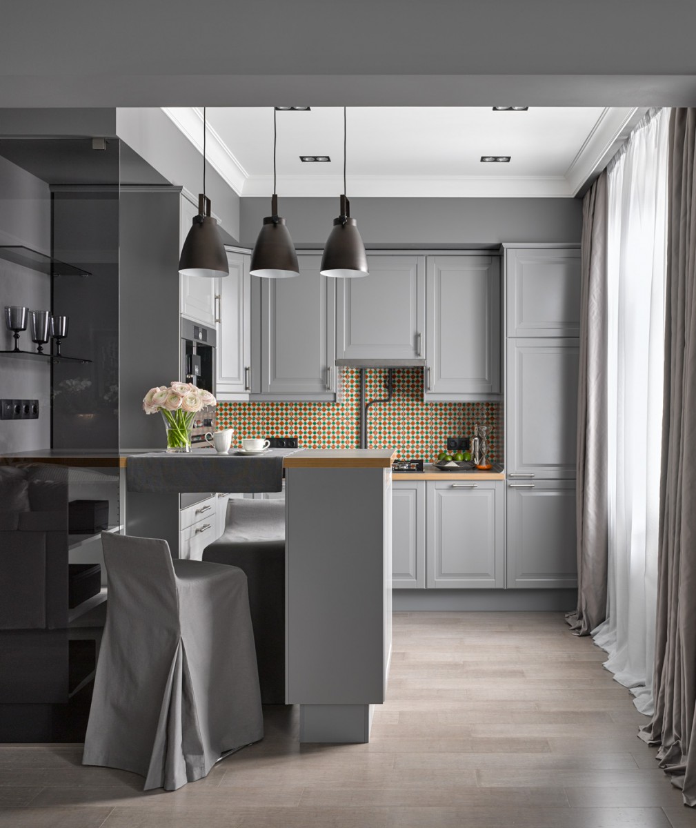
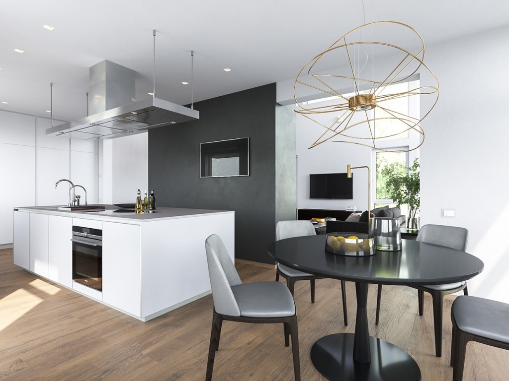
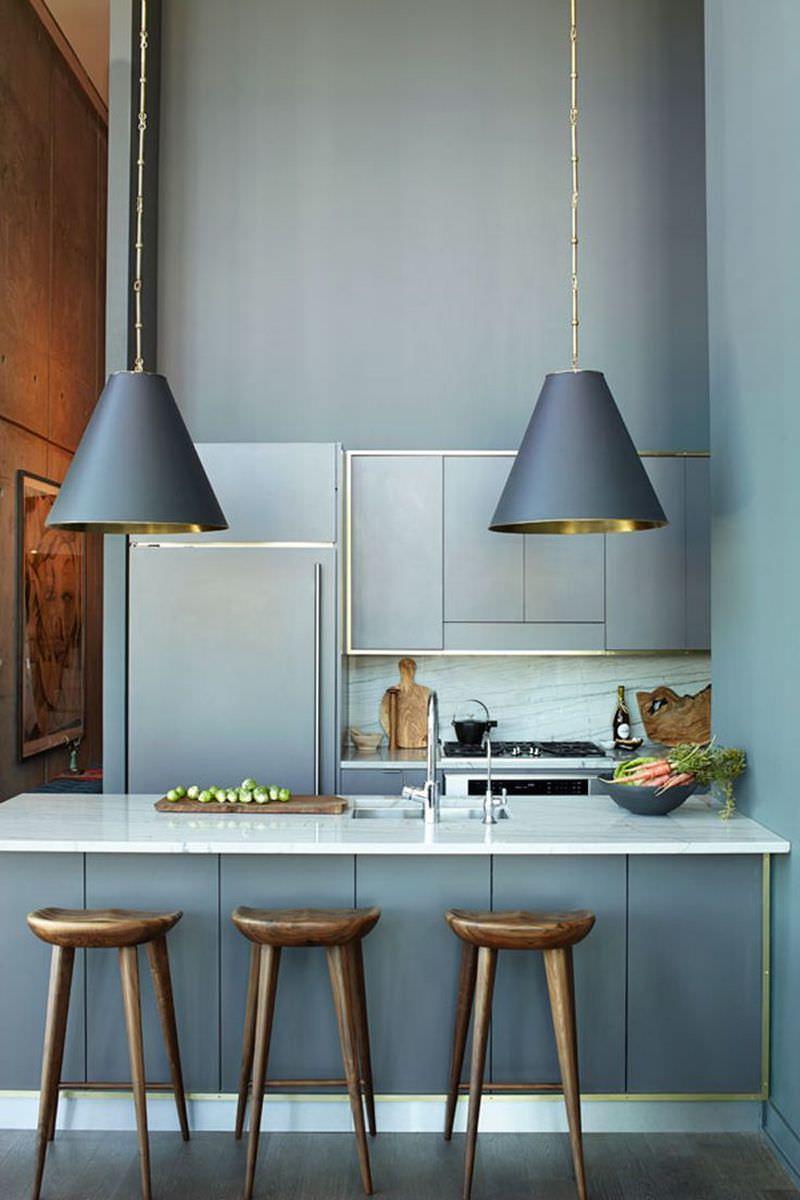
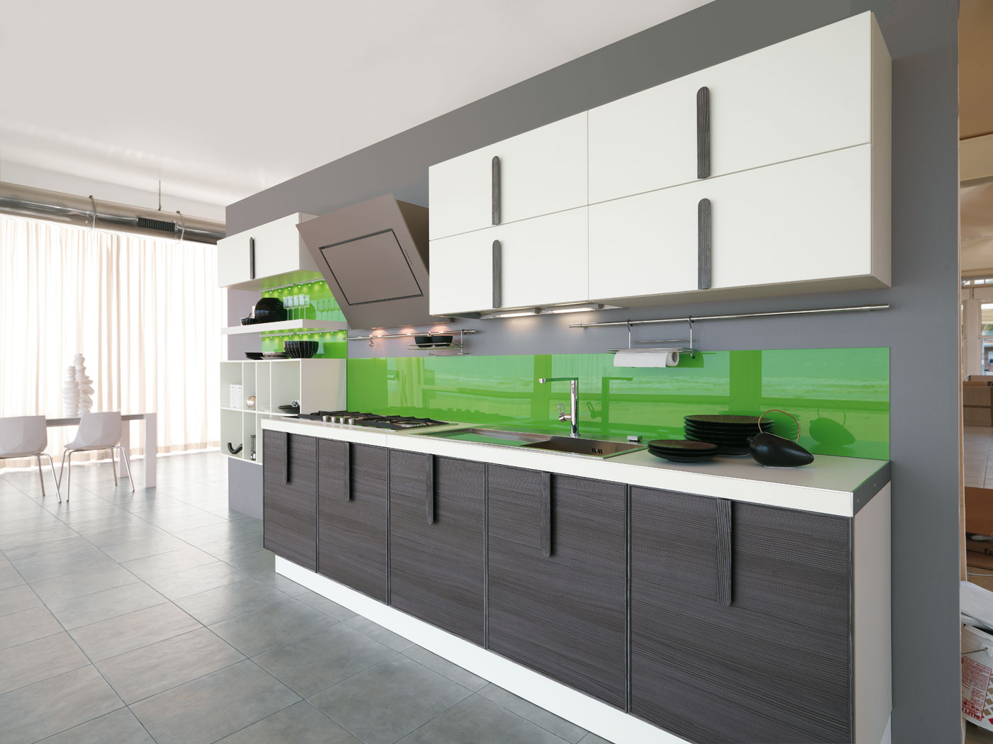
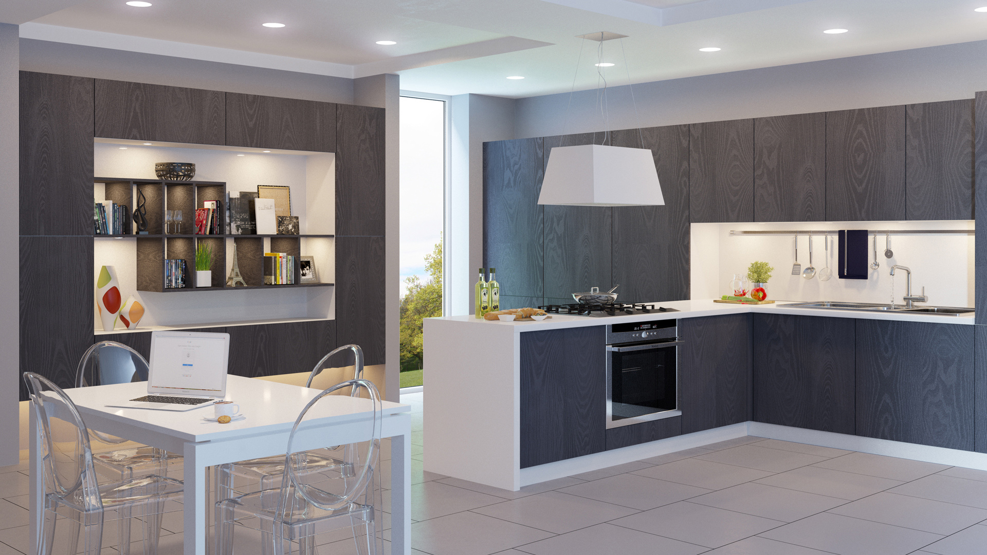
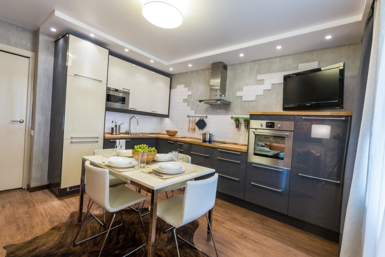
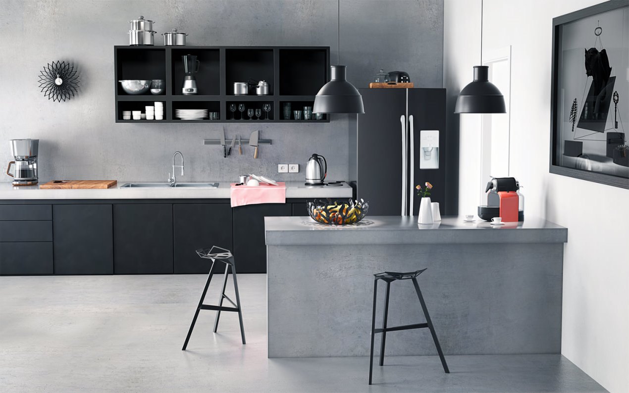
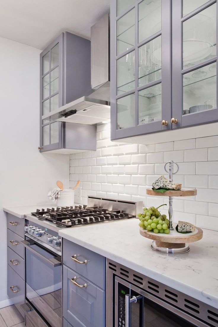
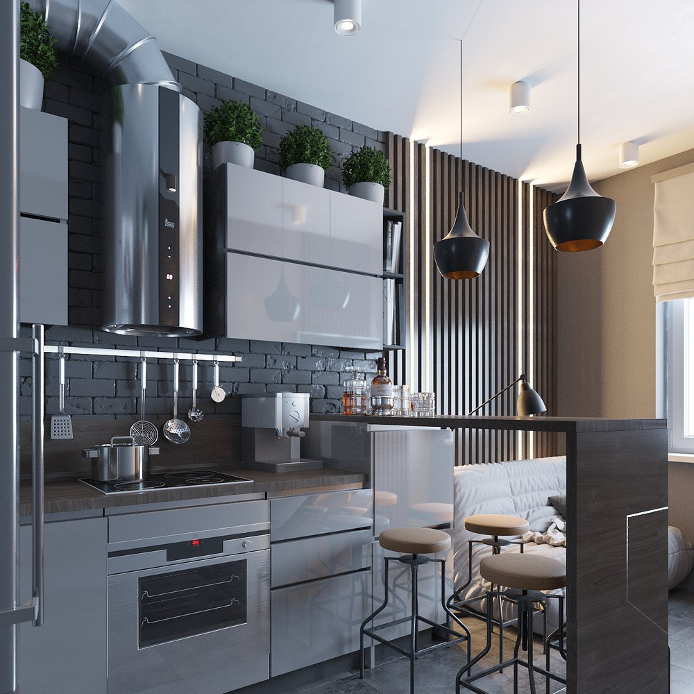
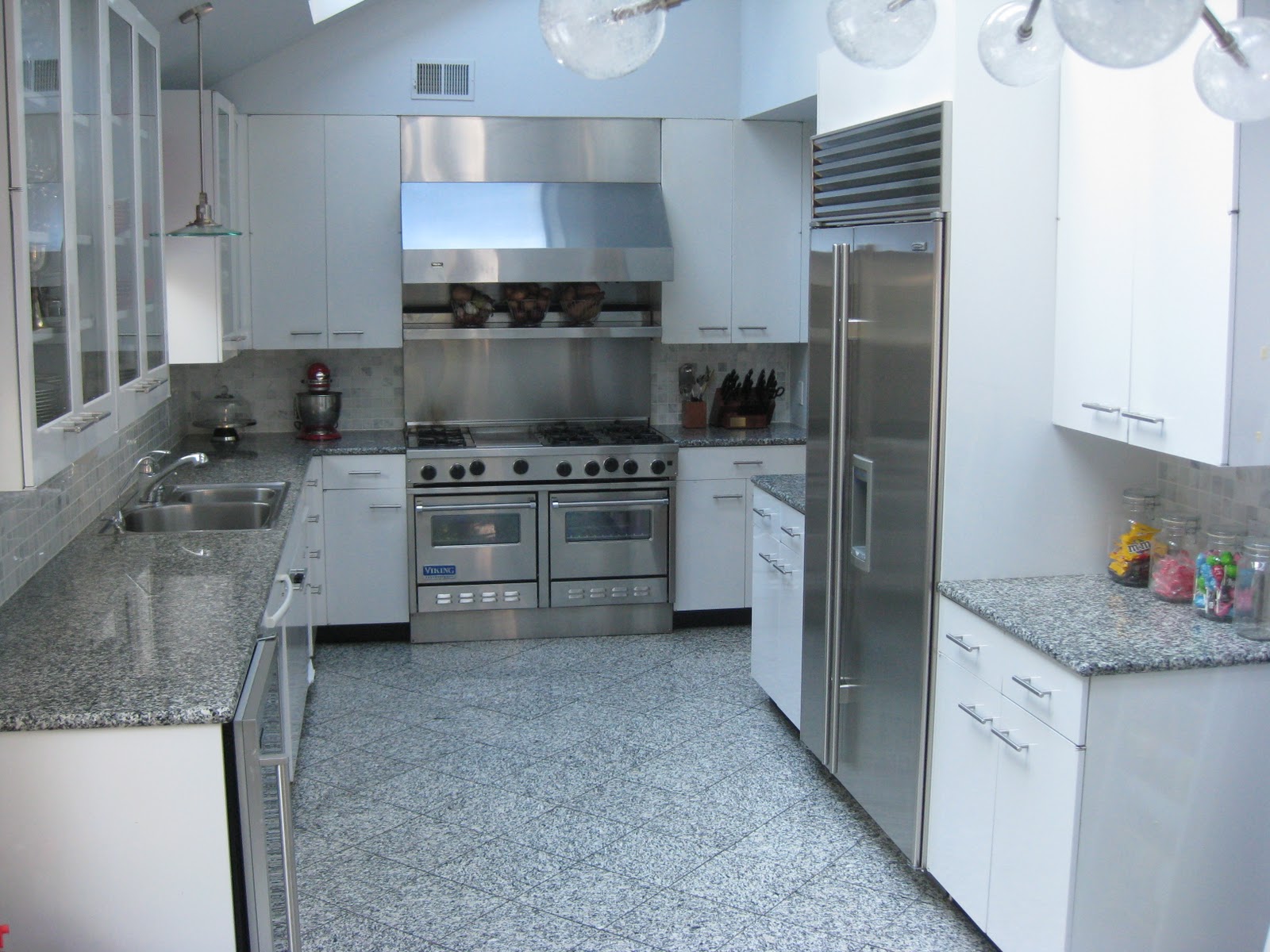
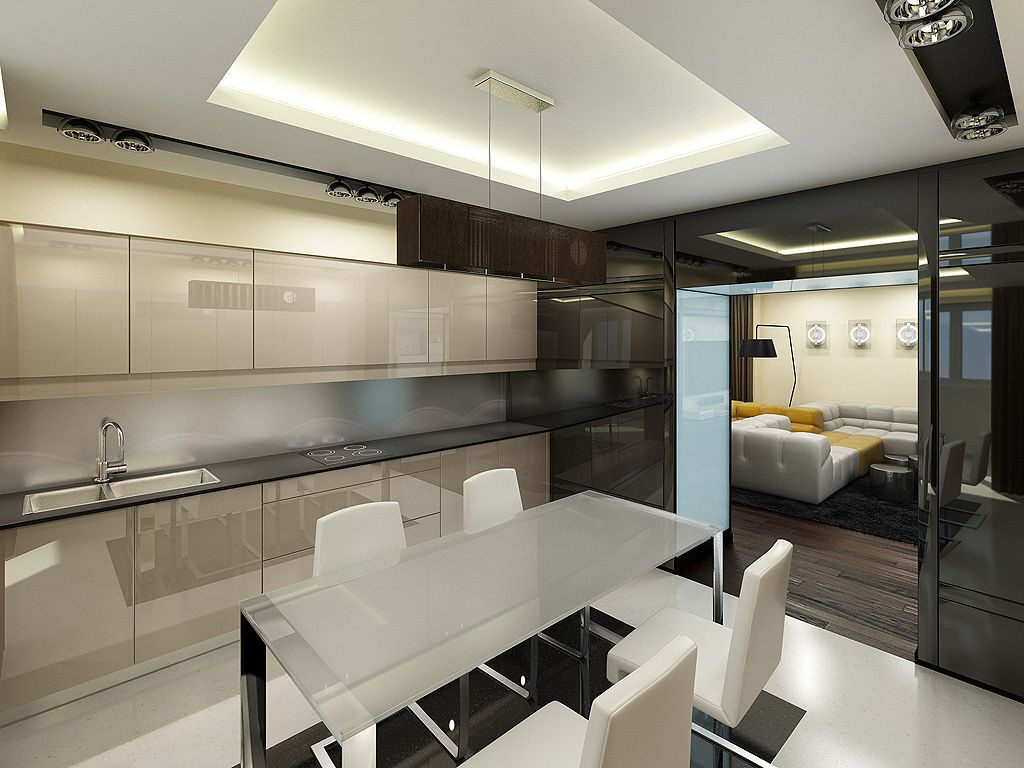
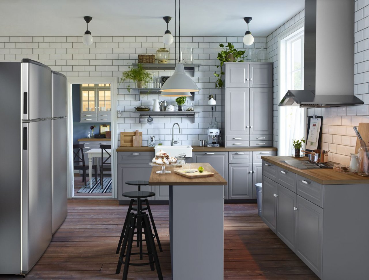
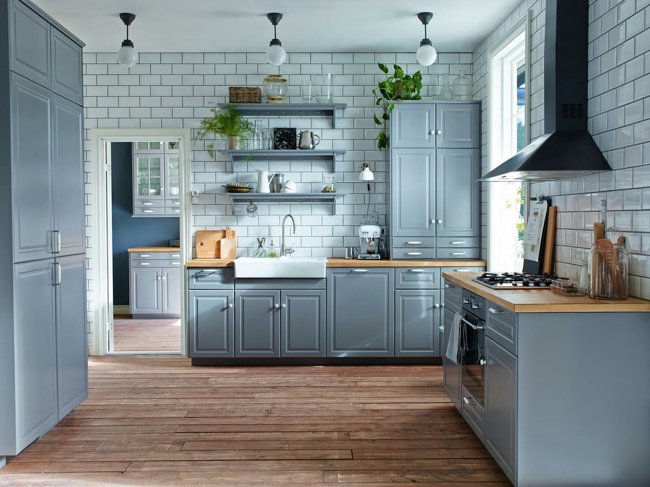
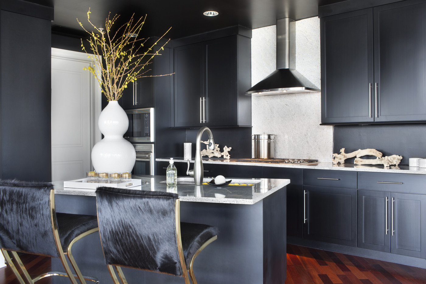
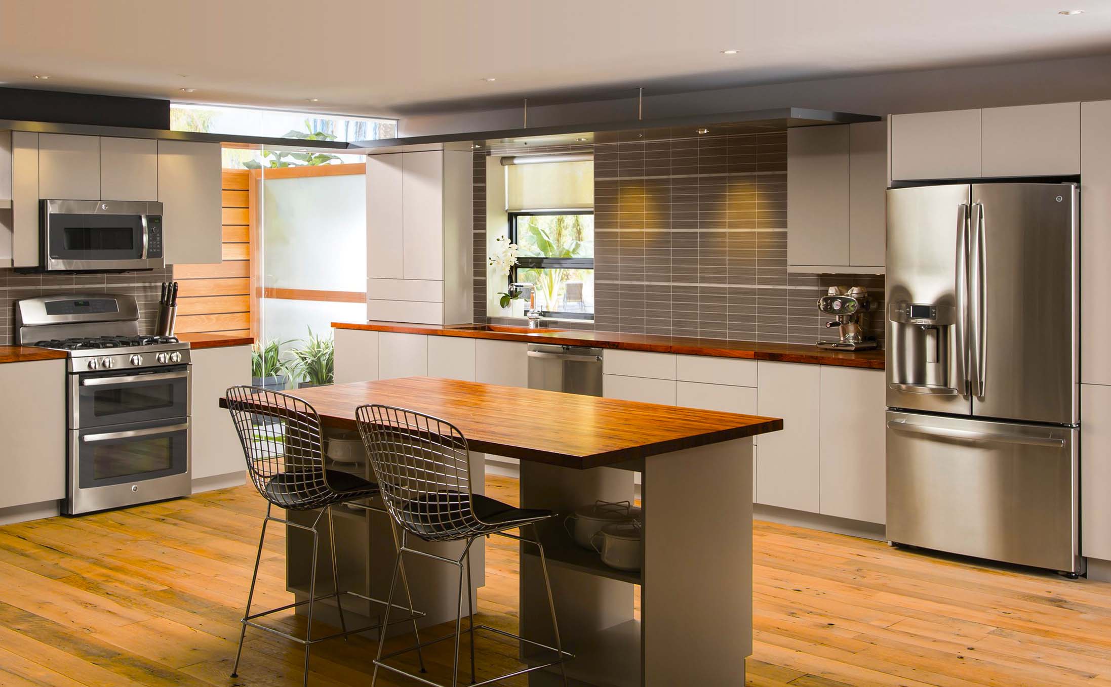
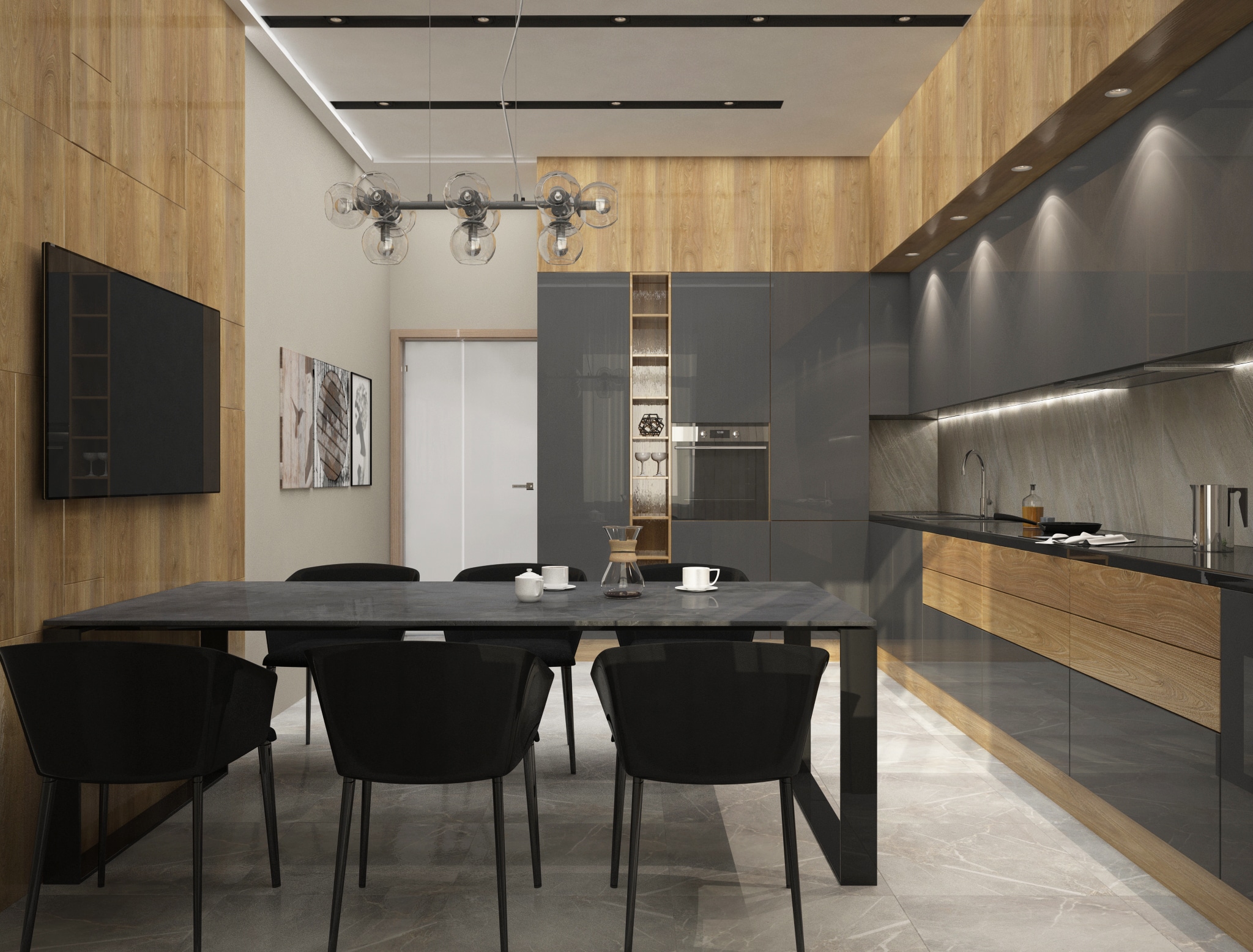
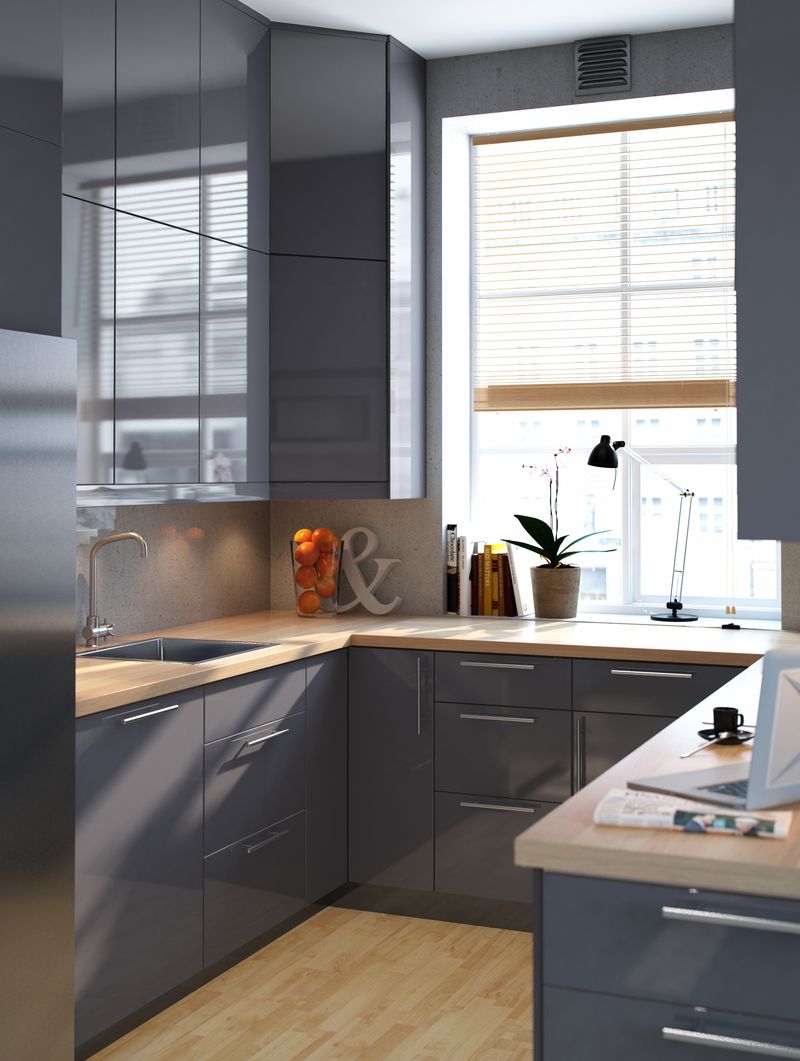
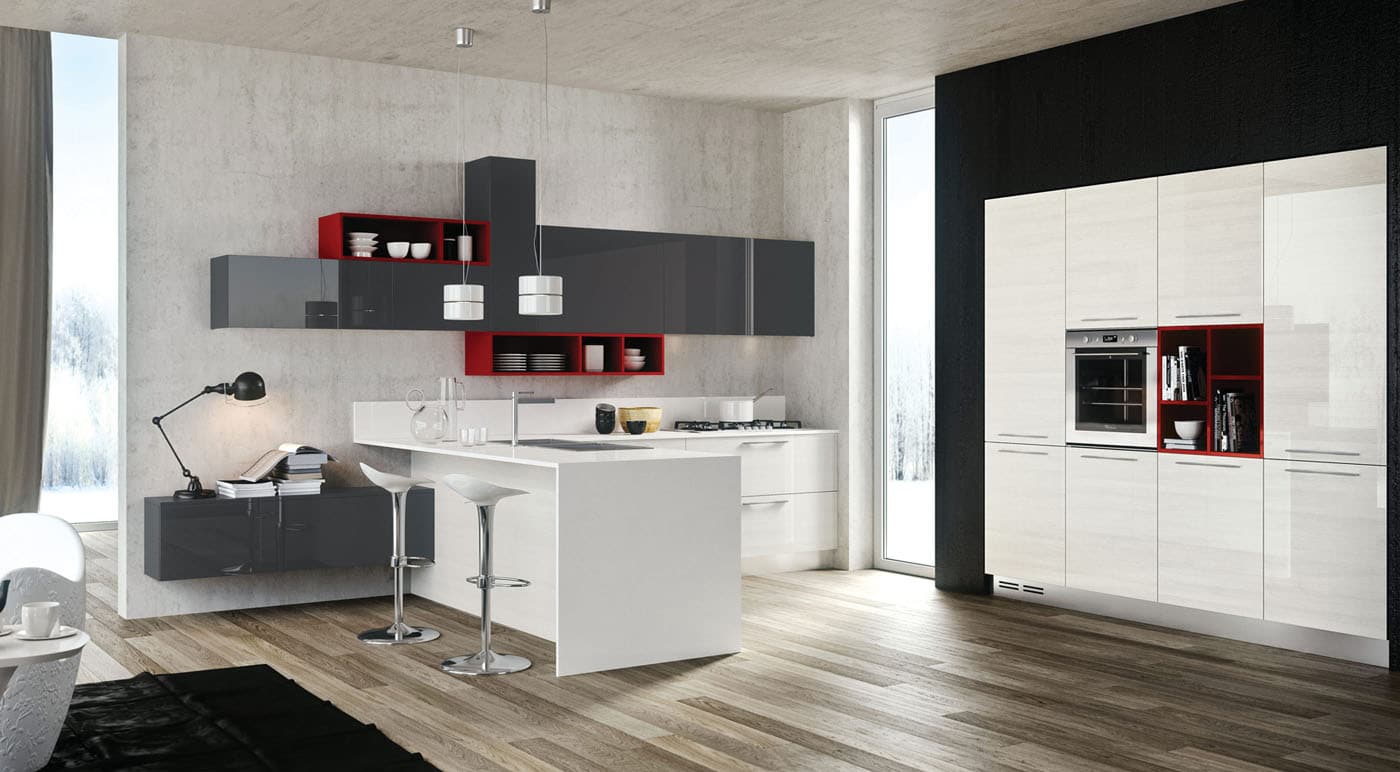
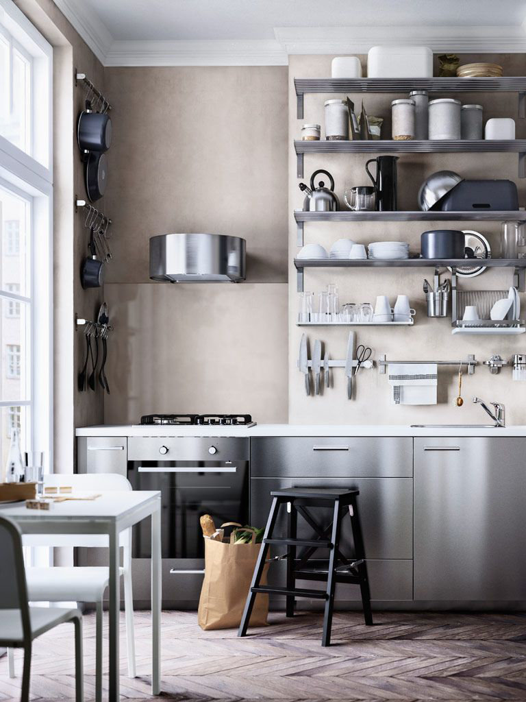
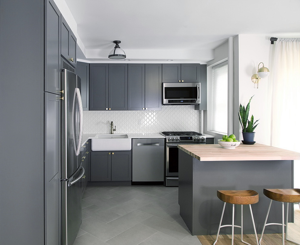
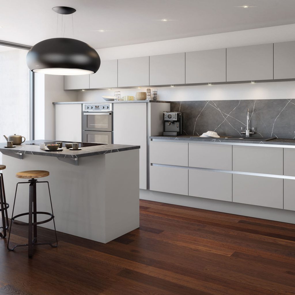
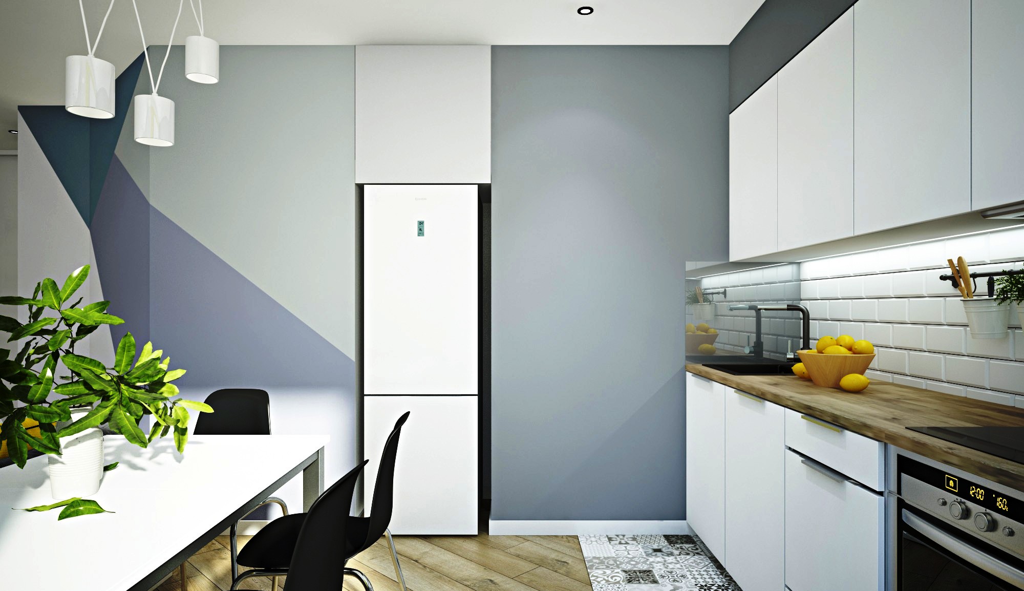
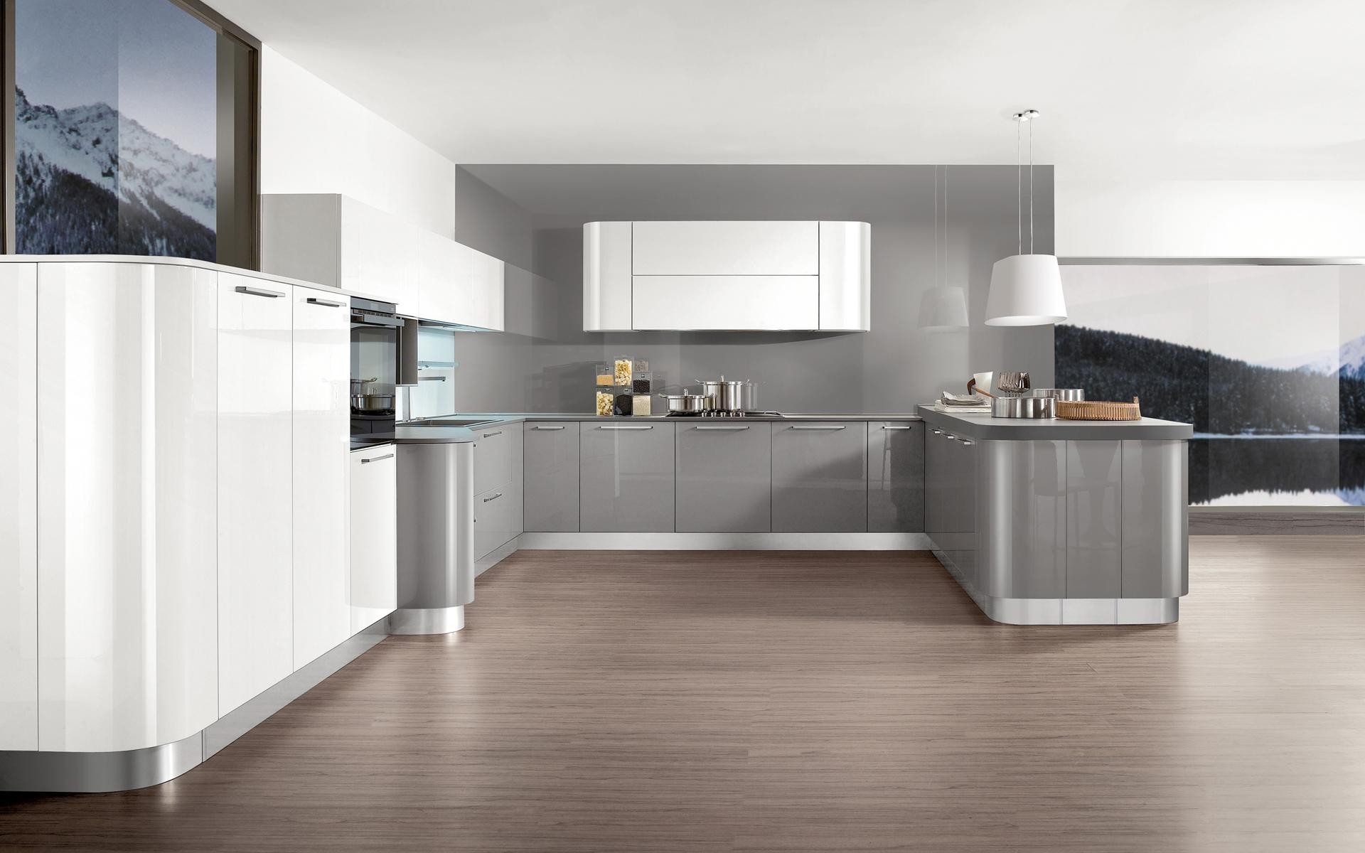
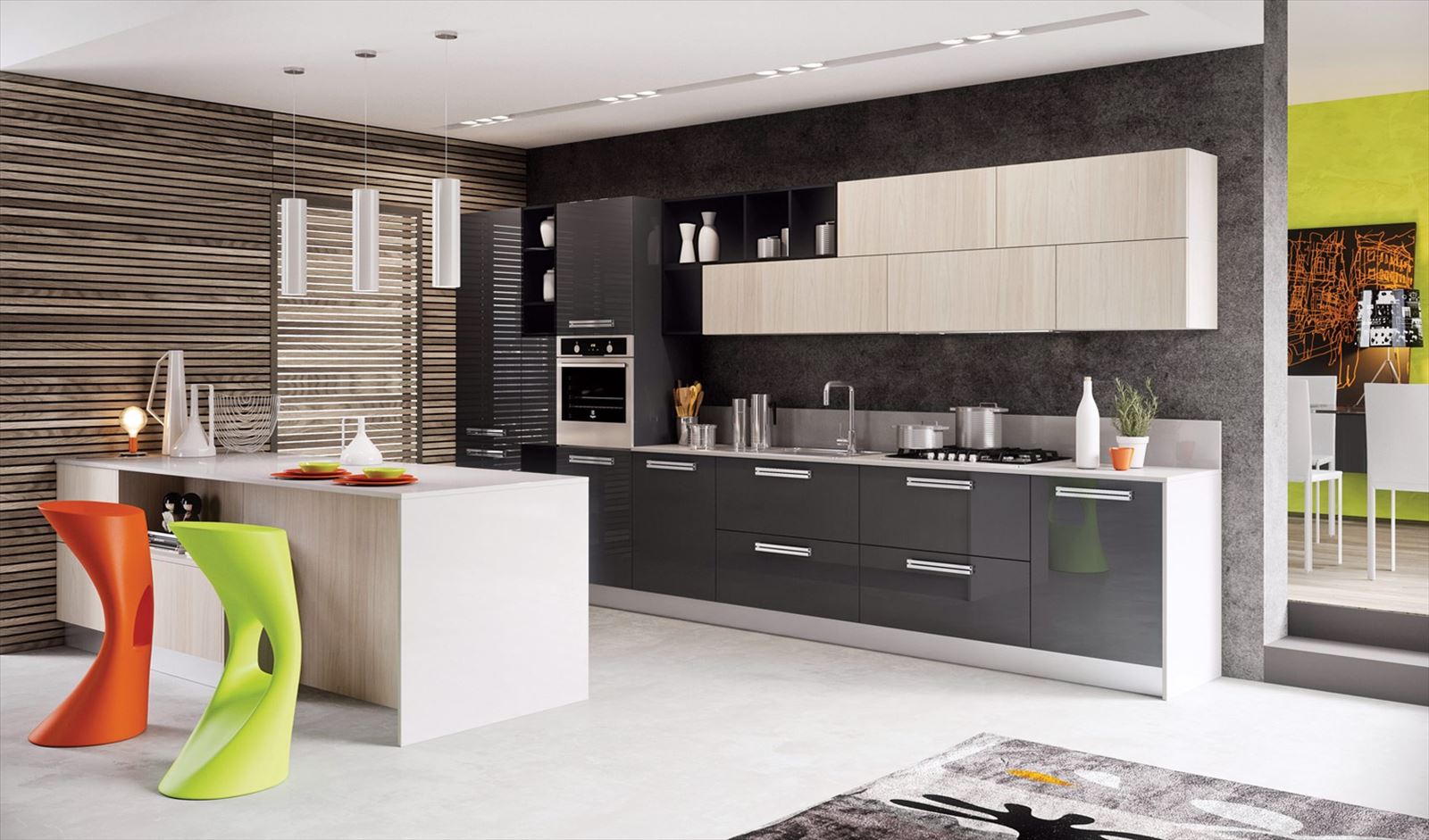
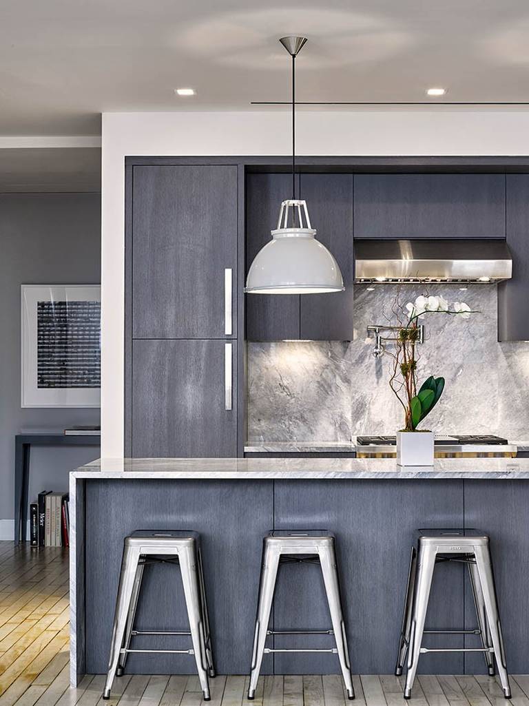
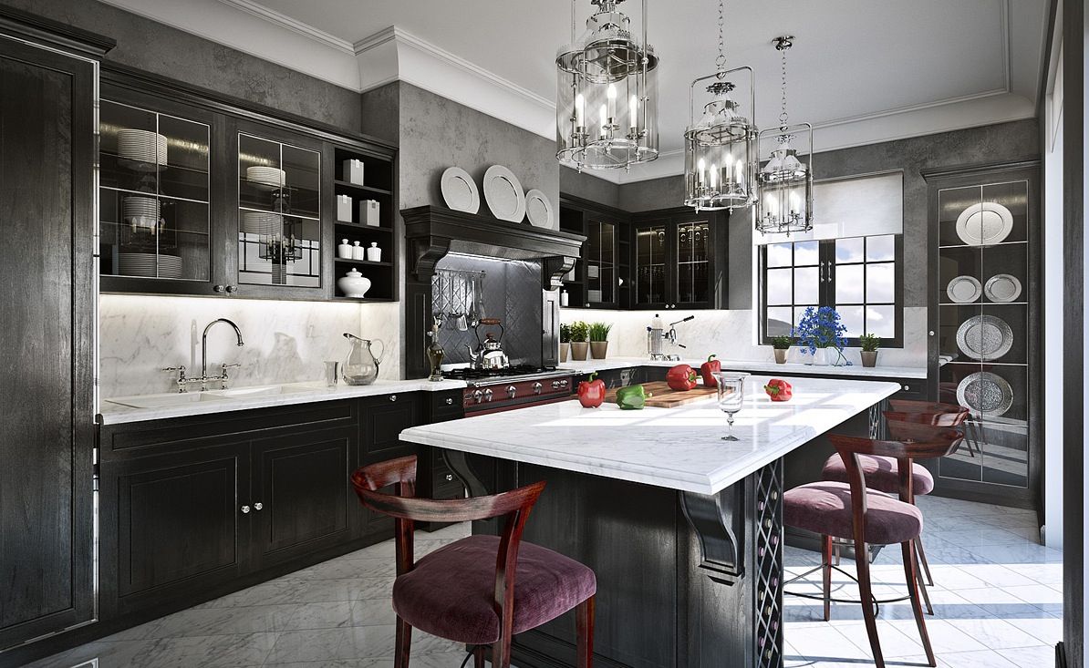
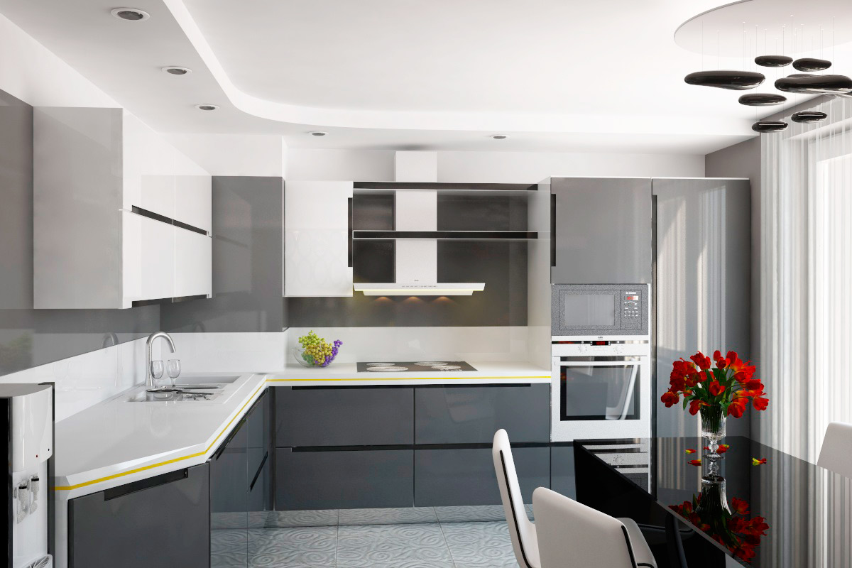
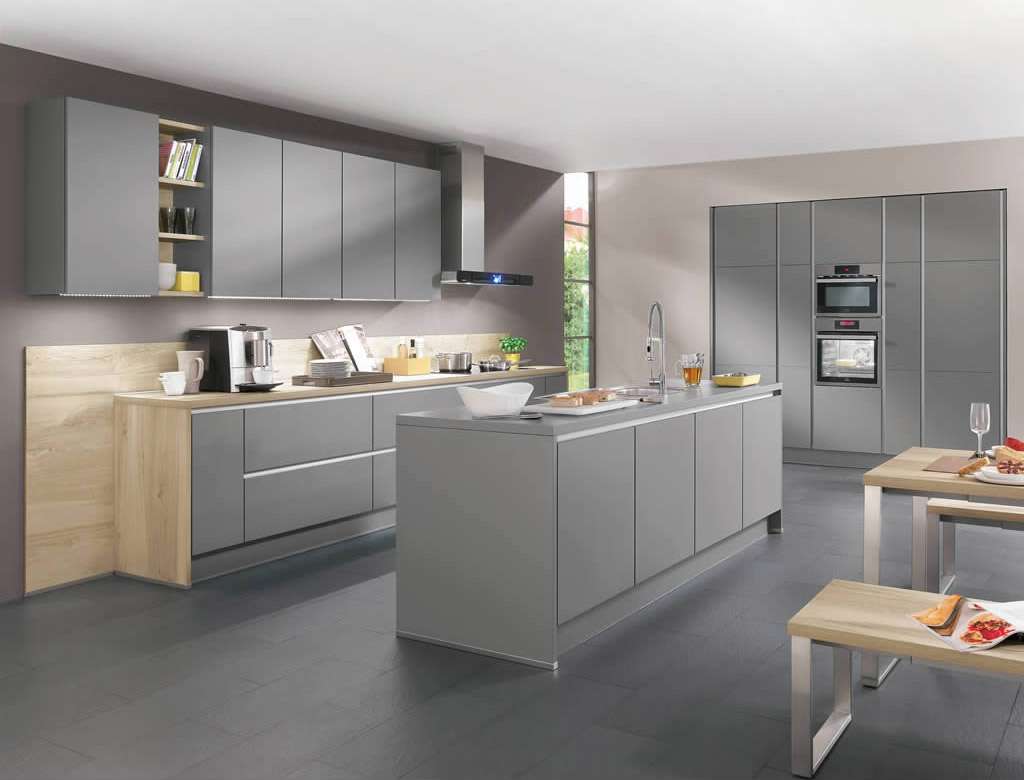
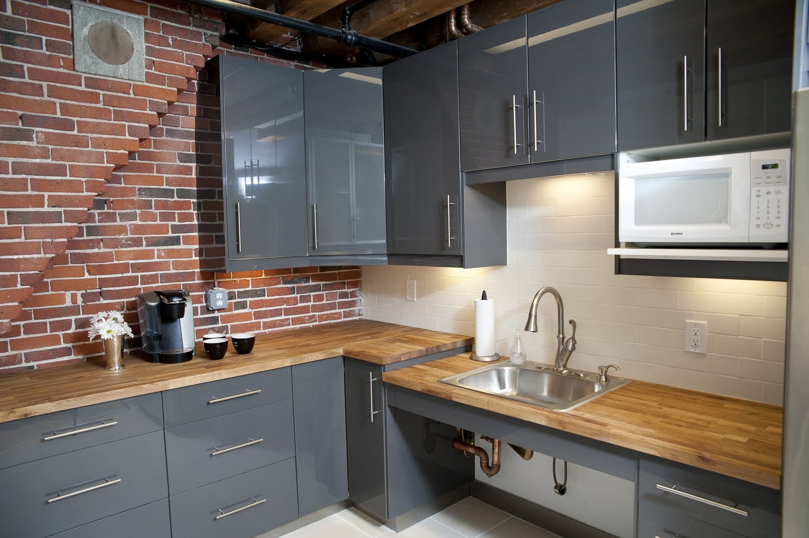
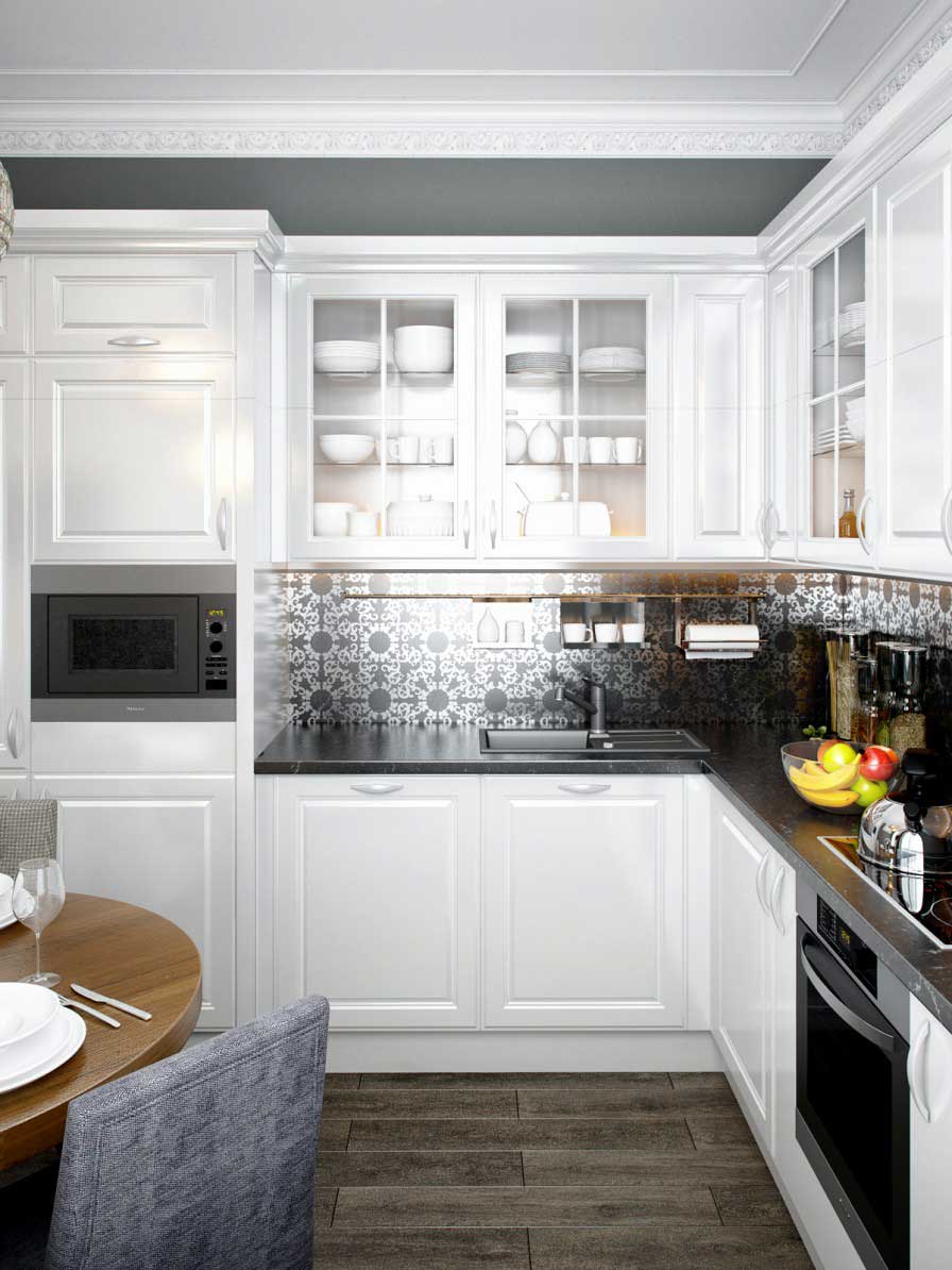
- It is the basis for creating kitchen design in style. high tech or minimalism. If you add steel appliances, chrome accessories, it will be very stylish. It is also used to design a classic interior - it adds elegance.
This design is more practical.
Depending on the design, gray can:
- be used in a small or large room;
- become a neutral background for bright blots of other colors;
- relieve tension and calm;
- be perfect for keeping clean.
Match correctly with other colors.
It will be interesting to you:REVIEW: How to choose a color for the kitchen: Practical tips (200+ Photos)
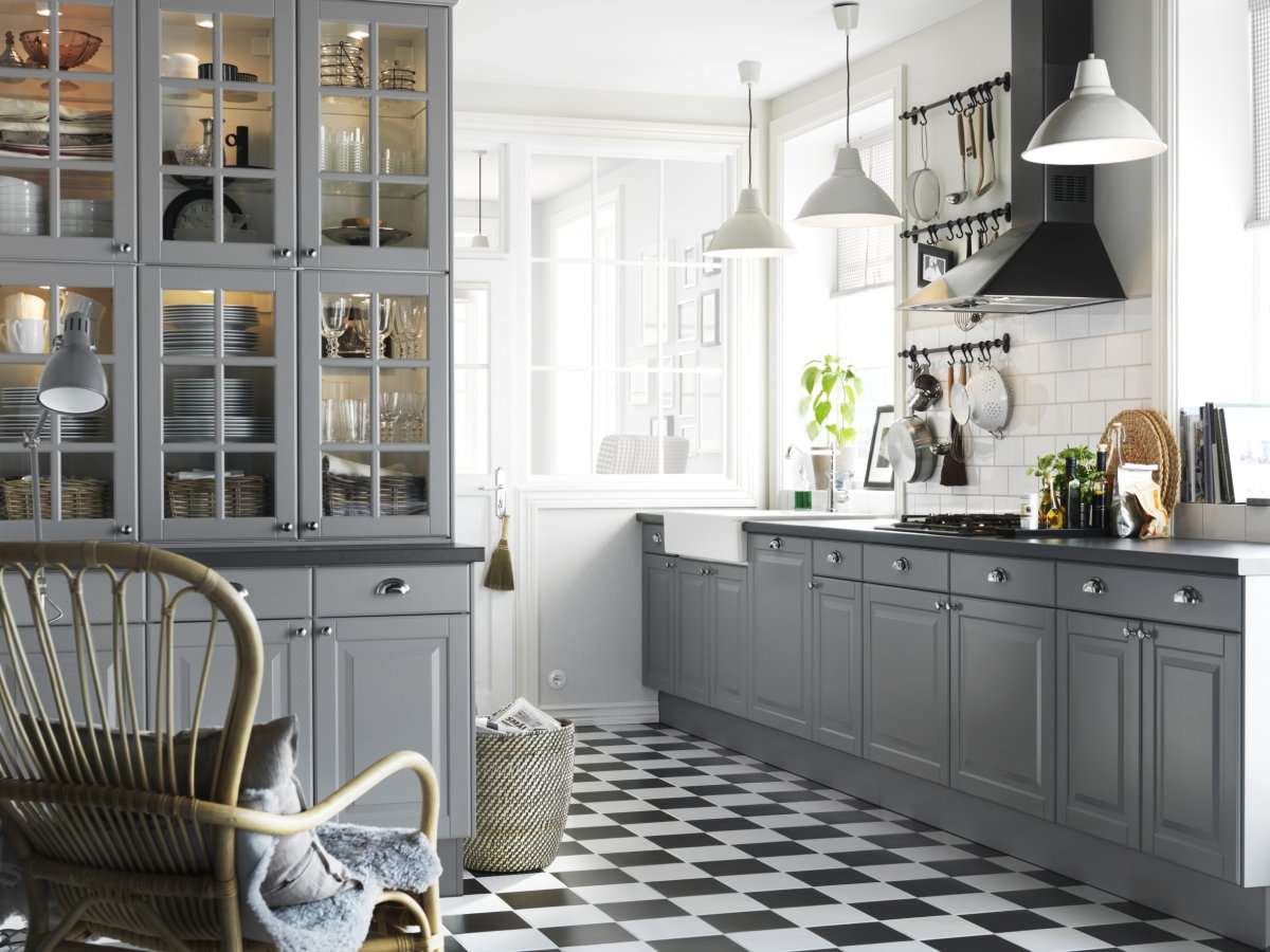
return to menu ↑Gray in various styles
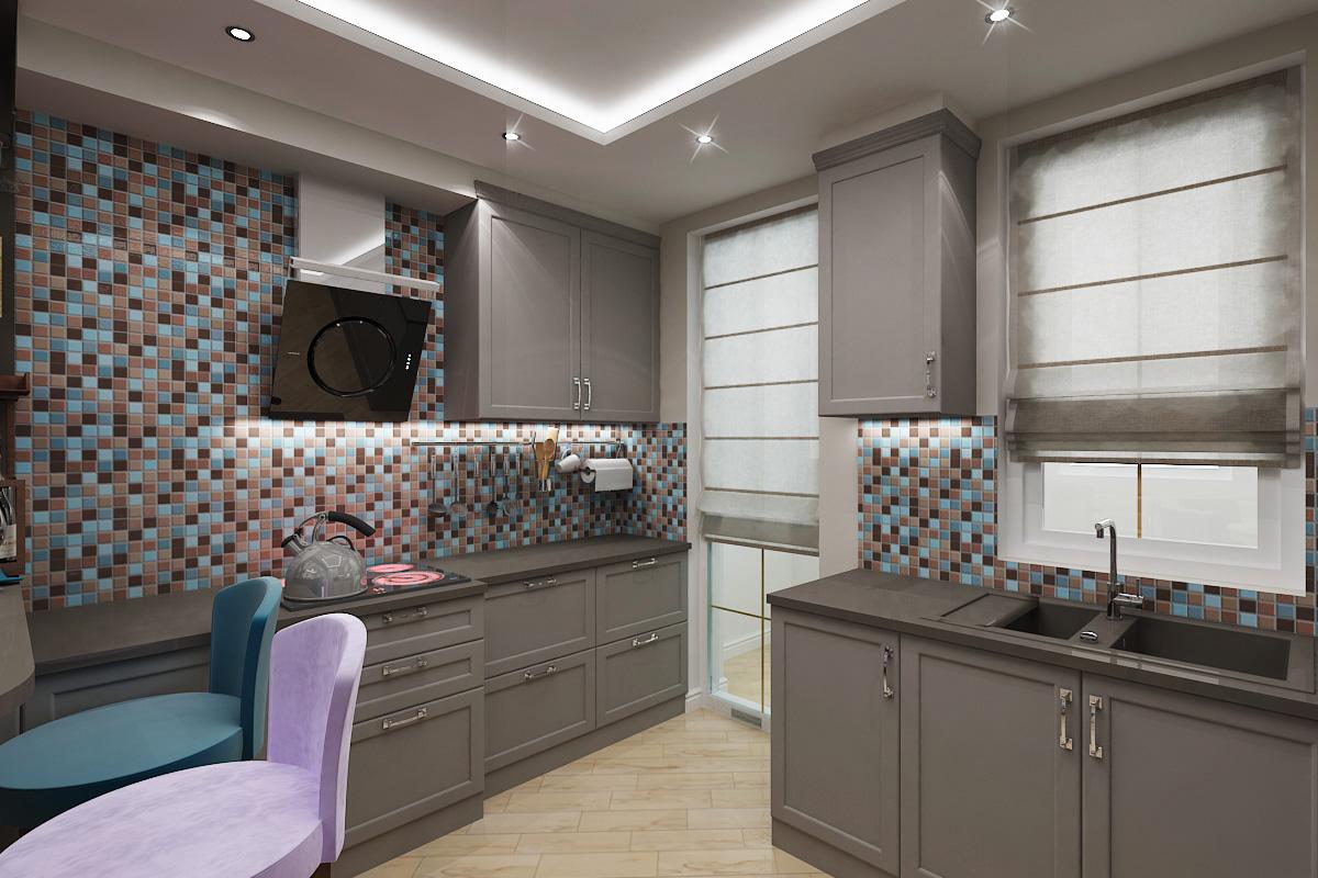
Hue looks great in the design of the headset, countertops and chairs, walls, apron, floor. It is unusual in matte and glossy design. The first option makes the room laconic and neutral, the second more elegant. Consider the main variations of gamma in different styles:
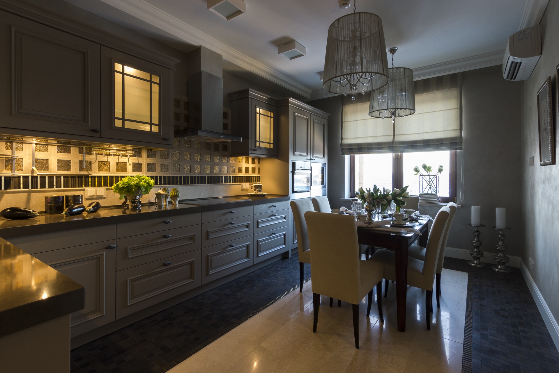
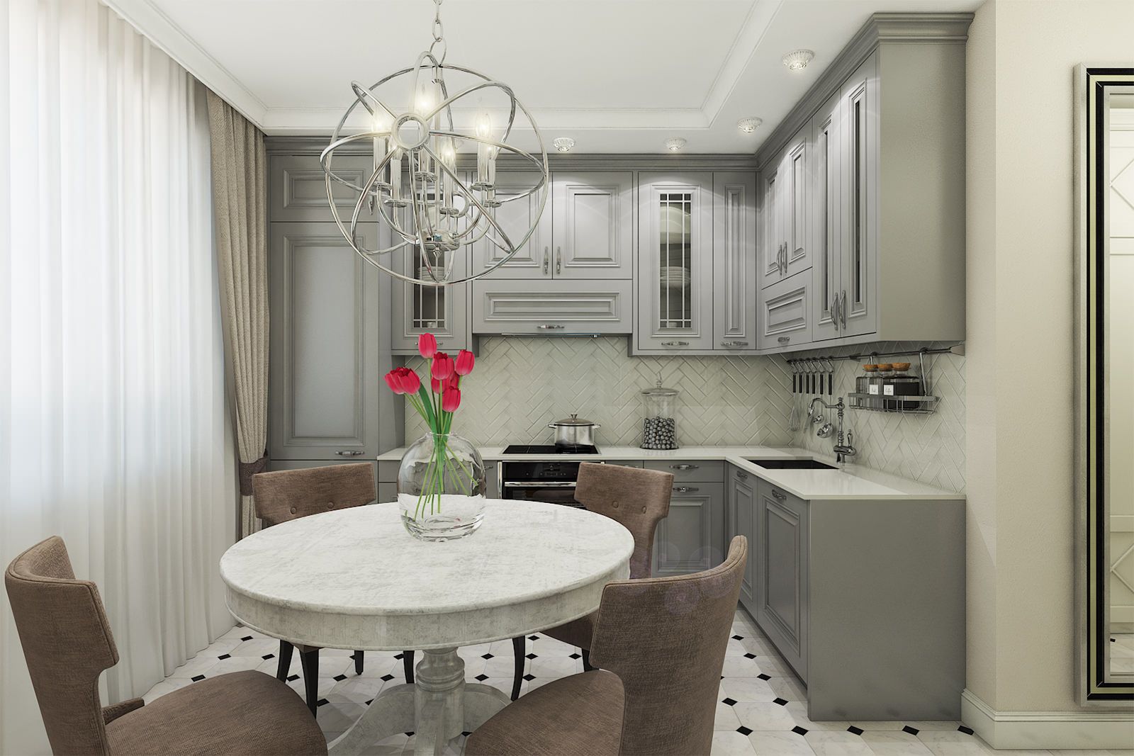
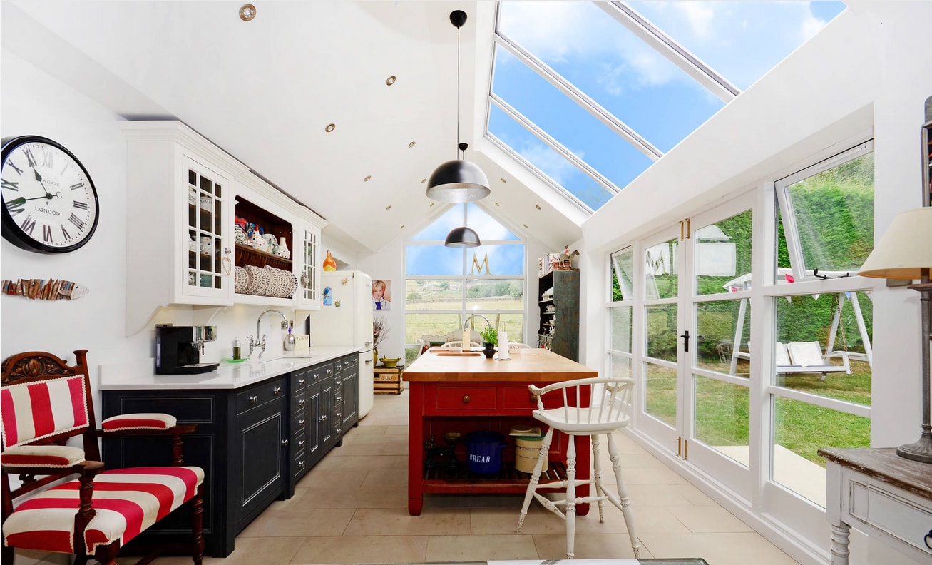
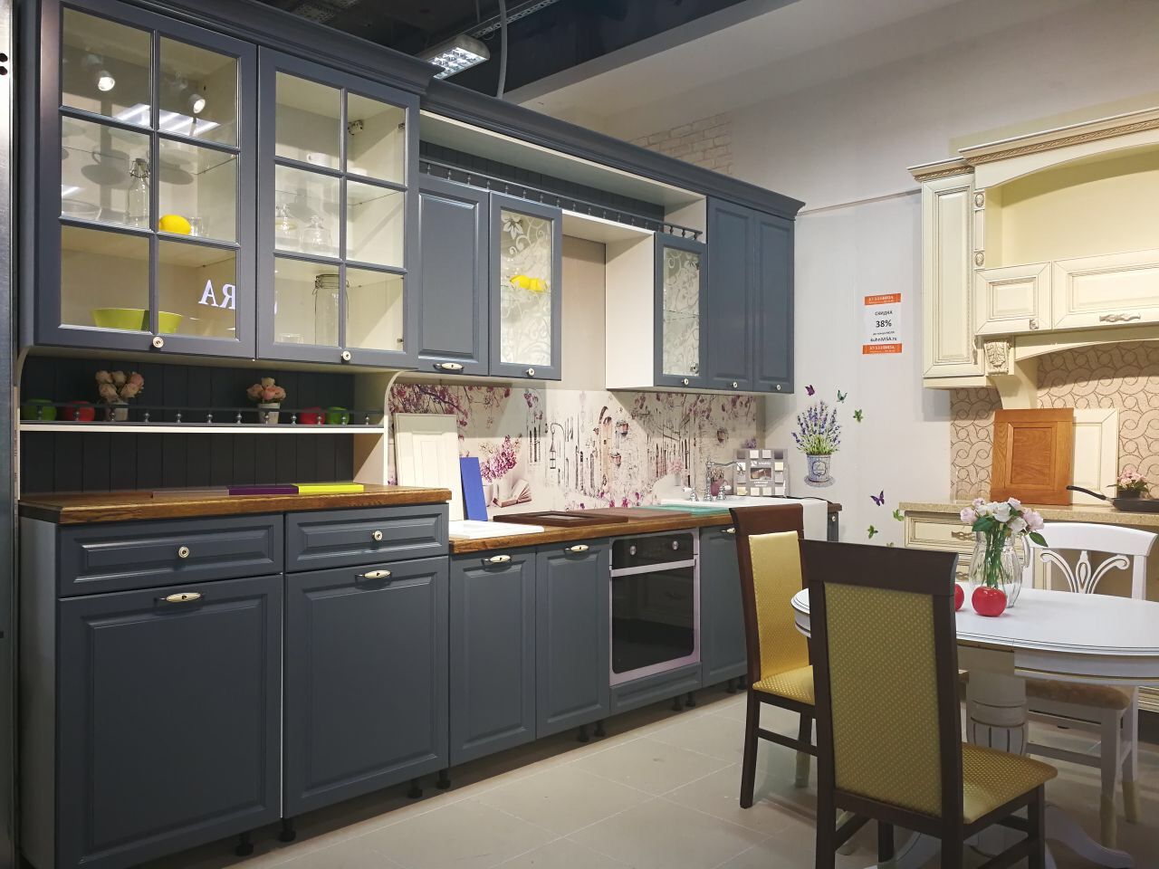
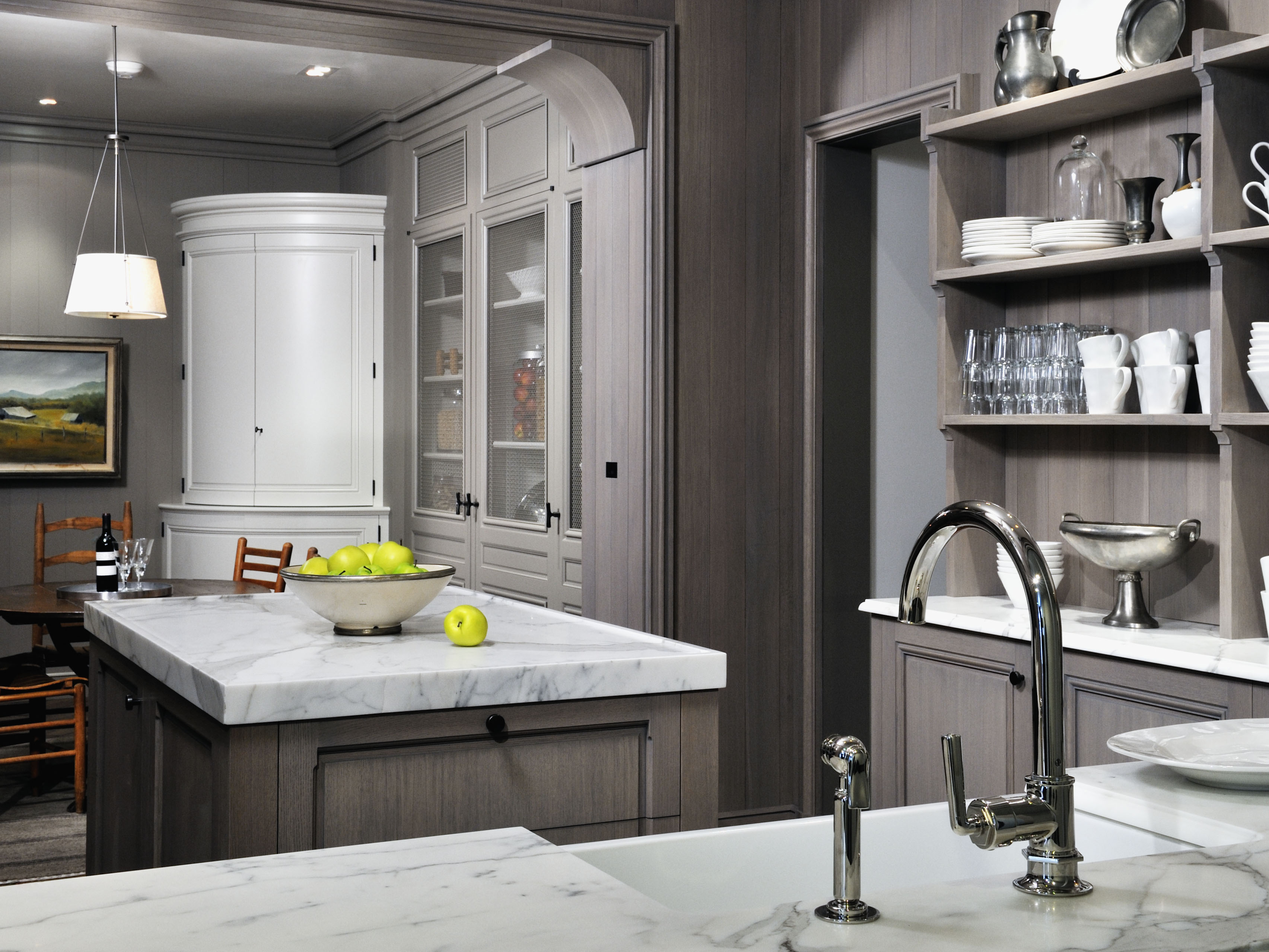
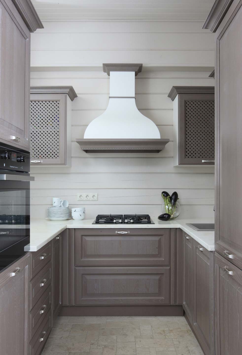
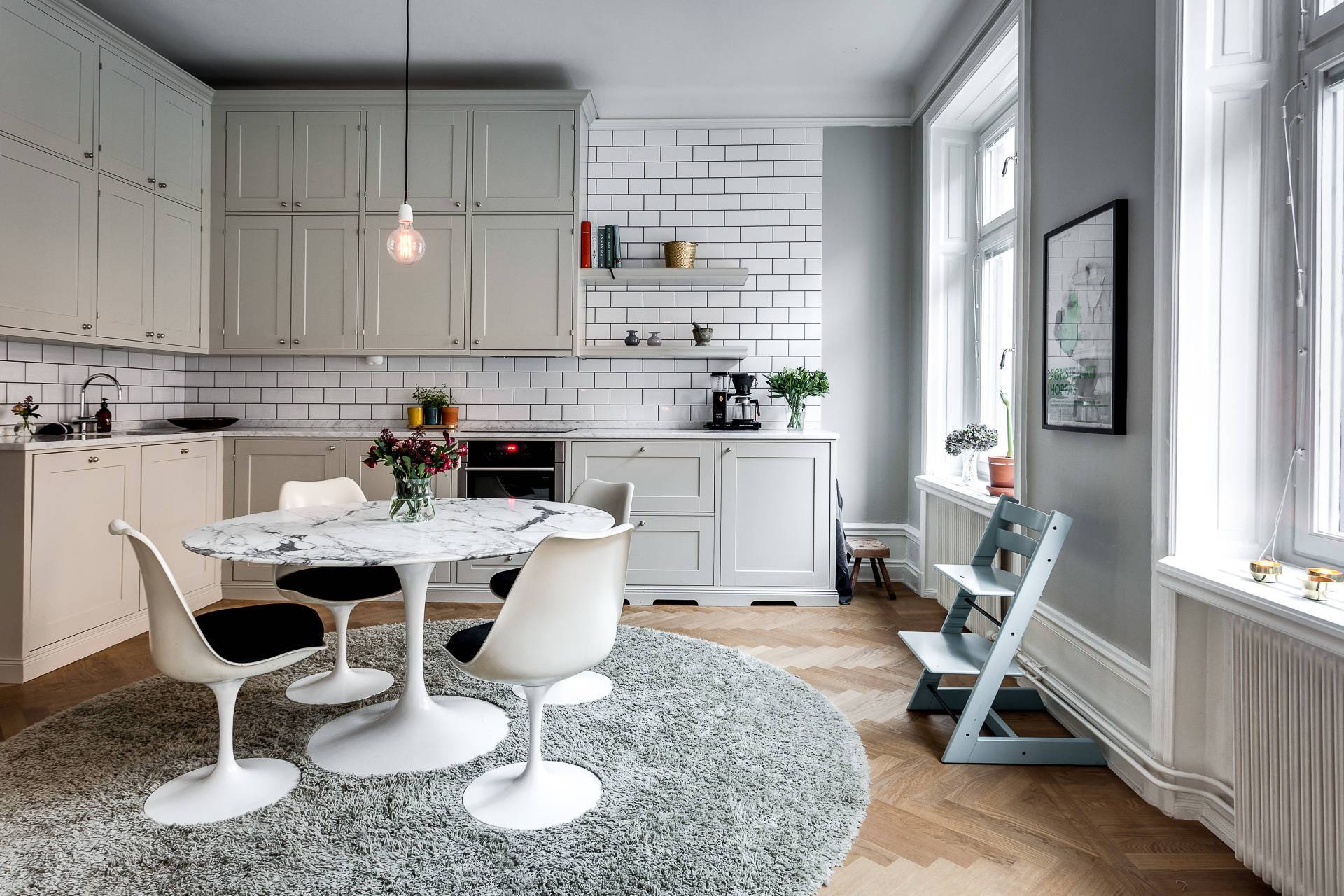
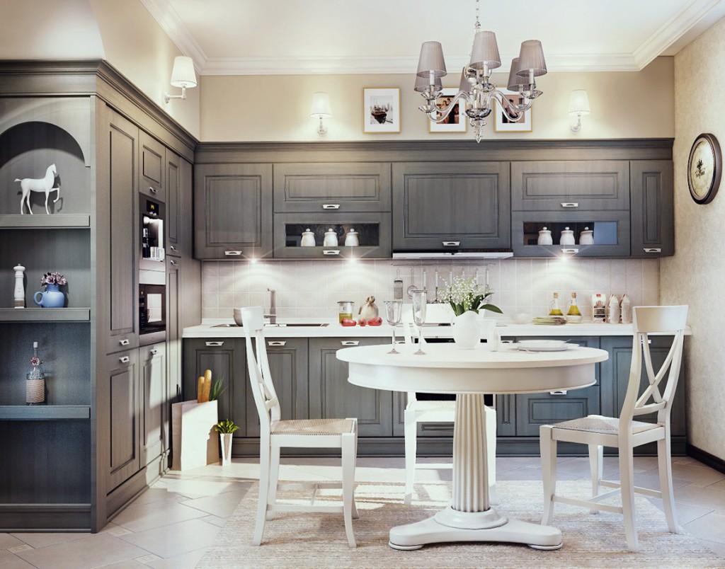
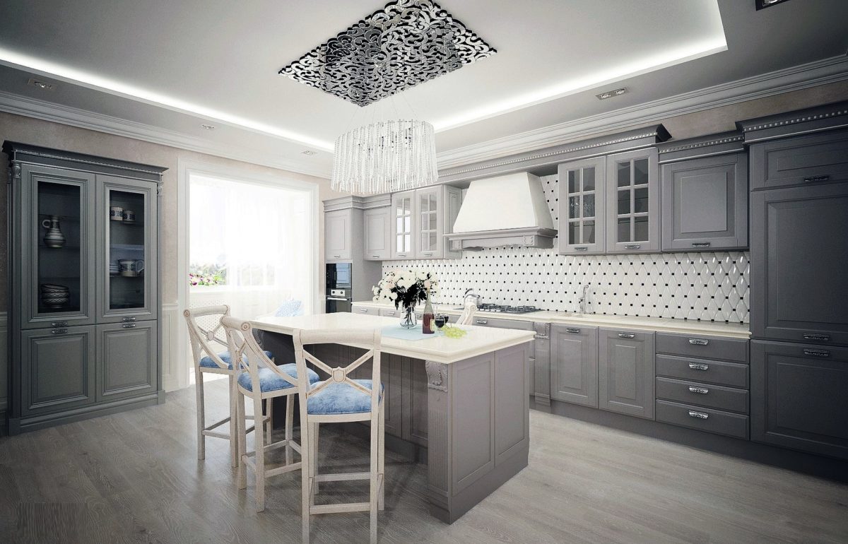
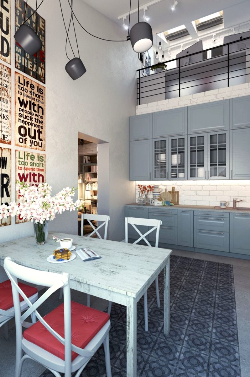
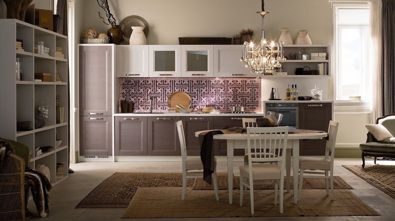
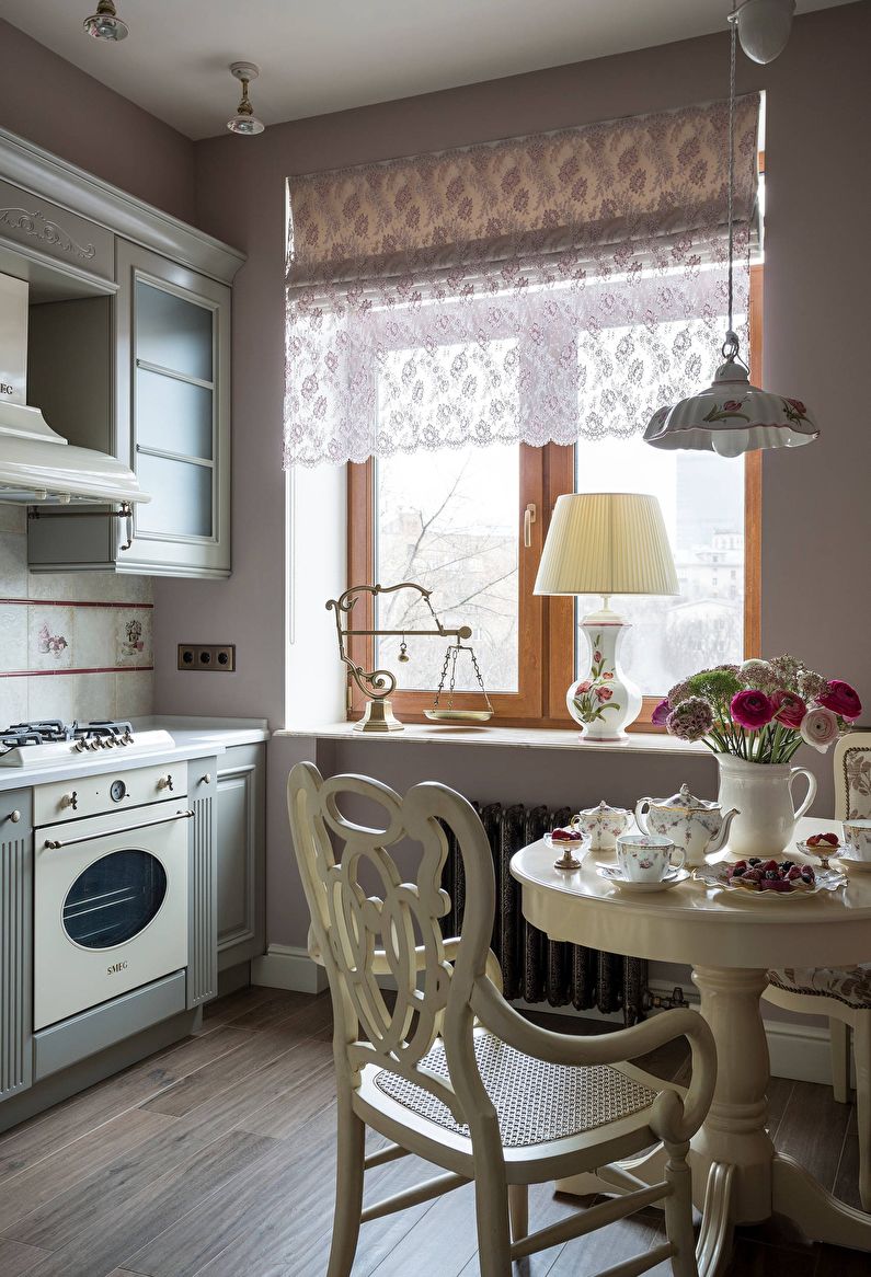
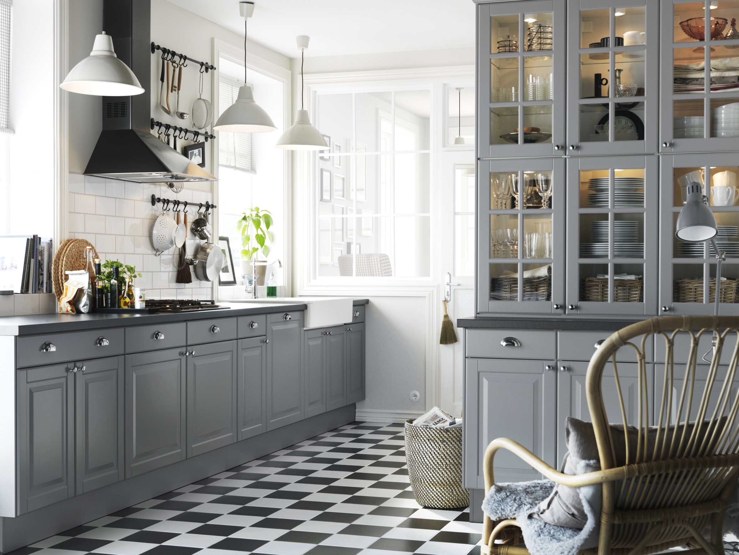
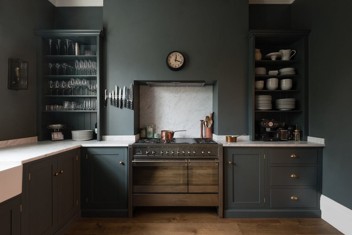
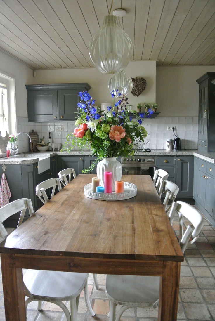
- Classical - gray design adds elegance and creates the right mood. Smoky furniture is organically combined with cream, white or light gray walls. If you use elements of silver and natural wood, you can add luxury. Hang on the windows curtains in black and smoky colors from heavy textiles.
- Art Deco - an exquisite style, implying expensive furniture and rich decor. Color allows to balance massive elements of furniture and rich decorative elements. It emphasizes the naturalness of materials.
- Retro - Tones well emphasize the wooden floor. Kitchen decoration can be supplemented with ceramic tiles warm shades or stone inserts. Kitchen furniture in retro style is concise and simple. The top of the room is finished with lighter tones, and the floor is darker to visually make it spacious.
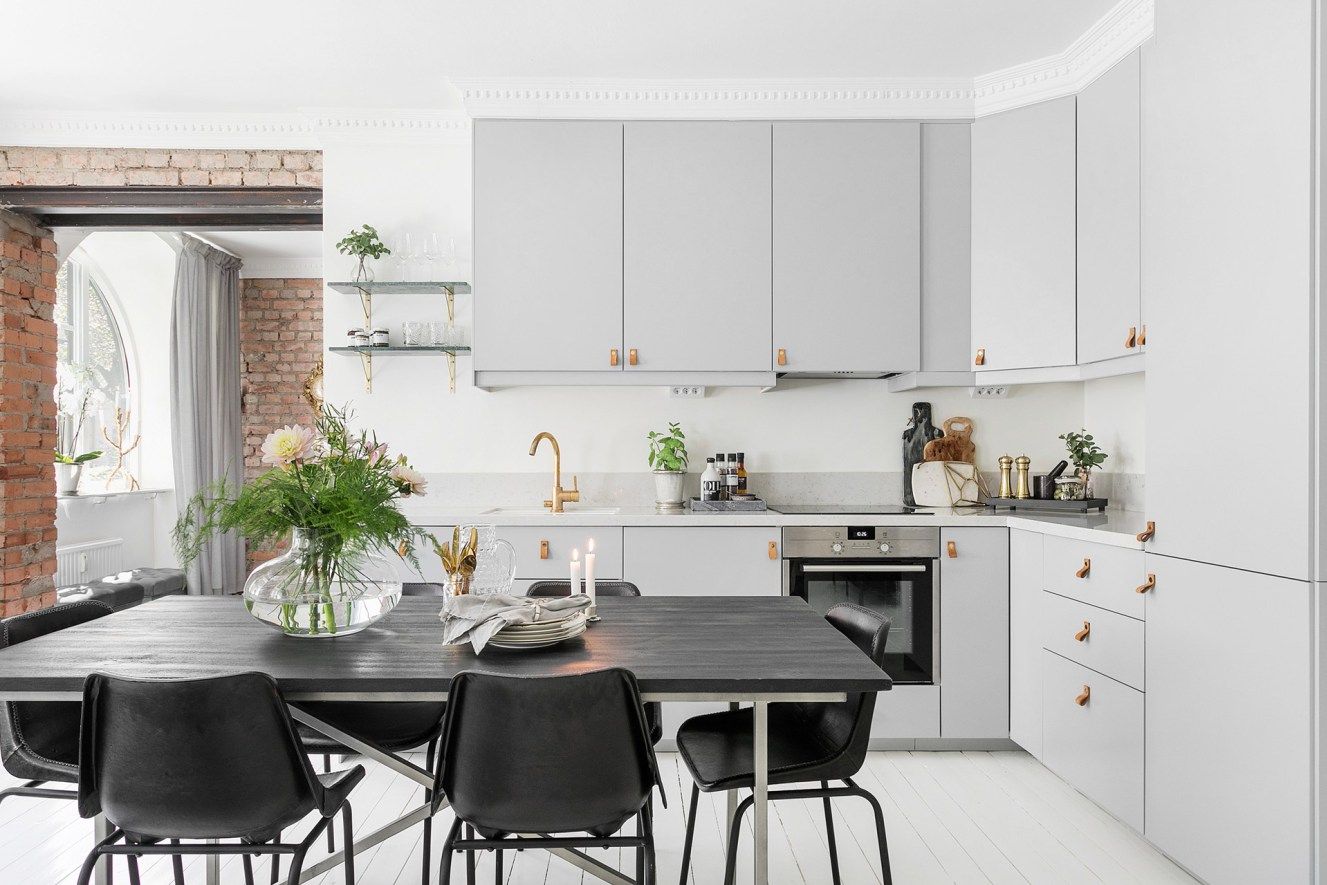
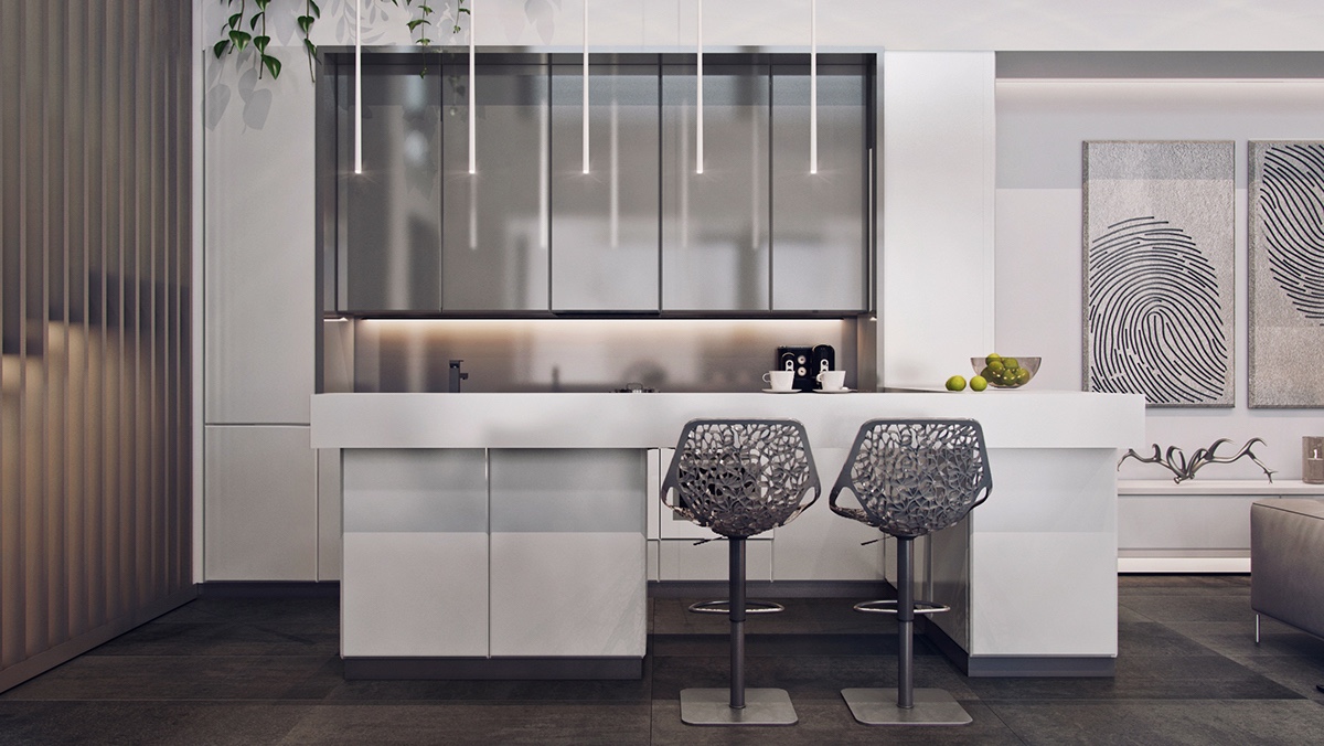
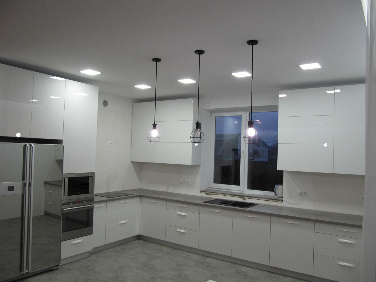
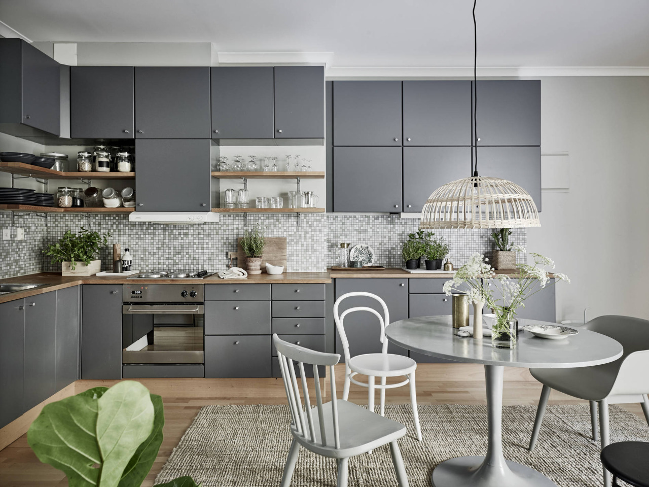
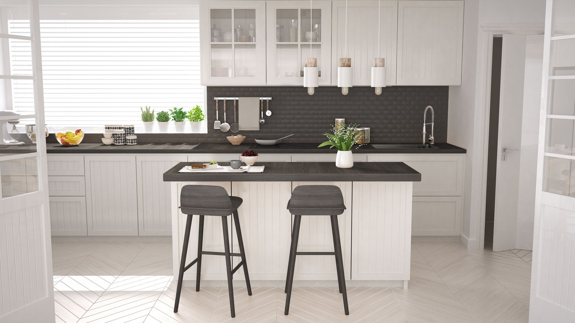
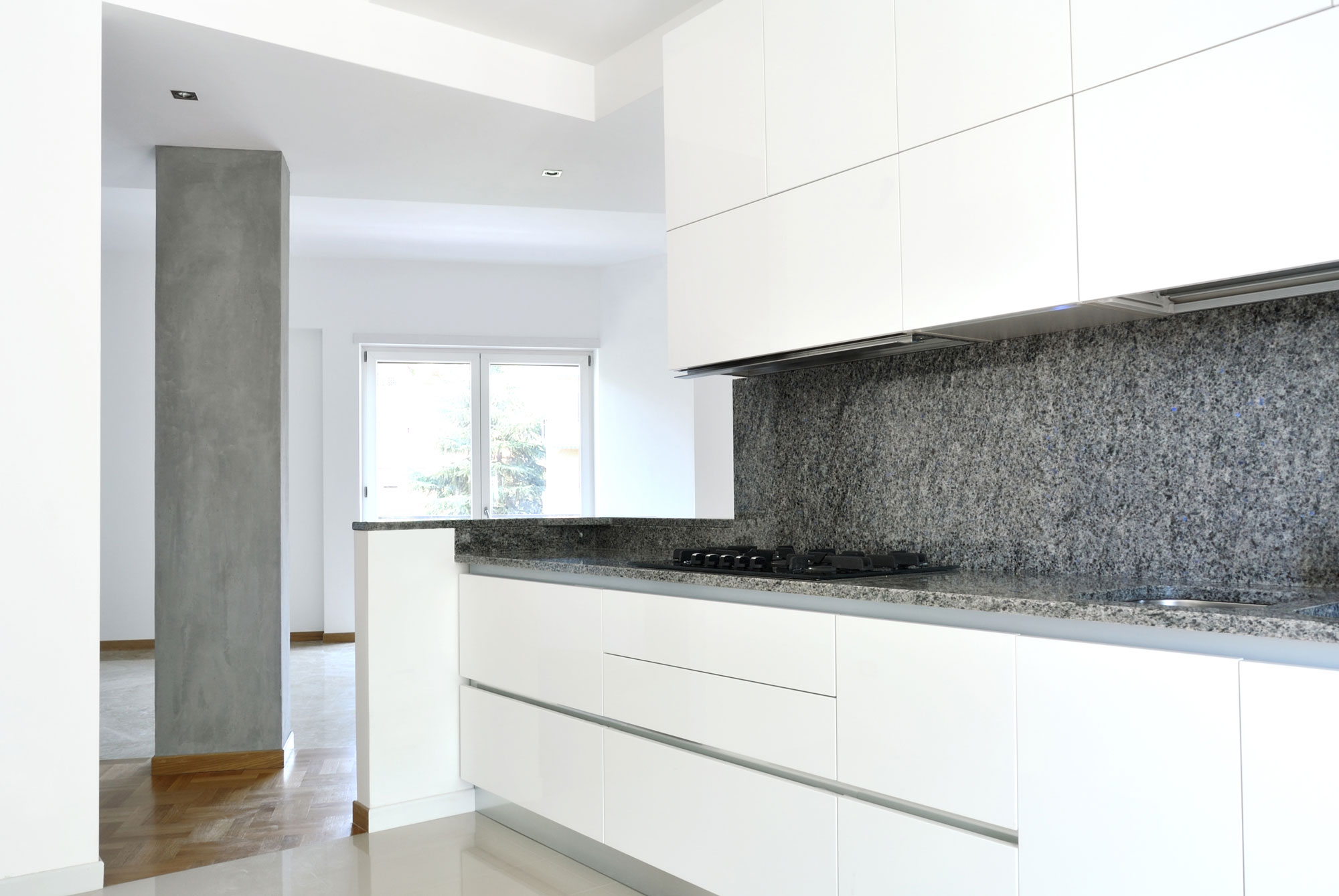
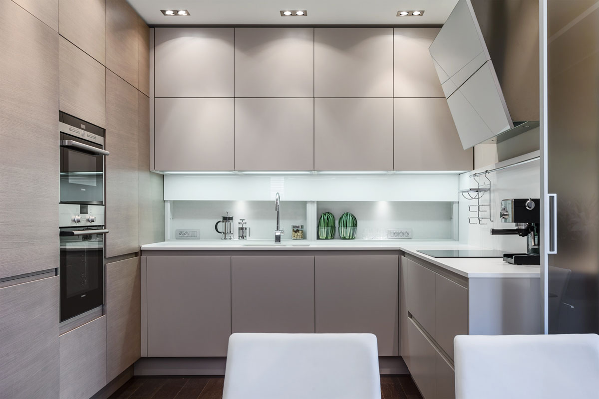
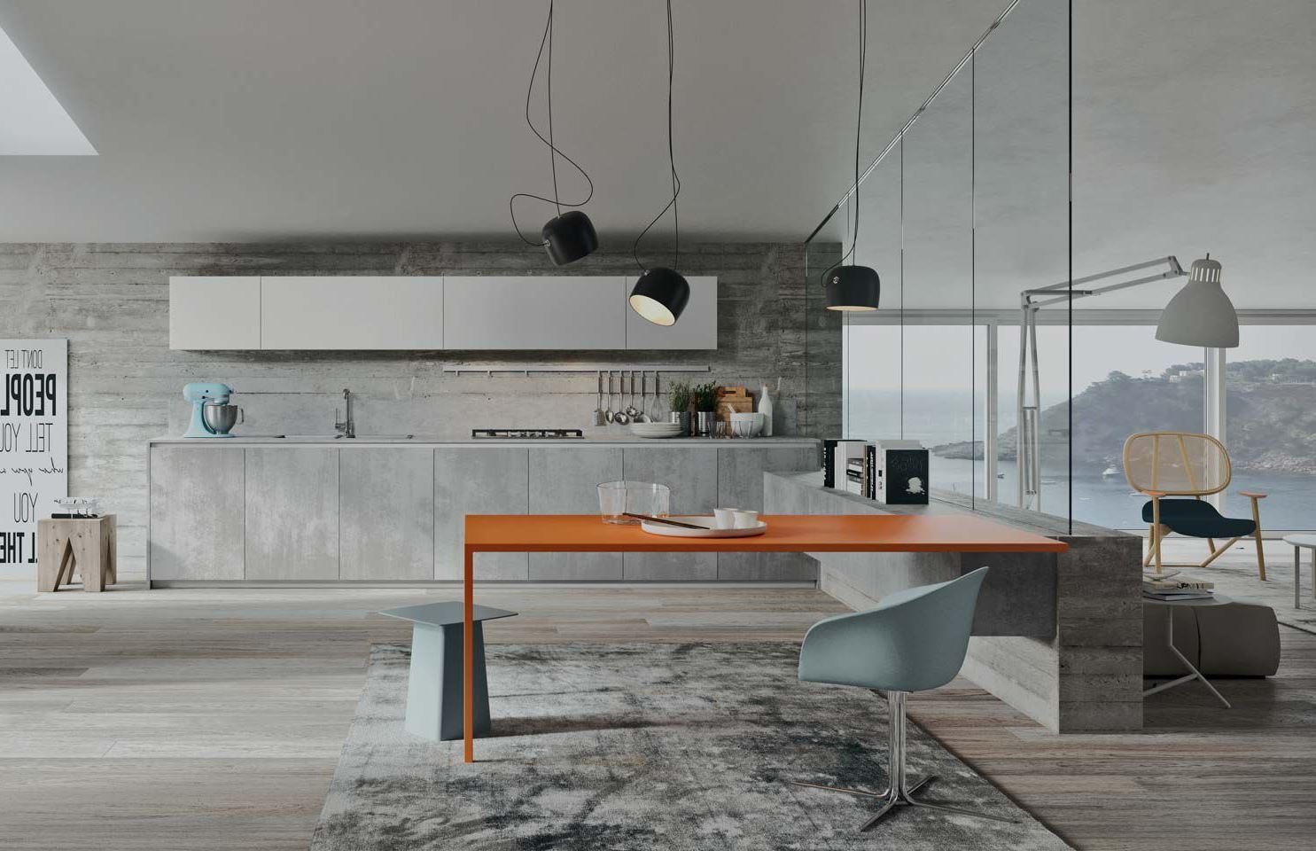
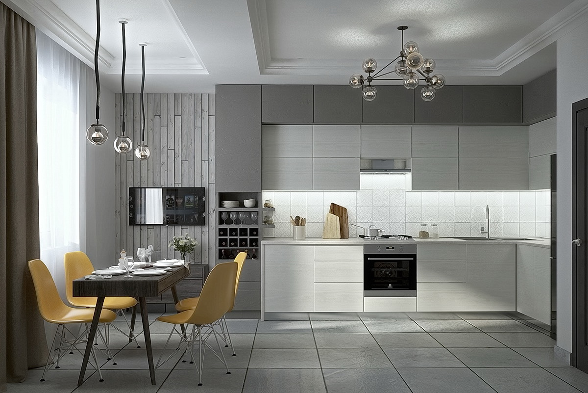
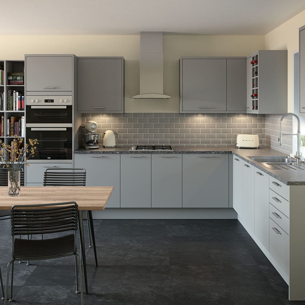
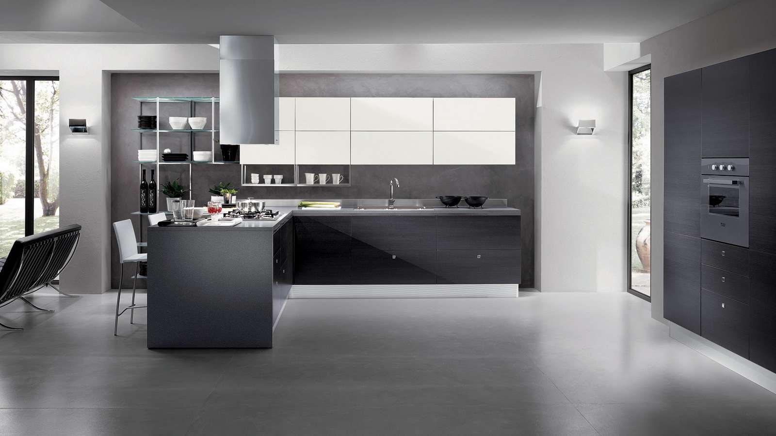
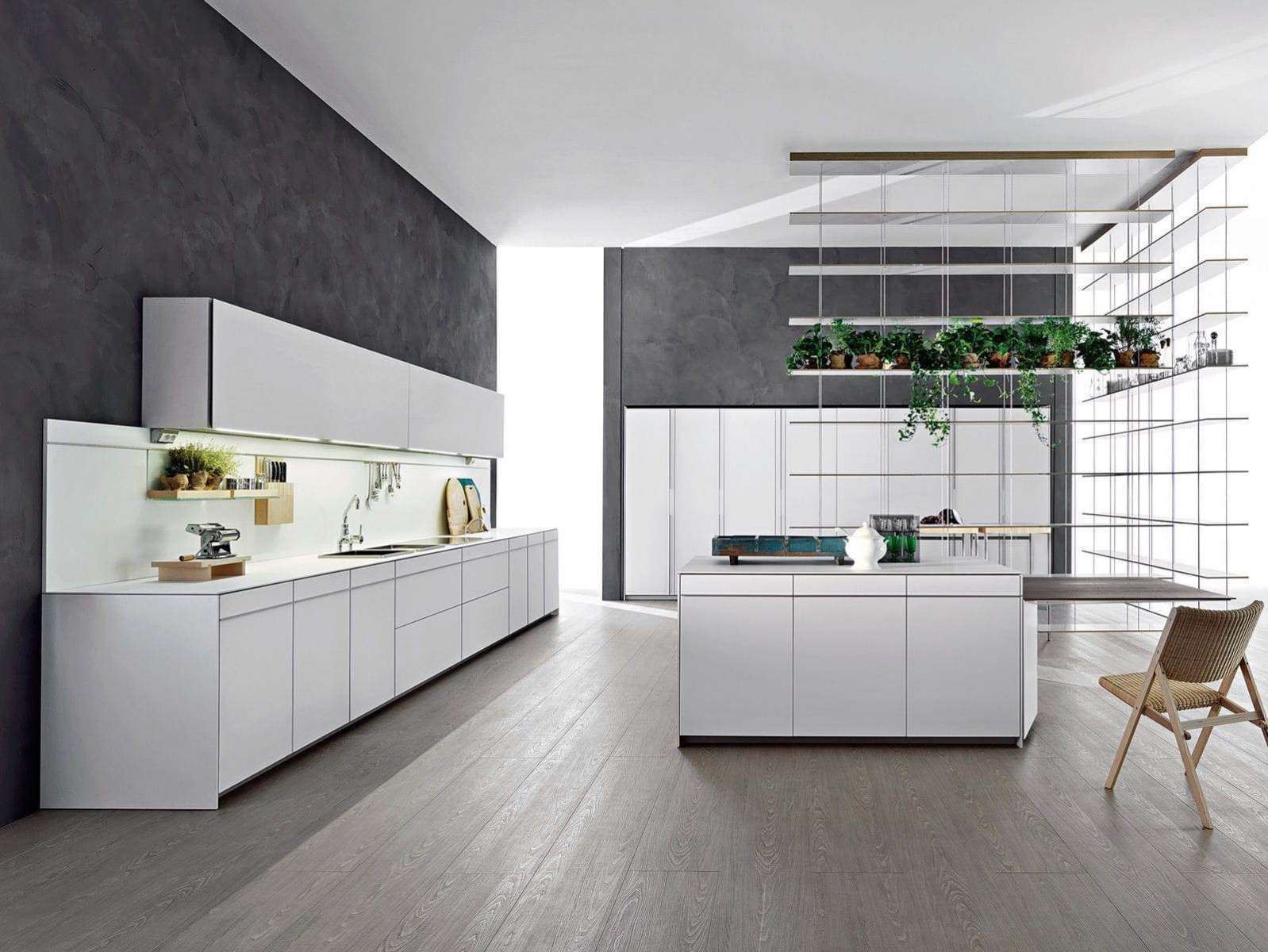
- Minimalism - The style makes the kitchen light, pleasant and weightless. Usually shades of walls, sets and furniture coincide, merge with each other. The best friends of the minimalist style are exactly gray and white colors.
In the style of minimalism - nothing more
Room decoration
Interior decoration of the kitchen should be designed and thought out in advance. Consider the basic combination rules for different areas and surfaces:
- Ceiling. Should always be decorated more lightly than other walls and floors. Choose 1-2 tones lighter than the color of the walls. If you have a small kitchen, arrange the ceiling in white, light gray, cream or beige shades.
- Floor. You can make it muffled, as in most rooms. Or to focus, making it darker than the dominant gray. With a contrast like green or yellow floor gray kitchen will look more impressive.
- Walls. If you buy gray furniture, the walls can be decorated in any shade - it all depends on your preferences! Designers recommend to look at the light pink, lavender, white and lilac.
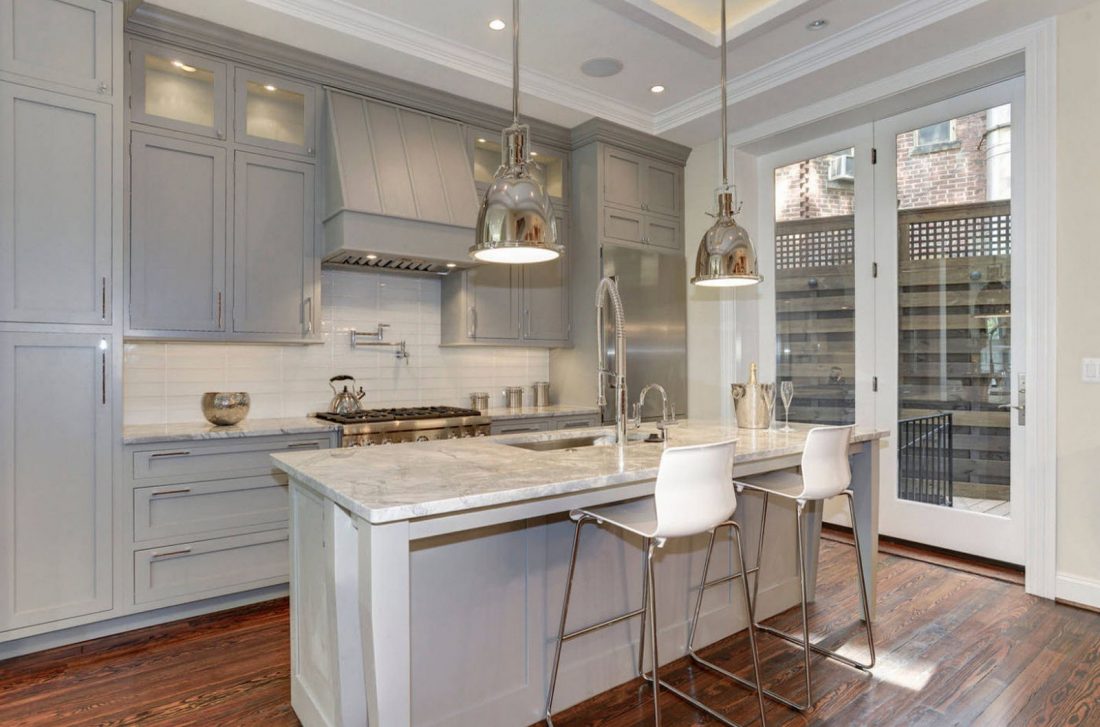
The ceiling is better to make light
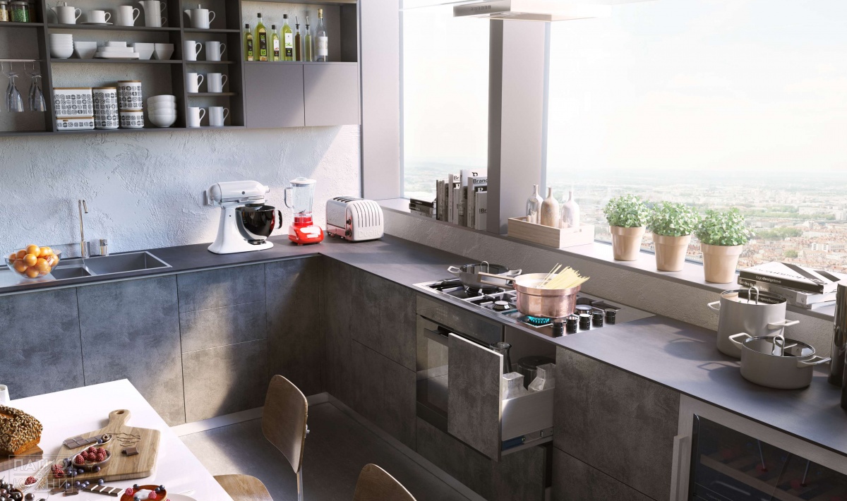
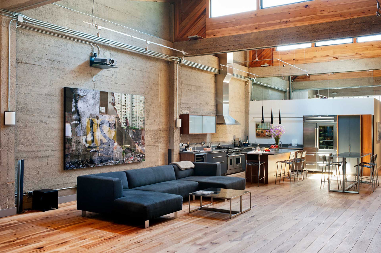
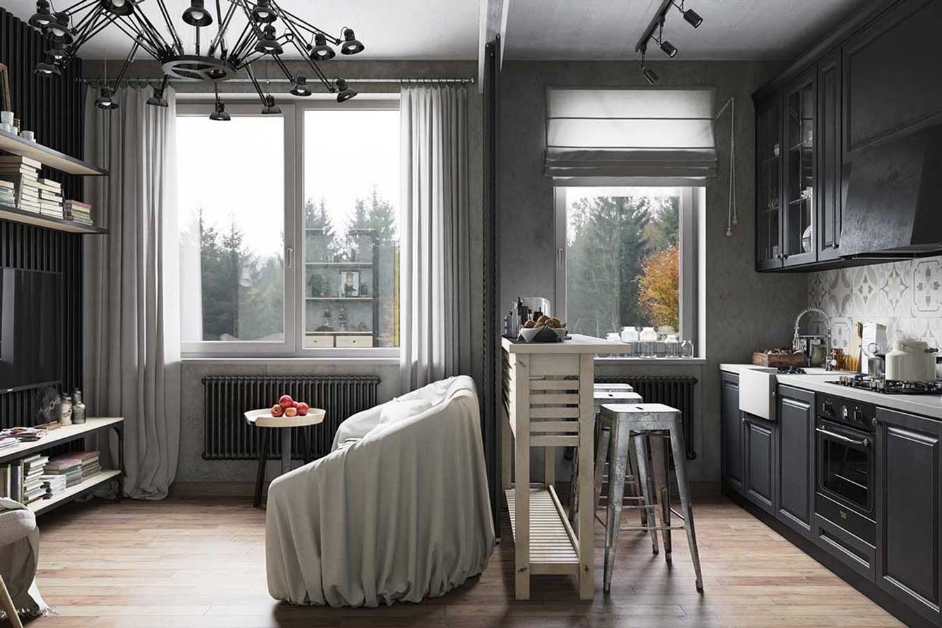
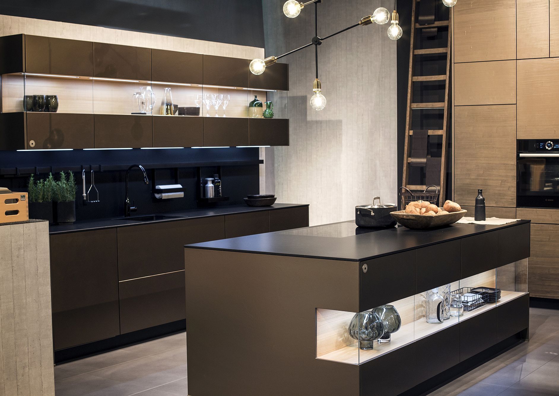
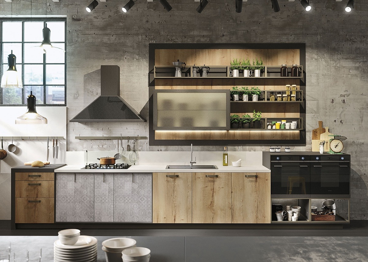
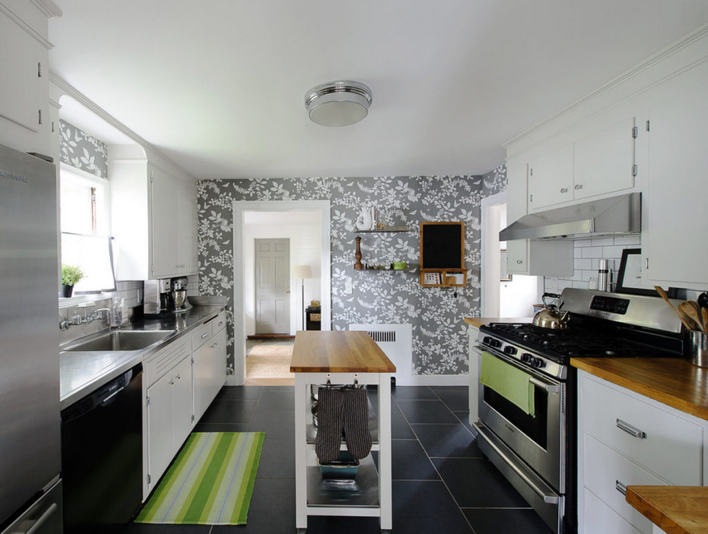
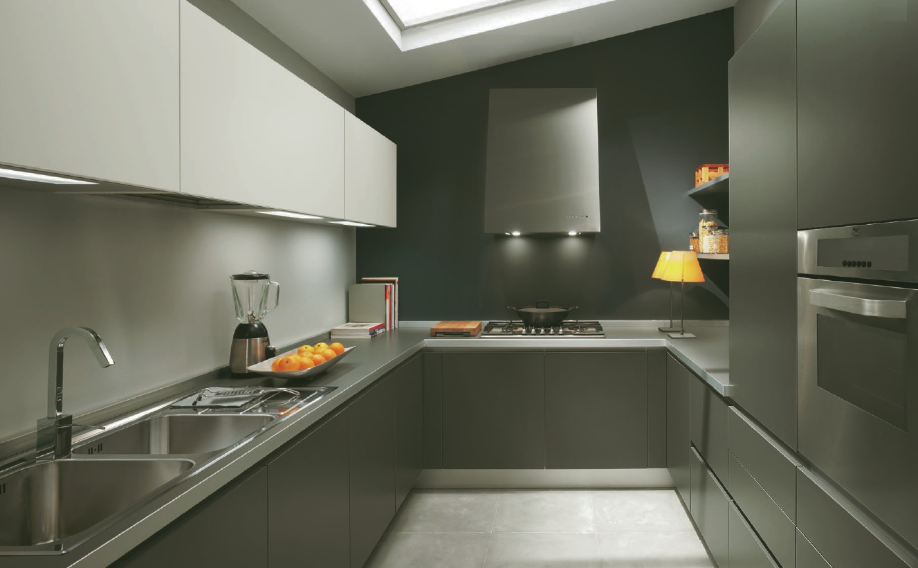
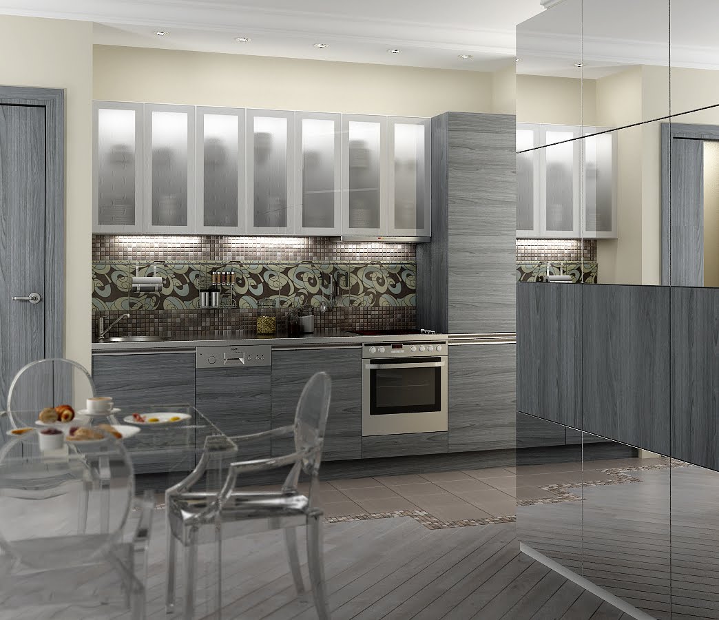
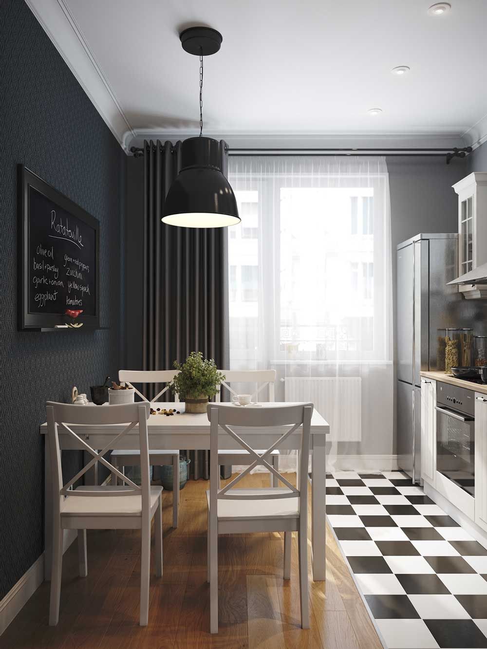
The walls of these tones are most often seen in high-tech kitchens or loft. They can be trimmed with stone or concrete, or simply decorated in plain colors. wallpaper. Wanting to recreate Scandinavian design, use a smoky beige design.
In high-tech style - stylish and elegant
Dark paint is not recommended for painting all walls. It looks good as an additional shade - it can successfully highlight the dining area.
It is not recommended to paint all walls dark.
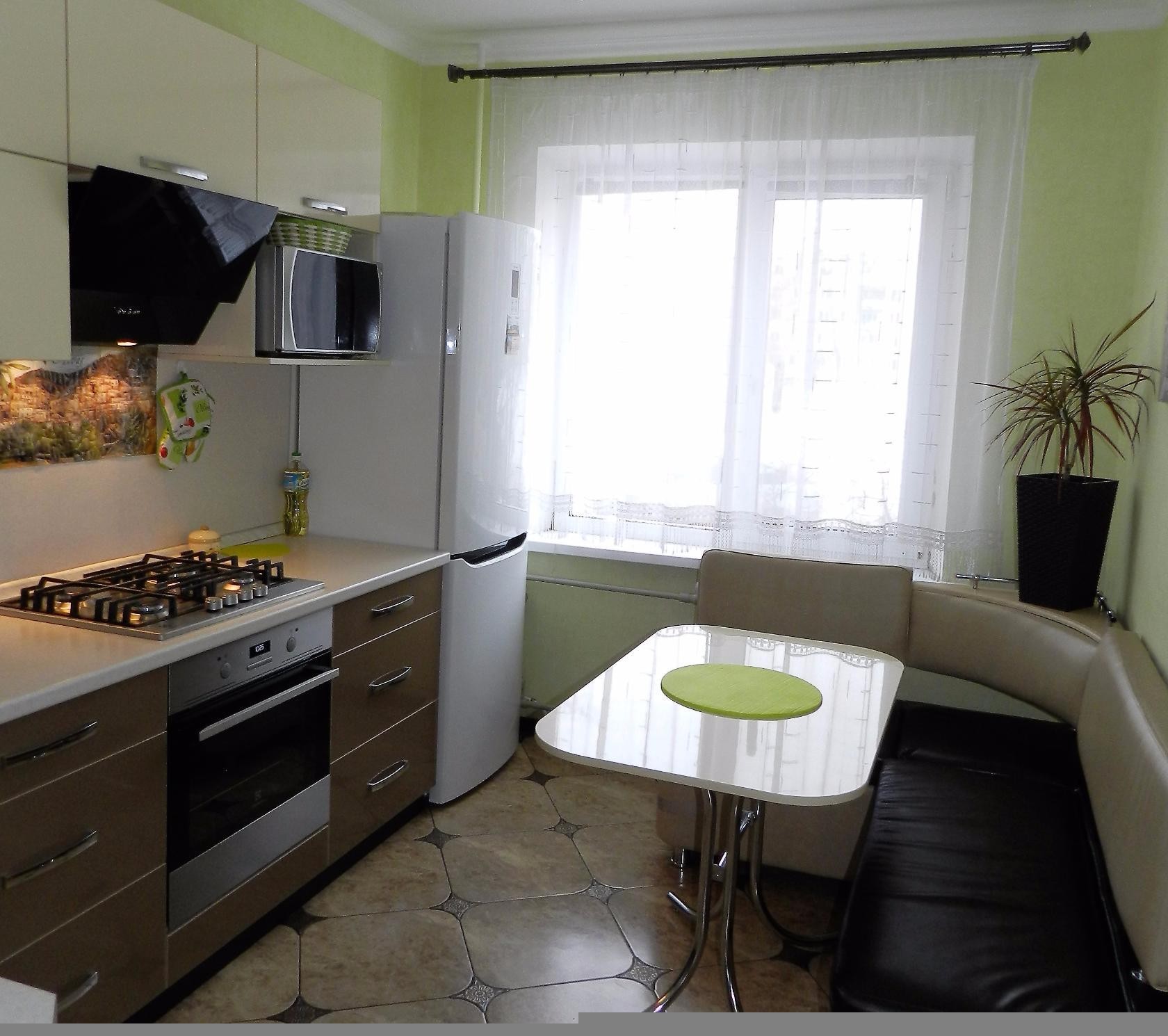
If you want to make the room brighter, use linoleum, laminate or floorboard grayish beige tone. Such a surface is very practical. Unlike the dark floor, it will not be visible dirt and stains.
The floor looks great tile
It will be interesting to you:REVIEW: Do-it-yourself kitchen decor: How to approach the issue professionally? Original ideas for wall decoration, apron, ceiling (200+ Photos)
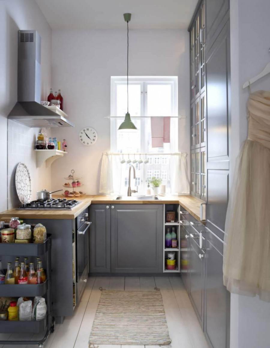
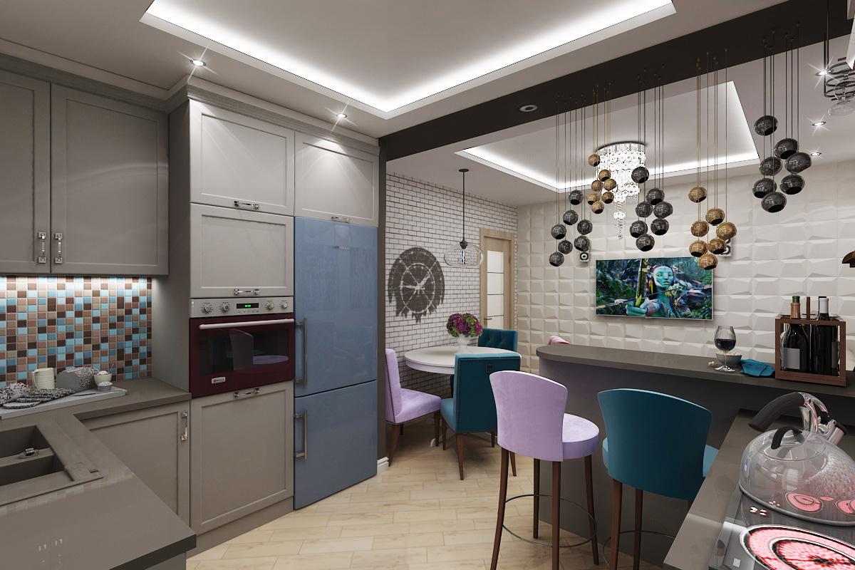
return to menu ↑Kitchen furniture
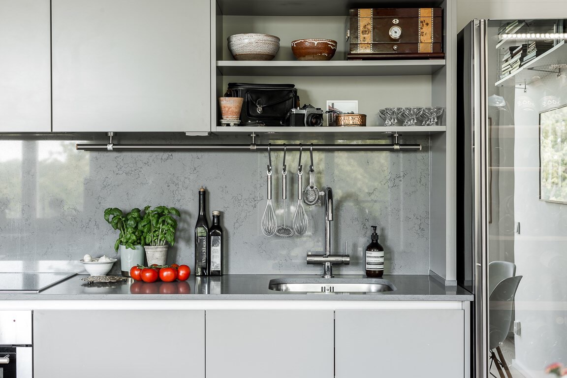
When choosing a design for your kitchen, remember the correct ratio of basic and additional colors. Since furniture occupies most of the kitchen space, pay special attention to its colors - the final impression of the kitchen will depend on it.
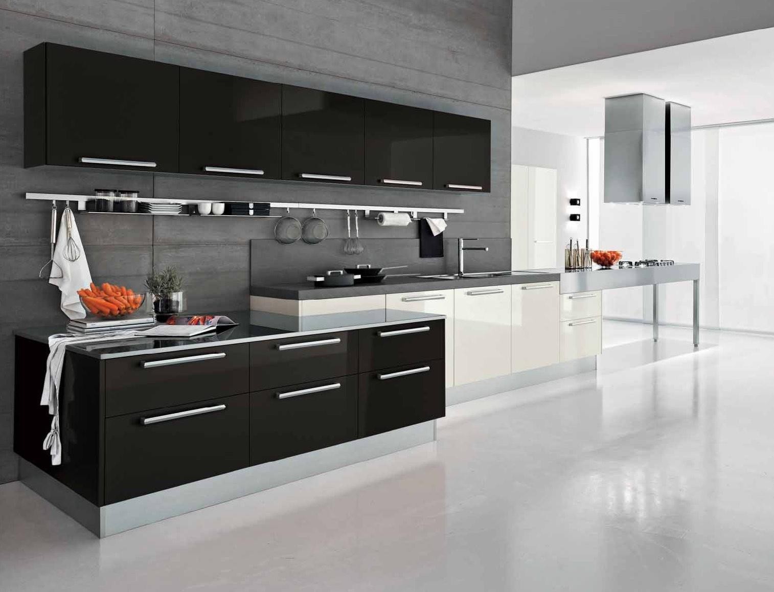
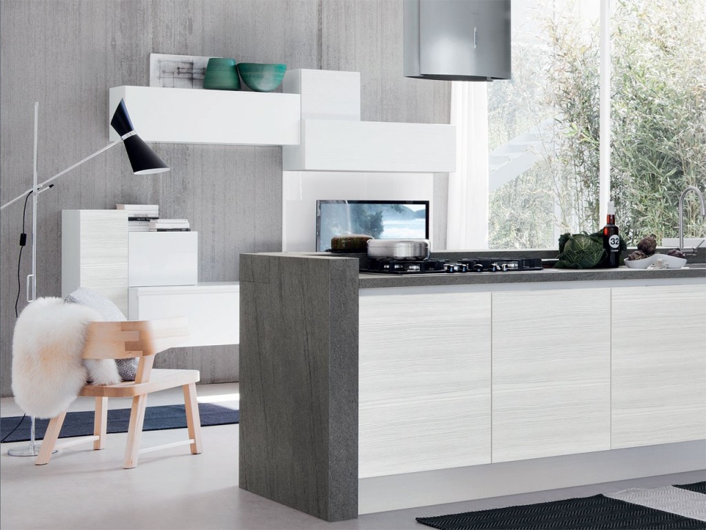
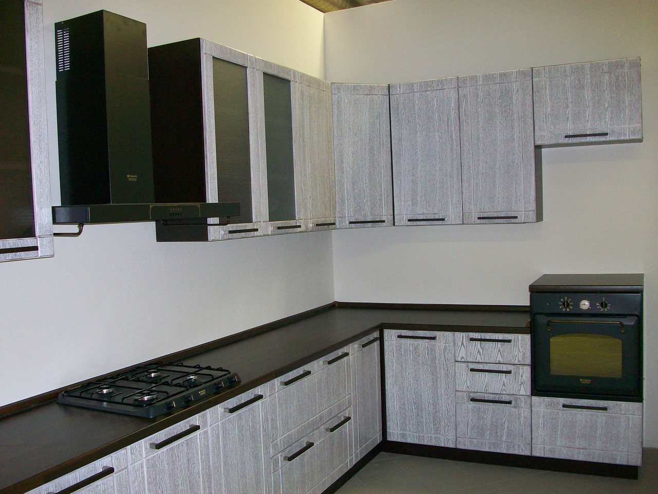
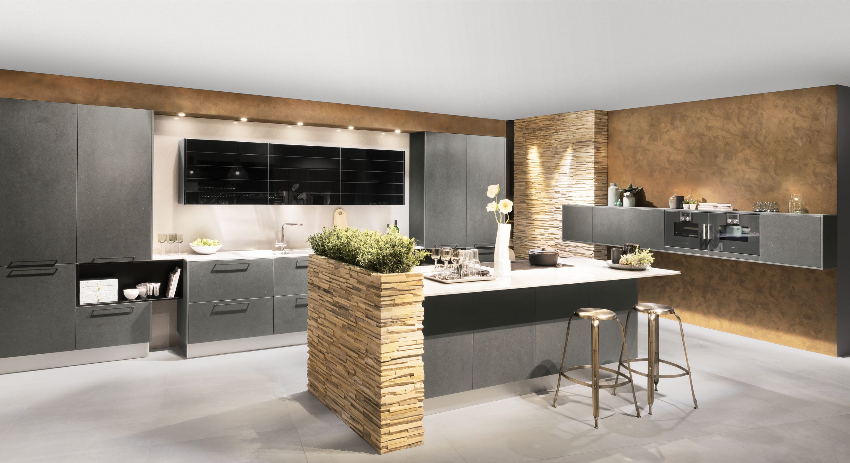
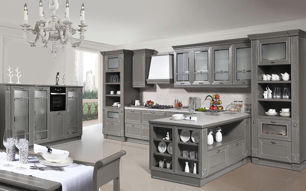
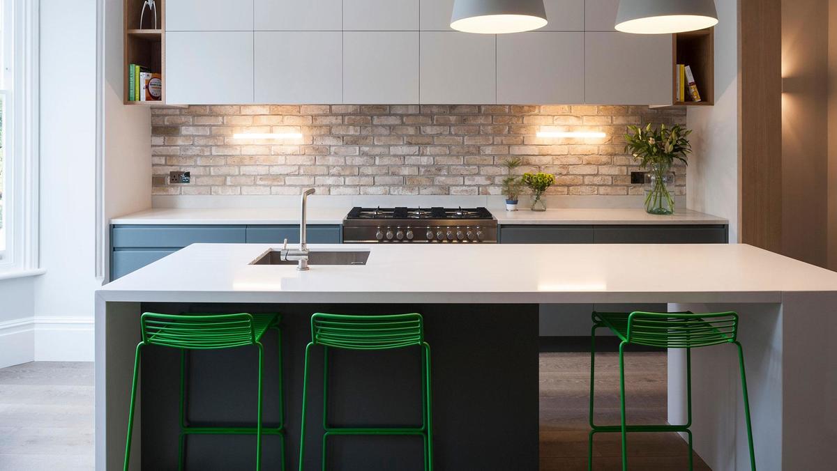
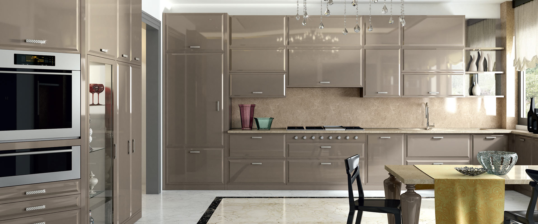
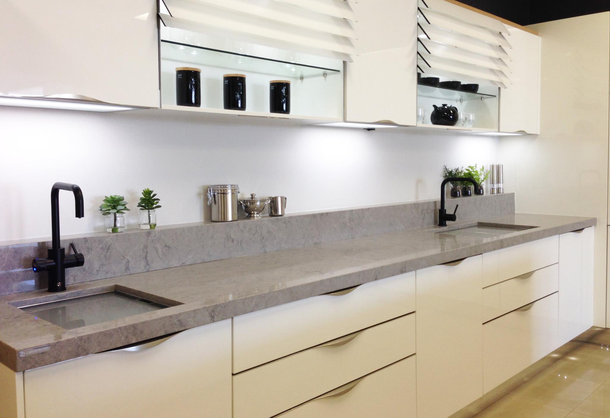
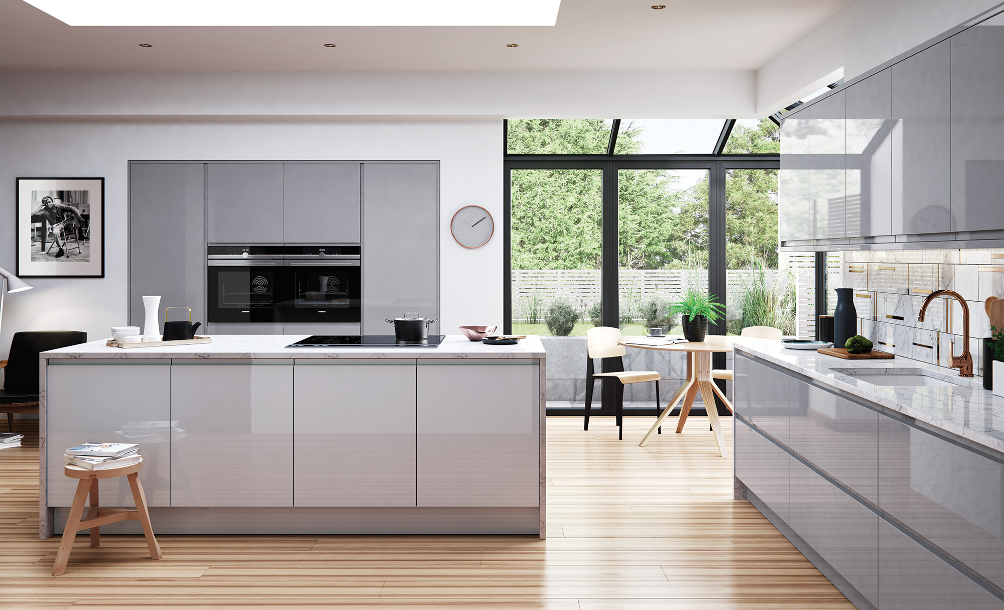
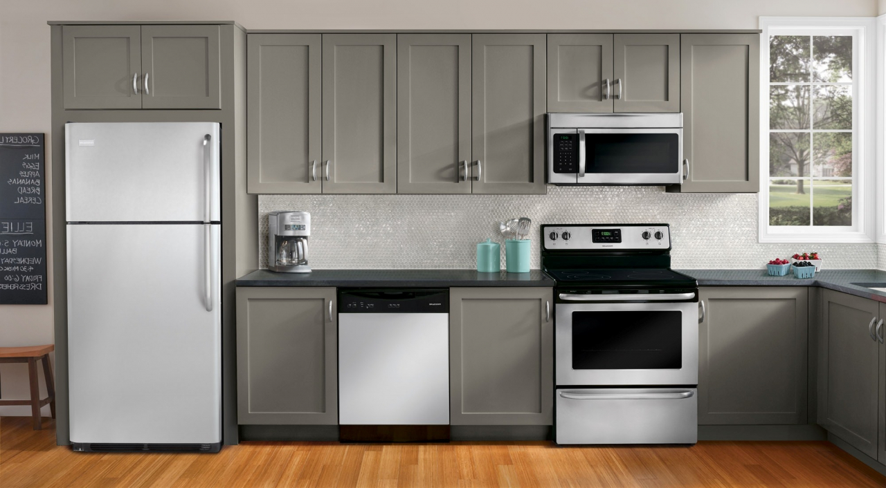
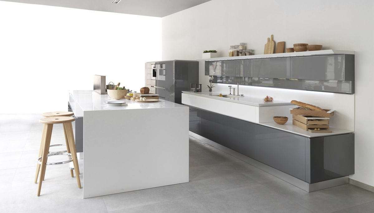
Matte set in smoky tones is considered a good solution. If you want to make the design of the room more glossy, use shiny surfaces. Combining them with stainless steel technology, you can achieve a truly amazing effect.
Matt wood top set
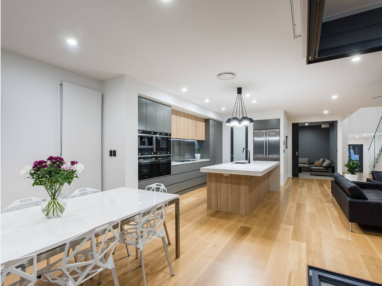
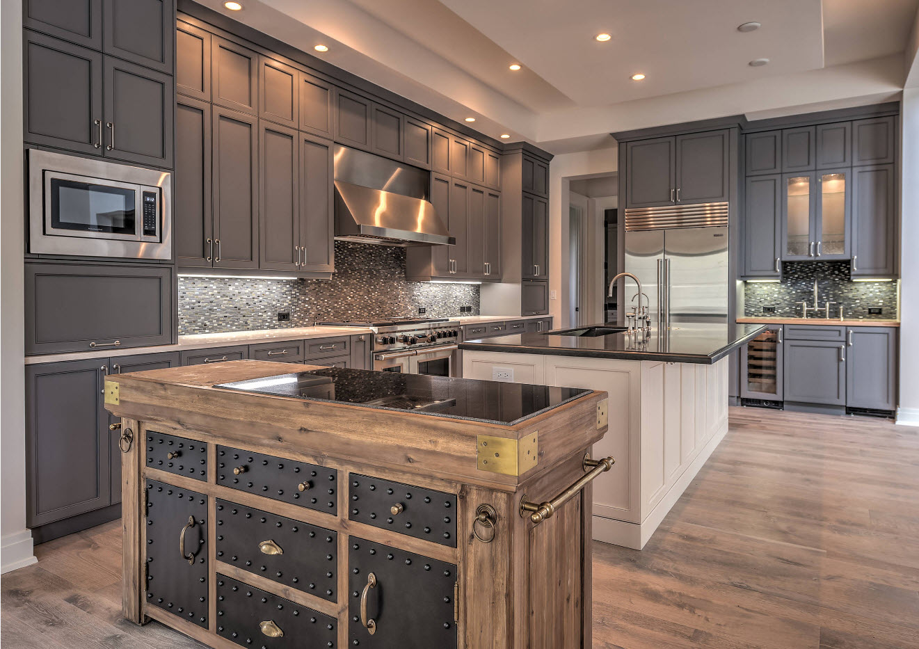
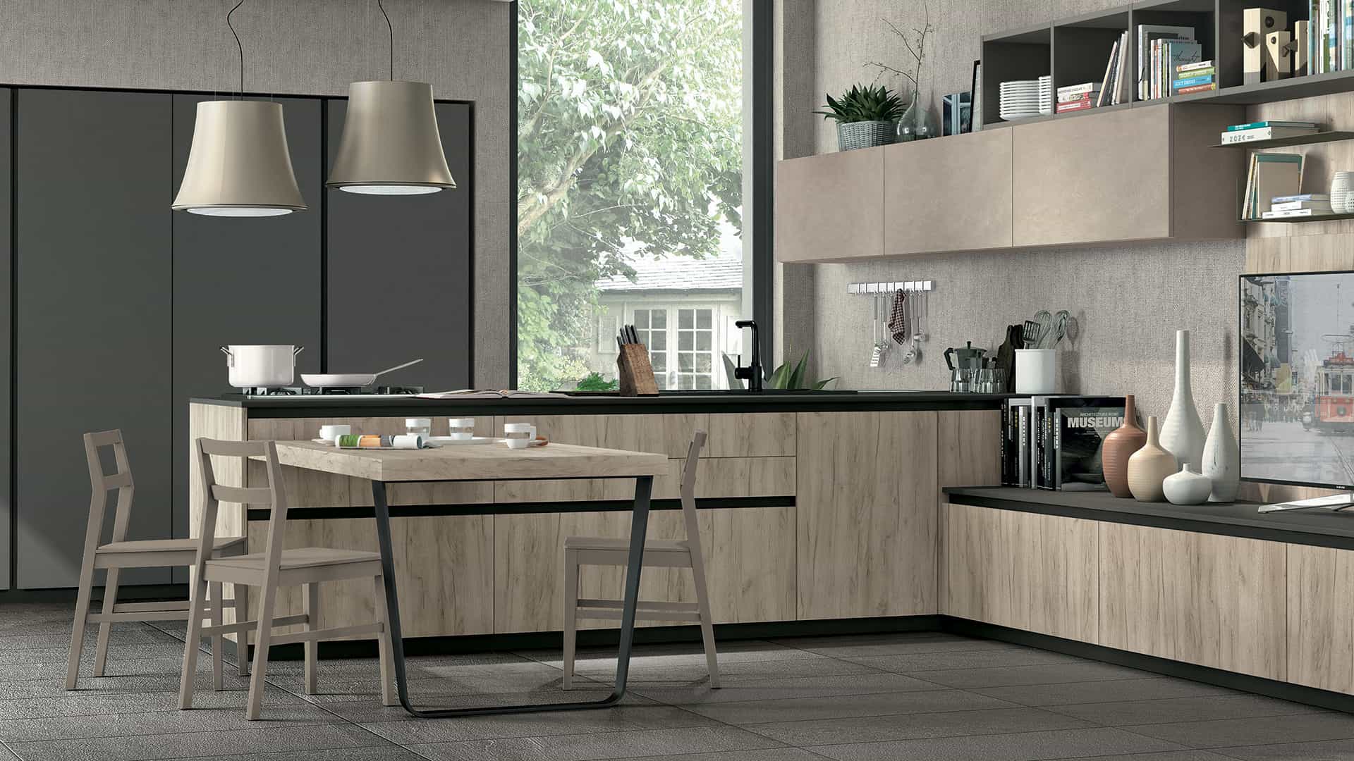
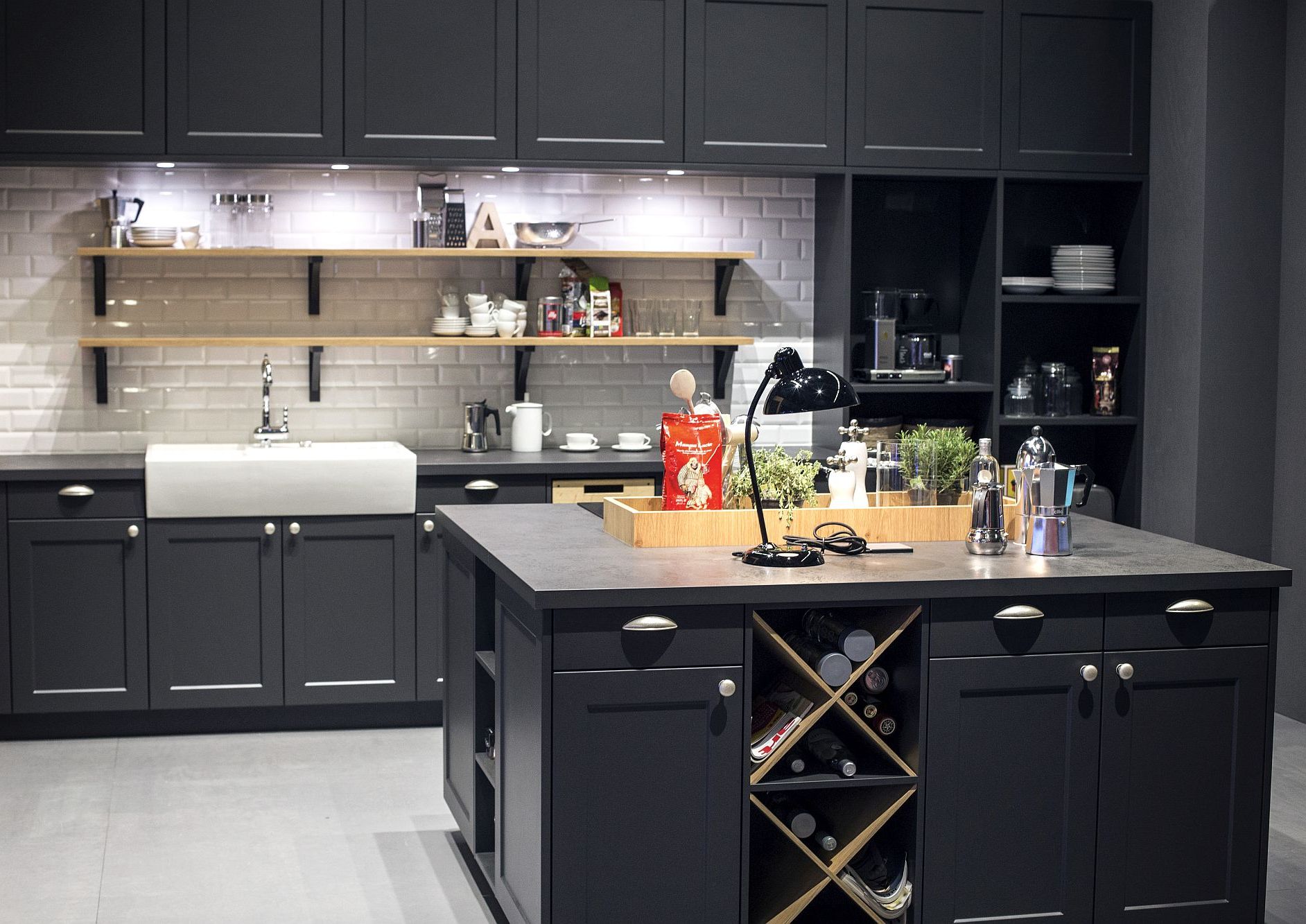
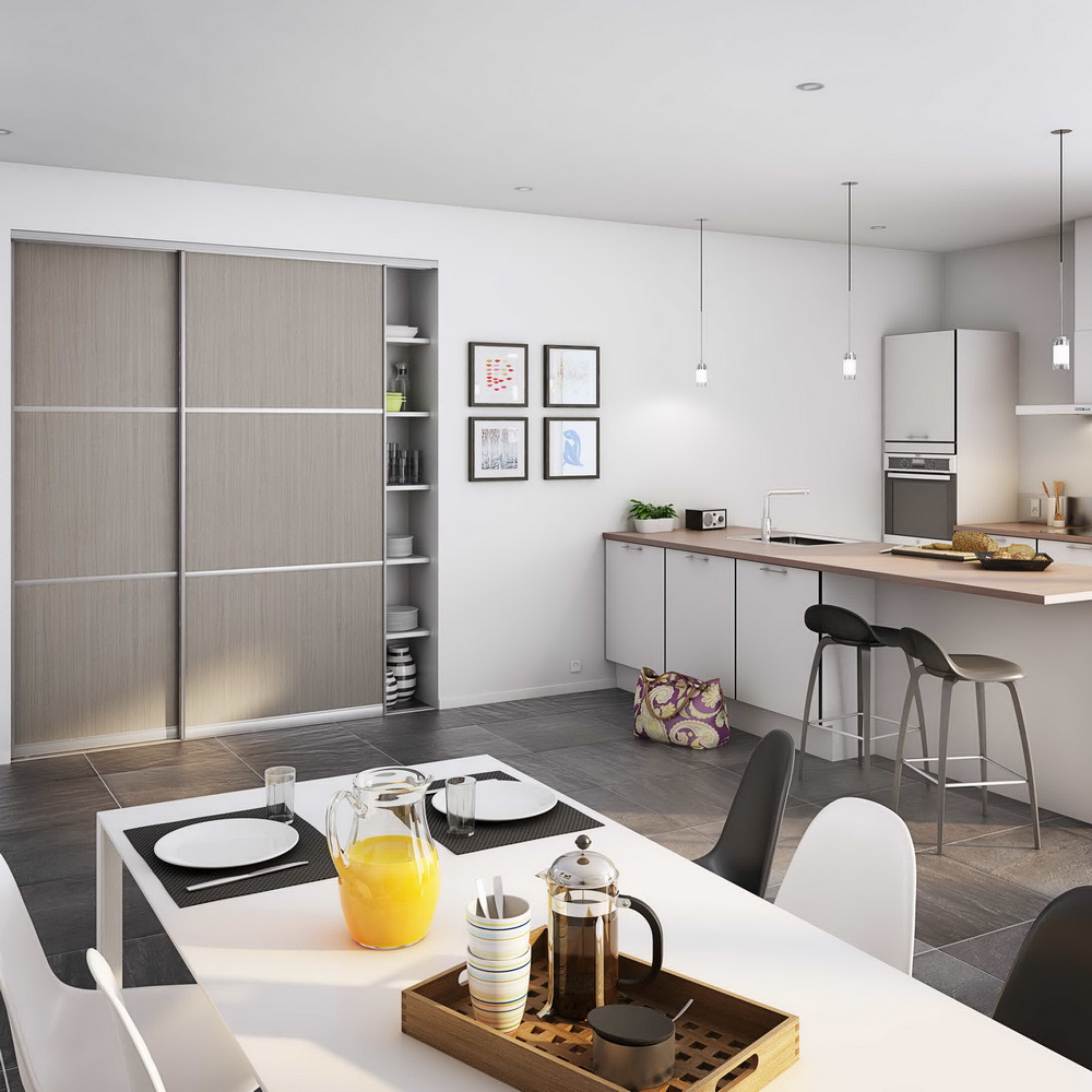
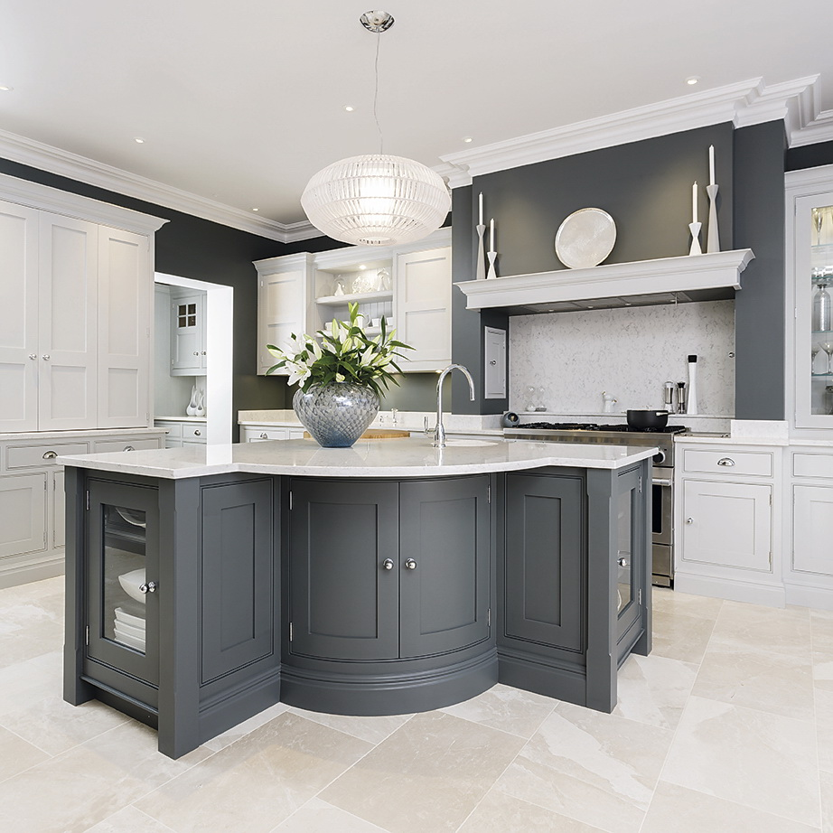
A popular design move is the installation of a kitchen island. It is recommended to make it more contrast than the rest of the furniture. Another modern trend is the choice of kitchen set without mounted cabinets. Often this design is used to design the Scandinavian style.
It is appropriate to purchase furniture made from natural materials - for example, wicker chairs or items from rattan. Will add stylish appearance a table-top from a natural tree.
We supplement the interior with natural wood
It will be interesting to you:REVIEW: Kitchen Design in Blue: What style to turn to? 170+ Photos of incredible interior combinations
return to menu ↑Optimum companion colors
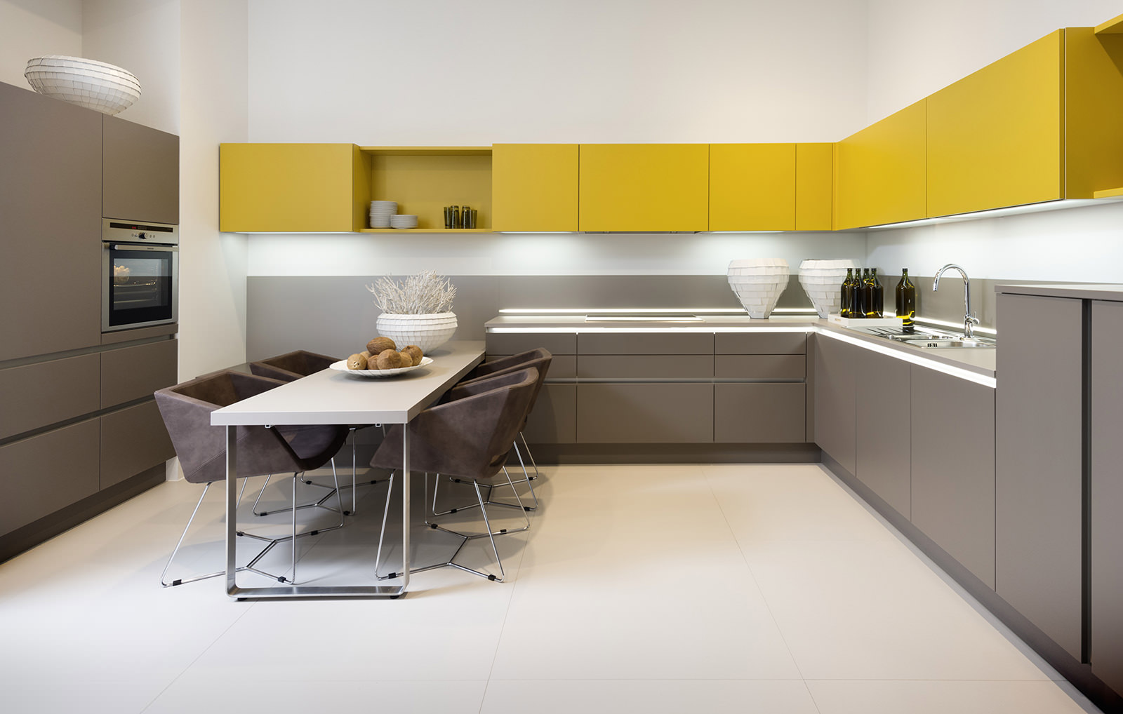
return to menu ↑Yellow
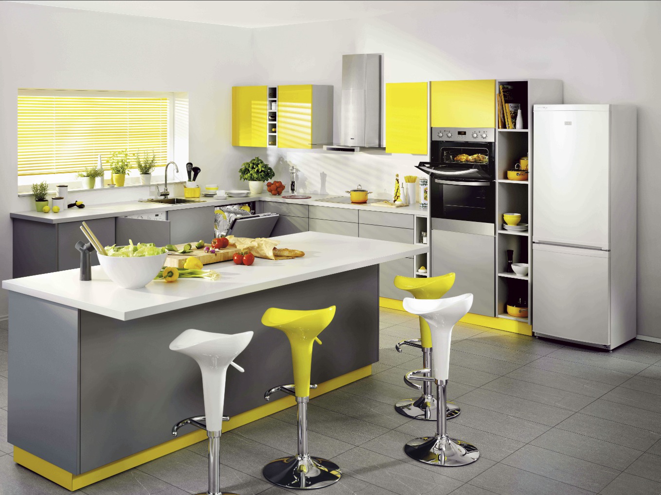
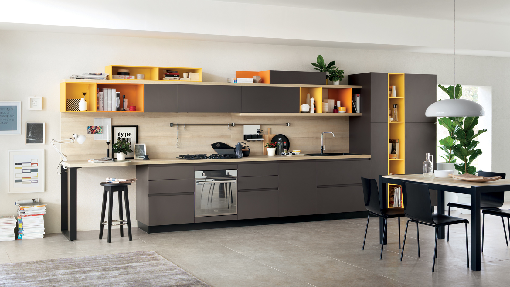
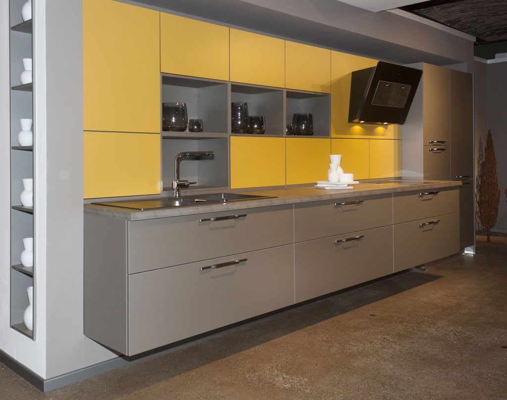
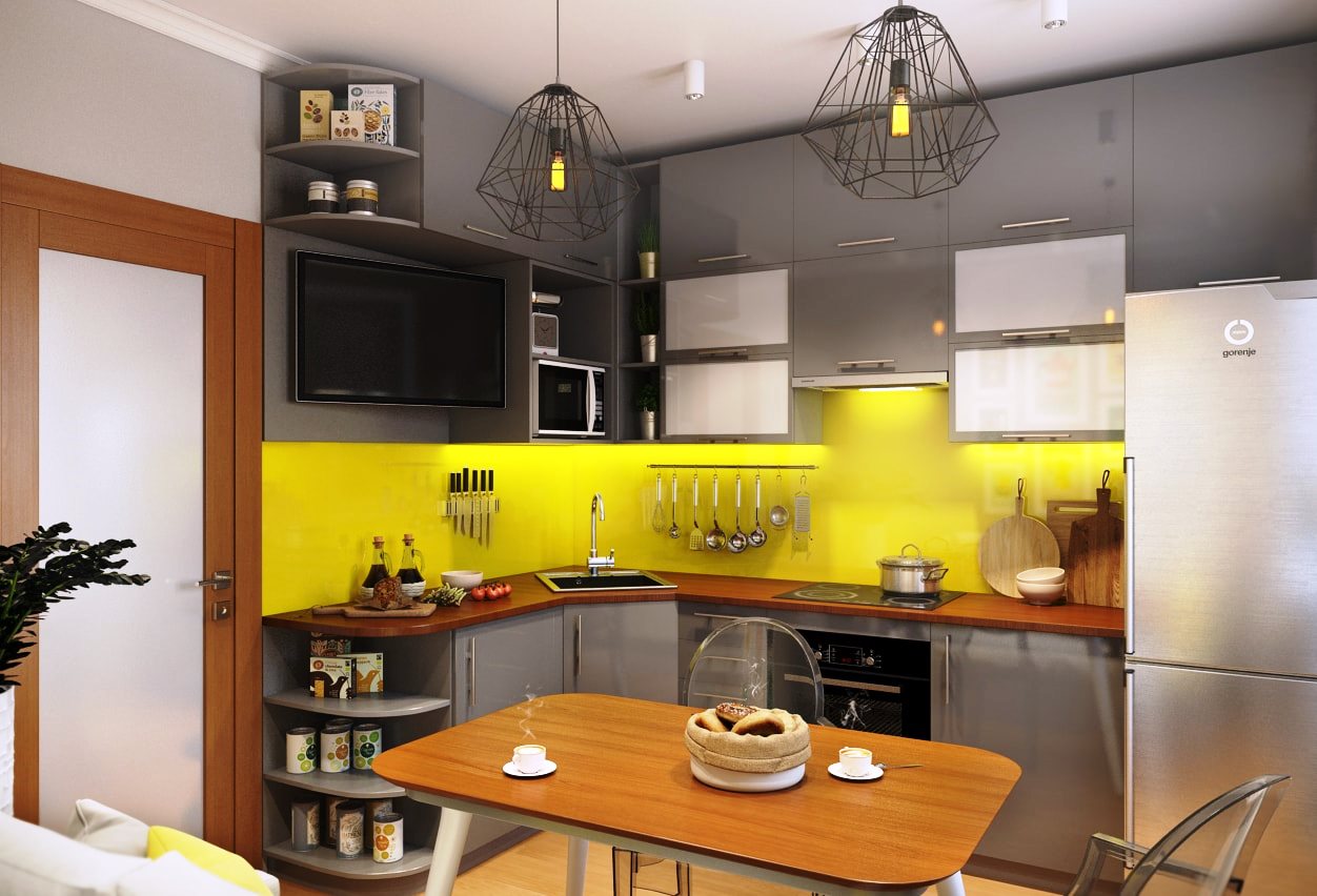
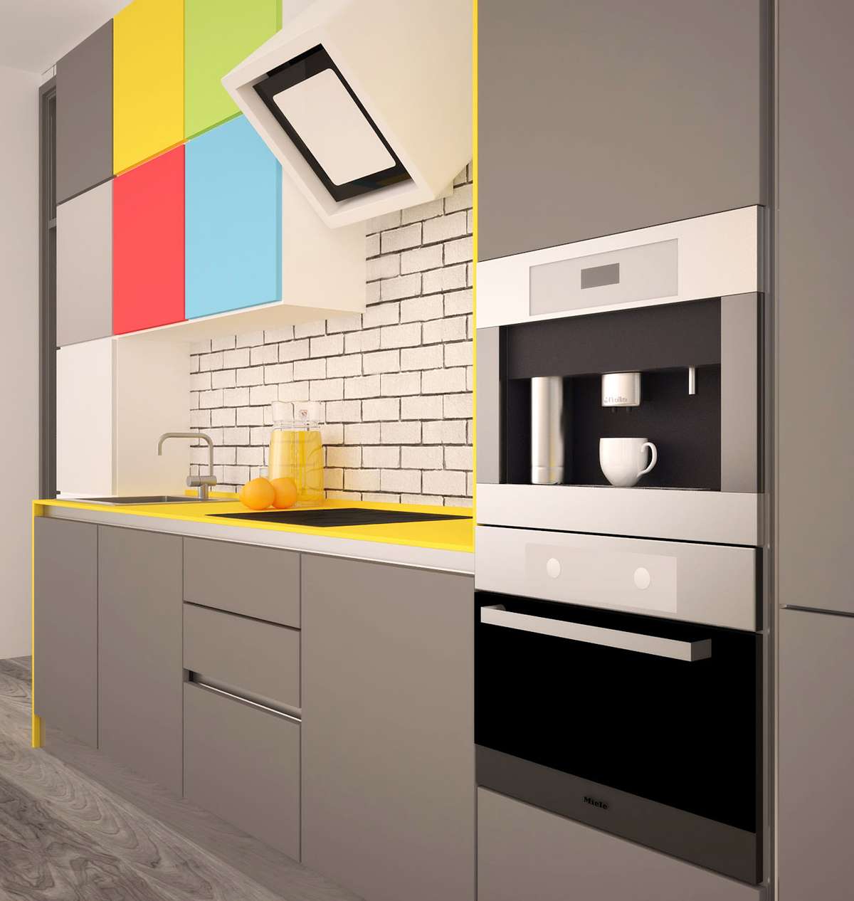
This palette looks good in the design of various rooms, in particular the kitchen. Gives residents tenacity, good mood, energy. Smooth the color intensity and make the design more stylish helps its combination. Bright yellow accents are used for kitchen apron tiles, fronts, or countertops.
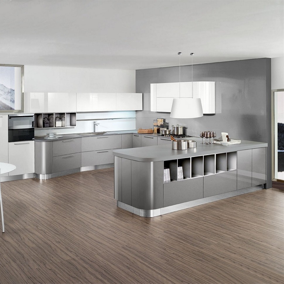
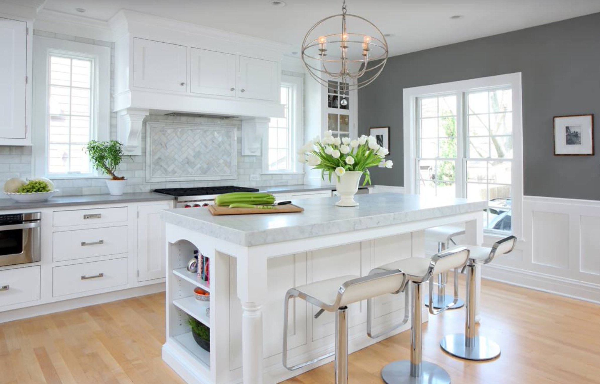
return to menu ↑White
A classic combination that brings comfort and style. There are many shades of white, successfully combined with our base color - cream, milky, beige, others.

Add some comfort
Green
Fits well with many design styles, for example modern or eco. The more saturated the green tone you select, the more you will have to dilute it with a mouse color. It is interesting to combine green walls with chrome appliances, work surfaces decorated under metallic.
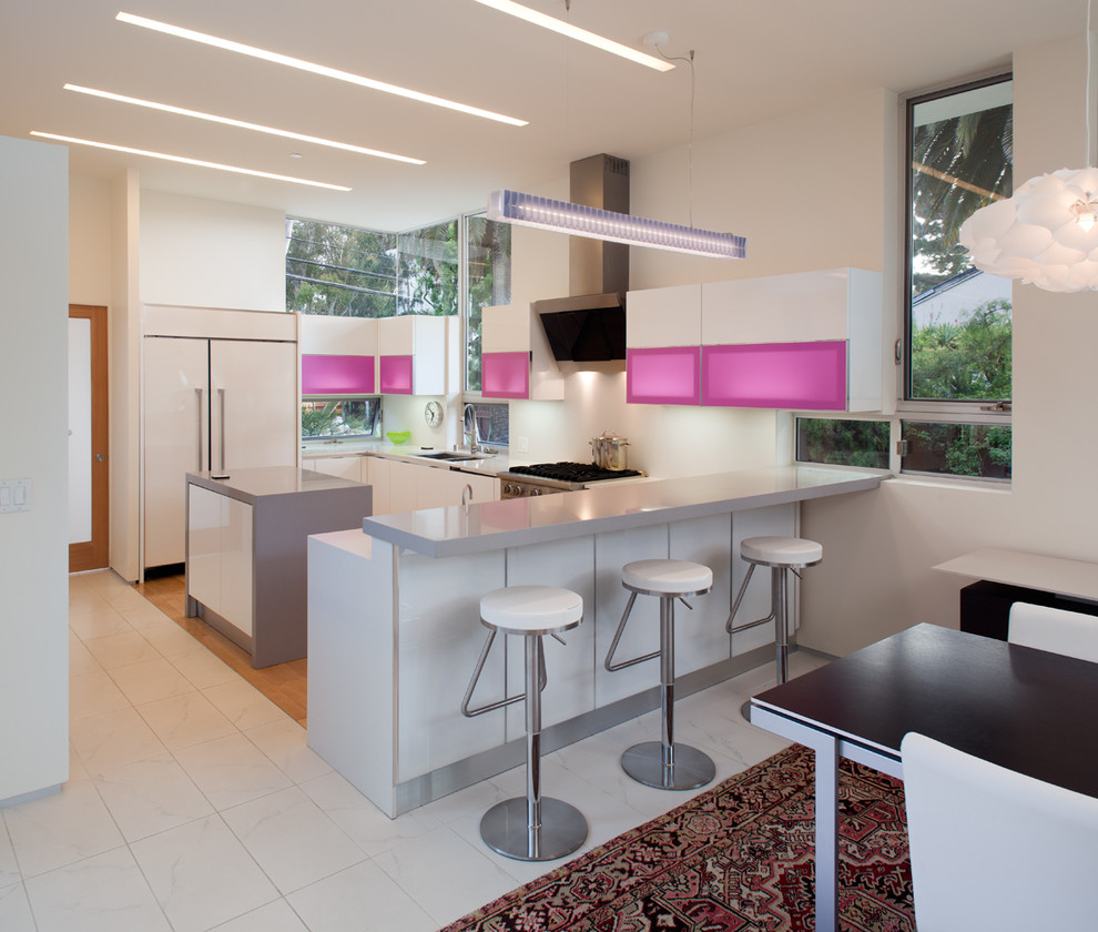
return to menu ↑Pink
You can create a romantic setting with a combination of pink. Pink walls are made out, sometimes rare patterns of pink headsets can be found. It is recommended to dilute this tone with glossy surfaces or metal appliances so that the interior does not seem too feminine.
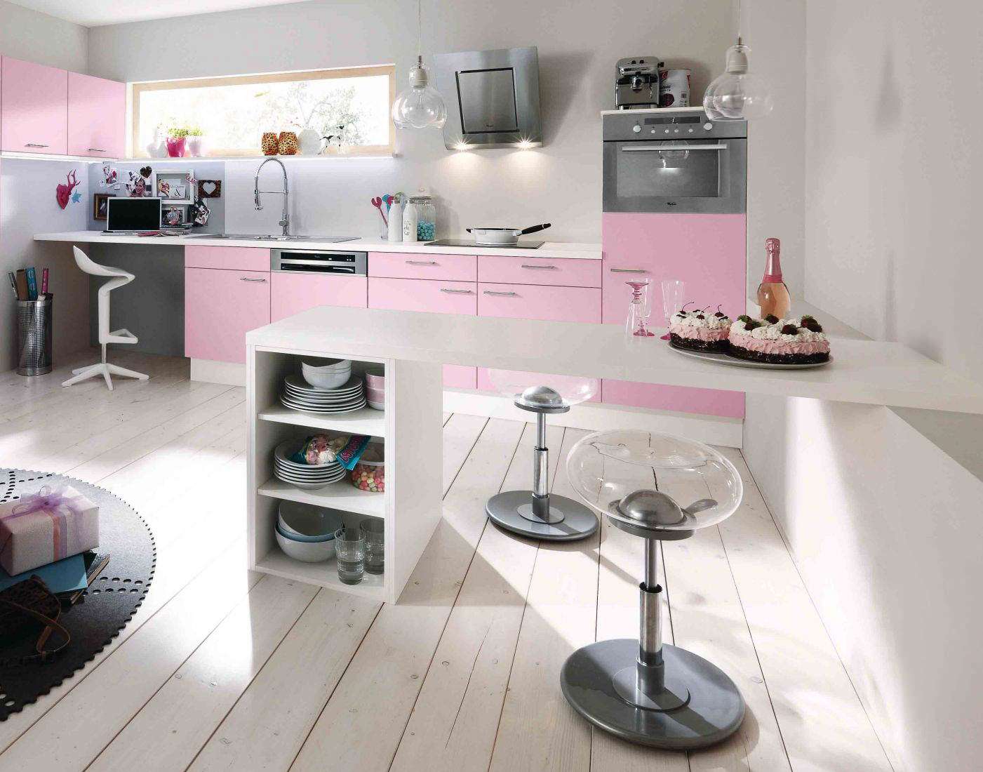
A little romance with a pink shade
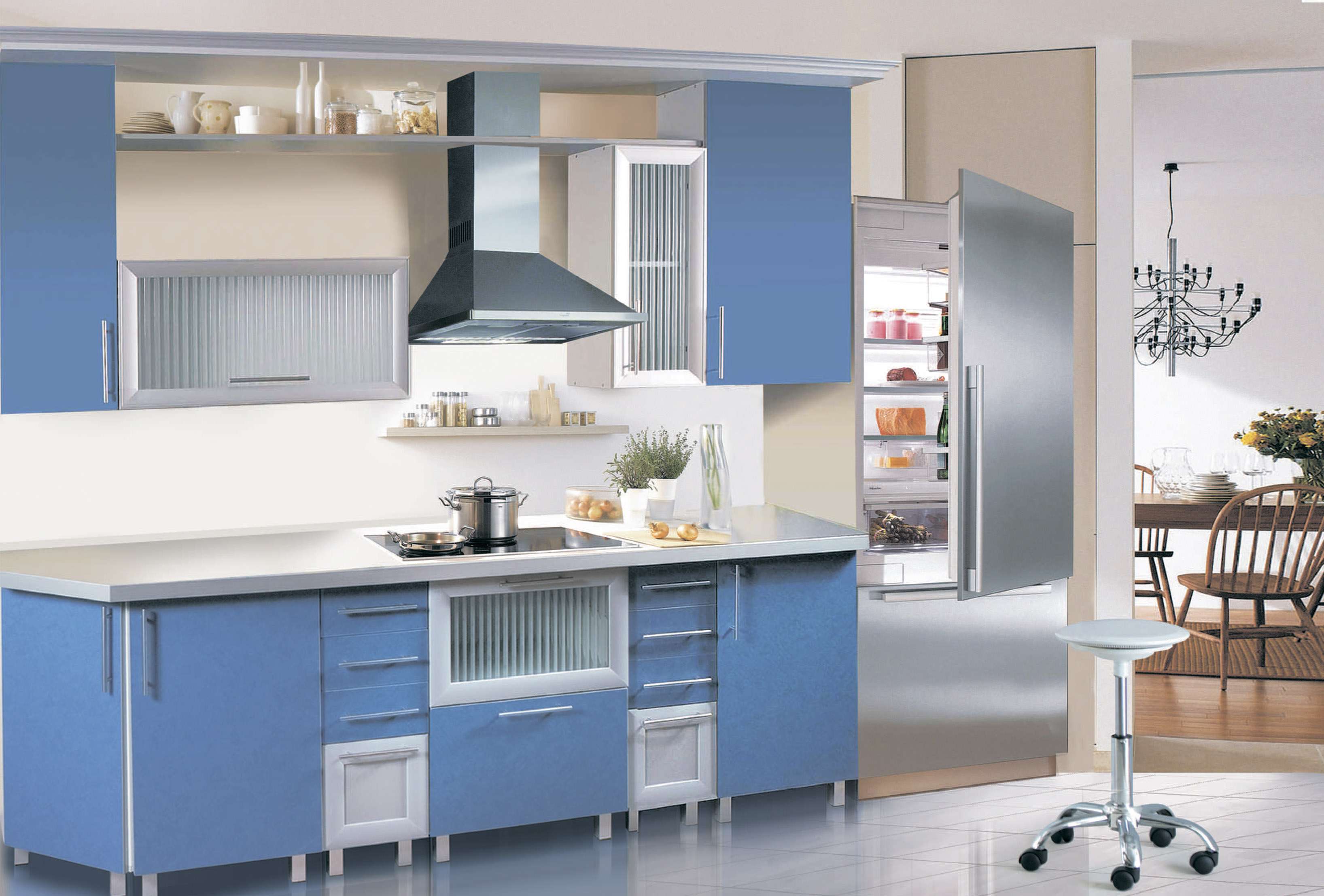
Blue
This two colors are in harmony with each other. Blue and blue tones can be used to design furniture fronts, tiles or walls - it all depends on your preferences. Try adding red, orange or black strokes in the form of a pattern of wallpaper, lamps or curtains.
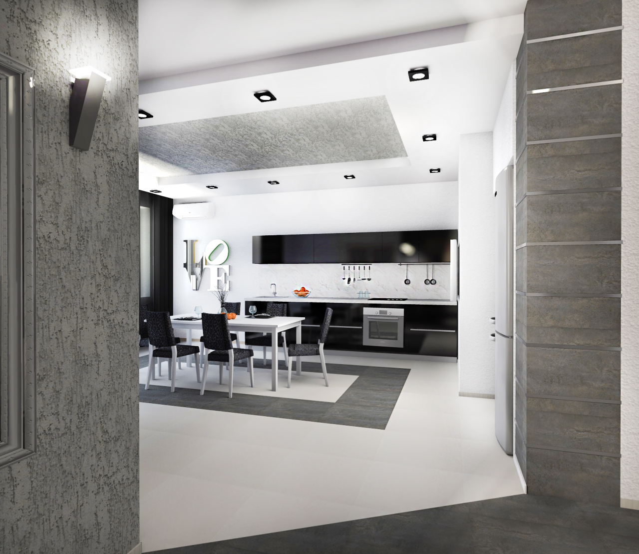
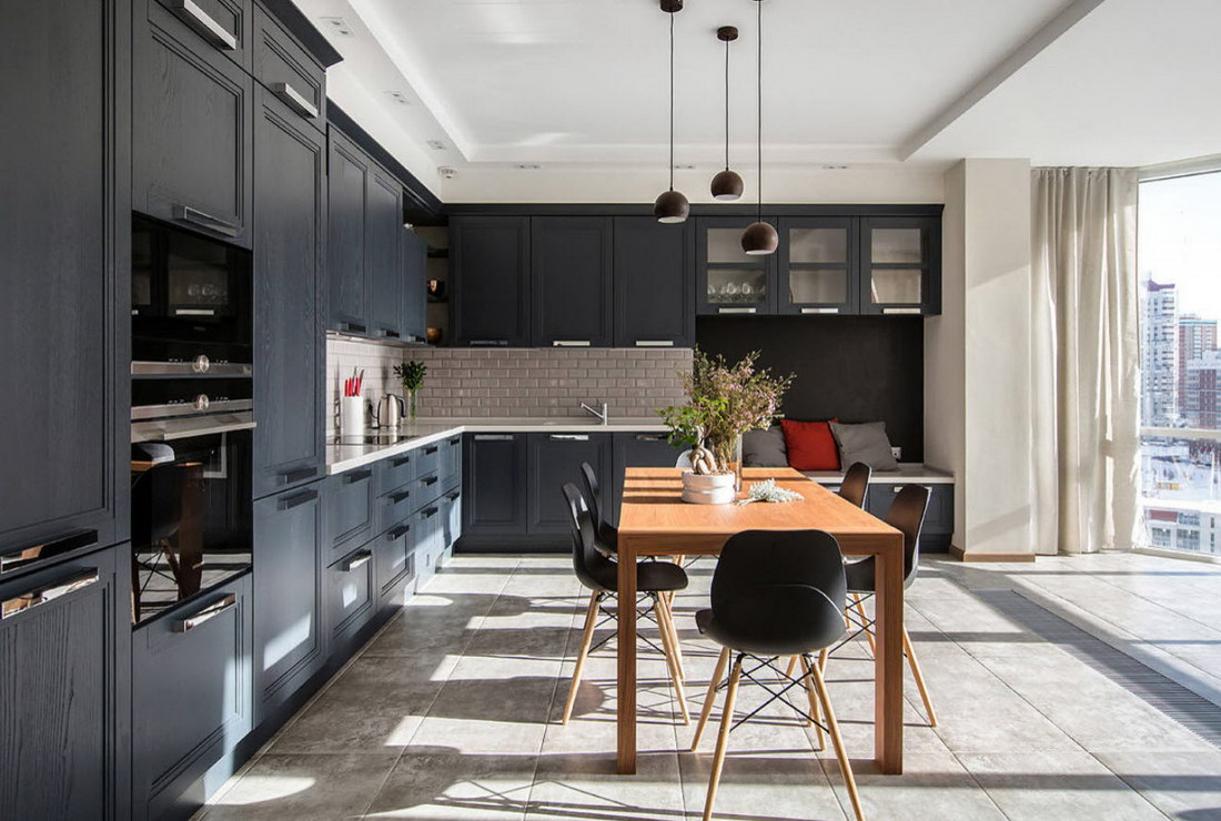
return to menu ↑The black
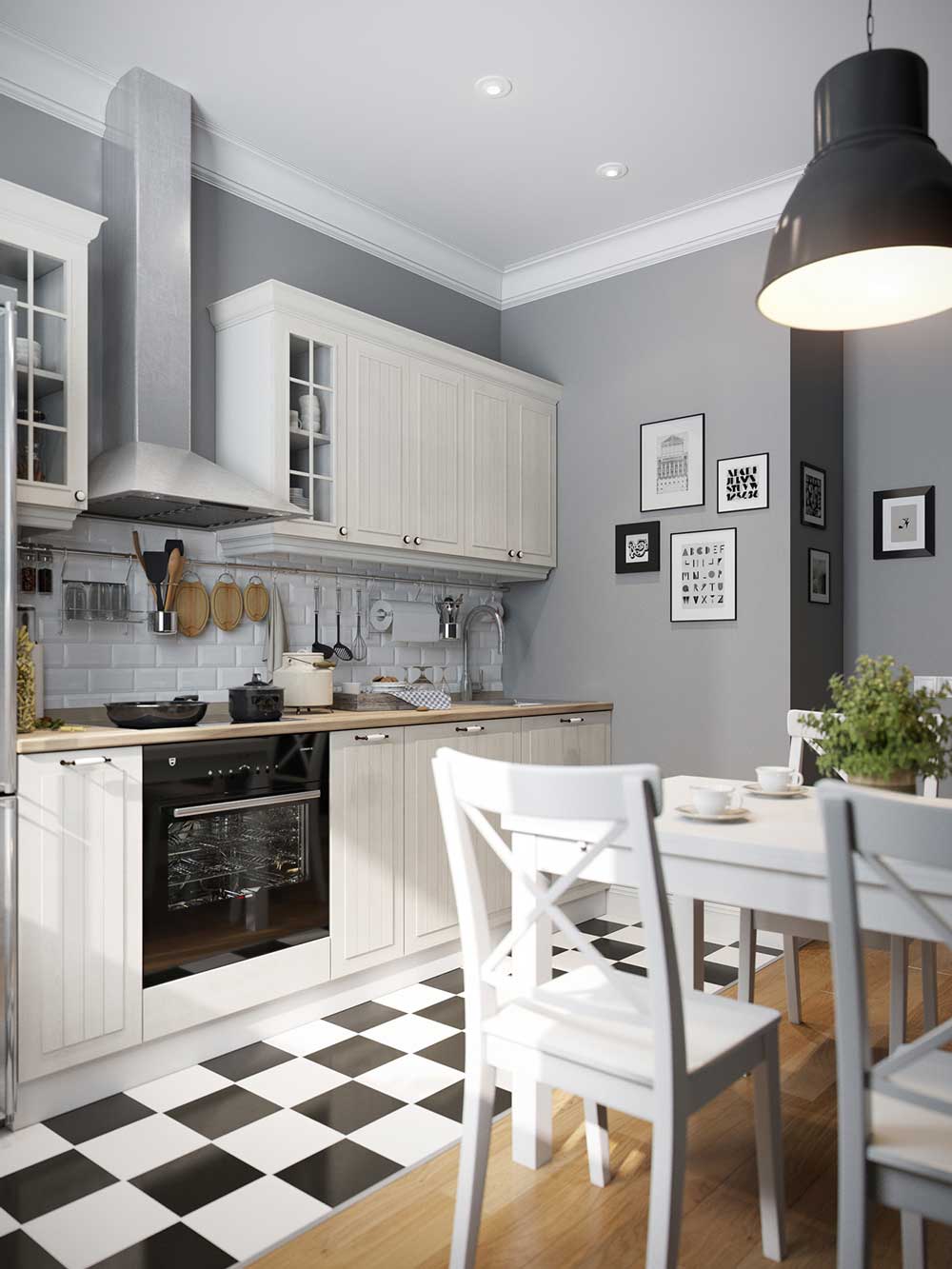
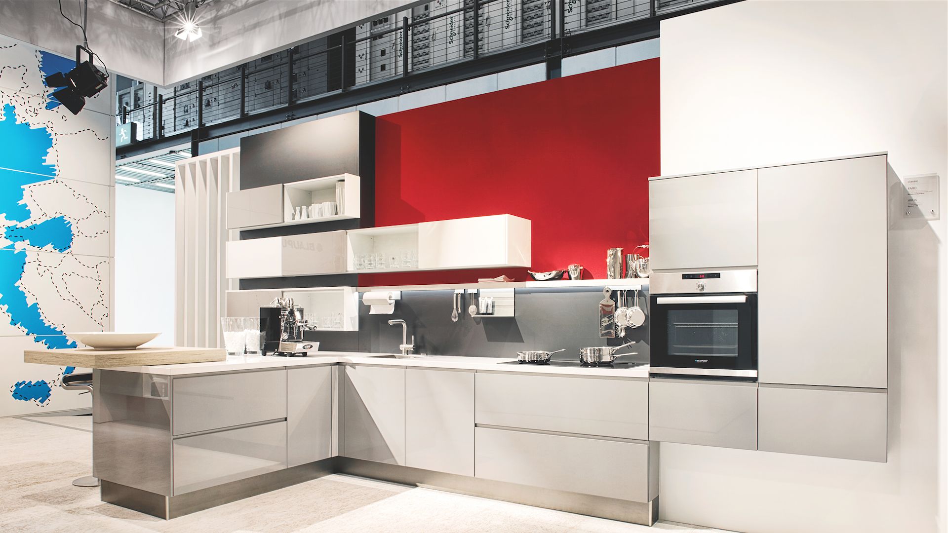
We'll have to reconsider a lot of options to combine black and lead in the kitchen. Most often they are diluted with white so that the room does not turn out too gloomy. For example, white floor and ceiling, black furniture and smoky walls - an option for high-tech or modern style. Dilute them with several bright details — yellow or orange.
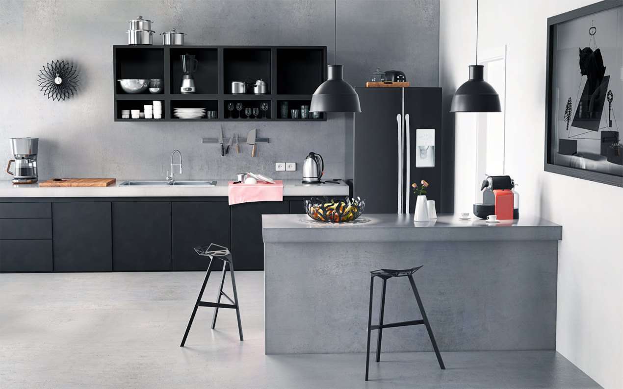
The main thing is not to be too gloomy
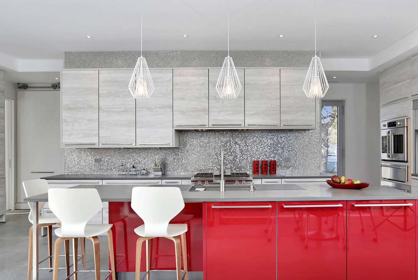
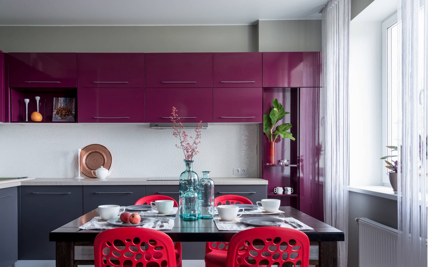
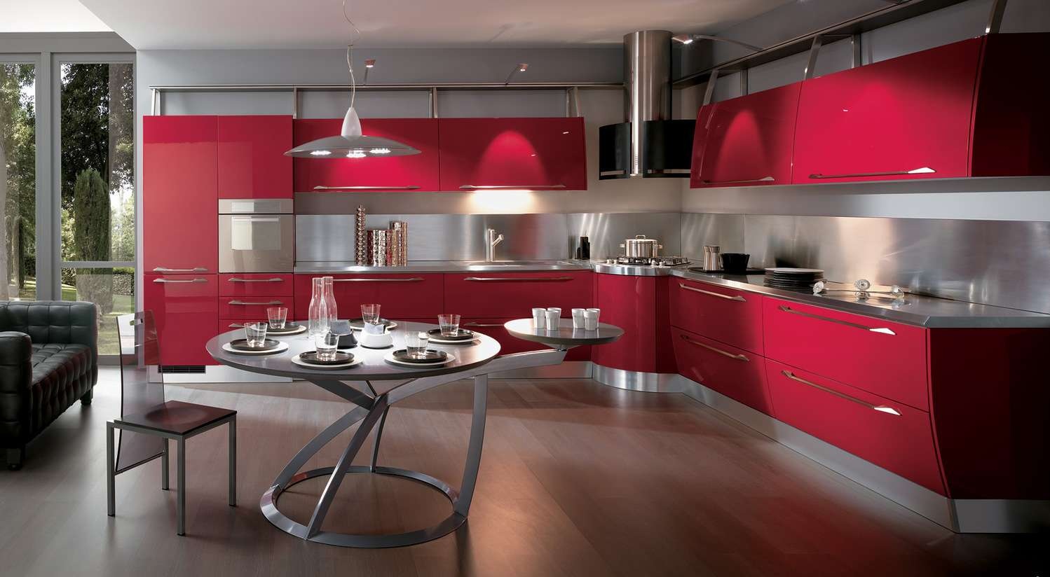
Red
One of the most difficult shades for registration which is chosen not by all. Making the right combination of gray and red is very difficult, but you can use ready-made photos design kitchens. Most often red is used for furniture, much less often they paint walls. You can dilute the gray-white kitchen with an original raspberry apron, expressive wallpaper or a rich floor tile.
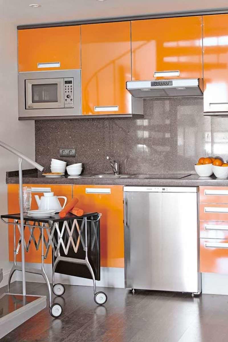
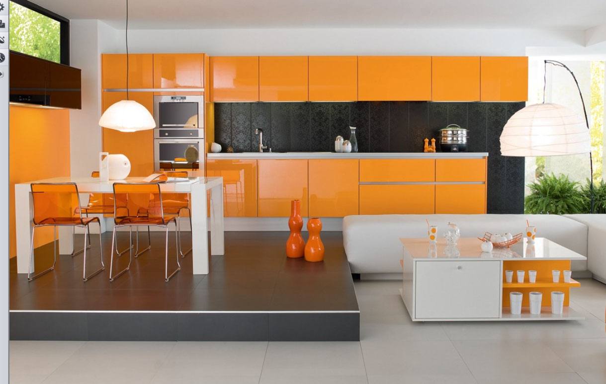
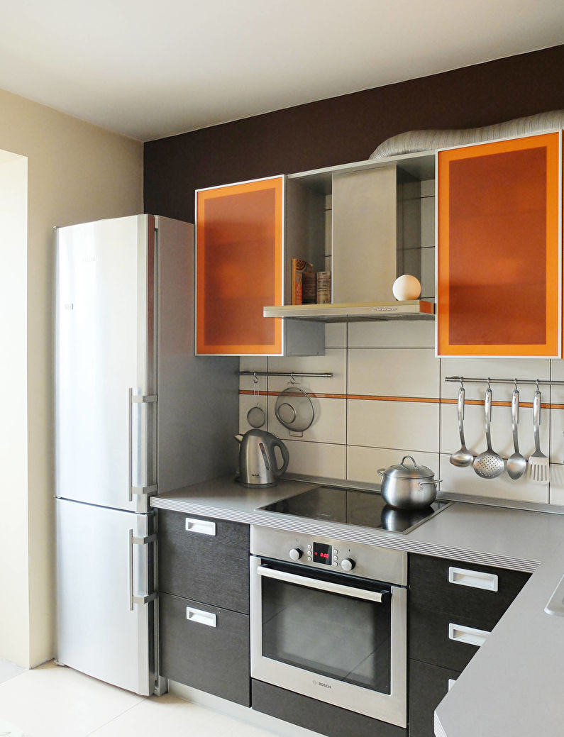
return to menu ↑Orange
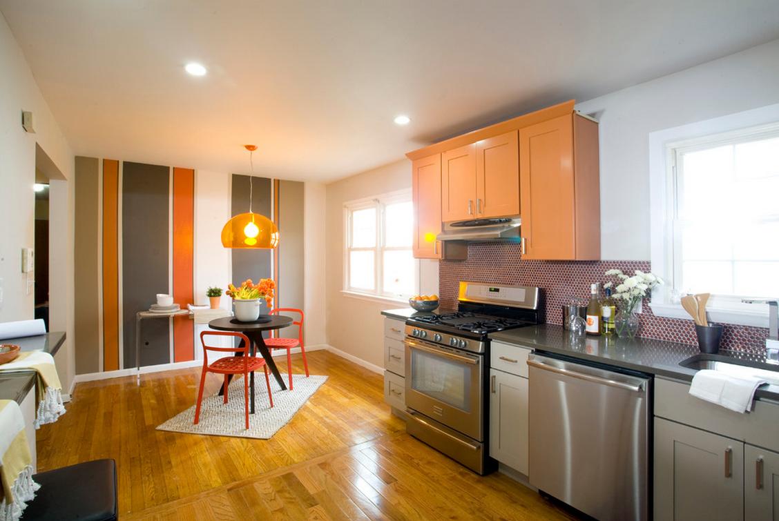
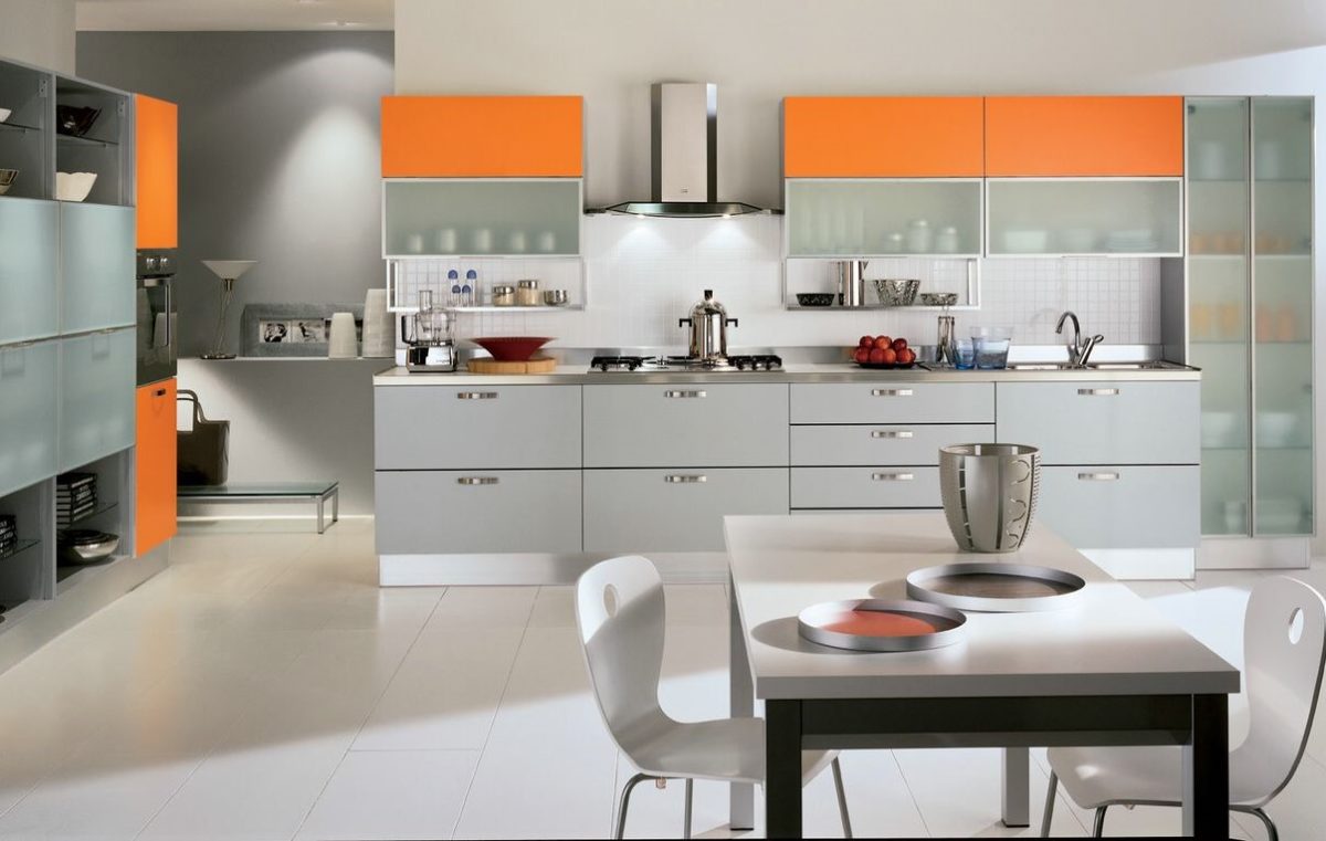
Orange color is rarely used in the design of home premises (if you do not take into account details like murals or chairs). However, grayish shades help to “extinguish” orange, so that the residents' visual perception is not irritated. With smoky carrot, orange and salmon tones are well combined.
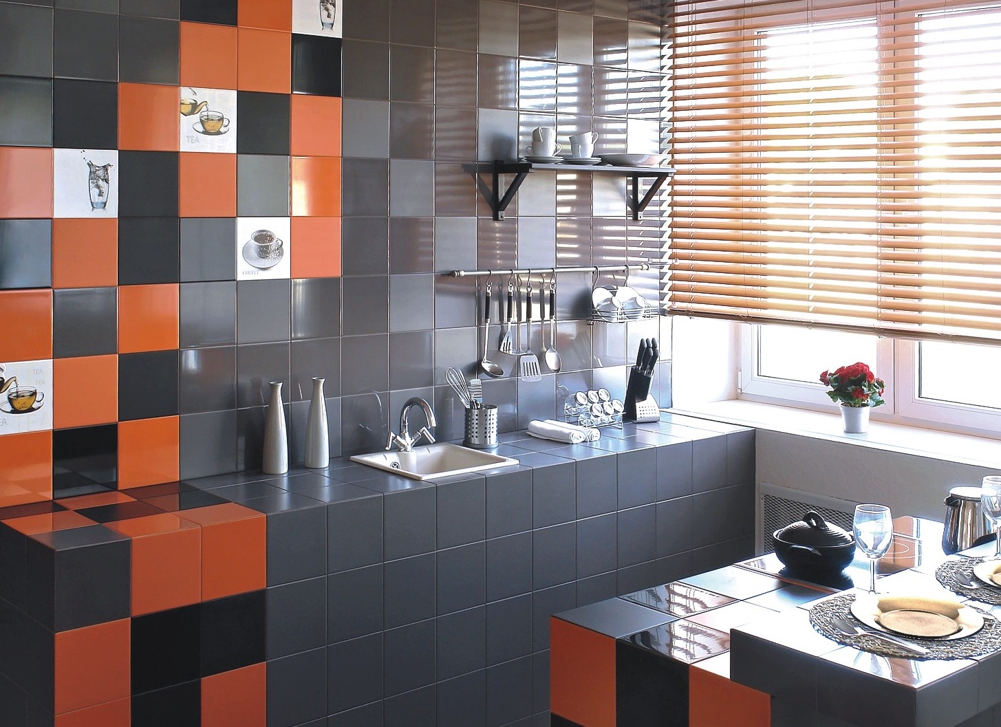
This duet is rarely used.
It will be interesting to you:REVIEW: How to make a narrow and long Kitchen: Nuances and tricks for a small interior (175+ Photos)
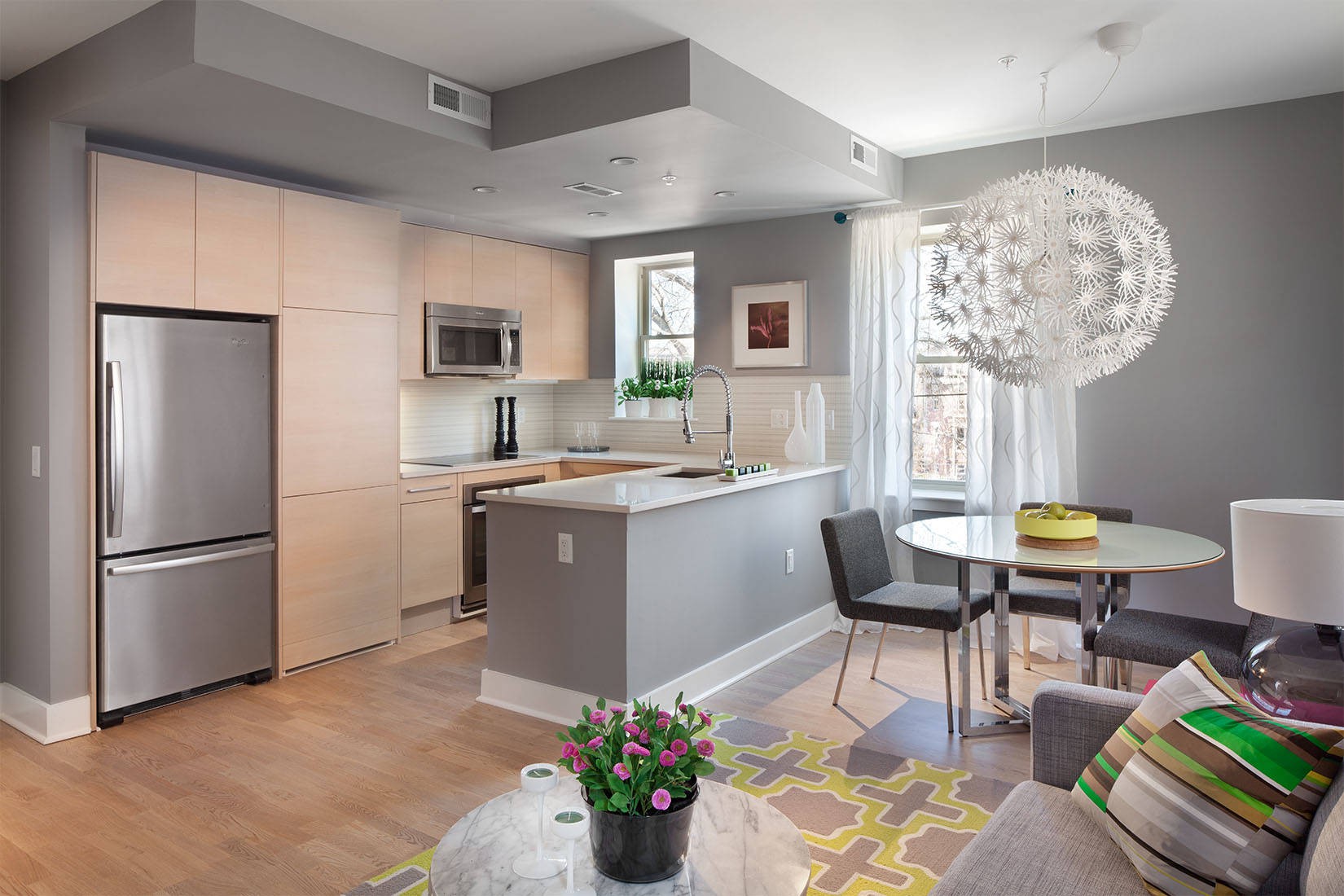
return to menu ↑Gray-white kitchen
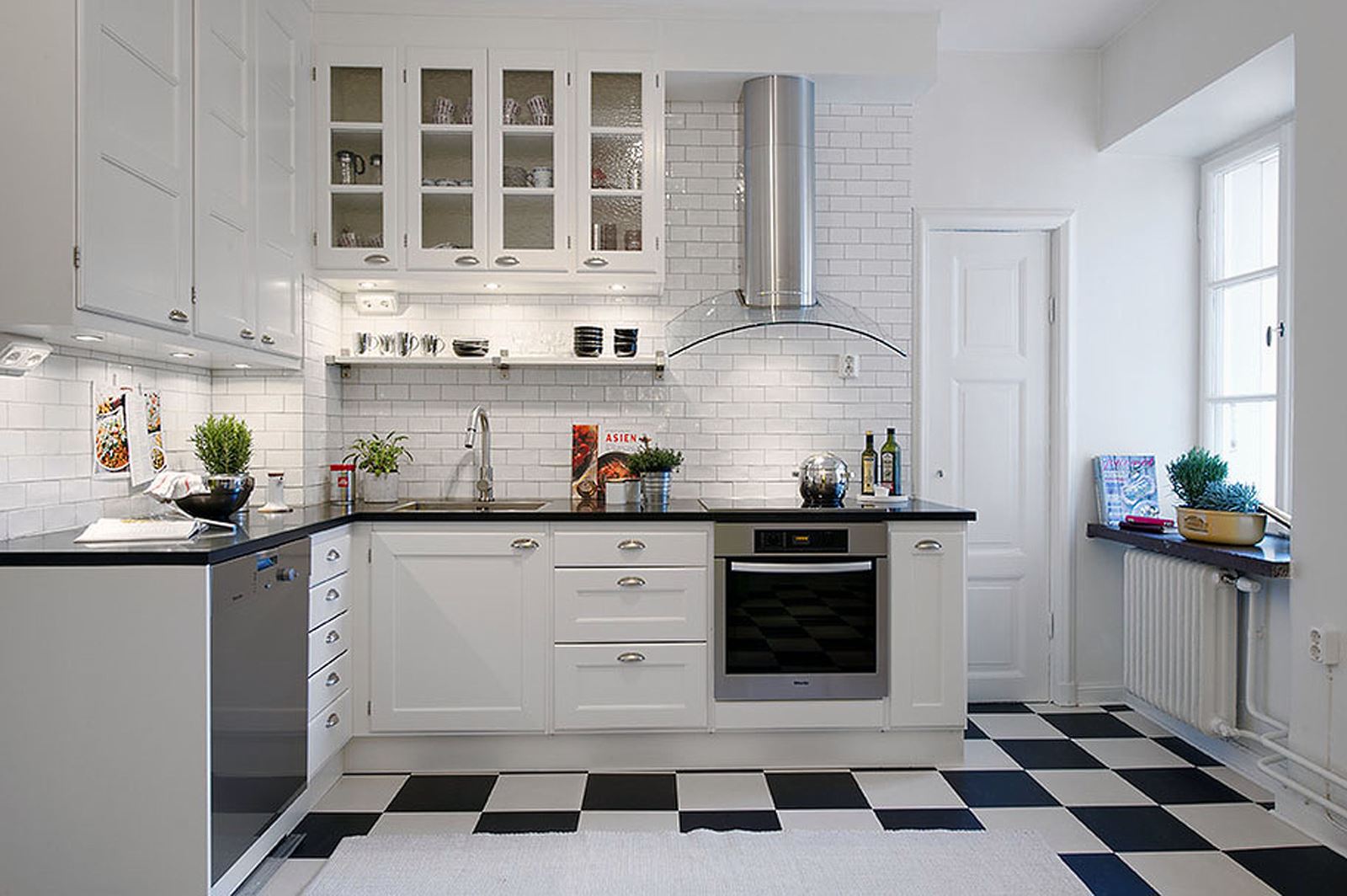
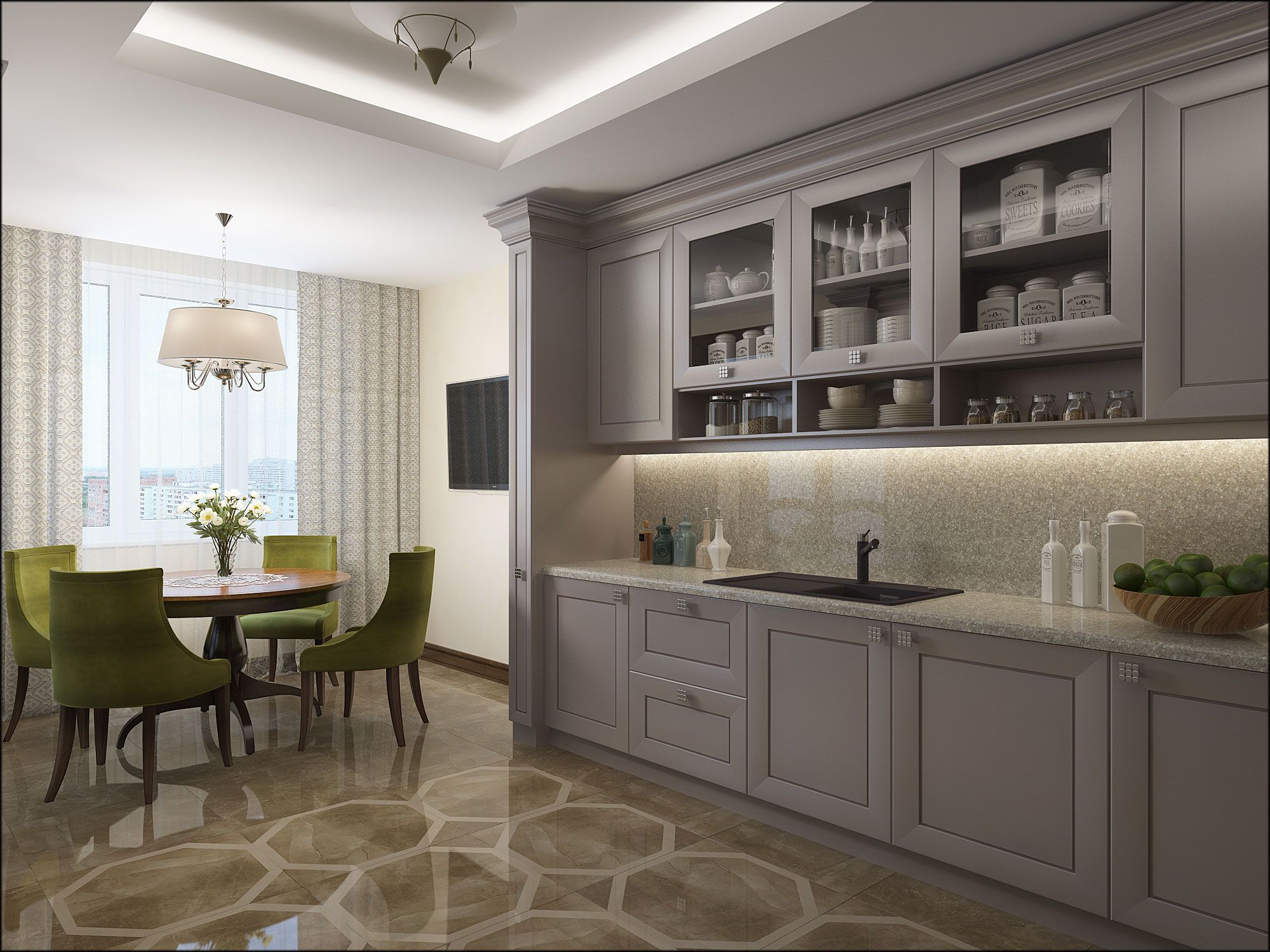
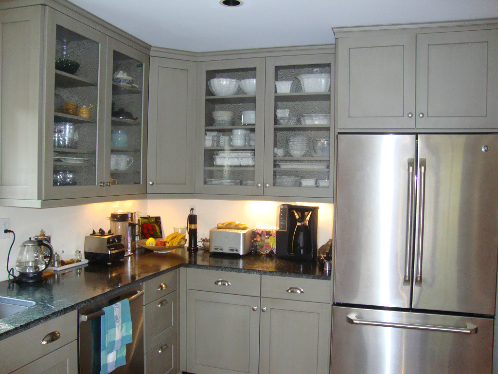
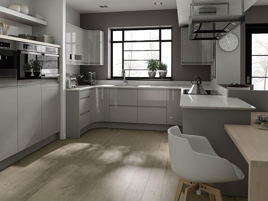
Those who prefer quiet colors and are not ready for experiments, it is best to choose a white-silver interior. One of the most important points is the choice of color for furniture. White kitchen set will create a feeling of purity, light and cool.
White gives the impression of purity.
The combination of white and gray interspersed with blue creates a spring mood. It takes us to the forest after winter — gray branches, remnants of snow and a blue sky.
Complement the picture of small details of green shades that will remind the first sprouts and snowdrops, peeking through the snow.
Those who love design more daringly can use bolder combinations. A white and silver kitchen will look beneficial on a dark purple, pistachio, saturated turquoise or orange background.
A bold decision - bright facades of several cabinets
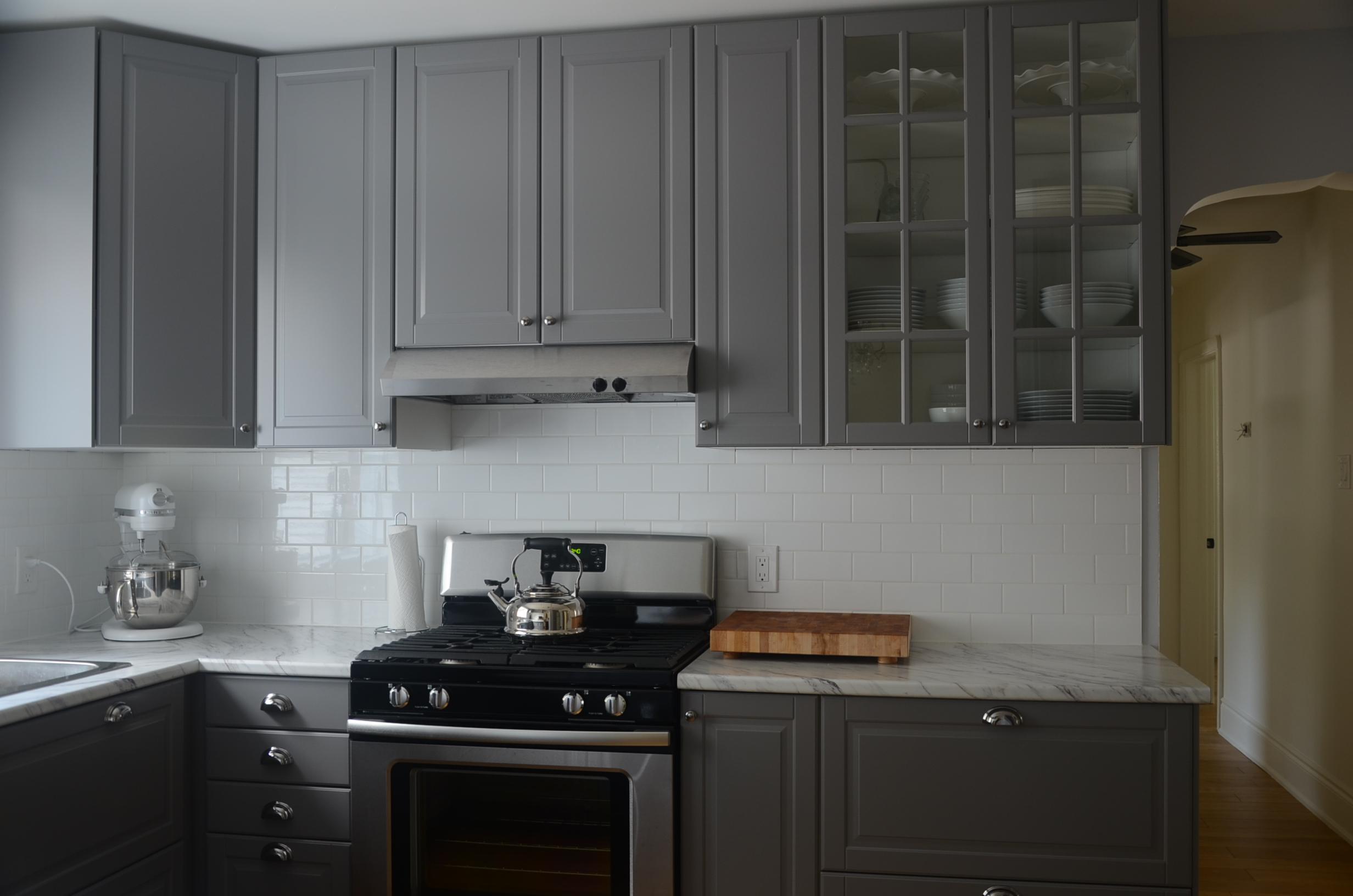
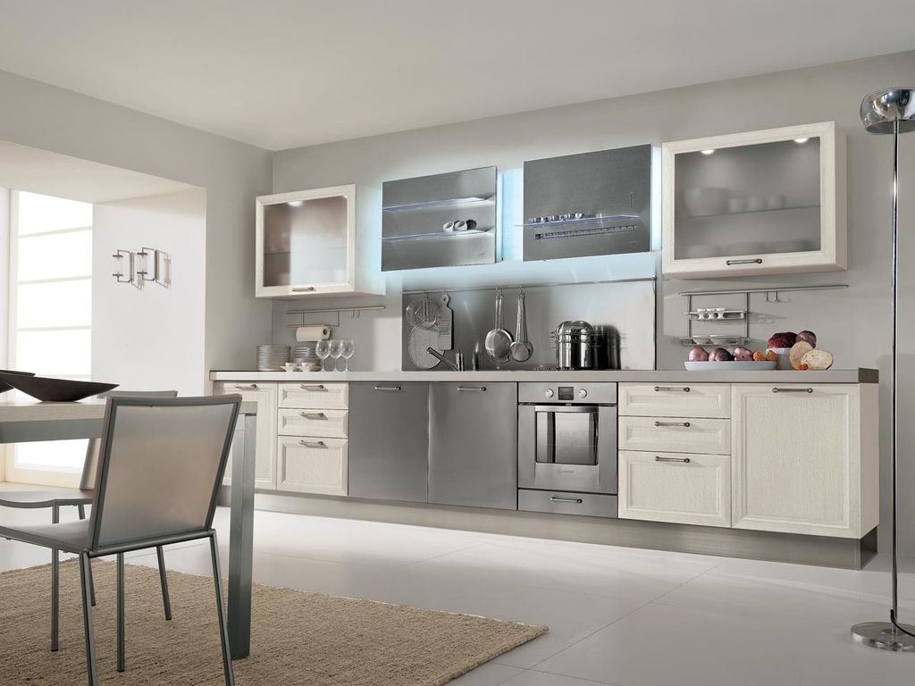
The best choice would be gray furniture with white facades.. Also interesting will be the "reverse" kitchen - a white tabletop with gray facades. At the same time, smoky can be diluted with marbles, speckles or other combinations.
The best choice is a gray kitchen with white facades.
Top cabinets are often complemented by mensols, a decorative piece that serves to unite the top of the kitchen into a single unit. For this type of room it can be white or gray.
The facades of chipboard and MDF can be done in the following versions:
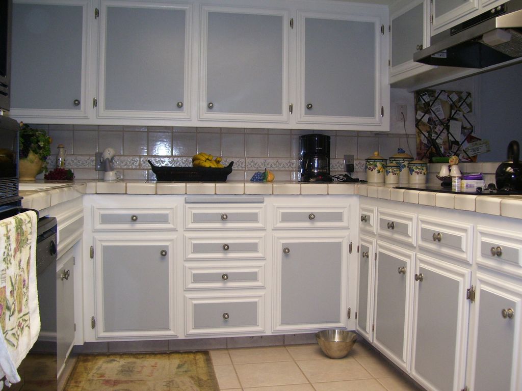
- white upper, gray lower cabinets;
- gray upper, white lower cabinets;
- part of the white, part of the gray upper and lower facades.
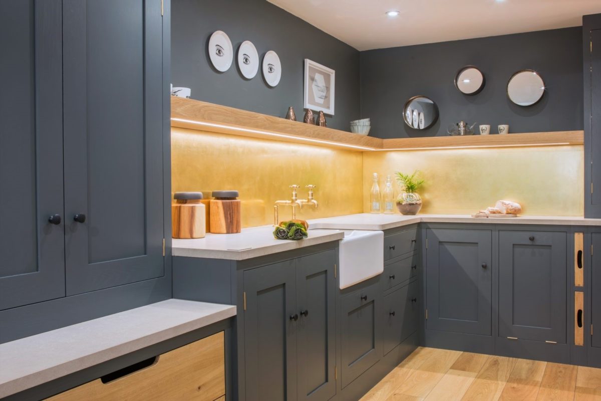
When gray is not the main, but additional
Considering the shades, it is important to think about the effect of color saturation on vision. The stronger the contrast, the faster your eyes will get tired. Especially it is worth paying attention to the part in which the “cook” spends the most time (for example, a cooking zone).
We install bright items that attract attention.
It will be interesting to you:OVERVIEW: Interior with sourness: + 135 Photos of the kitchen in yellow. We start the morning vigorously and sunny
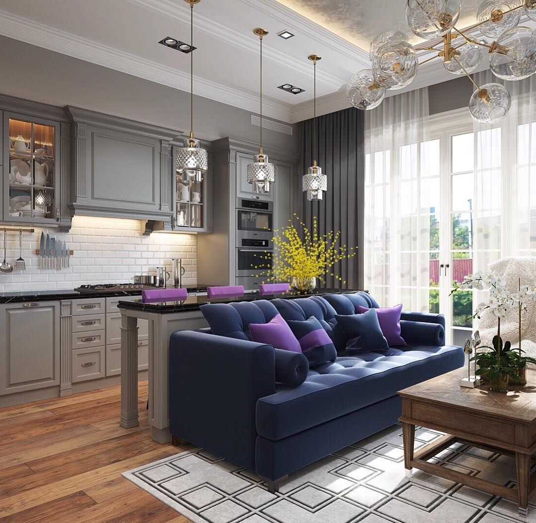
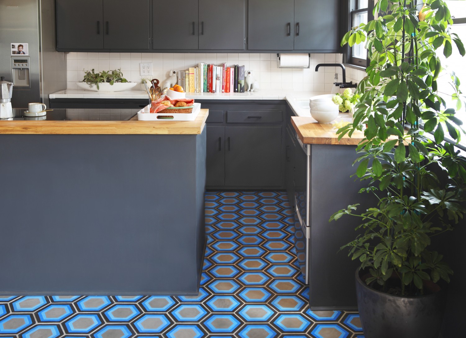
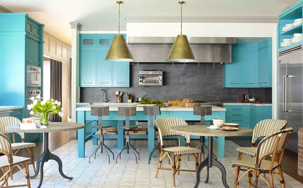
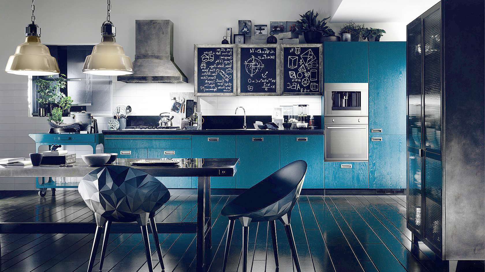
return to menu ↑Blue-gray
Blue-gray is still causing controversy among designers - some consider the combination unsuccessful, others are sure that there is nothing more stylish and original. In fact, the mouse color will act as a successful neutral background, while the blue on its background will reveal in all its glory.
Blue refers to the cold colors, so it stands out well in small rooms, significantly expanding the space. According to popular opinion, this color causes a lack of appetite, because it is chosen by individuals who watch their weight or want to lose weight. Blue tones relax, distract from problems and calm.
Blue on a gray background reveals in all its glory
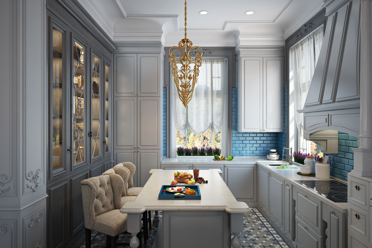
A bold combination of smoky and blue will create the right atmosphere in which it will be pleasant to cook and spend a long time with the whole family. One of the main options for wall decoration is tile. If you lay out the apron with the blue tone of the tile you like, it will magically shade the silver kitchen.
A few guidelines for registration:
- Blue, turquoise walls will look great in a room whose windows face the sunny side.
- You can shade two basic colors by adding coral or yellow to the decorations. They create a more original look and relaxed atmosphere.
- Blue finish is versatile, it looks advantageous in different styles - classic, retro, hi-tech. It is combined with materials such as ceramics, wood, metal.
Turquoise looks great on the sunny side
Do not want the room to look boring and mundane? Correctly pick up the shade of blue to the furniture:
- ultramarine;
- heavenly;
- azure;
- turquoise;
- cornflower.
Refinement and elegance
It will be interesting to you:REVIEW: Brown kitchen in the interior (120 + Photo) - Successful combinations for Smart ideas
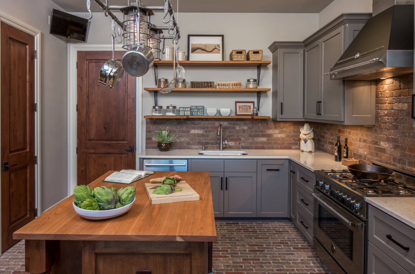
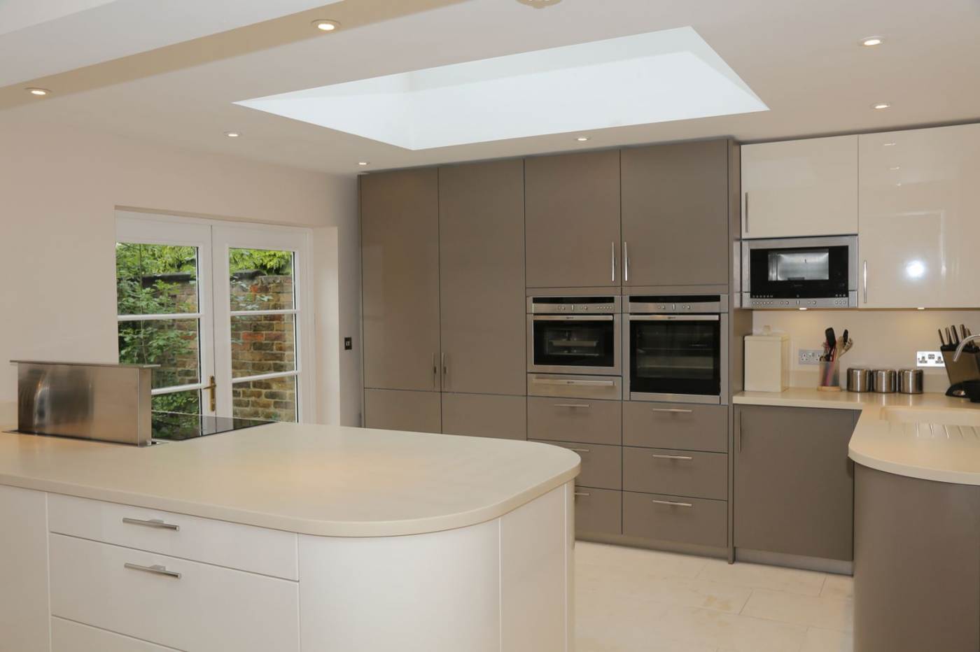
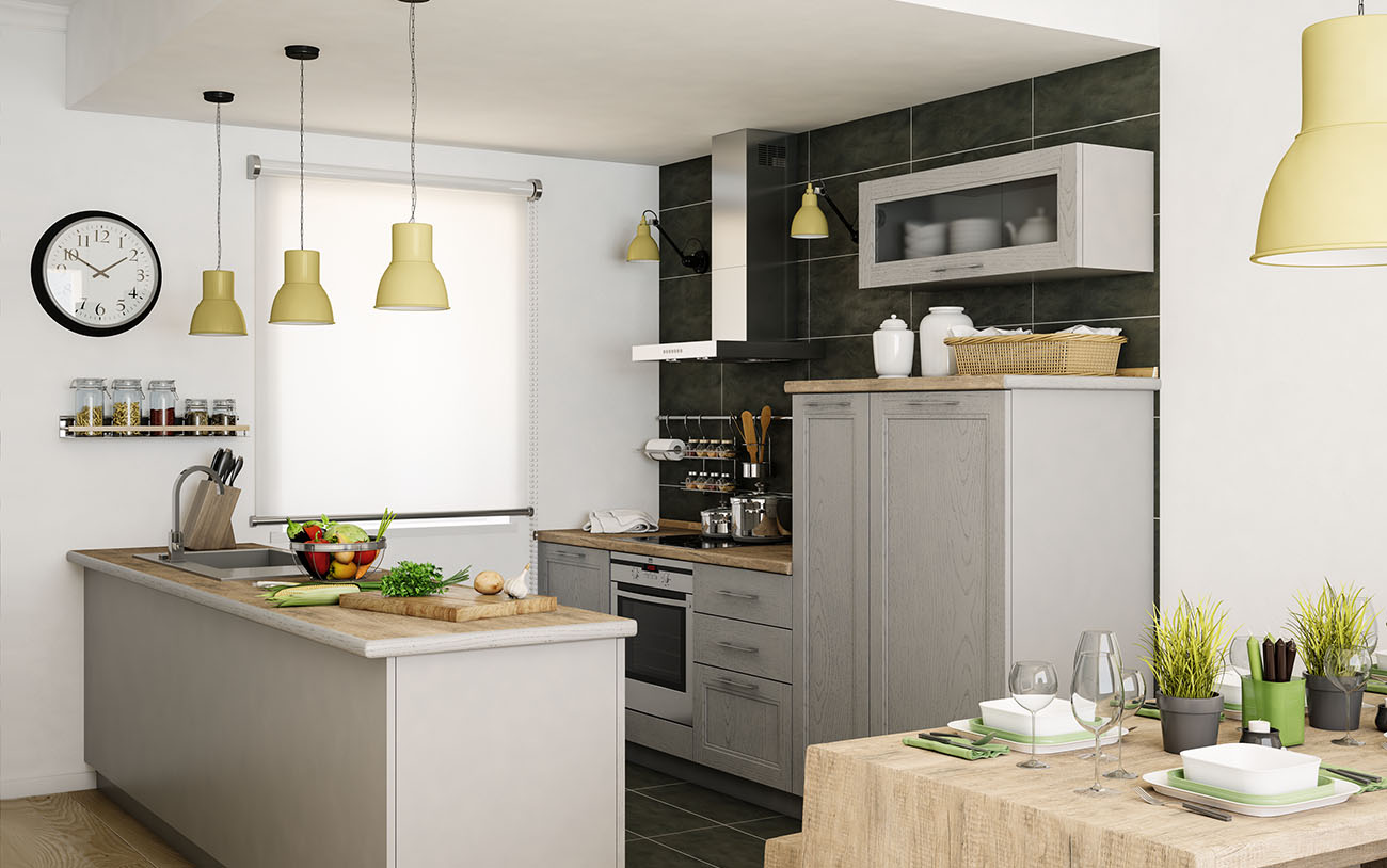
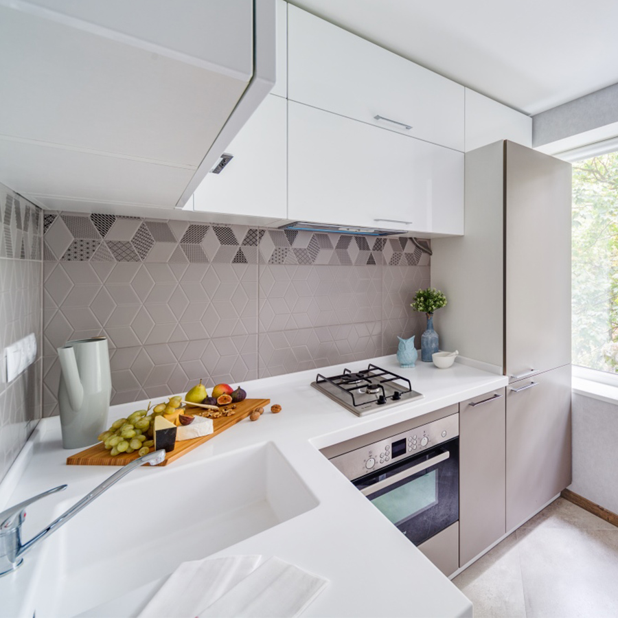
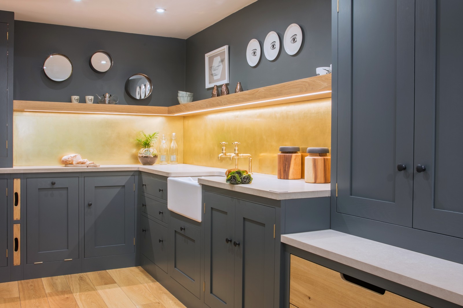
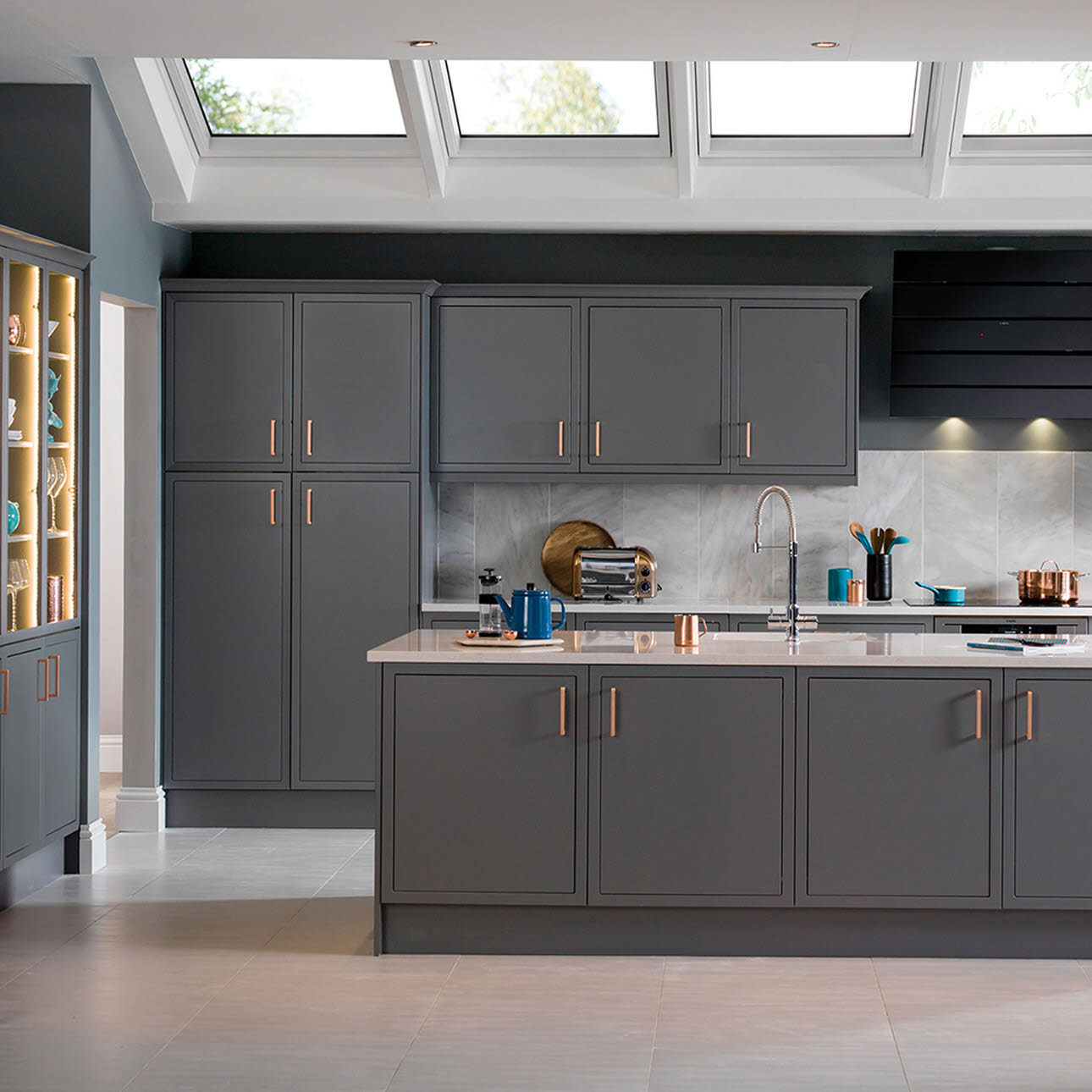
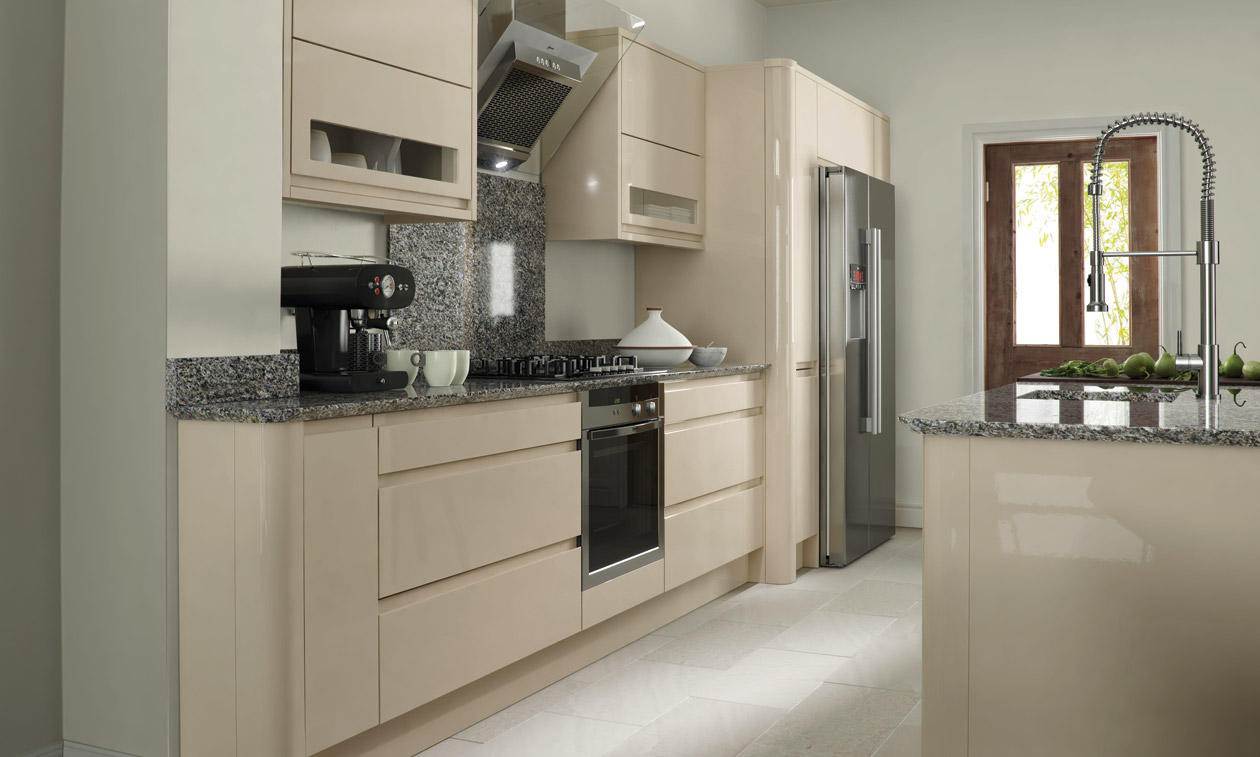
return to menu ↑Gray beige
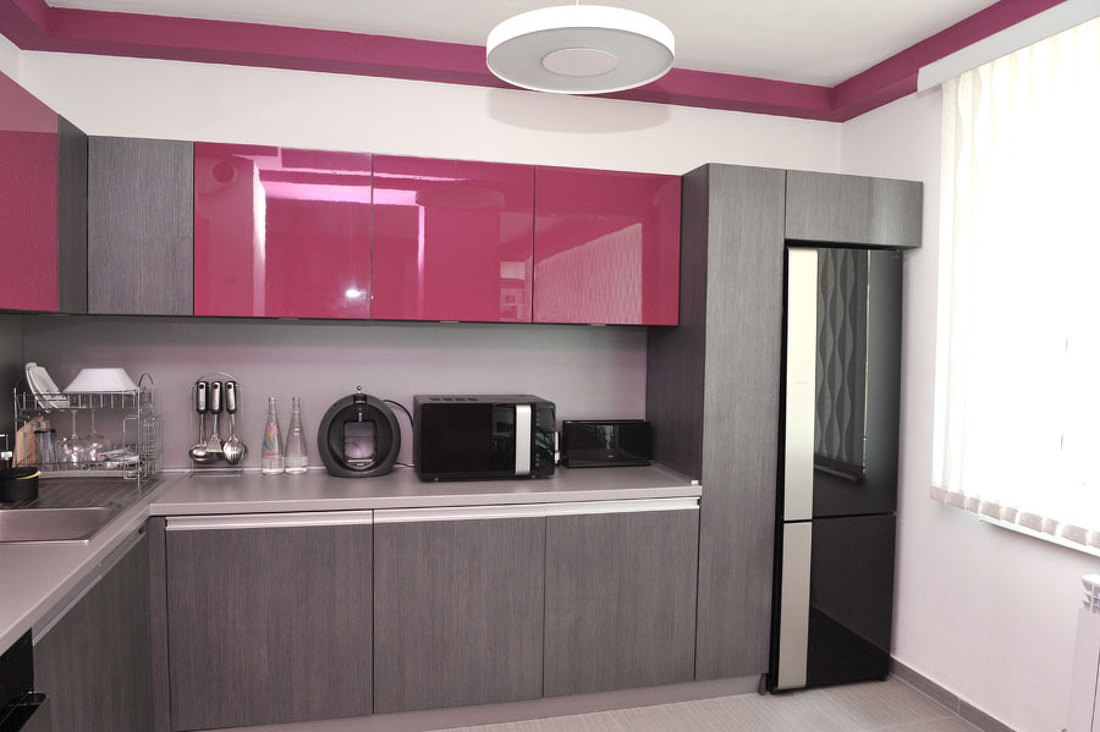
This combination can often be seen on the entire kitchen area. Smoky color can be used for wall decoration as the base color of furniture. To vary the monochrome room, you can choose a gray-metal glossy surface. Combine beige and silver with splashes of blue, green, red, yellow.
Gray with run - calm duet
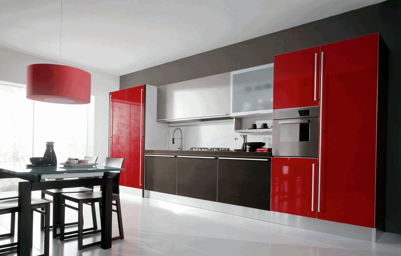
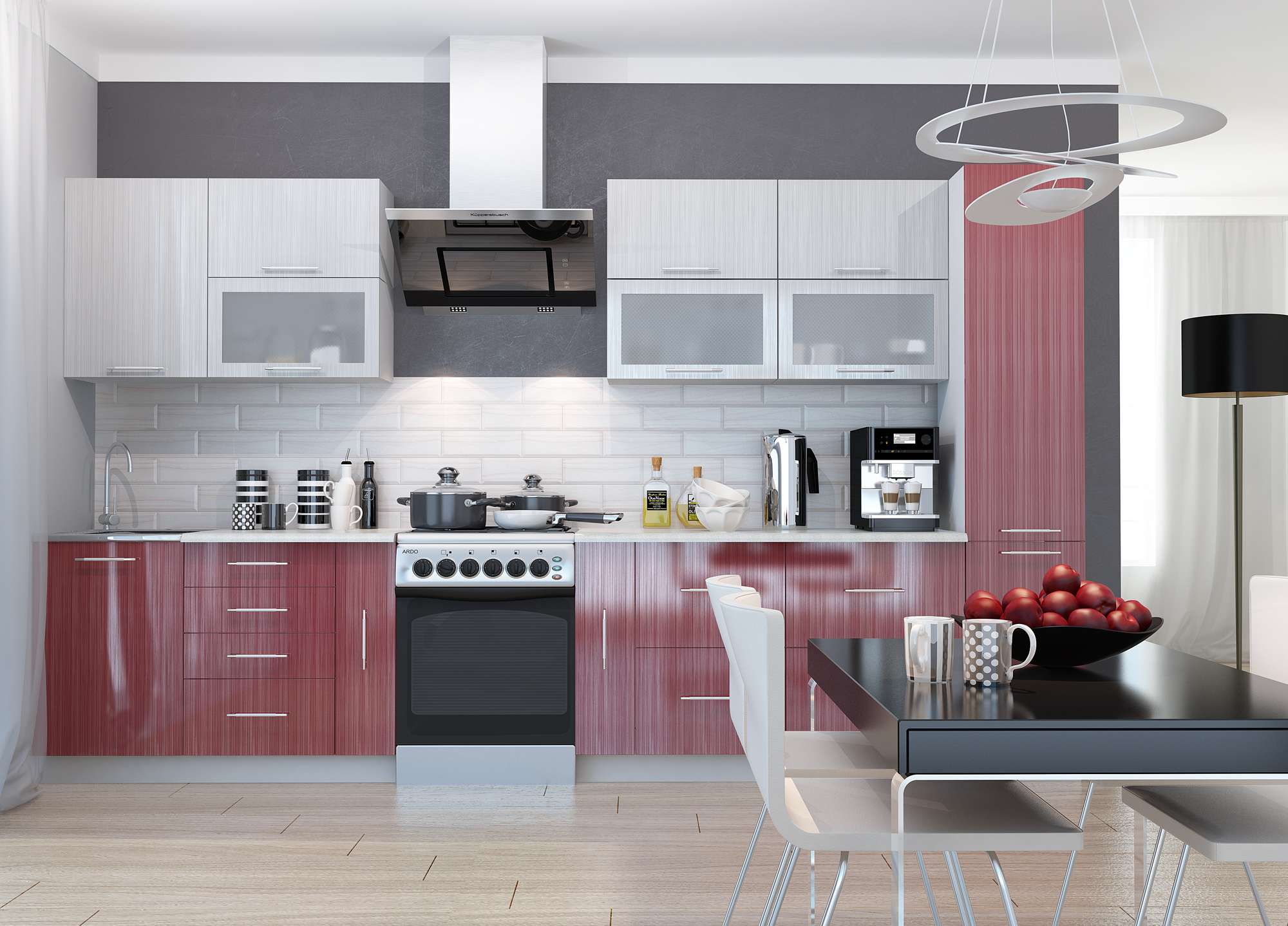
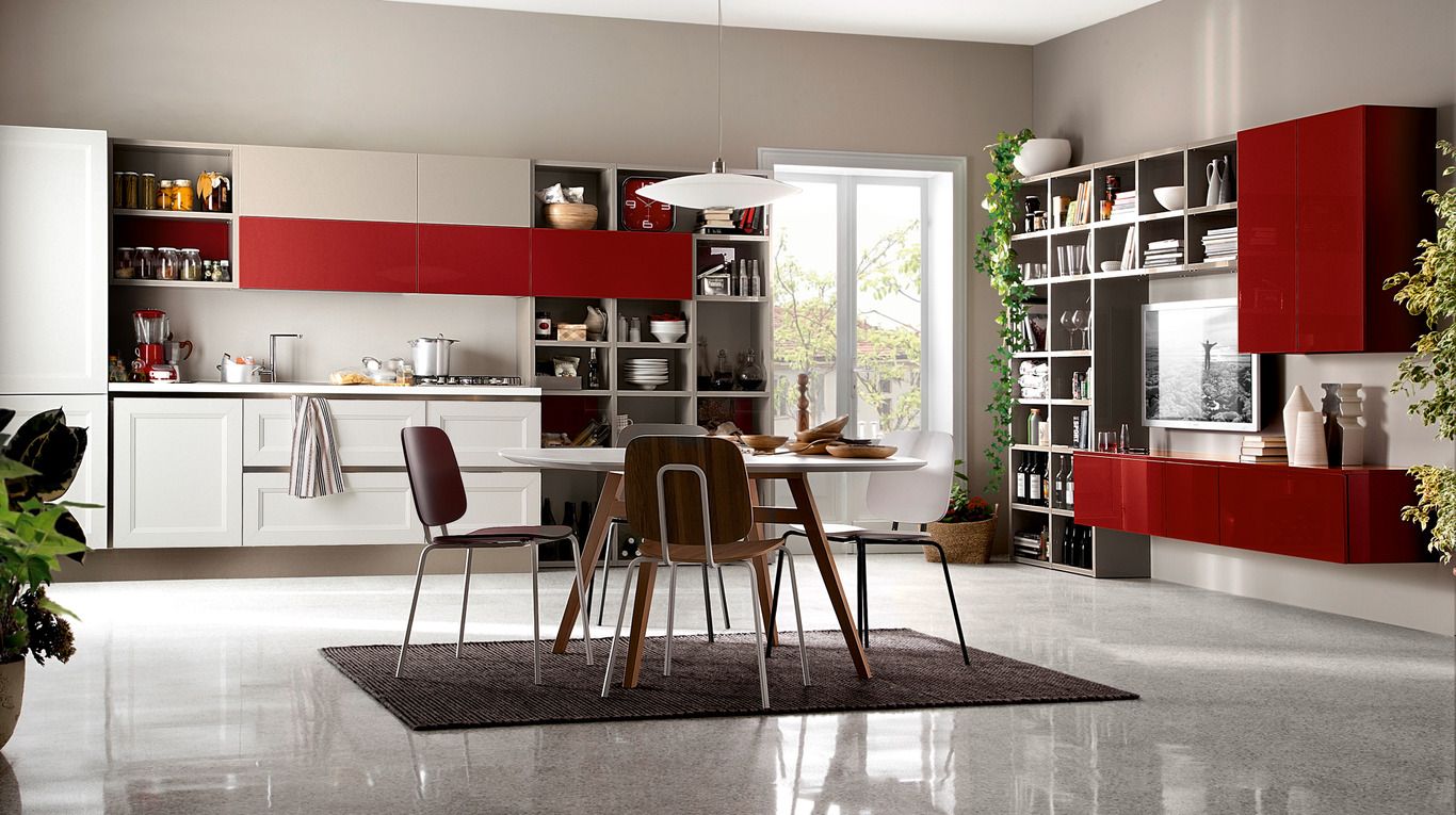
Red-gray
Noble red shades help create a luxurious kitchen decor. With the right combination with smoky color, you can create a bold style, confirm your exquisite taste.
Bold style with taste
Red is best combined with white or asphalt color. The most popular shades of red are:
- coral;
- scarlet;
- crimson;
- carrot;
- carmine;
- titian
Red facade accent
Benefits:
- Practicality - contamination in the form of fat and spray products inevitably appear in the kitchen, but red skillfully hides them.
- Originality - such a bright interior will not get bored very quickly, changing decorative elements (curtains, towels, vases) will help diversify it and add new accents.
- Positive influence - Red affects the psyche, invigorates in the morning and charges a good mood.
Very practical option
A deep smoky color with a purple subtone perfectly emphasizes red. In this combination, we advise you to choose a cold red so that the color spectrum remains correct. Beautiful tile ebb, the dominant shade of the facade, oven, refrigerator in metallic color - these are the successful accents. You can complement the design with a light smoky carpet with a long nap.
It will be interesting to you:REVIEW: The magic of color that affects our perception of the interior: Design of the Red kitchen in bright colors (115+ Photos)
return to menu ↑Curtains
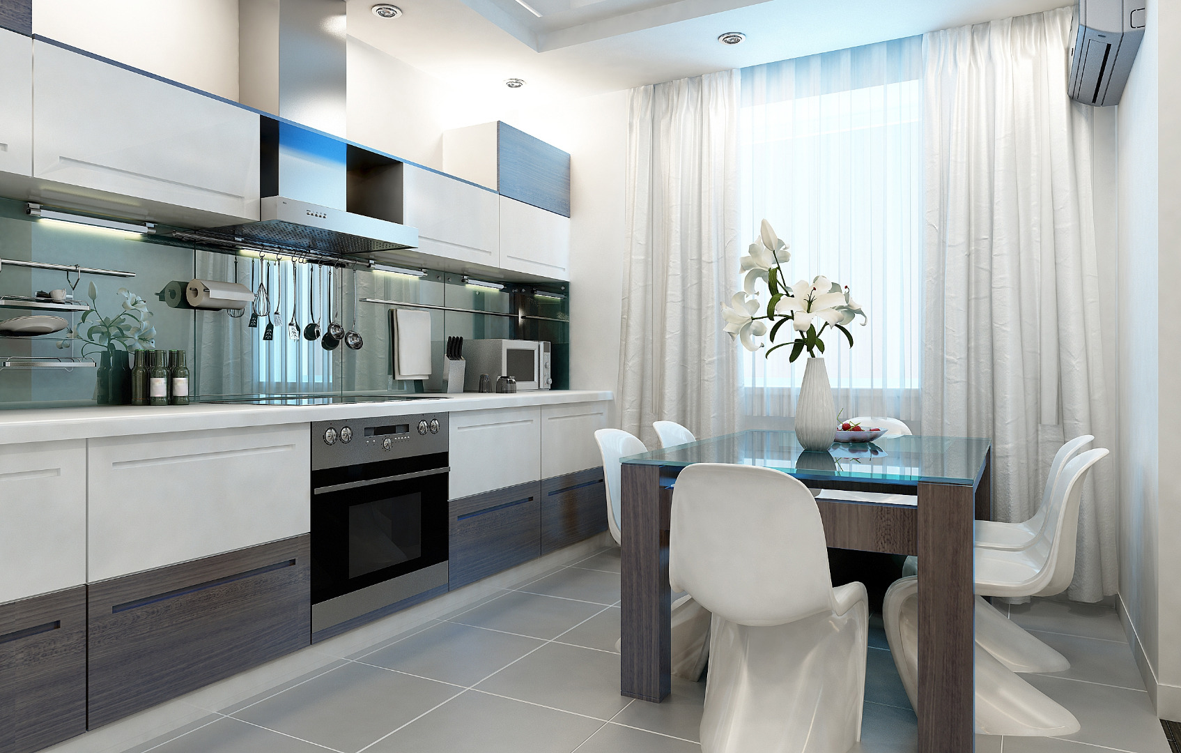
Some people consider this color as plain, boring, therefore they rarely choose curtains of this shade. However, it can be very beautiful, it is beneficial to emphasize the kitchen atmosphere. Imagine silver, pearl and gray-pink curtains - and this is not the whole list of beautiful tones!
Gray curtains should be lighter than the main background.
Grayish curtains in the interior of the kitchen - almost the perfect choice for you. They can elegantly look on a background of gray walls, shade a bright finish. There are several nuances that we advise you to consider when choosing smoky curtains:
- They should be at least two or three colors lighter than the base color of the furniture and kitchen walls.
- Well combined with a light design - the presence of white and beige shades.
- Silvery curtains will give gloss to your kitchen - surrounding surfaces will visually shine.
- Dark gray curtains can only be used with adequate lighting.
 combinations in design")
 combinations in design")
 combinations in design")
 combinations in design")
The strict elegance of this color will skillfully emphasize the overall style of the room. Do not be afraid of gray - its versatility will help you in creating the interior of a dream.
return to menu ↑VIDEO: Beautiful interiors of gray kitchens
Gray kitchen
Gray color in the interior