Choosing a combination of colors for the interiors for the photo, you can qualitatively transform the space of the room, update the design.
Content:
Basics of color combinations
The combination of colors is desirable to choose using the color wheel, which includes the main additional and auxiliary colors. Designers have developed many techniques for combining them, the use of various schemes. You can use:
- monochrome;
- adjacent;
- contrast;
- triadic.


Monochrome interiors assume the use of monochromatic color schemes where different shades of the same color are used. Due to the smooth transition of colors, the interior always turns out to be calm and soft, giving peace of mind. This option can always be diluted:
- white;
- black
- silver flowers.
Adjacent colors are those that are located in the adjacent color wheel. But one of the colors should be dominant, and the second should be used for accentuation. Such combinations create a relaxed and harmonious atmosphere.


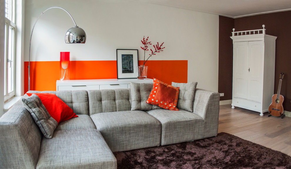
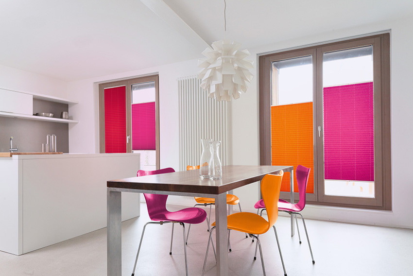
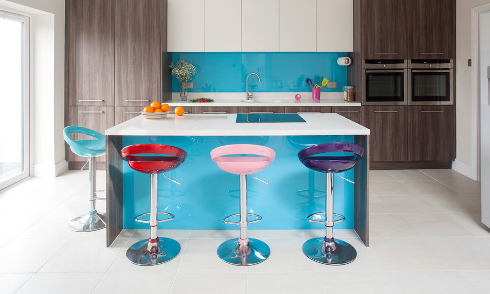
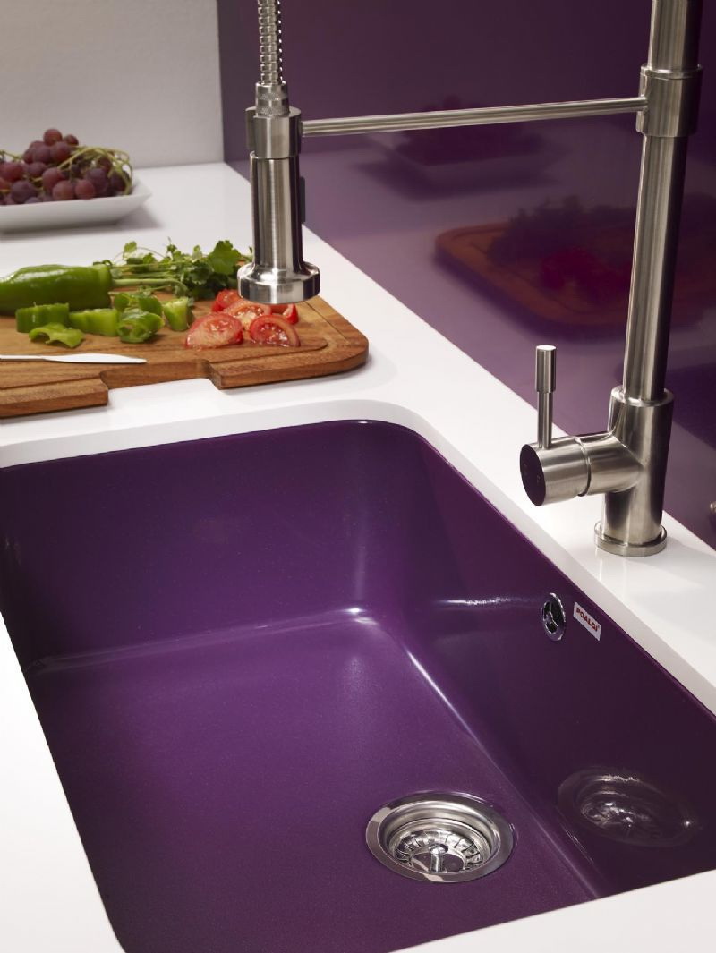
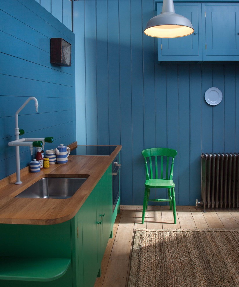
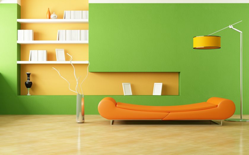
Contrasting consists in using spectrally opposite shades, for example:
- blue and orange;
- red and green;
- yellow and purple.
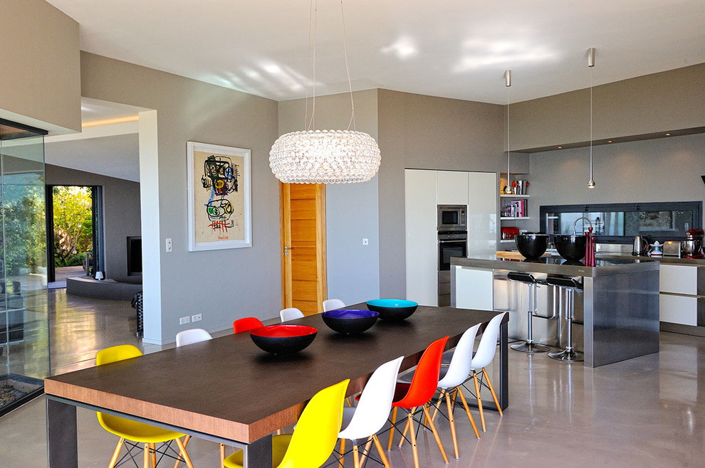
Such combinations are very bold. The finished interior is always bright and extraordinary, but can quickly get bored. Therefore, these combinations are best embodied in the details, which, if desired, will be easy to change.
The triad scheme is a combination of three colors of the color wheel that are at the same distance from each other. Of these, you need to choose one main rest will be auxiliary.


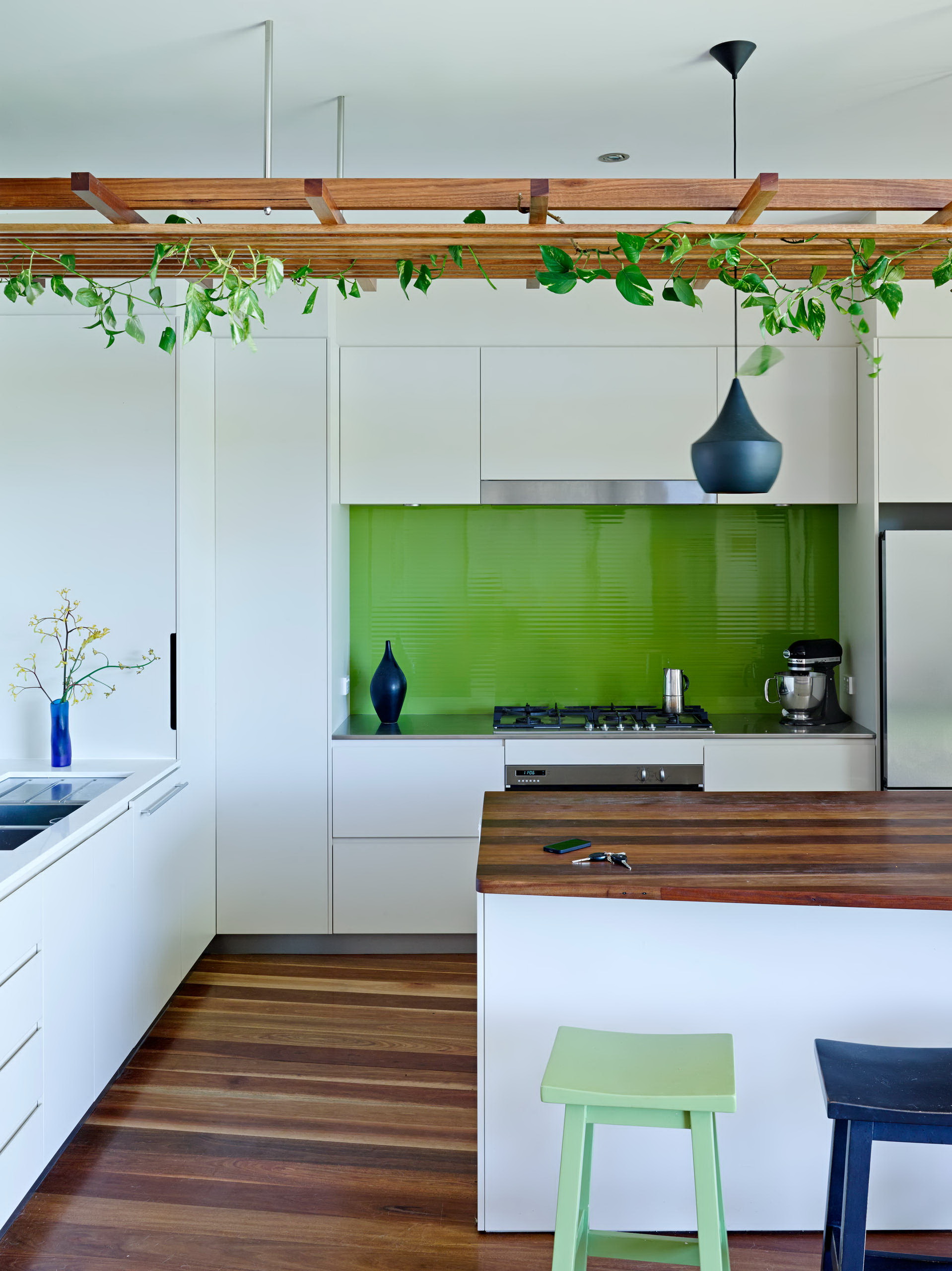
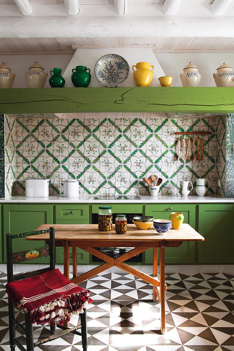
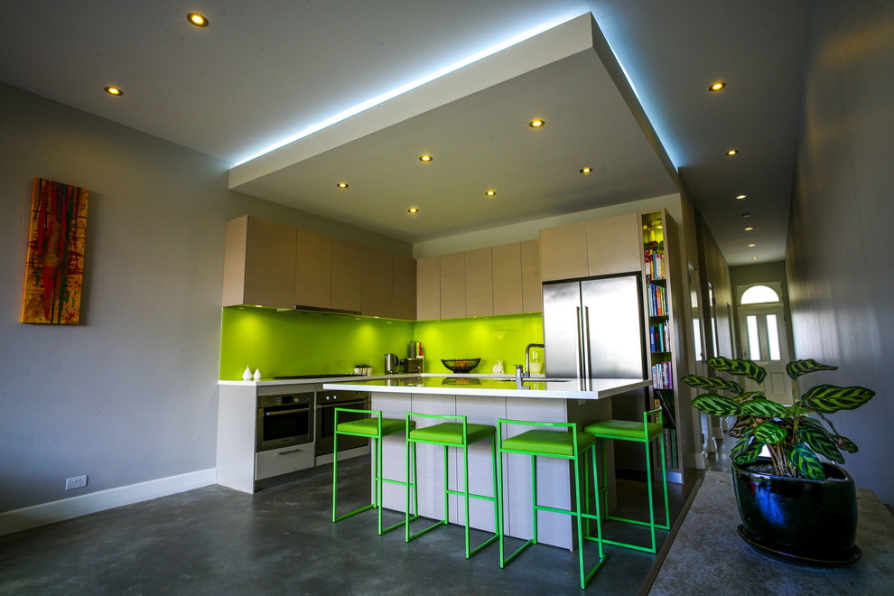
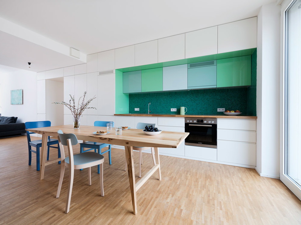
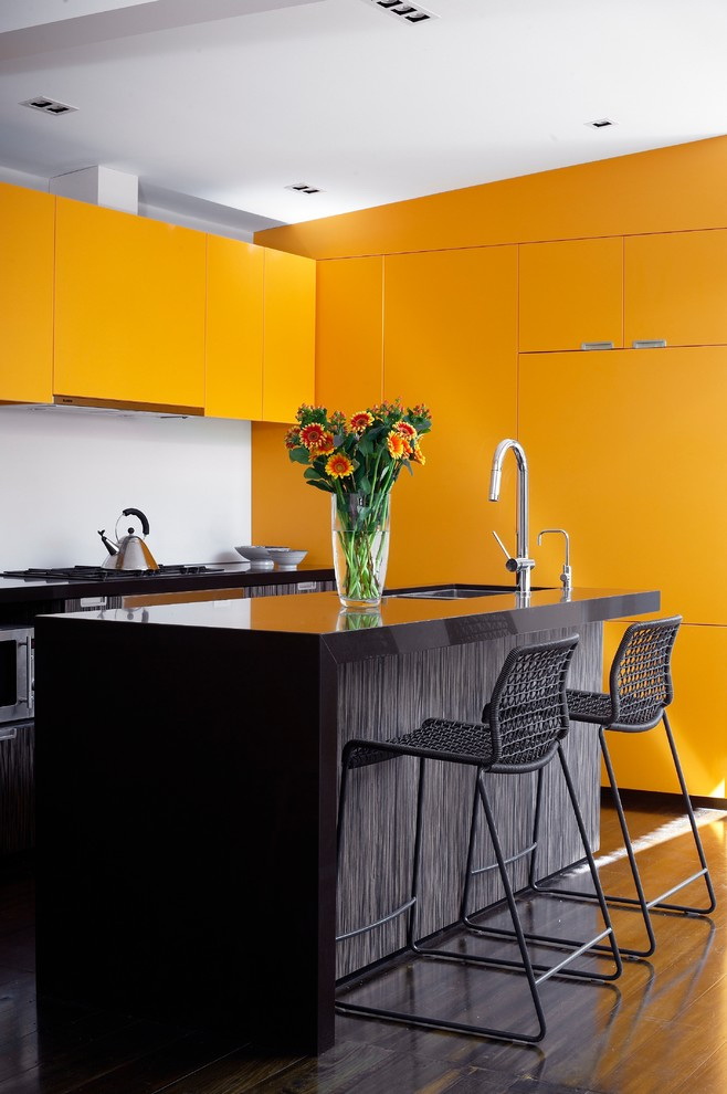
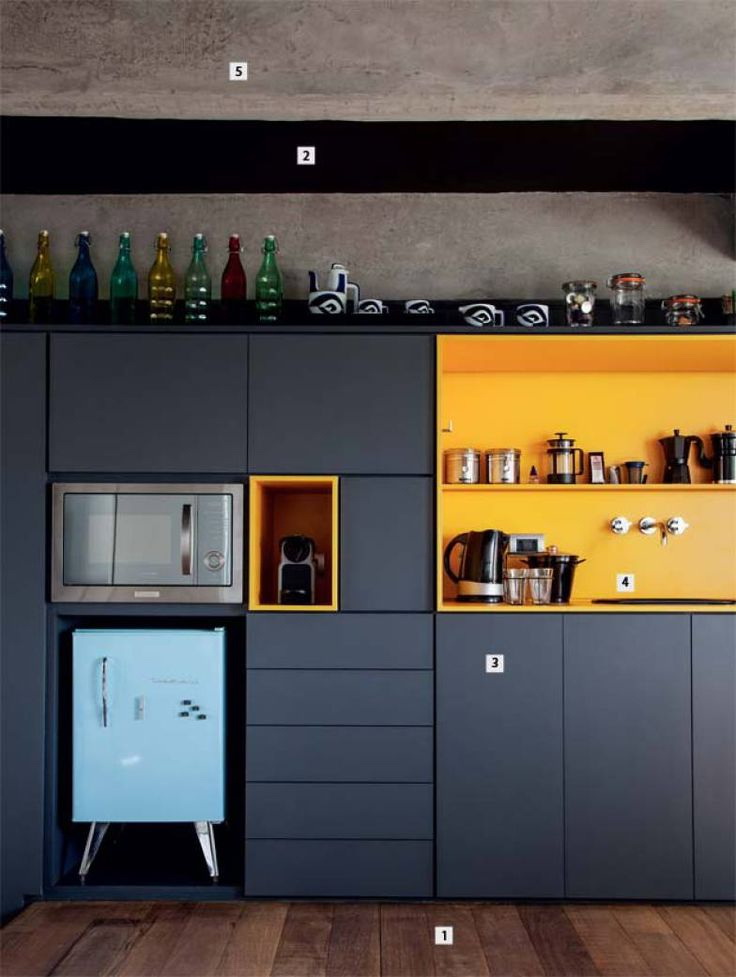
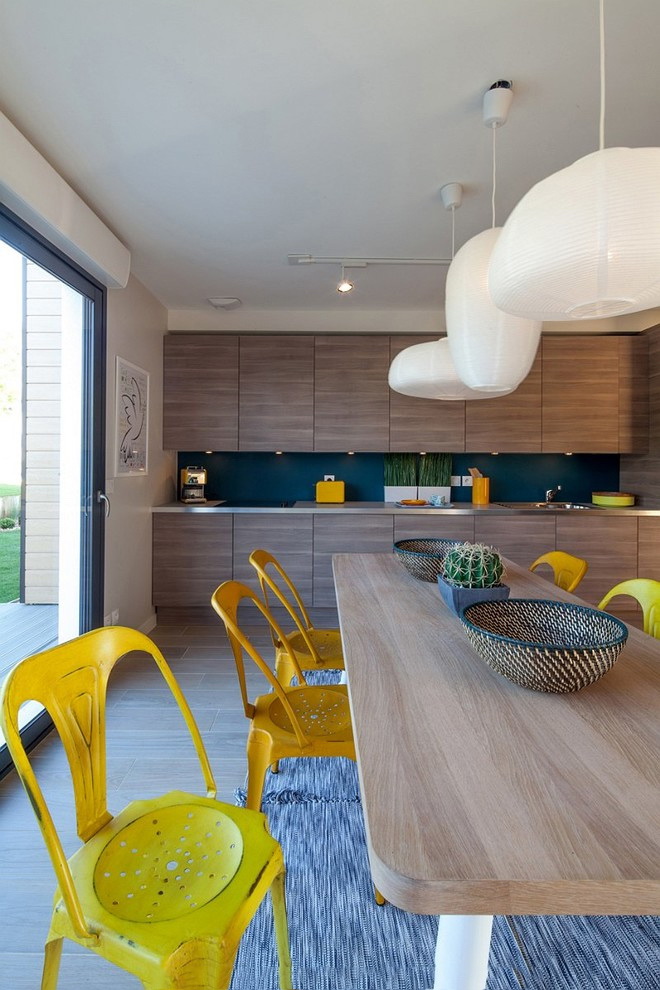
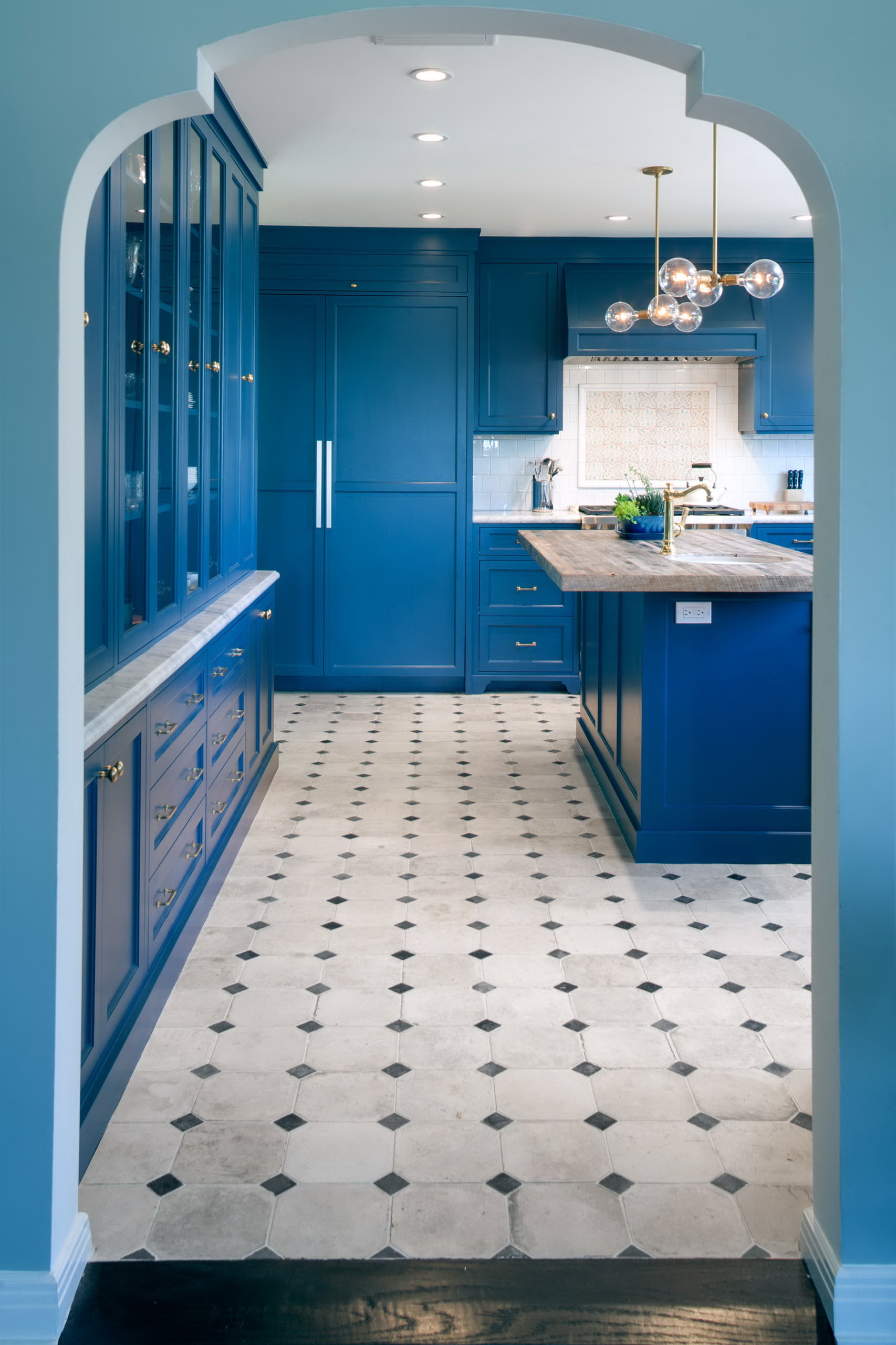
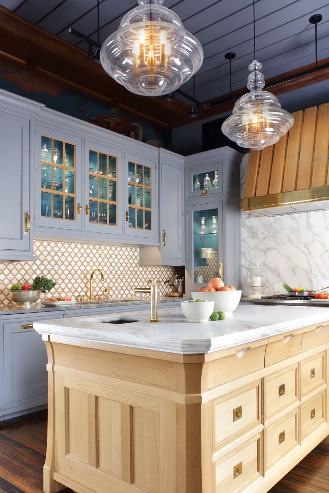
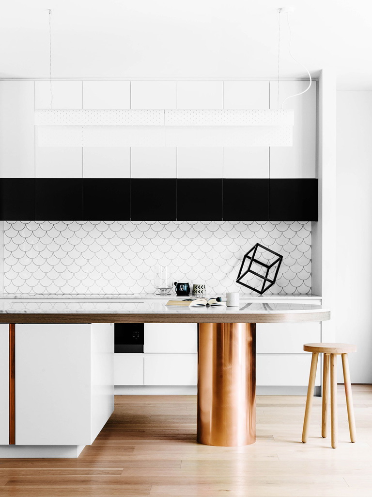
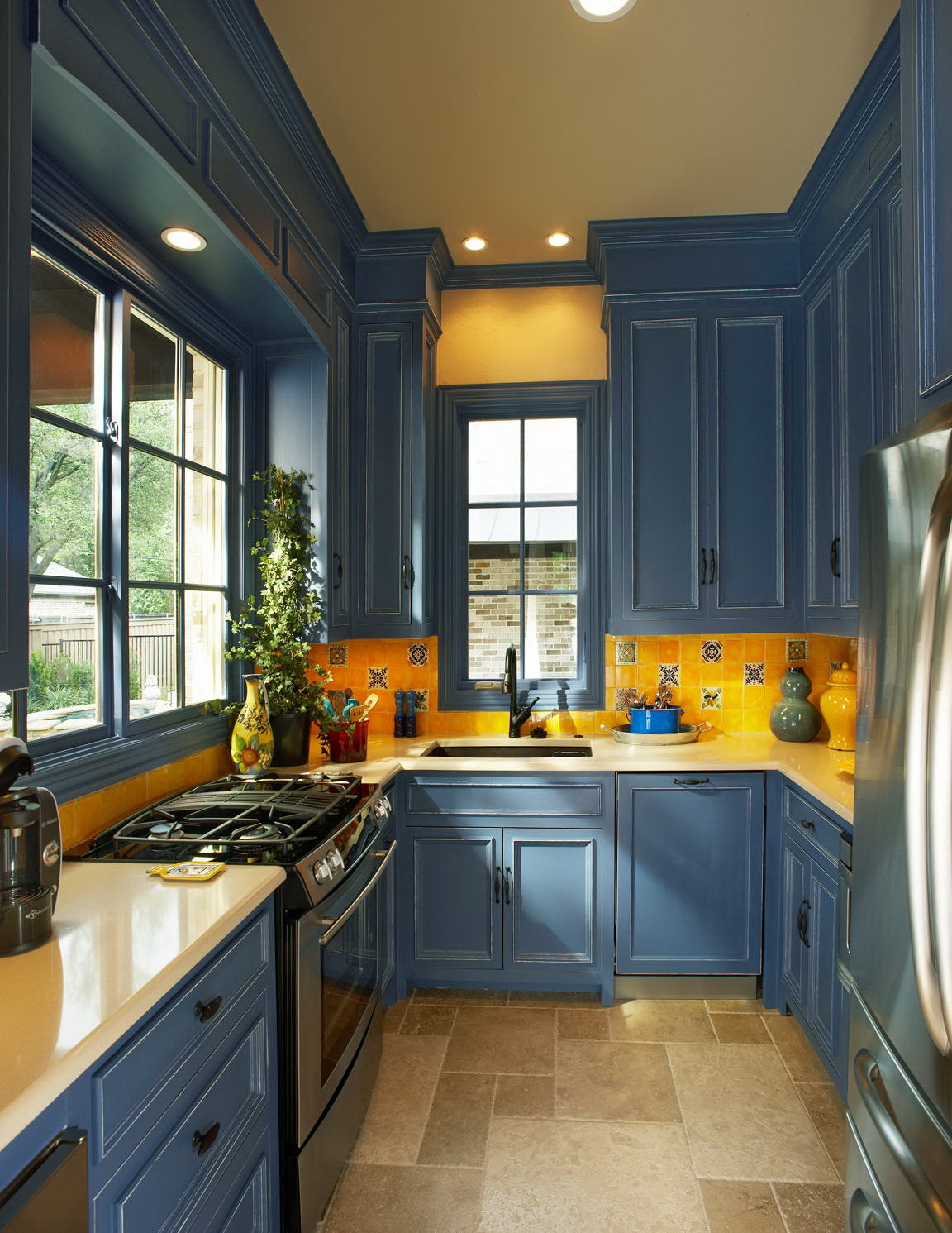
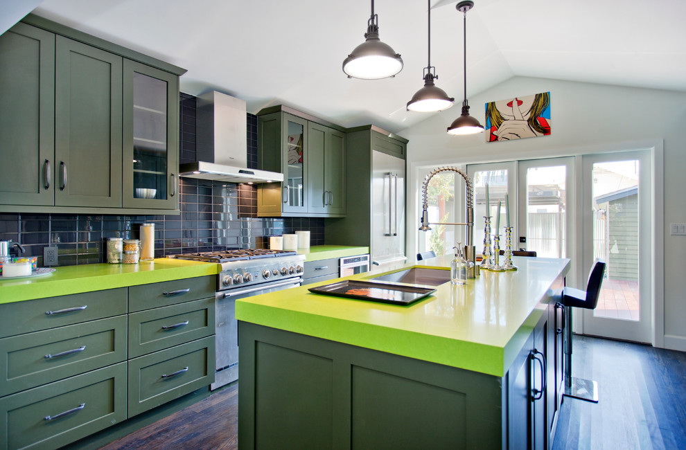
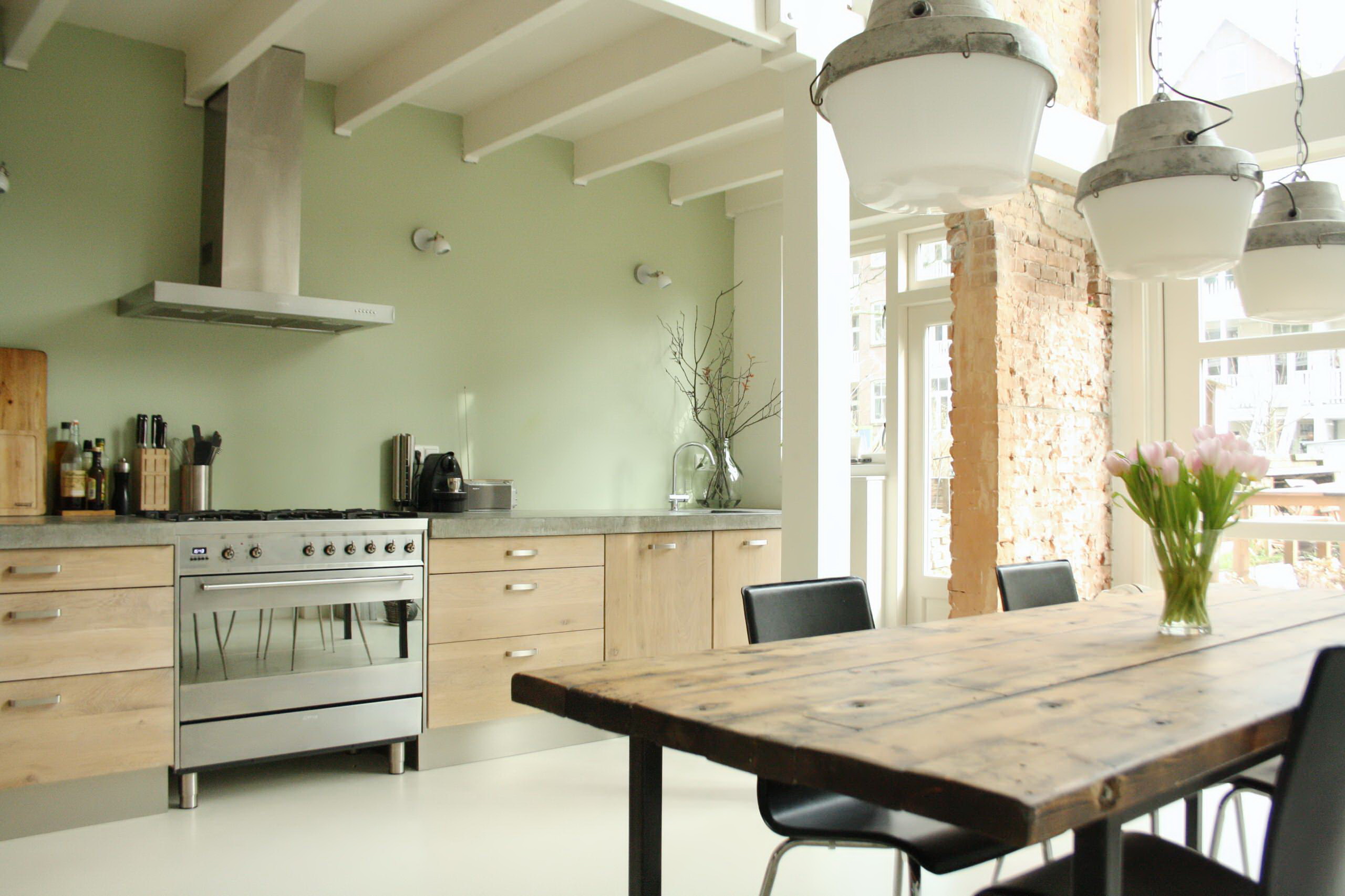
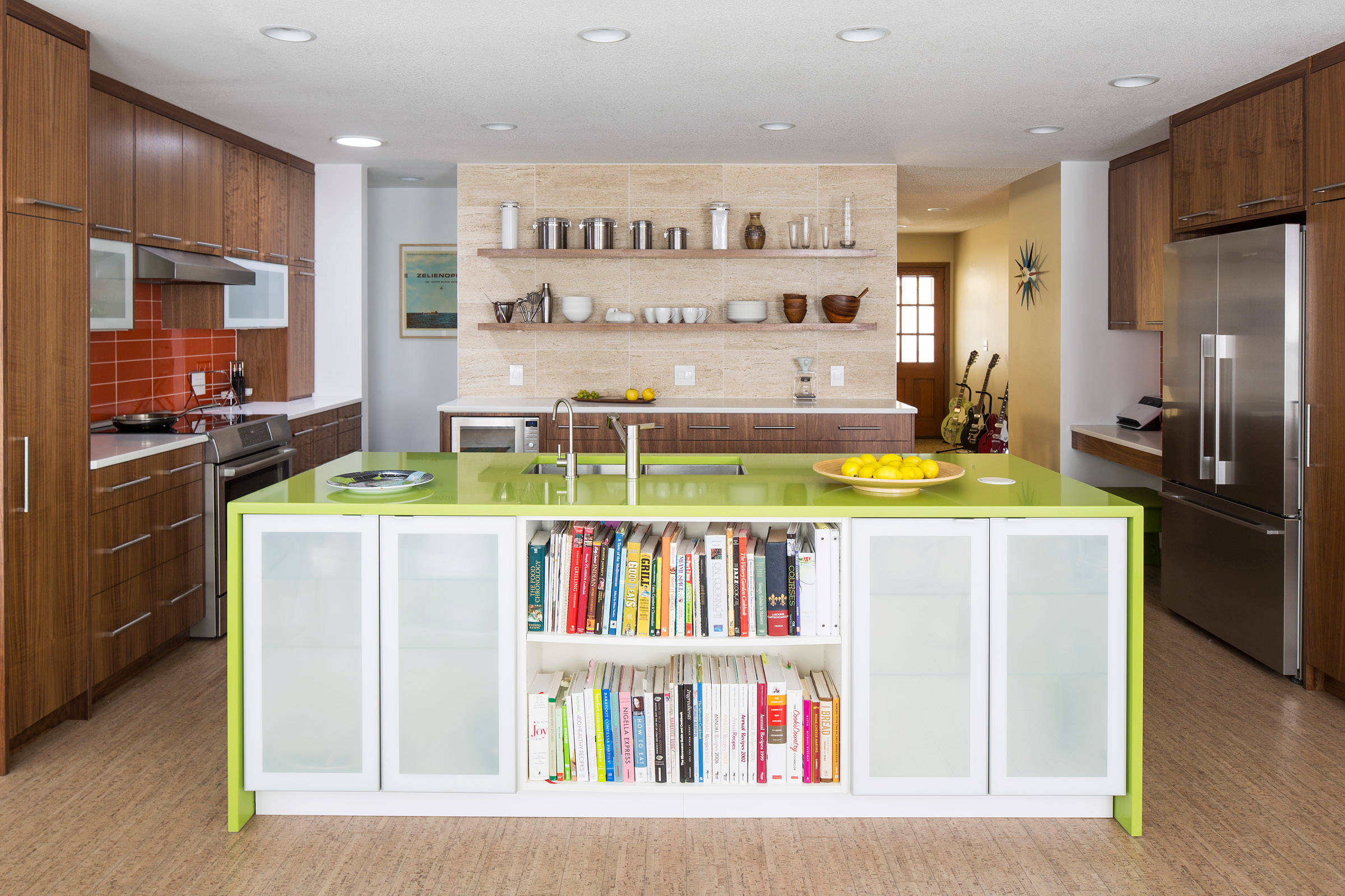
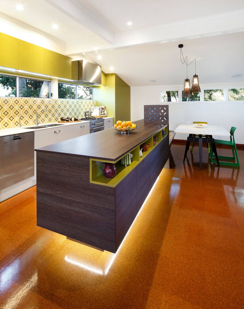
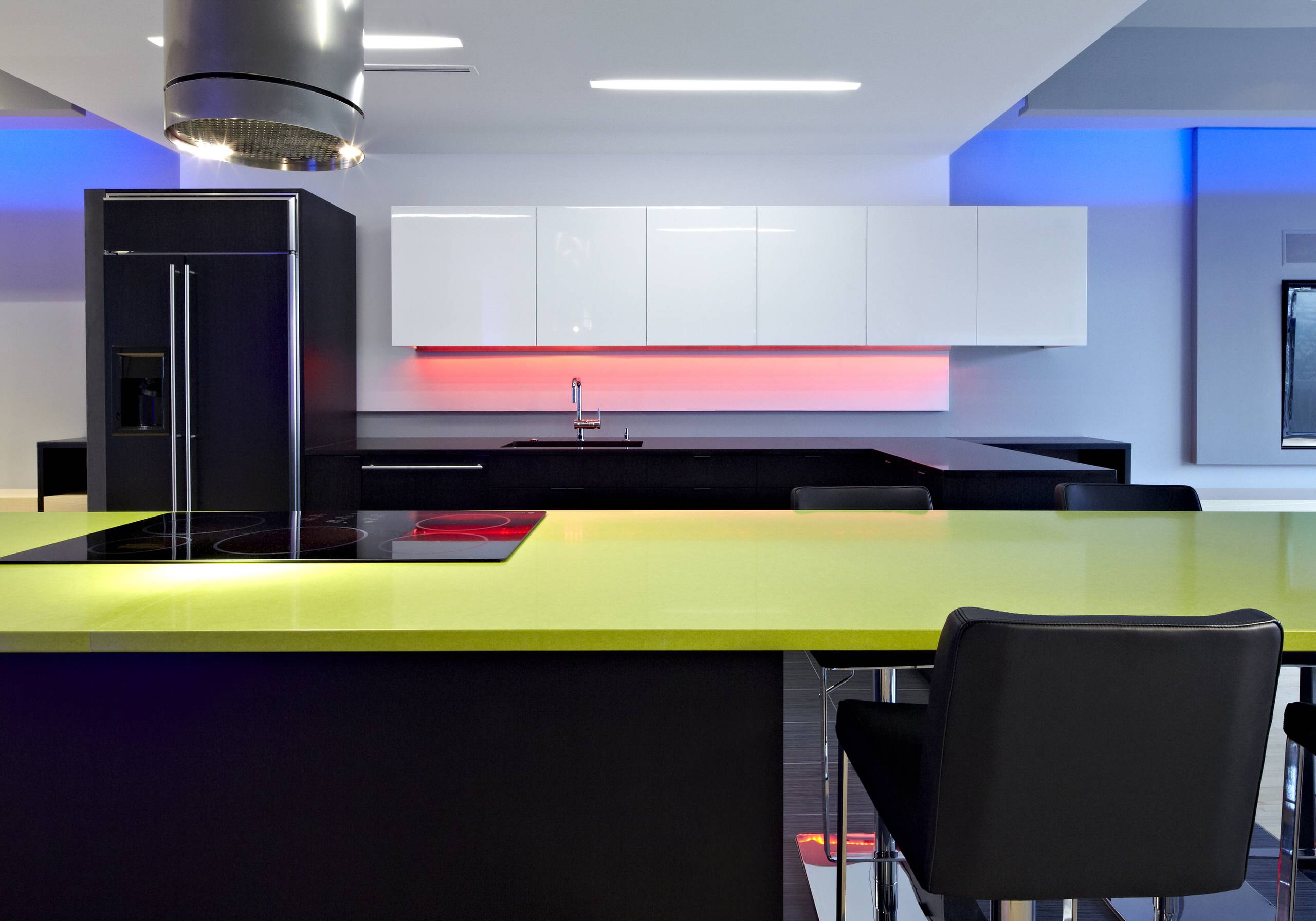
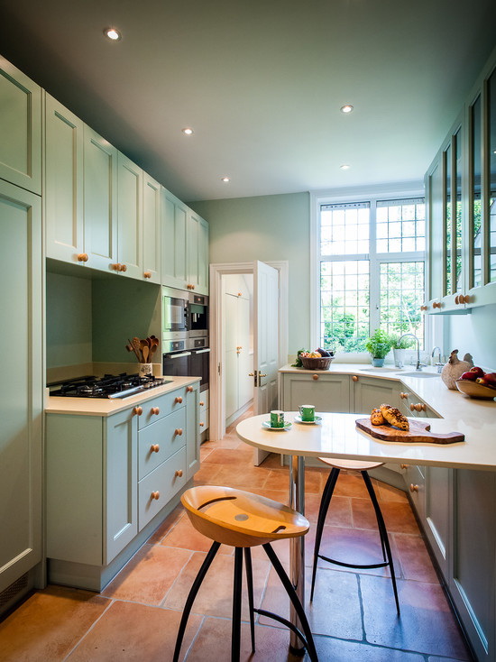
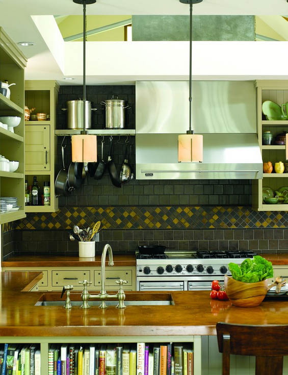
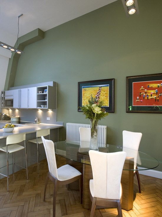
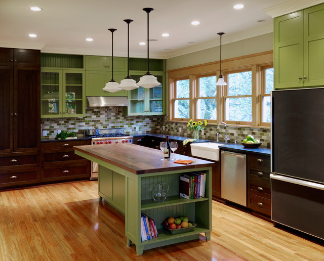
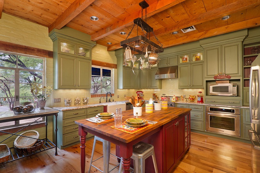
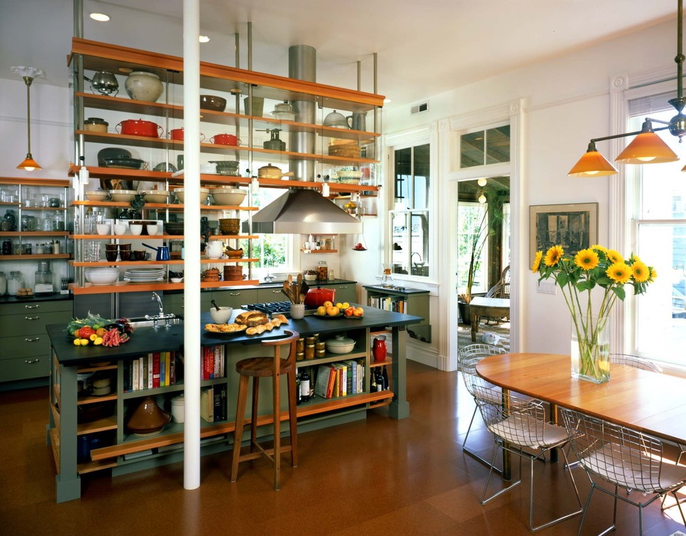
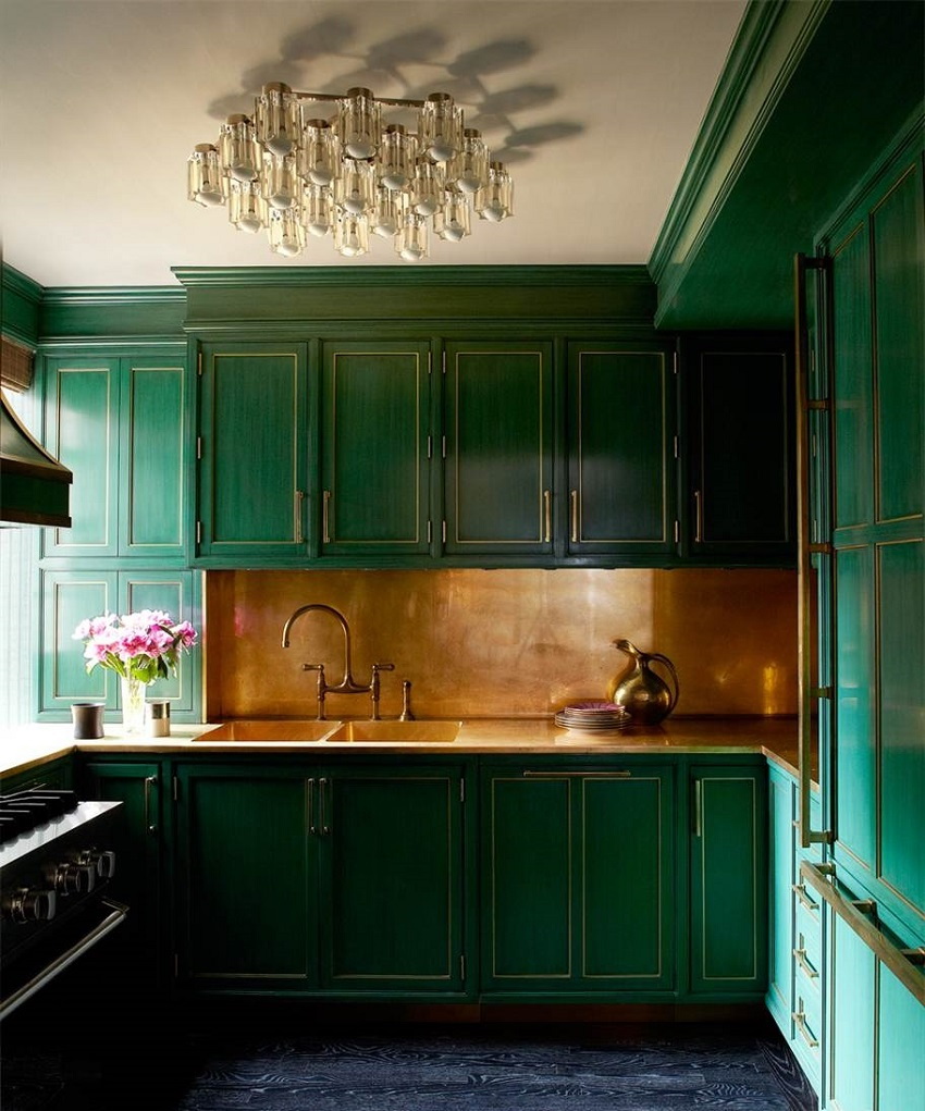
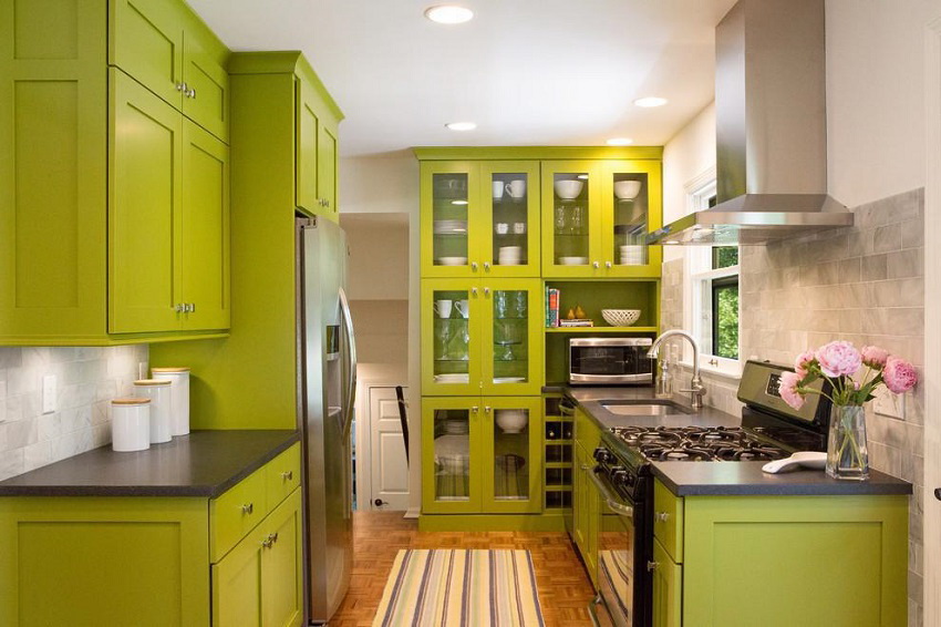
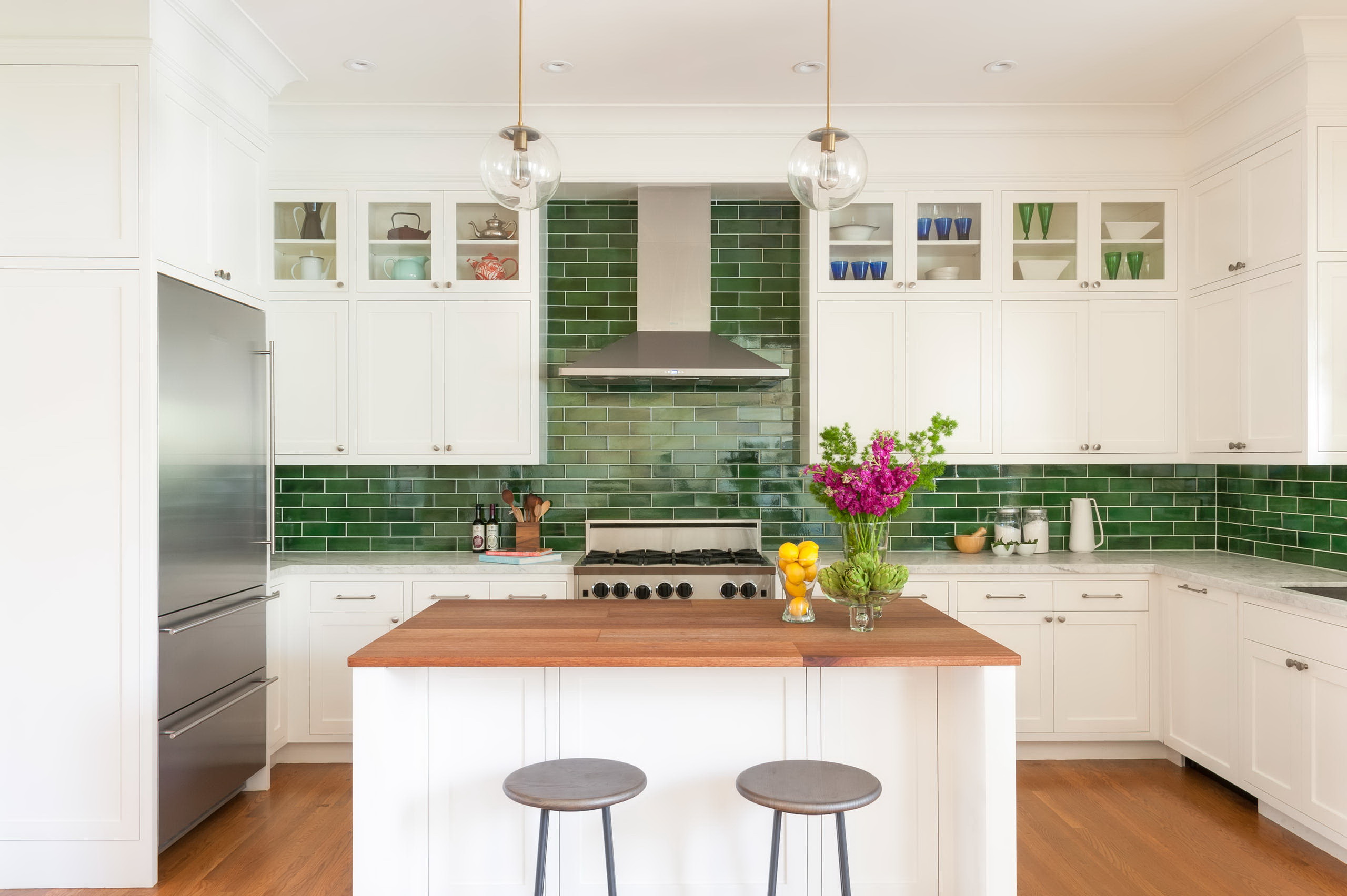
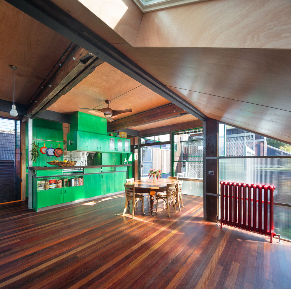
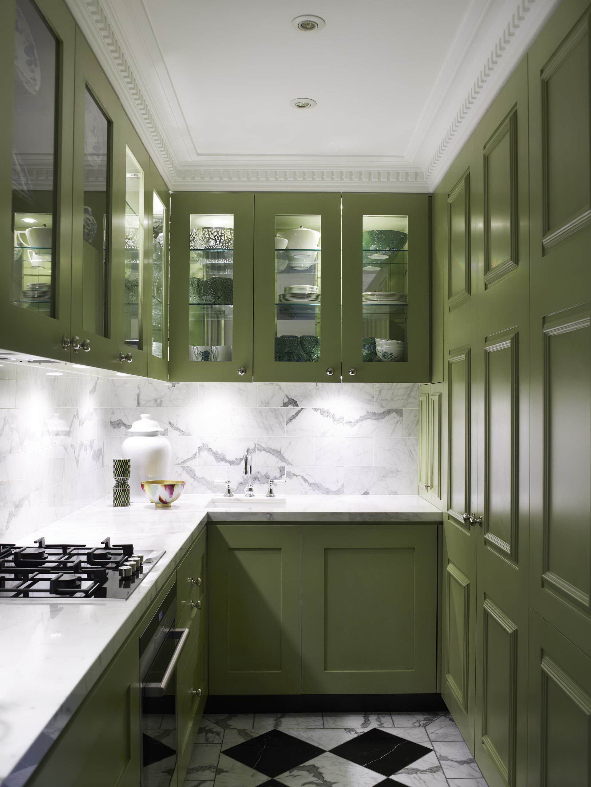
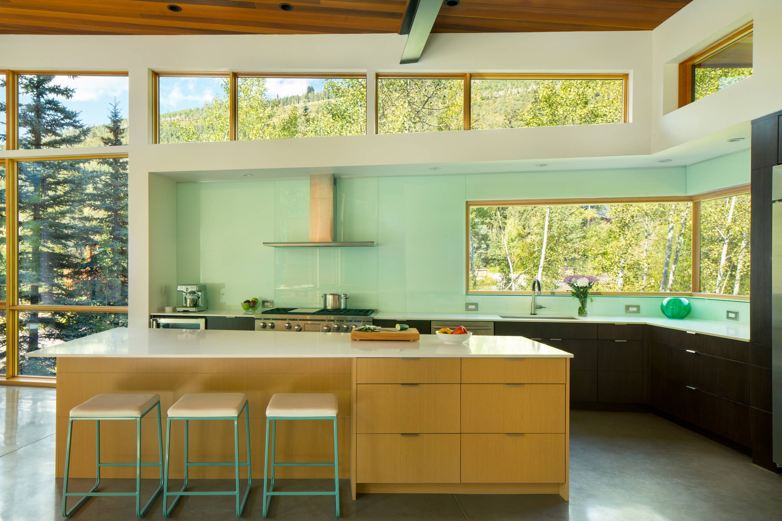
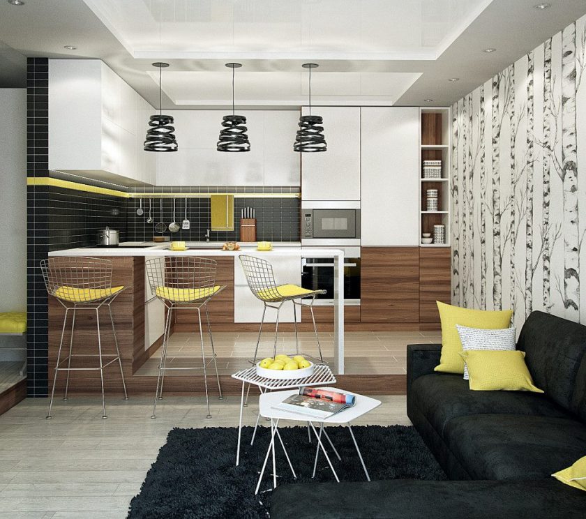
Color combinations for the kitchen
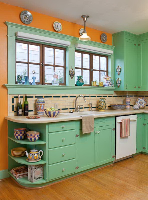
Not all colors are equally suitable for kitchens. For example, a blue tint can reduce appetite, and such as black, gray, white, can provoke depression and apathy, red excites the nervous system, causes overwork. But with the right combination of colors you can avoid the negative quality of the use of each.
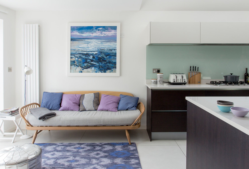
The combination of muted tones in the interior of the kitchen
Therefore, before choosing the main tone for the kitchen, you need to choose the main subject on which the emphasis will be placed. It can be:
This should be one thing, if it is intended in your interior. If it is bright furniture, the wall decoration should be restrained, and vice versa.
Combination Rules:
- In the kitchen cold coexist badly. Therefore, when choosing such colors, it is desirable to combine them with details and accessories of warm colors.
- Neutral and discreet shades of moderate brightness are suitable for the kitchen.
- The room should not be present more than three contrasts.
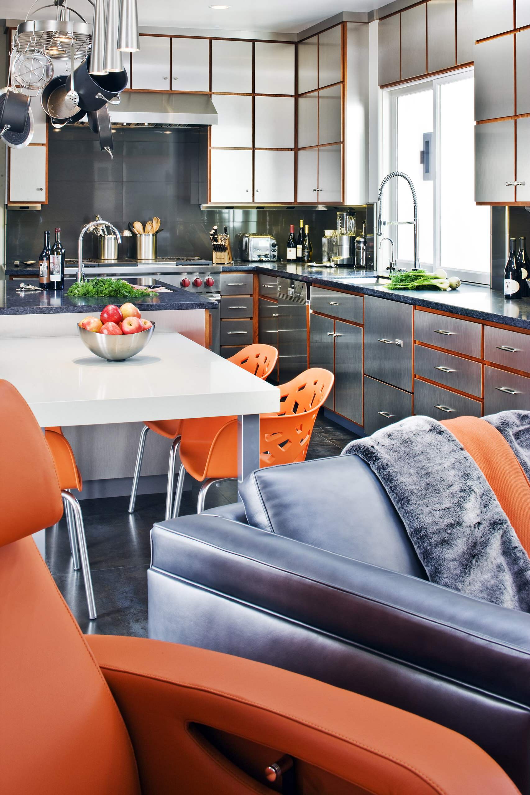
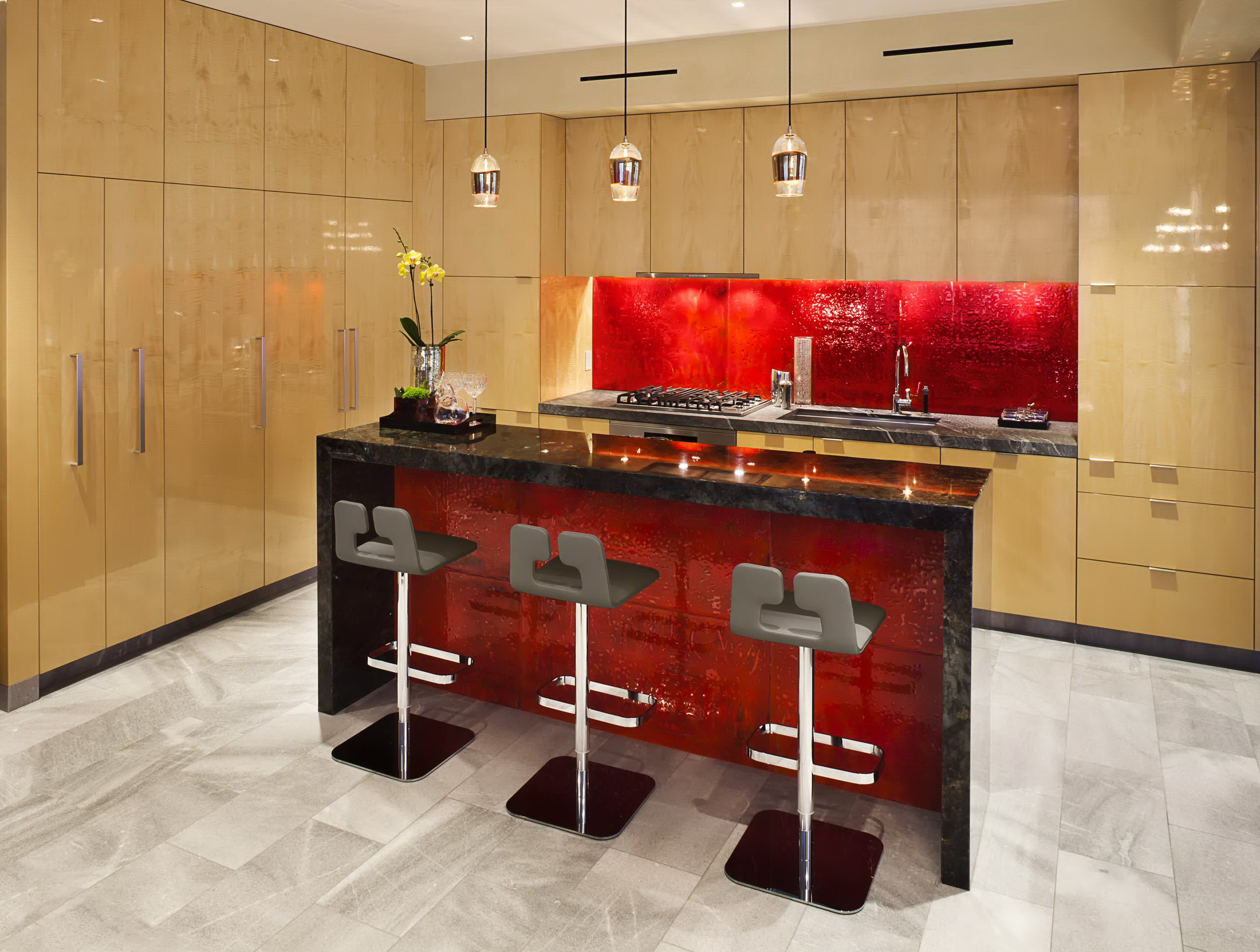
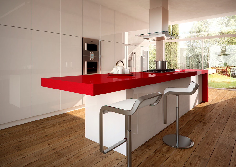
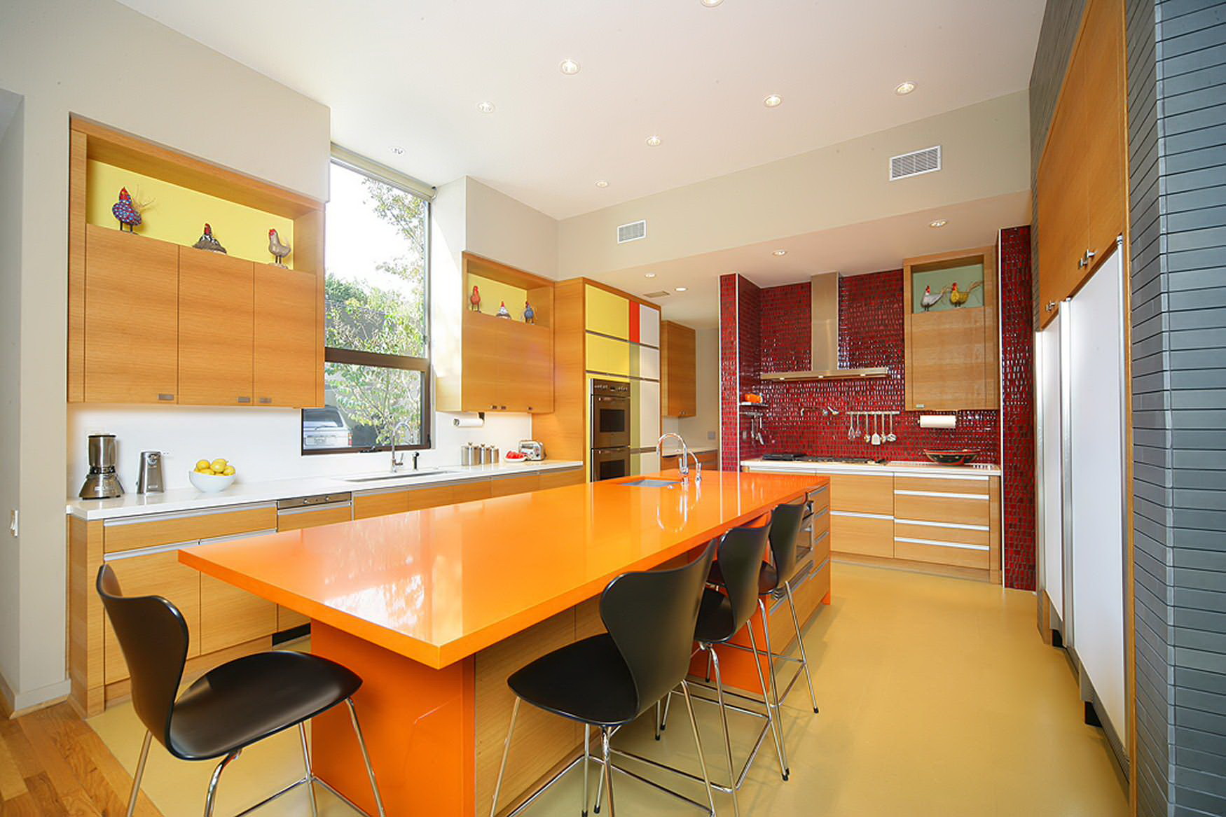
- In kitchens, colors such as orange, red, burgundy, which can be combined with white, beige, and black, look good.


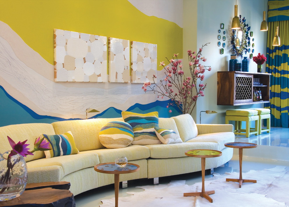
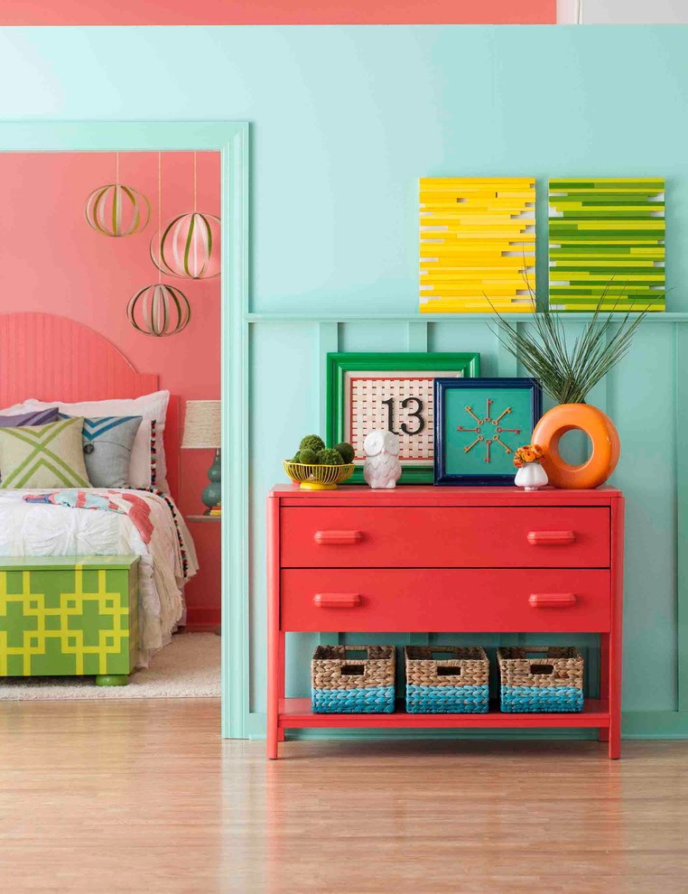
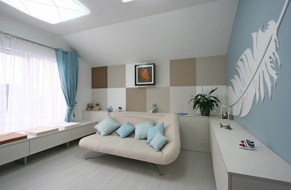
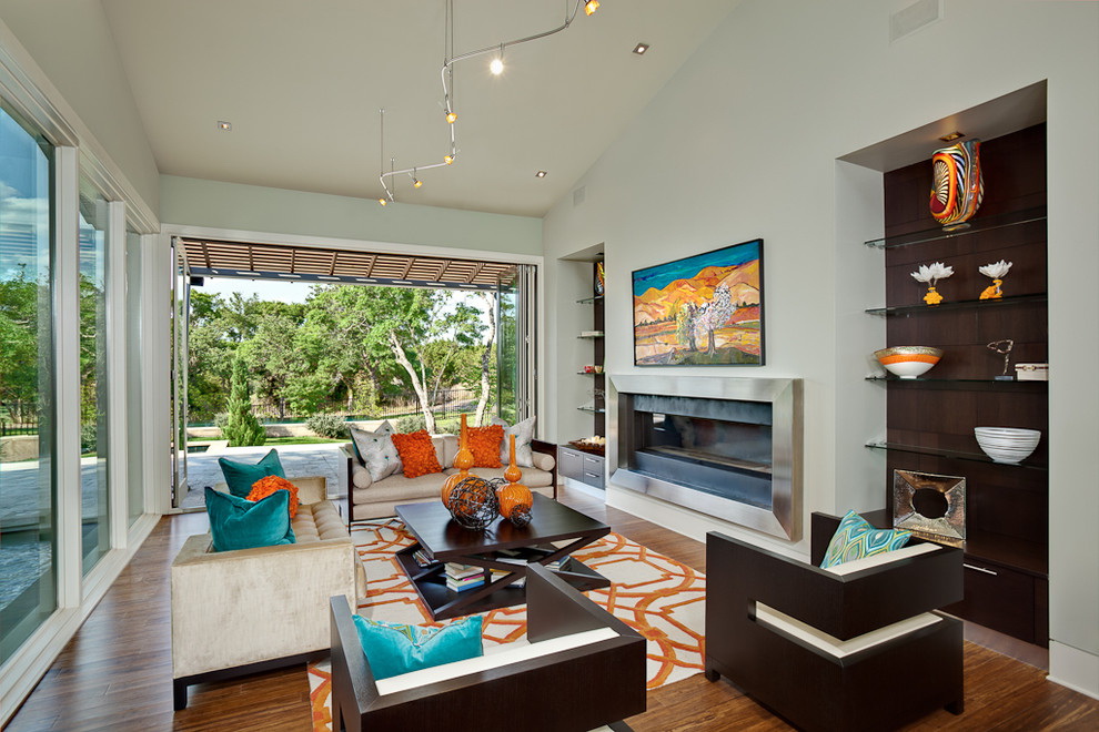
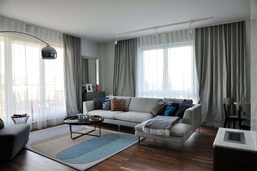
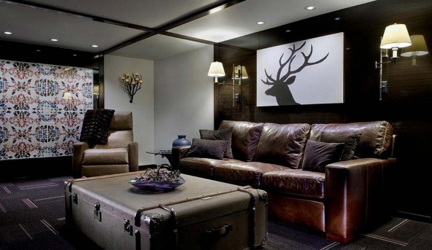
For living room
When choosing colors for a room like living roomneed to pay attention to underlying factors:
- the size of the room;
- its purpose, that is, character;
- selected design style.
For small rooms it is not suitable too bright, dark or saturated shades as a base color. They will make the room even smaller, the atmosphere in it is oppressive, uncomfortable. In the spacious room provides more opportunities for color combinations.


The living room can be a separate room, as well as serve as a place for rest, sleep, guests, food, study. Therefore it is worth choosing the color of the room.
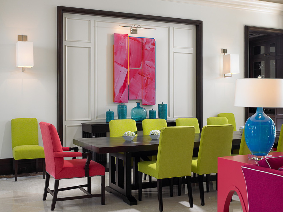
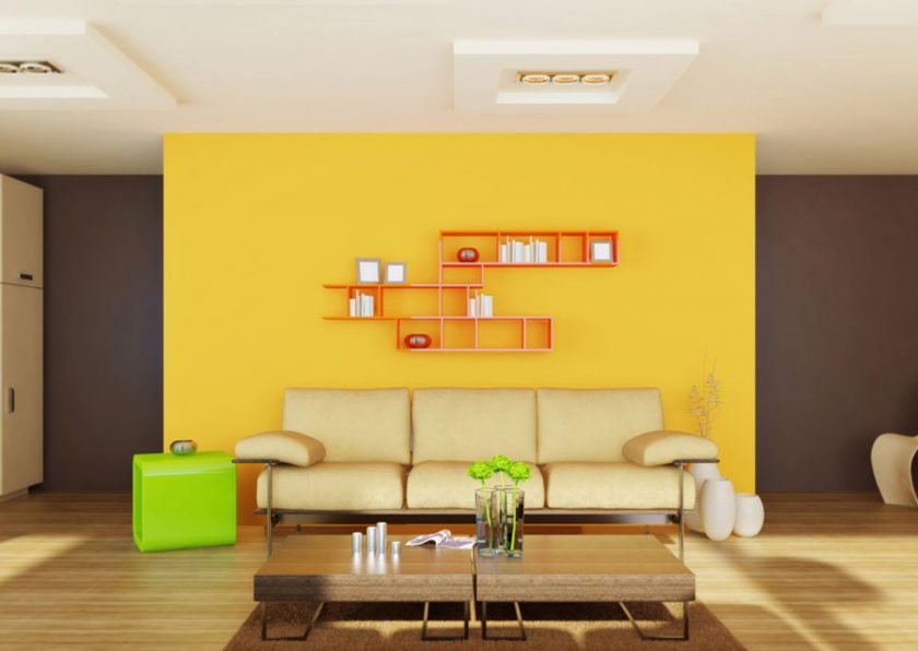
For meeting guests this room can be decorated in the style of pop art with bright flashy colors:
- pink;
- green;
- blue;
- brown;
- beige;
- lactic.
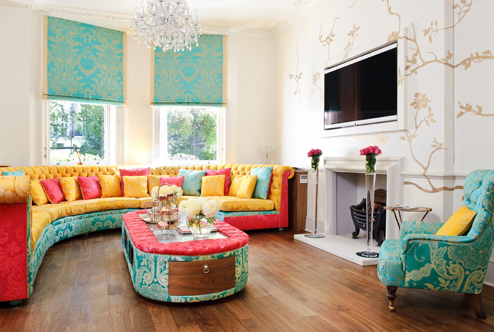
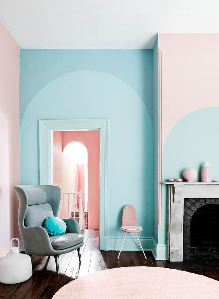
If this is a place to sleep and relax, then choose a pastel range, typical of the chebbi-chic styles, provence. These are gentle shades of blue, pink, green, violet, mint, combined with each other.
Consider the appropriate combination of shades with the existing primary color:
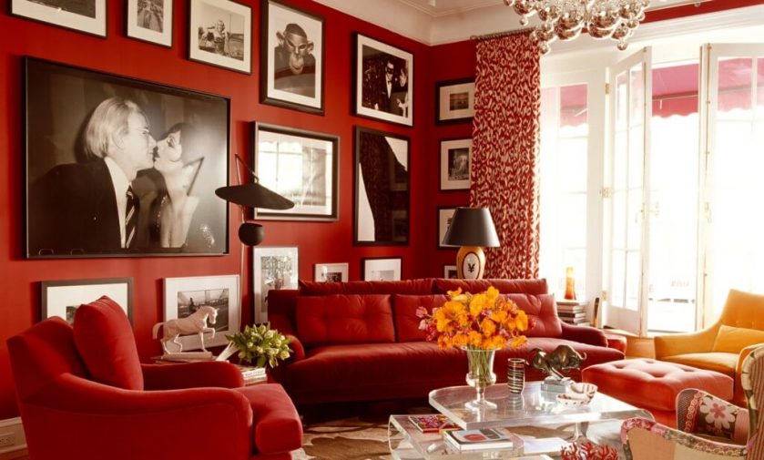
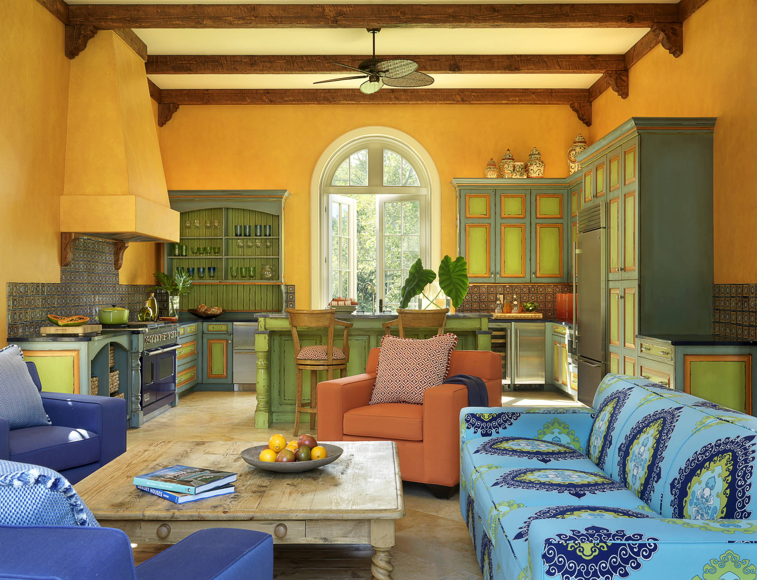
In red colors
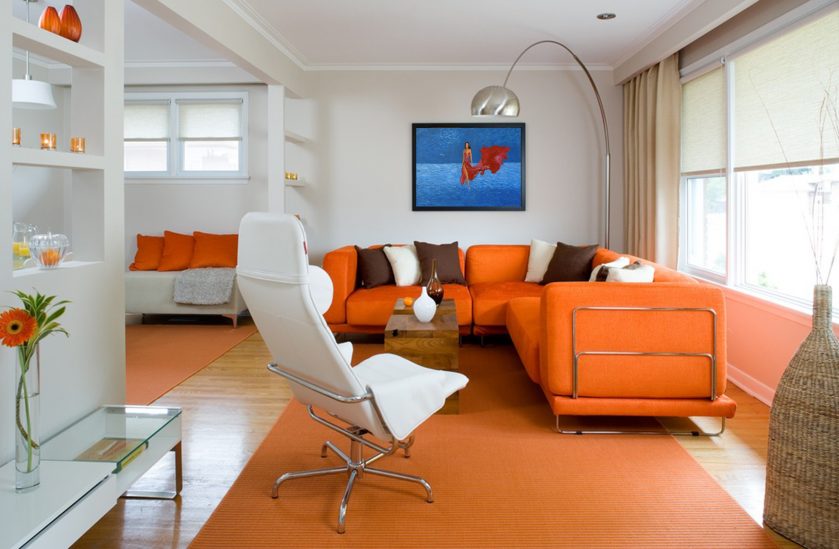
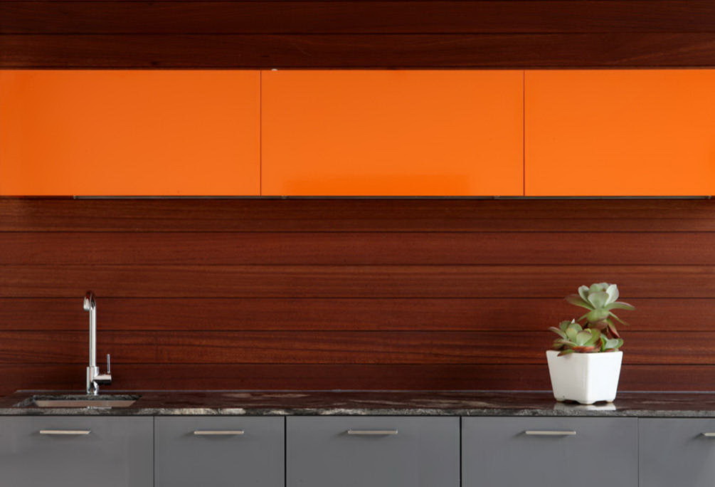
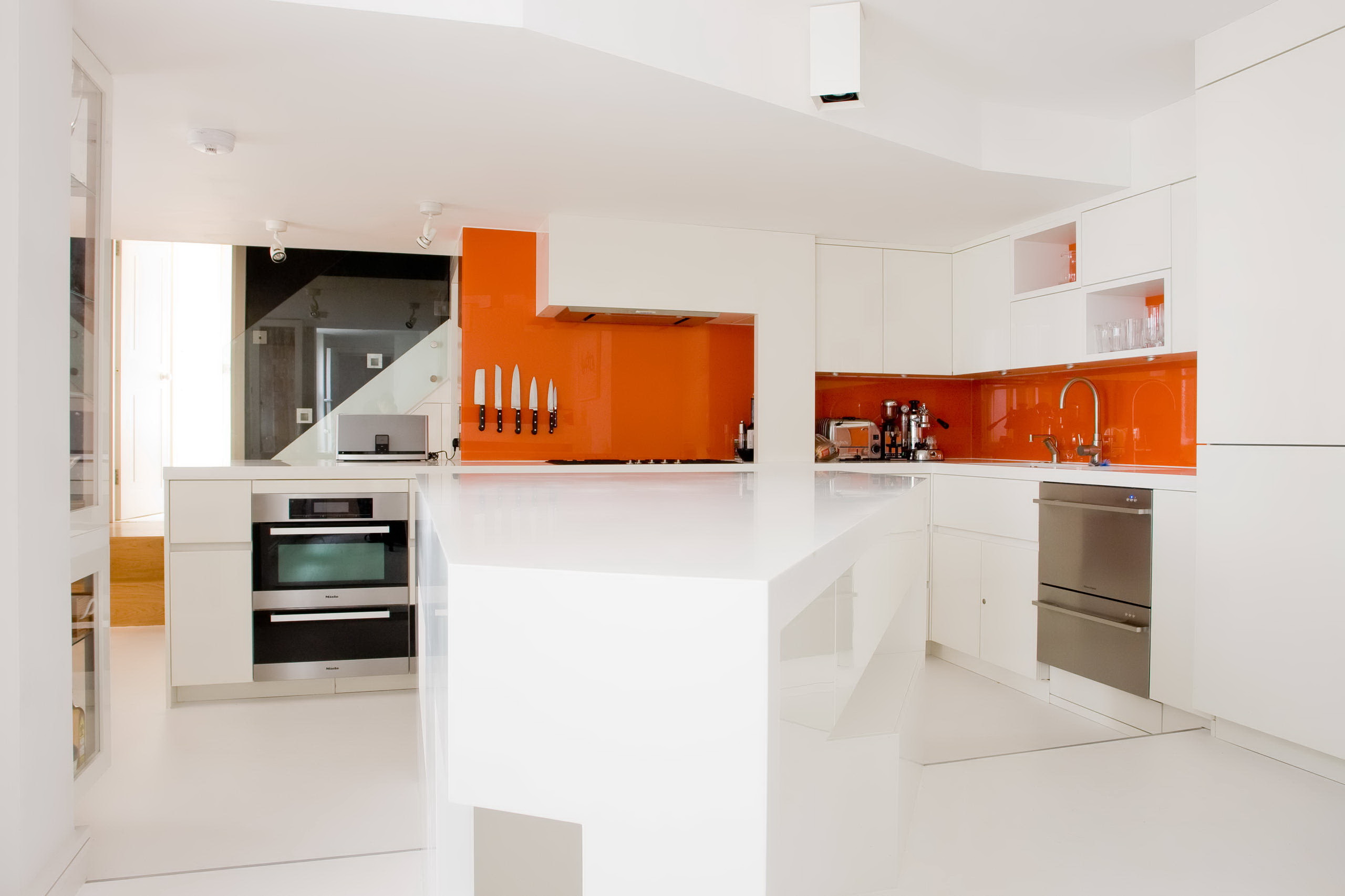
Orange is the color of energy
Symbol of wealth and joy
Green - the color of harmony
Vyzvevet associations with the sea surface
Brown - the color of nobility
Neutral base for combination with many other shades.
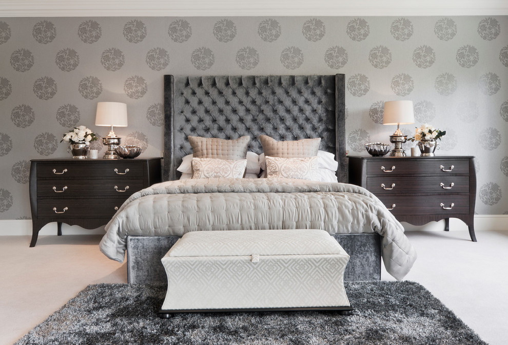
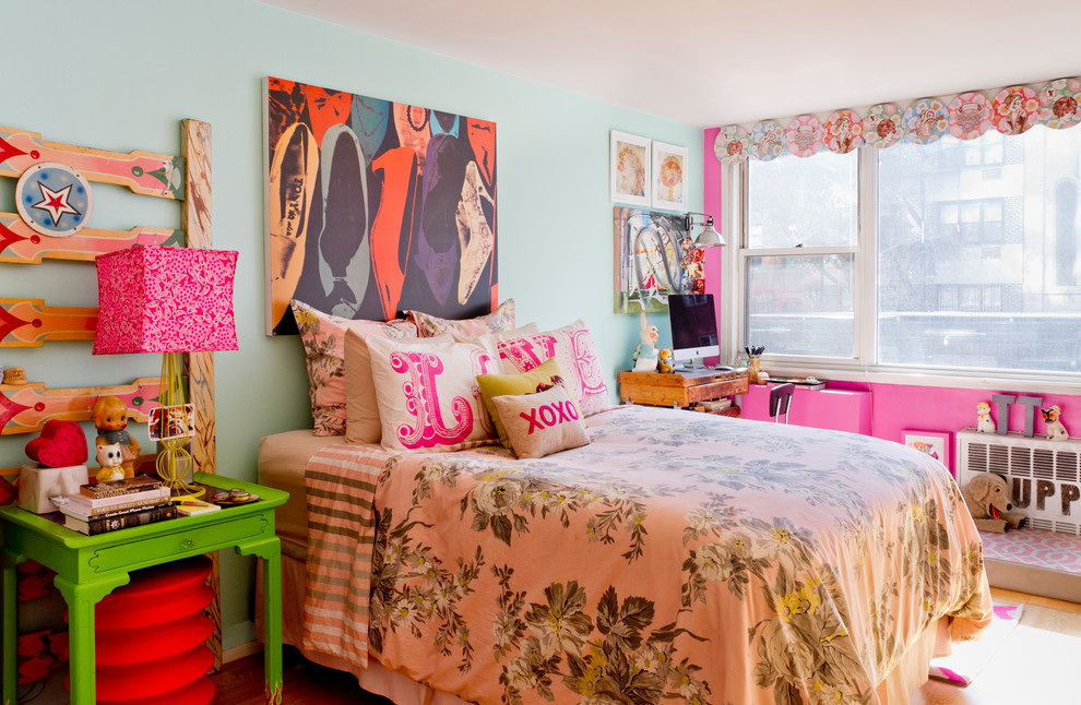
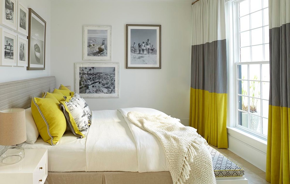
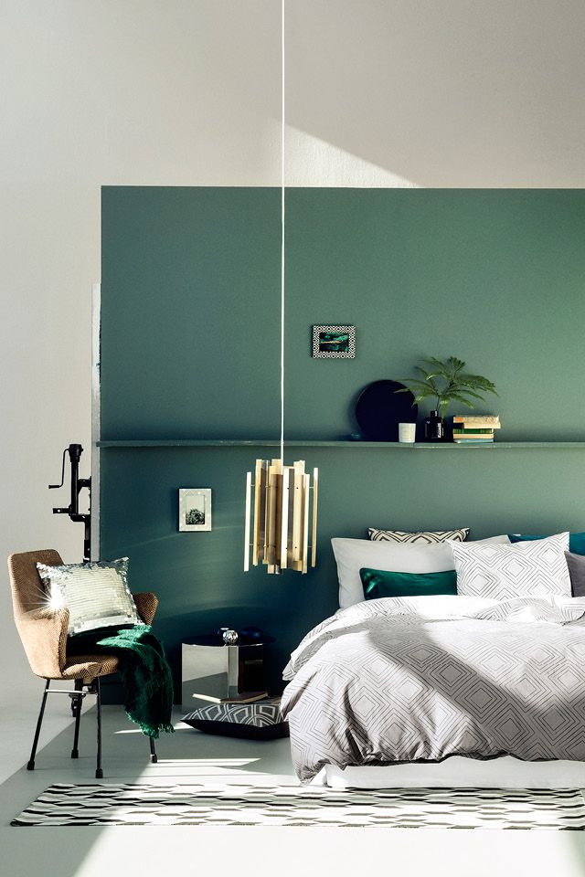
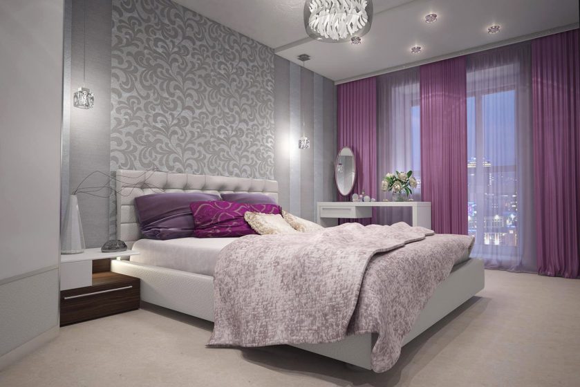
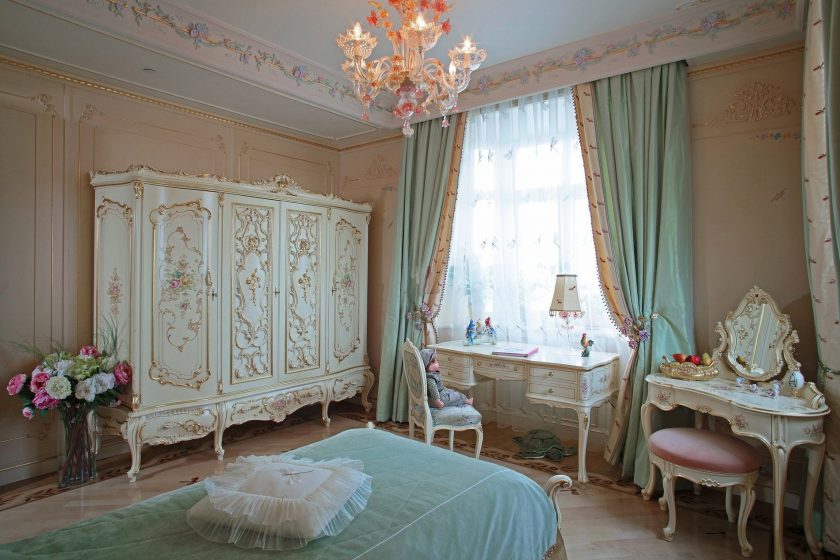
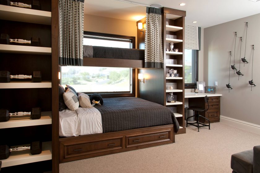
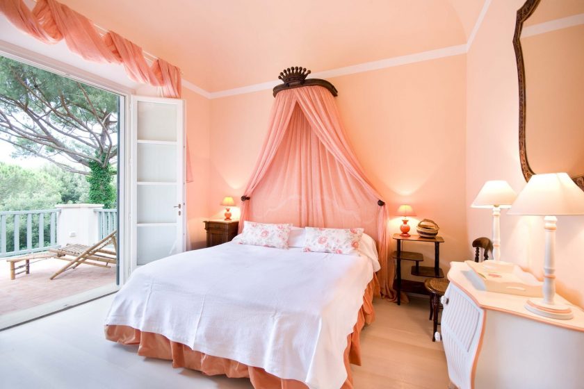
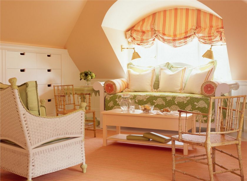
For the bedroom
When creating the interior design of the most personal place in the apartment, such as bedroom, you need to strive to embody not only a stylish design, but also to be able to stay exactly on those colors that will contribute to relaxation, fast falling asleep and a pleasant rest. Therefore, pay attention to the already existing correct and interesting combinations:
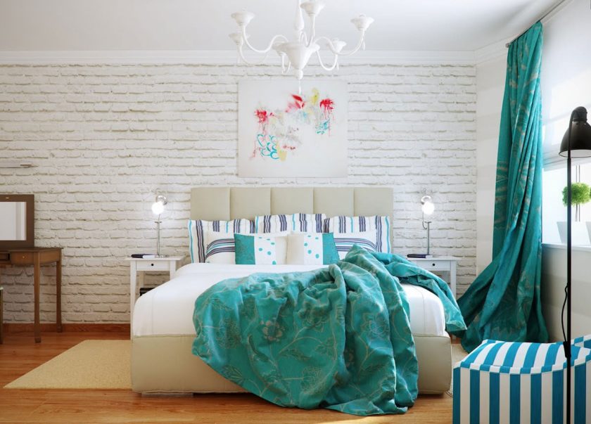
Greens and turquoise - gives energy
Gray in combination with lilac
Blue combined with beige
Berry mix with mustard
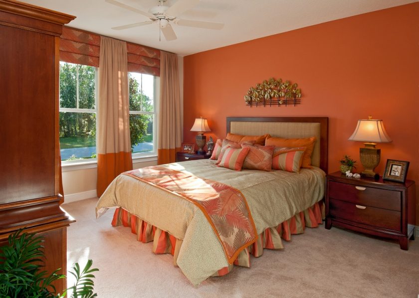
Orange combined with brown
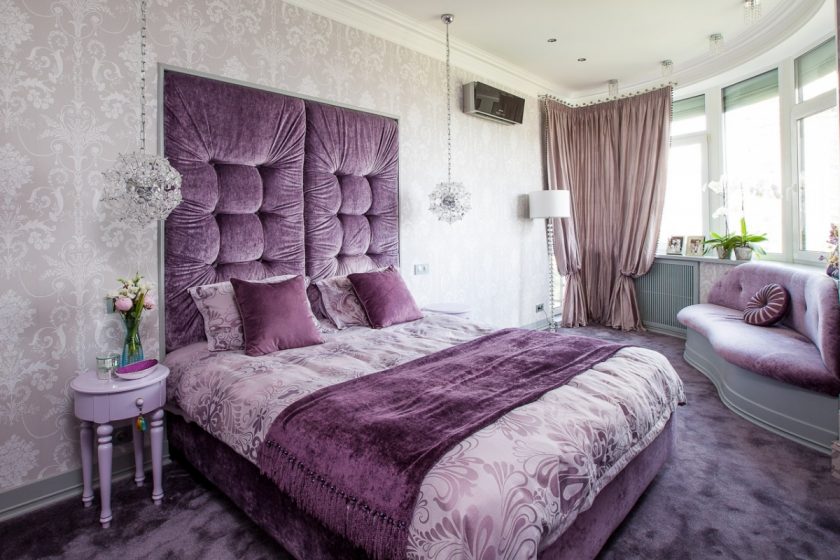
Purple - bedroom option
Characteristic colors for glamor
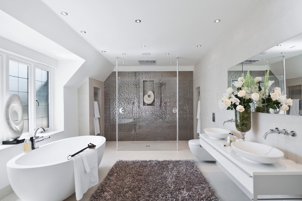
For Bath
Since the standard bathroom a room is a room with a modest size, it is important when decorating based on such rules:
- The interior should use no more than 3 different colors or 5 shades of the same color. It will be quite enough, and two capable complement each other colors.
- Brightness of colors - dark and flashy shades will reduce the already small space, and light will slightly expand the boundaries. But at the same time the moderation of bright shades will help to cheer up in the mornings, and pastel colors for evening calm.
- The influence of the psychology of color.


To the color scale of the bathroom looked harmonious, please the eye of the owner, I recommend take advantage of some ready-made layouts:
- white and blue;
- white and green;
- white and blue selection.
These are the most popular options, in which sometimes white can be replaced with milk or ayvor.
Pink in combination with lilac, purple or white is considered the second most popular combination for bathrooms. Advantageously complement the room gold accessories.


Any combination of gray can create a feeling of coldness and makes you feel uncomfortable. As with the interior with a lot of non-standard bright details, it can be associated with public places.
A warm shade is considered yellow, it carries a positive. Bright lemon enough to combine only with white, rich yellow with white and black, pale shades can be combined with green, orange or blue.
Brown in the bathroom always looks stylish and elegant. You can choose and combine with each other shades of brown, such as ocher, brick, terracotta, chocolate, vanilla, wenge.


Too bright shades of green in the bathroom is better not to use. They are associated with mold, dampness and decay.
For the hallway
Standard colors for hallways are beige shades in combination with brown, as they are perfectly in tune with the entrance door. And often people choose for this space. wallpaper with small or frequent pattern.
Usually hallways are small rooms lacking enough natural light. Therefore, the use of standard techniques becomes a big mistake.
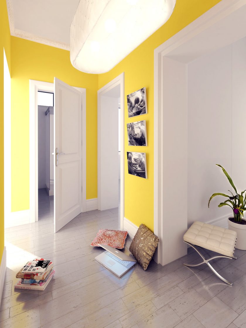
Option for a bright hallway
Dark shades and small pattern visually reduce the space. For registration the hallway It will be right to choose one of three categories of color matching:
- Warm colors - these include brown, orange, red. Getting into such a hallway, a person will feel comfort.
- Neutral shades - these include lime, turquoise, green. They are chosen by those who love coolness, freshness, as well as spring.
- Cold gamma - its main tones - purple, blue, blue. With a significant amount of lighting, such an interior will also look restrained, but cozy.
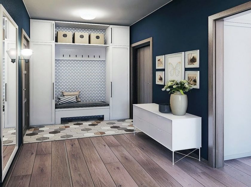
Using a dark blue shade
Depending on the style for the hallway, you can choose the following combinations:
- Modern and classic - natural shades such as sand, beige, milk, terracotta, white, brown. For the classic style malachite and emerald colors are suitable. For example, they can be used in the form of parts, paintings, ottomans.
- Rococo - rich shades of pink in combination with white and gold, red raspberry, purple pepper, red strawberry are appropriate.
- Empire - the style of bright colors without halftones. You can choose as the main shades green, blue, red, gold, complementing them with gray, beige, sand.
- Minimalism - selects the base beige, white, black, gray and bright accents in the form of brown, green, blue, red, any other natural shades.
- Hi-tech - the combinations of gray, metallic, brown and white look great in it.
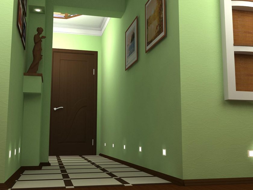
Option in green
Combinations of colors in the interior
Consider the most popular options for color combinations in the interior.
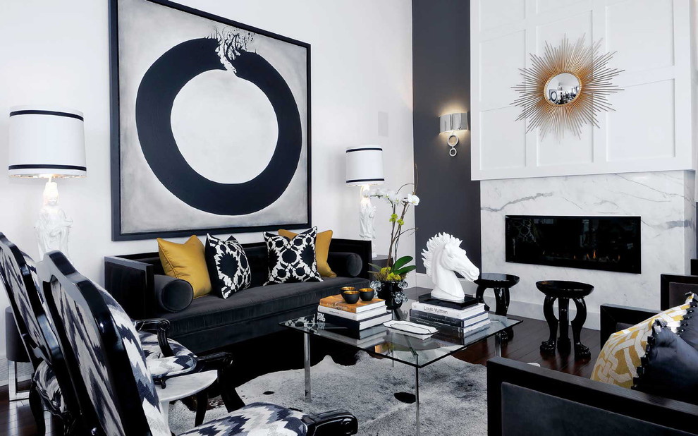
return to menu ↑Grey colour
Grayscale is the most commonly used variation. Gray color makes the interior elegant and stylish, allows you to highlight other color accents. This color is neutral and acts as an excellent background for almost any color. In its pure form, the monochrome gray interior is rarely used; it carries with it a certain detachment and emptiness.


Combinations with a gray tint:
- White-black supplement. Gray in this case is intermediate between them. In order to soften the interior in such tones, choose not a white color, but a creamy shade.
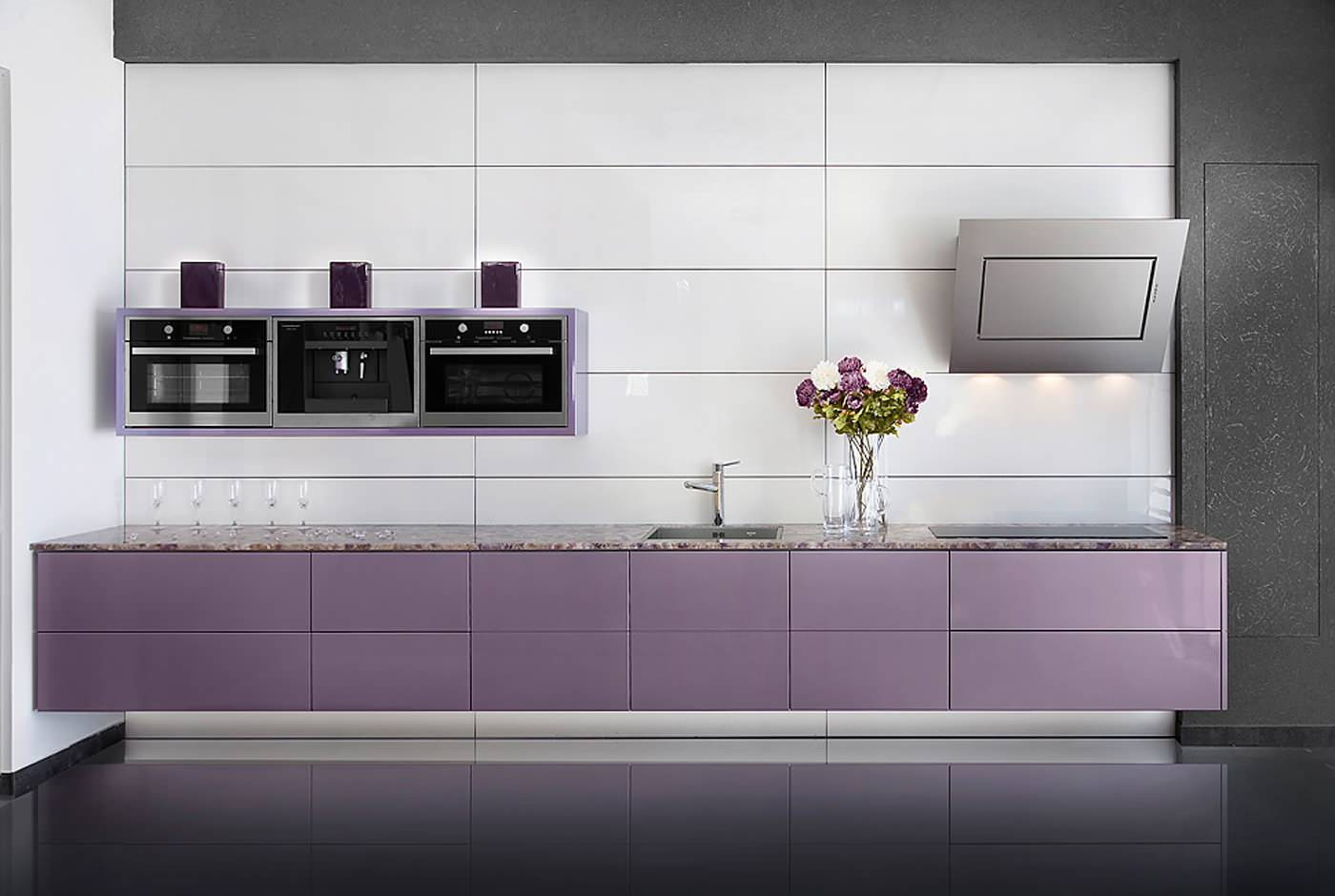
- Adding pink or purple is one of the brightest and most loved combinations. Gray-pink palette gives the room femininity. Therefore, it is suitable for bedrooms of girls, girls, women, living rooms in the style of glamor, other rooms in the style of shebby chic. Gray-purple tandem looks great regardless of the color of the latter. This may be lavender, lilac, purple.Additionally, you can combine these shades with the color of the wood, as well as white, silver or black.


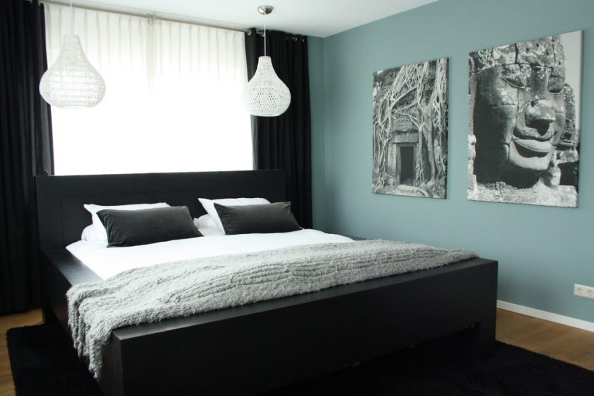
- Additions of blue or blueness - suitable for decoration of living rooms or dormitories. In which place there is no predominance of masculine or feminine. You can complement such tandems with unobtrusive patterns or patterns on curtains, wallpaper or other finishes.
- Yellow mood. Against the background of gray, yellow flashes like a flame. Therefore, the amount of yellow in the interior should be limited so that the glow effect is not suppressed. Against the background of gray walls, the furniture will look good in contrasting shades of gray, as well as the color of wood, white or black. Yellow is used in the form of additional parts, items, accessories.


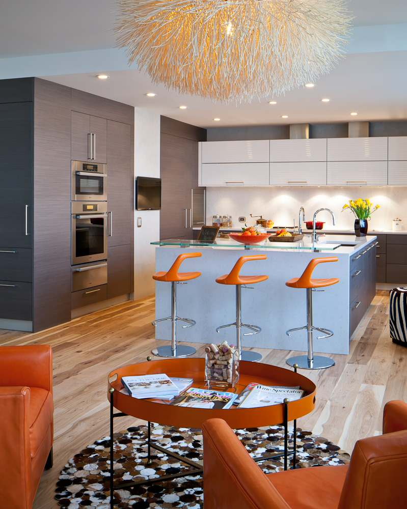
- Combining with red or orange will be a bold and modern solution. Therefore, it is peculiar to minimalism, hi-tech, modern styles. To soften the pulsating combination, difficult to perceive, you need cream or white shades. Also, red-gray combinations can be found in different interior styles, for example, neo-baroque, glamor.
- The combination with beige allows you to create a calm relaxing palette. In it, every person feels calm and comfortable. This is a combination of cool gray and warm beige, as well as an excellent background to accommodate bright color details.
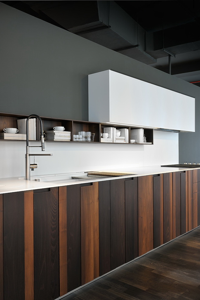
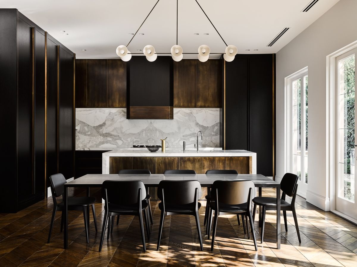
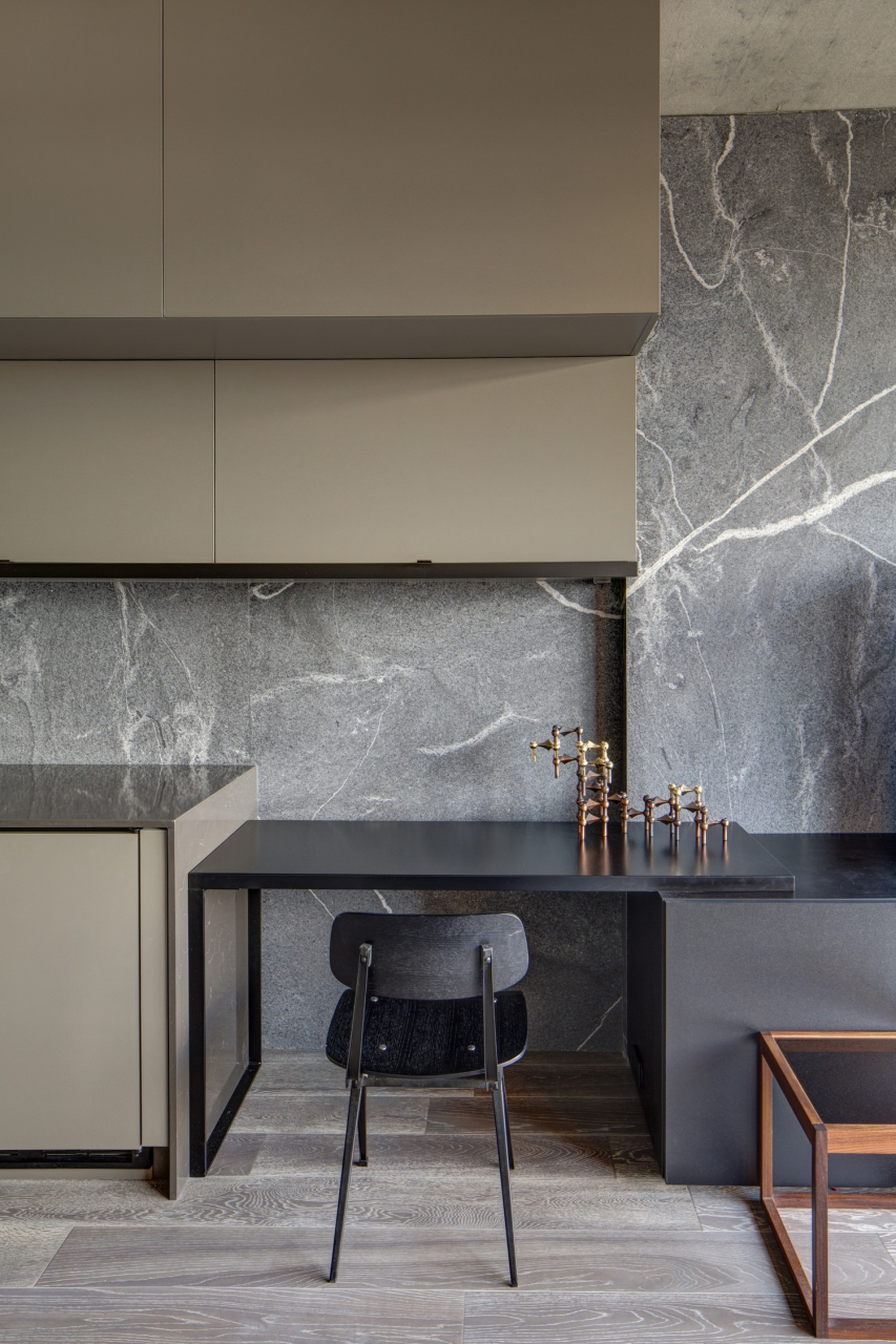
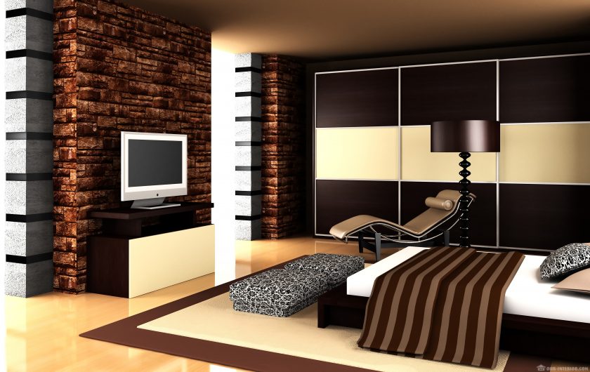
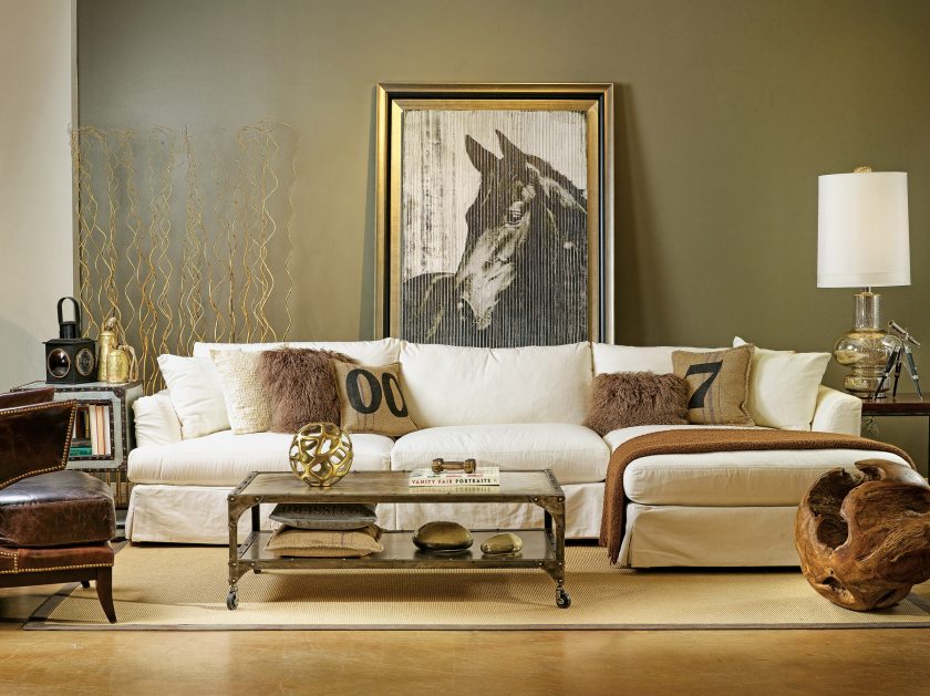
Brown
Brown color, personifying nature, can be found in any interior. If not as a wall decoration, then at least the floorin the form of furniture doors. It is believed that the brown color of conservatism corresponds to the classical style. But in most modern interiors, it is also an indispensable shade.


It will be appropriate in any direction. Suitable combinations:
- White-brown classics of the genre - so that the design does not seem boring, you can dilute it with several bright details, for example, turquoise, red, orange. If white will act as the main interior, then, despite the dark brown, it will expand the boundaries of space.
- Brown with pastel tones can also be attributed to the classic combinations characteristic of the eponymous style. It would be appropriate to use a combination in living rooms, corridors, hallways.
- Brown in tandem with blue gives a cool feeling. Even if blue is used in minimal amounts, brown enhances its coldness. The combination of these natural colors creates pleasant associations with the sea, mountains. The interior in which to combine brown with turquoise will look cozy and rich.


- Brown with yellow and gold is a truly luxurious and rich combination. Complementary shades will symbolize wealth and respectability. To this combination did not look pretentious, you need to dilute the interior beige and milky shades. Then it will turn out warm and calm.
Beige
Like gray, beige appears as a beautiful background and a basis for the realization of various ideas. Beige shades are universal, they can be used in any style.


Beige shades include:
- Ivory;
- cappuccino;
- biscuit;
- sand;
- cream;
- caramel;
- wheat.
These also include combinations with:
- gray;
- purple;
- brown;
- pink;
- orange;
- peach;
- yellow;
- green.
The color scale of beige is big and various.


Benefits look beige with colors such as:
- brown;
- Gray;
- blue;
- turquoise;
- Violet;
- green;
- white;
- pink.


A few tips on the right combination of beige in the interior:
- As a background, you can use beige on the walls, ceiling or floor, be sure to complement the bright decor.
- Light furniture - dark floor - bright walls.
- Beige gradient with insignificant difference.
The kitchen in beige colors is designed in the classics, Provence, Rostik, which is characterized by light materials and finishes. Such a shade is never annoying or boring, it can always be refreshed with new bright details.


Beige living rooms are chosen by older married couples or families with children. Beige shades promote relaxation. Beige bedrooms beige also create an atmosphere of relaxation and is a symbol of relaxation, comfort, luxury.
return to menu ↑Wenge color
The color of wenge is a natural brown shade of furniture. The name has received a shade from breed of wood of which the furniture is made. This is a rich and deep tone that favorably stands out against the background of bright or bright colors.
It requires two types of good lighting: artificial and natural. The interior can be decorated with wenge-colored details, such as furniture, picture or photo frames, armrests, coffee table legs, and a headboard.
The color of wenge is a natural brown shade of furniture.
With the color of wenge it is very easy to get a modern and stylish interior. This is one of the favorites of designers for dining rooms, living rooms, kitchens, children's rooms, parental bedrooms and even classrooms.
It can and should be combined with such colors:
This is a rich and deep tone.
With the color of wenge it is very easy to get a modern and stylish interior.
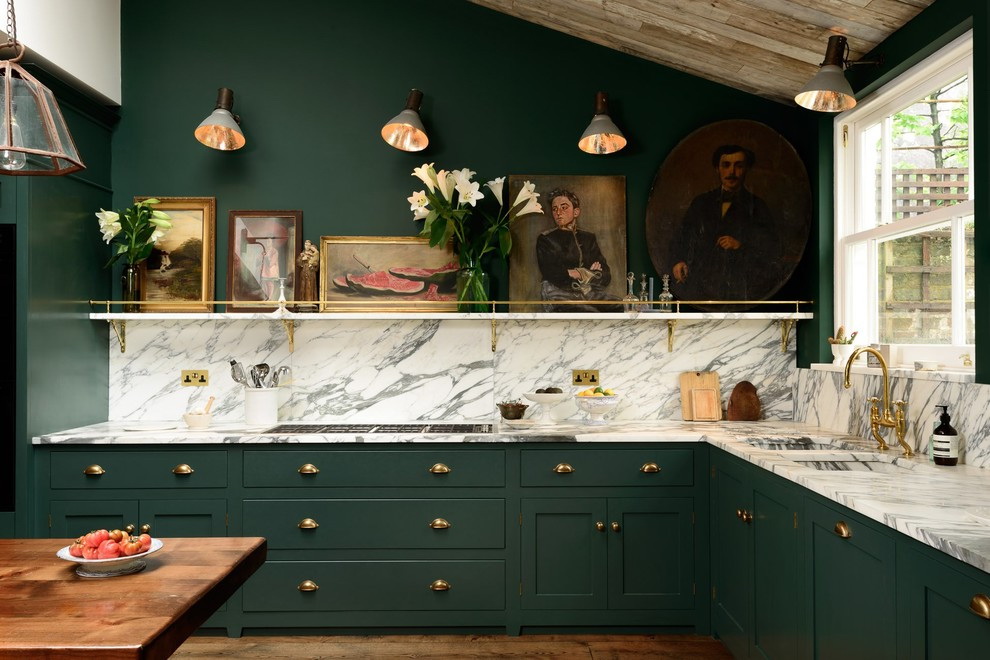
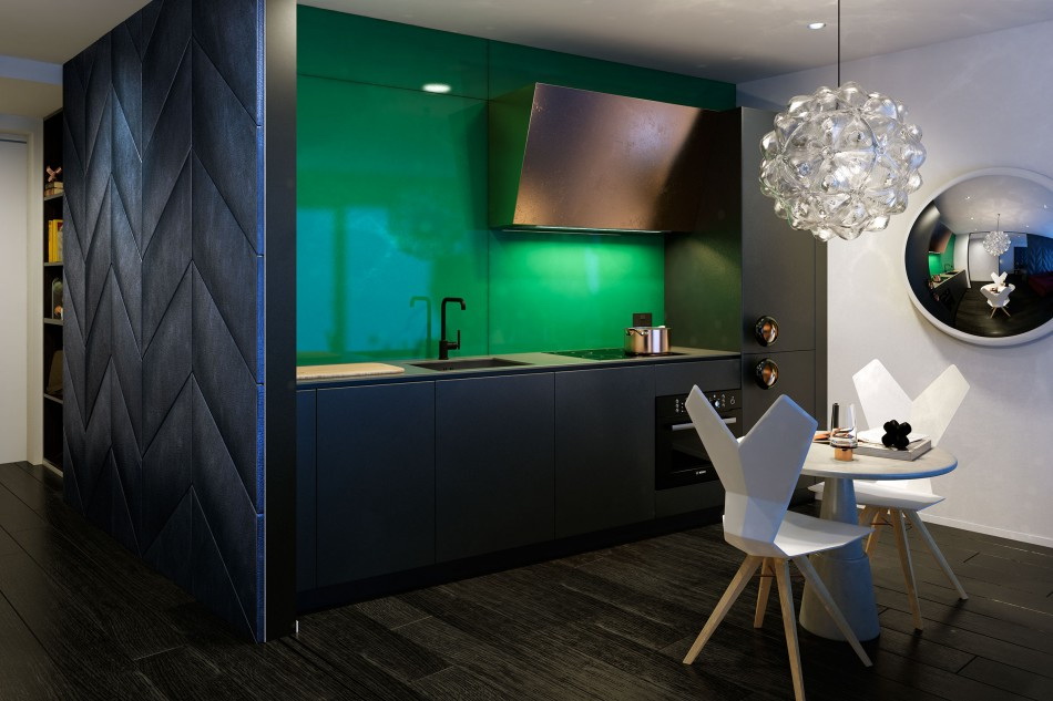
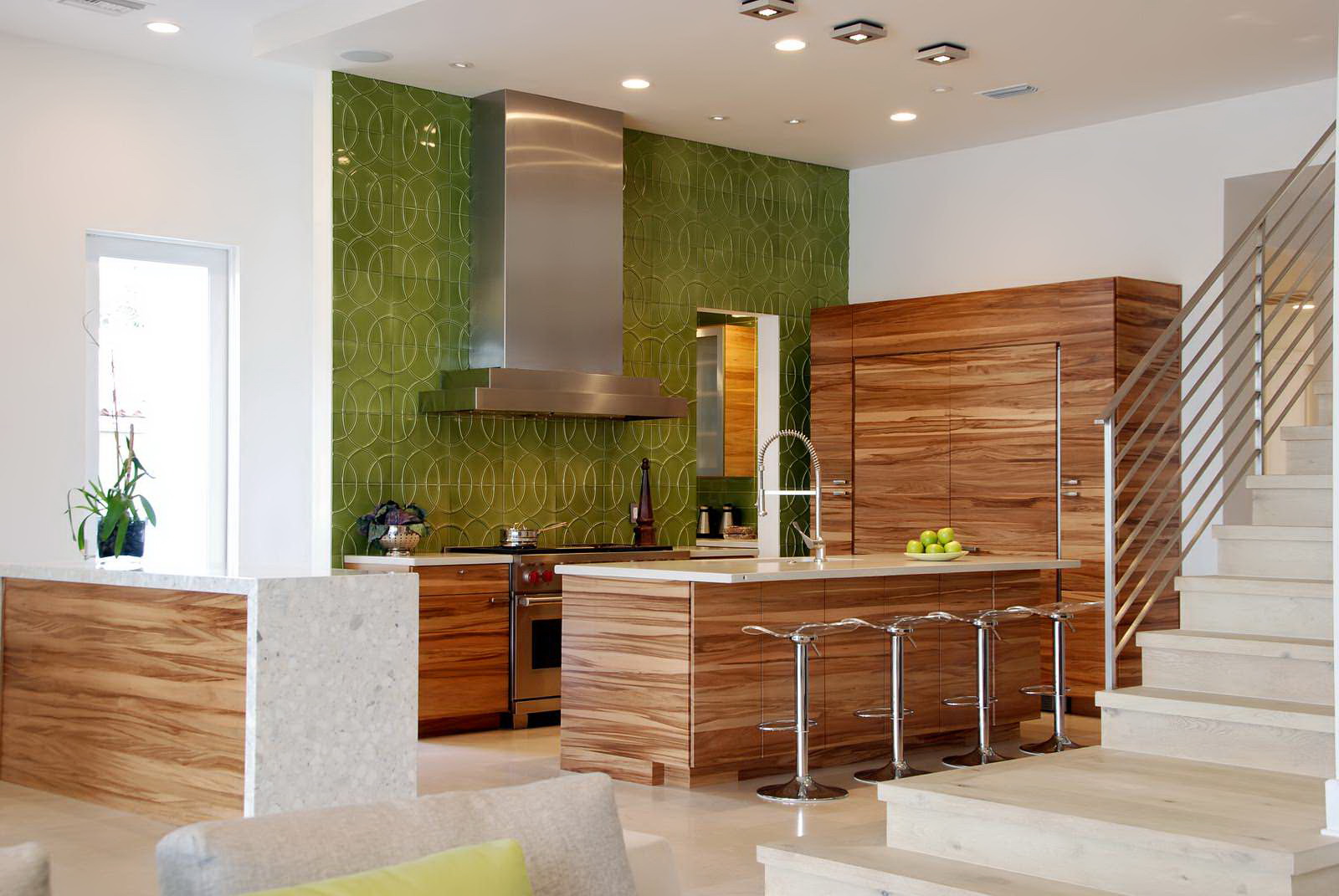
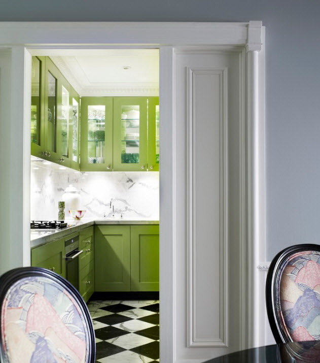
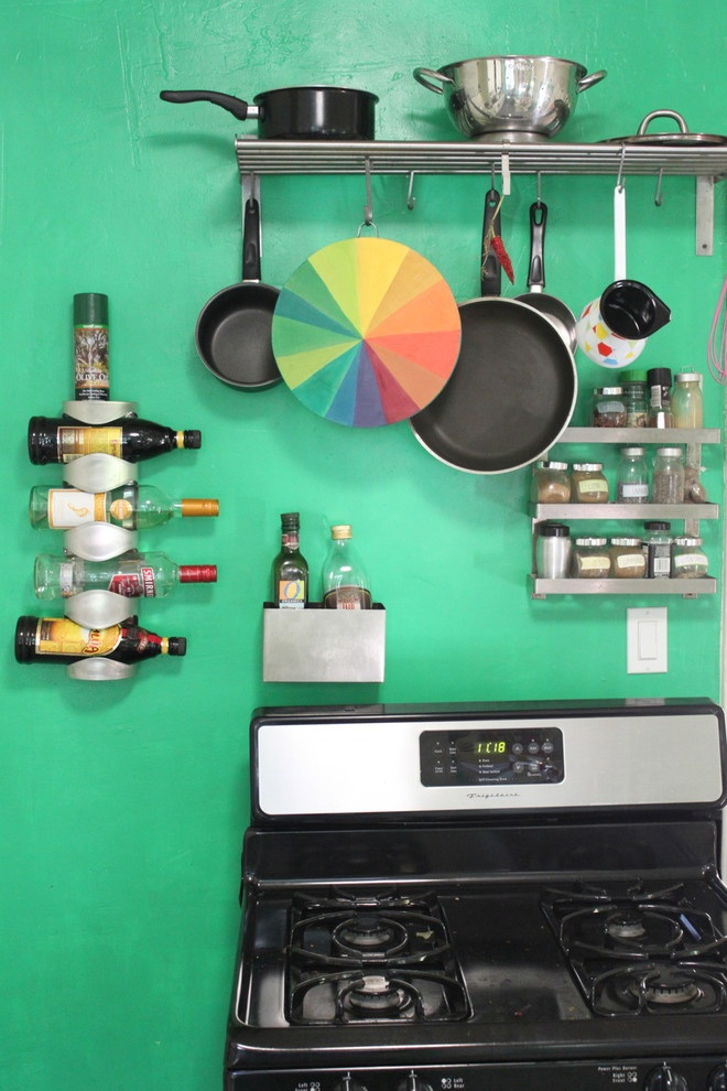
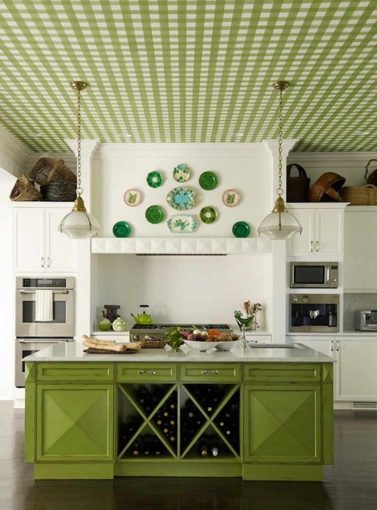
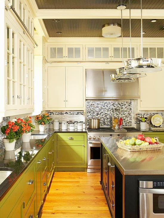
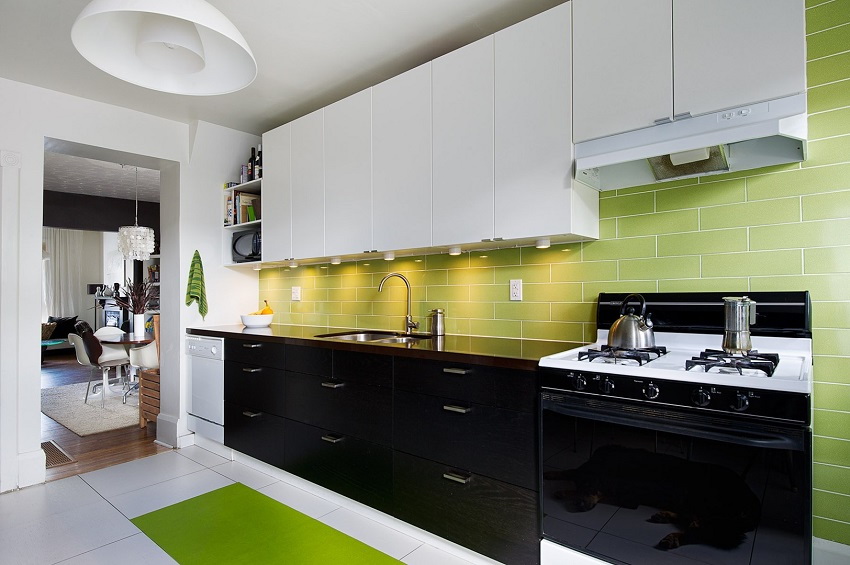
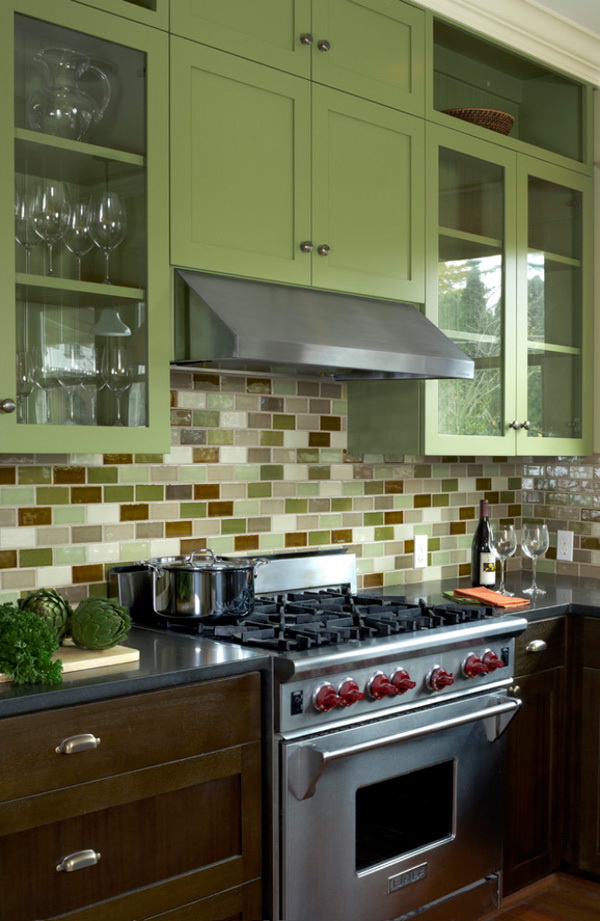
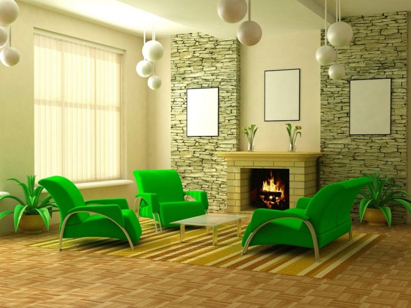
Green
Green color designers refer to the cold shades and also consider universal. It can look equally good in design. ceiling, walls, in the elements of textiles, decor, furniture facades.


This may seem surprising, but the green color goes well with almost all the other colors. In addition, it provides people with a comfortable stay in the room for a long time, improves mood.
What combinations of green are the most popular:
- The white-green combination gives a feeling of lightness and airiness, as well as harmony. Looks great in the living room, bedroom, bathroom. Visually increases the space of a small room.
- Red-green shade - a rare combination, characterized by aggressiveness. But muted red shades can look advantageous. For example, burgundy in combination with dark green symbolizes luxury. Bright shades of green and scarlet details are peculiar to eclectic style. Light shades of red and green are peculiar to country style and ethnic interiors.


- The brown-green combination has already been mentioned - it is a symbol of harmony with nature.
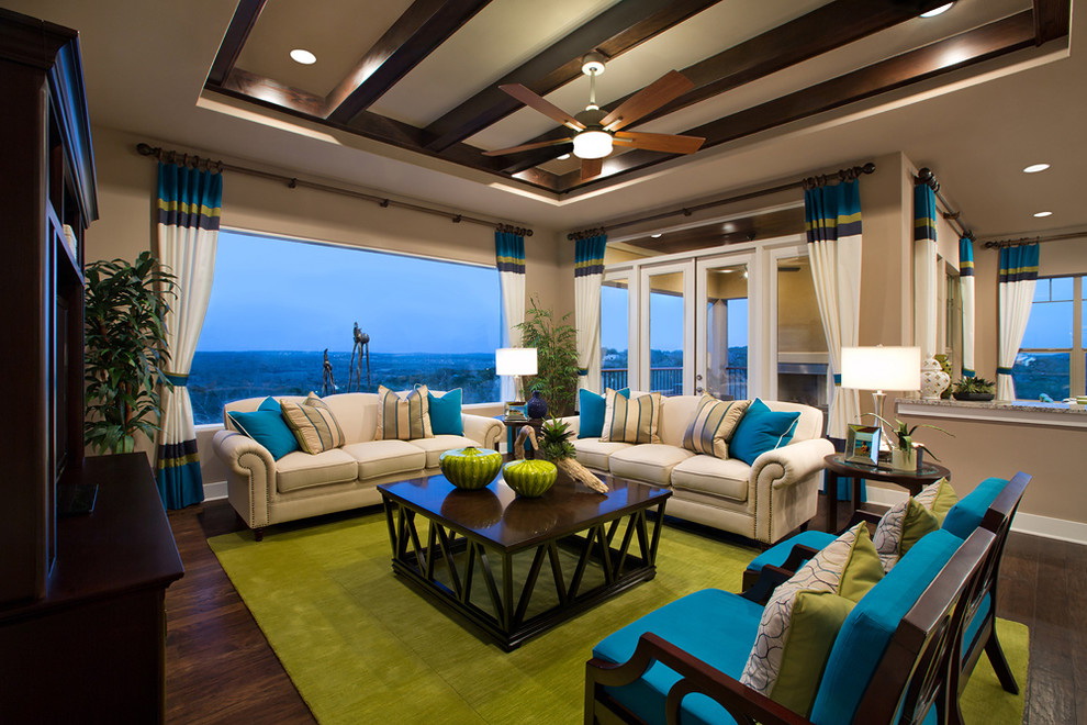
- Blue-green - perfectly in tune with two colors, often used in rooms such as children’s, bathrooms, less often kitchens.
- Green with blue makes the space airy and light, suitable for decoration of any room in the house or apartment. This combination is very popular, because individually the colors are the favorites of many people.
- Gray and green look original and elegant. Neutral shade emphasizes the juiciness of the green. Most often the tandem is used for decoration of office premises, offices, business centers.


- The pink-green shade is characteristic of the chebbi-chic and ethno style. When combined, a fresh and pleasant fruit and berry bouquet is obtained.
- The combination with yellow and orange will be successful only if there are very few warm shades in the interior. So they can not hammer the main tone.
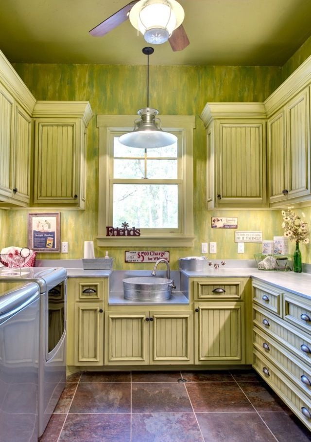
Pistachio and Olive
Light, fresh, invigorating pistachio color is considered the most fashionable and versatile trend. The combination in the interior with suitable pistachio flowers always looks advantageous. Natural color is a mixture of yellow and green.
White, gray are considered suitable additions for it, it harmoniously looks with black, but on condition of adding light shades. Good looks tandem pistachios with pastel tones. They are:
- beige;
- peach;
- cream;
- carrot;
- lactic;
- light pink.
Light, fresh, crisp pistachio color
For the interior of pistachio color you need to choose pastel shades. Other allied colors for pistachios are:
- sea wave;
- coral;
- crimson;
- blue;
- brown;
- chocolate.
Not the most profitable combinations will be bright green, pale blue.
Olive is another green variety. But compared to pistachio, it has a more subdued tone. This derivative between gray, yellow and green is used for decorating rooms not too often, as it has the ability to absorb light and darken rooms.
The combination in the interior with suitable pistachio flowers always looks advantageous
In order for the color in the room to look beneficial and harmonious, you need to provide him with a large amount of lighting, as well as be sure to combine it with white. He is very refreshing. It will be no less successful to be combined with other natural shades, such as heavenly, the color of young green, autumn leaves, summer flowers.
return to menu ↑Purple
Lilac itself is a very spectacular color. Some may be close to blue, others to gray, and others to purple. The palette is very diverse. Therefore, it is possible to create an interior of absolutely any mood. The most successful combinations of lilac will be:


- Lilac, blue and lilac-gray tones are in harmony with the snow-white. The rest of the range correspond to cream and milky shades.
- With pink - the combination is peculiar to young people, creates an atmosphere of celebration and friendliness.
- With a gray combination of lilac suits different in nature married couples. It turns out a noble range, especially if it contains additions in the form of natural stone, marble, granite.
- With purple and a minimum of red, so as not to overload with saturation. The number of these two colors in the whole situation should be no more than 20%.
- With green - this combination came from the Provence style. Harmoniously look lavender, olive.
- With metallic shades, silver and other gray metals remain in priority. But gold or copper is not worth choosing.


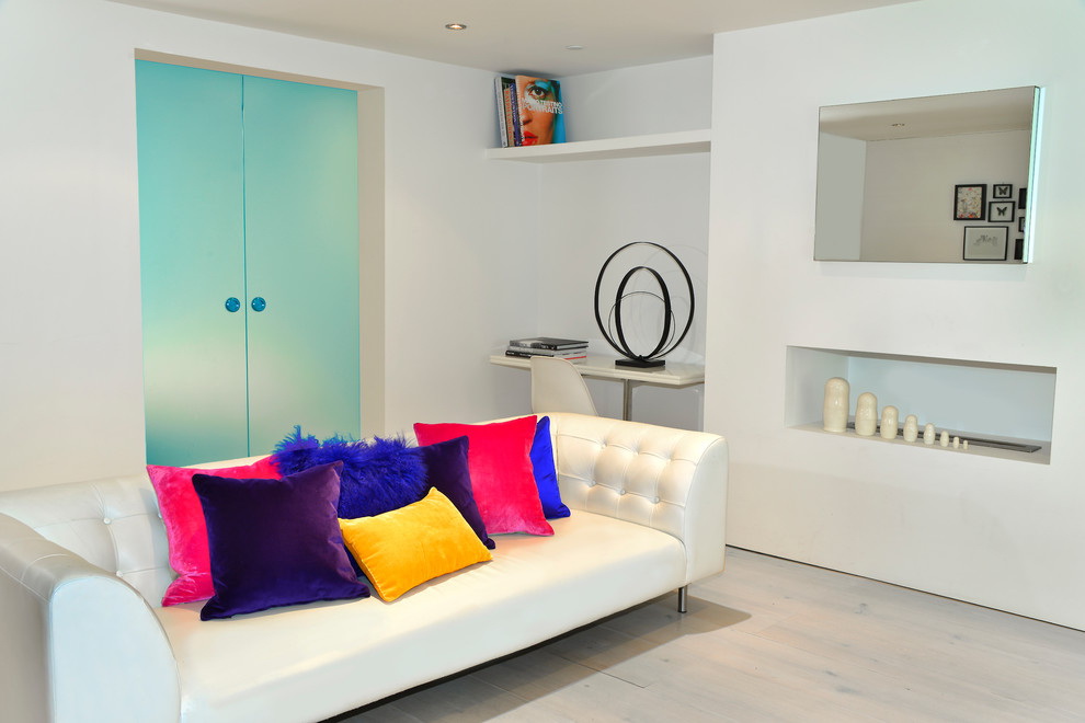
Pink
Pink color in the interior is likely to be appreciated by the female. To them, it seems attractive, cheerful and fresh. In fact, in decorating the interior, this color is considered one of the most difficult. It is very important to choose the right shade of pink so that the room in the final does not look ridiculous.


Therefore, I suggest you familiarize yourself with the four main prohibitions for pink color in the interior:
- in no case should not choose fuchsia, especially in large quantities;
- You should not use Total Pink in the interior - when decorators forget completely about the use or existence in principle of other colors besides pink;
- inappropriate placement of images of pink flowers on a pink background;
- Bright pink kitchen furniture looks like an enlarged kitchen layout of a world famous doll. Moreover, most often these walls look very cheap.


What combinations with pink will be logical and correct:
- Pink-gray - the most successful combination of the existing ones, especially if you choose pale pink, dusty, powdery. You can choose only one significant detail of pink color - a door, a picture, curtains, one of the walls.
- Pink and white - makes the interior very sweet and delicate, therefore suitable for children's rooms. Instead of white, you can choose ivory, baked milk, ivory.
- Rose-black with a careful combination will look good, but it is worth a little to overdo it and the interior will look vulgar.


- The pink-yellow combination will help create a positive, cheerful interior. The contrast of cold and warm - this is a ready antidepressant in the form of an interior.
- Pink-green is also a very beautiful phenomenon and the right combination, which has already been mentioned.
- Pink-blue or pink-blue with the right choice of shade can look like a perfect pair.


Pink is well perceived when its dosage is minimal. The larger the area of the object, the brighter the shade of pink should be. Bright tone will look favorably as an accent color.
return to menu ↑Mint
Mint color is completely different from the plant of the same name. It is a combination of light green and blue hue. Due to the range of colors from pastel tones to saturated, this color can be used as the primary as well as auxiliary color in the interior.


He always adds a spring mood and comfort in the room fills him with cheerfulness, cheerfulness. The partner colors of the mint shade are blue, green, from which it is obtained. The combination with cream, milk, beige or white will be a win-win option - this is a universal combination for any room.
It also looks good with mint, purple, violet, light and dark brown. It looks no less impressive with gold or silver. The second option harmoniously looks in bathrooms and kitchens, emphasizing the feeling of freshness and cleanliness.


If you want to make the room bright in summer, then you can mix it with light green, yellow, coral. All of them should be rich, but not take up too much space in the interior.
return to menu ↑Peach
Delicate peach color is often used for decoration of residential premises. It is obtained by mixing orange, yellow, coral, white.
Delicate peach color
Typical styles for the use of peach color are Mexican, Moroccan and other eastern destinations.
They combine peach with:
- terracotta;
- ocher
- brown;
- golden;
- black
- caramelized
Light peach gamma in combination with pastel tones creates a soft relaxed atmosphere of calm. Suitable tandems for peach - cream, pink, white - used in vintage directions.
This color is often used for the decoration of residential premises.
For modern design, bright peach tones can be used in combination with turquoise, red and purple.
Combination table
When creating a future interior design can be a very interesting occupation in the selection of colors. You can easily find your favorite shades among a variety of materials for finishing. However, a lack of knowledge can lead to mistakes. But in the finished interior will have to live for a long time, do not make repairs every year.
Table of color combinations in the interior
Therefore, it would be advisable to use the already prepared color combination tables.
The combinations of several shades presented in it should be used according to the rule:
- the first is the main tone;
- the next two are optional;
- the last two are colors for accents.
It is much easier to use the color wheel. It is used by professional designers in their activities for the selection of colors.
There are no white, black and gray colors in this circle, as they can be used in combinations by default.
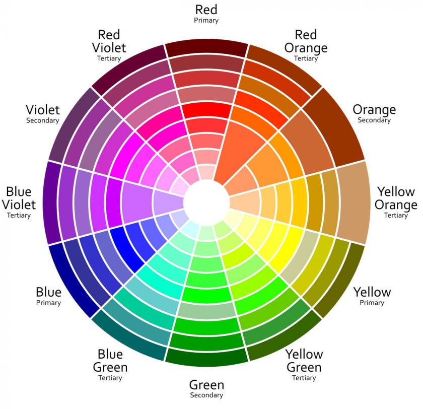
Color wheel for color matching
It is possible to combine colors from a circle according to several specially created schemes, represented in the image.
Colors in the interior
Choosing the right combinations