Psychology of contrasts: 105+ Photos of combinations of yellow in the interior. All pros and cons

In the spectrum of colors yellow is considered the easiest. It has many shades: sand, vanilla, tea rose, beige, fawn, champagne, ivory, amber. He invigorates, has a positive effect on mental abilities, tones. Associated with sunlight and summer, refers to the warm tones.
Content:
Why exactly yellow?
Very easy to combine with other colors. After all, he can express certain contradictions. For example, too much yellow will create too rich and intense interior. In its natural form will be. Without a combination with other shades it is better not to use it.


Like all other colors, yellow has a gradation. It may have warm tones, it may be golden and bright, but it also has a cold shade — pale yellow. Fun shades are suitable for decoration kitchensthey have a positive effect on the person. For bedrooms it is better to choose yellow pale shades. It has a calming effect, relaxes the person, and gives the bedroom a calm atmosphere.
Use in interior decoration should be very careful, following the advice of experienced designers.


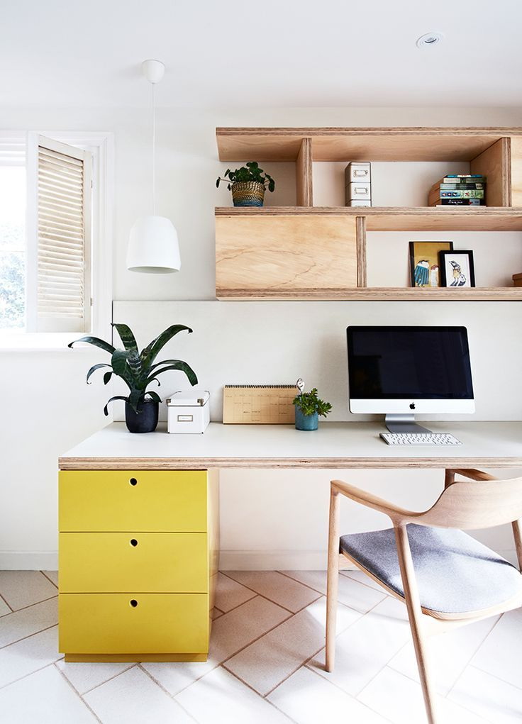
Choosing yellow in the interior, the user has the right to be guided by personal preferences and tastes. But just one or a few items and accessories are enough for the room to become interesting, sunny, and the person gets a good mood and peace from it. Furniture, snakes, carpetpillows sofa, chairs - all this will bring harmony into the house, fill it with vivacity and will not tire.
return to menu ↑Successful color combinations with yellow
You can draw ideas of combination with the rest from anywhere:
- flowers in the front garden;
- the national costume of our ancestors;
- tropical fruits;
- sweets;
- coat of arms
If you are confused and doubt the correctness of your choice, listen to the advice of designers on how to properly combine the sun shade with all the hotels and whether it is possible in principle.
Very easy to combine with other colors.
White
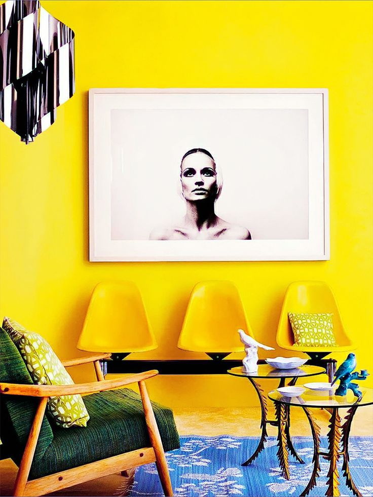
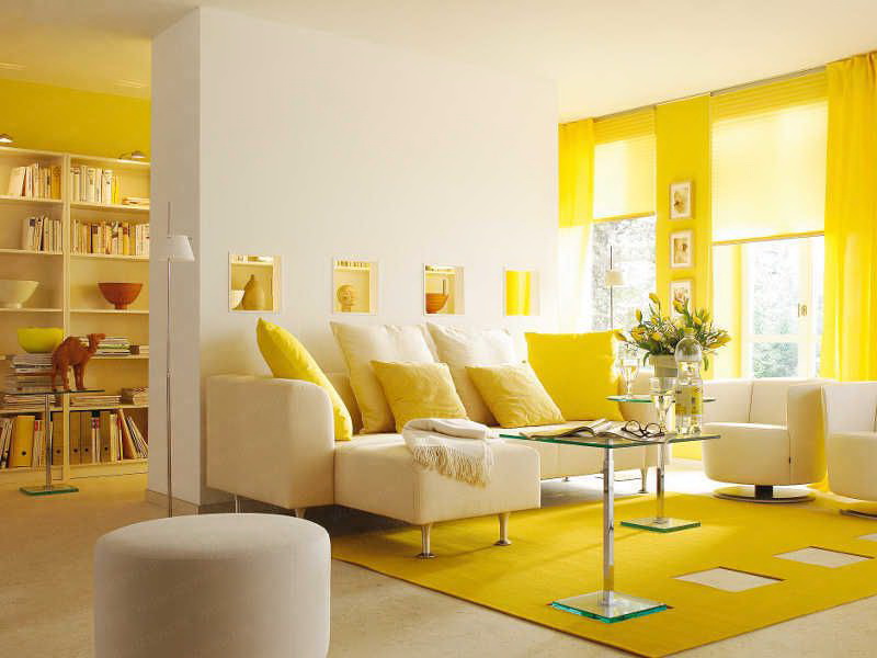
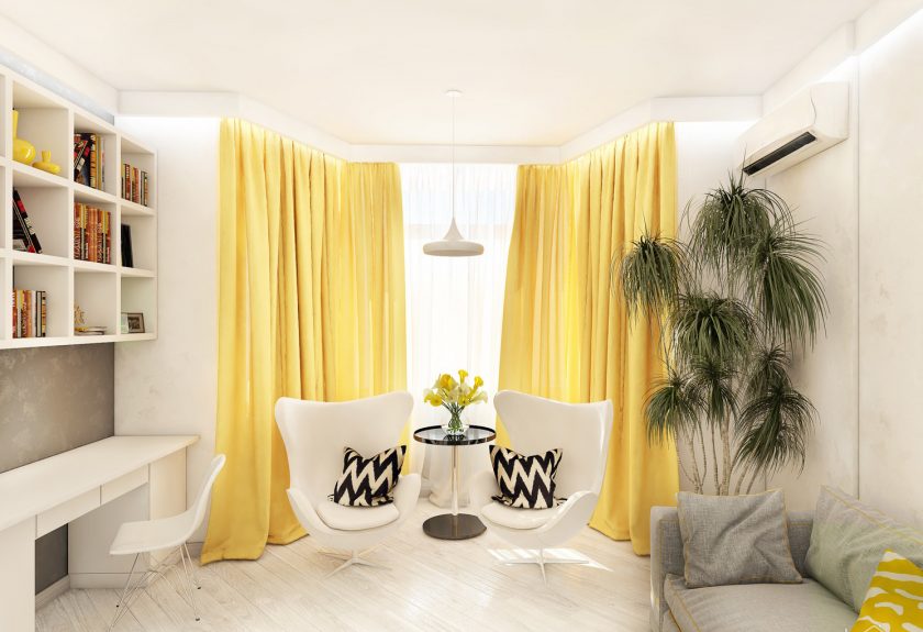
The most common combination is yellow-white.It will look good in small rooms with a lack of natural light. White will visually enlarge the space, and yellow will fill it with sunlight. The sophistication and simplicity of this combination is fascinating. Even the most saturated on a white background will look quieter.
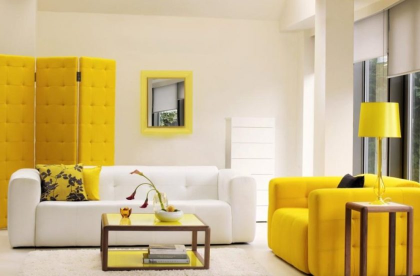
Yellow and white combination
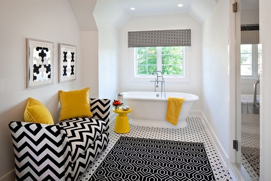
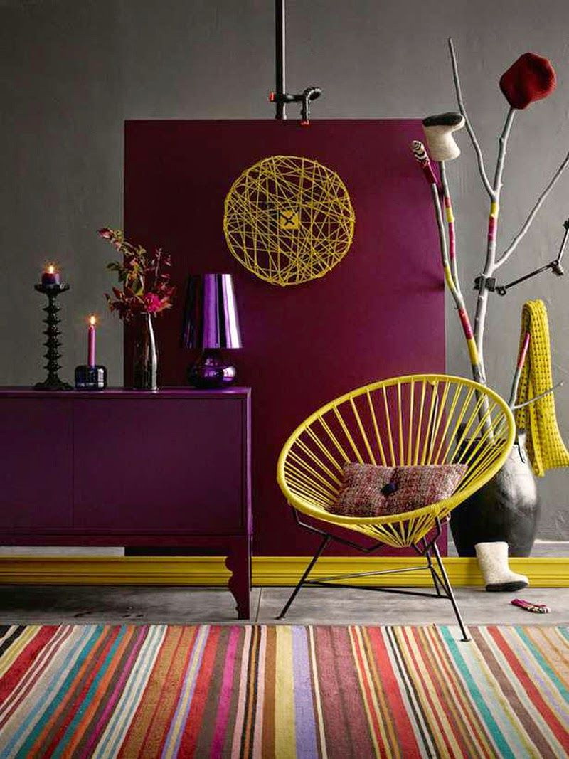
The black
Black and yellow combination is completely different from the previous one. It has to aggressiveness, contrasts become clear and sharp. For small rooms are not suitable in principle. They will look stylish and good in the case when this range is diluted with chrome elements with glossy surfaces. This combination, despite its ordinary, is very common.
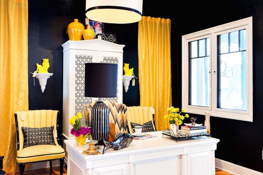
Black and yellow combination
Gold
Such an interior is considered an attribute of luxury. Gold elements must overflow: if it is wallpaper, then they should have an ornament or pattern, if it is a curtain, then the presence of folds is necessary, if it is furniture, then there should be carved details on it and so on. Golden interior in its pure form - a rarity. It usually combines gold elements with soft shades of white (ivory, milky, cream and others) with beige, black or brown tones.
Such an interior is considered an attribute of luxury.
Beige
For a combination with beige harmonious soft tones of yellow:
- dark pear;
- saffron;
- golden;
- yellow.
It will look good combination of lemon as an accent on a beige background. The yellow-beige version is suitable for spacious rooms. They are immediately filled with comfort.
In combination with beige
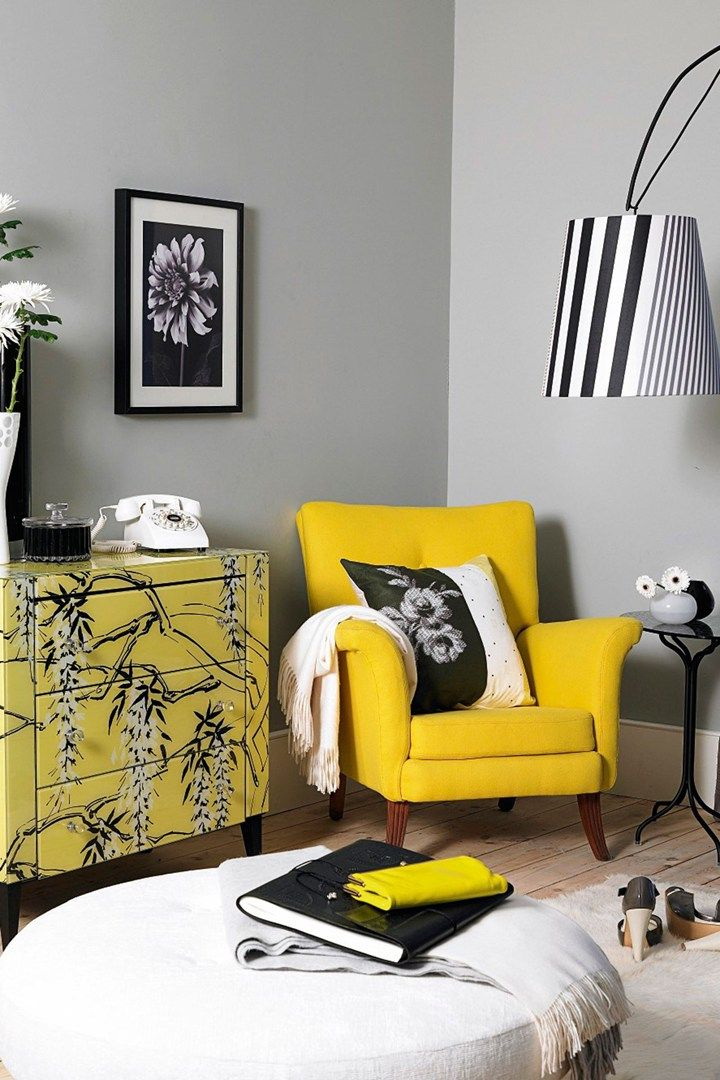
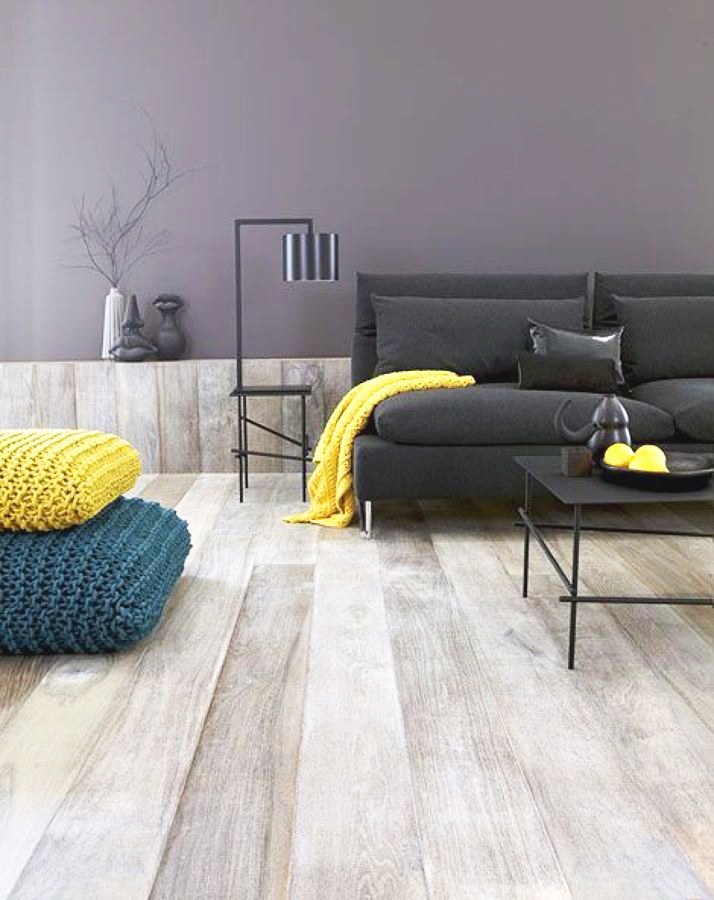
Gray
This color is considered universal. Against this background, not only yellow, but also all the others from the color gamut look good. In this pair, designers prefer the rich and ultra-bright shades of lemon. Gray, considered calm, will relieve from excessive energy. Will emphasize his emotionality and beauty. Gray-yellow color in the interior, unfortunately, occurs infrequently. This can be explained only by the fact that very few people know about the advantageous sides of this pair.
Universal color combination
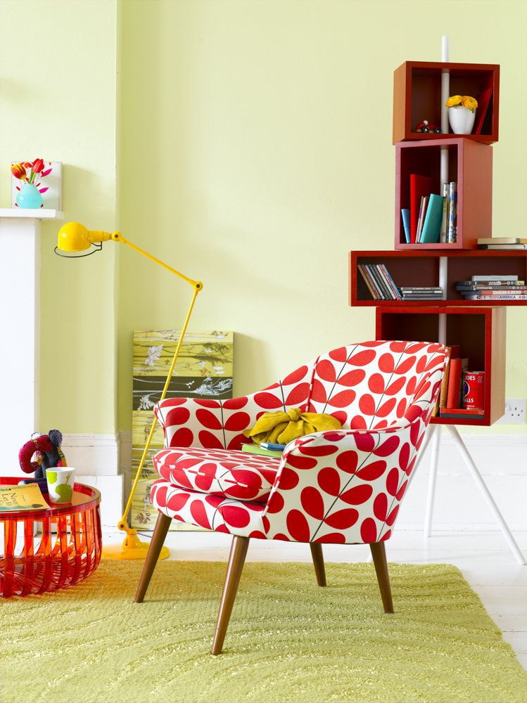
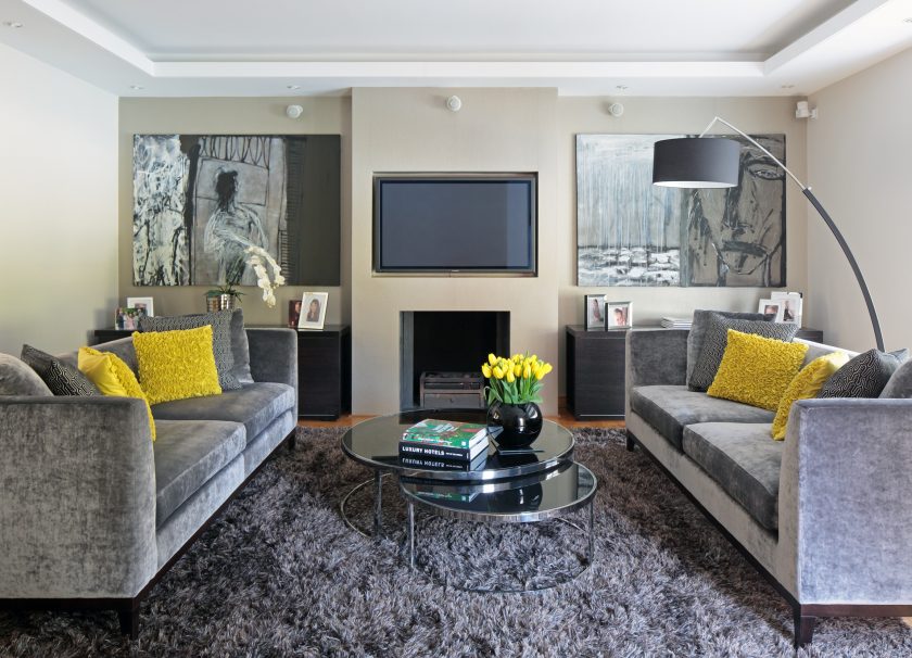
Red
An over-saturated duo, able to “overheat” the interior, because both belong to the category of warm colors. Although the pair look pretty interesting, original and unusual.
Much more interesting and safer and more original this combination option will look in the kitchen. If for you two warm and very bright colors seem too much, you can try to experiment with burgundy. He is more calm.
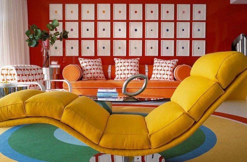
In a pair of colors look quite interesting, original and unusual
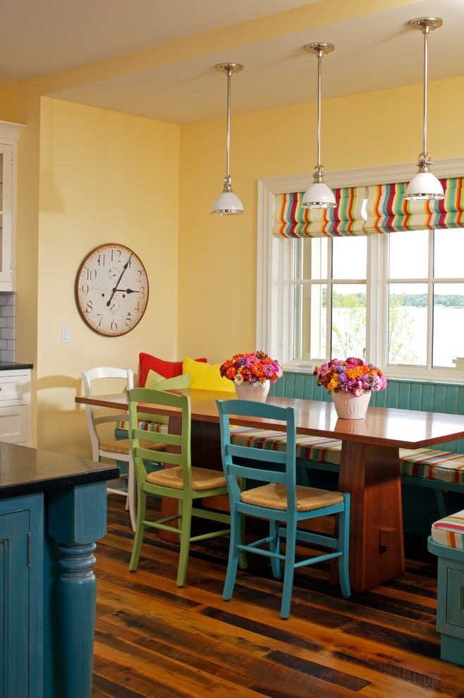
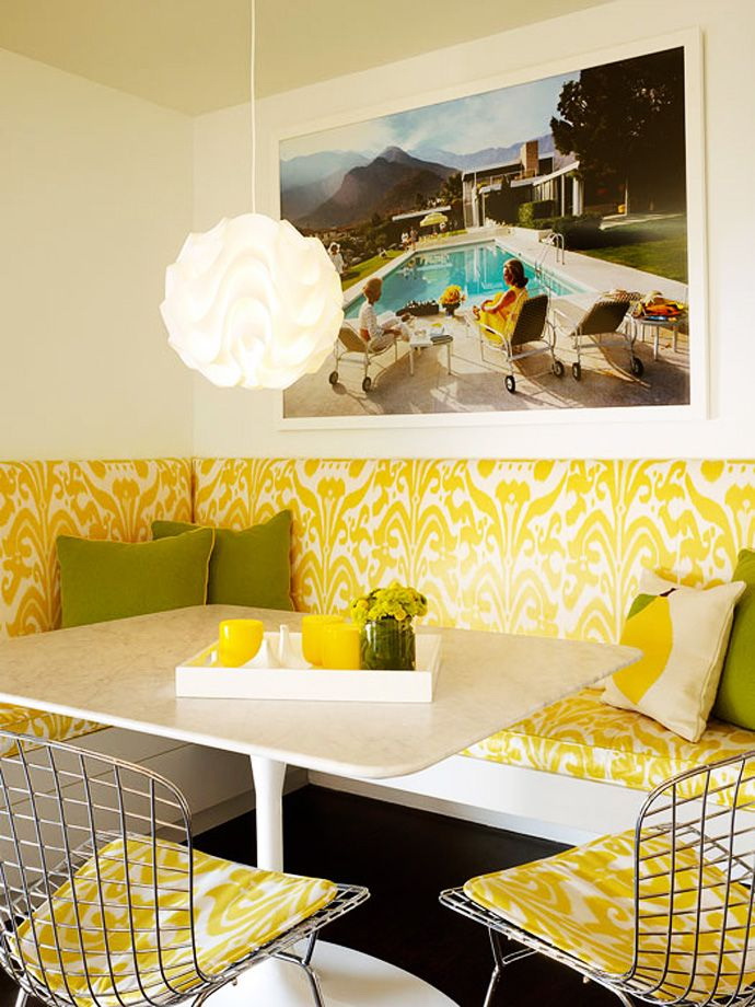
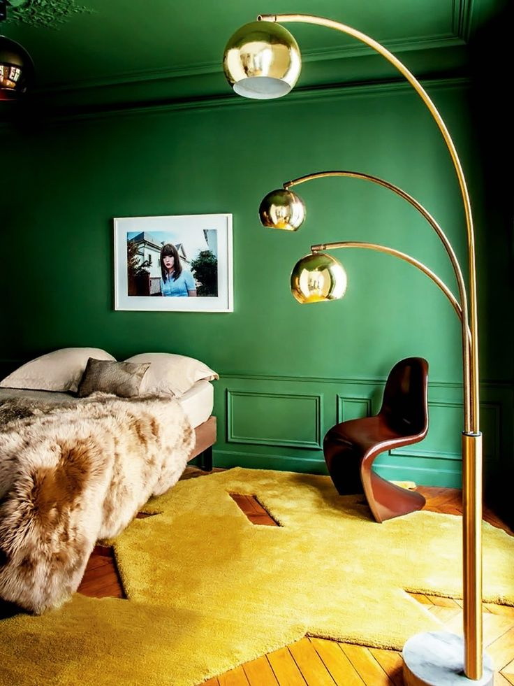
Green
This composition is perhaps the most cheerful and positive. Juicy yellow with bright green - a tandem that infects with energy, refreshes the room, causes a smile, improves mood. This contrast option is suitable for registration child's, kitchen, bathroom.
In life, the most common, taking advantage of the incredible popularity, yellow-green color with muted tones of each. The combination of pale yellow and mint shades has a calming effect on a person.
Juicy yellow with bright green - a tandem that infects with energy
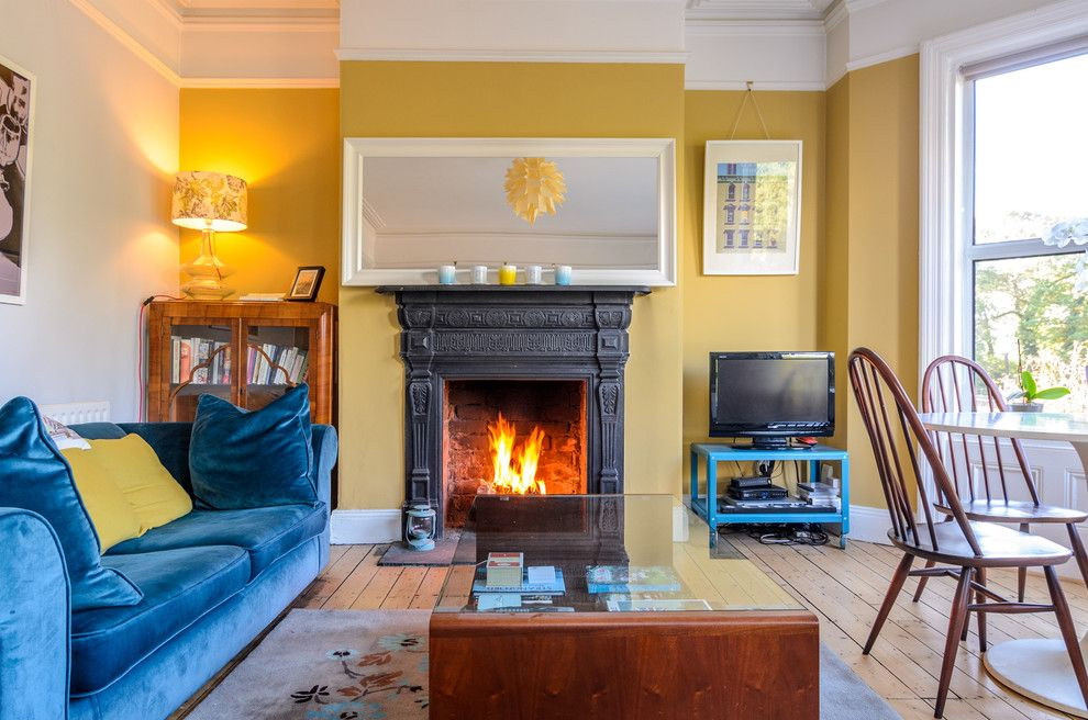
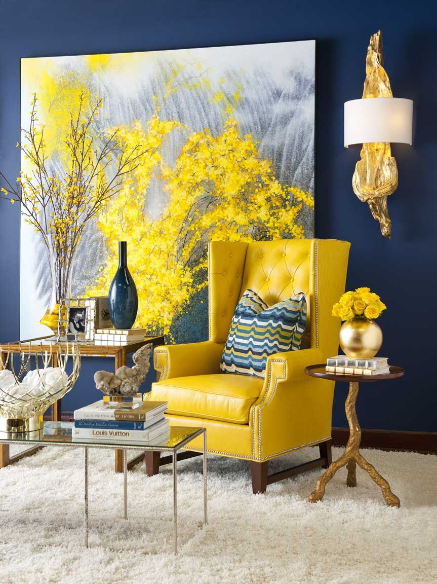
Blue
This combination is relevant both for designers and ordinary users.In the yellow-blue duet "met" two opposite colors - one refers to the cold, the second, to the warm. That is why they look against each other in a contrast and sharp way.
The combination of cold and warm tones
Violet
This combination is often found on the pages of glossy magazines or in the windows of stylish salons. Is this option appropriate in a residential area? These are two very bright colors and use one as the main one, and the second as an additional one - the idea is not a good one. From this a person will tire too quickly.
Such colors are better extinguished by something neutral, such as gray.
Brown
This combination can vary, in terms of contrast, from bright tones with a dark brown color to a softer light yellow-brown. Such a duet symbolizes tenderness, in which two absolute opposites merge: sullenly landed brown and spontaneous lemon. Like green, brown is considered akin to yellow. Therefore, not too common, all over the world, the shades simply merge, making the yellow-brown interior deeper.
Such a duet symbolizes tenderness
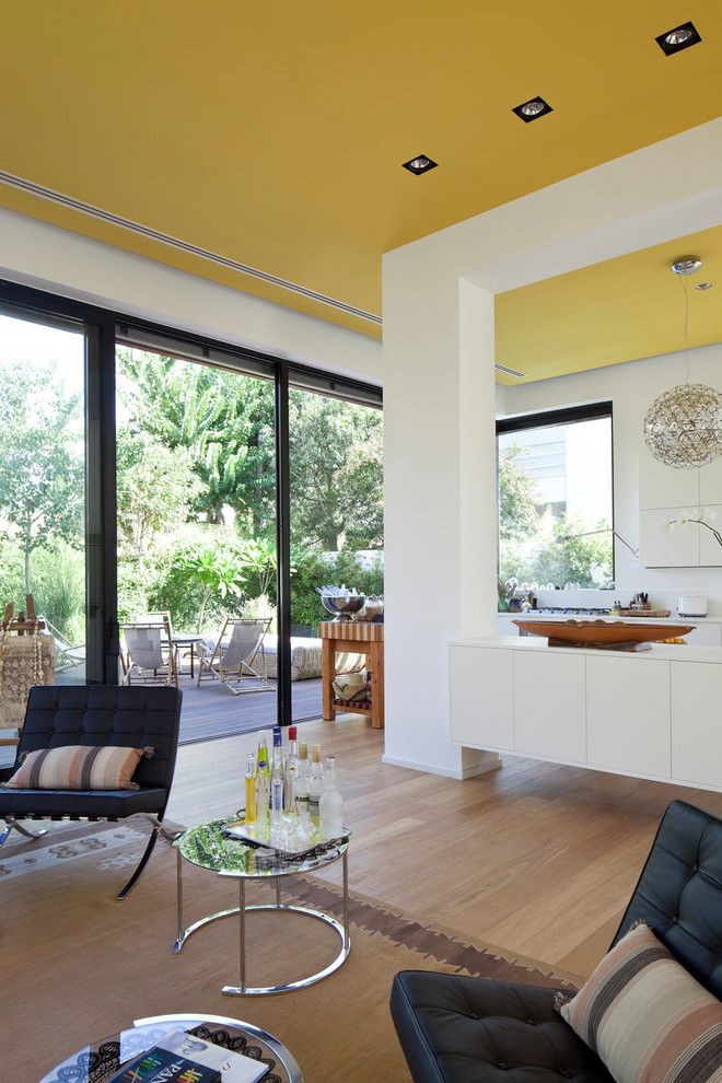
How to make walls and ceilings?
As for the walls, they can be made saturated and bright. As a finishing material, you can use everything: wallpaper, paint, decorative plaster or wall panels. Completely making all the walls of lemon is undesirable. It is best to combine colors with each other. For example, to make the accent wall yellow, the other three to draw in a different shade.


At registration living room in yellow, stick to these recommendations, and it will please you with a pleasant, comfortable atmosphere:
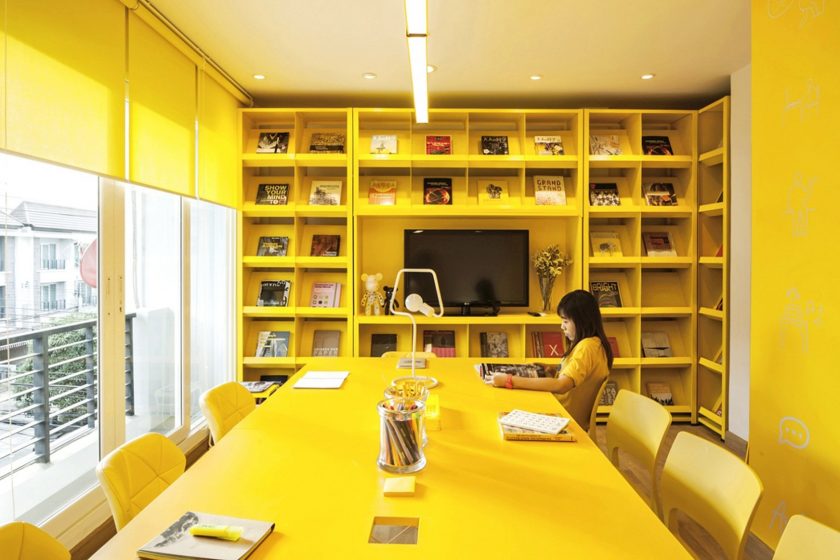
- Too much lemon in this room is a rude and frivolous decision. No need to overdo with yellow.
- If the living room is all in yellow: curtains, furniture, accessories and so on. Being in it will be very hard and the temperature in it will seem excessively high.
- If you use too bright shades of lemon in a hotel, it will be very difficult to concentrate in it, intellectual activity will decrease significantly, it will be very difficult to concentrate while reading or working.


What shades can replace bright yellow?
So that the saturated lemon color does not affect the psyche and does not excite a person, it can be replaced:
- sandy;
- ocher;
- golden;
- mustard;
- pastel yellow.
Mustard Shade
Using these shades of yellow interior will not adversely affect the psyche and nerves. It will allow you to fully experience all the positive qualities of this color.
return to menu ↑Cheerful tones in the living room
Yellow, as already mentioned, should be used in interior design very carefully, especially in the bedroom and child's. If you choose the shades correctly, a quick awakening in a good mood is guaranteed. If not, then bright (poisonous yellow) will not be a joy and the person will wake up not rested, depressed and excited.
Moderation must be observed in children's rooms.Despite the fact that children love this color, the children's nervous system can not cope with emotions if it is too much. Screaming the interior in their room will lead to the fact that children will always be over-excited and overly active. And if a schoolboy lives in the house, it can also affect poor performance.
Bright yellow, sunny interior
All these frightening arguments are not evidence that generally need to abandon this design option. You just need to know the feeling of Merya, choose the right shades, combine them with each other. Then the room will always delight with its beauty and radiance.
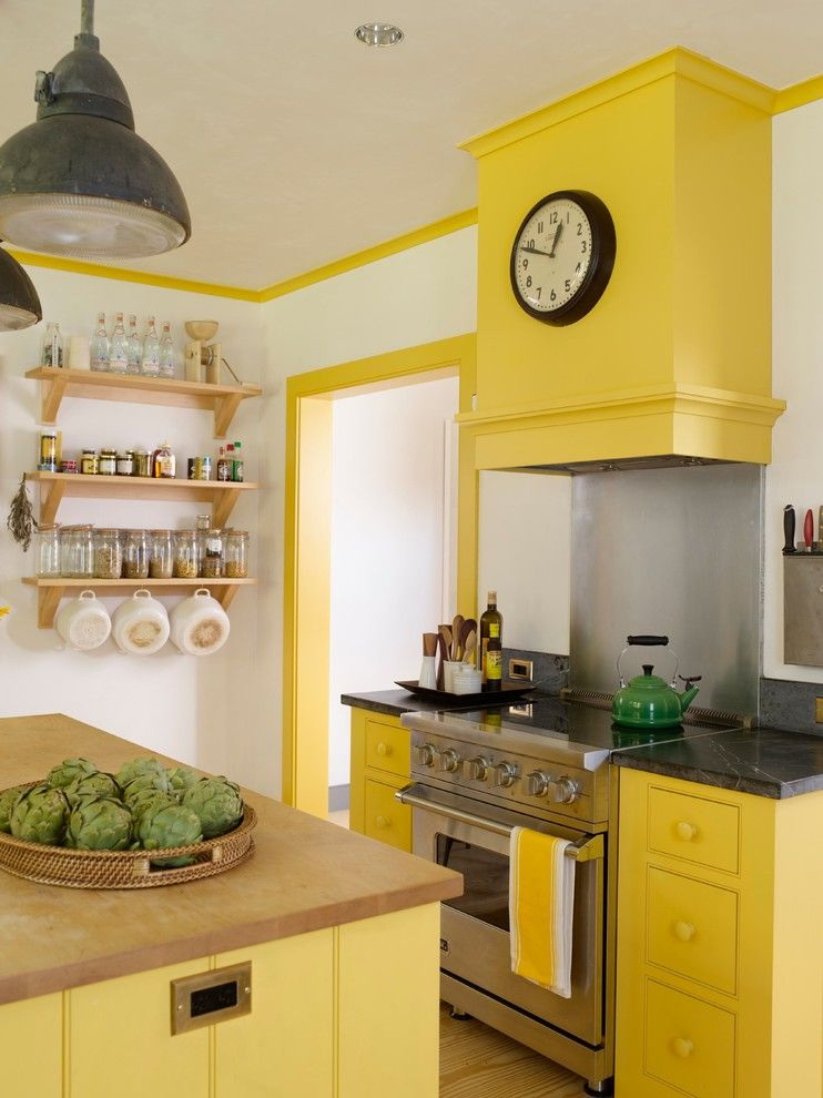
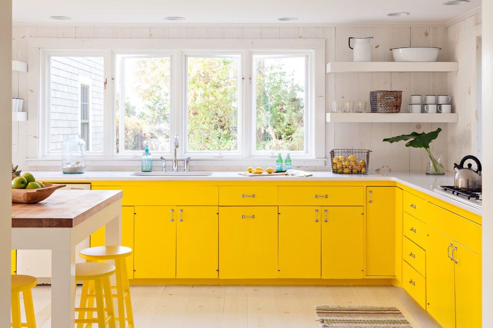
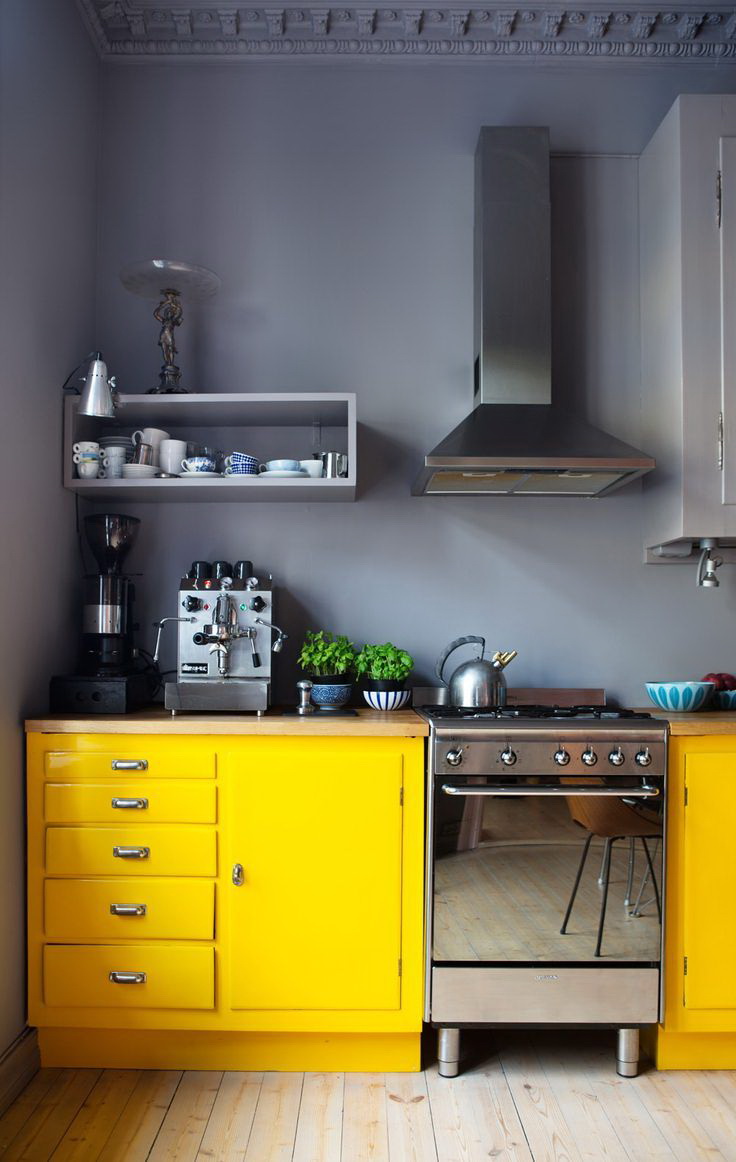
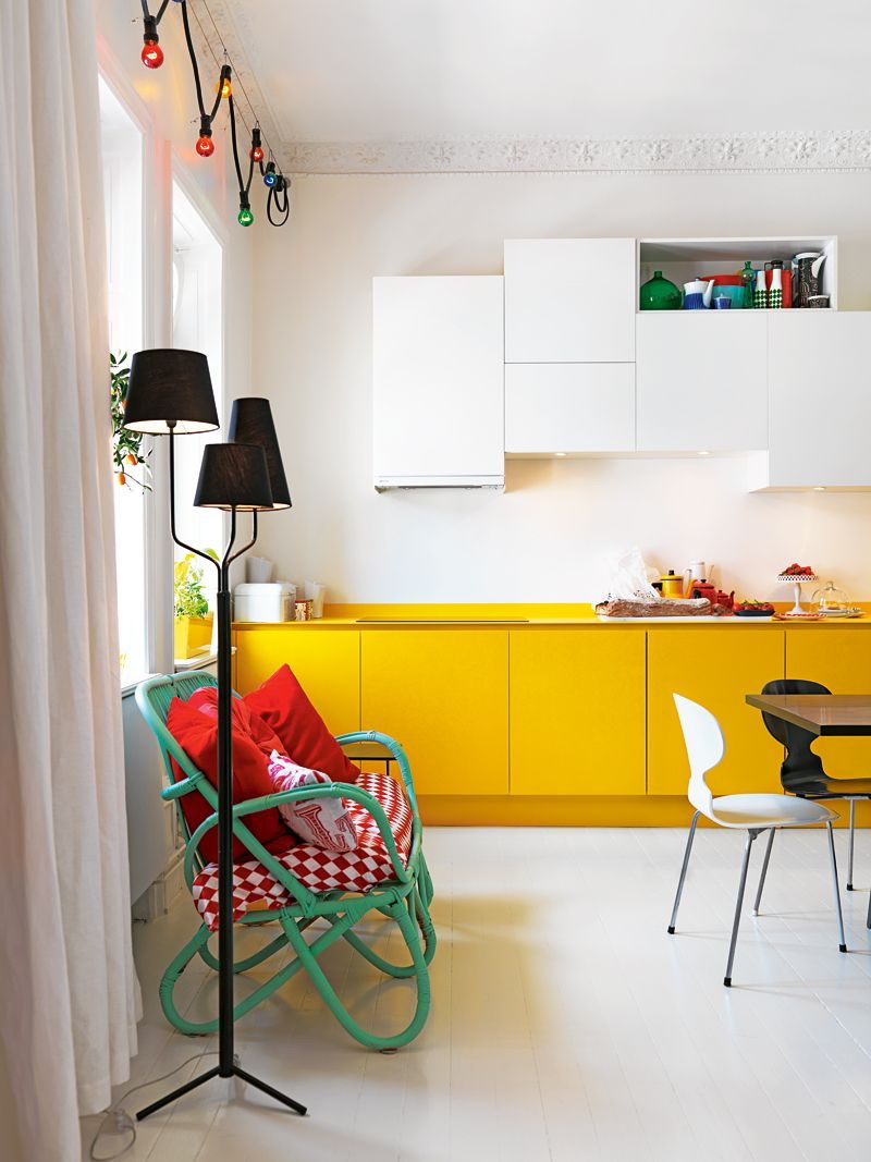
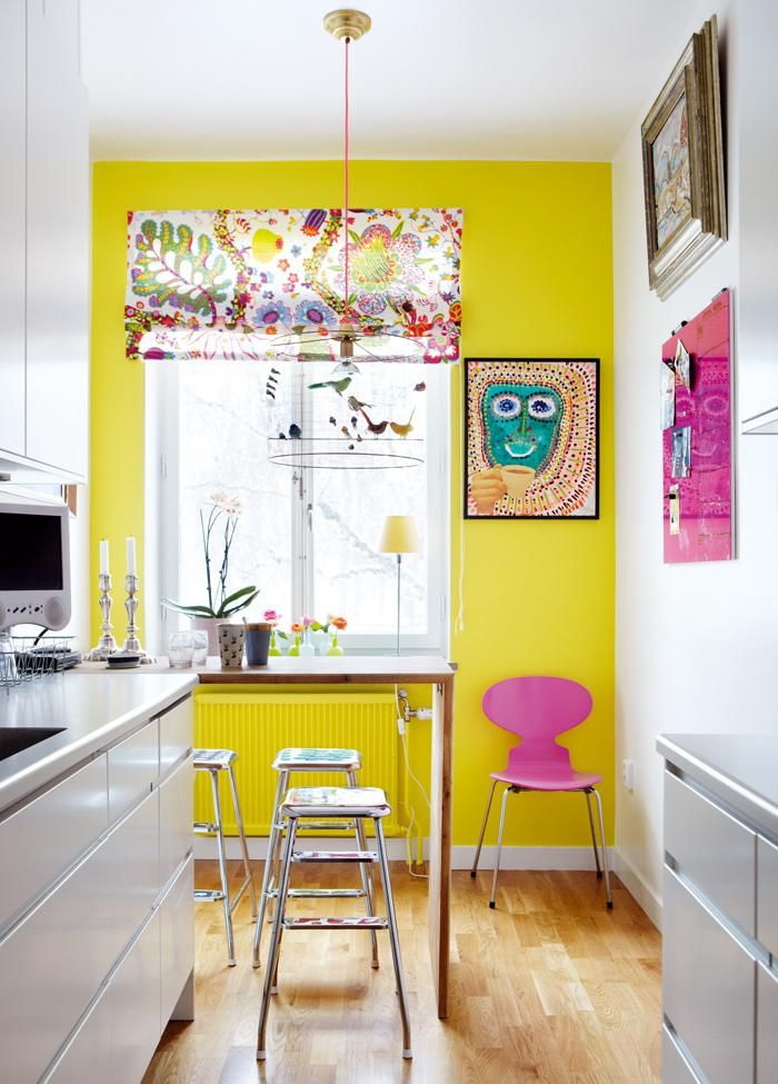
return to menu ↑Kitchen in yellow
This is a room where any experiments with lemon are allowed, including very bright and saturated ones. But think over the interior is still worth it.
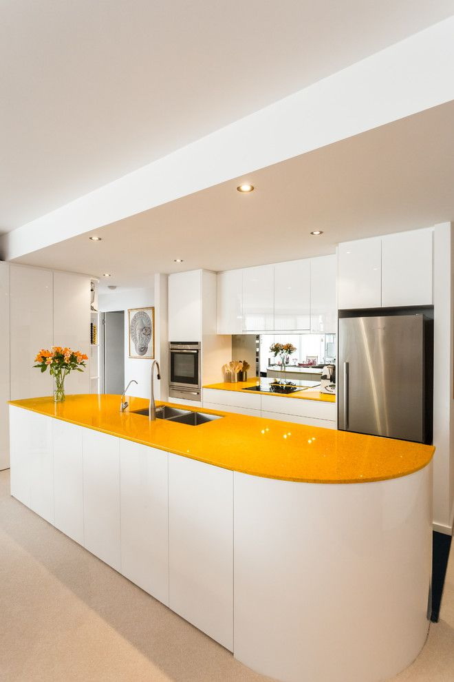
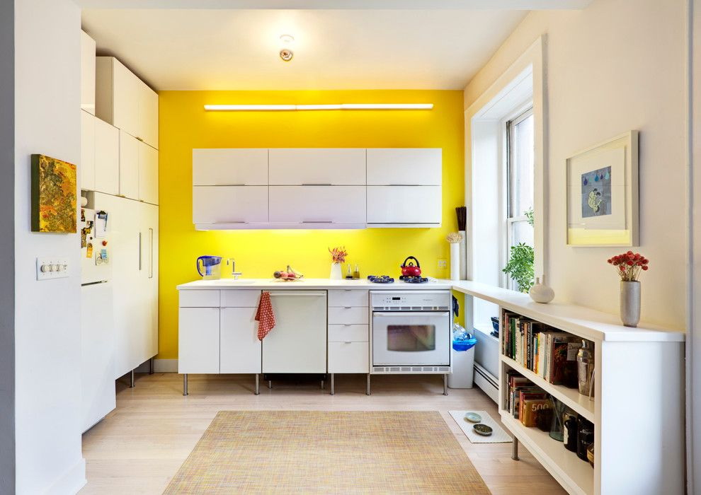
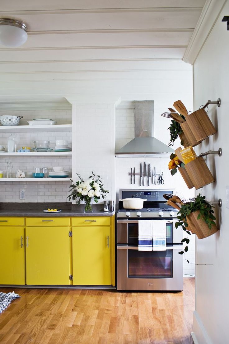
For example, white, this combination symbolizes purity, enhances appetite. You can focus on kitchen furniture. Not bad fit into the overall look of yellow kitchen chairs, curtains, dishes and other decor items. You can, as an option, select the zone apron in yellow.


Highlighting the dining area in gentle tones of lemon, adding details in a warm green, you get a natural combination that will give the room a charm.
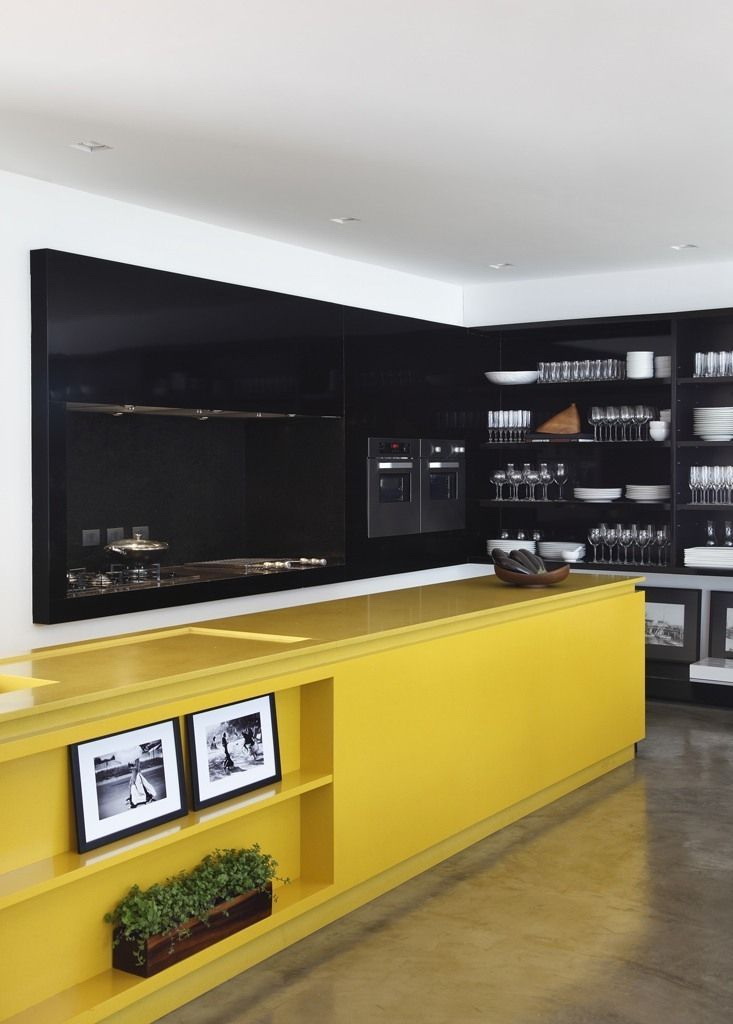
The combination of different shades of yellow with delicate gray will give the kitchen the necessary harmony. A special touch in the harmony will make black accessories. Glossy panels of kitchen furniture look good chrome interior elements. An abundance of lemon will only catch your appetite. The white interior in the kitchen gives it freshness and purity, if you add it with yellow accents, the kitchen will play in a different way, in spring.


Kitchen set gray steel color will not look catchy against the yellow facade and the floors are brick red in color. The interior gets a bright sound if the dining area is designed in the style of a classic, highlighting it with expensive elements and wooden furniture of mustard color.
Yellow on the kitchen It is intended to awaken the appetite, so using it in this room is justified and appropriate, and if you add black tones to it, then this approach will emphasize the depth of yellow.
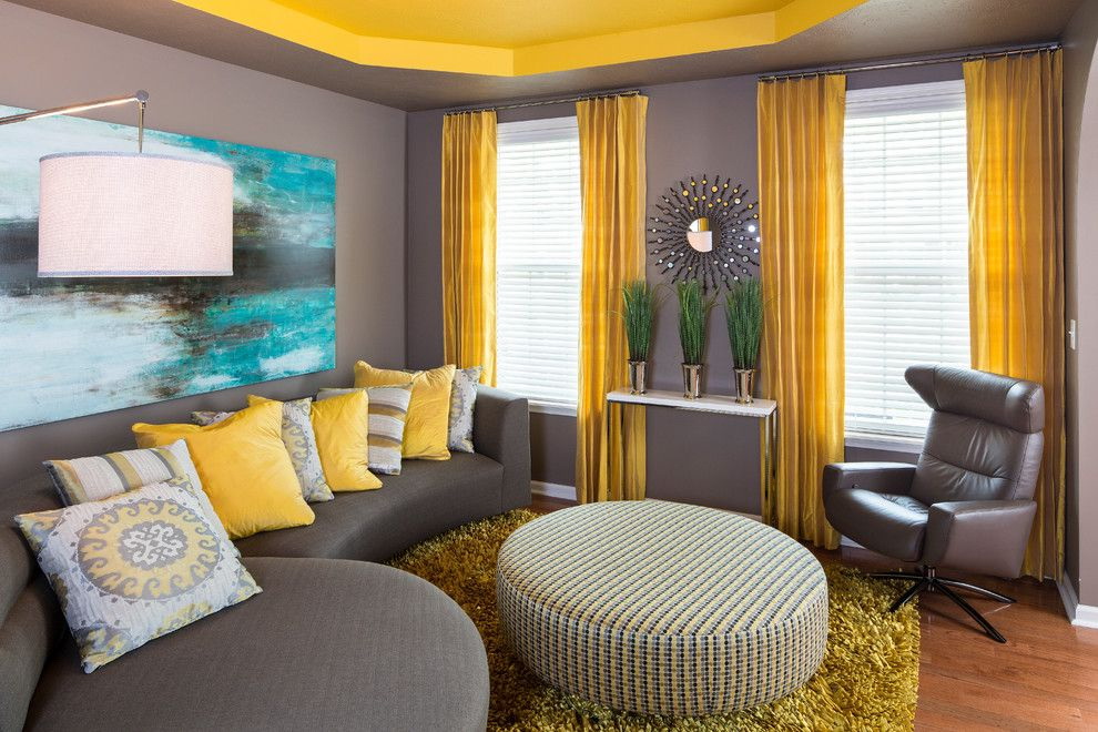
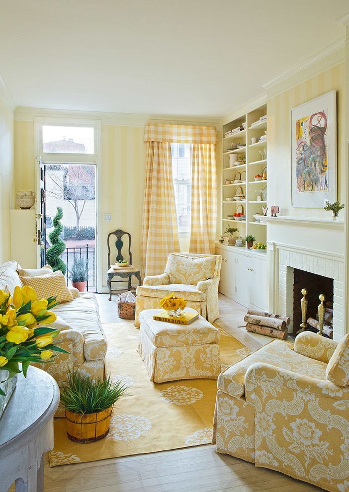
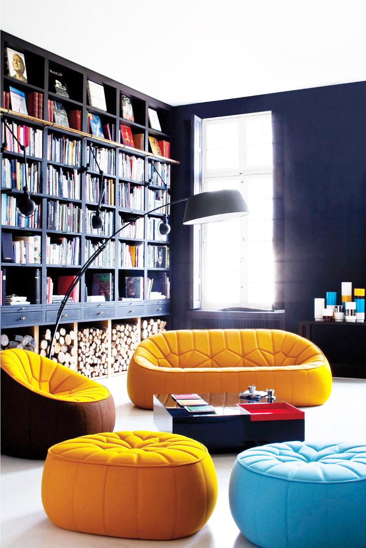
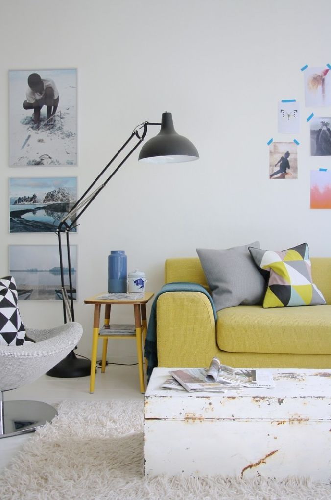
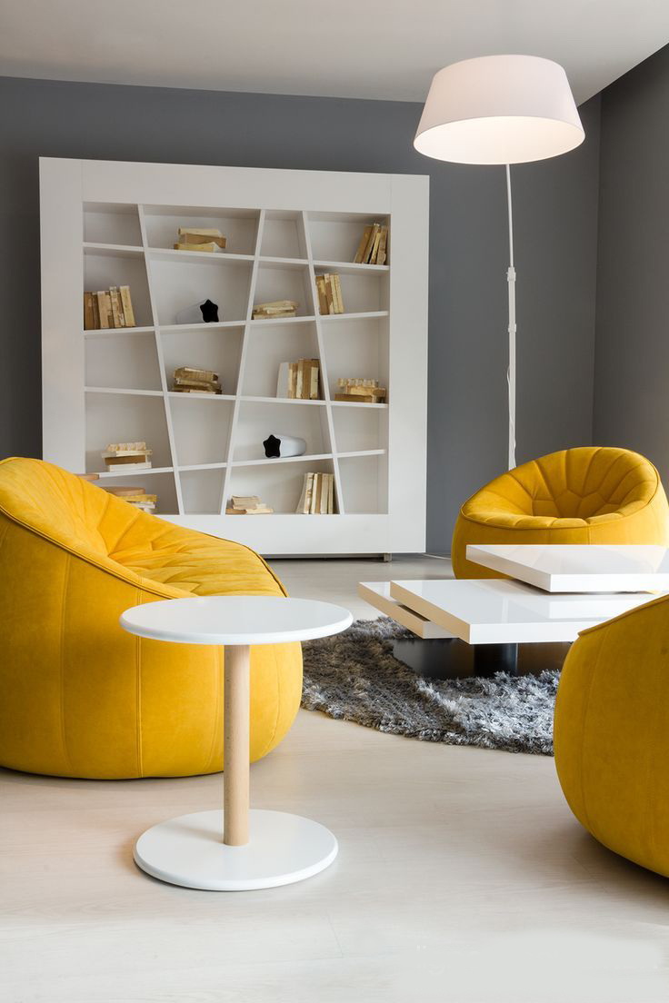
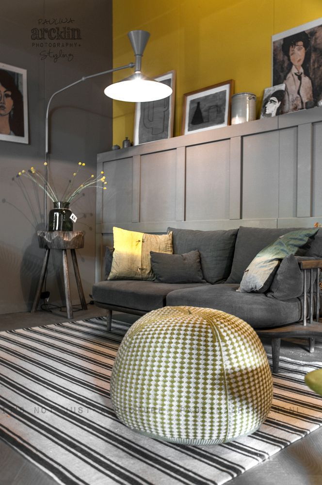
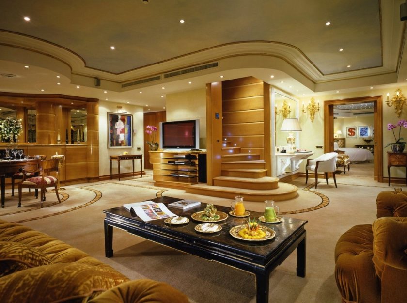
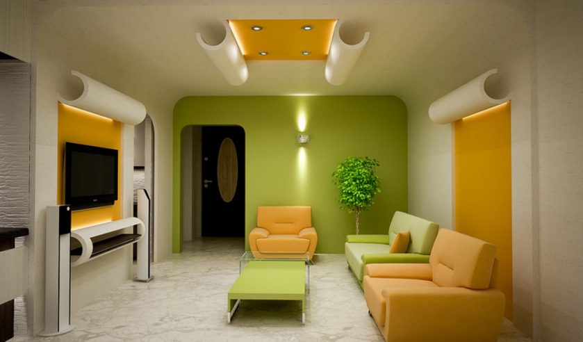
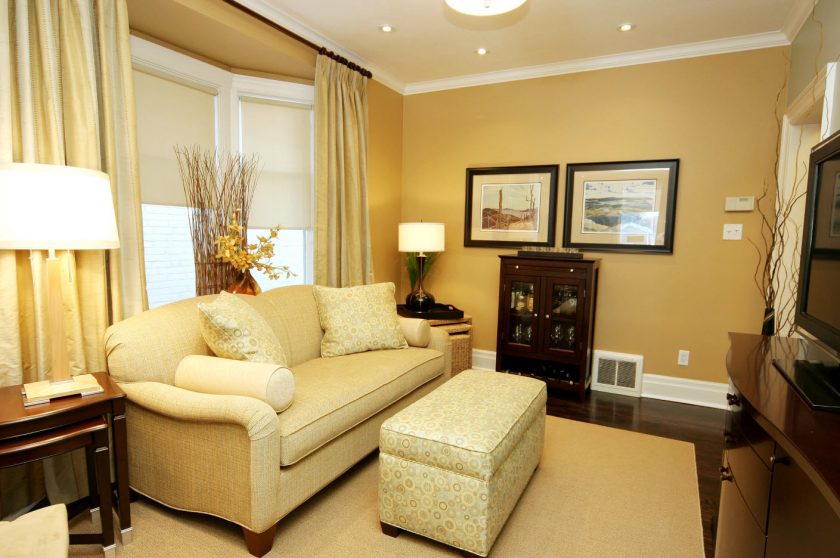
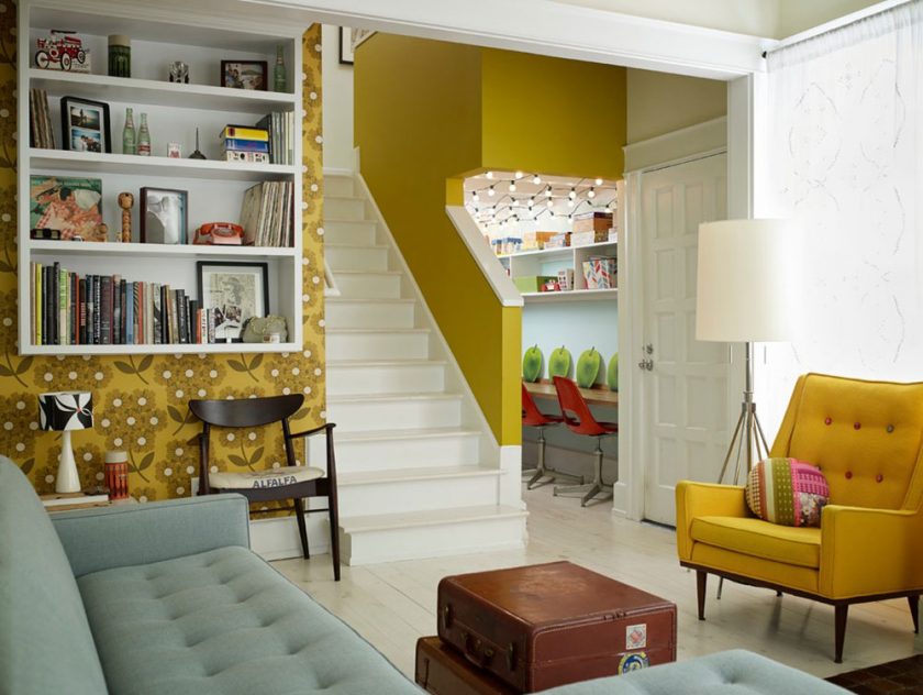
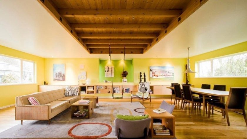
return to menu ↑Bright living rooms
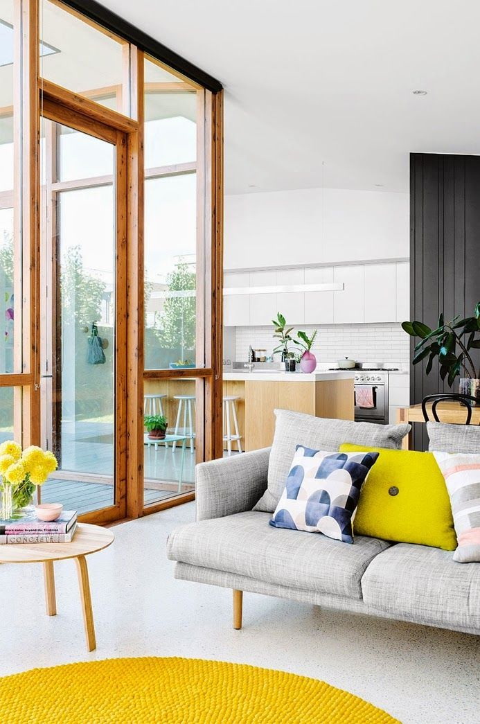
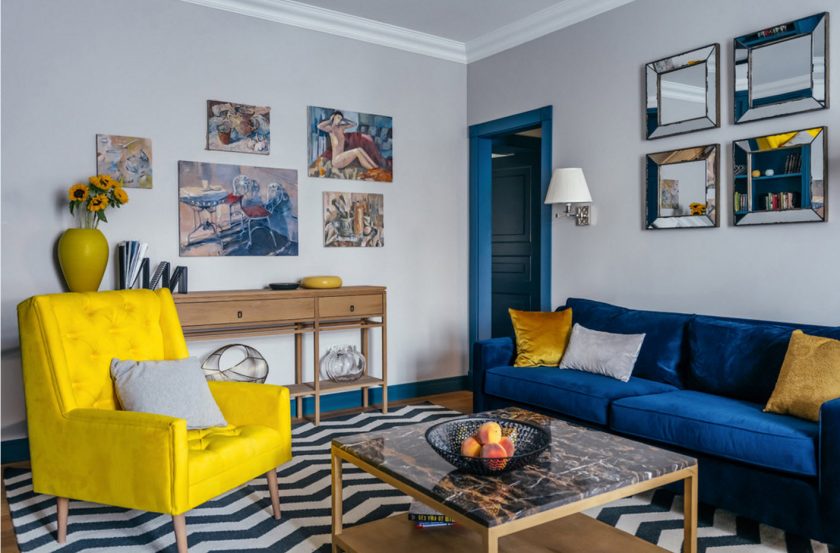
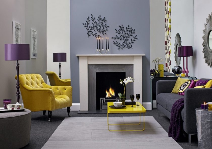
This room is recommended to be done in a restrained gray tone, and yellow is added in the form of decorations and accessories: carpets, chairs, tablebedside tables.
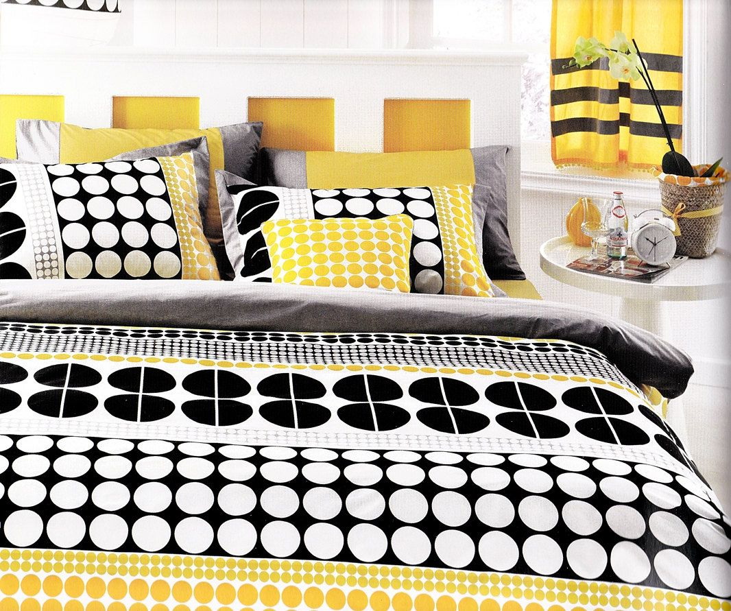
A minimalist guestbook with a yellow-black palette is a good option. The room looks exquisite.
Yellow is better to add as decorations
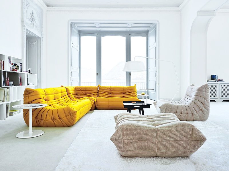
The living room with a yellow upholstery on furniture of non-standard forms is also unusual and also looks good.m
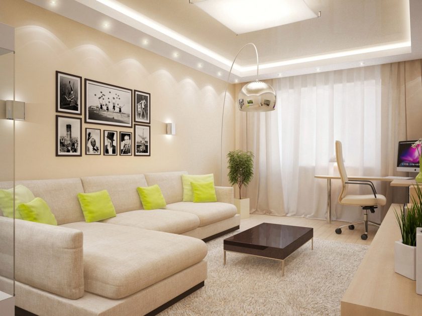
A good option is to combine the dining room with the guest room. The connection can be accomplished by zoning into a single room. The white-yellow combination allows you to focus on the details of the interior. This design looks very interesting. Soft furnishings of green and yellow colors will be the highlight of the living room, bringing variety to the palette.
A good option is to combine a dining room with a guest room.
Extravagant will look the living room, decorated in yellow with black. And if you add a little bit of chrome-plated elements, furniture of non-standard sizes and shapes, then such an interior will definitely attract attention to itself.
Admirers of light and open interiors are advised to try decorating the living room in a yellow-white version. Shades of red in the form of accessories will add comfort and life.
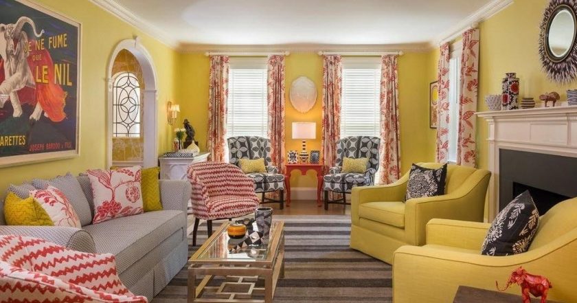
Cozy living room
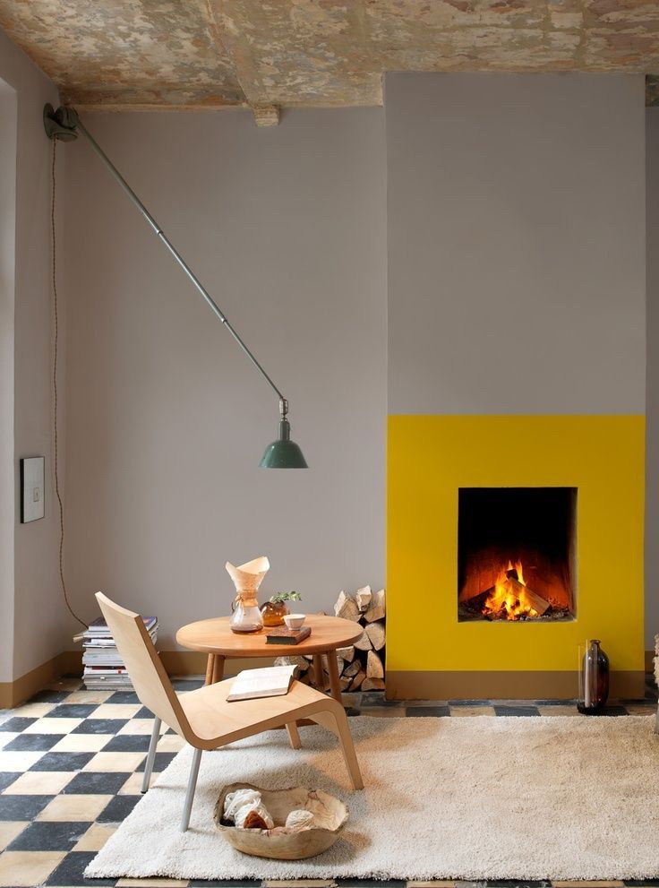
The soft apricot color in the guest color is in perfect harmony with white, and the accent is yellow. fireplace with other bright details of the same color will add to her luxury and respectability.
Living room decorated in soothing colors with bright elements of olive or yellow colors makes the design relaxed and cheerful. Pale yellow in the living room on the facade and white furniture in combination with fresh flowers and light textiles will bring a touch of romance to the design.
Restrained and modern design style
Yellow furniture on the background of the facade of soothing shades will add to the interior a sunny atmosphere. Sofa against the background of the original wall will fill the room with peace and tranquility.
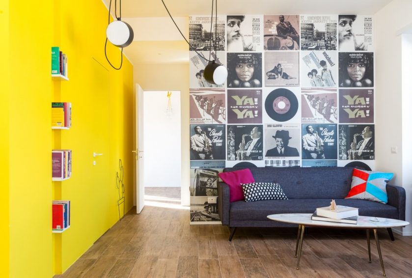
return to menu ↑Entrance hall
If the design of this room is the task of visually increasing the usable area, paint the entrance a door in yellow color.
Variants with a facade of different shades of lemon look very interesting. This option will look even better if you dilute the yellow black decor.
Hallway using yellow
The second option is a small increase in visual the corridor - Paint the walls in warm yellow shades.
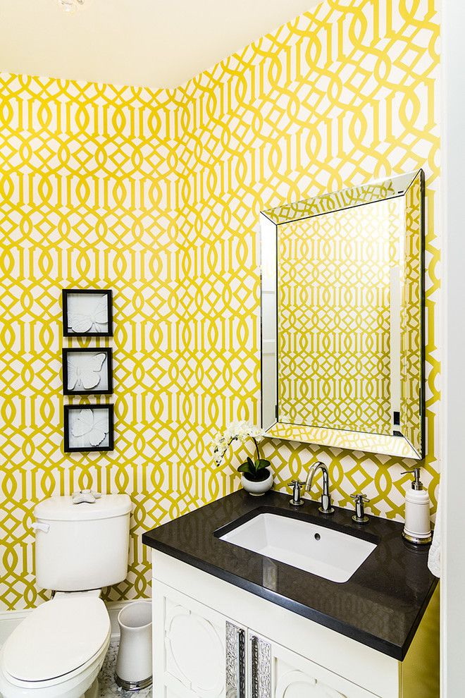
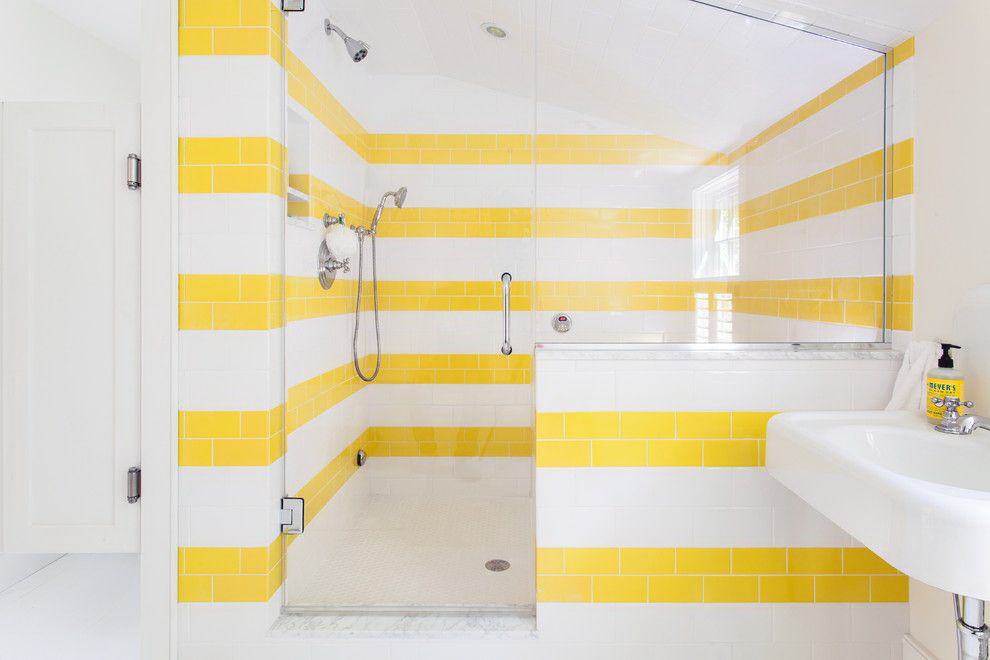
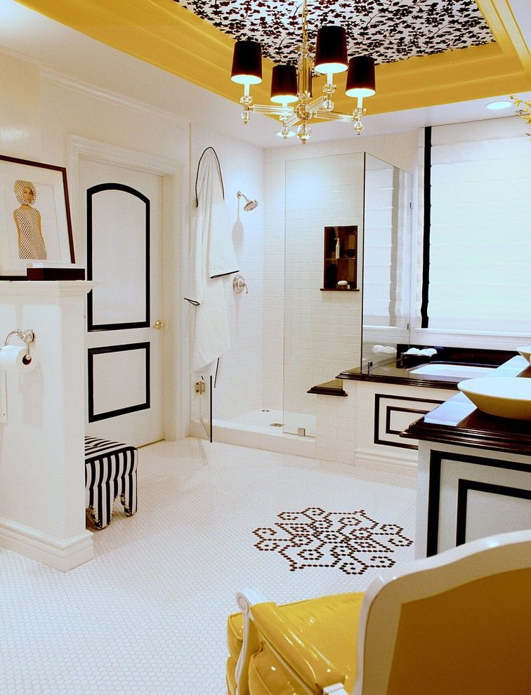
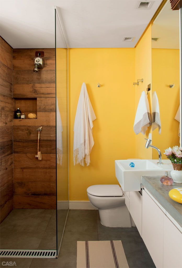
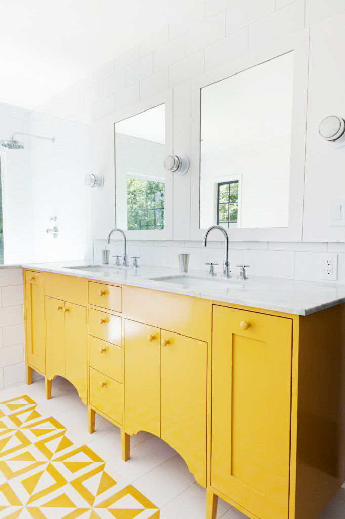
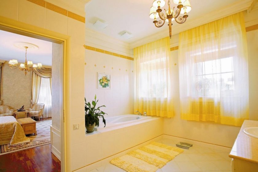
return to menu ↑In the interior of the bathroom
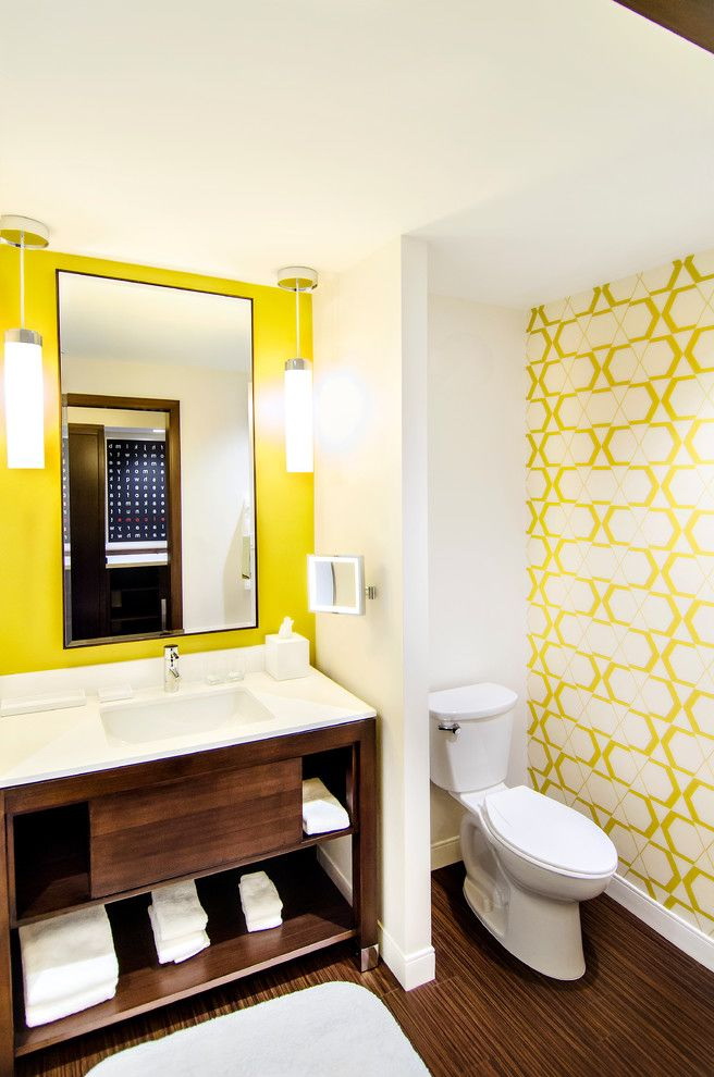
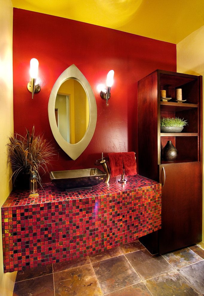
If the bathroom is decorated in pure yellow color, it will seem large and spacious. If you add mirrors here, its visual dimensions will increase even more. For bathrooms it is easy to choose the finish in a warm yellow palette or brown. These colors are ideally combined with each other, bringing softness and harmony to the bathroom.
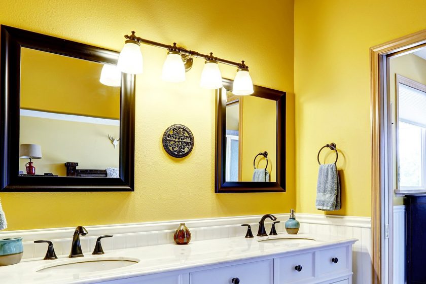
This color will make the bathroom large and spacious.
As an option, you can decorate the façade of the bathroom with tiled tiles of different edemacy, install a white bath, and choose toiletries in a dark color. The small bathroom can be expanded in bright colors. This approach will visually expand the space. Vanilla or straw paired with beige will help you with this.
Glossy tiles with mosaic inlays and suspended ceilings are a good design option for a small bathroom and a way to visually increase the area. Here you can use both light shades of yellow and bright.
Design option in a delicate color
You can arrange the whole room in the bathroom or its individual fragments:
- floor;
- sanitary ware;
- textile;
- the door to the shower stall.
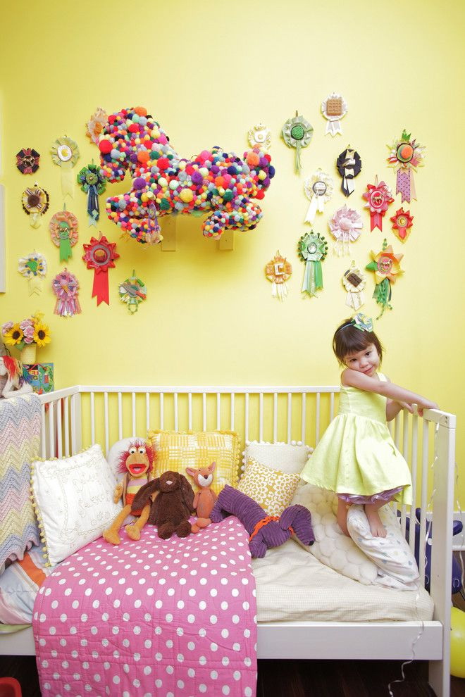
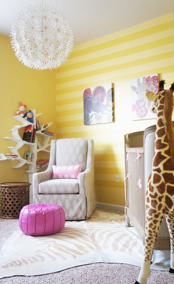
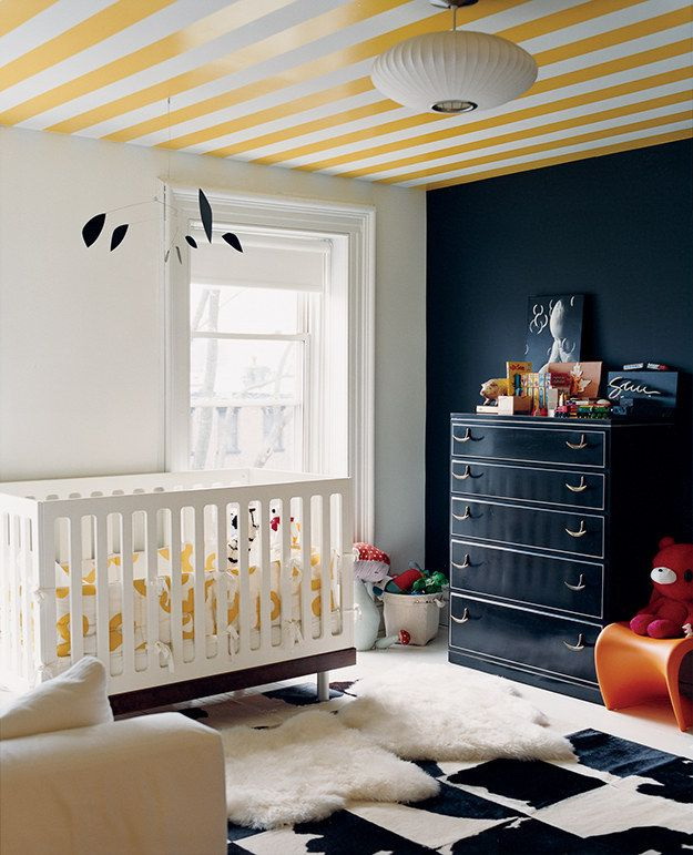
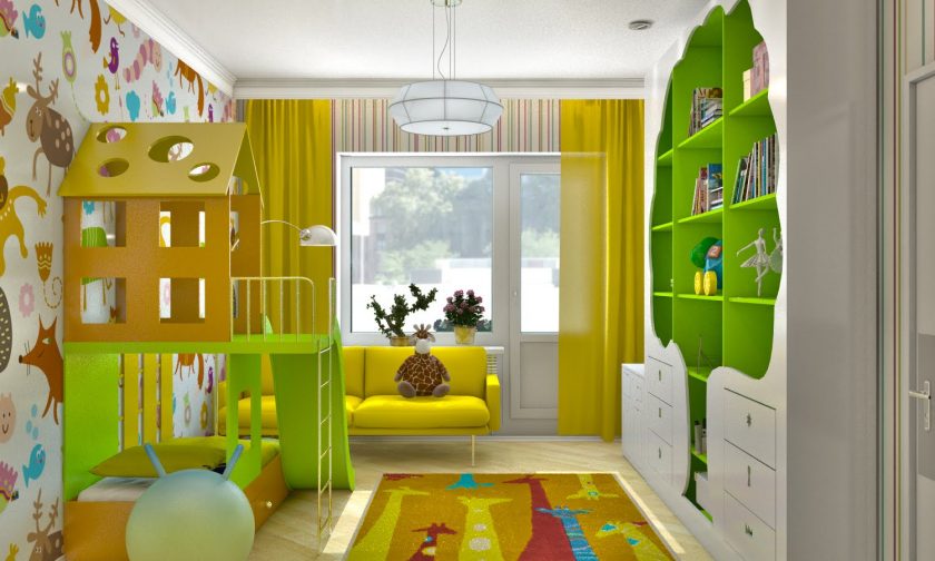
In the nursery
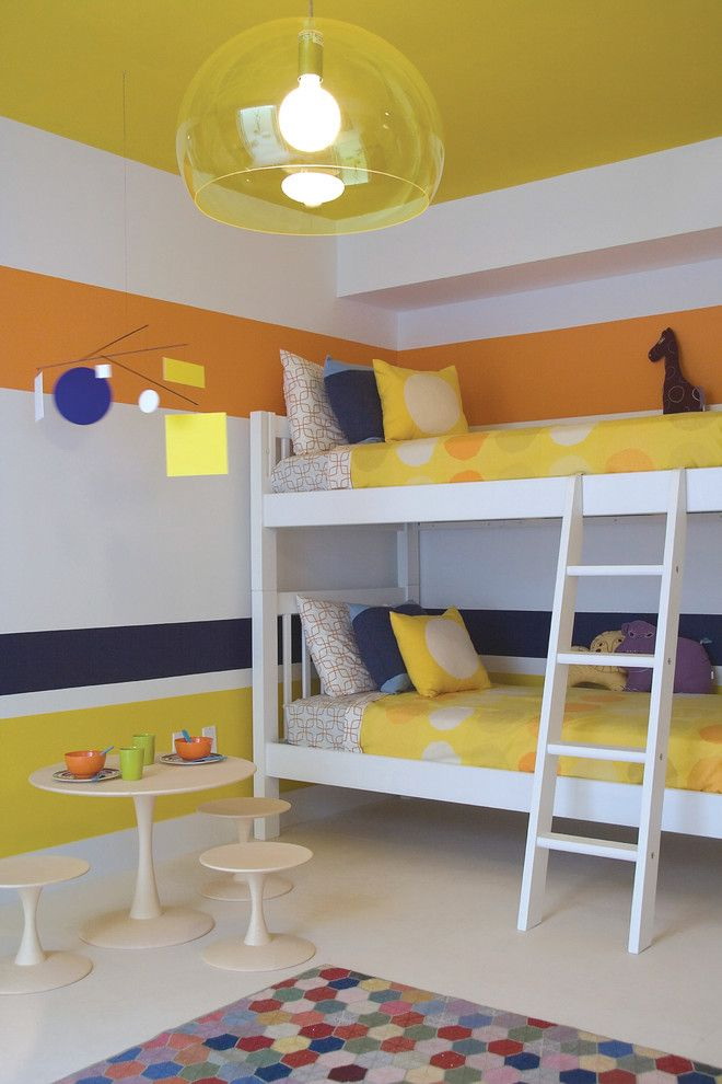
This color is also suitable for children's rooms. Here the yellow design of the room gives elegance, fun and festivity. In the nursery it is recommended to use bright colors in combination with salad or green. These combinations have a positive effect on the psyche and nerves of the child. Help develop, promote activity.
But first decide on the question of what kind of child is needed exactly for your child.
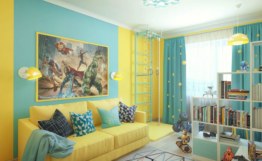
Gives room elegance, fun and festivity
A design option for a nursery where bright yellow and green are present is suitable only for calm children. If a baby has problems with a room, then such an interior should also be abandoned. The background in this case should be low-key and calm. And you can refresh the design with the help of stylish furniture and accessories.
In children's institutions yellow is used very often.Researchers have noticed that children spoil walls or furniture less often. They like all shades of yellow. This color is very popular in the design of children. But you need to develop a design project carefully. Excessive activity of the child will affect the circulatory system, and therefore will interfere with relaxing before bedtime.
These colors help develop, promote activity
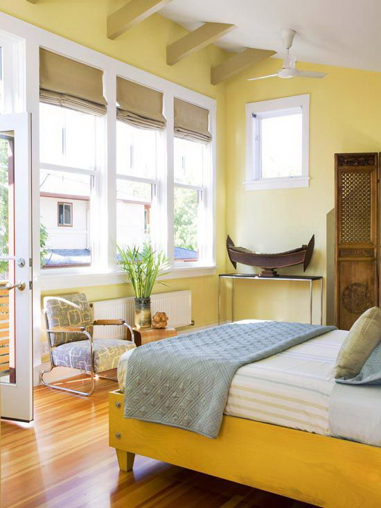
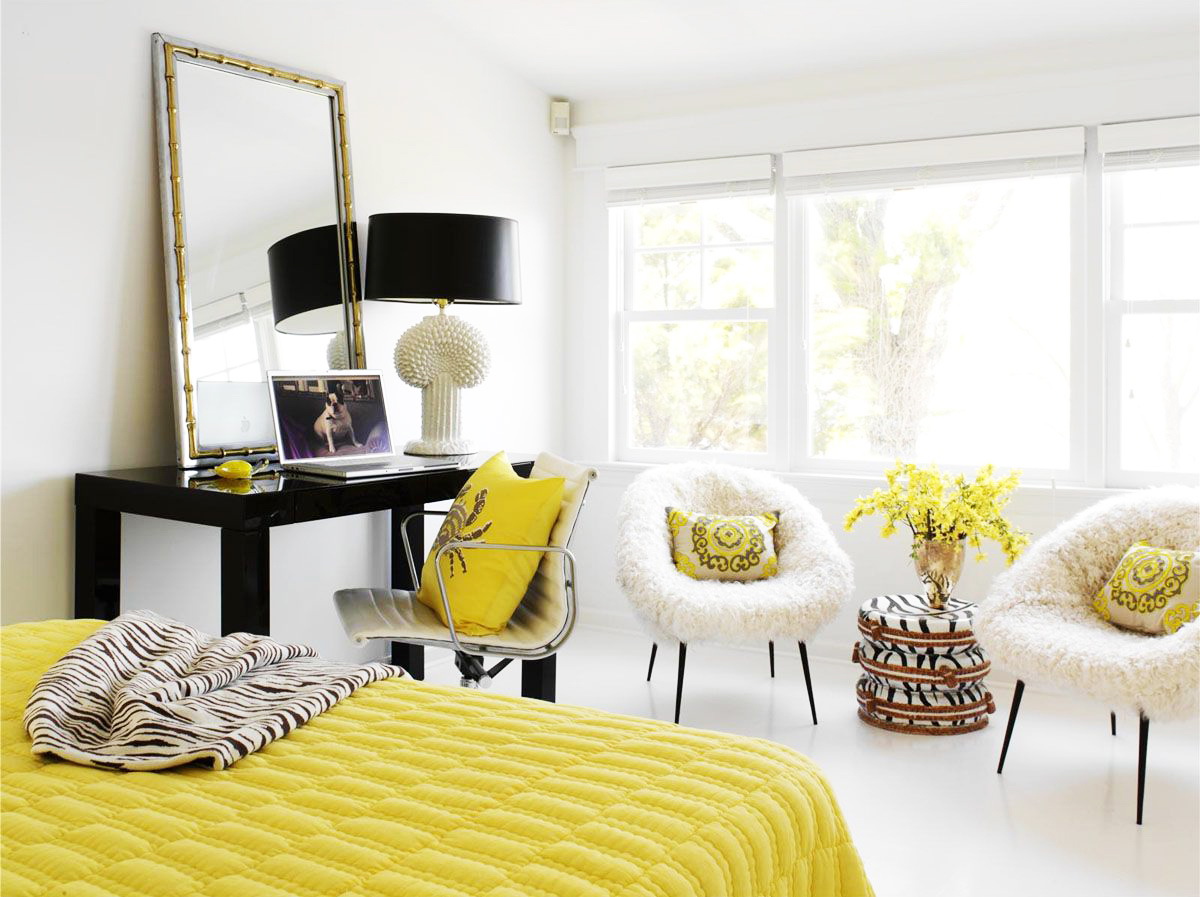
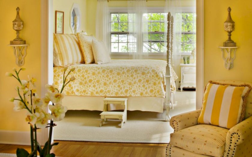
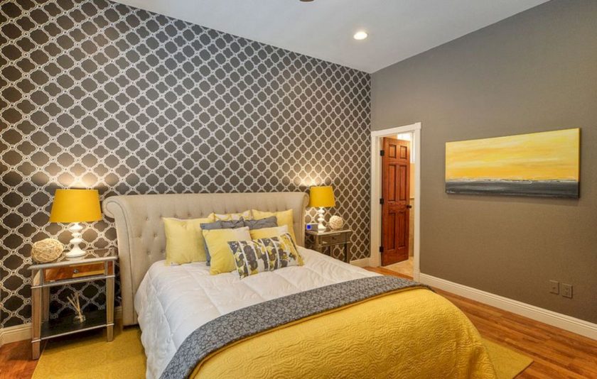
Bedroom
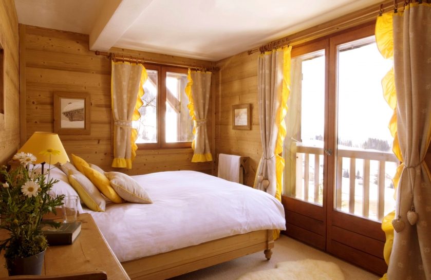
Shades of yellow on the walls bedrooms make it more spacious, cozier and lighter. Delicate apricot perfectly in harmony with white. The bedroom will look elegant and restrained if you arrange it in warm yellow tones. In addition, this finish option visually expands it. A mustard-colored furniture harmonizes the interior.
Spring mood will bring pastel walls and yellow pastels into the bedroom. the beds. If you want to create a neutral design option, you need to use accents and accessories of yellow-brown colors in the project. On the background of a white facade, they look stylish and colorful.
Similar bedroom looks elegant and discreet.
Finishing bedrooms involves the use of light colors. If it is a yellow design, then designers recommend using it as a base: champagne, straw color or apricot.
If the decision is made to use a poisonous yellow color in the bedroom, then it should be diluted with some kind of neutral, for example, white, gray or beige. This combination in any form will be advantageous. The combination in the bedroom shades of brown and yellow will give a similarity to the house in the village, which is filled with comfort and warmth.
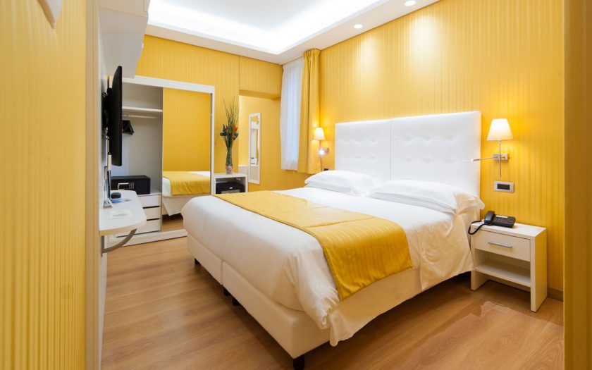
Shades of yellow on the walls of the bedroom make it more spacious, cozier and lighter.
Romance in this room will bring the olive duo in combination with white details and a variety of textiles:
- curtains;
- pillows;
- bedspreads;
- the curtains.
A good accent in the bedroom can serve as walls decorated in delicate tones of yellow palette. Here you can experiment with mustard or curry. Delicate yellow color on the walls and gray laminate floor are also a good combination and design project. This design option will look fresh, harmonious and sunny.
Yellow bedroom with brown - a good combination, but only in accents. This is the only way this duet will give the room a neutral range. And on the background of white walls and floors will look fresh and modern.
It is not recommended to use in projects too saturated yellow in its pure form.
Yellow at the head with a veil of the same tone on the bed attracts the eye, adds harmony and uniqueness to the interior.
return to menu ↑What accessories are suitable?
To make the project look complete and perfect, you can dilute it with various items and accessories. Alternatively, a beautiful yellow vase with flowers (can be artificial) against a white facade will suit, a red vase can be taken, only the flowers in this case should be yellow.
A golden statuette on a table or floor will give the room sophistication to emphasize a creative approach to creating a project.
Black will be a bright spot in a similar interior.
As a complement to the yellow tone can serve:
- decorative pillows;
- curtains;
- furniture.
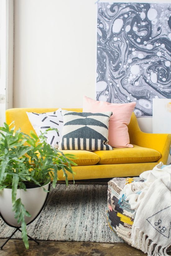
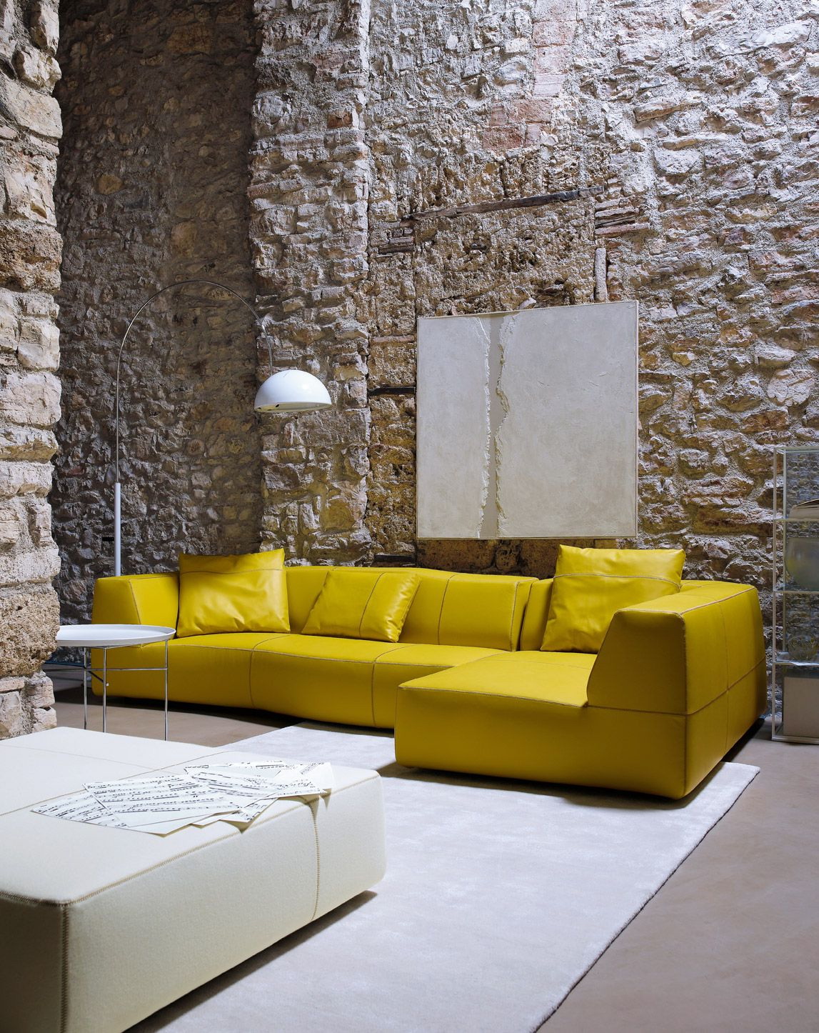
Designers refuse to design the facade yellow, so as not to overload the room. But they use it as additions in the form of stylish accents. The sofa and yellow pillows can simply attract attention, and yellow upholstery on furniture of unusual shapes and sizes will always look advantageous.
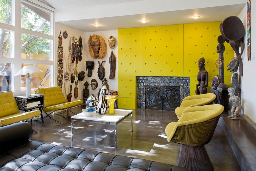
An interesting selection of accessories in the African style
Curtains and yellow curtains are not only a good way to hide the windows of rooms located on the north side, but also the ability to make them brighter and more sunny.
return to menu ↑Furniture in yellow design
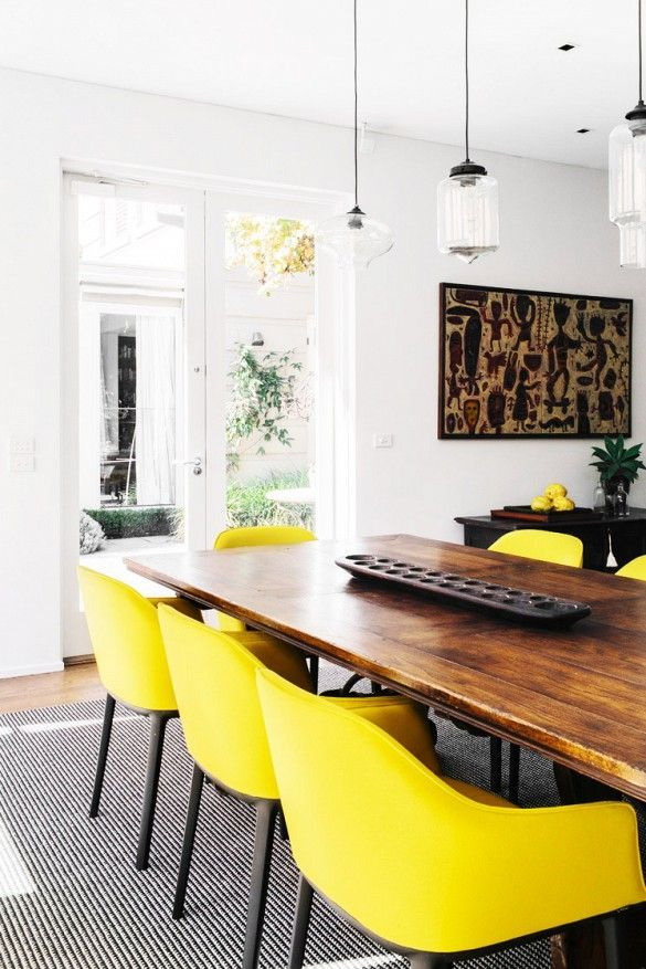
If you decide to arrange the room in yellow, then you do not need to buy furniture of the same color. On the contrary, choose more contrasting shades. With it, you can create amazing accents and combinations. Cabinet furniture of dark tones: wardrobes, sofas, sideboards will perfectly harmonize with any soft shade of yellow.
White soft chairs nobly shade an overly sunny atmosphere, bring a touch of peace, tranquility and relaxation in the yellow interior.
Choose contrasting shades for furniture
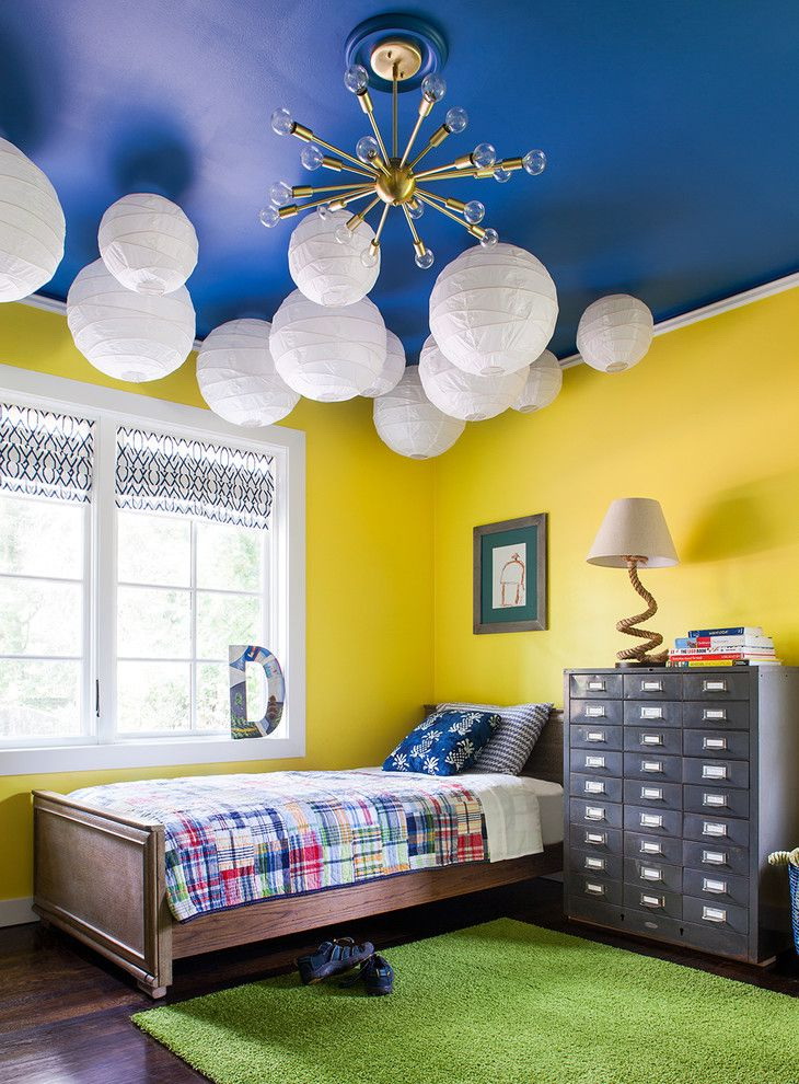
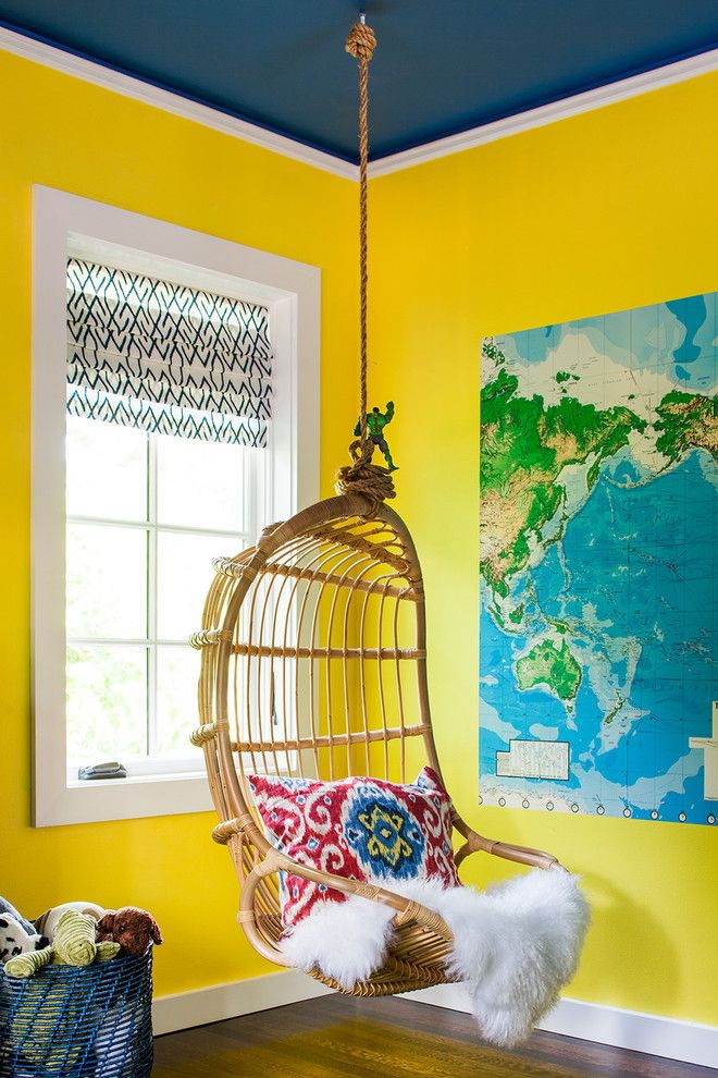
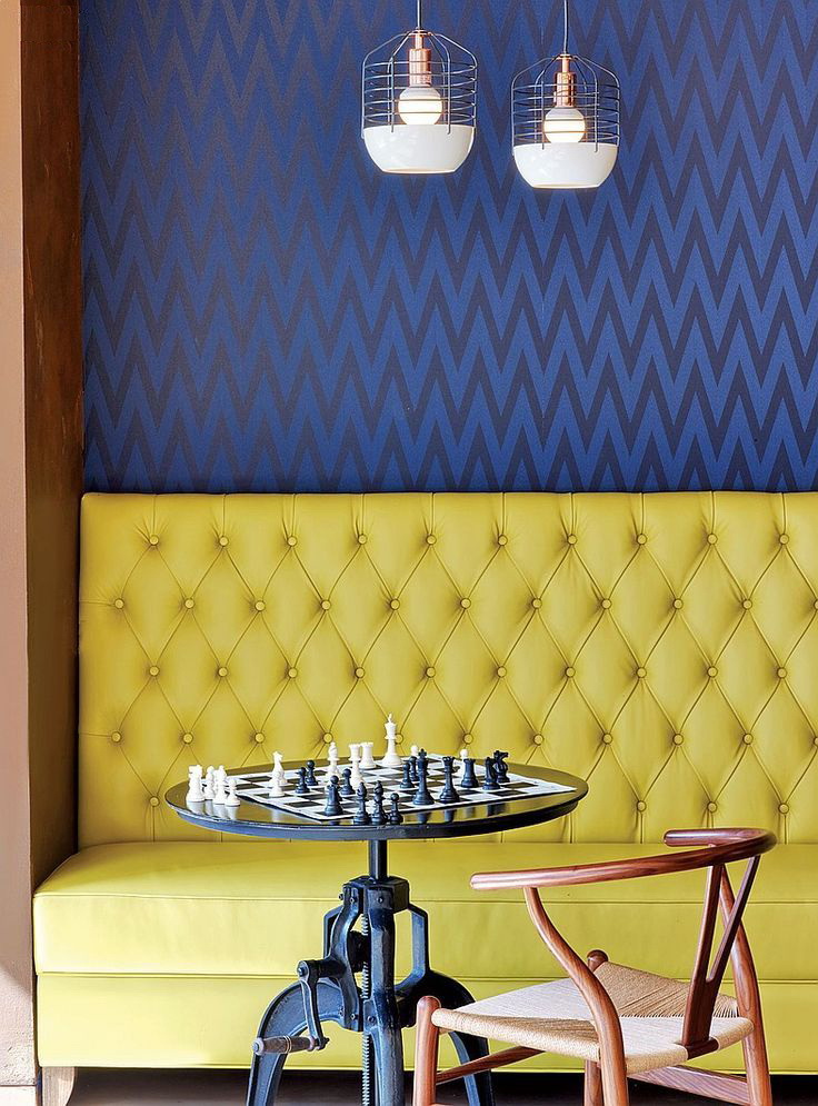
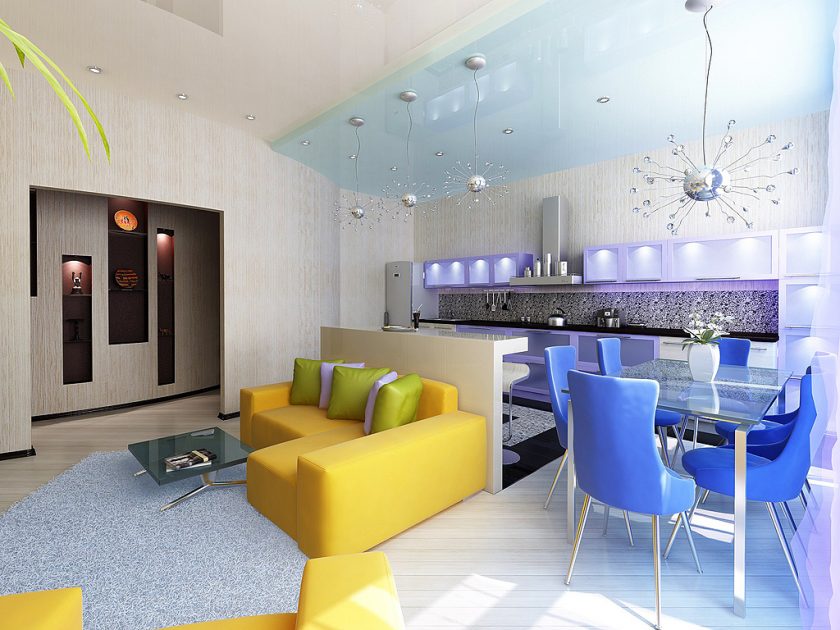
Yellow furniture will look great on the background of the blue facade. The combination is, indeed, successful in all variants. In the blue a lot of cold, and in the yellow heat. In this duet, two absolute opposites are connected. And if you add a little more blue here, you get a very sophisticated combination. Hang a bright green chandelier on the blue ceiling and everyone around you will get the impression that it is here that there is an outlet to nature itself.
Stylish combination of yellow and black
Yellow combination
Contrast design